iOS 14's App Library and Widgets reinvent the entire Home screen

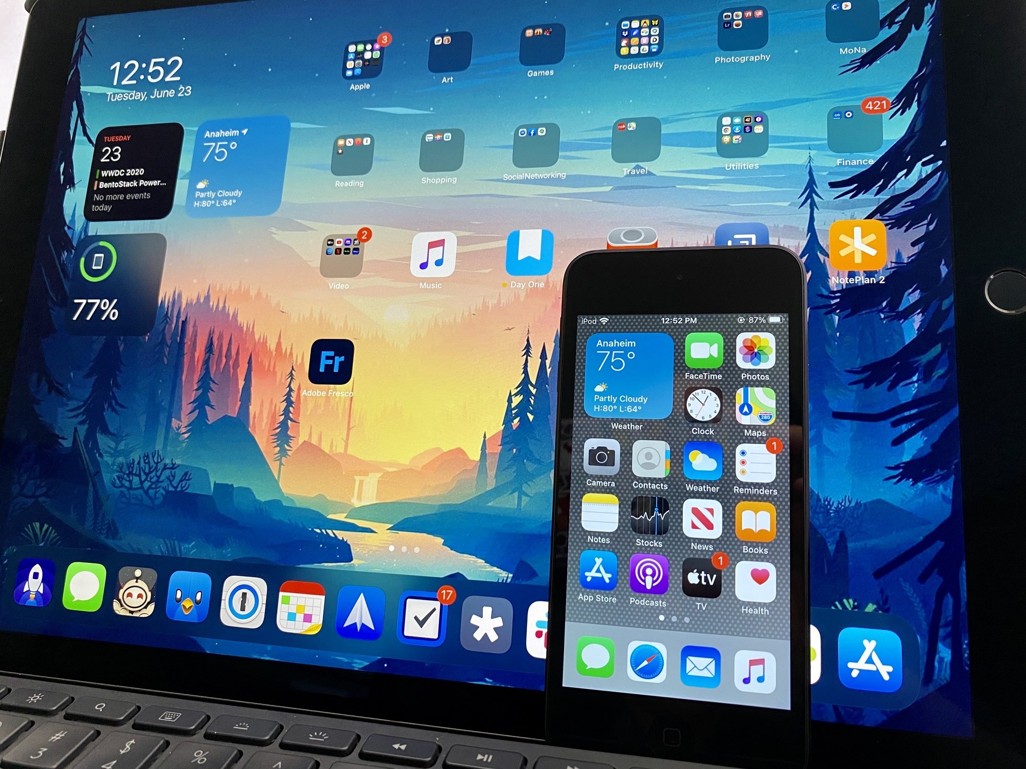
The Home screen on iPhone has mostly remained unchanged since the debut of the iPhone 13 years ago — it started out as a simple grid of icons and has stayed this way all the way up to iOS 13. In iOS 8, Apple added support for widgets, though they were tucked away in a separate view from the Home screen. And whenever you download a new app from the App Store, it goes on your Home screen (or another page of it) and adds to the digital clutter of icons and folders.
But with iOS 14, all of that is changing thanks to the App Library and the new Home screen Widgets. While most of us may have perfected our Home screen setups prior to iOS 14, these new features will completely reinvent how we set up our first (and most important) Home screen page. After all, this is the first thing that we see when we unlock our phones or exit out of an app to go Home.
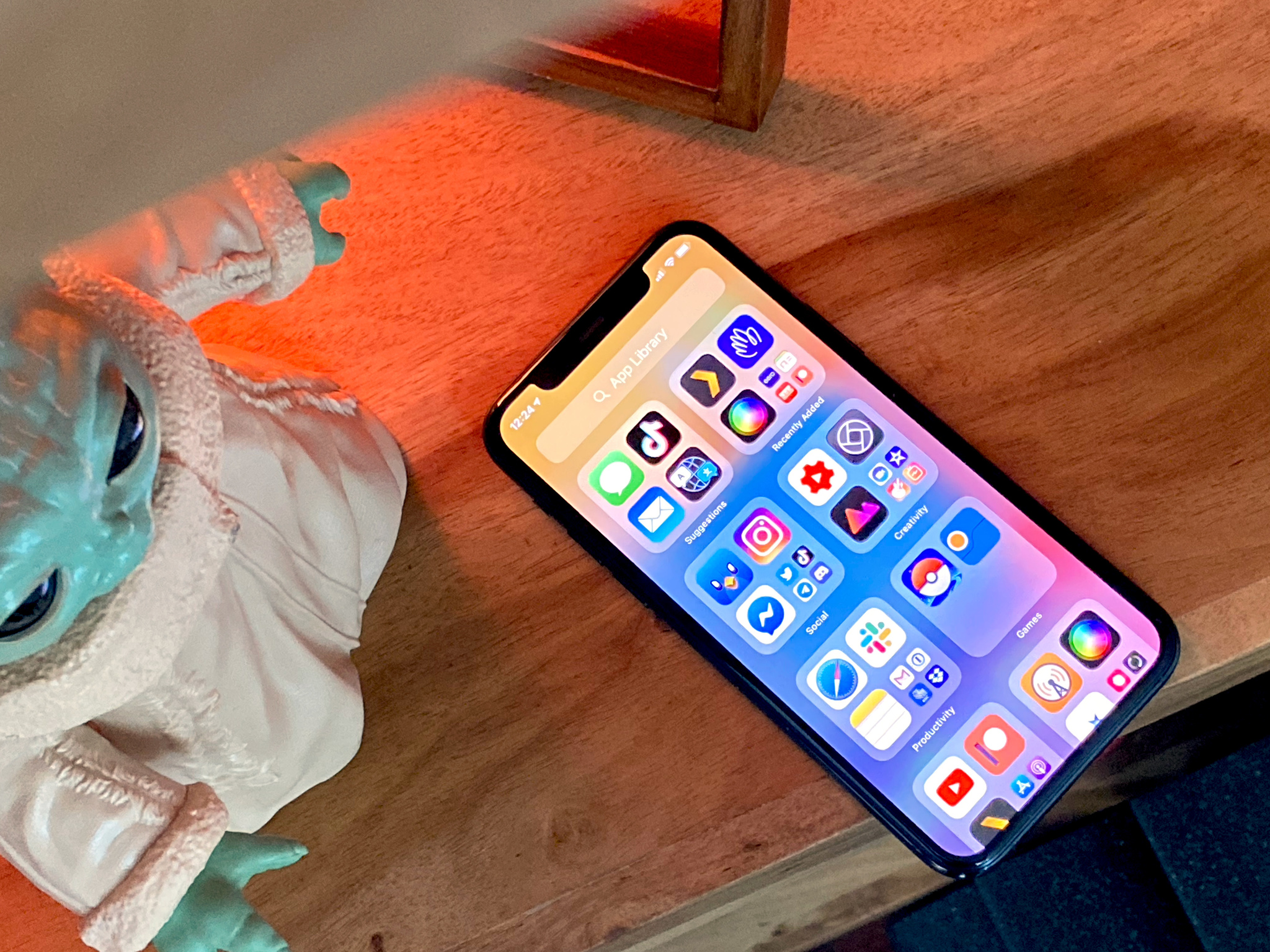
App Library is great for digital decluttering

Over the years, I've acquired hundreds of apps from the App Store, and I usually just do a restore from backup every year when I upgrade. This means that I have hundreds of apps on my iPhone, which means a lot of folders and random app icons all over the place after the first page on my Home screen. Honestly, I'm just too lazy to go through and clean out all of my apps. This is why App Library is a godsend for me.
As I've been trying out the developer beta, there is a new option in Settings for the Home Screen. The setting is to have new app downloads be added to the Home Screen, or just add them to the App Library Only. With this setting, I can download a bunch of new (or old) apps, and they won't clutter up my Home screen. I've wanted something like this for years because honestly, page two and beyond on my iPhone are just an absolute mess, and I just focus on page one.
Now, you may be wondering how I would access these new app downloads if they aren't on the Home screen? The App Library is always a swipe away, and it automatically organizes all of your apps by category. There's also the insanely useful "Recently Added" category, where you will find all of the apps that you've downloaded lately. And Search is also available on both the Home screen (pull down) and App Library.
However, it doesn't seem to be as easy to delete apps entirely from the App Library en mass like you could with the Home screen, because there is no "jiggle mode" on the App Library. Maybe this can change in a future version of iOS 14, but as of right now, deleting apps from the App Library must be done one at a time.
Home screen Widgets are Apple's version of Microsoft Live Tiles

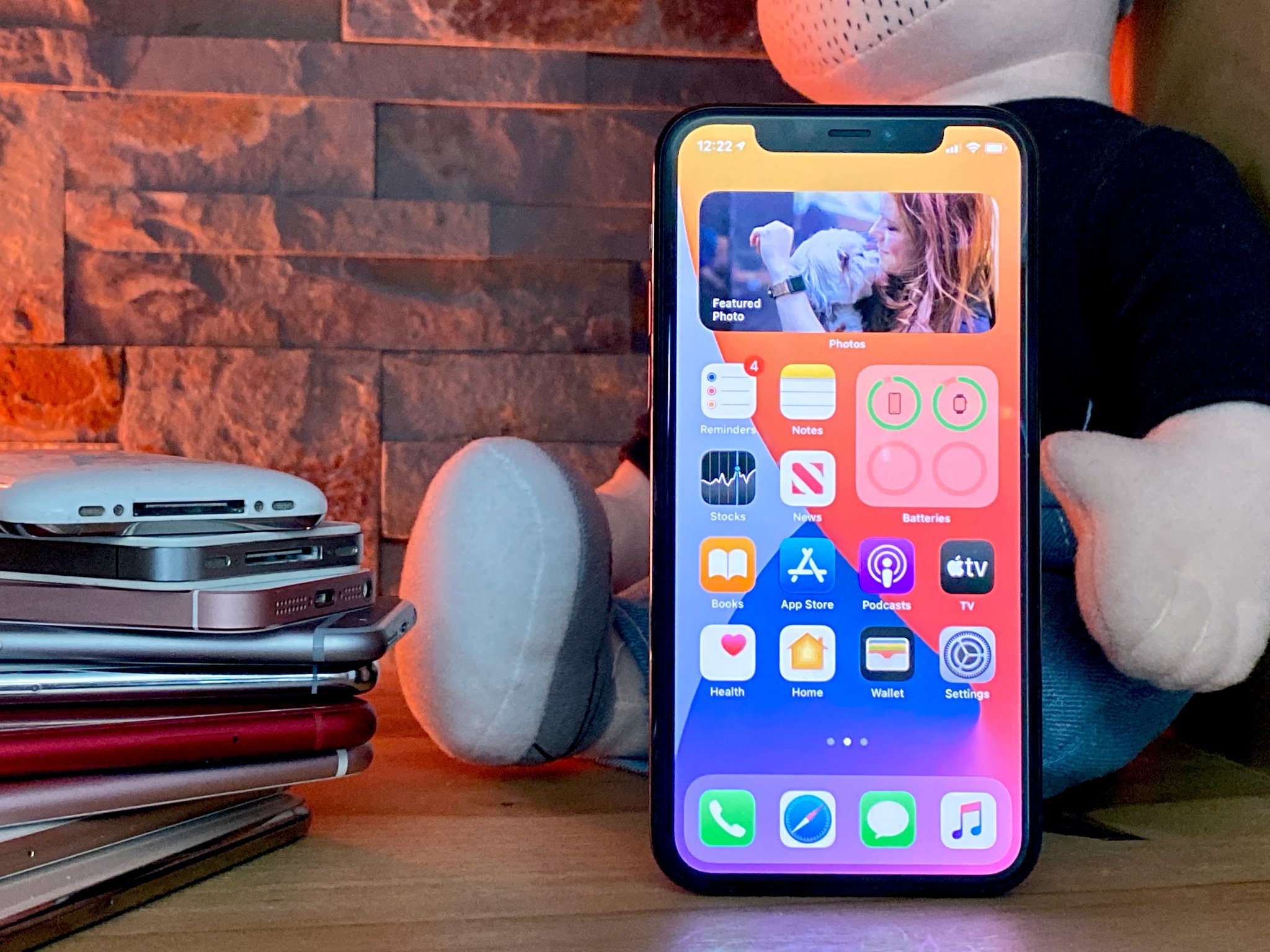
For years, I've wished to have widgets on the Home screen, kind of like how the Calendar and Clock app icons actually change to reflect the current date and time. But I wanted this for a lot of other apps, and with even more information available at a glance. With the new iOS 14 Widgets, I'm getting just that, and I love it.
First off, widgets are now available in varying sizes that display as little or as much information as you want, both in the standalone widgets view or on the Home screen. Even the smallest size can display some useful information versus a static app icon, since the data refreshes throughout the day, and the largest one can replace two entire rows of app icons. But if you're still struggling with space on a one-page setup, then you can simply use the Smart Stack widget and stack multiple widgets on top of one another and swipe through them. Or just turn on the Smart Rotate option for the Smart Stack, and have iOS 14 take care of it for you.
The Siri Suggestions widget is also one of the coolest new additions to iOS 14. For this particular widget, one of the options are App Suggestions, which takes up two rows of icons on your Home screen. With this widget, it blends in naturally on your Home screen and will give you app launch suggestions based on your usage patterns over time. Theoretically, you could have multiple "Siri App Suggestions" widgets on your Home screen, and it detects when there are duplicates, so the set of app suggestions can't repeat itself. And if you don't want to have an app appear in this widget at all, you can tell it to leave out specific apps.
Sure, you can always just launch the app to view the information shown in a widget, but I find having this information available at-a-glance from my Home screen to be so much faster. A lot of the, time I just need to quickly know something, like the temperature, and it's more time consuming to open the app up instead of a quick glance at the Home screen.
You can now hide entire pages off of the Home screen with App Library
One of the more hidden features of the App Library is the ability to hide entire pages of the Home screen at will. While I plan on using it on my iPhone to hide everything past the first page, this can also be used to dedicate entire screens of apps and widgets for work, school, travel, and more, but only when you need them.
I've often looked at people who only have one page on their Home screen with a bit of envy because it's just unmanageable for me with hundreds of apps. But App Library is changing that entirely — I can literally yeet entire pages off of my Home screen and not deal with a digital mess of organized chaos in the form of folders and randomized app icons any longer. And when you combine this with the other features of the App Library, it truly is a new way to look at the iPhone Home screen.
How do you plan on setting up your new iOS 14 Home screen?
It's been 13 years in the making, but the iOS Home screen is about to become much more useful this fall. Are you excited for the iOS 14 App Library and Widgets? Let us know what you think in the comments.
Master your iPhone in minutes
iMore offers spot-on advice and guidance from our team of experts, with decades of Apple device experience to lean on. Learn more with iMore!
Christine Romero-Chan was formerly a Senior Editor for iMore. She has been writing about technology, specifically Apple, for over a decade at a variety of websites. She is currently part of the Digital Trends team, and has been using Apple’s smartphone since the original iPhone back in 2007. While her main speciality is the iPhone, she also covers Apple Watch, iPad, and Mac when needed. When she isn’t writing about Apple, Christine can often be found at Disneyland in Anaheim, California, as she is a passholder and obsessed with all things Disney, especially Star Wars. Christine also enjoys coffee, food, photography, mechanical keyboards, and spending as much time with her new daughter as possible.

