iOS 15 needs to give us the customization we've been asking for

With WWDC 2021 less than a month away, we fully expect to see Apple unveil the next iteration of iOS in the form of iOS 15 (and iPadOS 15, respectively). We already have a list of WWDC 2021 expectations, and I have some specific features I want to see in iOS 15.
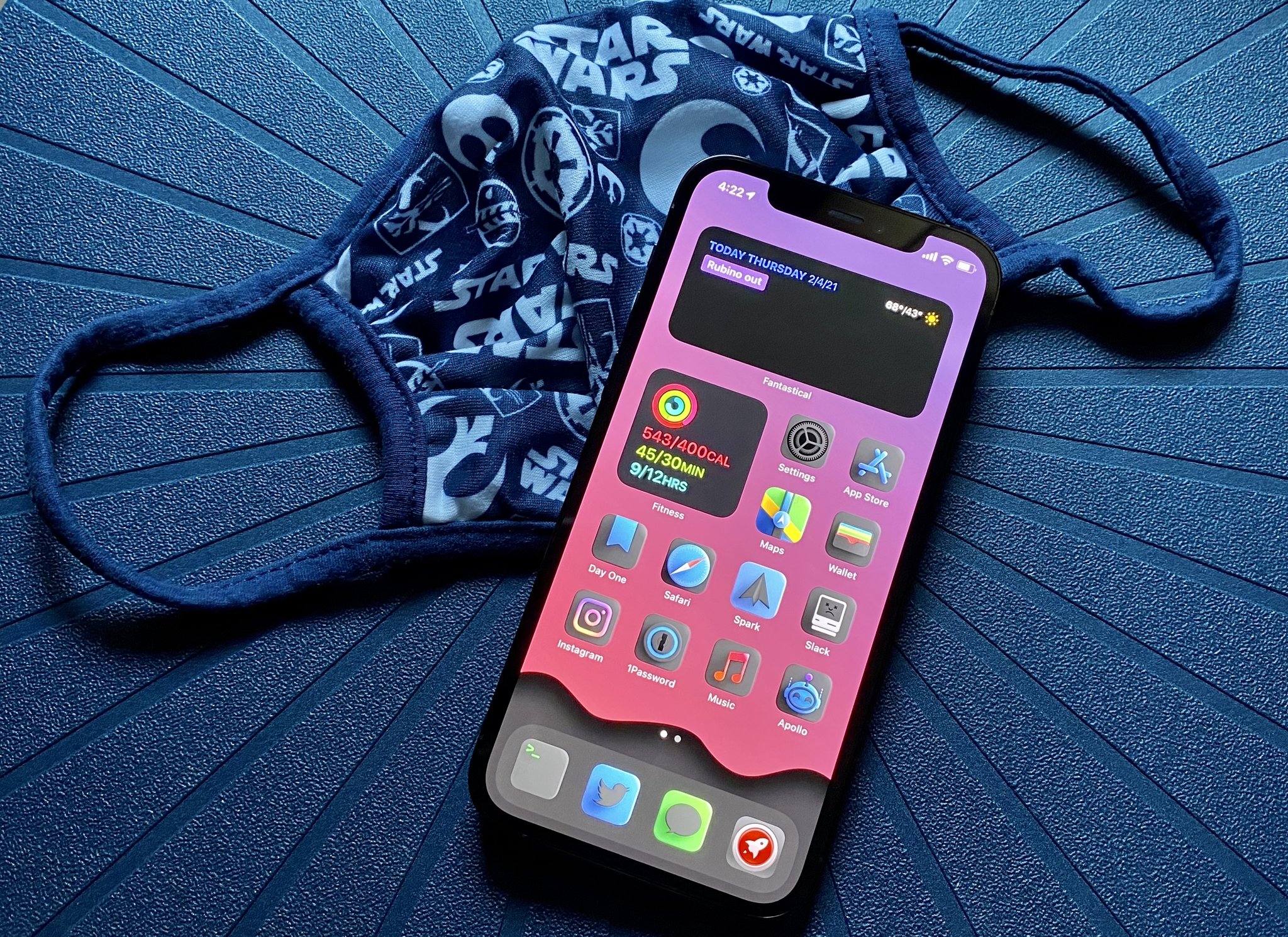
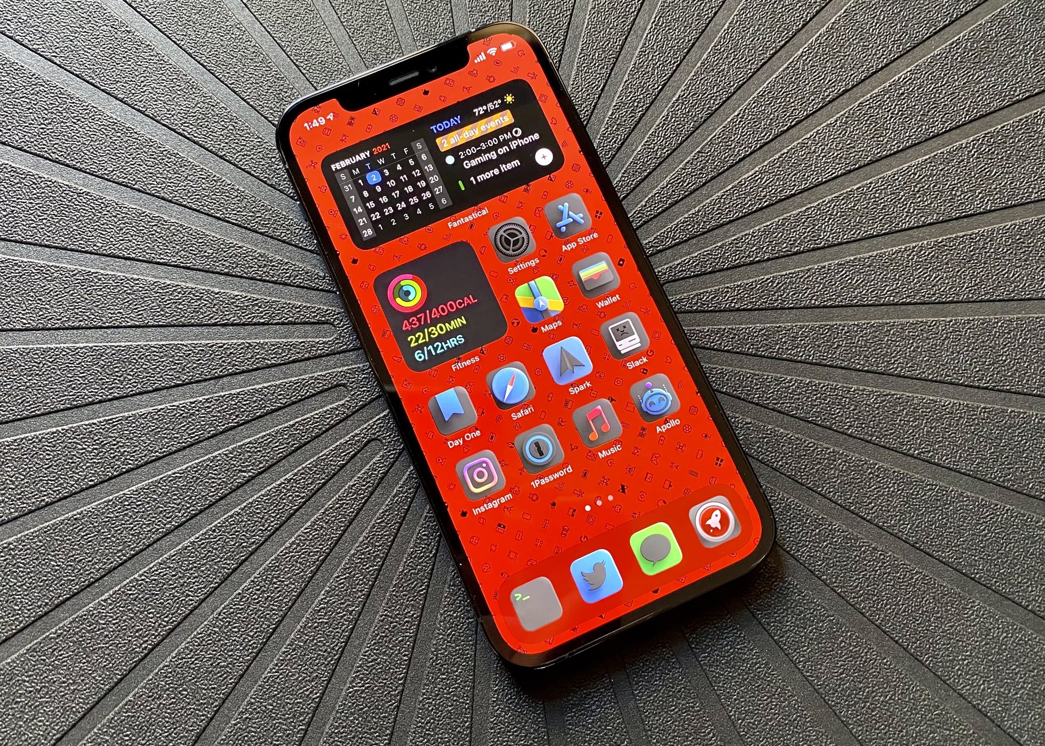
One of my biggest wants for iOS 15 is more customization. While iOS 14 gave us a decent start, there are so many improvements that Apple could make to streamline the entire process. After all, right now, the process involves using the Shortcuts app to change app icons one-by-one, which is tedious. And while it no longer opens up Shortcuts before going to the app itself, you still have a rather annoying banner at the top when launching an app from a custom icon.
That's why when Apple reveals iOS 15, I am hoping that there will be a more streamlined process to customize your iPhone and iPad Home screen, from the app icons to the widgets and even themes. Here's why I think customization should be something Apple highlights.
Let us customize app icons directly from the app itself

One of my favorite things about customizing my iPhone right now is changing the app icons. I'm not a big fan of how most stock app icons look, and I especially love seeing the cool icon themes that the community comes up with. However, the main method of doing this right now is tedious and cumbersome. In fact, I've changed up the theme of my Home screen once, and I have not changed it since because I don't feel like going through the entire process again, even though I find tons of inspiration from r/iossetups.
If Apple makes any changes to Home screen customization in iOS 15, it needs to be the ability to make changing app icons easier. I would love it if Apple allowed developers to have a setting inside of the app itself, or even from Settings.app, to choose a custom icon. After all, many apps these days give users several different app icons to use, so why not apply this same setting for custom app icons? Plus, that way, you can open the app as you normally do and don't need to hide it away in the App Library or a hidden page in favor of your custom app icon version. And let's face it — that Shortcuts banner is a little chonky and annoying, so it would be good to get rid of that method entirely.
Please, Apple, give us this one thing for customization — it would simplify a lot and get more people interested in customizing their devices.
Make theming possible with something like Nova Launcher

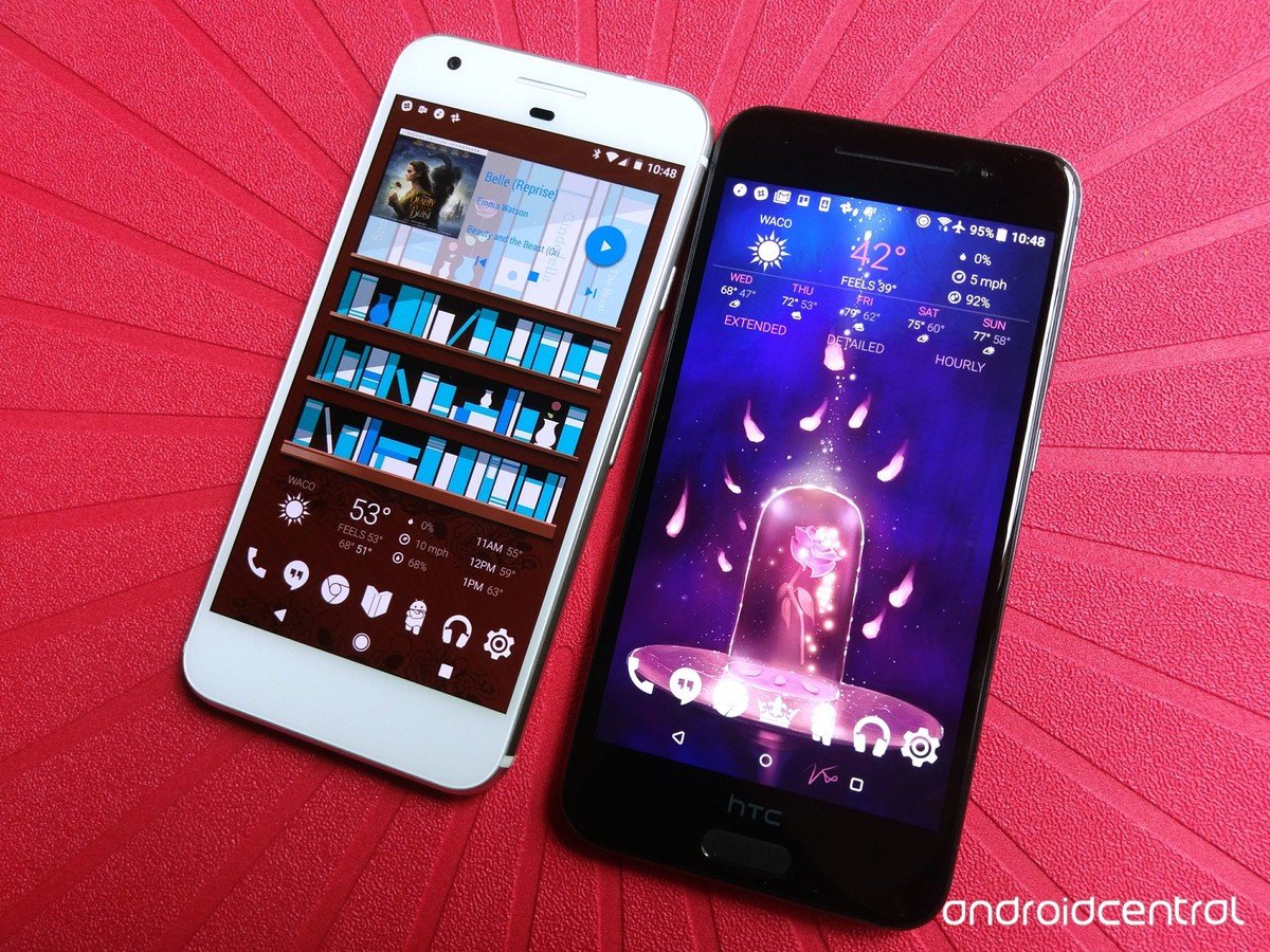
On Android, one of the best personalization apps that you can get comes is Nova Launcher, which is essentially a home screen replacement. If you've never heard of Nova Launcher, it's pretty cool — it's a powerful app that lets you personalize your entire home screen with complete icon themes, Night Mode and Dark Themes, custom app drawers, subgrid positioning, and so much more. If Apple can go above and beyond with customization in iOS 15, I hope to see something like Nova Launcher.
iMore offers spot-on advice and guidance from our team of experts, with decades of Apple device experience to lean on. Learn more with iMore!
When I started playing Persona 5 Royal last winter, I fell in love with the game's stylish visuals, especially when you get messages from the other characters on your phone. At this point, I was obsessed with the game and wished that I could customize my Messages app to have the Persona 5 style, but I knew that it was impossible — at least not without a ton of modifications or jailbreaking. But could you imagine if Apple allowed us to use something like Nova Launcher to apply a complete theme to our Home screens instantly?
I'm a sucker for customization (which is one big appeal of the best mechanical keyboards for me), so being able to slap an entire theme on my iPhone Home screen with just a few taps would be a dream come true. We all have different interests and tastes, so why not apply that to how our iPhone software looks? I mean, we already do it with the best iPhone cases already, so I don't see why theming is any different. I feel like we're still a ways away from Apple allowing that much customization, but hey, who knows? If it's not coming this year, maybe the next year or two, right? I'll keep crossing my fingers.
Let us put widgets wherever we want on iPadOS 15

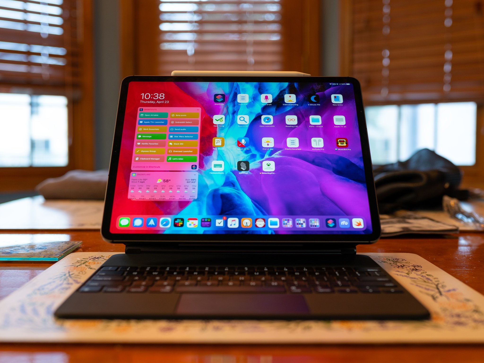
One thing that made zero sense in iPadOS 14, when compared to iOS 14, was the fact that the App Library and Home screen widgets were nowhere to be found. Considering that an iPad, even the iPad mini, has more screen space than even the iPhone 12 Pro Max, it boggled the mind why widgets were still only available in the Today view panel.
With iPadOS 15, I hope that Apple lets us put our widgets anywhere on the Home screen grid because this is a long-overdue feature. It just seems like wasted space on the screen, especially if we don't put the maximum amount of apps on a page. After all, you can only have so many widgets in the Today view before you need to scroll to view the rest. Allowing us to put widgets wherever we please on the Home screen brings us one step closer to turning our iPad into a kind of personal dashboard display if we want. C'mon, Apple, let's make it happen.
And while the App Library doesn't really add to the customization scene, it does let you basically hide dozens or hundreds of apps away from the Home screen. It will definitely help de-clutter your Home screen of unnecessary app icons, giving you more freedom to tinker around and create Home screen pages that suit your needs, as minimal or extravagant as they may be.
Since we're still on the topic of widgets here, I would also like to see iOS 15 add some interactive elements to widgets. At least from what I've seen in iOS 14, even though we can place widgets anywhere, they're still static or update on a regular interval. But tapping them just takes you to the app. For example, I would love to be able just to have a Notes widget that I can quickly jot down things without having to open up Notes.
What do you want to see in iOS 15 for customization?
The reveal of iOS 15 is just around the corner, with WWDC 2021 a few weeks away. We're definitely excited to see iOS 15 and iPadOS 15 and crossing our fingers for easier customization. What do you want Apple to reveal with iOS 15? Do you wish it were easier to customize your iPhone or iPad Home screen? Let us know in the comments.

Christine Romero-Chan was formerly a Senior Editor for iMore. She has been writing about technology, specifically Apple, for over a decade at a variety of websites. She is currently part of the Digital Trends team, and has been using Apple’s smartphone since the original iPhone back in 2007. While her main speciality is the iPhone, she also covers Apple Watch, iPad, and Mac when needed.
When she isn’t writing about Apple, Christine can often be found at Disneyland in Anaheim, California, as she is a passholder and obsessed with all things Disney, especially Star Wars. Christine also enjoys coffee, food, photography, mechanical keyboards, and spending as much time with her new daughter as possible.
