iOS 16 Lock Screen customization is a huge leap in the right direction

Apple's Worldwide Developer Conference (WWDC) event keynote has come and gone, with plenty of big updates coming for all of your Apple devices. The iPad is getting a much-needed update to multitasking with Stage Manager, the Apple Watch will be able to track sleep stages, and so much more. But the iPhone got a lot of love too in the form of iOS 16.
The headliner feature for iOS 16 is Lock Screen customization. If you've followed my work here at iMore ovver the past few years, you'll know that I'm a big advocate for customization and personalization on iOS. Yes, I'm well aware that Android is the king of customization and I've been told numerous times that "if you want customization, go to Android." But no, I simply prefer iOS, and I've been wanting better customization options ever since iOS 14 showed us what is possible.
While I didn't get all of my customization wishes this WWDC, I'm incredibly excited for iOS 16's new Lock Screen and what it means for the future of iOS personalization.
iOS 16 is to the Lock Screen what iOS 14 was to the Home Screen

When the iPhone first came out, we had "Slide to Unlock" on the Lock Screen, and it became a staple in the modern smartphone world. Eventually, when Apple added Touch ID to the Home button, there was no more Slide to Unlock — instead, we used our fingerprint to unlock the iPhone. Then, Face ID came along and replaced our finger for biometrics.
But even with the Touch ID and Face ID changes, the Lock Screen remained relatively the same. Apple added two buttons for quick access to the Flashlight and Camera at some point, but the overall look and feel of the Lock Screen has never changed — that is, until iOS 16.
The Lock Screen is what we first see on our favorite iPhone before we start using it. And when you're around other people, it's also the first thing they're going to notice before you unlock your phone. Before iOS 16, everyone's Lock Screen was pretty much the same, except for the wallpaper.
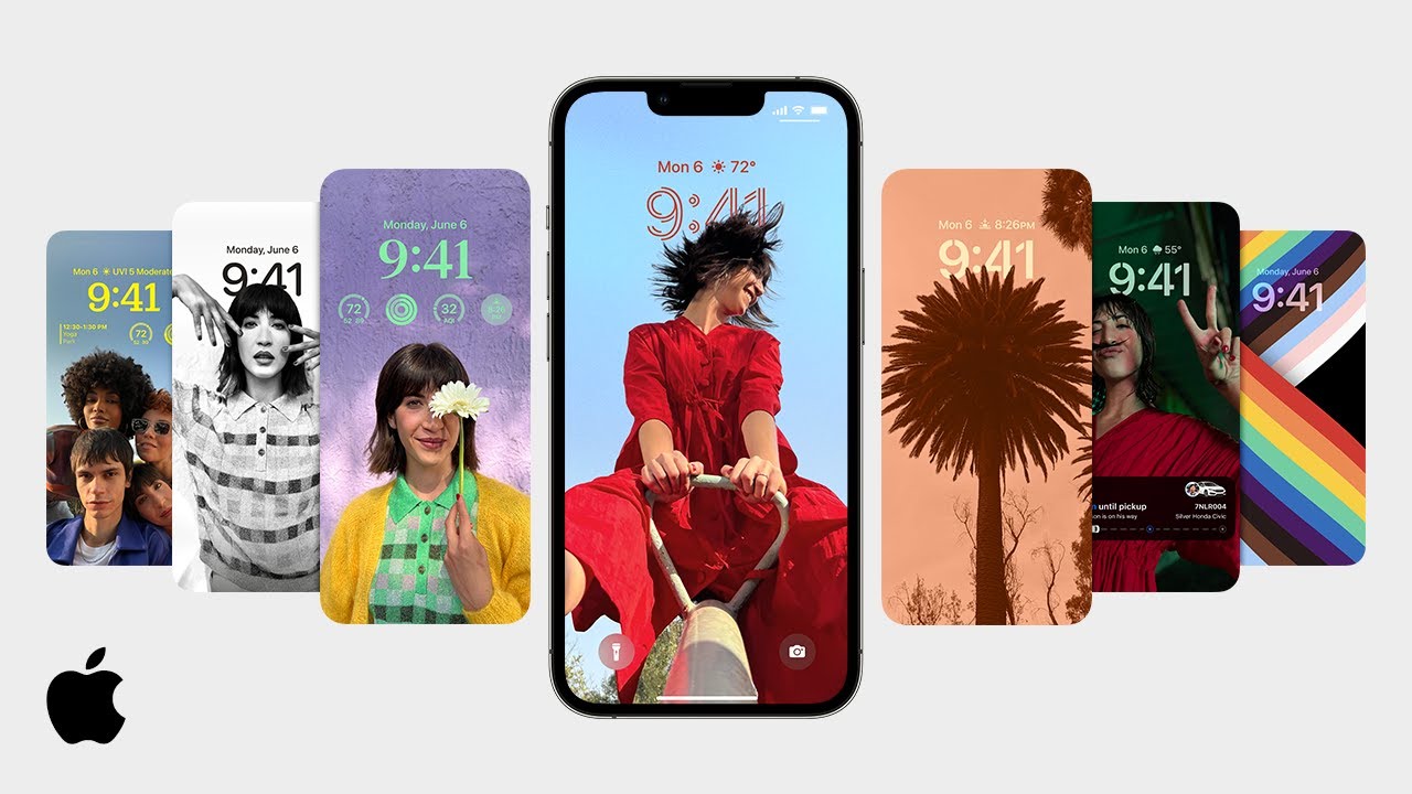
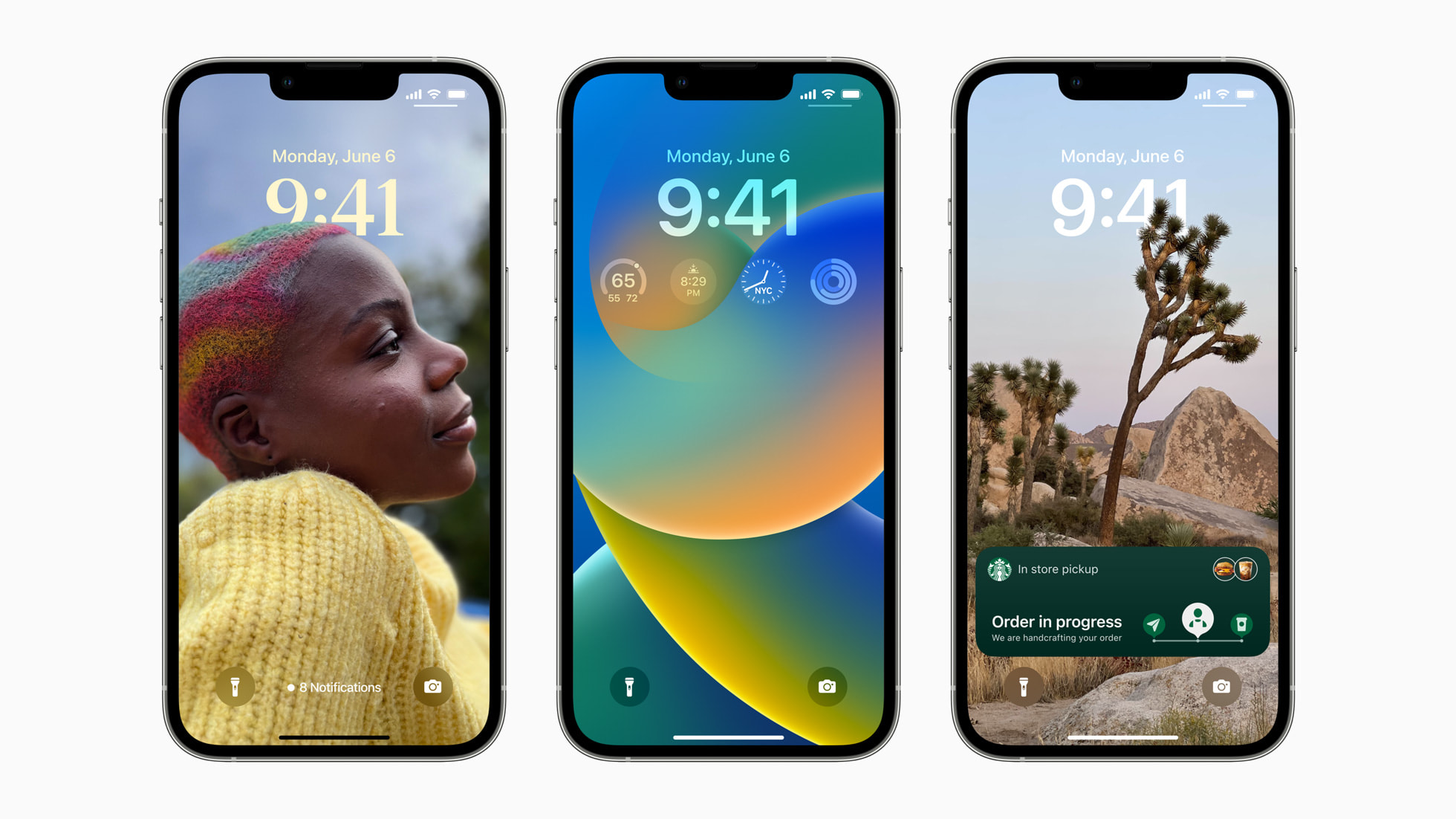
With iOS 16, we are finally able to make the Lock Screen truly ours by choosing a color and typeface for the clock, as well as adding informative or fun widgets. The Lock Screen will now also have a multilayer effect for a sense of depth so subjects in the foreground of a photo can appear "on top" of the clock. And to emphasize your personalized Lock Screen, notifications now roll in from the bottom, similar to how it was done on the now-dead webOS (RIP).
Speaking of notifications, Apple also added Live Activities, which are unique, real-time notifications that look and act like widgets. However, they will constantly be refreshed and updated with app data, eliminating the need for multiple notifications, which was always annoying. At the moment, Live Activities seems to be limited to Now Playing controls, as well as Timers (iOS 16 is still limited to one timer at a time, for some dumb reason). When third-party developers are able to create Live Activities, they'll be glanceable but not interactive like Now Playing and Timers, unfortunately.
Apple's on the right track for customization
When I wished for Apple to add more customization to iOS, I wasn't thinking about the Lock Screen. I simply wanted a better way to use custom app icons without the Shortcuts method, and maybe just have a way to apply entire themes, including wallpaper, to the device.
I'll admit, the Lock Screen customization we got caught me off guard, Bbt I think it's a sign of things to come. Apple clearly is emphasizing personalization, and being able to finally change up the Lock Screen is huge. It's a little odd it didn't include different options for the two shortcut buttons on the Lock Screen for Flashlight and Camera, but maybe that'll arrive sooner rather than later.
Regardless, the changes to the Lock Screen are huge and a good sign that Apple knows we want to make our devices feel more like our own. I mean yeah, we can always put on a great iPhone case, but we should have our own style and tastes be reflected in the operating system itself, too.
Master your iPhone in minutes
iMore offers spot-on advice and guidance from our team of experts, with decades of Apple device experience to lean on. Learn more with iMore!
Christine Romero-Chan was formerly a Senior Editor for iMore. She has been writing about technology, specifically Apple, for over a decade at a variety of websites. She is currently part of the Digital Trends team, and has been using Apple’s smartphone since the original iPhone back in 2007. While her main speciality is the iPhone, she also covers Apple Watch, iPad, and Mac when needed. When she isn’t writing about Apple, Christine can often be found at Disneyland in Anaheim, California, as she is a passholder and obsessed with all things Disney, especially Star Wars. Christine also enjoys coffee, food, photography, mechanical keyboards, and spending as much time with her new daughter as possible.

