iOS 16 review: Unlocking the potential of the Lock Screen and beyond
iOS 16 is a beefy update that shows us the true potential of customization on the Lock Screen and more.
iMore offers spot-on advice and guidance from our team of experts, with decades of Apple device experience to lean on. Learn more with iMore!
You are now subscribed
Your newsletter sign-up was successful
Apple has finally released iOS 16 to the masses after going through several betas during the summer months. Though iOS 15 was more about refinement, iOS 16 is a major overhaul of Apple’s mobile operating system, much like iOS 14 before it. In fact, while we didn’t get more Home Screen customization (boo!) like we did two years ago, Apple has unlocked the potential of the Lock Screen with new customization tools and widgets.
Aside from the headliner feature of Lock Screen customization, iOS 16 also gives us a lot of smaller quality of life improvements across a variety of apps, including Messages and Maps, as well as a new way of showing Notifications, and so much more. Plus, you can easily make stickers out of any photo. Oh, and did I mention that Apple brought back the battery percentage that disappeared with the introduction of iPhones with notches?
It seems that Apple has put a lot of emphasis on what your best iPhone can do when it’s not actively in use when it comes to iOS 16, though that’s not exclusive. All of the big and small things in iOS 16 just come together to create a new iOS that makes picking up your iPhone fun again, and using it is just delightful.
Device compatibility
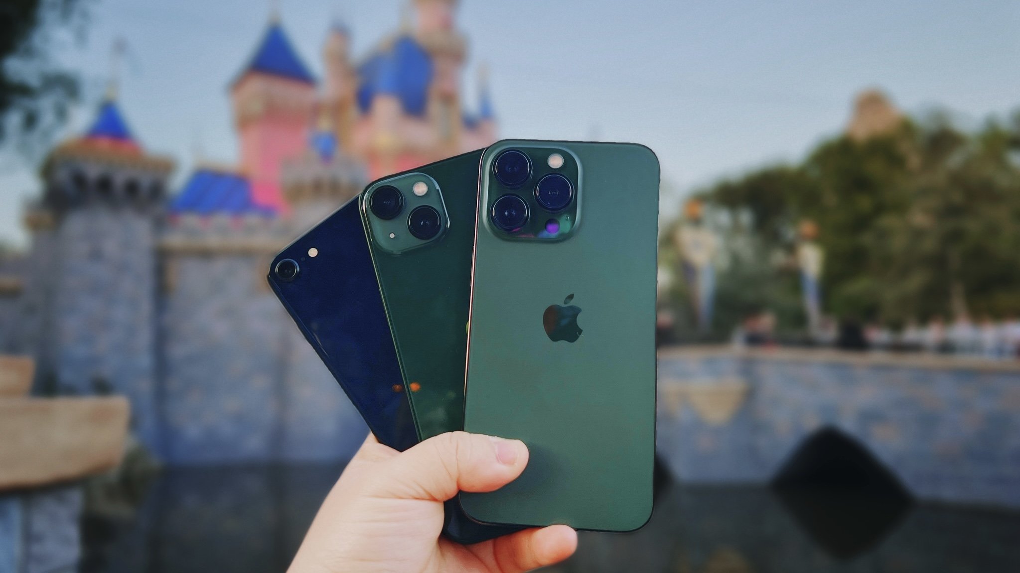
First off, you're probably wondering if your current iPhone will be able to run iOS 16. While iOS 15 worked on any device that could have iOS 14, the same cannot be said for the jump to iOS 16 from iOS 15. So here's the list of compatible devices that will be able to handle iOS 16:
- iPhone 14 Pro Max
- iPhone 14 Pro
- iPhone 14 Plus
- iPhone 14
- iPhone 13 Pro Max
- iPhone 13 Pro
- iPhone 13
- iPhone 13 mini
- iPhone SE (2022)
- iPhone 12 Pro Max
- iPhone 12 Pro
- iPhone 12
- iPhone 12 mini
- iPhone SE (2020)
- iPhone 11 Pro Max
- iPhone 11 Pro
- iPhone 11
- iPhone XR
- iPhone XS Max
- iPhone XS
- iPhone X
- iPhone 8 Plus
- iPhone 8
If you have ordered an iPhone 14, iPhone 14 Plus, iPhone 14 Pro, or iPhone 14 Pro Max, then it will ship out with iOS 16 already on it.
New Lock Screen widgets and customization
When iOS 14 came out, it gave us the ability to finally add some customization to our Home Screen by letting us add custom app icons through Shortcuts and even widgets. iOS 16 is like iOS 14 in regards to customization, except this time it takes place on your Lock Screen.
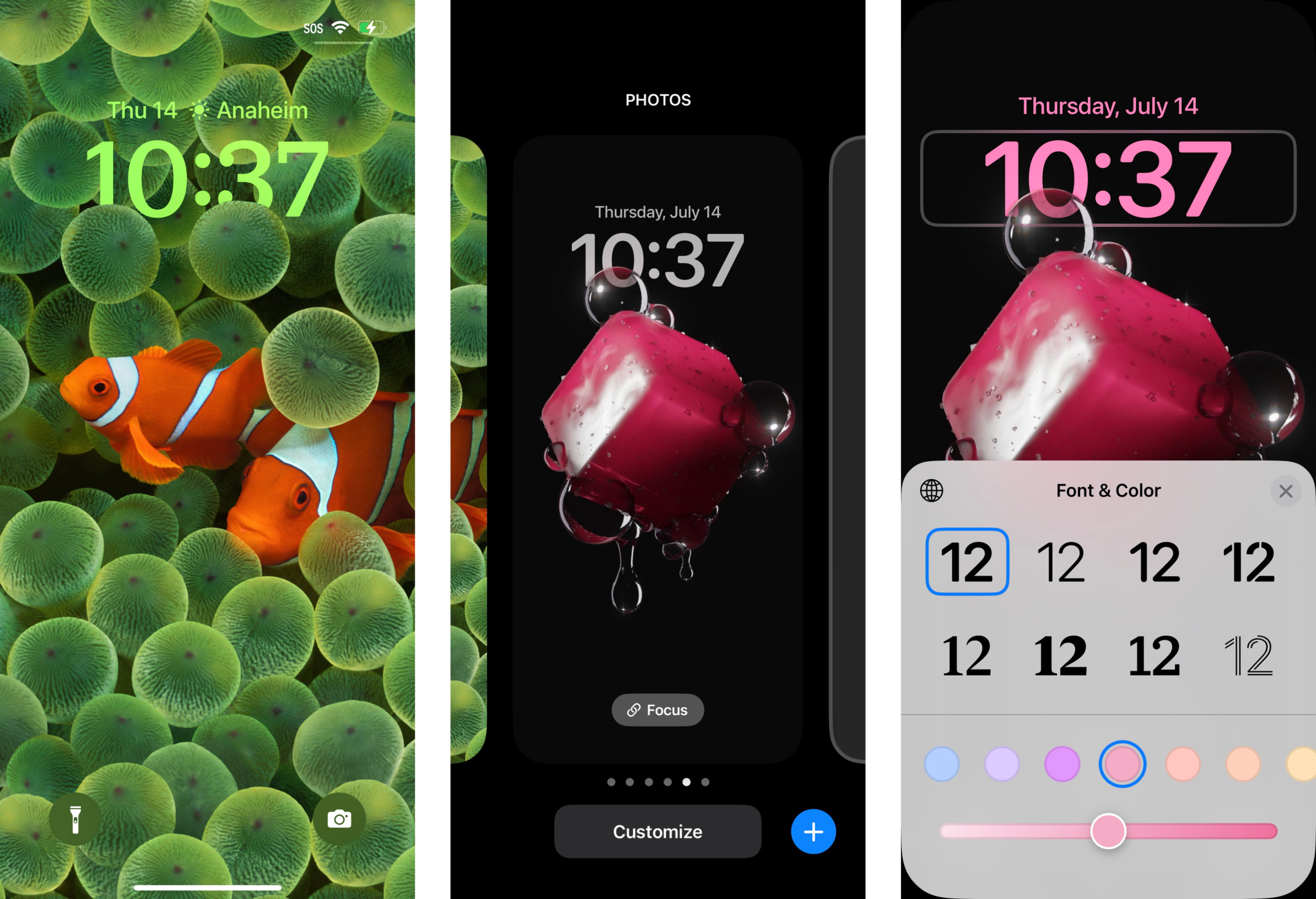
The Lock Screen, similar to the Home Screen before iOS 14, has remained unchanged and quite honestly, stagnant, over the years. But iOS 16 changes all of that by letting us to change the typeface and color of the date and time, add widgets that are similar to Apple Watch complications, and even your wallpaper can have some depth to it, allowing the time to appear "behind" a subject in the foreground.
iMore offers spot-on advice and guidance from our team of experts, with decades of Apple device experience to lean on. Learn more with iMore!
Customizing your Lock Screen is done in a similar fashion to how you change your best Apple Watch face. You simply press down on your Lock Screen and you're in the customization mode. You can even create multiple Lock Screens for various occasions and switch between them by swiping left and right in the gallery view, just like on your Apple Watch.
However, I find it annoying that you can't just swipe from the edge of the screen to quickly cycle through multiple Lock Screens, as you can do that with multiple Apple Watch faces. Doing this on the iPhone just brings up the Today View or the Camera, respectively.
Another thing that I've noticed since iOS 16 is that you can't easily change your Home Screen wallpaper anymore. Now, even when you go into the Photos app to find an image to use as a wallpaper, you'll be prompted to set up your Lock Screen first with that image, before you can set it as your Home Screen wallpaper. I personally like to use two different images for my Lock Screen and Home Screen, so this change is very tedious. It adds extra steps to changing up my wallpapers, because if you just want to change up your Home Screen ONLY, you have to go to Settings > Wallpaper > Customize under the Home Screen image. Then you'll have to go into your photo library from there and find the image you want.
The entire process is not very intuitive, and it seems that Apple is trying to push users towards using the same wallpaper on both the Lock and Home Screens. While I love being able to customize my Lock Screen, I think Apple needs to streamline the process a bit more, and make it easier for those who prefer to use two different wallpaper images to set a Home Screen wallpaper directly from the Photos app.
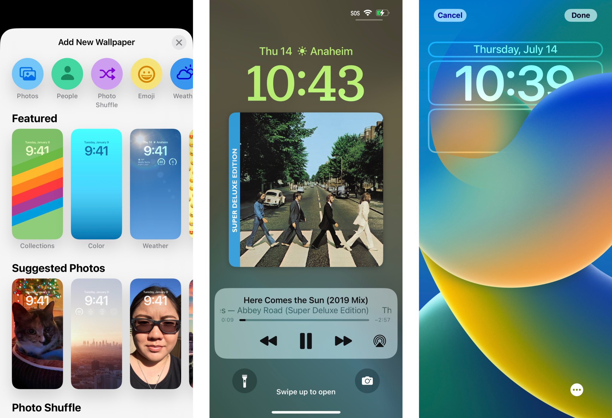
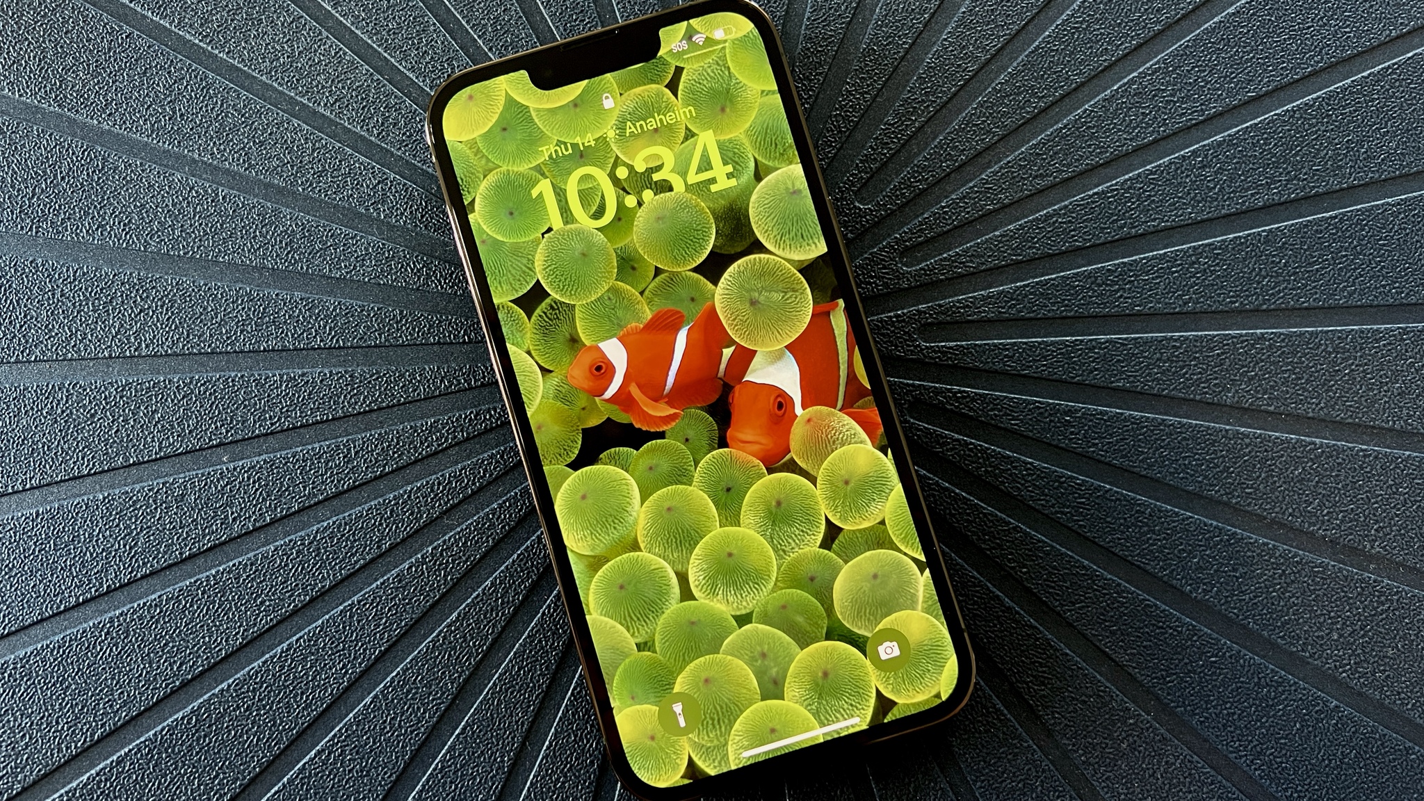
When creating a new custom Lock Screen, it's important to note that some of the aesthetic choices available to you really depend on what you select as a wallpaper. iOS 16 will add a multilayered depth effect to all of your photos, not just Portrait mode images, but sometimes the depth effect isn't available as the subject may block out too much of the time for it to work. The depth effect also won't work if you choose to add widgets, which I'll get to in a bit. You have many choices available to you for wallpaper: You can always go with your own photos, but Apple also provides plenty of starting options in a few different categories too. There's Weather & Astronomy, Emoji, Collections (including the incredibly well-known Clownfish), and Color.
Regardless of the wallpaper that you choose, you'll be able to swipe through different color filters that can be applied to the image, which can change the overall tone or mood. The clock can also be in Arabic, Arabic Indic, or Devanagari style, with eight typefaces in each.
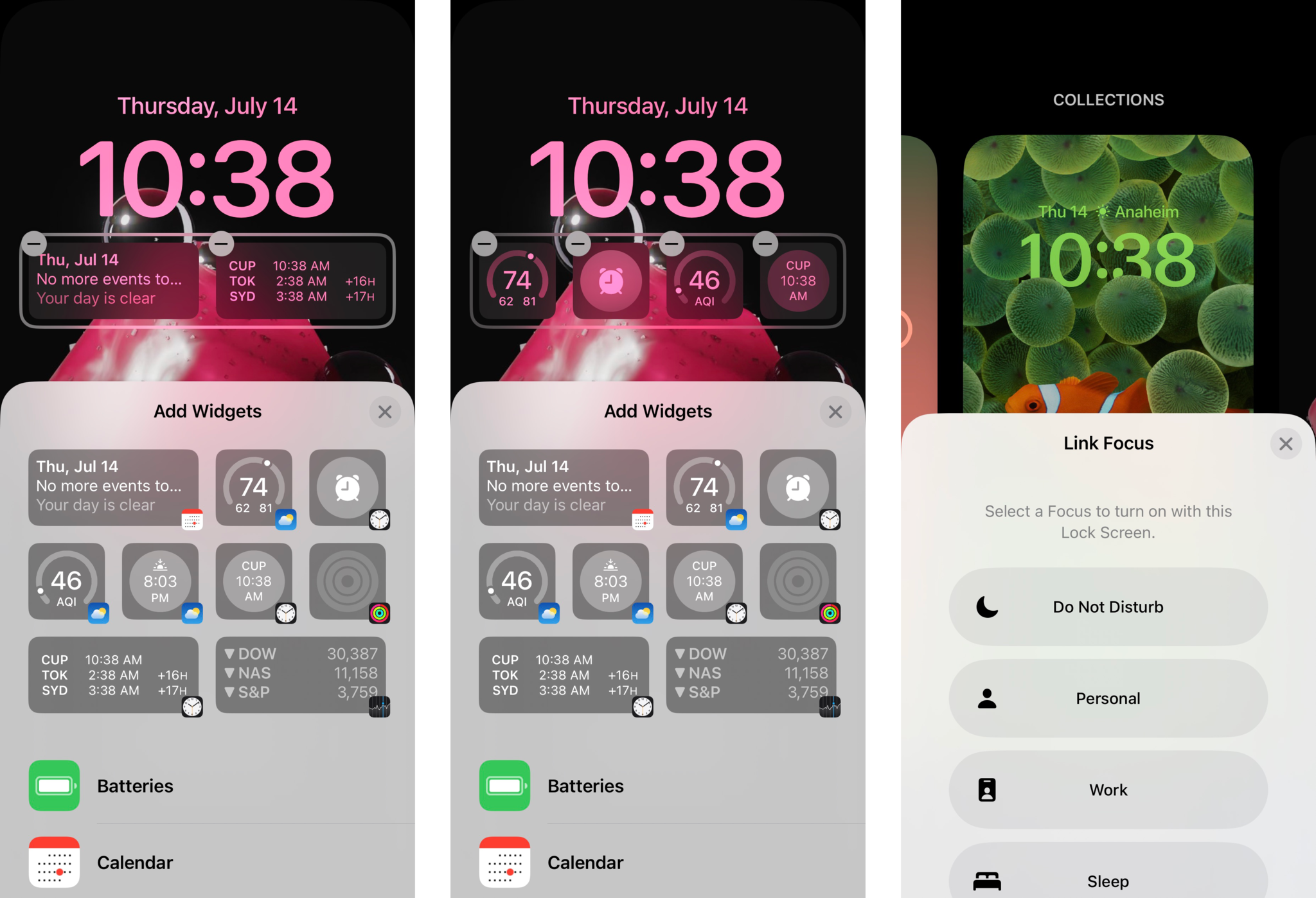
While you may have associated the date with the clock all these years, it turns out that the date is now a Calendar widget. You can actually change the date to a different widget if you prefer, and again, Lock Screen widgets are designed to be informative glances, much like Apple Watch complications. To change the date to a different widget, just tap on it to bring up other "inline" options, though the date will show up with whatever you choose, regardless. The space below the Clock is also for widgets. For the widgets under the Clock, you can have up to four 1x1 square widgets, two 1x2 rectangles, or a combination of the two. But you can't exceed four widget squares or two widget rectangles, because that's all Apple has allotted for Lock Screen widgets in that area.
Right now, most of the widgets that you may see showing up are first-party from Apple. But as more developers add widgets to their apps with the WidgetKit framework and submit updates, you'll start to see more widget options populating the widget selection screen as you customize. It's still very early, but developers are submitting their updates (and we all know how app review can be from Apple). I know right now that the popular Reddit app, Apollo, has some fun widgets that you can add. Even Facebook has a widget, and Google has been advertising its apps with widgets.
Here are first-party Apple widgets that you can add right now:
- Batteries
- Calendar
- Clock
- Fitness
- Home
- News
- Reminders
- Stocks
- Weather
Another new feature with the Lock Screen is the ability to link a specific Lock Screen to one of your Focus modes. If you do this, every time you activate a Focus, the Lock Screen will also change to the one you have set for that Focus. Since you could also set a specific Home Screen to appear when a Focus is activated, linking a Lock Screen just completes the set. I personally don't have a need to change the Lock Screen per Focus mode, so I haven't used this feature much. But it is useful if you want a distraction-free, plain Lock Screen, or perhaps one with some useful widgets on it for work.
Notification improvements and Live Activities
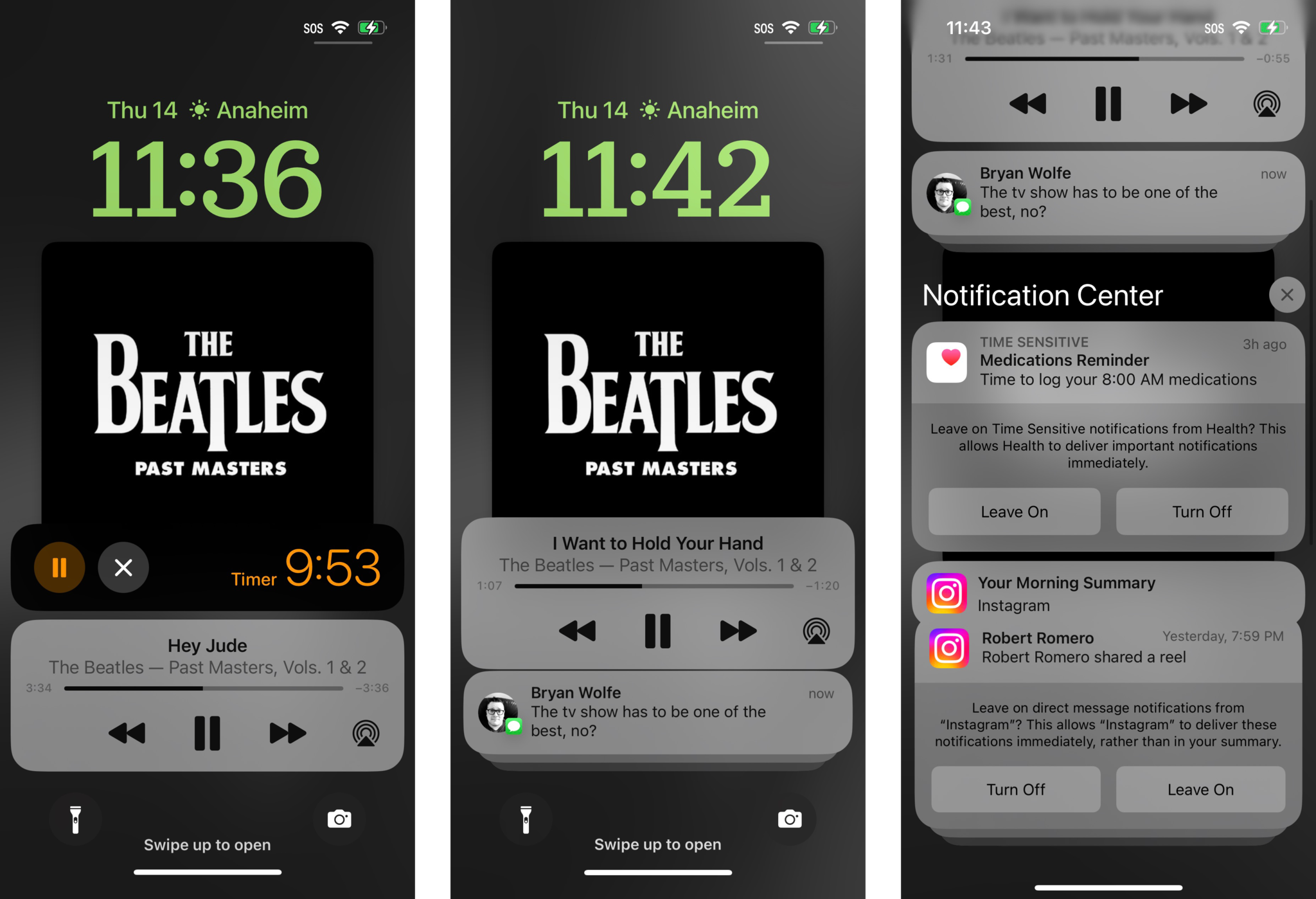
With the new Lock Screen, notifications have been tweaked so that there's more space to show off your Lock Screen wallpaper and widgets. Notifications now roll in from the bottom, and you can swipe up to view your full list of notifications, or swipe down to hide them. This is reminiscent of how the old Palm Pre with webOS did notifications, and I personally love it. I often spend time picking out a good wallpaper for my Lock Screen (and Home Screen), and it always bothered me that notifications ended up covering up my wallpaper, especially if it's a photo of my husband and I.
Another change to notifications comes in the form of the new Live Activities style. This notification style works best for apps that tend to send multiple notifications in a row because of changes that happen in real-time. For example, think of when you get an Uber or Lyft, or when you place an order with a food delivery app, or when you want real-time sports scores. Live Activities will show a single compact and glanceable notification that acts like a widget because it will have live updates for you, rather than sending multiple notifications and alerts.
The new Lock Screen style and notifications are much more compact and less intrusive when you have multiple notifications.
While Live Activities will work best with third-party apps that use the Live Activities API, there are two available Live Activities style notifications that are available at the moment: Now Playing and Timers. For the Now Playing, you are able to see what is currently playing in real-time, and you can control the audio playback right from the Live Activity notification on the Lock Screen. The Timer allows you to view the countdown, and you can pause or cancel it directly from the Lock Screen.
Unfortunately, if you're expecting Live Activities from third-party apps, you're going to have to wait a little longer. Apple is delaying Live Activities until a later iOS 16 update, so as of right now, the only Live Activities type of notifications are still Now Playing and Timers. Developers who plan to make use of Live Activities will have to implement the Live Activities API in their apps before it works.
The new Lock Screen style and notifications are much more compact, making them less intrusive when you have multiple notifications. And though we only have two Live Activities notifications right now, I'm excited to see what third-party developers come up with in this area. It definitely beats having multiple notifications in quick succession.
A smoother way to Focus
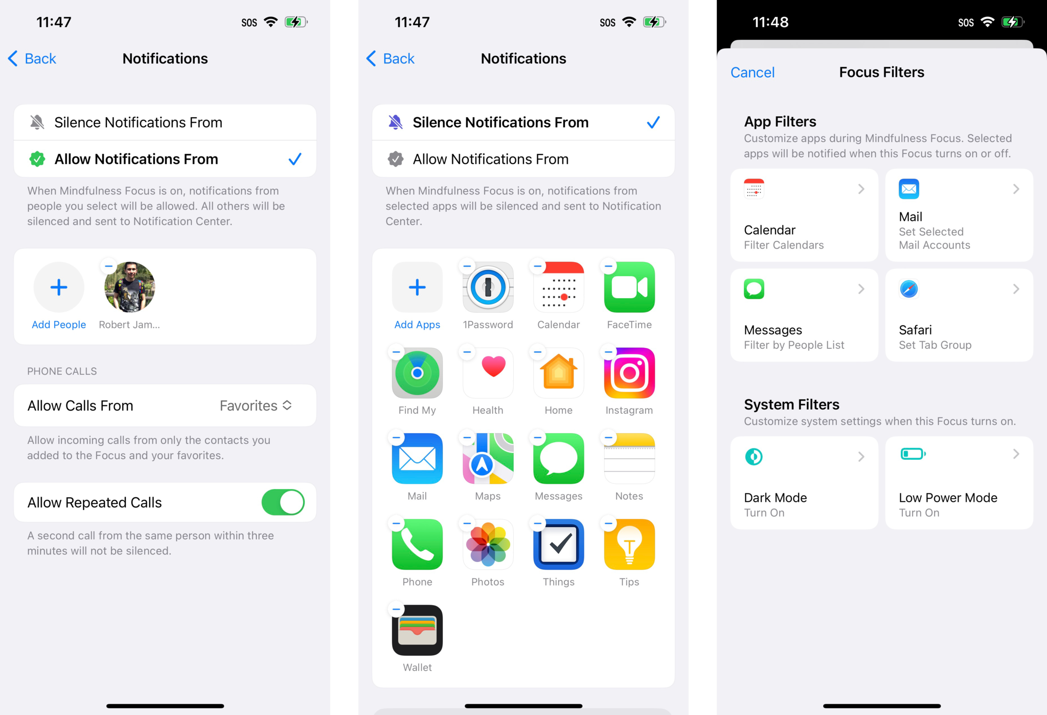
Focus originally debuted in iOS 15 and it was often described as "Do Not Disturb on steroids." However, it seems that a lot of people ended up not using different Focus modes because it was tedious to set them up. Apple is changing that in iOS 16 with some improvements to Focus to make it a bit more streamlined for everyone.
For example, in iOS 15, when setting up a Focus, you could only choose which people or apps to allow notifications from. In iOS 16, a big change when creating or editing a Focus is that you can choose people or apps to either allow OR silence notifications from. This makes it a lot easier to decide whether you want to include or exclude certain people or apps from sending you notifications when a Focus is on. And you can easily choose a specific Lock Screen and Home Screen to link to a Focus, as I mentioned briefly earlier.
In iOS 16, Focus will be a bit more streamlined and easier to set up.
But Focus improvements aren't stopping there. In iOS 16, you are now able to add Focus filters. With Focus filters, you are able to only allow specific content from apps to come in while a Focus is on. With Focus filters, you can only allow work-related calendars to come through, or only get notified about new messages in a work email account. Or perhaps you want to only use a particular Safari Tab Group in a Focus. System filters also include turning on Dark Mode or Low Power Mode.
I often use Focus to create a distraction-free environment while I work every day, so the new improvements to Focus have been helpful. It should also make the feature more accessible to more people. Developers can add Focus Filters to their apps with the Focus API — if you take a look when setting up a Focus, you can probably find a few of your current apps implementing Focus Filters as part of the initial wave of iOS 16 app updates.
A better Messages app
The Messages app on current iPhones and iPads has slowly been getting more modernized features in recent years, such as in-line replies, @ mentions, and even pinned threads. But it's iOS 16 that is bringing some new features that are heavily inspired from third-party messaging apps like WhatsApp.
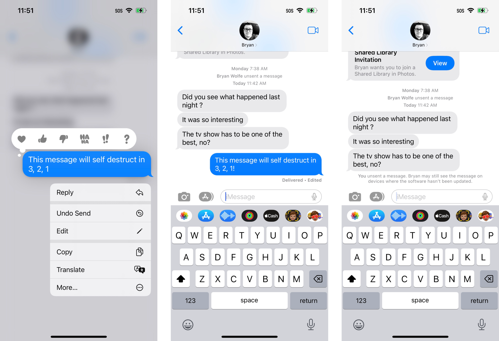
With iOS 16, users are now able to edit and unsend messages with other Apple users. Note that this feature does NOT work with standard SMS text messages. Both the edit and undo send functionality have a specific time frame, so once that window passes, the message can no longer be edited or rescinded. For editing, you have up to 15 minutes, and you can only make up to five edits per message. For undo send, you have only two minutes. You can get to the edit or unsend option by long-pressing a message you just sent.
I often send messages quickly, which may lead to some unsightly typos. That's pretty much the only time I feel like I would use the edit functionality, so then I could correct my typos instead of spamming the correction (which also gets autocorrected every now and then, curse you autocorrect!) to the recipient. In my personal use case, this is the only real time I would feel the need to edit a message, but I'm sure that others may have more of a need to edit a sent message — perhaps to add in more exact details of where to go or if something could be misunderstood.
If everyone in an iMessage conversation is on iOS 16, then there is an "Edited" indicator to let everyone know that the message was edited. By tapping the "Edited" status, one can view a full change log of all edits. But if a recipient is on an older version of iOS, then edited messages are sent as a new message, with "Edited to" in front of the new text.
Users will be able to edit a message up to five times within 15 minutes, and undo send in two minutes.
Originally, I had some concerns with the early betas because one could not view a change log of all edits made to a message, which could potentially be abused by certain people in abusive relationships or other scenarios that may require records of messages in court. However, since the fourth iOS 16 developer beta, Apple made big changes that I'm actually pleased to see, considering that the company touted other iOS 16 features like Safety Check, which are designed to protect one's privacy and curb unwanted tracking with products like AirTag.
First, messages can only be edited up to five times within a 15 minute window. Originally, you could make unlimited edits within 15 minutes; after the 15 minutes was up, you could no longer edit the message. The other change is that undo send's time frame has been reduced to two minutes instead of 15. So if you want to take back a message, you have an even shorter window of time to do so.
In previous betas, my thought process was that 15 minutes is a very long time to make changes, whether it was editing or unsending. Someone could drastically alter the original meaning or intention of a message in that time, and without seeing the previous records, the recipient would have no proof unless they were very fast at taking screenshots.
If the recipient is on an older version of iOS, they'll still be able to see the unsent messages, even if you "unsent" it. Edited messages will be sent as new messages (watch out for that spam). But if everyone is on iOS 16, you can expand or collapse the edit log with a tap, and unsent messages will "poof" into digital nothingness, with a status indicator letting everyone know that a message was unsent.
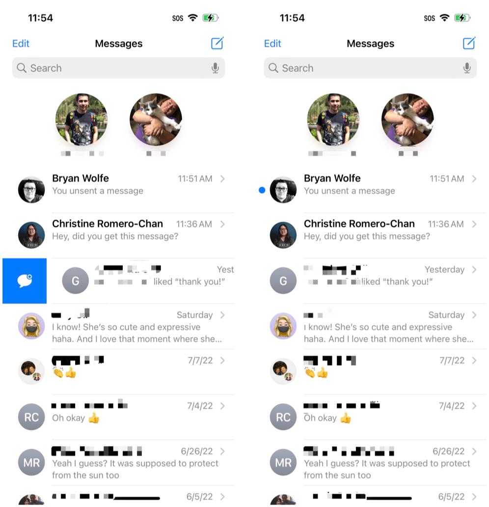
Finally, another much-requested feature is Mark As Unread. This lets you mark a conversation as unread, allowing the notification badge to stay on the app. This is useful for those scenarios when you just don't have time to respond immediately but need a reminder to get to it later. This is something I often need, and I'm glad to see it finally in iOS (and I'm sure everyone else is too). Similarly, you can also mark an entire thread as read too, in case you just don't care to read all the messages you've missed (such as group chats).
Enhanced Live Text and Visual Lookup
Live Text is a feature that launched with iOS 15, and it allows you to select text from images on a system-wide level. iOS 16 is taking this a step further with Live Text to video, as long as it's video that plays through the native iOS media player. So, unfortunately, this won't apply to things like YouTube, but if you have other apps that use the standard iOS video player, or you just have videos that you want to pull text from, now you can. This feature could be particularly useful for things like pulling license plate information from my dash cam videos, for example.
Those who like to use the Translate app will be pleased to know that you can now take a photo in Translate and have text translated directly from it. This is a feature that exists in third-party apps, like Google Translate, but it is now native to Apple's own Translate app. I don't have to translate things very often, but it is nice to finally have the option to just take a picture and have it translated without the need for third-party apps.
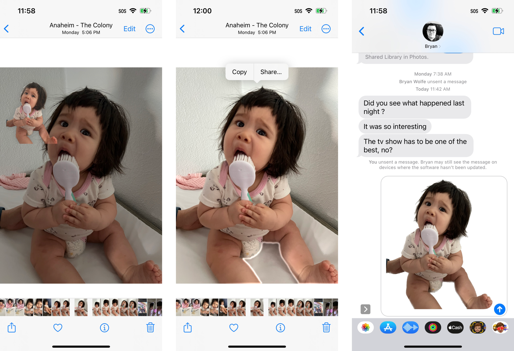
You can now turn your photo subjects into Slack emojis with ease; or you know, pretty much whatever you want.
But my favorite thing is the new Visual Lookup feature, "lift subject from background" (what a boring name). With this tool, you are able to tap-and-hold on a subject in one of your images in the Photo Library to "lift" it up, and then drag and drop or just copy and paste it into other apps. Basically, it removes your subjects in images and turns them into stickers. And boy let me tell you, this is insanely fun.
Ever since I used this feature in the betas, it's worked very well, and I'm honestly very impressed with how intuitive it feels. I have used it plenty to "lift" my daughter from images and send them to my family and friends, but this is also a very cool feature for epic Photoshop battles. With the "lift subject from background" feature, you can easily separate a subject in the foreground from the background of an image, and then superimpose that "sticker" onto another image since it becomes a transparent PNG. Or you can turn your photo subjects into Slack emojis with ease. Or you know, pretty much whatever you want.
Honestly, it's one of my favorite features in iOS 16, and I find the process quite intuitive. I like using the "drag and drop" method, but you can also bring up a contextual menu when doing the long press, and then copy and paste it into other apps, like Messages or Mail. I definitely am making use of this to take my baby picture spam to an entirely new level.
Other miscellaneous tidbits in iOS 16
Though the big headliner feature in iOS 16 is definitely the new Lock Screen, along with the other features I've already mentioned, there are just so many great quality of life improvements in iOS 16 that I just can't cover them all here, especially while we're still in the beta phase. So I'm going to quickly go over some smaller changes that are still quite significant.
Personally, I'm still a user of Spark Mail myself, but that's because I like how it organizes my inboxes to Notifications, People, and Newsletters. But for those who use Apple's native Mail app, there are some changes coming that will bring Mail up to speed with the third-party competition.
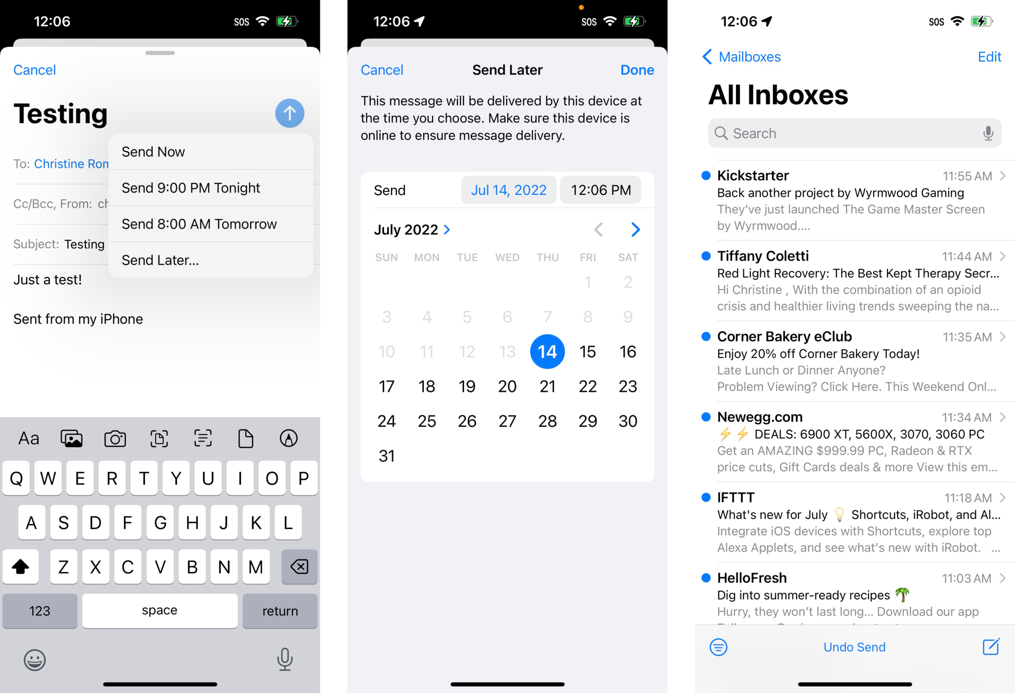
First, like in the Messages app, you'll be able to undo send, though it's limited to a 10-second window and basically just delays sending by 10 seconds. Other new features include the ability to schedule email messages for later, reminders (the equivalent of snoozing in other email apps), and a vastly improved search. I often need to search through my inboxes because I have so many messages, so it can be hard to find things. The search now works in real-time, even highlighting your search terms in messages that match up, and also accounts for typos in your search query. Plus, Mail now offers suggestions as you search, which could make all the difference in the world if you aren't quite sure what you should be looking for.
I still use Spark myself over Apple's Mail app, but it's great to see these huge improvements. Those who stick with the native Mail app are bound to enjoy making use of these features. It's about time Mail becomes a decent competitor to all the other email apps out there.
Multi-stop routing in Maps
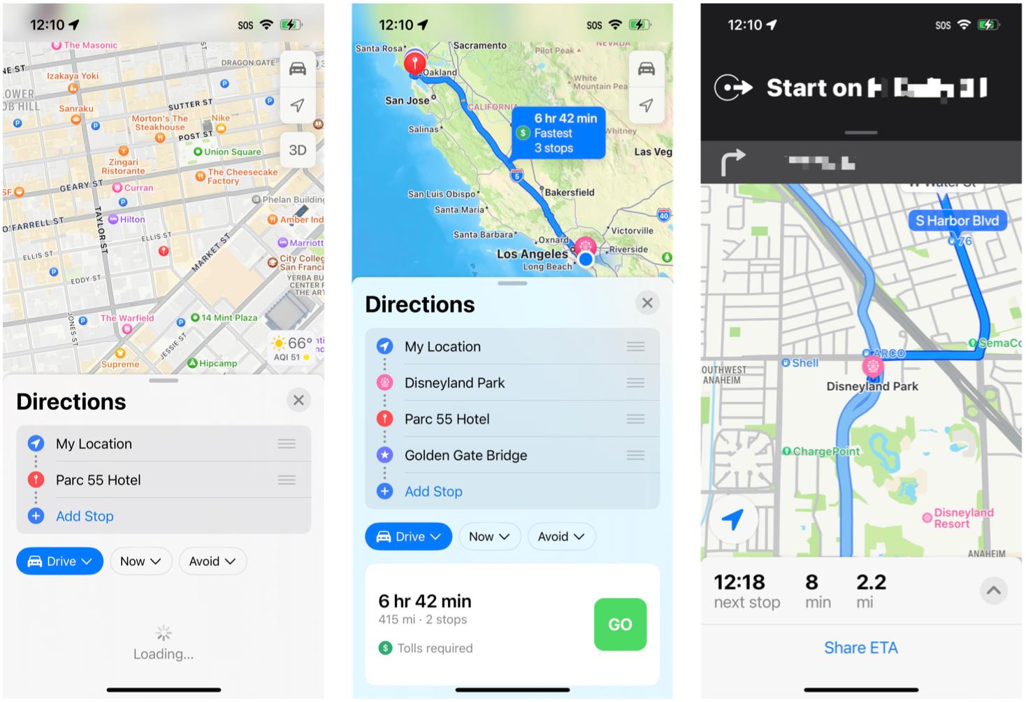
While I don't really have the time for a long road trip right now with a baby to take care of, I'm happy to see that Apple has finally added this functionality to the Maps app. It's something that many people, including myself, have been wanting to see added for a long time, and Apple finally added multiple stops to routes in iOS 16. The days of just having Point A to Point B on your Maps turn-by-turn directions will be no more — in fact, with iOS 16, you'll be able to plan trips out with up to 15 stops.
The process of adding multiple stops to a route is easy enough: Search for your destination, map it out, and then search for more stops to add along the way. You can even tell Siri to add more stops while you're on the road. I did notice one thing about multi-stop routing that I didn't particularly like, though. Rather than automatically optimizing the route to be the most efficient, you'll have to rearrange the order of stops manually. I wish that Maps could use intelligence to automatically make your route the most efficient, but perhaps that is but a fever dream.
iCloud Shared Photo Library
Apple added the iCloud Shared Photo Library in the third developer beta, so I was able to test it out briefly. However, Apple has delayed this feature until a later update.
With iCloud Shared Photo Library, it's a separate iCloud Photo Library that you can share with up to five other people. Everyone who is invited to an iCloud Shared Photo Library will have equal permissions for adding, sharing, and deleting photos and video. An iCloud Shared Photo Library will also share all captions, keywords, and even favorites. You can move existing images from your personal Photo Library into the iCloud Shared Photo Library, or you can snap new ones that automatically go in there from the Camera. Another method is to use "smart suggestions" to add existing content, such as photos with certain people in them, like you and a significant other or child.
Once you move a photo into the Shared Photo Library, it will disappear from your personal Photo Library.
I haven't personally used the iCloud Shared Photo Library too much because this is something that is designed to be used with your family members, and perhaps very close friends. As of right now, my experience with this feature is limited since Apple has delayed it until later.
I have briefly tested it with a coworker during the beta, and during that time, it seems to work as intended. However, I did notice in the beta that once you "move" a photo into the iCloud Shared Photo Library, it will be moved out of your personal Photo Library, so it doesn't just copy it over (though this image remains in your regular Photo Library on older versions of iOS). If you would rather have an image in both your personal Photo Library and iCloud Shared Photo Library, then you may need to duplicate it first, and then move the copy over. Again, this occurred during the beta stages before Apple removed the feature, so it could very well work differently once Apple actually releases this feature to the public.
You can only be in one iCloud Shared Photo Library too, so it's definitely not designed to be used with say, your entire circle of friends and coworkers. I mean, there are always still Shared Albums for things like that.
Haptic keyboard feedback
One of the smaller features of iOS 16 that you might have missed is haptic keyboard feedback. I often have my phone on silent 24/7, which means I do not get audio keyboard feedback with those satisfying little pops. But Apple has finally brought along a much-requested feature, haptic keyboard feedback.
Once you enable it (Settings > Sounds & Haptics > Keyboard Feedback > Haptic toggle ON), you will feel some tactile feedback each time you tap on a key. As someone who likes mechanical keyboards because of the tactility, it's nice to finally have this kind of feedback on the iPhone. I disliked not having any feedback because I would never be sure if it actually registered my keystroke or not.
This is a small change, sure, but very welcome for a lot of people like myself.
Battery percentage indicator
LONG LIVE THE BATTERY PERCENTAGE!
Yes, after Apple took away battery percentage indicator in the status bar ever since the iPhone X (due to the godforsaken notch), it's been something that a lot of people have begged Apple to bring back. And with iOS 16, they did. Though it's not quite the same.
Since current iPhones still have the notch, or as with the iPhone 14 Pro devices, the Dynamic Island, there is still limited space to fit everything in the status bar. Now, rather than displaying the percentage next to the battery, the percentage is inside the battery icon itself. Oh, and now the battery always appears "full" and either white (in use) or green (charging), so that the percentage number is easily visible. Yeah — the battery icon itself never depletes, so it always looks like a full battery, with the number inside letting you know how much juice is left.
Honestly, I'm not sure how I feel about this just yet. I understand why Apple went this route — it's because the current implementation is accessible for those who may be visually impaired — but I'm not sure I like it. The number is always there, but I think I've learned to not care about the number and just go by how much "juice" is left in the battery icon. It's really just a matter of personal taste, but I'm not sure this is a good way to integrate it. Maybe it will change in iOS 17.
An iOS update that's jam-packed with features
There's a lot of cool new stuff to play around with in iOS 16. Customizable Lock Screens are fun and let us give our iPhones even more of a personal touch to them, just like the Home Screen customizations in iOS 14. Now that we have opened up more personalization for our iPhone, perhaps we can see more streamlined processes for both Lock and Home Screen customizing in the future. Simply put, we have the foundation — at this point, it's time to build upon it further.
But it's not just about the Lock Screen with this update, though it's a biggie. iOS 16 gives us some amazing features in iMessage with the ability to edit and unsend messages, and mark as unread (hallelujah!) I'm also pretty happy to see that Apple did take feedback from the beta stages and made necessary changes to the edit and unsend feature, because it was originally going to be, well, clearly abused by those with malicious intent. I'll be using the editing feature when I can just to fix my typos, but not sure if unsend will be used as much.
And seriously, if you haven't used the "lift subject from background" feature yet, try it! It's just so much fun, and it's definitely one of my top features from this massive update. Oh, and do yourself a favor and enable that haptic keyboard feedback — you're welcome.
It's a little disappointing to see that some of the big advertised features still missing, though, and I hope we see them sooner rather than later. I'm eager to try out iCloud Shared Photo Library with my husband for pictures of our family, and I would like to see multi-stop routing in Maps get some kind of automatic optimization.
Finally, as much as I like the new Lock Screen customization, please Apple, make it easier to set two different wallpaper images for the Lock and Home Screen right from the Photos app. Pretty please?
Updated September 2022: Updated for iOS 16 public release.

Christine Romero-Chan was formerly a Senior Editor for iMore. She has been writing about technology, specifically Apple, for over a decade at a variety of websites. She is currently part of the Digital Trends team, and has been using Apple’s smartphone since the original iPhone back in 2007. While her main speciality is the iPhone, she also covers Apple Watch, iPad, and Mac when needed.
When she isn’t writing about Apple, Christine can often be found at Disneyland in Anaheim, California, as she is a passholder and obsessed with all things Disney, especially Star Wars. Christine also enjoys coffee, food, photography, mechanical keyboards, and spending as much time with her new daughter as possible.
