iOS 7 preview: Gestures controls, consistency, and collision

iOS 7 adds new gestures for control center, for navigating in Mail, Messages, and Safari, and more
iOS 7 continues Apple's long history of gesture-based controls, some system-wide like the new swipe up from the bottom bezel to open Control Center, and some app (or multi-app) specific, like the new swipe right from the left bezel to travel back to the list views in Mail or Messages. Gesture controls can be tricky, however. If not direct they can be hard to discover, if not consistent they can be hard to habituate, and if not carefully considered they can collide and conflict with each other, both system-wide and app specific.
Here's what Apple has to say about some of the gestures in iOS 7.
Just swipe up from any screen — including the Lock screen — to do things like switch to Airplane mode, turn Wi-Fi on or off, or adjust the brightness of your display. [...] Just swipe down. And get up to speed. [...] And with a swipe, you can go back or forward a page. [...] To quit an app, just swipe it up and out of preview. [...] With a swipe, you can capture what you want the way you want. [...]
And here's what Apple's shown off so far.
- Swipe up from the bottom to reveal Control Center
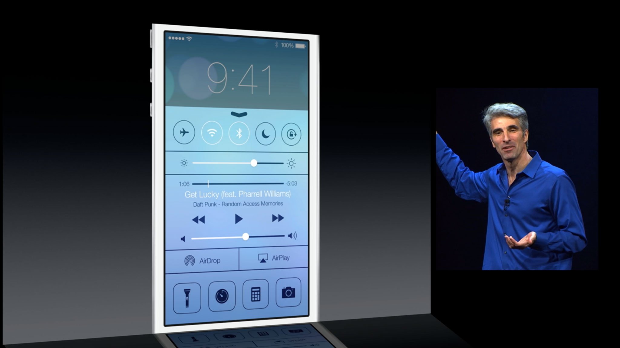
- Swipe right from the left bezel in Mail and Messages to pull back the list view hierarchy (go from message content to message list to, in Mail, message box).
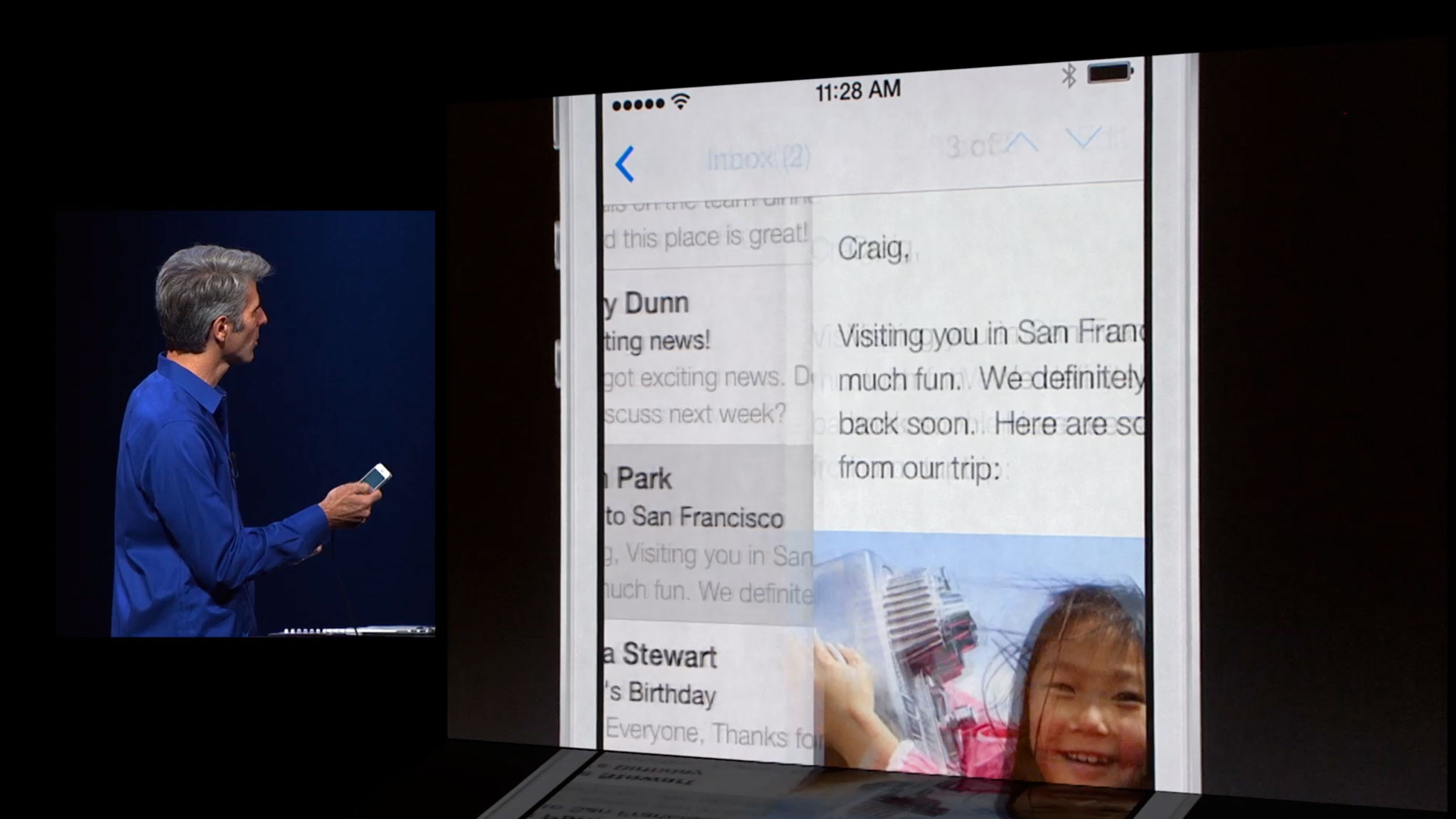
- Swipe right from the left bezel to go back in history in Safari.
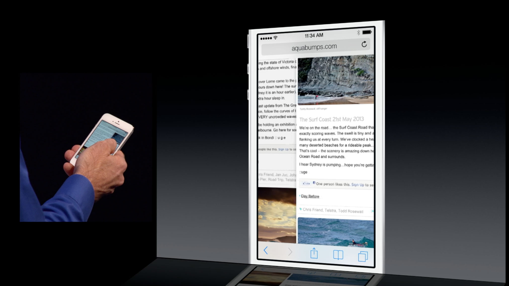
- Swipe left from the right bezel to go forwards in history in Safari (if you've previously gone back).
- Toss up to close an app from the multitasking switcher.
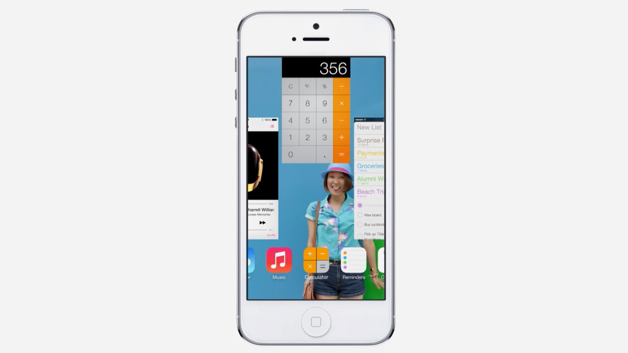
- Toss left to close a tab in Safari.
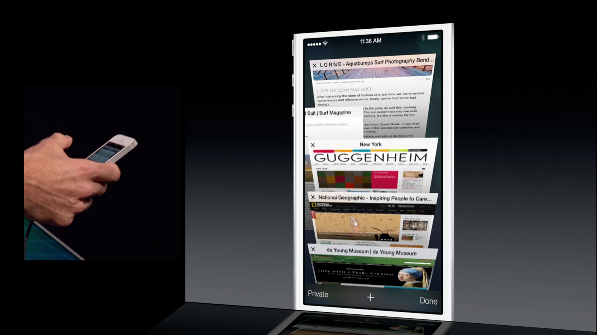
Apple also showed switching Camera modes by swiping between them, as well as previously existing gestures like swiping between days in the Calendar, images and videos in Photos, and there may be other gestures, both informational (peek) and navigational (change) that Apple hasn't yet shown off yet as well.
Like Notification Center, Control Center will colide with anything already using a swipe-up-from-the-bottom gesture. Hue, the app that controls Phillips' Hue lightbulbs, comes immediately to mind. In Hue, you currently swipe up to access controls for all the lights. That'll have to change, as will any other app that currently uses something similar.
Because the swipe-right gesture appears limited to certain apps, namely Mail and Messages, it won't collide with other apps already using that gesture. However, the way Apple is implementing the interface in iOS 7 in general, because of that gesture in Mail or Messages, could make other apps look odd. Especially ones that currently use the popular "hamburger button and basement sidebar" design (I'm looking at you Facebook, Google apps, etc.)
Even if iOS doesn't stomp all over them, if they look wrong, or simply feel wrong on iOS 7, they may be forced to change and become more Mail or Messages-like. (And that might not be a bad thing.)
Master your iPhone in minutes
iMore offers spot-on advice and guidance from our team of experts, with decades of Apple device experience to lean on. Learn more with iMore!
The good news is that all of these are direct manipulations. The bad news is that they're not all consistent or symmetrical.
Direct manipulation vs. abstract commands
Broadly speaking, there are two types of gesture controls, direct manipulation and abstract commands. Direct manipulation is akin to interacting with a physical object. Tapping a virtual button works like tapping a real-world button. Touching and sliding a virtual panel works like touching and sliding a real-world panel. Turning a virtual page works like... you get the idea. There's a 1:1 relationship between action and result that, when well implemented, feels like you're doing it, not just triggering it. That's why they're more discoverable (you can often chance upon, and quickly come to understand them, through play), and more easily remembered. They also offer the potential to "peek" at information by only partially sliding a panel open or turning a page. However, the number of ways you can directly manipulate an interface element are inherently limited.
Abstract commands are when the gesture performed on the touchscreen has little or no relationship to the function it performs. There's no 1:1 relationship, and like a button you're ultimately watching rather than doing. Swiping on a screen, waiting, and then watching it change is an example of how simple yet visceral the difference can be. Yet, for things like games, tracing a pattern on the screen to cast a spell or invoke a special attack work wonderfully well. Abstract controls, however, because they're abstract and because they can be far more numerous than direct manipulation are nowhere nearly as discoverable (you almost always need to be told about them), and they require a lot of memorization.
There are hybrids as well. Multiple finger gestures add a level of abstraction to direct manipulation. An example would be swiping with one finger to move the content on screen, swiping with two fingers to move between screens, and swiping with three fingers to move between apps. Each one directly manipulates something, but you have to remember a modifier to control exactly which something you're manipulating.
As much as people like to joke about Apple hating buttons, and minimizing buttons on their devices, iOS has always had a lot of buttons.
As much as people like to joke about Apple hating buttons, and minimizing buttons on their devices, iOS has always had a lot of buttons. There's the hardware Home button, of course, which is always there, an escape hatch for every mainstream user that, with a single click, will always return them to a known state (the Home screen). Beyond that, iOS has and continues to use a plethora of software buttons (even if many of them are now being rendered more like text links in than the previous, simulated mechanical button style).
Yet iOS has also always made use of multitouch gestures. Indeed, one of the biggest attractions of the original iPhone was its implementation of swipe, pinch, flick, and other intuitive, direct manipulations. Abstract commands were also included early on, most famously swipe-to-delete.
With the iPad version of iOS, Apple introduced system-wide gesture navigation. With four fingers you could swipe sideways between apps, up to get to the fast app switcher, and pinch to get back to the Home screen. Consistent throughout the system, once familiar, they made moving around iOS faster and easier.Because the iPad navigation gestures came later, however, they collided with some of the gestures already implemented by developers. The classic joke became Fruit-Ninja-ing your way out of the game and into Mail.
Apple didn't, and hasn't yet brought them to the iPhone, ostensibly because 4-finger gestures would be prohibitive on the smaller screen, and no obvious alternative presented itself.
Notification Center, which brought edge-gestures to iOS, caused similar collision problems with apps that had already implemented a downward swipe for their own controls. (Some mitigation was possible thanks to an intercept that only presented the grabber for Notification Center on first swipe, requiring a second swipe to "confirm" and actually pull it down.)
Apple, not surprising, sticks almost entirely to direct manipulation for iOS and relegates abstract controls to accessibility, where quantity trumps all other concerns.
Fast camera access in iOS 6 let you swipe up from the bottom to get to the Camera app. However, since it was limited to the Lock screen, Apple had full control of the experience.
All this to say that simple, direct manipulations tend to be robust and easy to remember and make a lot of sense on the system-level, while abstract gestures are fiddly, tough to remember, and make more sense as advanced shortcuts for power users and gamers.
Apple, not surprising, sticks almost entirely to direct manipulation for iOS and relegates abstract controls to accessibility, where quantity trumps all other concerns.
The case for consistency
Where iOS 7 appears to be more problematic is in its consistency. Direct manipulations are more easily discovered, but in order for them to be habituated they need to be consistent. Notification Center is the perfect example. Any time, from anywhere, you can swipe down and what happens is exactly what you expect to happen - it appears.
Control Center should be the same. That it overlaps with fast camera access on the Lock screen is unfortunate and slightly awkward, but it shouldn't be hugely problematic. (The iOS 7 Lock screen has far bigger problems to fix right now anyway.)
The sideways gestures are where iOS 7 starts running into problems.
The sideways gestures are where iOS 7 starts running into problems. First, because they're only implemented in specific apps, they require the user to remember which apps include them. Worse, because they're implemented inconsistently and asymmetrically across apps, they require the user to remember what they do in each app. That's a high cognitive burden.
For example, in Safari - and in Photos, Calendar, Weather, and other apps before it - swiping from left to right takes you back a screen in the sequence, and swiping right to left takes you forward. That's logical and symmetrical. Even Camera, where swiping changes modes, moves through the modes in sequence and remains consistent.
However, in Mail and Messages, swiping from left to right doesn't take you back through the sequence of messages, but up in the message hierarchy. You swipe back from message to message list to - in mail alone - message list box. Where it gets more challenging is swiping from right to left, because not only doesn't that take you forward through the sequence, it doesn't take you deeper into the hierarchy either. What it does do is switch from direct manipulation to quasi-abtract command, revealing a destructive action - delete. That's not only a massive cognitive change, but its asymmetrical (swiping different directions results in massively different behaviors), and its inconsistent with other apps.
Photos can have hierarchies with albums, Calendar days with months, so there's some overlap, but Apple's recognizing that hierarchies in Messages and Mail are far more important in real-world use cases than they are in other apps, and re-assigning the gesture. They're also keeping it simple by not, for example, leaving a one finger swipe to move through sequences of messages and using a two-finger swipe to move back to the hierarchy. That's understandable and, in a world filled with trade-offs, sensible.
Switching from direct manipulation to go back to abstract command to delete is less understandable and sensible, but more a reflection of a legacy control Apple's been using since iOS 1 (iPhone OS 1.0).
In a perfect world swiping from right to left from the edge would move you into whatever message your touching, while touching a message and holding would allow you to delete it, much like cards and tabs. Apple has used modal gestures before, for example an edit button that changes an upward movement from the general scroll gesture to a specific item re-arranging gesture. It adds complexity but also functionality. Detect if the gesture started at or near the edge, and if so make it navigation. If not, if it started on the meaty part of an item in a list, make it editorial. It will require learning, but not much.
As to fast Camera access on the Lock screen, having top, left, and bottom + bottom-offset gestures seems less well balanced that having top, left, bottom, and right gestures. Swiping one way to unlock and the other to enable fast actions, Camera now, who knows what else later, might be a workable trade off.
Unless and until a swipe takes you back in every app where there's something to go back to, it'll always be harder to remember and become habituated to.
The most important thing is consistency. Unless and until a swipe takes you back in every app where there's something to go back to, it'll always be harder to remember and become habituated to. Unless and until a forward swipe does something in every app where there's a backward swipe, and there's something to forward to, likewise.
For gestures to really become intuitive and mainstream, they have to always be where they're expected, and always do as expected. And when compromises have to be made, they have to make sense under the circumstances.
iOS 7 is a great start, but it still feels a lot like a start.
iOS 7 gestures
Gestures are an incredibly rich, incredibly deep topic that's difficult to write about and far, far, far more difficult to design and develop. A lot of supremely talented people are working on implementing them, and things like pinch-to-zoom have shown, when done right, they can quickly become integral parts of mainstream computing.
iOS 7 gestures will ship with the rest of the update sometime this fall. In the meantime, let me know what you think - which gestures do you prefer, and how would you like to see them implemented?
- Iterate 22: Gesture based interface
- iOS 7: Everything you need to know
- iOS 7: Discussion forum

Rene Ritchie is one of the most respected Apple analysts in the business, reaching a combined audience of over 40 million readers a month. His YouTube channel, Vector, has over 90 thousand subscribers and 14 million views and his podcasts, including Debug, have been downloaded over 20 million times. He also regularly co-hosts MacBreak Weekly for the TWiT network and co-hosted CES Live! and Talk Mobile. Based in Montreal, Rene is a former director of product marketing, web developer, and graphic designer. He's authored several books and appeared on numerous television and radio segments to discuss Apple and the technology industry. When not working, he likes to cook, grapple, and spend time with his friends and family.
