iOS 7 preview: Lock screen gains access to notifications, controls, some confusion
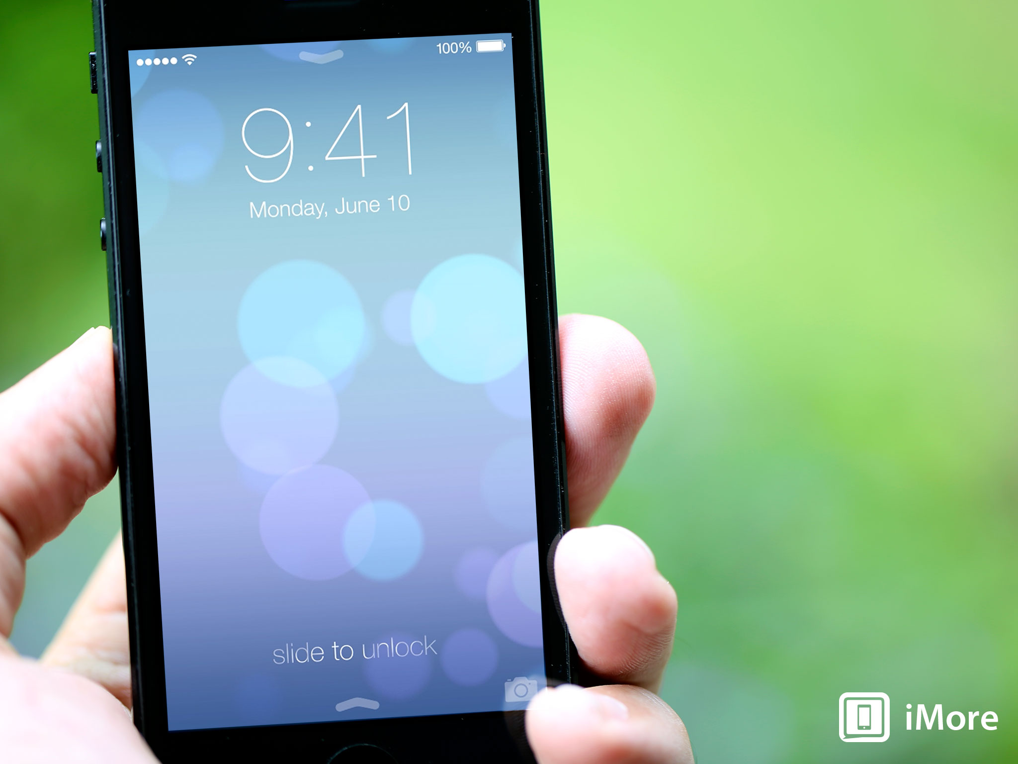
iOS 7 brings not only live, physics-based wallpaper to the iPhone and iPad Lock screen, but Notification Center and Control Center access as well!
The Lock screen exists in some between-space, where your iPhone, iPod touch, or iPad are no longer off or asleep, but nor are they fully awake and functional yet. With iOS 7, however, Apple has greatly increased the Lock screen's functionality, mainly by giving it access to Notification Center and the new Control Center, while retaining its own notifications and fast Camera access.
Apple doesn't have a dedicated description for the new Lock screen features, but they do mention them in the context of other features. From Control Center:
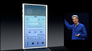
Just swipe up from any screen — including the Lock screen — to do things like switch to Airplane mode, turn Wi-Fi on or off, or adjust the brightness of your display.
From Notification Center:
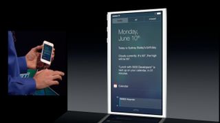
You can access Notification Center from any screen, including the Lock screen. Just swipe down. And get up to speed.
From Find my iPhone:
Even after a remote erase, Find My iPhone can continue to display a message with your phone number on the Lock screen.
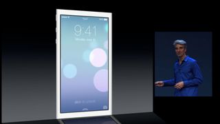
And here's what Apple's shown so far:
- There's at least one, new, live wallpaper. It appears to have depth, or at least varied levels of blur, and, as Apple terms it, "vitality".
- Up and down chevron icons give a visual indication of where Notification Center and Control Center live, and just like elsewhere in iOS, they can be accessed via a downward or upward swipe from the bezel, respectively.
- Notification Center on the Lock screen, of course, includes the new, tabbed, Today, All, and Missed views.
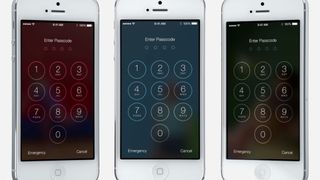
- Passcode has been redesigned and, thanks to its blur and translucency effect, it takes on the flavor of the wallpaper below.
- The time and date are still front and center on the Lock screen, though they've been giving the Helvetica Neue Ultra-Thin treatment, like much of the rest of iOS 7.
- Slide to Unlock, the now iconic control for accessing an iPhone, iPod, or iPad, is still there, and in the same place, but its interface chrome - its button and slider channel - has been removed leaving only the text itself. It still has a sweeping, highlight animation to help draw attention to it, though it appears now to be slanted on the diagonal.
- Fast Camera access is also still there, also redone in the new iOS 7 aesthetic.
- Lock screen notifications, unsurprisingly, also remain on the Lock screen.
"Live wallpapers" aren't new, but they've previously been animated, like old-fashioned keyframe cartoons, or like video recordings. What Apple appears to be doing is actual, real live wallpapers, using the same physics engine that's driving their new UIKit dynamics and Sprite Kit. These wallpapers move just like other iOS 7 elements, in relation to how the device itself is moved (almost certainly programmatically in reaction to the accelerometer and gyroscope). Yes, even the wallpapers are objectified and gamefied.
We've only seen the circles so far, but hopefully come the fall there'll be a wider variety of choices and perhaps, one day, a way for us to make, or at least buy or download, custom ones.
Master your iPhone in minutes
iMore offers spot-on advice and guidance from our team of experts, with decades of Apple device experience to lean on. Learn more with iMore!
The up and down chevrons, while aiding in discoverability for Notification Center and Control Center, also create some confusion, especially the latter due to its proximity to the Slide to Unlock control. It could make a casual observer think they should slide up to unlock, instead of the proper left-to-right.
Fast Camera access also shares the same direct manipulation gesture as Control Center, simply offset to the right. Again, the Camera glyph makes it discoverable, but the doubling up of the gesture could again be confusing.
Passcode has a great, flat white effect when entering numbers. It might not look like much, but on top of a translucent blur, it's as impressive as it is ingenious.
Slide to Unlock experiences almost the opposite problem. With the interface elements reduced to pure text, it's lets discoverable and more confusing than ever. However, it looks like you can swipe left-to-right from almost anywhere on the screen to trigger it, making it more usable once discovered. (Swiping right-to-left doesn't seem to be used for anything right now, or at least nothing Apple's shown off to date.) On the positive side, the highlight, which is designed to draw attention, looks like its now diagonal, which is clever.
Lock screen notifications, makeover aside, seem to be functionally consistent with previous versions of iOS. Because Notification Center now works from the Lock Screen, some of their functionality may seem to have been superseded. They remain an at-a-glance list of recent alerts, however, which is faster if less in-depth than what Notification Center offers.
Apple hasn't shown if double clicking Home still brings up media controls in iOS 7, the way it has for previous versions of iOS. However, Control Center now includes media controls, so they may not be necessary any more.
All these new features do come with a downside, however. The more functionality you make available outside the Passcode system, the more information can be accessed without needing the Passcode. That now includes anything and everything in Notification Center.
Also, because Passcode has to allow access to this data, and to functions like emergency calls, it remains a vulnerability in an otherwise secure chain, and just as we've seen numerous times in the past, vulnerabilities can and will be exploited.
If past behavior is any indication, however, Apple will let us turn off Lock screen access to Notification Center and Control Center, just like they've let us tun off Lock screen access to Siri, Passbook, and other features in the past.
The new Lock screen will ship as part of iOS 7 this fall. Check out the resources below for more, and let me know - are you happy with the update? Anything else you'd like to see, or see changed?
- Lock screen: Everything you need to know
- iOS 7: Everything you need to know
- iOS 7: Discussion forum

Rene Ritchie is one of the most respected Apple analysts in the business, reaching a combined audience of over 40 million readers a month. His YouTube channel, Vector, has over 90 thousand subscribers and 14 million views and his podcasts, including Debug, have been downloaded over 20 million times. He also regularly co-hosts MacBreak Weekly for the TWiT network and co-hosted CES Live! and Talk Mobile. Based in Montreal, Rene is a former director of product marketing, web developer, and graphic designer. He's authored several books and appeared on numerous television and radio segments to discuss Apple and the technology industry. When not working, he likes to cook, grapple, and spend time with his friends and family.

