It's trite. It's cliché. But it's what a lot of people are going to say. iOS 7.1 is what iOS 7 should have been. Given that iOS 7 enjoyed less development time than any previous version — 10 months instead of the usual 12, or the 15 afforded iOS 5 — it's certainly understandable. Given that it's taken an additional 6 months — iOS 7.0 was released in September of 2013 — it's also been a long time coming. There are new features like CarPlay, and improvements like manual Siri control and auto HDR for the iPhone 5s. There are also some incredibly welcome bug fixes in iOS 7.1 including an end to the rampant Springboard crashes, the decaying Touch ID fingerprint recognition, and the performance on the iPhone 4. So, despite the long wait, is iOS 7.1 the update iPhone and iPad users have been waiting for?
iOS evolution
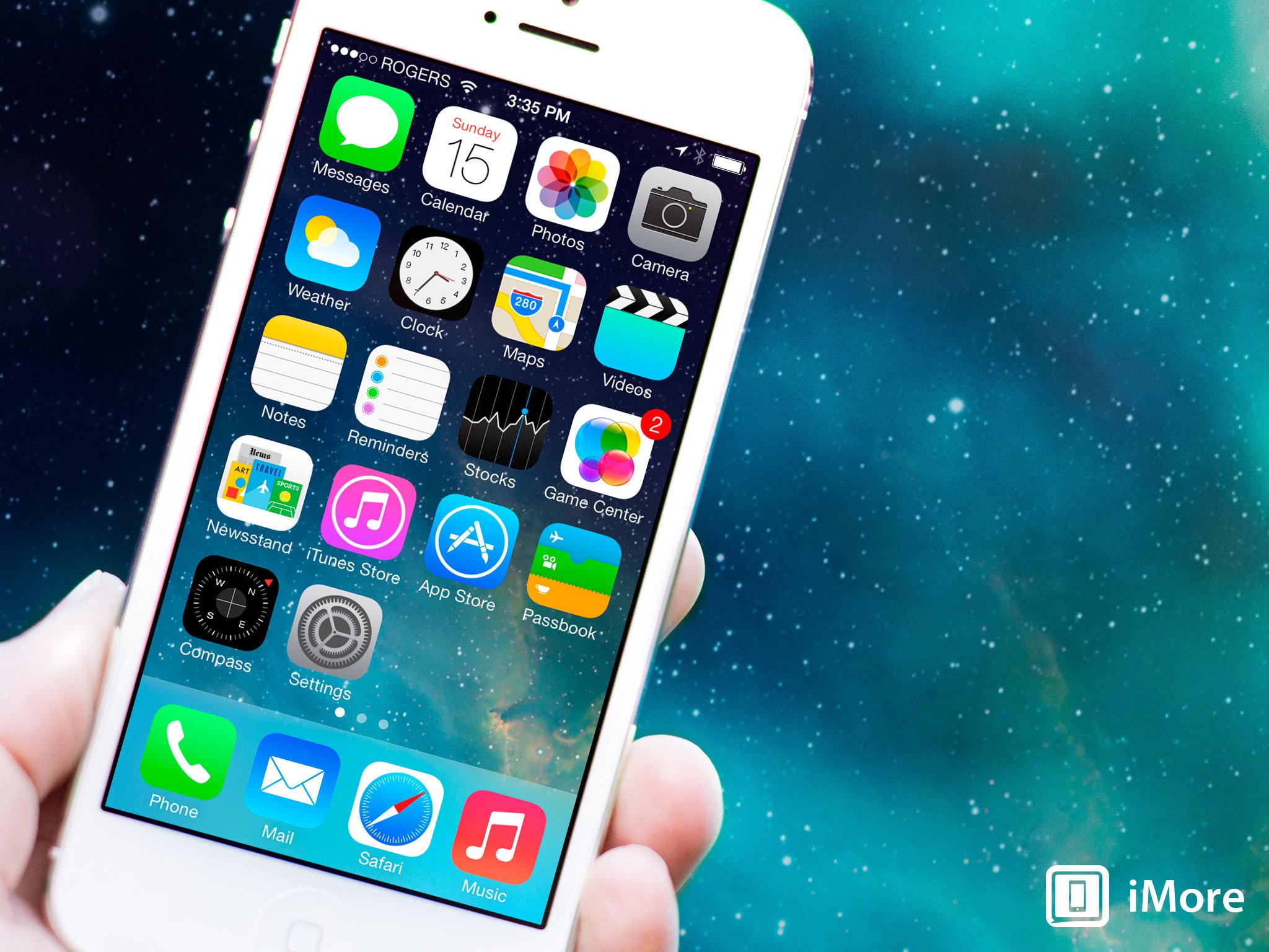
iOS 7 was first shown off in June of 2013 at Apple's annual developer conference, WWDC. The iOS 7.1 update became available in March of 2014. That's a long time. Previously new versions of iOS x.0 were launched in june with the new iPhones, and x.1 in September with the new iPod touches. iPhones now ship in September and x.1 whenever Apple gets around to it. They are no longer the quick updates they were. For comparison's sake, here are our reviews of past versions of iOS.
- iOS 7 for iPhone and iPad
- iOS 6 for iPhone and iPad
- iOS 5.1 for iPhone and iPad
- iOS 5 for iPhone and iPad
- iOS 4.3 for iPhone, iPad
- iOS 4.2 for iPhone | iOS 4.2 for iPad
- iOS 4.1 for iPhone
- iOS 4 for iPhone
- iOS 3.2 for iPad
- iOS 3.1 for iPhone
- iOS 3.0 for iPhone
- iPhone 2.2 for iPhone
- iPhone 2.1 for iPhone
- iPhone 2.0 for iPhone
Compatibility and updating
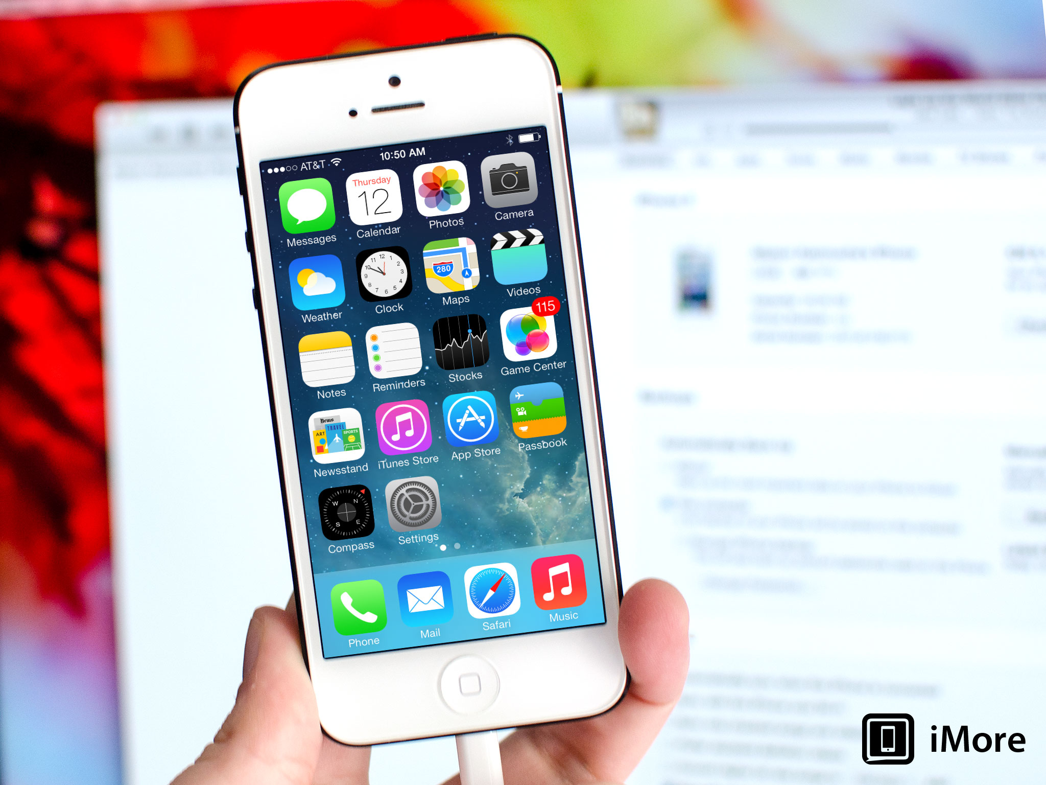
iOS 7.1 is a free update for anyone using an iPhone 4, iPhone 4s, iPhone 5, iPhone 5c, iPhone 5s, iPad 2, iPad 3, iPad 4, iPad mini, Retina iPad mini, iPad Air, and iPod touch 5. (As always, not all features are available on all devices.)
You can update over-the-air (OTA) on on-device or over USB using iTunes on Mac or Windows. OTA updates-in-place are typically the fastest, setting up as a new device is typically the best way to get the best performance.
- How to install iOS 7.1 over-the-air using Software Update
- How to install iOS 7.1 over USB using iTunes
iOS 7.1 and iPhone 4
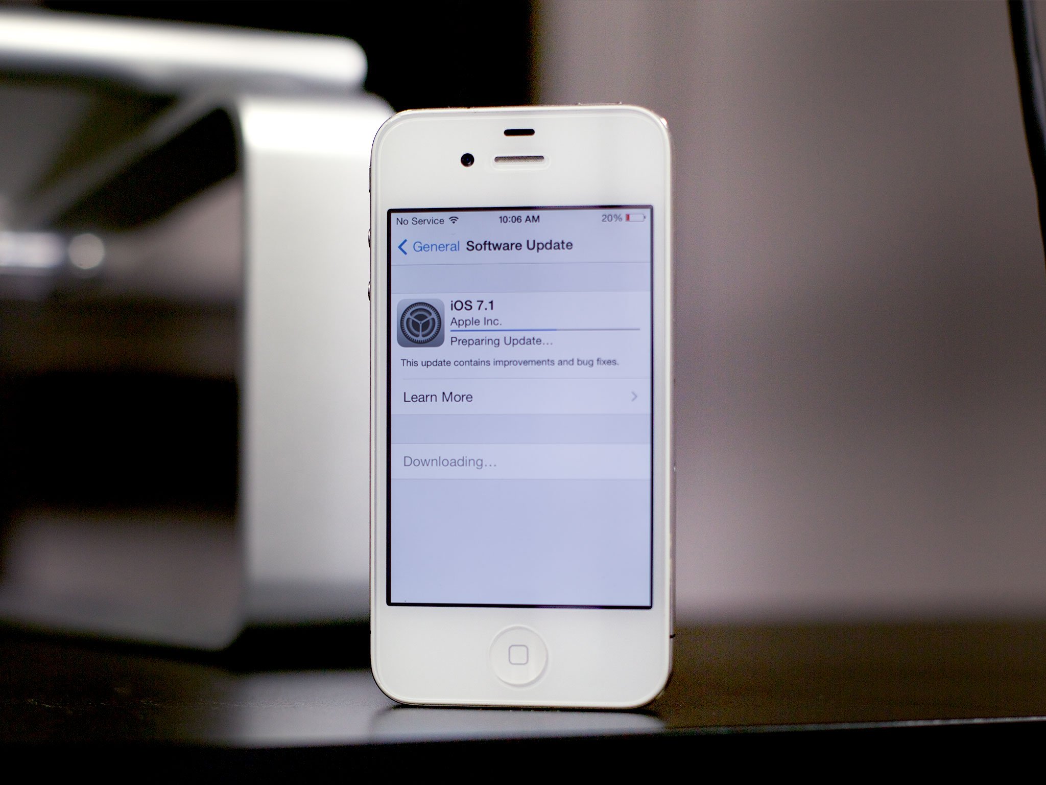
iOS 71 on the iPhone 4 deserves special mention. iOS 7.0 performance on the iPhone 4 was bad enough that it had many people desperate to downgrade. That's nothing new, of course. The bottom end of the upgrade list is often excruciating on the x.0 but picks up on the x.1 or x.2. So it was with the iPhone 3G in its day, now it is with the iPhone 4.
I installed it iOS 7.1 on my circa January 2011 white GSM iPhone 4 and performance does indeed seem to be markedly improved. Where before it would stutter and stammer and otherwise force me to practice my deep breathing and dude-abiding skills, now it's noticeably better. It's not iPhone 5 fast, of course — that old Apple A4 chipset, it ain't what it used to be — but it's at least acceptable now.
If you have an iPhone 4, you'll want iOS 7.1.
iMore offers spot-on advice and guidance from our team of experts, with decades of Apple device experience to lean on. Learn more with iMore!
iOS 7.1 design
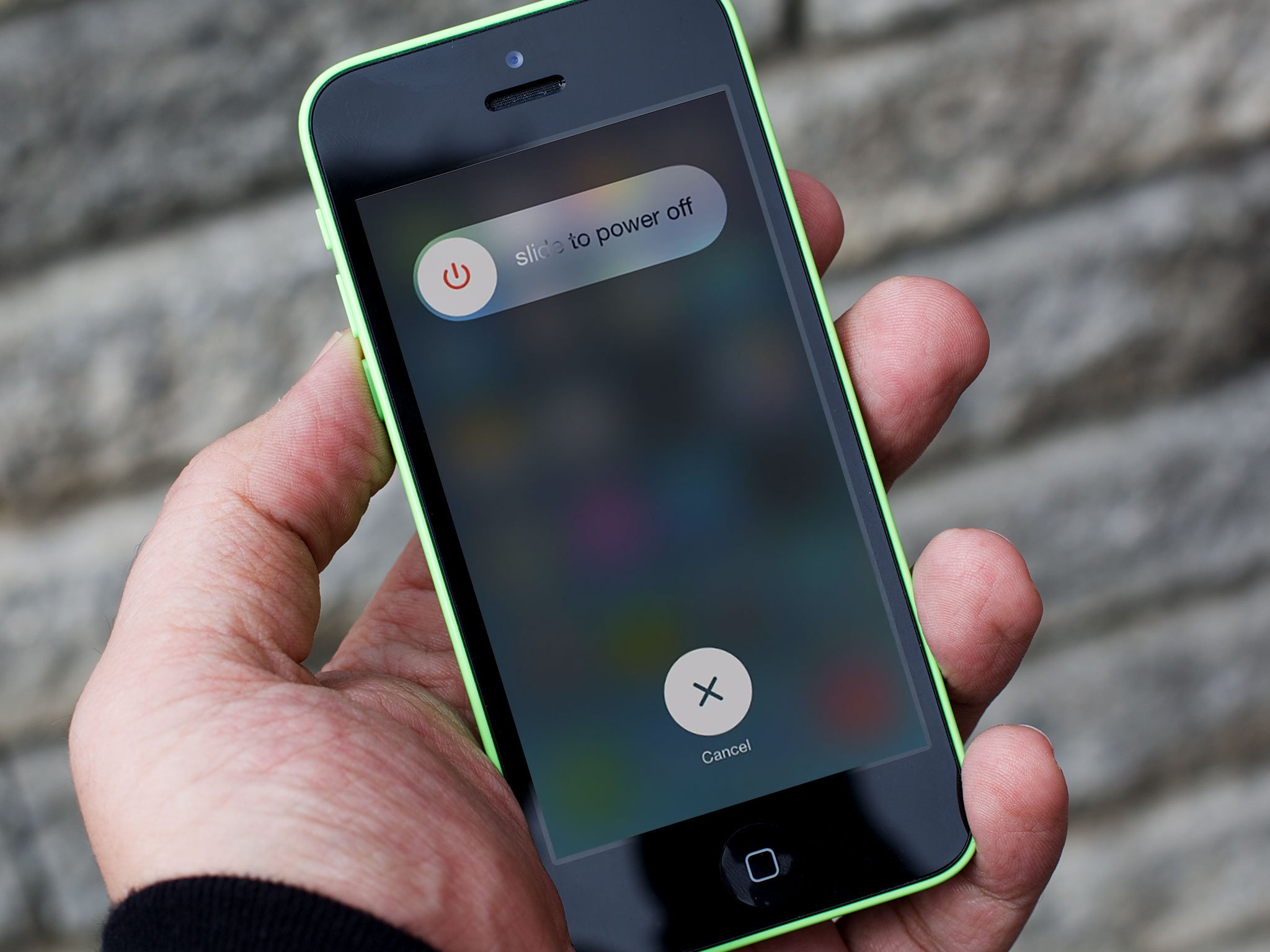
iOS 7 was a design revolution. It scraped away the rich, skeuomorphic textures favored by the late Steve Jobs to expose a new focus on depth, deference, and clarity. From layers of transparency and blur to app bereft of chrome and cruft to new palettes and typography, the playfulness previously found in the interface was transferred to the interactivity. It's the iOS that former head of hardware design, now head of all design, Jony Ive always wanted. But the brutal deadline for iOS 7 meant we got only as much of it as his design team could sprint across the finish line by its September 2013 launch. It should come as no surprise, then, that iOS 7.1 contains more than the usual amount of finish and polish.
Transitions have been tightened and animations sped up. For example, what looked like app icons easing out of warp space to fill the Home screen on iOS 7 now looks like proper jump. The scaling from app to folder to full screen also seems better, the portals between worlds that used to saunter now seem to snap. The effects slowed down the perceptive speed of iOS 7. Now, whether the pixels get pushed or the bits launched faster or not, iOS 7.1 feels faster and that's what matters.
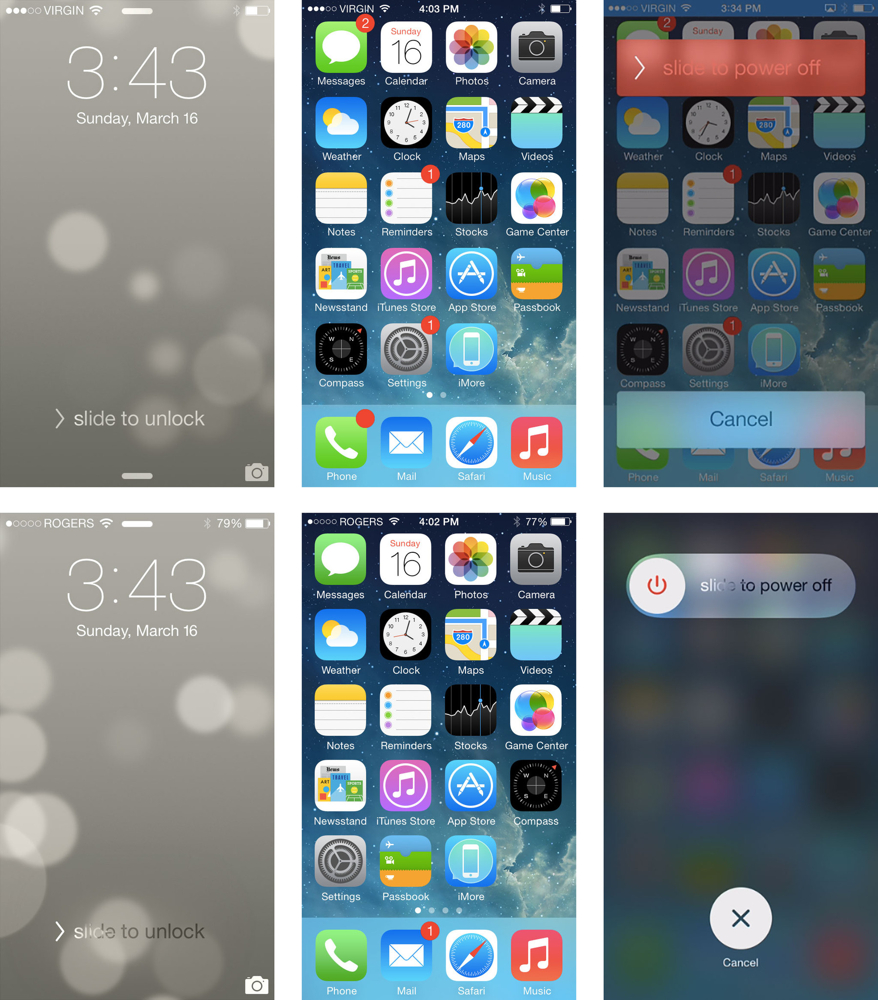
Some of the other changes are more subtle. The Lock screen "slide to unlock" feature, for example, has the same overall look but a brighter, more obvious animation. On the Home screen the green app icons, like Phone and Messages, have deeper gradients. And the "slide to power off" screen now has a blurred background and better looking, round interface elements. That includes a power icon on the slider. Here are the differences (iOS 7 on top, iOS 7.1 on the bottom):
Control Center has a tighter bounce animation now and the brightness and volume sliders have gained bounce animations all their own. Like the rubber banding on the original iPhone, it makes them feel better and more delightful.
The Weather app sees its icons move from outlines to solids. Generally in iOS 7 an outline is used to represent a normal state and a solid a selected state. However, with the animated backgrounds, the solid state of clouds, suns, etc. in the Weather app looks more balanced and are easier and faster to visually parse.

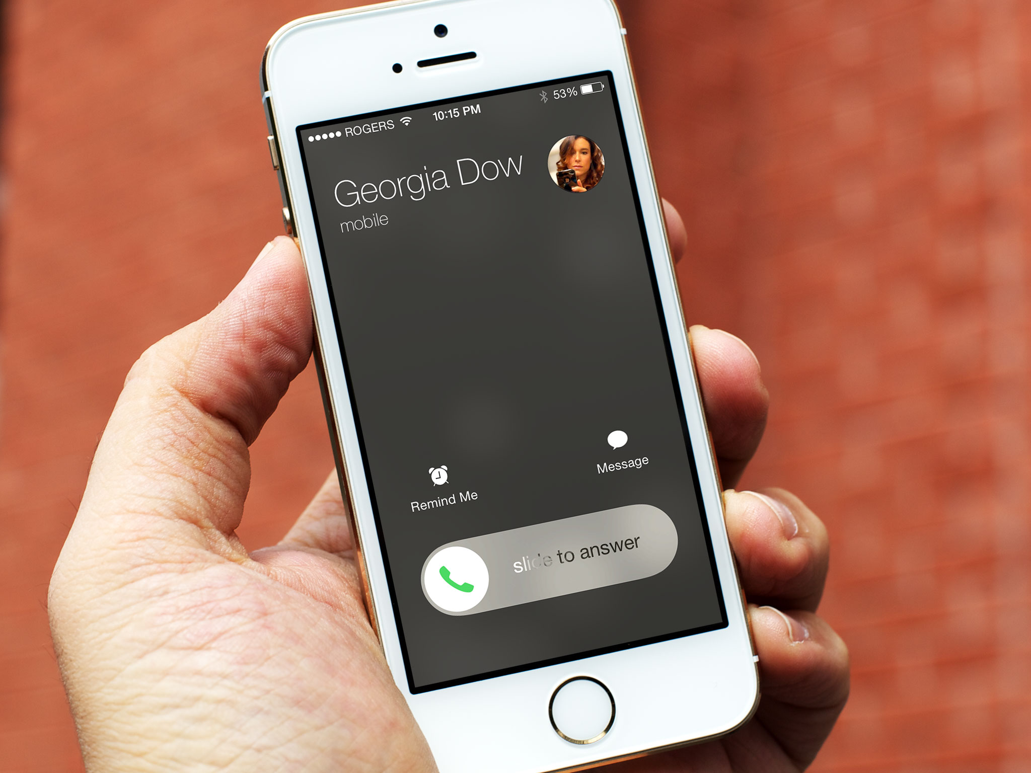
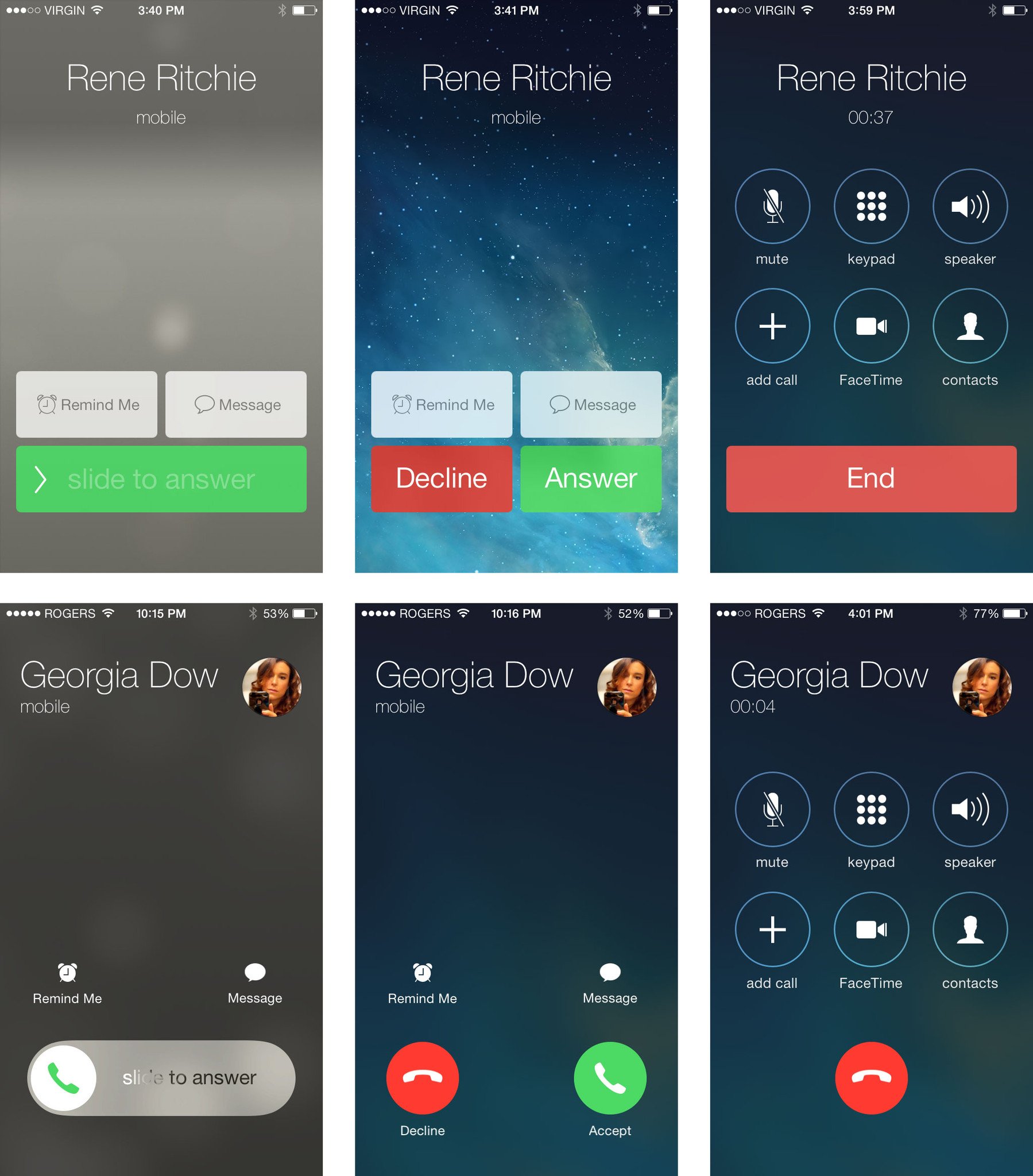
The Phone app has a much-improved call answer screen both for the locked and unlocked state, and better buttons in general. It extends the round theme found in iOS 7 avatars and toggles and makes everything look cleaner and clearer.
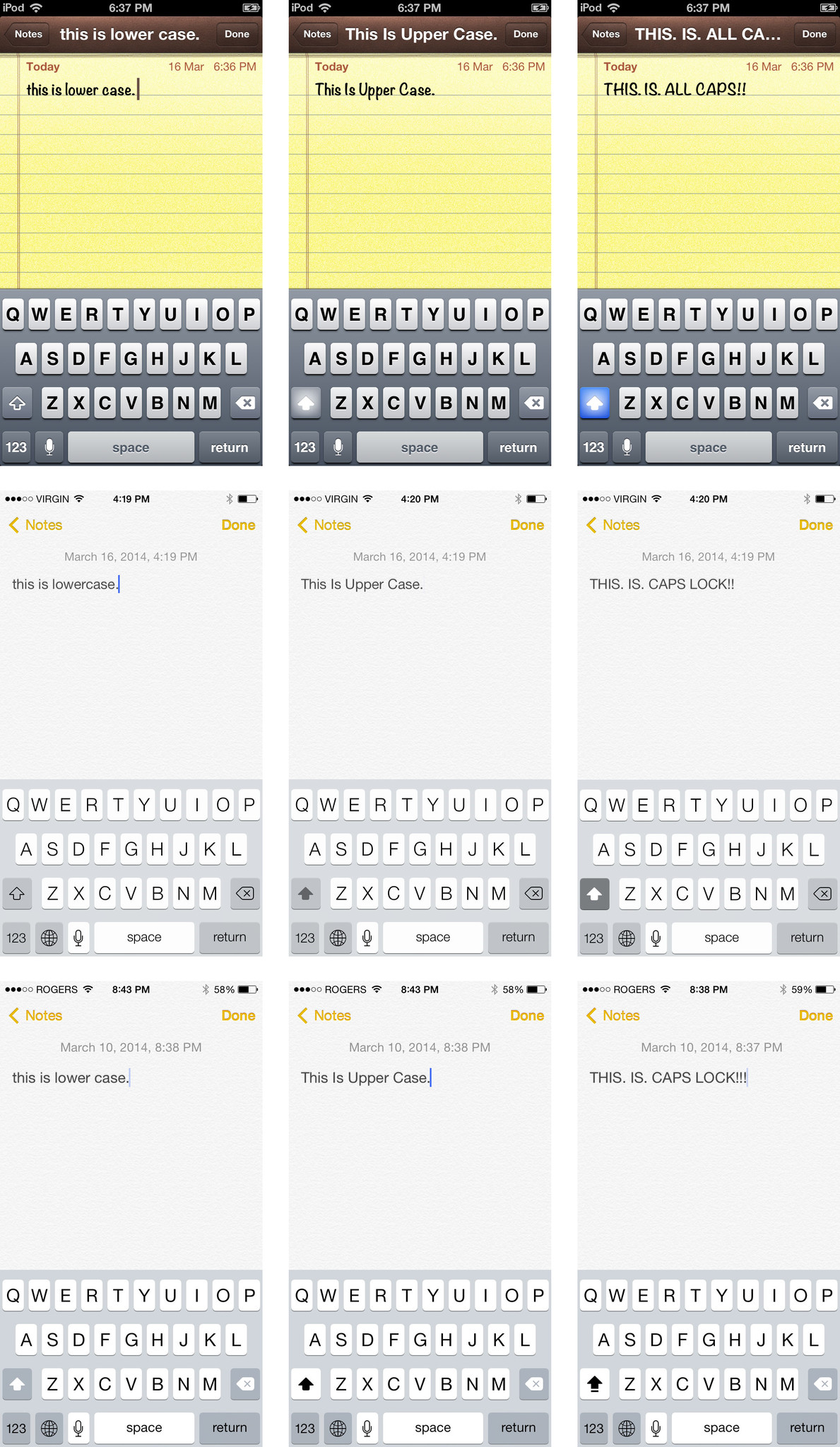
Another subtle yet potentially far more frustrating change in iOS 7.1 is how the state of the shift key is displayed. In iOS 6, the default shift key state (lowercase) had a dark background and light, outlined icon. When selected (uppercase), the icon became solid and gained a glow ffect. When double-tapped (caps lock), the background turned blue.
In iOS 7.0 the default was medium background with dark outline, dark fill for selected, and dark background with light fill for caps lock. Now, in iOS 7.1, it's medium background with light fill for default, light background with dark fill for selected, and light background with dark fill, underlined, for caps lock.
iOS 7.0 seemed to be consistent with the basic guidelines of the new interface in general. The new one isn't as consistent or obvious. It makes it difficult to determine the state the shift key is in, and counter-intuitive to the point that you find yourself uncertain and guessing wrong more often than not. Granted, it could be a lot worse — and was during one of the betas — but it could also be a lot better. Here are the changes (iOS 6 on top, iOS 7 in the middle, and iOS 7.1 on the bottom):
Arguably Apple could change the entire keyboard to reflect lower case vs. uppercase letters but that could add to the cognitive load — find "d", hit shift, lose "D", find "D" again. Either way, iOS 7 wasn't perfect but it was more intuitive than iOS 7.1.
Overall, however, the iOS 7 design is improved and solidified in iOS 7.1, with almost all of the changes being decidedly for the better. iOS 8 likely won't get anything close to the visual redesign iOS 7 got, so whatever quibbles remain iOS 7.1 provides a solid foundation for whatever comes next.
iOS 7.1 performance and battery life
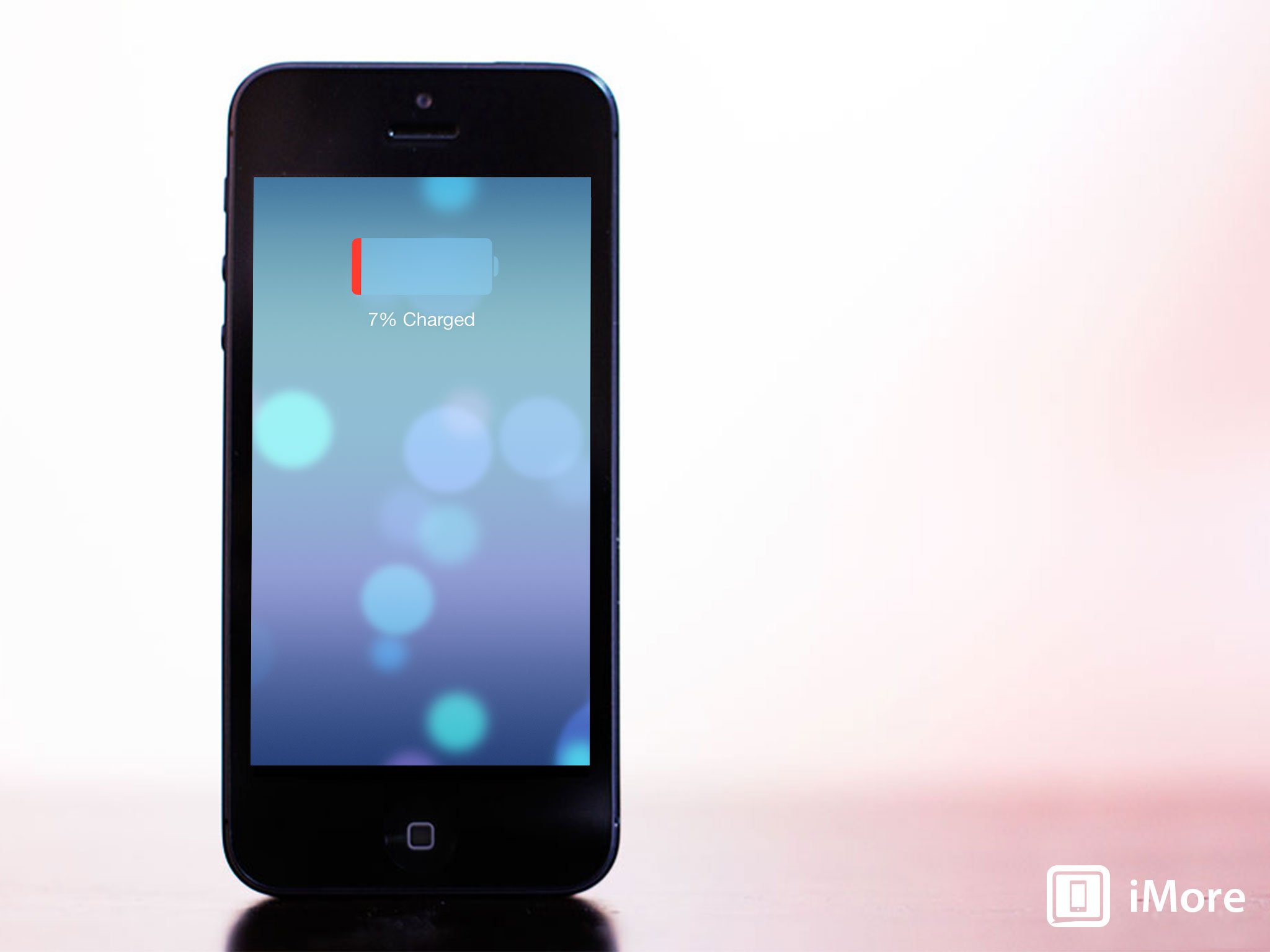
Any time Apple updates iOS the same pattern emerges — for some people performance and battery life are markedly improved, for most it stays roughly the same, and for a few, it becomes truly terrible. The same appears to be the case with iOS 7.1. On my iPhone 5s battery life is exactly the same and performance is better (though that's mostly due to the tighter animations).
If you're experiencing problems, whether something went wrong in the update process or an old backup got restored with glitches, you'll want to take steps. iOS 7.1 shouldn't hit your phone any harder than iOS 7 did.
iOS 7.1 and improved Touch ID fingerprint recognition
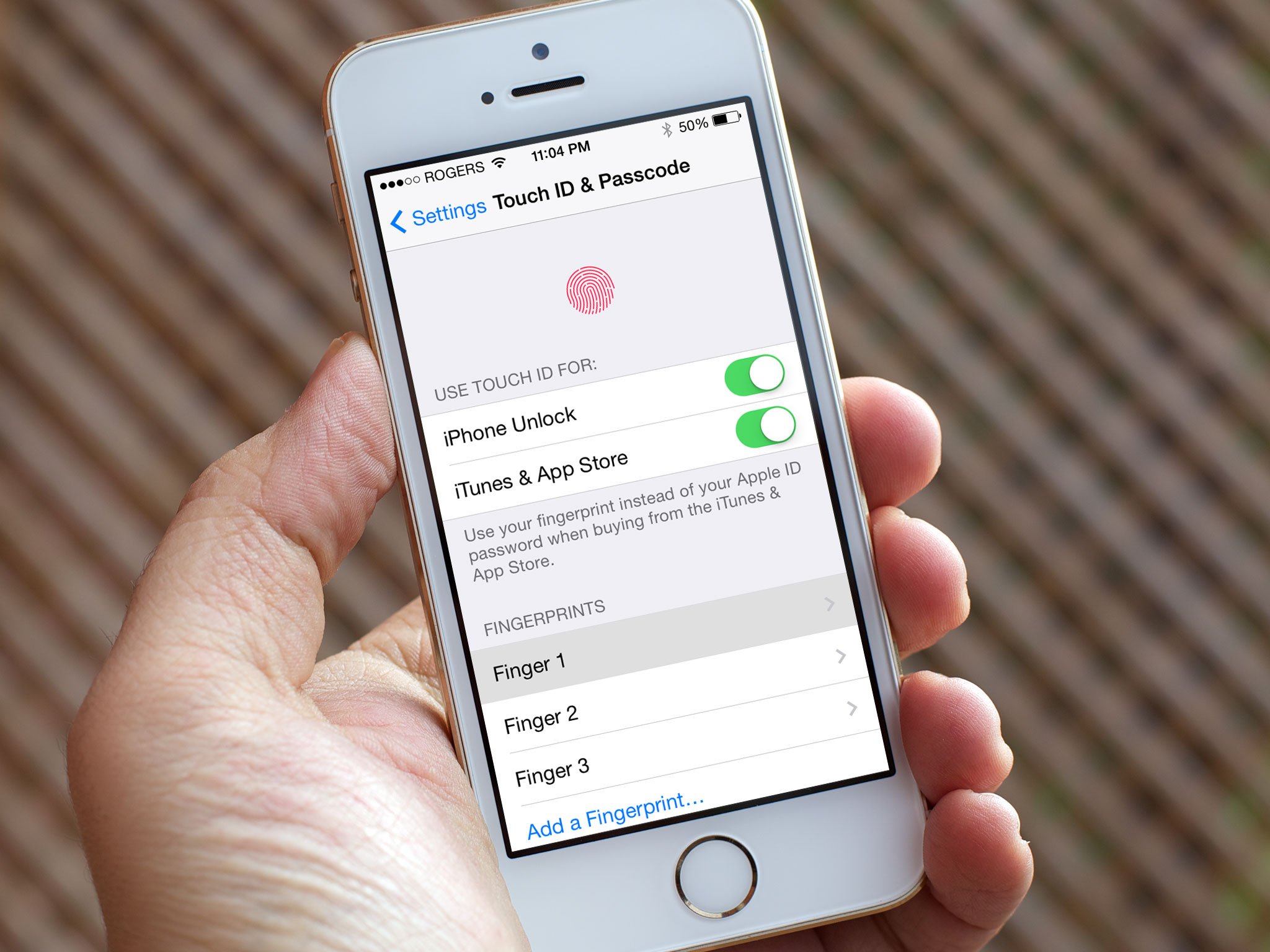
Touch ID is Apple's fingerprint identity scanner, currently exclusive to the iPhone 5s. When it senses something capacitive, like a finger, it takes a high resolution snapshot of it. The image is converted to a hash and sent to the secure enclave on the Apple A7 processor. If there's no match, a "no" token is released. If there is a match, a "yes" token.
Every time a finger is scanned successfully, Touch ID is supposed to improve its record and become more reliable. Yet for some people running iOS 7 the process would start off well but instead of getting better it would actually get worse over time. Whether errors were occurring that caused aberrations to grow in the record, or some form of decay was happening with the record itself, for some people it simply became unreliable to the point of unusable.
iOS 7.1 fixes that. According to Apple, Touch ID now has improved fingerprint recognition. So, while things like moisture can still throw off the sensor, the record itself should now work the way it's supposed to for everyone and all of the time.
Touch ID worked well enough for me in iOS 7 but it's worked flawlessly for over a month with iOS 7.1 (including the betas). What's more, if you had problems, it should just start working better. Better still, if you have to or want to reset or redo your Touch ID fingerprint registration, Apple has also moved the Touch ID — and Passcode — Settings out of the General basement and onto the top level, making them easier to access.
iOS 7.1 accessibility, reduced motion, and increased contrast
iOS 7.1 offers several additions to the Accessibility settings, though in this case they all involve altering what are defining characteristics of iOS 7. The first is an expansion of the Bold Font option, which now also enhances the weight of the keyboard, of the Calculator app, and of many of the standard glyphs (icons) like the share button and trash can. Unfortunately, due to the way iOS works, your iPhone or iPad still has to reboot for the Bold Font option to take effect. If you do make the switch, however, here's how the difference looks (standard on top, Bold below):

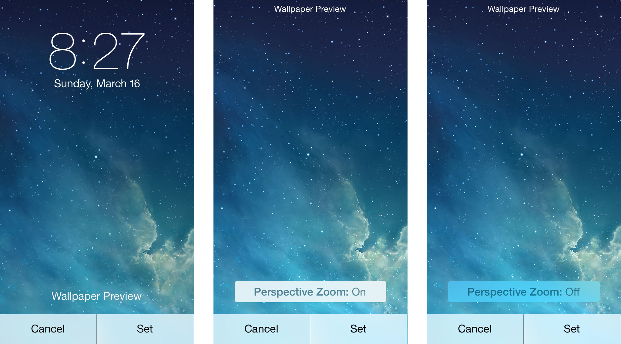
Reduce Motion now disables the bounce physics in iMessage, switches the scaling in the multitasking interface to a cross-fade, and freezes the animations and scrolling in the Weather app. You can also turn off Perspective Zoom on any wallpaper you set for the Lock screen or Home screen. Here's how it looks (iOS 7.0 on the left, iOS 7.1 toggles in the middle and on the right):
With iOS 7, Apple stripped out a lot of the "chrome" (heavy interface elements) including the embossed button shapes of iOS 6 and previous versions. That left them "naked" — text or icons with nothing around them. The shapes, however, helped with affordance (something that hints at how an interface element should be used). They made buttons look like buttons and their outline showed their touch-targets (the exact area you could tap to activate them). With iOS 7.1, Apple given us the ability to bring them back.
Toggling Button Shapes on fills in the background around a naked text and glyph buttons with a darker color outlining its shape and also underlines naked text buttons on dialogs to make them look more like web links. The result of the former doesn't look exactly right but it will be more usable for anyone who really missed traditional button elements. Here's how it looks (iOS 6 on the left, iOS 7 in the middle, and Button Shapes turned on in iOS 7.1 on the right):

There are also several options to Increase Contrast in iOS 7.1. You can Reduce Transparency to make things like folders and Control Center opaque. You can Darken Colors to make things like the naked text buttons slightly less bright, and you can Reduce White Point to tone the backgrounds down to a step to light gray. Here's what the differences look like (default on top, Increased Contrast below)
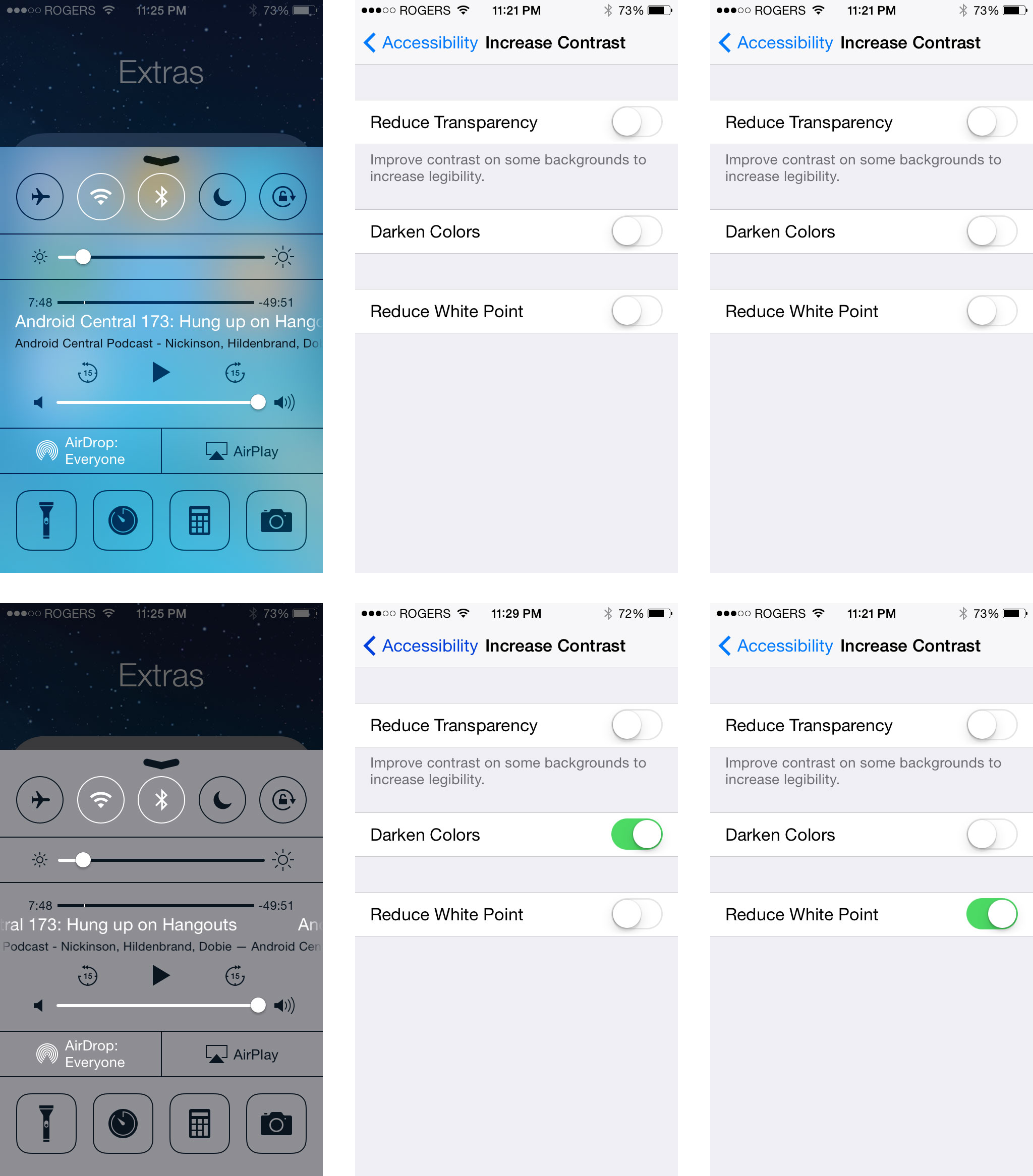
That Apple felt the need to add these settings is interesting. It appears to acknowledge that some people had serious usability issues with iOS 7. Rather than walking anything back for everyone, however, Apple simply added options for those who need or want them. My guess is that Jony Ive and team still firmly believe in the direction they took iOS 7, they just feel it's taking the rest of us a little longer to adjust to it than they'd hoped. So, the new settings are a middle ground. Something that's there for those who find iOS 7 challenging or distressing to use.
I still like the overall design of iOS 7, including the default typography, animations, and contrasts. The naked buttons haven't hurt usability for me but do still seem unfinished, design-wise. Either way, I've not enabled any of the new settings above. However, if iOS 7 was hard for you to read, if it made you motion sick, or if was in any way difficult or uncomfortable for you to use, these news settings will provide some welcome relief.
iOS 7.1 and CarPlay
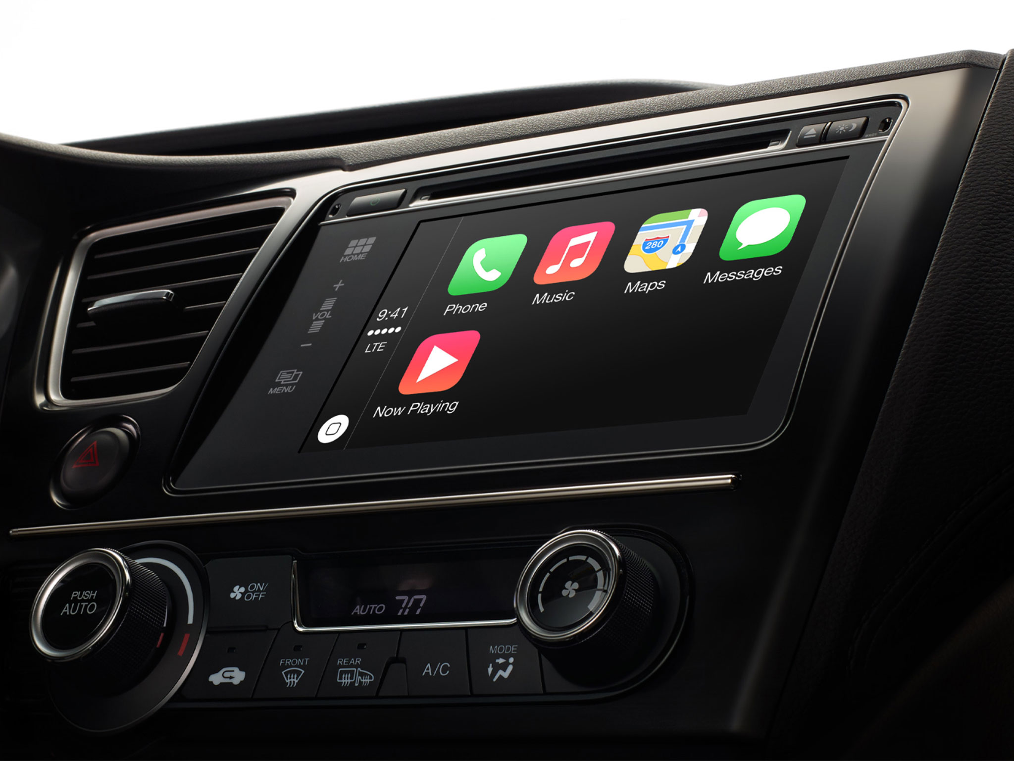
CarPlay beams select iOS apps from your iPhone to the display in your car. It's not dissimilar to AirPlay and your television but works in a bi-drectional manner and, because there's no external box in between like the Apple TV, it requires car manufacturers to build support for it directly into their information and entertainment systems. Because it also requires a Lightning connector, CarPlay is only available on iPhone 5s, iPhone 5c, and iPhone 5.
It might seem odd to have a physical cable connection to the car rather than a wireless one like AirPlay in the living room. However Wi-Fi is not yet a standard feature on cars and while losing a connection to your TV is annoying, losing one to your car could be dangerous. Built-in cellular connectivity is also rare, making a physical tether to your iPhone's LTE radio a more realistic option at present.
Apple's been uncharacteristically flexible when it comes to the types of displays and controls that work with CarPlay. That's likely more a reflection of the state of the automotive industry than the experience Apple really wants to provide. Whatever the case, and depending on what's available, CarPlay will work with Siri, capacitive touch screen, resistive touch screen, and even with knobs, dials, and buttons.
Since Siri doesn't have an always-listening option, activating Apple's personal digital assistant requires the push of a button on the steering wheel. Capacitive touch screens, the kind found on iOS devices, are more responsive but can't be used if you're wearing gloves. Resistive touch screens, the kind found on devices from the stone-ages before iOS, are more sluggish but won't force you to remove your racing leather. The knobs, dials, and buttons allow CarPlay to work with the controls already in your car, the ones you're already familiar with.
Because of the variety of controls, and the unique demands of an in-car interface, iOS apps need unique interfaces for CarPlay. Apple calls them "re-imagined". While still in the style of iOS 7, they're bigger, bolder, more glance-able, and hopefully less distracting than their originators on the phone.
If you're worried, however, or would simply prefer to use the built-in system even when your iPhone is plugged in, iOS 7.1 provides a way to toggle CarPlay on or off in Settings.
Built-in iOS apps currently supported by CarPlay are Phone, Music, Maps, and Messages. Apple is also providing support for an extremely limited selection of App Store apps including their own Podcasts app as well as iHeartRadio, Beats Music, Spotify, and Stitcher. Like the Apple TV, getting onto CarPlay requires a special partnership with Apple. Additional apps should certainly be possible in the future but Apple will likely keep the type of apps restricted. No one needs to flap birds, crush candy, net flicks, or edit their iWork while driving after all.
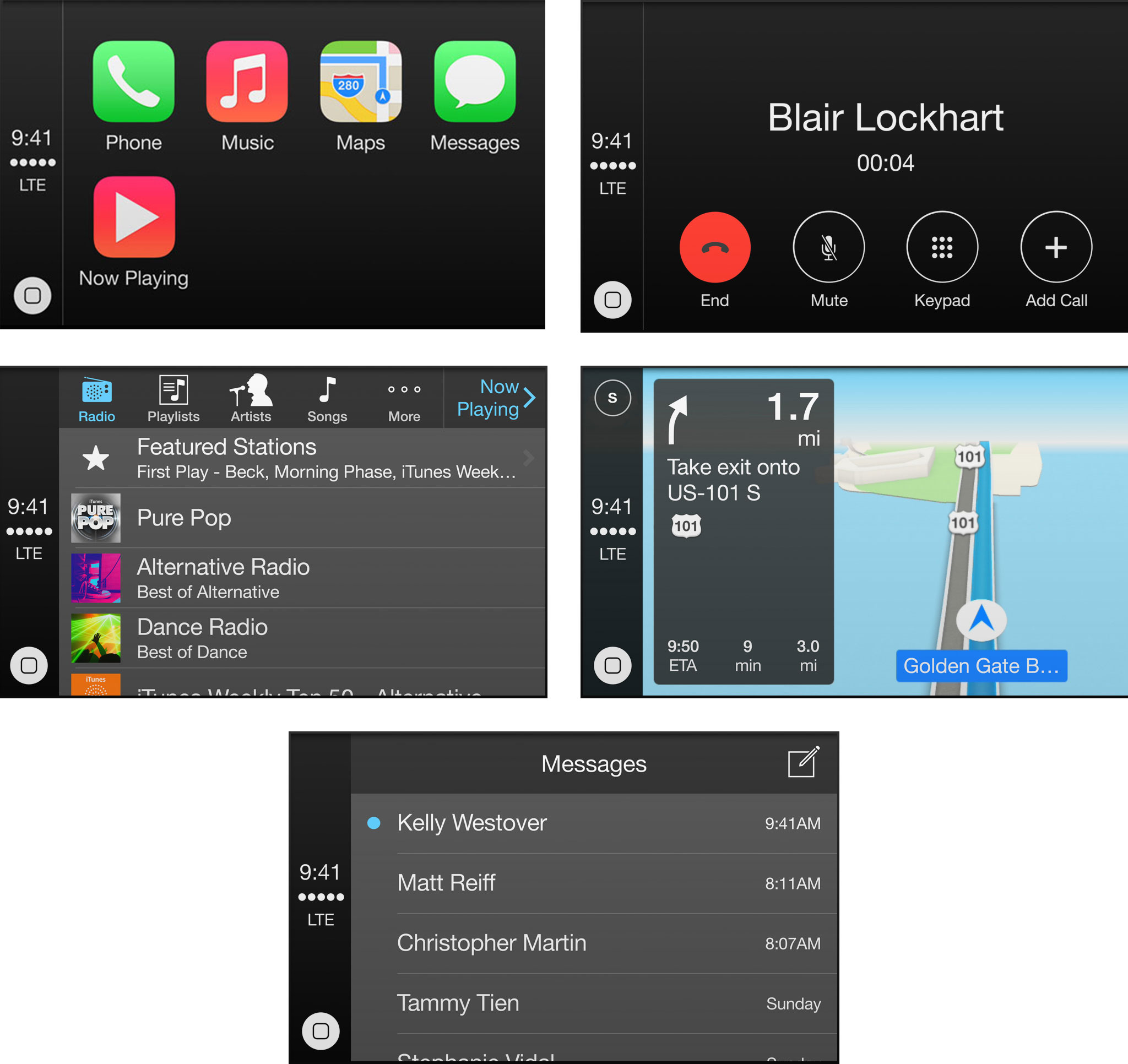
Ferrari, Honda, Hyundai, Mercedes Benz, and Volvo have already announced and/or shown off vehicles with CarPlay support. Apple says BMW, Chevrolet, Ford, Jaguar, Kia, Land Rover, Mitsubishi, Nissan, Opel, Peugot, Subaru, Sazuki, and Toyota will be building CarPlay compatible cars in the future as well. (No word yet on Tesla, Lamborghini, and other manufacturers — they may simply require more time to build compatibility into their on-board systems, or they may not (yet) have reached CarPlay partnership agreements with Apple.)
CarPlay has only just been shown off and I've yet to try it in person. When I do have the chance I'll update this review to reflect not only my opinions of the choices Apple made but how well the implementation works in the real-world as well.
iOS 7.1 and Siri hold-to-talk
iOS 7.1 brings new, better voices to Apple's personal digital assistant, Siri for Mandarin Chinese, U.K. English, Australian English, and Japanese. It also adds the ability to manually control how long Siri listens. The concept is remarkably similar to the old push-to-talk systems. Hold down the Home button and Siri listens, let go of the Home button and Siri stops listening and goes to work. Apple stresses both those things: that we can control when Siri listens and Siri knows when to stop listening.
It highlights the difference between Apple's Siri, which requires specific user action to listen, and both Google's Moto X and Microsoft's Xbox One. With those devices, whether you're touching them or you're across the room, you can simply say "Okay, Google Now" or "Xbox", tell it what you want, and it'll do it. No button press or physical contact required. To do this, however, they have to be listening to every word you say so it'll know when you say "Okay, Google Now" or "Xbox". (The Moto X even has natural language and contextual coprocessors to make doing so more energy efficient.) For some of us the convenience far, far outweighs the privacy concerns since we like Google or Microsoft and love gadgets and, hey, it feels like something out of Star Trek.
With the iPhone and the new Siri option you absolutely have to press and hold down a big, clicky, physical button and hold it down for as long as you're talking. Say "Okay, Siri" and you know what you get? Nothing. You get nothing and more nothing unless and until you're hold down the button. Don't hold it down and Siri won't be listening. For some of us the loss of convenience is more than made up for by increase in control. Siri isn't always listening but we're damn sure it isn't listening when we don't want it to.
If your hands are busy or full or messy, always-listening can seem like a life saver. If you're in the middle of confidential, personal, or sensitive moment, push-to-talk can seem like a blessing.
The best of both worlds might be the ability to tell Siri to enter an always-listening hands-free mode. It could persist for a short period of time or until you tell Siri to stop listening. That way you have the privacy and security of push-to-talk most of the time, but the convenience of always-listening when you're driving, cooking, or otherwise have your hands and attention elsewhere.
It would have the advantage of Apple's business model not being dependent on aggregating our personal data, at least so far, but it wouldn't have all the depth and breadth of Google's services. Some might find that reassuring, others frustrating.
Likewise the on-board voice parsing — no need to go to the network to set alarms or perform other local tasks — and the whole "prescience" thing — preemptively serving up what it feels is relevant information. Google Now has done both for a while now. Siri, however, still goes to the network for everything and still only speaks when spoken to...
iOS 7.1 and Calendar combo-view
When iOS 7 launched the Calendar app got a facelift but it tucked away list view under search and the combination month/list view was nowhere to be found. iOS 7.1 fixes that. There's now a new button on the menu bar that will toggle you between regular month view and combo month/list view

iOS 7.1 and auto HDR
iOS 4.1 brought high dynamic range (HDR photography) to the iPhone 4. Now, iOS 7.1 has made HDR automatic for the iPhone 5s. Where previously you had to toggle a setting to put the iPhone into HDR mode, now you can simply leave it set to Auto and, when the Camera app detects an image that would benefit from separate light and shadow exposure, it'll just take them.
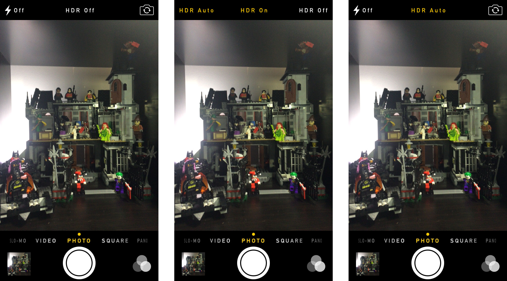
Since the iPhone 5s and its Apple A7 chipset are fast enough that saving HDR is almost instantaneous most people would be best served by simply leaving the camera set to auto all the time.
It's just one more welcome step in Apple's long history of making "every day photos" turn out as well as possible is as many different situations as possible.
iOS 7.1 iTunes Match & iTunes Radio
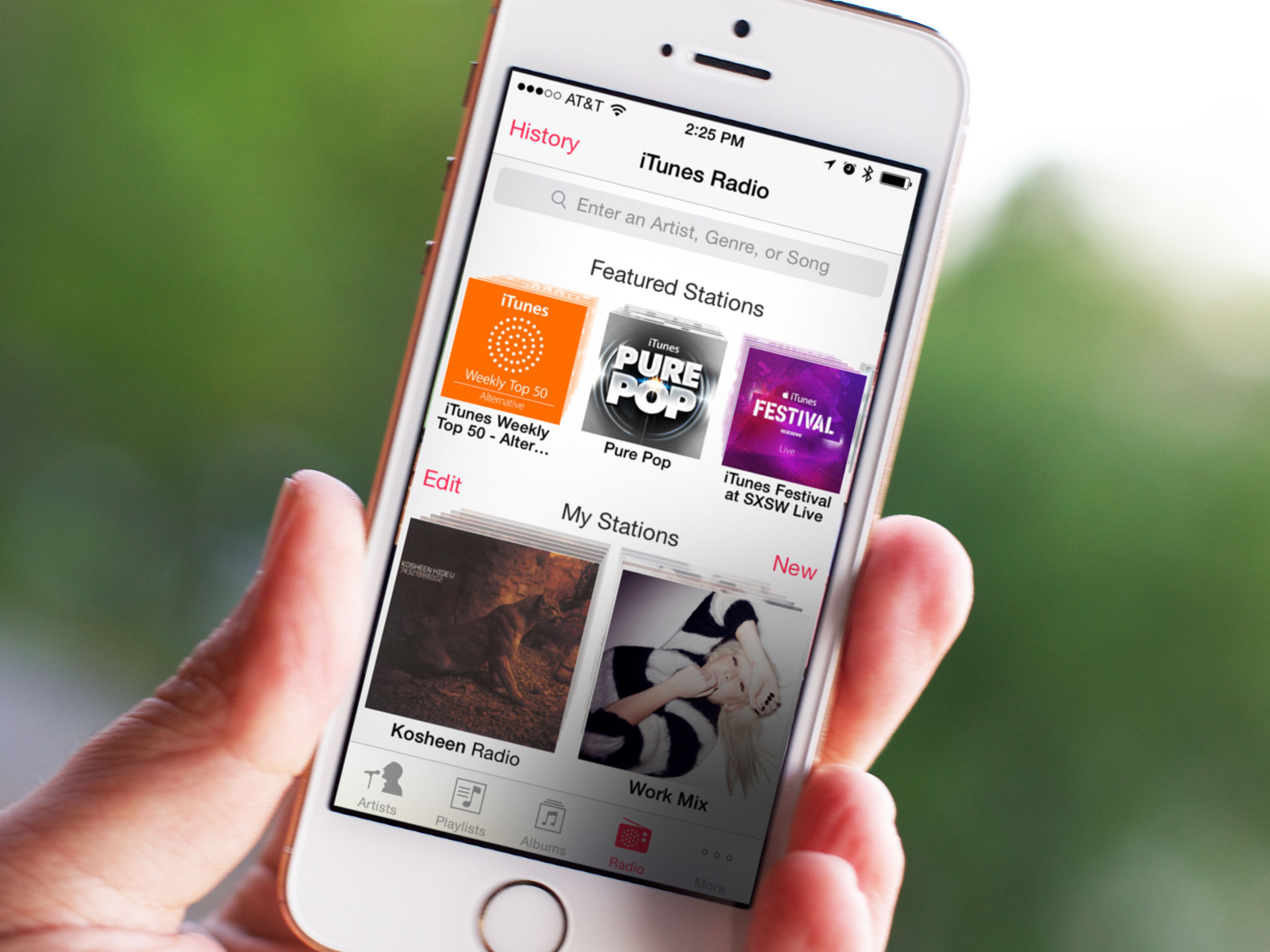
With iOS 7.1 Apple has added a few extra conveniences to both iTunes Match and iTunes Radio.
First, if you're not already subscribed to Apple's $25 music locker service, you can now subscribe directly on your iPhone or iPad. Second, they've added a search field to their streaming music service above the featured stations section to let you more easily create stations based on your favorites. Lastly, they've added a buy button to iTunes Radio so, if you love a song enough to want to own it, you can quickly move over to the iTunes Store and complete the purchase.
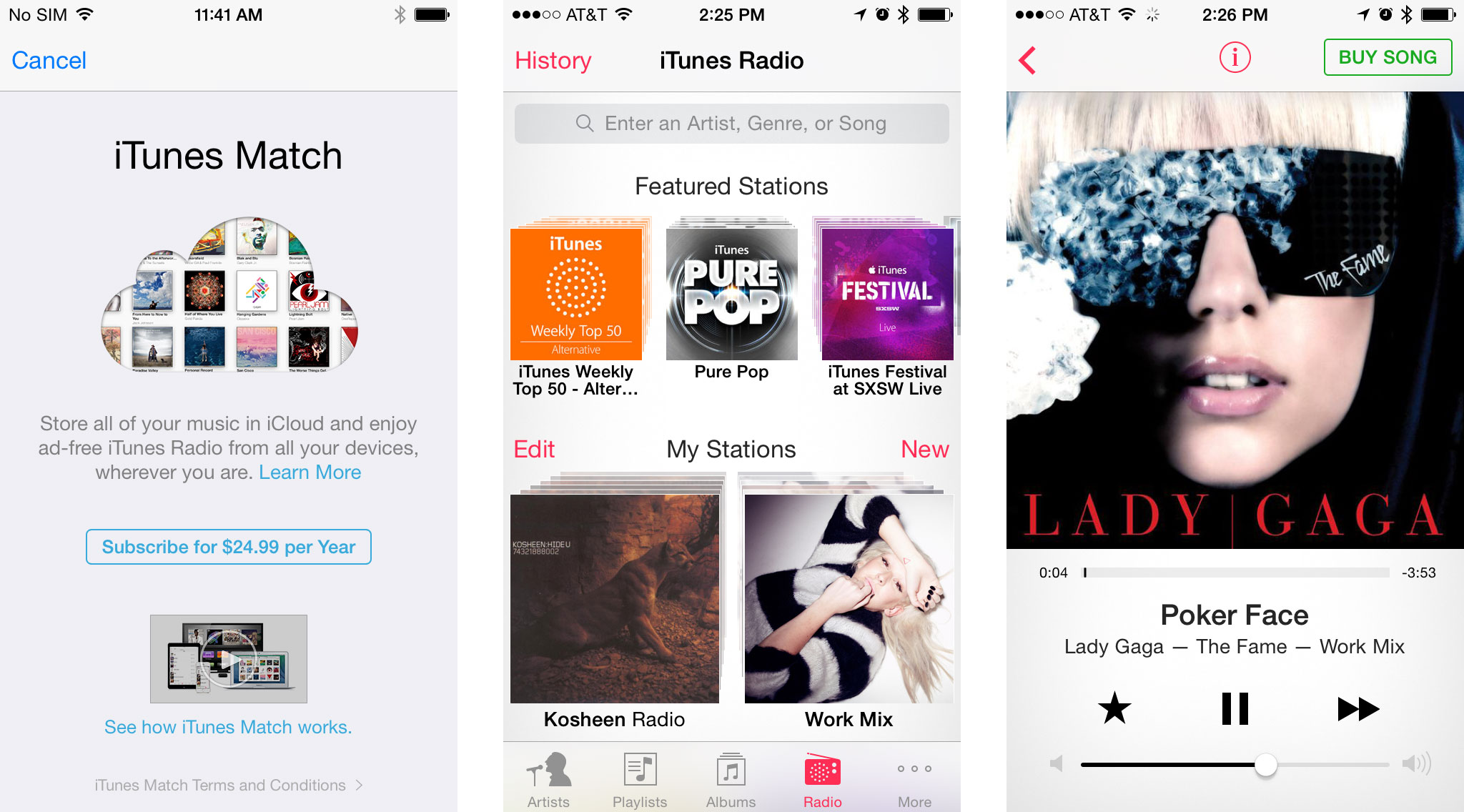
Unfortunately, while iTunes Radio has recently expanded from the U.S. to Australia, it still hasn't expanded to most of the rest of the world, which makes those features accessible to only a small fraction of iPhone and iPad users.
iOS 7.1 and bug fixes
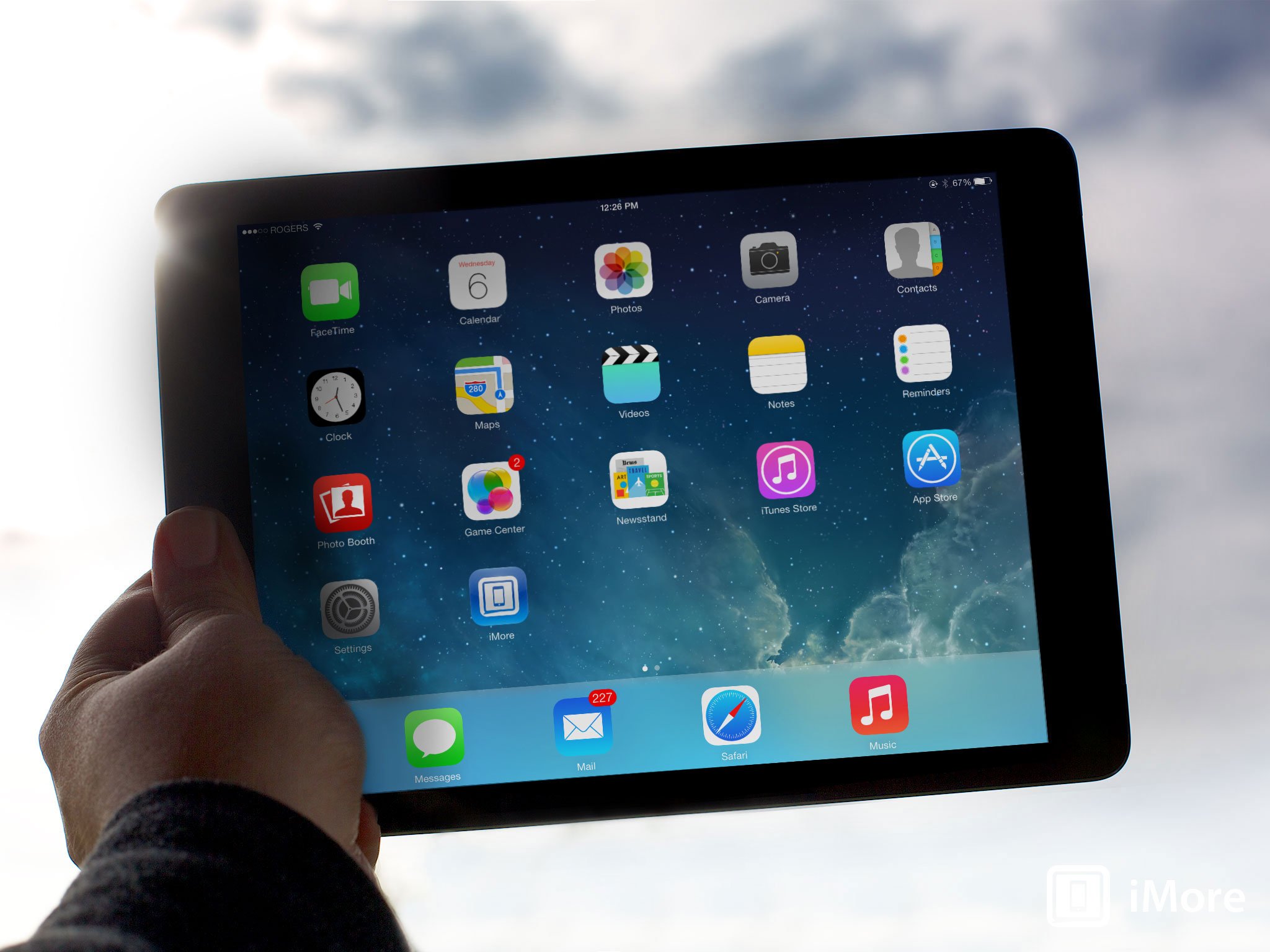
iOS 7 was subject to numerous Home screen crashes (re-springs). Every version of iOS has these occasionally. For iOS 7, however, some people had them several times a day, every day. It was not only annoying it made Apple's software look bad. And Apple didn't fix it for 6 months. iOS 7.0.1, 7.0.2, 7.0.3, 7.0.4, 7.0.5, and 7.0.6 came and went without addressing the re-springs. iOS 7.1 beta, however, addressed them months ago. I can't begin to imagine how complex a problem it was or what repercussions had to be handled to properly fix it. But 6 months. Regardless of the difficulty, it should have been fixed faster.
Apple also fixed a glitch with FaceTime notification badges not syncing properly between devices. I'd turned mine off to avoid having to deal with the glitch, so the fix is most welcome.
If you have more than 10,000 unread messages in Mail, iOS 7.1 will display that badge properly now as well. (Though I'd suggest that if you have over 10,000 unread messages you don't really need a badge — you need an intervention...)
Rotating the iPad Lock screen no longer results in the shade layer rotating separately a second later. My brain thanks Apple for this.
iCloud Keychain is now supported in additional countries, but like OS X 10.9.2, Apple has removed the ability to force auto-fill on websites that try to prevent.
Apple has also fixed several security issues, a complete list of which can be found on Apple's knowledge base
And, of course, iOS 7.1 also provided the previously mentioned iPhone 4 performance improvements and Touch ID reliability fixes.
Again, Apple didn't fix all of this as fast as they should have, and some of it shouldn't have been a problem in the first place, but with iOS 7.1, at least its fixed now and fixed well.
iOS 7.1: The bottom line
So is iOS 7.1 what iOS 7 was meant to me? No. That's trite. That's cliché. iOS 7.1 is what iOS 7 has become thanks to an additional 6 months of development and design time, experience and realization. The screws were tightened, the rough edges were smoothed, the surfaces were polished.
Yes, in the case of the re-springs the fix was too long coming and in the case of the shift key the improvement is anything but. However, for everything from the animation speed to the interface tweaks to what could very well be the beginning of iOS everywhere — CarPlay — the update is good. It's very good.
Apple is front-loading new iOS features in the x.0 releases these days, and that doesn't leave much for the x.1. That's what happens when an operating system matures, when obvious holes have been filled, and when competition intensifies. And that also means more substantial updates and improvements likely won't be seen before WWDC 2014, likely this June, when Apple gives us our first peek at iOS 8.
In that regard iOS 7.1 does exactly what it needs to. It takes something that was audacious and impressive, if flawed and unreliable in places, and makes it more than solid — it makes it downright enjoyable.

Rene Ritchie is one of the most respected Apple analysts in the business, reaching a combined audience of over 40 million readers a month. His YouTube channel, Vector, has over 90 thousand subscribers and 14 million views and his podcasts, including Debug, have been downloaded over 20 million times. He also regularly co-hosts MacBreak Weekly for the TWiT network and co-hosted CES Live! and Talk Mobile. Based in Montreal, Rene is a former director of product marketing, web developer, and graphic designer. He's authored several books and appeared on numerous television and radio segments to discuss Apple and the technology industry. When not working, he likes to cook, grapple, and spend time with his friends and family.
