iOS 8 wants: Interactive notifications and push interface redux

Another of my longstanding desires for iOS is interactive (what some call actionable) notifications, which takes interface from being pull — I have to go find what I want to do — to push —the system brings what I want to do right to me. Home screens, widgets, apps are all pull interface. I have to go to switch out of what I'm doing in order to go do something else. Interactive notifications are push interface. No matter what I'm doing, they come right to me. Depending on implementation and settings, that can be convenient or annoying, but it's inarguably powerful. OS X Mavericks got it last year. It'd be great of iOS 8 got interactive notifications this year.
Back before iOS 6, in an article explaining why widgets weren't the answer, I outlined the problem like this:
The problem is, when I'm in an app, if anything else happens, I'm forced out of that app and into another app. If a notification pops up alerting me to an iMessage or an email, and I want to either read all of it or respond, I have to stop what I'm doing, leave the app I'm in, go to the source app, and then respond.Notifications aren't actionable within the notification interface. I can't "quick view" a Tweet or a Facebook message, I have to go to the Twitter or Facebook app. I can't "quick reply" to them in-app, I have to go back to the associated apps to respond. That either causes me to ignore messages I may not really wish to ignore, or to wrench myself out of what I'm doing to go handle them immediately.
Another problem is that, while tapping on a notification can quickly and easily send you to the appropriate app, there's no symmetrically quick and easy way to get back. Tap and you're taken from where you are to where you need to go to act, but then you're left to double click the Home button to get to the app switcher cards, tap the card, and only then go back. It's like being teleported to the bottom of a hill and then left to climb back up on your own.
Back before iOS 7 I started to try an imagine how Apple could implement interactive notifications on iOS:
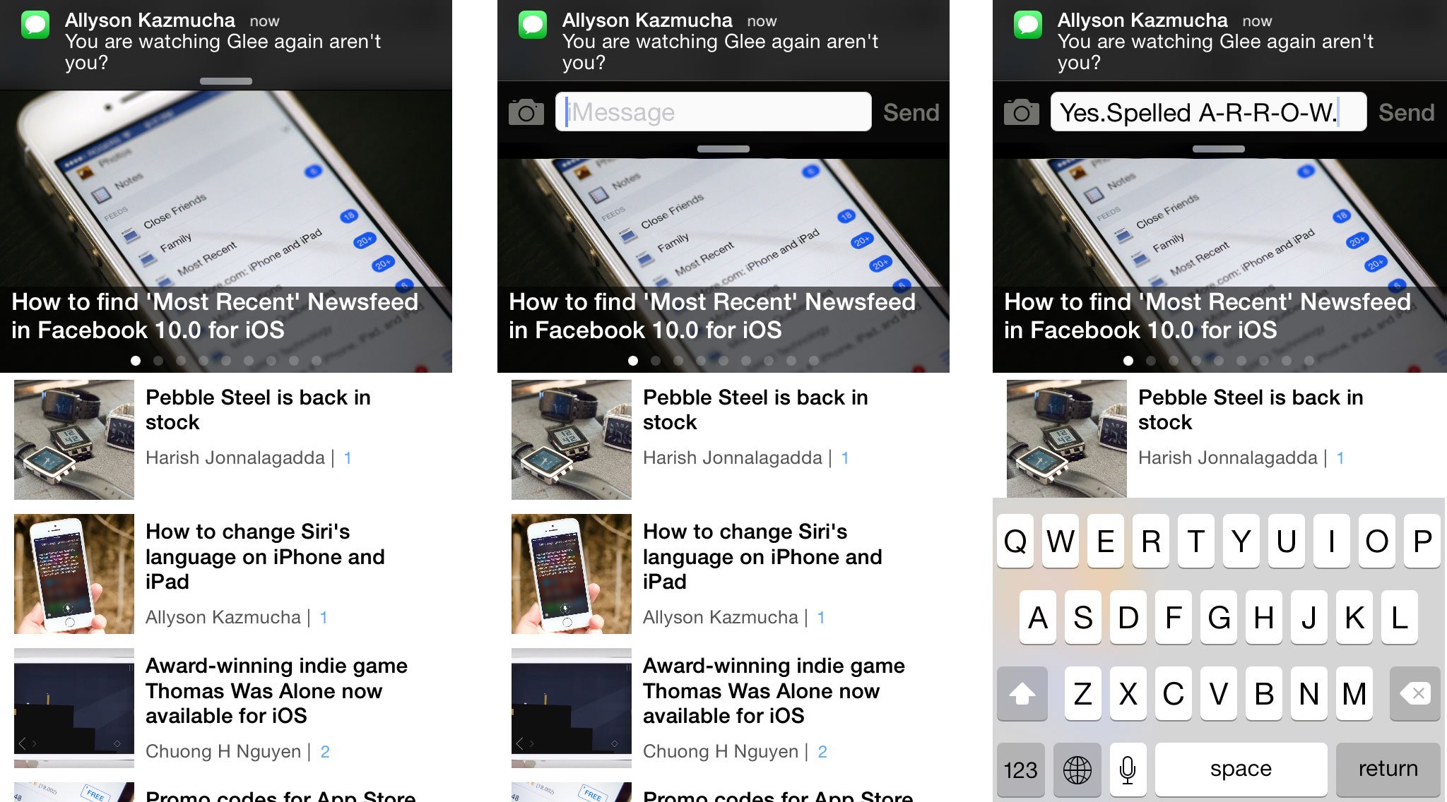
Imagine instead that, once the banner notification rolls down, we could not only tap on it to go to the app, but drag it down to get an actionable dialog. Then we could quickly enter and send a response, at which point the dialog would disappear and we could immediately resume what we were doing. No carousel app switching, no need to click and tap our way back.
And, of course, keep dragging to get the full Notification Center, just like in iOS 7.
Apple already does a lot of the out-of-app heavy messaging lifting today, in Share Sheets. Launch the Photos app and pick a photo. Tap the Action button, tap Mail, Messages, or Twitter, and an embedded Mail, Message, or Tweet sheet slides up from the bottom. Type and send a message. The message gets sent and the sheet slides down again, allowing you to continue right where you left off. In fact, Notification Center already has buttons for calling up Twitter and Facebook sheets.
Notification Center lost the Twitter and Facebook buttons — hopefully they'll reappear in Control Center — and, as mentioned above, Mavericks got the interactive notifications instead of iOS.
Apple did address two important areas in iOS 7, however:
Master your iPhone in minutes
iMore offers spot-on advice and guidance from our team of experts, with decades of Apple device experience to lean on. Learn more with iMore!
If we tap the banner, it rips us from our current activity and sends us carousel-ing into whatever app owns that bit of text. At that point, we have to wait for the host app to wake up, connect, and download the actual message. (Even if all of it was shown in the push notification, the information isn't passed along and the app has to make its own, post-launch request to get its own, post-launch copy.)
Now, at least, when you hit a notification, iOS 7 background refresh means you can be reasonably certain the message or other content will already be downloaded and there waiting for you.
If Apple wants to get really avant guarde, Notification Center could become contextual, presenting information, actions, and options depending on the time of day, our location, and what we're doing when we invoke it. And, of course, helpfully nudge us with actionable banners when we haven't invoked it -- the classic example being "Traffic has changed, you will now have to leave 10 min. earlier for your meeting, would you like me to message attendees?"
Basically, I wanted to fast app switch dock media controls in Notification Center, along with quick toggles and Google Now-style contextual information. Control Center took over the media controls and toggles, and the Today video added the beginnings of contextual data with Next Location.
So that's better, but it's still missing the interactive part.

Messaging
Instant messaging, be it iMessage, Twitter, WhatsApp or any short, concise bit of text on iOS currently suffers from the exact problem described above. Notification Center banners can show you a message has arrived but in order to reply you have to carrousel over to the originating app.
With OS X Mavericks active notifications you can now click on a reply button within the notification and be given a reply field within that notification. No more switching apps, not more having to figure out how to get back.
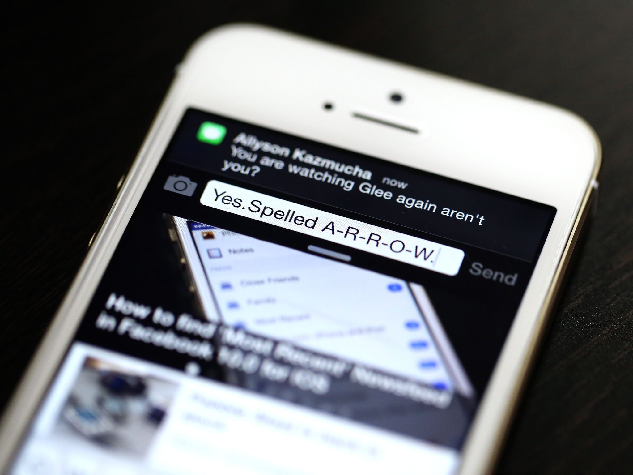
That same system is what pretty much everyone wants on iOS. Notification Center banner comes in, choose to tap on it and it expands with a reply field you can use to respond immediately, right where you are, and get right back to doing what you were doing a moment before.
Setting
Last year I described push interface applied to re-setting clocks and timers like this:
The same basic system could also work for changing alarms. Right now, just like with messages, if an alarm goes off, we can either okay it or put it to sleep, but we can't change it. If we want to do that, we have to mishandle the alert in someway, then go track down the app (typically Clock) to do something about it.In a push-interface world, the alarm would go off and the banner could be pulled down into, or the popup would already be, a widget that could not only be dismissed or slept, but altered right there and then.Even if it was kept modal, a timer could be scrubbed back from 00:00 to 00:30, for example, right on the alert.
It's a more challenging interface to push, but one that greatly increases convenience.
Playing
The same thing could be applied to audio notifications. If a new podcast is available to download, for example, the notification that tells you about it could be expanded to show basic media controls so you could play the episode immediately without having to change apps and find your way back.
With video, for example a new episode of Mad Men becoming available on iTunes, you probably want to go to Videos and watch it when you're ready. New audio you can just start listening to as you keep doing whatever it is you were doing when you were notified.
Dynamics
iOS 7 felt to me like the beginning of dynamic interface. Really, however, it started earlier than that. It started with AirPlay and CarPlay. It started with the embeddable Mail and App Store and Share sheets Apple has been building up over the last few years. We're seeing it everywhere. Hell, it started with webOS notifications, BiteSMS, and JellyBean active notifications.
That's the future interface seems to be hurtling towards and it'd be great if we could get even closer to it come iOS 8.

Rene Ritchie is one of the most respected Apple analysts in the business, reaching a combined audience of over 40 million readers a month. His YouTube channel, Vector, has over 90 thousand subscribers and 14 million views and his podcasts, including Debug, have been downloaded over 20 million times. He also regularly co-hosts MacBreak Weekly for the TWiT network and co-hosted CES Live! and Talk Mobile. Based in Montreal, Rene is a former director of product marketing, web developer, and graphic designer. He's authored several books and appeared on numerous television and radio segments to discuss Apple and the technology industry. When not working, he likes to cook, grapple, and spend time with his friends and family.
