iMore Verdict
iOS 17 is a substantial upgrade packed with features users will love, and it deserves a place on your iPhone. It brings a lot of quality-of-life improvements alongside some brilliant new features like StandBy and Contact Posters. While not the flashiest, iOS 17 is one of Apple’s best software updates in years.
Pros
- +
StandBy
- +
Added customization in Phone and Messages
- +
Quality-of-life improvements
Cons
- -
StandBy is not as good on older devices with no AOD
- -
SharePlay in CarPlay lacks functionality
- -
No extra Dynamic Island usage
You can always trust iMore.
It’s that time of year again. iOS 17 is finally here and brings with it some notable changes and improvements to your iPhone’s software. Whether you’ve purchased an iPhone 15 Pro or are updating your software on an iPhone 12, iOS 17 will be a major factor in the next year of your smartphone’s life.
With notable new additions like StandBy and Contact Posters alongside new security features like Check In, does iOS 17 live up to its billing, and will it make your older device feel new again? Here are the top 10 iOS 17 features. Ranked.
iOS 17: Availability and compatibility
iOS 17 is available to download right now alongside new software for iPad, Apple Watch, and Apple TV.
iOS 17 is available on all of Apple's current best iPhones, from iPhone XS to iPhone 15 and iPhone 15 Pro. This year, Apple has dropped support for iPhones with the A11 Bionic chip, such as the iPhone 8, 8 Plus, and iPhone X.
iOS 17: Top 10 features
10. Visual Look Up improvements
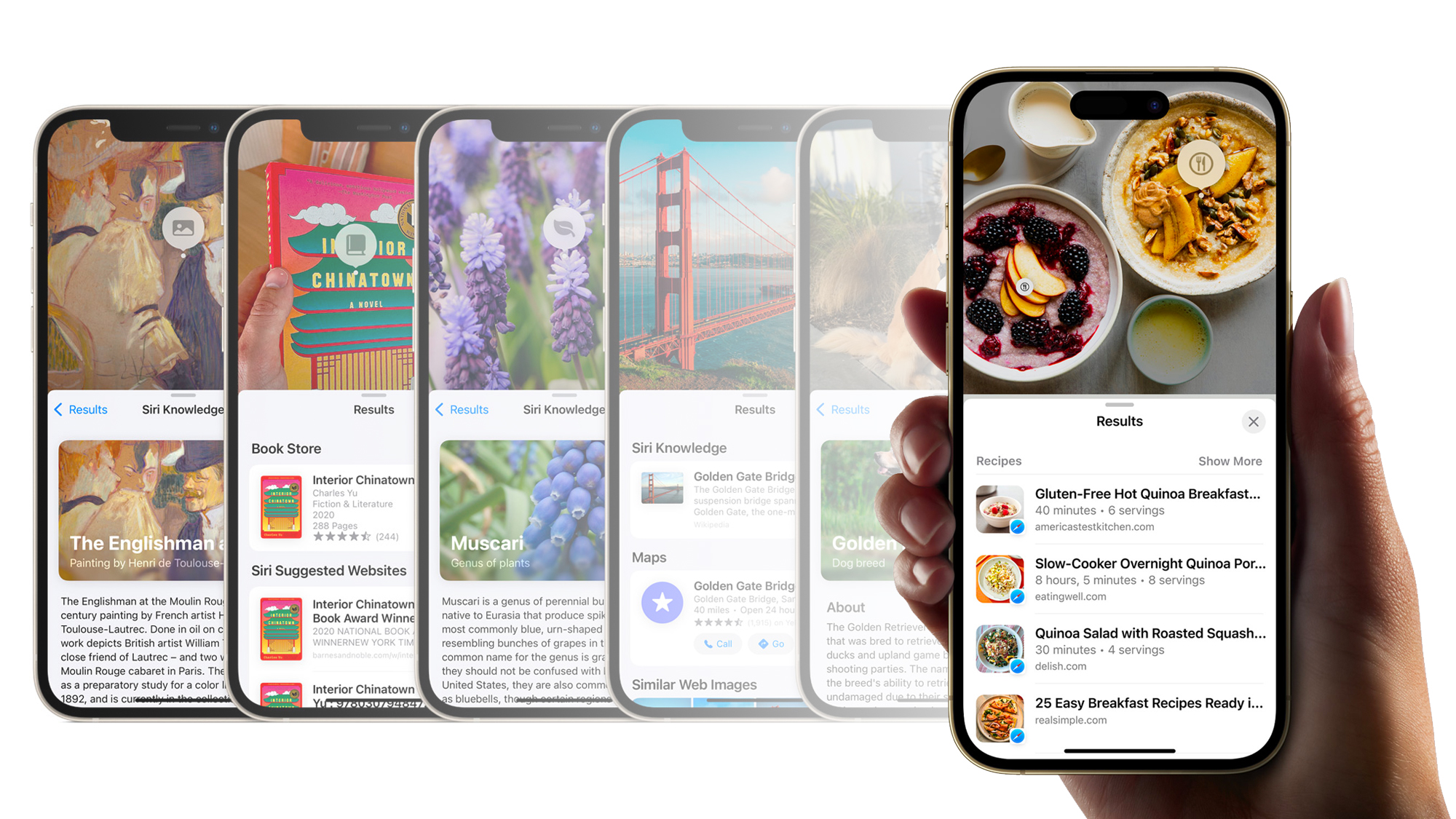
iOS 17 brings new powers to Visual Look Up, and as a foodie, I’m in love. Now, you can find recipes for a meal just by using Visual Look Up on a photo - it’s magic.
This feature has been perfect for when I surf the web and stumble across tasty-looking treats without knowing their origin. It’s still not perfect, but I expect the capabilities to improve throughout the course of the year. For instance, Visual Look Up will find recipes with similar ingredients, but it won’t find you the precise recipe. I’m unsure if that would even be possible, but if Visual Look Up could match the picture to an exact recipe, this feature would be way higher up the list.
Visual Look Up also adds support for video content for the times that you need info but can’t find a photo of what you’re looking for. It’s one of these features that is criminally underused on the iPhone, but hopefully, the improvements in iOS 17 get people excited for your own pocket detective.
How to use Visual Look Up to find a recipe
9. Keyboard improvements
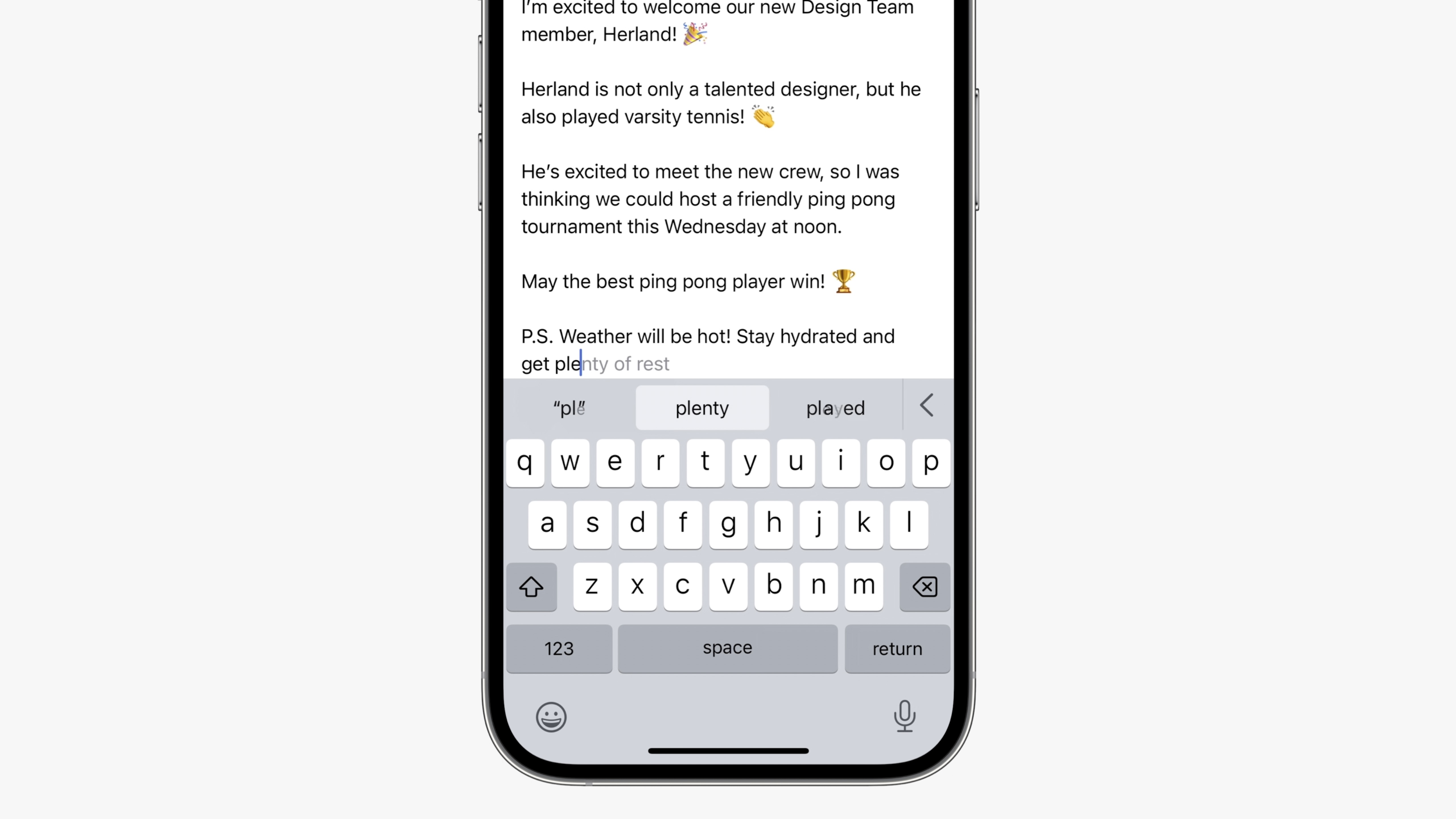
Fed up with your iPhone autocorrecting to “Duck”? Now, you can voice your frustrations better than ever before with the improved keyboard language model that makes Autocorrect more accurate and less frustrating to use.
I’ve noticed a huge improvement in my typing since updating to iOS 17, and it seems to get better the more I use my keyboard. iOS 17 now fixes typos better, and you can edit autocorrected words far more easily. I’ve fallen in love with the Inline predictive text additions to iOS 17 that allow me to type faster by completing sentences with a tap of the Space bar.
The keyboard in iOS 17 feels more complete and, in turn, more comfortable and quick to use. I’ve found myself far more efficient when replying to texts or searching the web. As one of the most used aspects of a smartphone, a keyboard needs to be great, iOS 17 is definitely making the keyboard better.
8. Check In
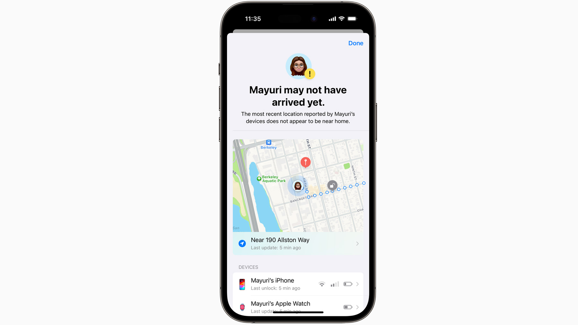
Check In is a big addition to iOS 17 and a fantastic safety feature to add to your iPhone. In its simplest form, Check In allows you to let a family member or friend know when you arrive at your destination. It allows peace of mind and security that is perfect for parents, partners, and children all to feel safe when out and about.
There are multiple options to choose from, with the option to check in on a person after a certain amount of time or when their iPhone battery levels are running low. I’ve not had the opportunity to use Check In properly yet, but it deserves a place on this list just for the sheer impact I believe it will have when people start to use it. In my testing, the user experience is very easy to understand, and the feature works exactly as you’d hope it would.
This is Apple’s next step towards making the iPhone the smartphone centered around security and safety after adding Crash Detection to the iPhone 14 last year.
7. Live Stickers
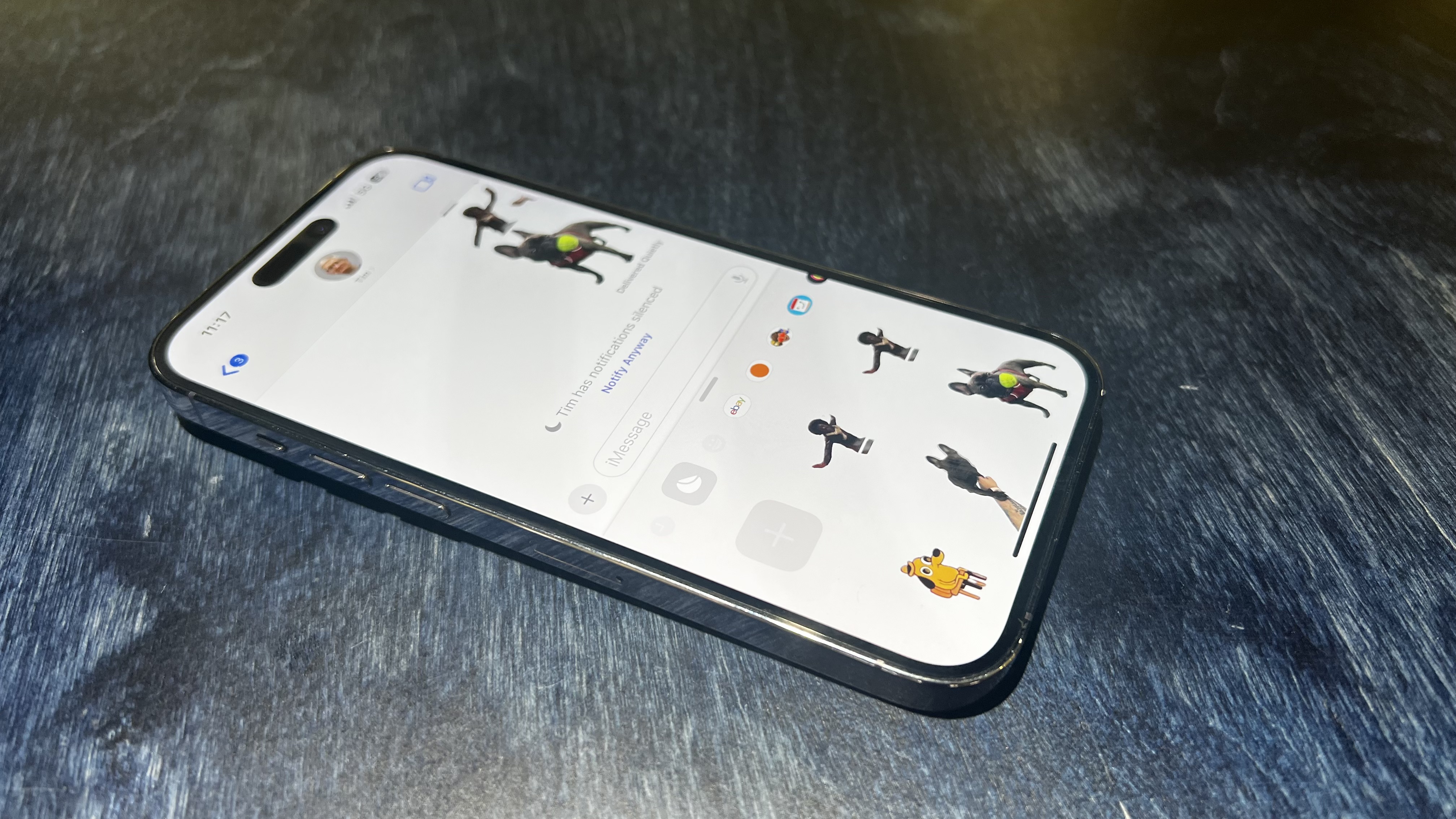
The main theme of iOS 17, in my opinion, is personality. Apple wants you to have fun and make your iPhone yours by adding new customization features across the board. None are more enjoyable to use than the new Stickers experience in Messages and systemwide.
I’ve had so much fun with Stickers in the last month, creating different stickers of my French Bulldog, Kermit, as he goes through life loving everyone and destroying any shoe in sight. You can easily tap on a subject in Photos and turn it into a sticker. It also works with Live Photos, which make GIF-like Live Stickers.
As a huge fan of 90s stickers and trading cards, the Stickers improvements have been a joy to use. I particularly love the Shiny effects you can add to the Stickers to make them look like the holographic stickers from when I was growing up - most people will be able to relate to them, and because of that, they rule.
If that wasn’t enough, Stickers now have systemwide integration, which makes them more useable than ever. If, like me, you love a terribly edited meme or a quick Photoshop, Stickers now lets you do that directly from Markup. I used to use third-party apps to superimpose images on my iPhone, but now I can do it in seconds by lifting a subject, creating a sticker, and then adding it to the image I want.
Once people see the possibilities that the update to Stickers brings in iOS 17, I think way more users than ever will use the feature, and we’ll see a world of Messages filled with random shiny Stickers of our pets.
How to use Live Stickers on iOS 17
6. Find My improvements
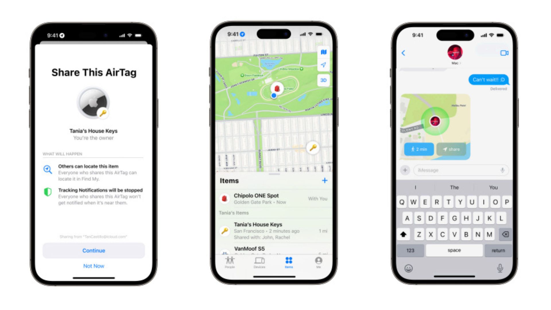
Okay, this might not be at the top of many lists, but I think it’s one of the best iOS 17 improvements. Find My integrates into other apps and widgets better than ever before. For example, I use Find My with my partner for those times when we’re trying to cross paths after she finishes work or when I’m grocery shopping and she wants to see if I’ve left the shop yet.
In iOS 17, those Find My locations are finally integrated into the Maps app, something I’ve been screaming for since the dawn of time. You can easily search someone’s name in Maps and see where they are - super useful. Not only does Find My now appear in Maps, but it also appears in my Favorite Contacts widget on the home screen, giving a brief update of her location under her contact photo.
You can also now request and share locations with others directly from Messages, which makes Find My way less niche and way more convenient to use with friends.
iOS 17 has a lot of little quality-of-life improvements that make using your iPhone easier, and the way Find My has expanded beyond the app is something I’ve noticed and loved since I installed the new software on my iPhone.
5. Messages
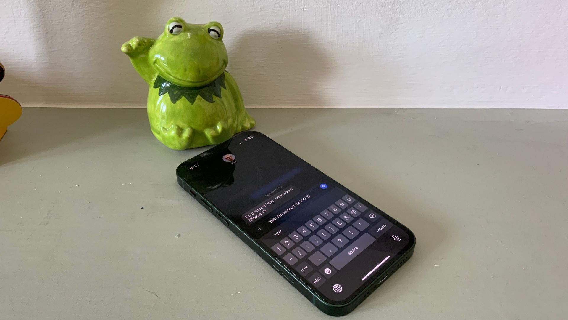
Stickers aren’t the only improvement to messaging on iOS. Now, the Messages app feels more fluid and intuitive thanks to some big additions.
I use WhatsApp a lot, and I’ve wanted a swipe-to-reply feature in Messages on iOS for far too long. Now we have it. You can easily reply to a message by swiping to the right, and it works just as you’d expect.
Messages also has a better search feature that helps you find specific messages with different keywords. I’ve found this search feature to be much improved on the search functionality found in iOS 16. Apple says you can search for people, keywords, and content types like photos or links with search filters.
Another huge improvement is in audio messages. Now, iOS 17 transcribes audio messages under the play button so you can read quick messages if you’re out and about and unable to listen. This comes in handy when you’re in busy places like the grocery store, and I’ve used it on multiple occasions so far.
iOS 17 has a recurring theme of better integration across all of Apple’s first-party apps, and Messages is no different, with a better app drawer for all of your Messaging apps which makes it easier to send photos, live locations, and even songs from Apple Music.
How to use swipe to reply on iOS 17
4. Mental Health
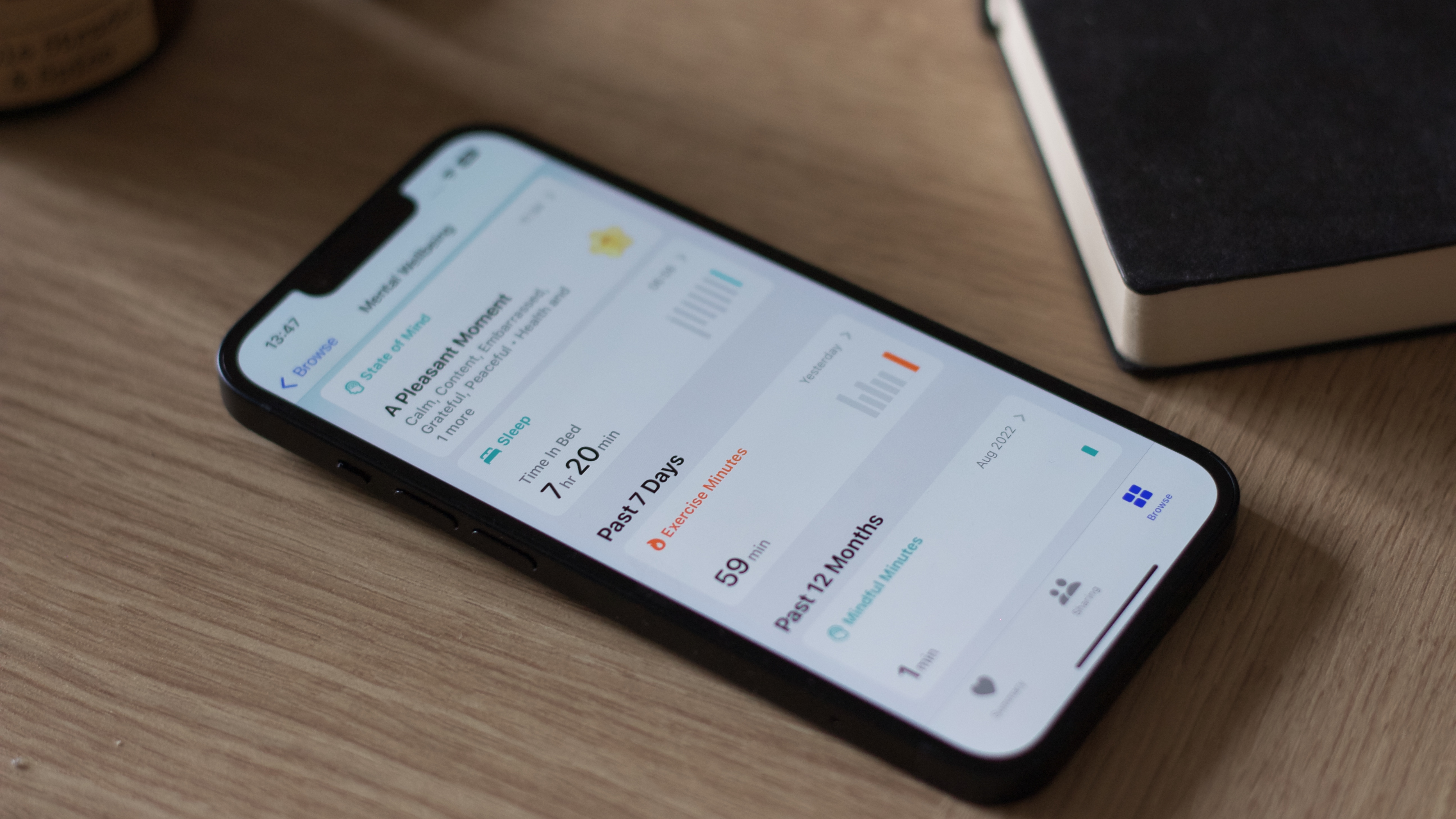
Since installing iOS 17, I’ve received a notification twice daily asking me how I’m feeling. It doesn’t sound like the fanciest feature, but it has helped me be more aware of my feelings and conscious of my mindset.
Found in the Health app, there is now a Mental Health section that logs the way you feel on a daily basis. My iPhone now asks me how I’m feeling, and based on my answers, I can then highlight and visualize what impacts my mood.
There are a bunch of apps that do similar things, like Headspace, for example, but having the data incorporated into Health alongside access to Mental Health assessments often used in clinics is a fantastic step to normalizing mental health checkups in a world where we can constantly feel overwhelmed.
I also really like how the Mental Health logging fits in with the Apple Watch on watchOS 10, allowing you to answer questions without ever taking your iPhone from your pocket. It all works seamlessly and should help a lot of people think more about how they’re feeling.
How to log your mental health with iOS 17
3. Interactive widgets
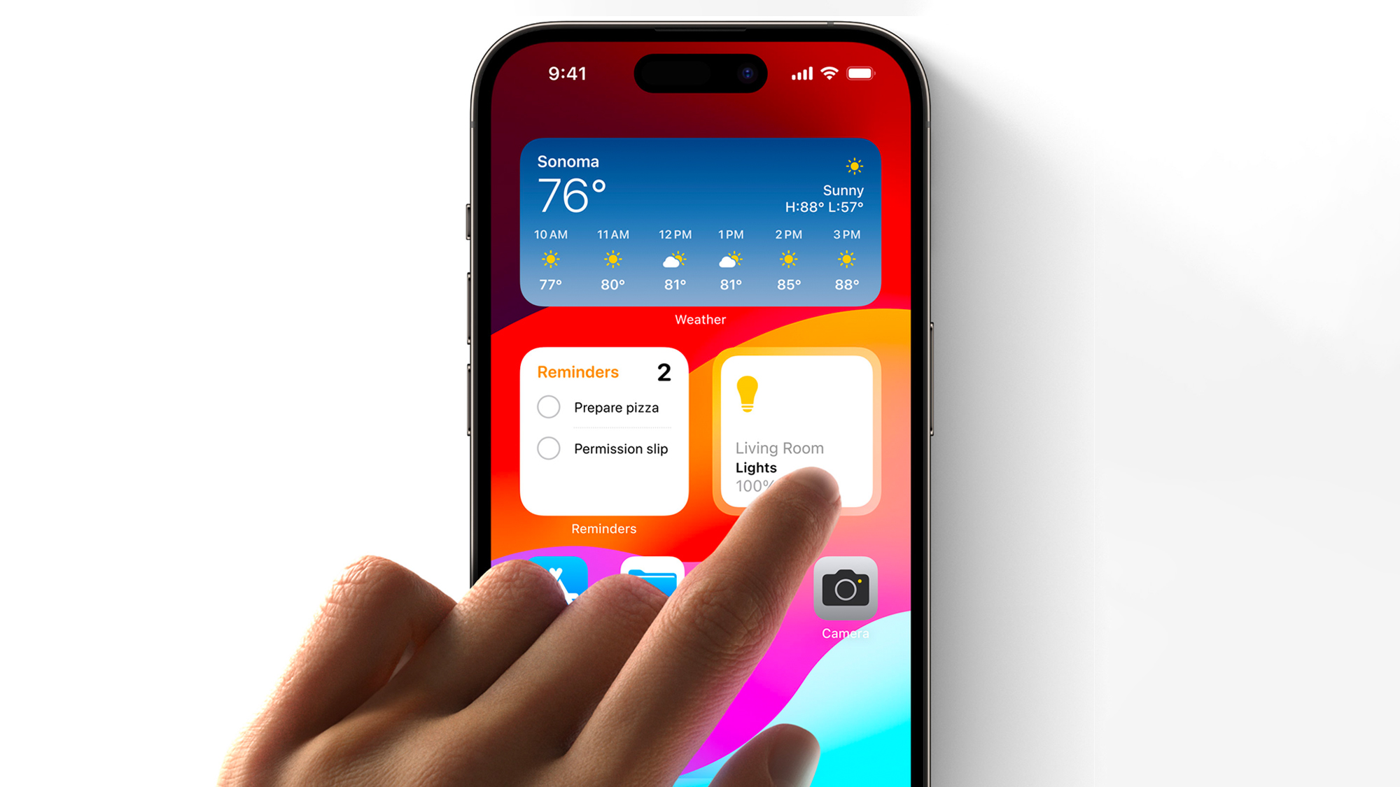
Interactive Widgets have arrived with iOS 17, and they are glorious. Your home screen feels like a living and breathing ecosystem of your favorite apps, more so than ever before, thanks to the ability to interact with widgets without launching the app they are connected to.
Gone are the days of tapping the Home widget, opening the Home app, then tapping again to switch on a smart light. You can now tap the Home widget directly from your home screen, and your light switches on. Apple has also added interactive widgets to Music, Podcasts, Contacts, News, Safari, and Books. Developers will also be able to add interactive widgets to their apps to improve the way users interact with third-party widgets. It sounds like a very small improvement, but it makes all the difference to the way you interact with iOS 17.
How to use interactive widgets on iOS 17
2. StandBy
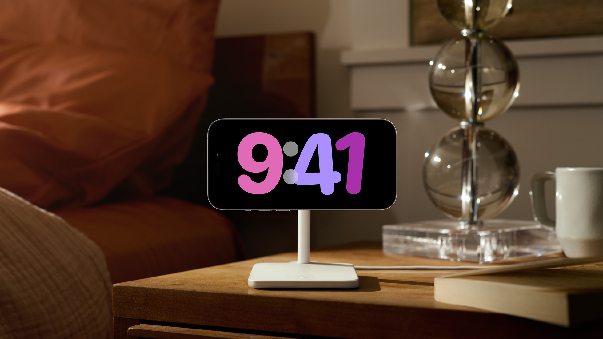
StandBy stole my heart at WWDC, and while I love the concept, it feels a little barebones at the moment. That said, it’s such an interesting way to use your iPhone and a headline feature of iOS 17 that it deserves this spot on the list.
StandBy allows you to connect your iPhone to a charger in landscape and showcase widgets, photos, and clocks in a very mindful way. I’ve been using StandBy at my desk connected to an Anker Cube MagSafe stand, and it has made using my phone while at work far less distracting. When a notification comes in, I get a nice full-screen preview and then can opt to access the app or ignore it for later. StandBy also has a beautiful full-screen media player that makes listening to music and podcasts more fun than ever before on iPhone. I’ve mostly used the feature as a quick way to change songs while working, as well as control my smart lights with a tap of a button.
And of course, if you know me, you know I love sports. I’ve had the tennis scores in full screen under my monitor as I work, the perfect companion to a summer of tennis.
1. Contact Posters
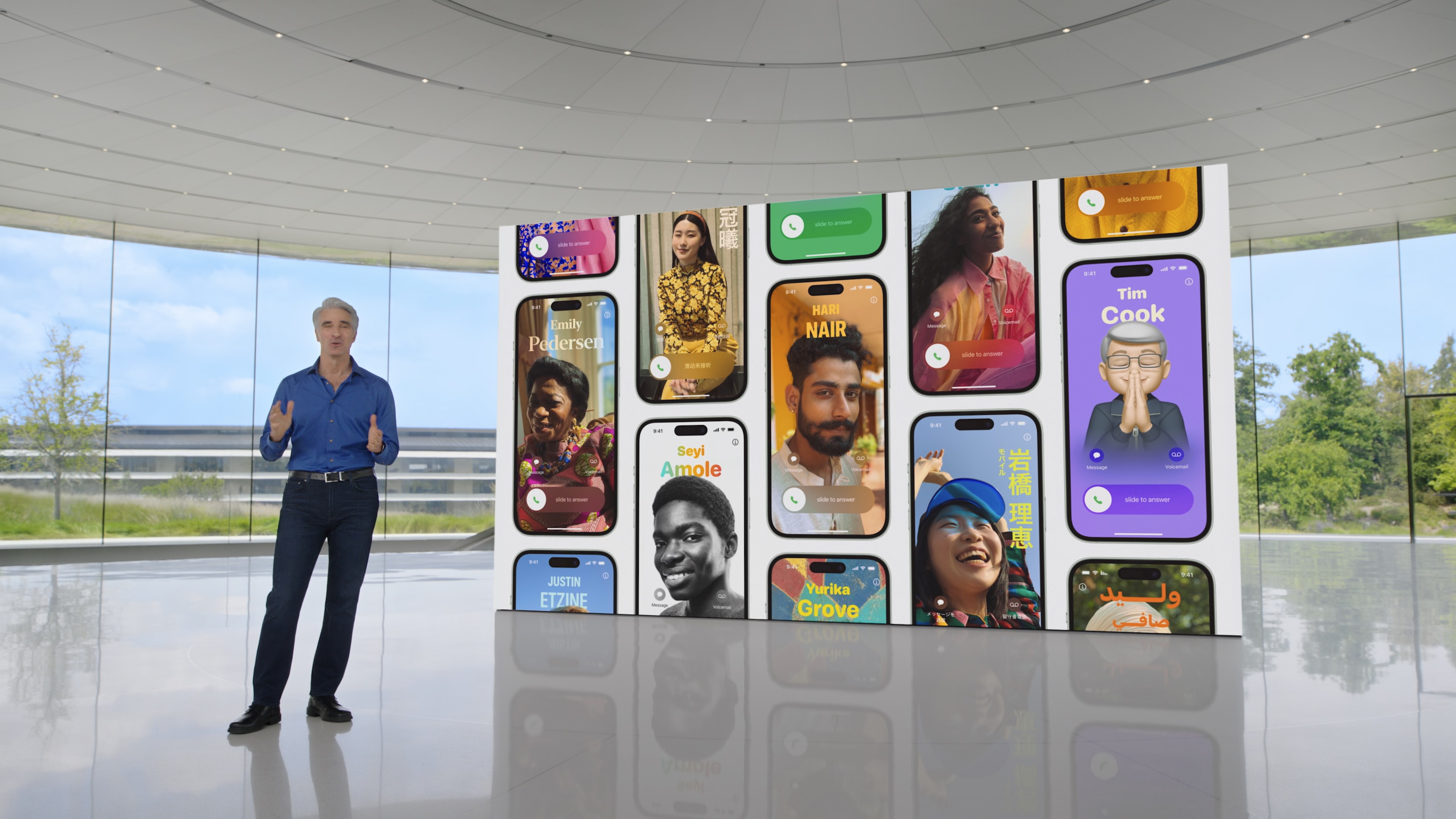
When Contact Posters were first revealed, I wasn’t too fussed about the lock screen wallpaper customization coming to your contacts list. Now, after using Contact Posters for the last few months, I’m sold.
Contact Posters are essentially full-screen contact images for when you call one of your contacts. You get to showcase your personality by picking what image pops up when someone makes a call or receives a call from you. It’s an incredibly fun tool that makes your iPhone feel even more personalized and adds a level of “you” to phone calls in a way we’ve never seen before.
As I've been playing around with making my own, I’ve grown more and more fond of the way it modernizes the phone app on iPhone. I can’t wait to see my contacts make their own because I think this could be one of the defining features of iOS 17. It’s so easy to do that the world of grey contact photos could be gone for good.
I’m calling it now: Contact Posters will be the main feature we remember from iOS 17. It’s a small but revolutionary way of making the iPhone’s core functionality better than we’ve ever seen.
How to make your Contact Poster on iOS 17
iOS 17: Other features
While these features haven’t made it onto the top 10 list, there are many other improvements to iOS found in iOS 17 that deserve a mention.
For starters, making grocery lists in Reminders is amazing. The way that iOS 17 now slots my food into food categories has completely changed the way I do grocery shopping, and I’m sure it will have a huge impact on many people’s lives.
The ability to leave FaceTime video messages is also a huge addition to the way that voicemail works on iOS 17. Now, you can leave loved ones video messages when they don’t pick up a call. I’m not sure how often people will use this, but some may find themselves leaving FaceTime video messages more than making actual FaceTime calls.
Apple’s put a big focus on health in iOS 17, and while we’re still waiting to try the Journal app (set to release later this year), Apple has other health benefits beyond Mental Health tracking. Screen Distance for eye health is a nice-to-have that allows you to focus on staying further back from your iPhone’s screen. I switched it off pretty early on as I’ve found I spend my life too close to displays, but this will be a brilliant feature for parents wanting to protect their children’s eyes.
There is a lot to like on iOS 17, and your experience will differ depending on how you use your iPhone. With so many features on offer, iOS 17 is definitely worth an update.
iOS 17: Room for improvement
One of my favorite features in this year’s software update is StandBy. But StandBy has a few glaring faults that I hope Apple changes in the full release of iOS 17. For starters, if I’m using StandBy, I'd like the option to disable Face ID or a passcode. I’ve tried using StandBy on my bedside table, and it’s annoying not to be able to just turn off my light without getting up from my pillow and unlocking the device - it feels counterintuitive to the interactive widget.
Another is just how frustrating it is to use if you don't own an iPhone with an Always-On-Display. If you own any iPhone other than the 14 Pro, you'll have to tap the display every single time you want to see the information on StandBy, it's infuriating.
And, possibly, the biggest oversight of StandBy is when you click to act on a notification, and you’re brought to your iOS home screen. You’re thrust into a confusing battle of orientation because the iPhone no longer has a landscape home screen layout. Apple clearly wants you to lift your iPhone and use it off of the stand in this circumstance, but it feels limiting in a way that hinders StandBy for me.
The next feature I wanted to bring up is actually a glaring omission from iOS 17, especially with the launch of the iPhone 15. Dynamic Island has no significant improvements in iOS 17, and it still feels a little unloved. I was hoping that with Dynamic Island coming to all iPhone 15s, we would see some new and exciting ways to use the software-enhanced notch. Unfortunately, the Dynamic Island you know and (maybe) love in iOS 16 remains unchanged in iOS 17. That’s not necessarily a bad thing, but I’ve written in the past about how I’m worried the Dynamic Island becomes another TouchBar. Without further support from Apple in showing third-party developers how they can make the most of the pill, we could be going in that direction.
For families who were excited about SharePlay in CarPlay, there are also some limitations that make the feature not work as well as many would hope. At the time of writing, child accounts don't work with this feature, so your children can't add songs to your Apple Music queue while sitting in the backseat.
Finally, iOS 17 doesn’t make the Pro Max-sized iPhones feel any more feature-rich. I used a Samsung Galaxy S23 Ultra for a couple of weeks and was amazed at how the operating system takes advantage of a bigger screen. On iOS, the Pro Max-sized phones have the exact same functionality as their smaller siblings, and I was hoping that iOS 17 would be the year for change. Unfortunately, that isn’t the case, and as I mentioned above, features like StandBy are hindered by the inability to use your massive 6.7-inch display in landscape mode.
iOS 17: Verdict
iOS 17 is one of the best iPhone updates we’ve seen in years. It’s stable, it’s fun to use, and it introduces new ways of using your iPhone — the holy trinity everyone wants in a software update.
New features like Contact Posters, StandBy, and Live Stickers, alongside major improvements like interactive widgets, make iOS 17 a must-download and install.
While some issues with Apple’s iOS development, like the lack of dedicated UI that takes advantage of a larger display or no improvements to Dynamic Island, are a little disappointing, I think iOS 17 is the software update we’ve been waiting for. I can’t wait to start seeing everyone’s Contact Posters and Live Stickers in action.

John-Anthony Disotto is the How To Editor of iMore, ensuring you can get the most from your Apple products and helping fix things when your technology isn’t behaving itself. Living in Scotland, where he worked for Apple as a technician focused on iOS and iPhone repairs at the Genius Bar, John-Anthony has used the Apple ecosystem for over a decade and prides himself in his ability to complete his Apple Watch activity rings. John-Anthony has previously worked in editorial for collectable TCG websites and graduated from The University of Strathclyde where he won the Scottish Student Journalism Award for Website of the Year as Editor-in-Chief of his university paper. He is also an avid film geek, having previously written film reviews and received the Edinburgh International Film Festival Student Critics award in 2019. John-Anthony also loves to tinker with other non-Apple technology and enjoys playing around with game emulation and Linux on his Steam Deck.
In his spare time, John-Anthony can be found watching any sport under the sun from football to darts, taking the term “Lego house” far too literally as he runs out of space to display any more plastic bricks, or chilling on the couch with his French Bulldog, Kermit.
