iPad apps on Mac: Project Catalyst Explained

macOS Catalina highlight a longstanding Mac software problem. When Apple bought NeXT, it inherited the legit brilliant NeXTStep technology and the AppKit framework for making apps. Apple built on them for generations, adding everything from CoreGraphics to CoreAnimation, SceneKit to Metal. But, the Mac's market share was never huge. So, while the Mac always had great apps, phenomenal apps, it never attracted a great number of them.
Then came the iPhone and the enormous popularity of the App Store. It used a new framework called UIKit, built on the many lessons learned from AppKit. And it became so popular, millions of developers raced to make millions of apps for it.
The iPad also used UIKit, of course. So, many of those developers were willing to risk the tiny little step it took to make tablet versions as well.
The Mac, though… the Mac stuck with AppKit, and nowhere nearly as many developers were willing to risk that much bigger leap. And, even those that wanted to didn't often have the extra time and resources needed to commit to it.
That included the biggest Mac developer in the world, Apple.
Back then, Apple had separate teams working on the iOS and macOS versions of apps. iOS Mail and Mac Mail. iOS Messages and Mac Messages. iOS Safari and… you get the idea.
Even so, the iOS side had more resources because it faced far more demands. So, over time, iOS got new features first and the Mac would trail behind or sometimes just fall behind.
Master your iPhone in minutes
iMore offers spot-on advice and guidance from our team of experts, with decades of Apple device experience to lean on. Learn more with iMore!
(sent with Fireworks)
Then, a few years ago, Apple merged the teams. One Mail team, one Messages team, one Safari team… again, you get the idea.
But that still left the teams with two sets of apps to code, UIKit for iPhone and iPad and AppKit for the Mac. It also often left them two times the work to implement new features and new frameworks.
Enter Marzipan, now Project Catalyst. Or, more plainly, UIKit for Mac.

Project Catalyst is fiendishly clever in its simplicity: Developers were already making iPad-specific versions of their iPhone apps, why not let them make Mac-specific versions of their iPad apps?
Not AppKit versions, where they could maybe keep data models but have to relearn and redo all the app-specific code. But UIKit versions for the Mac, where they could maintain one code base across both platforms.
Running iOS apps on the Mac had been possible since Apple launched the iPhone SDK in 2008, but only as part of the Simulator in Xcode. The Simulator had and has its own copy of all the iOS frameworks, databases, and services, but it's meant to replicate the iPhone or iPad environment so developers can run and debug their apps as needed, not make those apps look and feel native to the Mac for end users to for end users to run them every hour of every day, all the time.
So, here's what Apple did.
AppKit had its own interface frameworks up top but, underneath, it had similar frameworks to iOS. CoreGraphics, CoreAnimation, Foundation, similar databases for photos, contacts, calendars, even similar services like clipboard, all built on the same Darwin kernel.

Apple started off by combining and unifying the underlying frameworks and databases. So, where there were two separate stacks under AppKit and UIKit now, on the Mac, there could be only one.
Apple had to keep the higher level frameworks separate, like WebKit, MapKit, RealityKit, and SceneKit, because AppKit and UIKit are still separate and each still needs its own implementations — and they didn't bring ARKit over at all, at least not yet. Likewise, HealthKit, HomeKit, and some other things also remain on the to-do and to-finish list as well. And, of course, most deprecated iOS frameworks have been brought over. So, Metal, not OpenGL.
Apple also automatically maps other things over for, quote unquote, free. That includes adding a default menu bar, settings pane, scrolling system, drag and drop, Touch Bar, contextual menus and keyboard commands and game controllers, if the app already has them, and Share extensions, and reducing text size by 77%, from the iOS standard 17pt down to the Mac standard 13pt.
UIKit multitasking gestures will also get automatically remapped to mouse and trackpad on the Mac. Single tap to mouse down, long press to mouse down and hold, and pan or swipe to drag. Pinch and rotate with also be mapped but instead of the middle point being used as the axis, the cursor position will be used as the axis.
Gestures like edge swipes, pull to refresh, don't translate well so won't be mapped over, but hover states get added for any app that wants to implement them.
And if apps are being updated to support new iOS 13 features like multi-window, Symbol Images, dark mode and the new system colors, that'll carry over as well.
All that to say if an app is using standard UIKit components and controls, Apple will do a lot of the heavy lifting and translation for it. In other words, the better the iPad app the better the Mac app starts off.
Some things aren't so automatic, though. Like developers will still have to make a Mac-specific icon with its distinctive silhouette if they really want to be Mac-like, decide if a sidebar gets the vibrancy treatment or not, remove custom tint colors so as not to clash with user-configurable accent colors on the Mac, add custom toolbars and Touch Bar controllers, adjust the positions of controls, add a sidebar if there isn't one already but it makes more sense to list locations or collections of content on the Mac, bump up the size of very small fonts, figure out how to handle custom gestures, and more.
So, the better the polish, the better the Mac app ends up.
Basically, Apple wanted to make it easy to start working with UIKit on the Mac, so developers could maintain one project, one source base, one target. And, while their apps will remain iPad on the inside, they could be first-class Mac experiences on the outside.
Last year, Apple tested it on a few apps like Home, Voice Memo, News, and Stocks. And… they weren't very good. Not only weren't they very Mac-like, they weren't even consistent unto themselves.
Apple's Senior Vice President of software engineering, Craig Federighi, has recently said that wasn't because of any limitation inherent to Catalyst but, because the technology was so new, it came down to the individual design decisions of the people and teams implementing each of those apps.
My guess is the technology was so new, and everything had to be done from scratch, it was half experimentation to see what was possible and half pragmatism or compromise just to get it all working.
Either way, it caused some anxiety in the Mac community — that Catalyst would be used to just dump a bunch of iPad apps onto the Mac, quickly, lazily, out of place, and with nothing approaching a Mac-like experience.
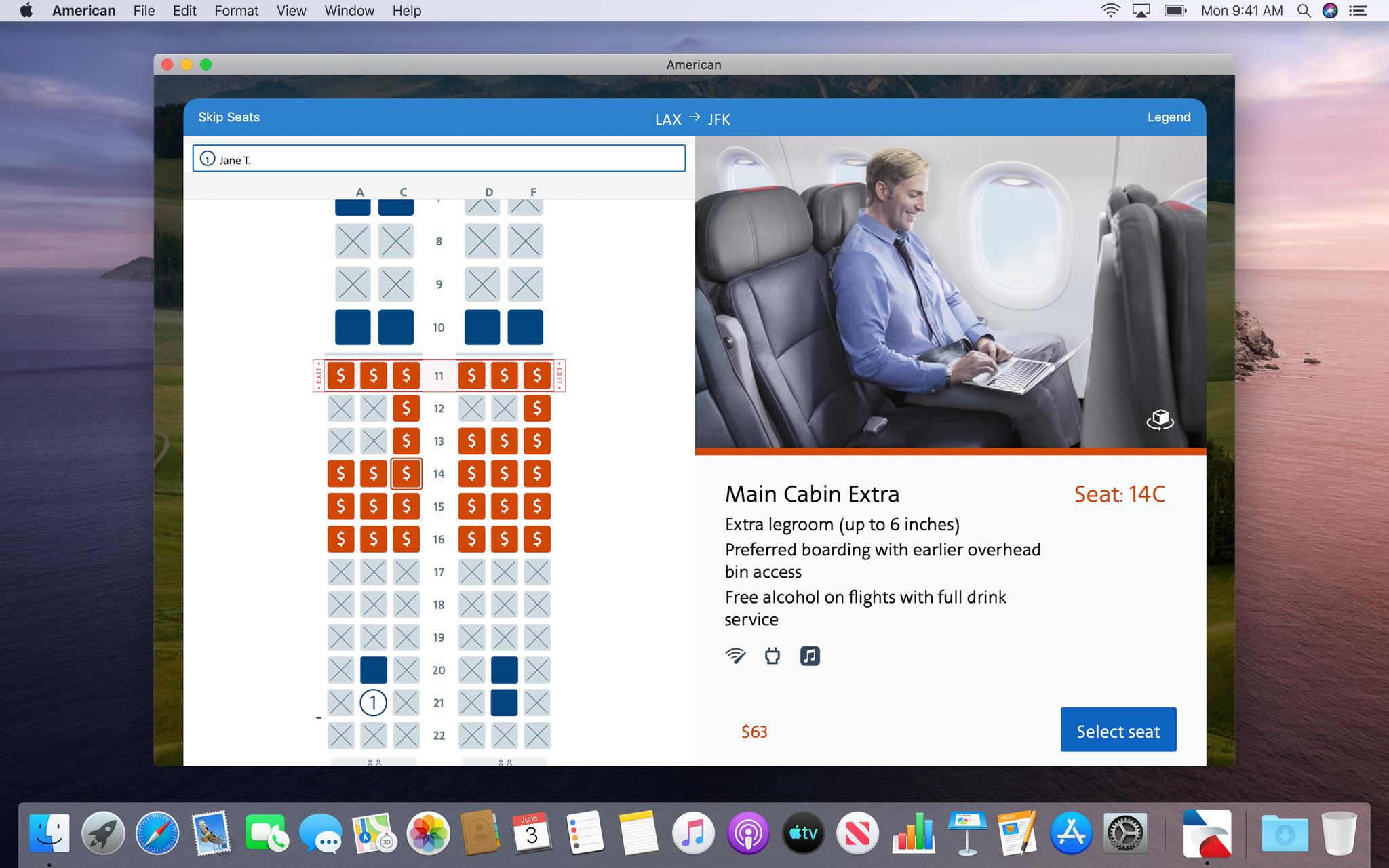
But this year, when Apple opened up Catalyst as a beta to developers, it also rolled out a new Podcast app using those UIKit frameworks and one that's almost indistinguishable from the new AppKit-based Music and TV apps.
Now, Apple isn't going back and redesigning or reimplementing Home, Voice Memo, News, and Stocks to be more like Podcasts, at least not yet. They are adding and polishing a few features here and there, but don't expect any major changes when Catalina launches this fall.
Maybe, hopefully, one day though.
Still, even though it's early days, my take is optimistic. I think there are a ton of developers who would like to move their iPad apps to the Mac, good iPad apps that they want to make into good Mac apps, but just never had the time or resources to learn AppKit so they could do it.
Now, with Catalyst, they don't have too. They can bring their existing iPad apps over and, instead of spending time on AppKit, they can spend that time polishing the interface of their UIKit app to make it into a first-class Mac experience.
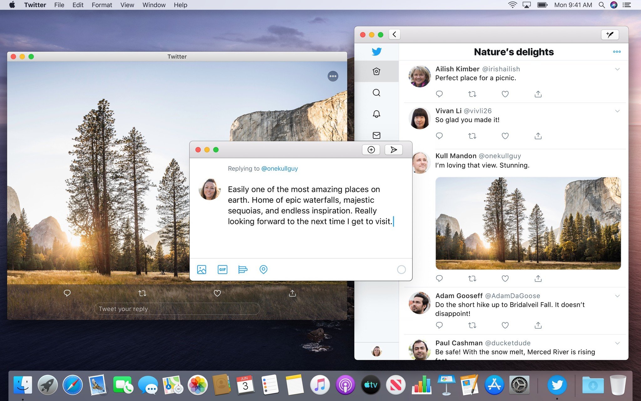
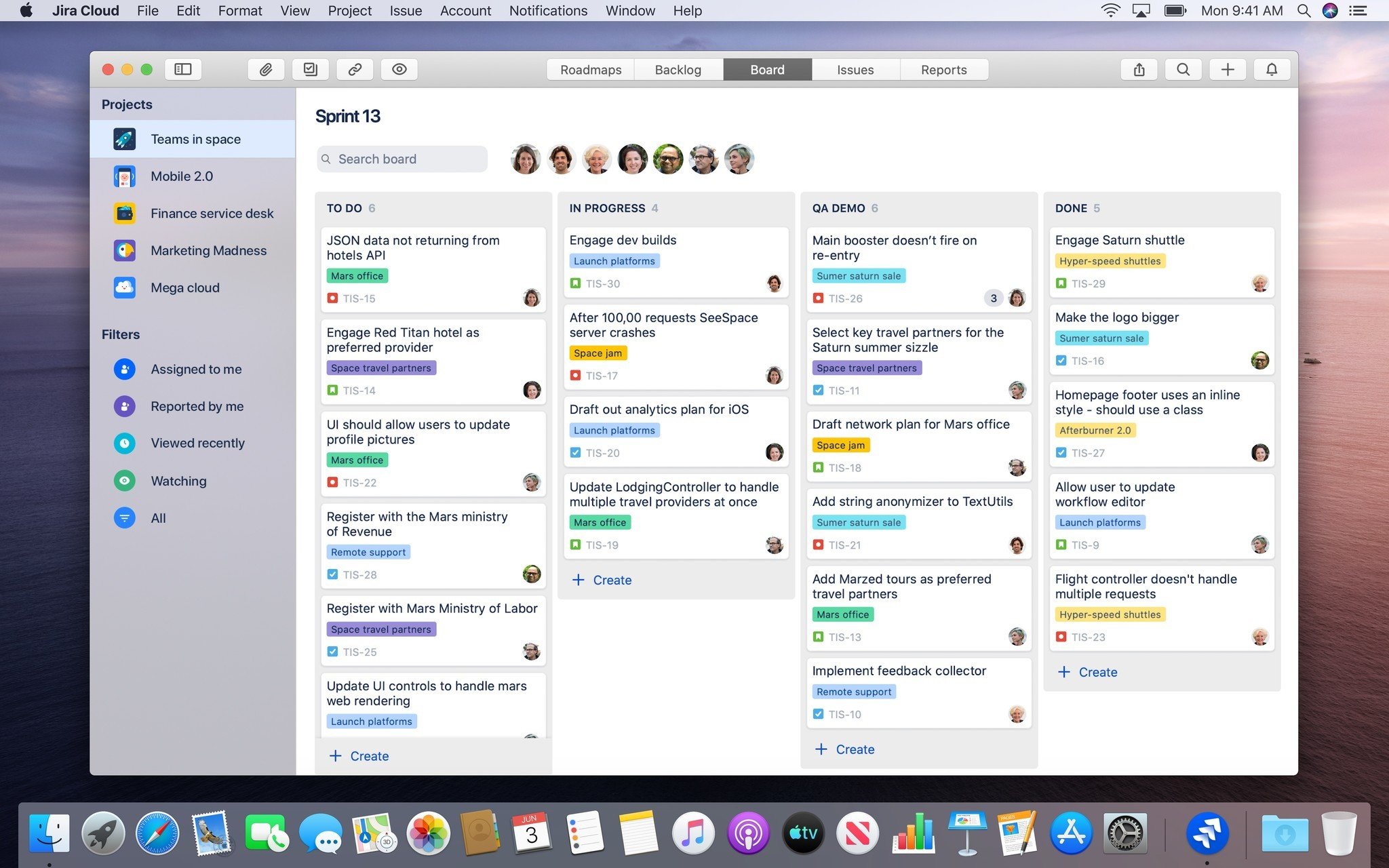
That includes developers that have an iPad app but either never made a Mac version or simply let the Mac version fall fallow over time. For them, a unified codebase makes creating or replacing the Mac app far more efficient. DC Universe and Twitter have already announced they'll be doing just exactly this.
Also, iPad apps that have relied on a website for the Mac. Here, native frameworks allow for far more features and far better performance. For example, Netflix could make a Mac version of their iPad app that would finally bring their 4K HDR content to the Mac.
And then there are my least favorites, the apps that use Electron on Mac, actively wasting my memory and destroying my battery life just to wrap themselves in Chromium for that oh-so-not-so-native look and feel anyway. Those, like Slack and Skype, desperately need to switch to Catalyst and fast.
Since I like to dream about the future, I'll also throw this out: Today you can drag an iPad app into a narrow split view and it takes on the characteristics of the iPhone version. Tomorrow, I want to toss an iPad app onto a 27-inch 16 by 9 external display — effectively what a 35-inch iPad would look like when you correct for scaling — and have it take on the characteristics of a Mac app.
Read the full macOS Catalina Preview

Rene Ritchie is one of the most respected Apple analysts in the business, reaching a combined audience of over 40 million readers a month. His YouTube channel, Vector, has over 90 thousand subscribers and 14 million views and his podcasts, including Debug, have been downloaded over 20 million times. He also regularly co-hosts MacBreak Weekly for the TWiT network and co-hosted CES Live! and Talk Mobile. Based in Montreal, Rene is a former director of product marketing, web developer, and graphic designer. He's authored several books and appeared on numerous television and radio segments to discuss Apple and the technology industry. When not working, he likes to cook, grapple, and spend time with his friends and family.
