The iPad Pro Experiment: Image editing, reading, and music

On Thursday, I'd charged the tablet overnight using the included 12W charger. (Note to multi-device owners, don't charge the iPad with a 5W iPhone charger unless you want it to take 16+ hours.) After an evening's charge, I snapped it into the Logitech Create case, and put it into my laptop bag along with an SD card with recently-snapped photos from a photoshoot a few days prior, my Lightning to SD Card Reader, and my Jot Dash stylus. (Still no Pencil. Sorrow and sadness.)
At the doctor's office, I got a bit of "work" (catching up on Twitter, Slack, and email) done on my iPad Pro before my appointment, and wrote my Day Two outline in Notes. (Still haven't switched to a new writing program just yet.)
After my appointment, I celebrated a clean bill of health with a trip to my favorite local café, loaded up on hot cider and scones, and opened up the Create case. iPad battery level when I sat down around noon: 95 percent.
Processing and editing photographs
My first order of business—after scones—was to take care of a little photo editing. I'd shot some headshots for a friend of mine awhile back as a favor, and needed to resize and crop them for a project he had coming up.
After setting up my iPad, I pulled out the SD card I shot them on, plugged it into Apple's Lightning to SD Card Reader, and imported them into the Photos app within seconds. (Note: While Photos for iOS will import RAW images, I was just working with high-quality JPEG files in this import.)
I've actually done this kind of iPad import a number of times, even before this experiment started. The reason? Pixelmator.
I make a lot of little repairs to most of the hero (big) images you might see on iMore: Usually it's removing dust and dirt on an iPhone or Apple Watch screen, or lightening a background. And for those sorts of tasks, I find a touchscreen far faster and more useful than a mouse and my Mac.
Master your iPhone in minutes
iMore offers spot-on advice and guidance from our team of experts, with decades of Apple device experience to lean on. Learn more with iMore!

With my prior experience, it took less than 20 minutes to pick the best headshot of the bunch in Photos, send it to Pixelmator, copy the headshot template from my friend's email, overlay the template on the headshot, resize it accordingly, remove blemishes with the repair tool, and extend the background to the new resized headshot. Once finished, I sent the final copy in JPG form to my friend via Dropbox.
Largely, I prefer editing and viewing images on the iPad. Your editing program of choice may vary, and some require different things of your images than others—the Photos app offers nondestructive edits and you can work right within the app; Pixelmator requires importing and exporting images from its database; Lightroom builds its own separate images database using Creative Cloud; and so on.
And batch editing multiple photos can be more of a pain on the iPad than Mac, though Lightroom (if you have an Adobe Creative Cloud subscription) offers a great implementation for copying the previous photo's adjustments and tweaks.
If you need to do tiny tweaks, it helps to carry around a stylus like Adonit's Jot Dash (or Apple's Pencil, if you can get your hands on it). Zooming in on a photo and working with the stylus nib lets you change tiny parts of the photo with precise strokes and movements.
Exporting images can be tricky if you, like me, work on the Internet. Very few apps support a true "Export for Web" option; additionally, naming images or changing metadata can be equally problematic if you're uploading them to a server or a content management system.
Lucky for us, Workflow exists. The automator-style application lets you do all sorts of wonderful things to just about any file you have on your iPad, including images. Workflows are pretty easy to learn to build as a newcomer, but there's also a huge gallery available for more complex pre-built solutions.
I have to give a huge hat tip here to MacStories's Federico Viticci for helping me fix my renaming and resizing woes with a great Workflow script: It finds images from your Photos library, renames them, resizes them, and exports them to your destination of choice. (I put them in iCloud Drive, but you can also send images to Dropbox or any other storage location you prefer.)
This script lets me process images faster than I've ever done them on my Mac, and from there, I can upload the resized photos to iMore's CMS, email them, or do pretty much whatever I please. (I could probably build an AppleScript on my Mac to do a similar function, but AppleScript scares me a whole lot more than Workflow. Don't know why. They're not really that different, but such is my taste, I suppose.)
The pain of Google Drive
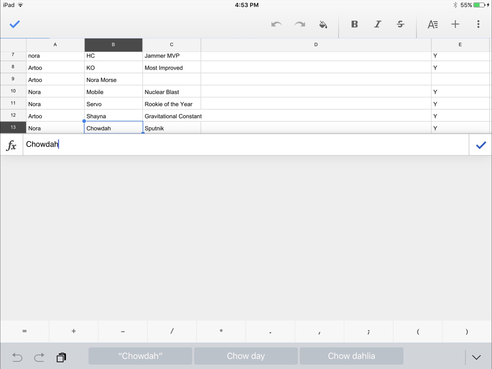
In the midst of fixing my friend's photos, I got a request to edit a Google Sheet for a roller derby event. Now, Google Docs online has traditionally been miserable on iOS—it renders in a special view-only mobile hellscape, and you have to open it in one of Google's iOS apps for it to function correctly.
Google's apps have traditionally been pretty good, though they occasionally goof at collaboration. But on the iPad Pro, they're painfully bad. Just awful. They're upsized, so the graphics aren't crisp, and typing data into a single cell takes up two-thirds of the Pro's screen with an oversized keyboard. If you have a hardware keyboard connected, the giant software keyboard disappears—replaced with a giant grey box.

It's a huge let-down from Google, especially since its web apps don't work properly in Chrome or Safari for iOS. The company has had years to build for dynamic layouts and multiple size classes, and has known about the iPad Pro since September. And yet, its iOS apps make a mockery of doing professional work on an iPad. It's almost impossible. And that's not great for the many people who rely on Google Drive, Docs, and Sheets for organizing their business.
Reading time
Every Friday evening, I like to sit down and catch up with This., a social network based around sharing interesting and in-depth reading. Usually I end up catching up on articles using my iPhone, but as part of the iPad Experiment, I decided to read my This. queue entirely on my iPad Pro.
I unhooked the iPad from the Logitech Create case and swapped it into portrait mode, and began to read the first article—an incredible, though graphic, tale about American veterans and paying it forward.
I'll say this for the Pro: While it's not as comfortable to hold in-hand as an iPad mini or Air 2, it pulls you into graphically-rich stories better than just about any digital device I've used. It's immersive, haunting, and beautiful. And that's just viewing stories and images—I don't read many digital comics or magazines, but I imagine those look just as spectacular.
The Pro probably isn't perfect for every kind of reading—I look at it as more of a coffee table book experience. I wouldn't take it to bed with me, but I'm more than happy to lounge on the couch with it and read the news and features. That big, gorgeous screen does the well-built web every favor—and, alternatively, shows just how terrible the ad-ridden side of the web has gotten.
Siri, play me a party mix
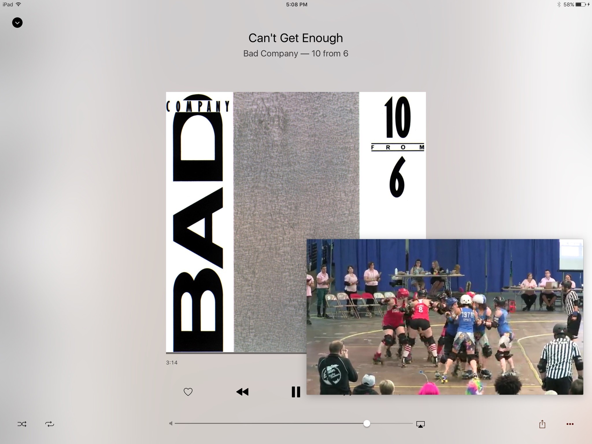
On Friday night, my roller derby team held our end-of-season awards party. Aside from the expected merriment, awards silliness, and chin-ups to "kiss the alien" (don't ask), I had our championship game running on my iPad during the evening in Picture-in-Picture mode along with a few team songs on repeat.

As they passed the iPad and saw the game, I had several teammates remark in surprise over not just Picture-in-Picture, but the quality of the iPad's sound system. I knew it was great, and worlds better than my laptop, but it says something when people who I wouldn't normally categorize as "passionate about sound quality" speak up.
Battery for days
Better yet: After a full day of work, music playing, and background video, I went to bed that night with my iPad at 46 percent battery life.
My 11-inch MacBook Air gets maybe four hours of active battery life if I'm lucky. My iPhone averages around 12-14 before demanding a charge. It's, frankly, a little crazy to me that the Pro could handle 12 hours of heavy work, music, and video—with a Smart Keyboard connected for most of that time!—and come out of it with just under half its battery remaining.
As I wasn't planning on doing much with the iPad over the weekend, I intentionally didn't charge it to see how it would fare in standby; after two days of very light Twitter usage, I checked Monday morning to see 32 percent in the upper left corner. (I used it until noon before finally plugging it in.)
The iPad's battery has always been good, but for me, it's always been the sort of "Good, this is still charged" relief. This experiment is the first time I'm putting an iPad through its paces, and I'm very impressed. As someone whose devices are always on the verge of battery death, the iPad wildly outscores my portable Macs—to the extent that I'm seriously wondering if I might just ditch my laptop after this experiment for battery gains alone. Maybe. We'll see what the other days have in store for me.
Up next: Day Four!
In which I draw with a bunch of (non-Pencil) styluses, do a pseudo cheat during a podcast recording, and camp out at Apple in hopes of a Pencil. Stay tuned!
Serenity was formerly the Managing Editor at iMore, and now works for Apple. She's been talking, writing about, and tinkering with Apple products since she was old enough to double-click. In her spare time, she sketches, sings, and in her secret superhero life, plays roller derby. Follow her on Twitter @settern.

