iPad Pro vs Microsoft Surface: A tablet showdown for writers and artists
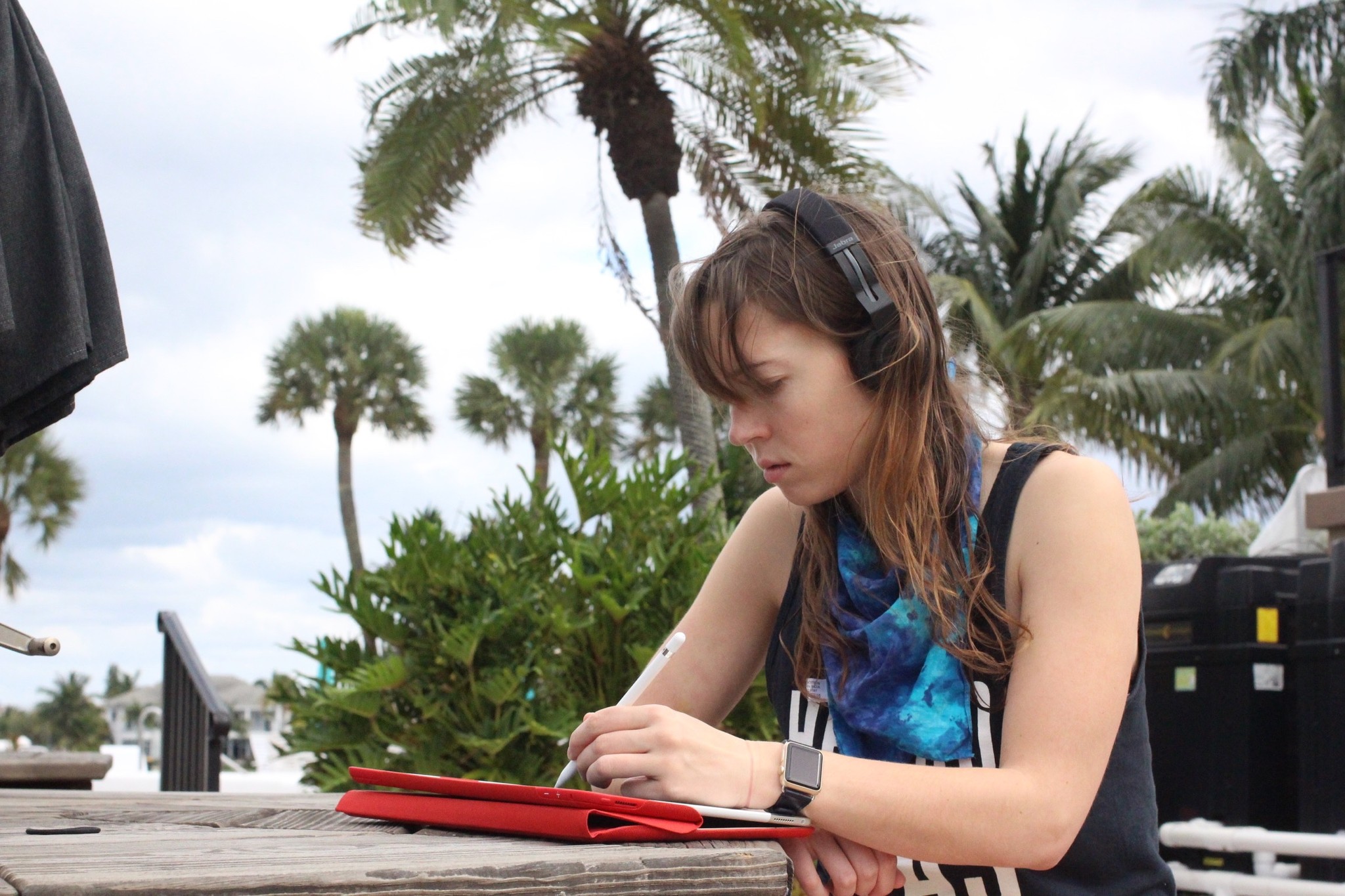
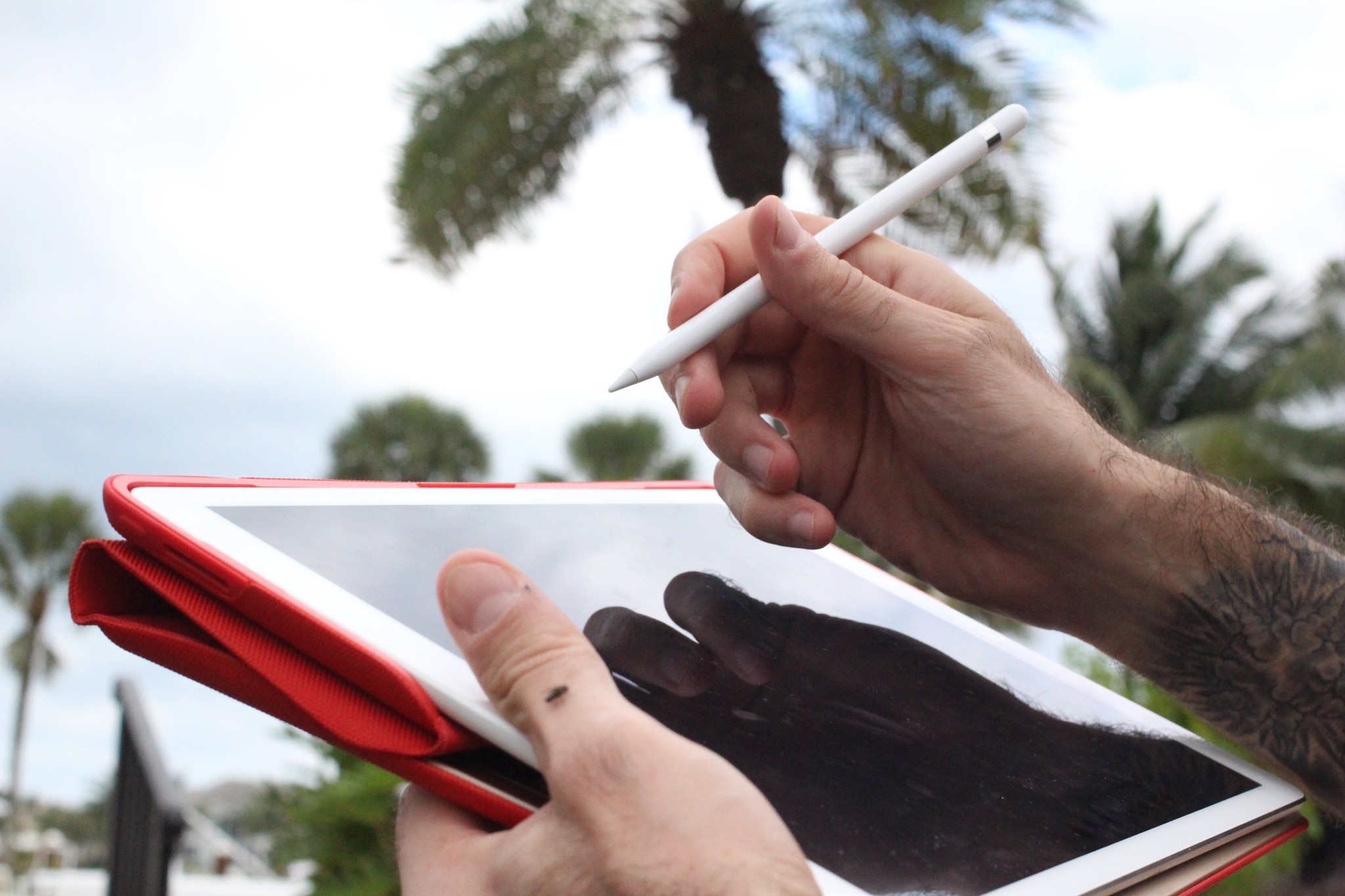
Last week, I took a trip to the offices of our sister site, Windows Central with my iPad Pro and Pencil. I hadn't used the Surface tablets to draw on since the original Surface premiered in 2012, and was very curious to compare the new Surface Pro 4 and Surface Book with Apple's tablet.
First, let me get this out of the way: This isn't a comprehensive review of either iPad nor Surface. In this comparison, I'm looking at both tablets as artist and writing tools, testing pen-related activities and the software that supports them. If you want speed tests and more comprehensive deep dives of how each works as a computer, you'll want to read WC's reviews of the Surface Pro 4 and Surface Book, and our iPad Pro review.
The specs (that matter)
Both the Surface Pro 4 and the Surface Book are marketed as whole computer replacements, and as such, have the capacity for an impressive amount of power—power that rivals MacBook Pro standards. The iPad Pro, in contrast, has an impressive amount of power for a tablet device, but it can't compete against 16GB of RAM or a Core i7 processor.
When it comes to using either device as a sketchpad/writing platform, however, I don't really care about 60FPS gaming possibilities: I want long battery life, smooth interaction with the tablet's stylus of choice, fast brush rendering in artistic apps, and comfort on my lap and in my arms. My ideal tablet should work in tandem with my desktop computer, rather than replace it entirely.
If your goal is to do all your artistic work on your laptop—no desktops allowed—then the Surface is going to be a lot more appealing to you. If you're looking for something to replace to your laptop and work alongside your desktop powerhouse, the iPad Pro is a much more compelling option.
If you want a desktop replacement: Surface Book
If you want a laptop or second screen replacement: iPad Pro
Master your iPhone in minutes
iMore offers spot-on advice and guidance from our team of experts, with decades of Apple device experience to lean on. Learn more with iMore!
In terms of weight, the iPad Pro comes in at the lightest of the three tablets (unsurprisingly, given its lack of additional chips), at 1.57 pounds (1.59 if you have the Wi-Fi and Cellular model). The Surface Book sans keyboard is a few ounces heavier at 1.6 pounds, though if you attach its keyboard base, be prepared for a whopping 3.34 pound total; the Surface Pro 4's base model comes in at the heaviest of the three tablets at 1.74 pounds.
As I picked up all three tablets sans their keyboard options, there wasn't a noticeable difference in weight, but I do prefer the overall feel of the iPad in both landscape and portrait mode. The tablet feels much more well-balanced, even when holding it with a thumb and forefinger by a corner; in contrast, both Surface models feel much more weighty when held lightly in one hand. All are pretty comfortable when writing or drawing sitting down.
If you plan to carry your tablet in-hand: iPad Pro
If you plan to use it chained to a desk or in a lap: Three-way tie
Battery is a big deal here: The Surface Pro 4 and iPad Pro have pretty comparable battery life, packing a 38.2 and 38.5-watt-hour lithium-polymer battery, respectively and promising 9-10 hours of battery life. (Buy a more powerful Surface, however, and expect that battery estimation to go down.) The Surface Book's a different story altogether: It stores most of its battery in that gigantic keyboard. Detach to use as a tablet, and you're looking at just 3-4 hours of battery life.
I didn't do extensive battery testing on the Surface or Surface Book, so I'm taking Microsoft at its word on battery life (and for more on that, you can always visit Windows Central). In my personal experiences with the iPad Pro, the tablet's had incredible battery performance—I've regularly been getting 14 total active hours without recharging when sketching, writing, and listening to music.
If you want great battery life on the go or at a desk: iPad Pro / Surface Pro 4
If you work a lot at your office or don't mind the extra weight: Surface Book
Software differences
No surprises here: Tablets made by Microsoft and a tablet made by Apple are going to run different operating systems, and offer different program compatibility.
The Surface Pro 4 and Surface Book run both Microsoft's Windows 10 tablet operating system and the full desktop version of Windows 10: This means that you can switch from Microsoft's touch-designed environment to the full desktop workflow of Windows 10—and all the awkwardness that comes with small touch targets designed for pointers. Despite not-ideal interactivity, this does mean that you can run full desktop applications on the tablets—like Adobe's Creative Suite.
The iPad Pro, in contrast, is limited to running iOS (though it can also be used very effectively as a second screen for your desktop computer with apps like Astropad and Duet Display. As such, the iPad is primarily limited to programs available in the iOS App Store.
I will say this, however: The traditional version of Photoshop may not exist, but don't discount non-Adobe apps. There are a ton of great photography and graphics applications hiding away that can do just as much as what you might use Photoshop and Illustrator for, if not more. On the sketching side, apps like Paper make for the best unlimited sketchpad you could want; more pro-level apps like Procreate, Pixelmator, Sketch Club, uMake, and others provide high-quality canvases, layers, vector tools, 3D modeling, and export to Adobe-compatible formats like PSD.
I doubt an iPad fits in every creative professional's software workflow right now, but it's worth an investigation. Do you really need the full power that Photoshop or Illustrator offers, or do you mainly use brushes, vectors, layers, and repair tools?
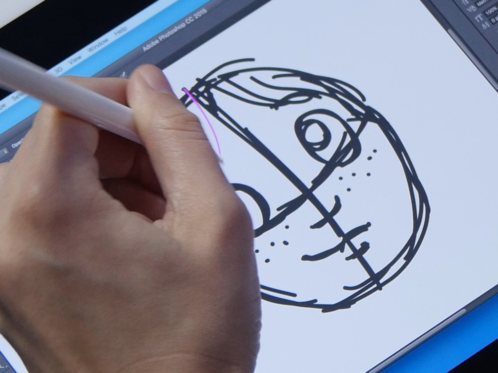
If you do want that pressure-sensitive sketching experience in Photshop, you can turn your iPad Pro into a pressure-sensitive second screen for your desktop Mac—with or without wires!—using Astropad. Astropad currently supports the Pro and Pencil in beta, offering pressure-sensitive drawing with almost no latency between iPad and Mac, thanks to smart refresh tricks from the developers.
Officially, there's been around a half-second delay in my past tests between lines made with the Pencil and when they appear in Photoshop. Astropad combats this, however, by providing a native pink "guide" line on the iPad as you draw: This guide line is as fast as native sketching in Notes or Paper or Procreate, and it tricks your brain into not seeing the latency while you draw.
If you need Adobe apps on your device no matter what: Surface Book
If you want to end up in an Adobe app but do initial work on your device: iPad Pro
If you want a Cintiq-like second screen experience for your Mac: iPad Pro
The Pen and Pencil
Both tablets have their own distinctive stylus: for the Surface, it's the black, blue, or silver Pen; for the iPad, it's the white-and-silver Pencil.
Unlike the Pencil, the Surface ships with the Pen—you don't have to buy one separately, though you can upgrade your older Surface tablet's pen for $60. Microsoft acquired N-Trig and its active pen technology last year, and used it to upgrade the Pen significantly for the Pro 4 and Surface Book. For those not in the know, N-Trig's secret sauce is much like Wacom's—a combination of pen input with an integrated digitizer and controller built into the tablet.
The Pen now sports 1024 levels of pressure—similar to an entry-level Wacom tablet—and offers multiple pen tips to draw with. (In my tests, those tips seemed to be based solely around artist drawing comfort, rather than changing the line style or width of the Pen.) It connects to the Surface Pro 4 via Bluetooth, is powered by a sole AAAA battery, and attaches to the tablet with magnets for easy (ish) storage. Oh, and there's a small slender button and an eraser, though I didn't take much advantage of either while drawing.
Apple's Pencil contrasts in a number of different ways. It ships separately from the iPad, for $99. It uses a very different technology than either Wacom or N-Trig, relying on the iPad's refresh rates, special software, and internal chips within the Pencil to get the most accurate line. Apple hasn't stated any official pressure levels for the Pencil, nor has it even made an indication that it wants to use that metric to compare the Pencil with the Surface or Wacom pen technology.
There's just one tip currently shipping with the Pencil—a hard rubber pencil-like nib—though you get a spare in the box, and there's no digital eraser, pen clip, magnetic storage, or extra buttons to be found. And the Pencil needs no batteries: Instead, it charges using a built-in Lightning Connector.
Given the Pencil's extra cost and lack of extra bells and whistles, it's easy to write it off and declare the Surface Pen the better tool on looks and outward function alone. But 90 percent of a stylus's job is drawing and writing, and this is where the Pencil dominates.
The Surface Pen feels like pretty much every Wacom or N-Trig pen before it has felt: plastic and click-click-clicky. It's a motion artists have gotten used to over years of digital drawing, but it doesn't come close to the natural drawing experience on paper. The Pencil, while still not a true replacement for the texture of paper and pen, is much more solid in your hand—its weight, length, and balance feels right for this sort of tool. It doesn't eliminate the "drawing on glass" feeling, but the nib is much more muted on the glass surface, and pressing into the screen feels much more natural than it does with the Surface Pen.
Did I notice not having an eraser and extra buttons? Honestly, no. Like Rene, I haven't worked with a built-in eraser for drawing or writing since grade school—and even on my Wacom, the eraser was clunky. It also encourages me to use actual art techniques when I do digital pencil drawings—shading with lighter greys and whites to remove strokes rather than using a blunt (and, honestly, very digital in its execution) eraser.
Similarly, buttons remind me that I'm drawing digitally: I'd much rather physically touch or swipe on the surface to undo. Gestures make undoing a stroke feel like brushing away charcoal fragments; pen button clicks are much harsher—and worse, easier to trigger accidentally.
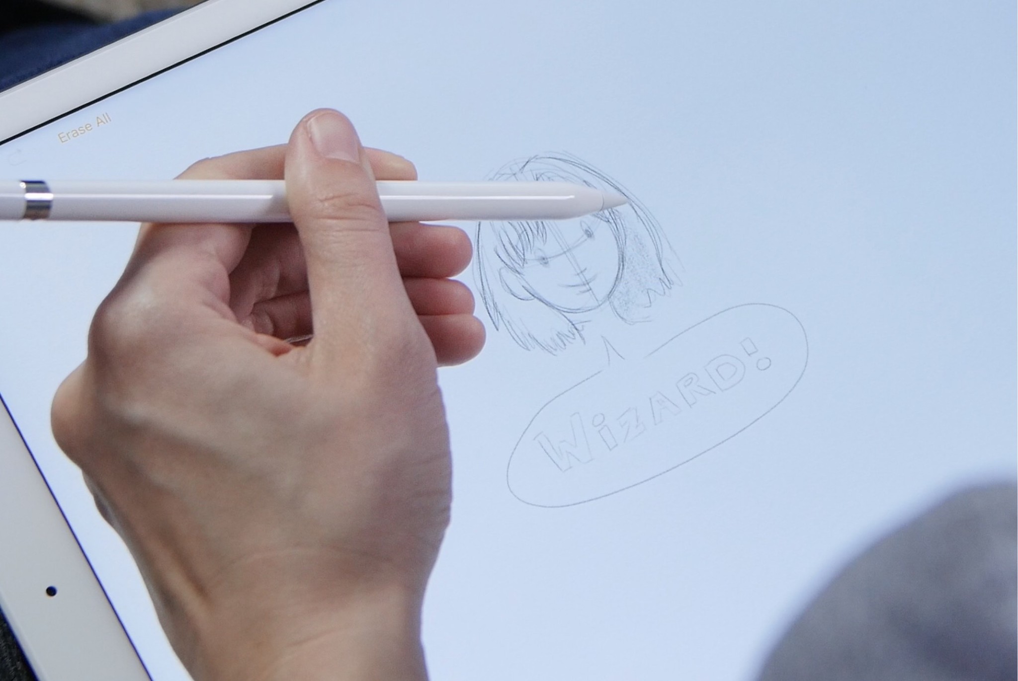
I didn't miss the eraser on the Pencil. But I quickly missed the Pencil's tilt-to-shade technology when drawing on the Surface. It, above all else, makes the Pencil feel natural in a way the Surface Pen does not. Digital artists have become accustomed to relying on the same tiny nib for all tools, whether we're using inks, pencils, big brushes or little. With tilt-to-shade, the Pencil isn't just a dumb-but-pressure-sensitive tool: It reacts to your movements on the digital paper in the way styluses of old just can't. It's a glimpse of the future.
Is the Pencil more expensive and more limited? Absolutely. But to me, both of those were the right calls: The Pencil is the best digital stylus I've ever used by a mile. Apple's unique take on pressure-sensitive drawing makes it feel different and more comfortable than the Surface Pen or a Wacom stylus, and tilt-to-shade is a very comfortable way to color and enhance drawings. And while Lightning port charging looks odd, I vastly prefer not having to stress out looking for a AAAA battery if my stylus runs out of power while on the road.
If you like eraser nibs and Wacom-style pens: Surface + Surface Pen
If you want a better drawing and writing experience: Apple Pencil + iPad Pro
The writing and drawing experience
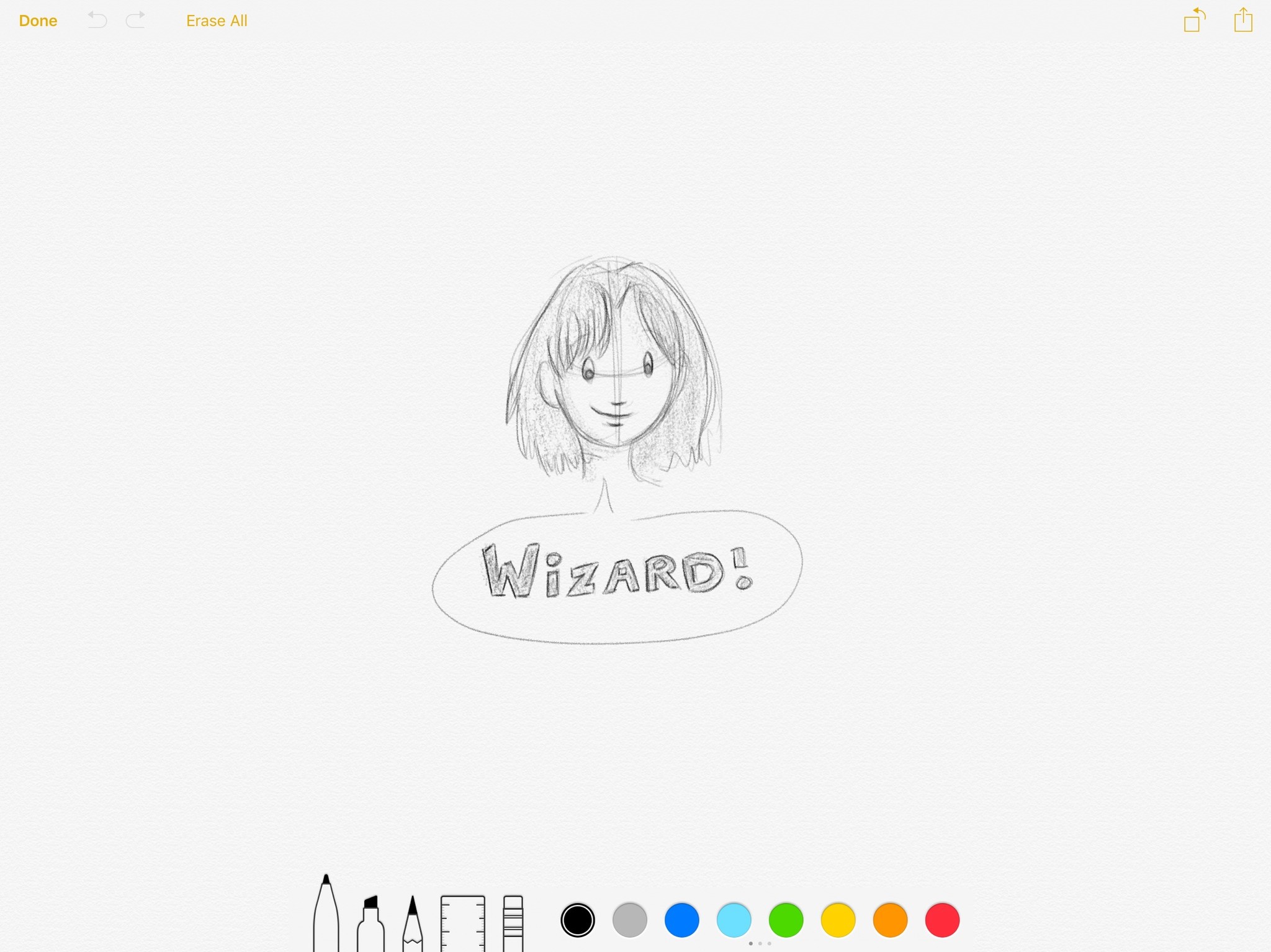
During my tests, I used a few different programs on the Surface and iPad Pro. I wanted to compare the company's entry-level drawing apps, so my initial round of tests were done in Fresh Paint on the Surface, and Notes on the iPad Pro.
I also took a look at the Adobe experience on both platforms: On the Surface Book, that meant Photoshop Express; on the iPad Pro, I tried both Adobe Sketch and Astropad while running Adobe Photoshop on a MacBook Pro
You can see my full tests below. If I were to do these again today, I'd probably have added OneNote, as well, since the app is available on both platforms.
Don't want to watch the video? Here's the skinny: Both tablets are great at writing and drawing, but the iPad Pro edges out for me in terms of overall experience.
Writing and drawing is about as precise on both the Surface and iPad Pro, though I did find that writing in small letters was much more comfortable and readable on the iPad. Overall, the tests were mostly draws (no pun intended): You're going to get a pretty good result whatever tablet you use.
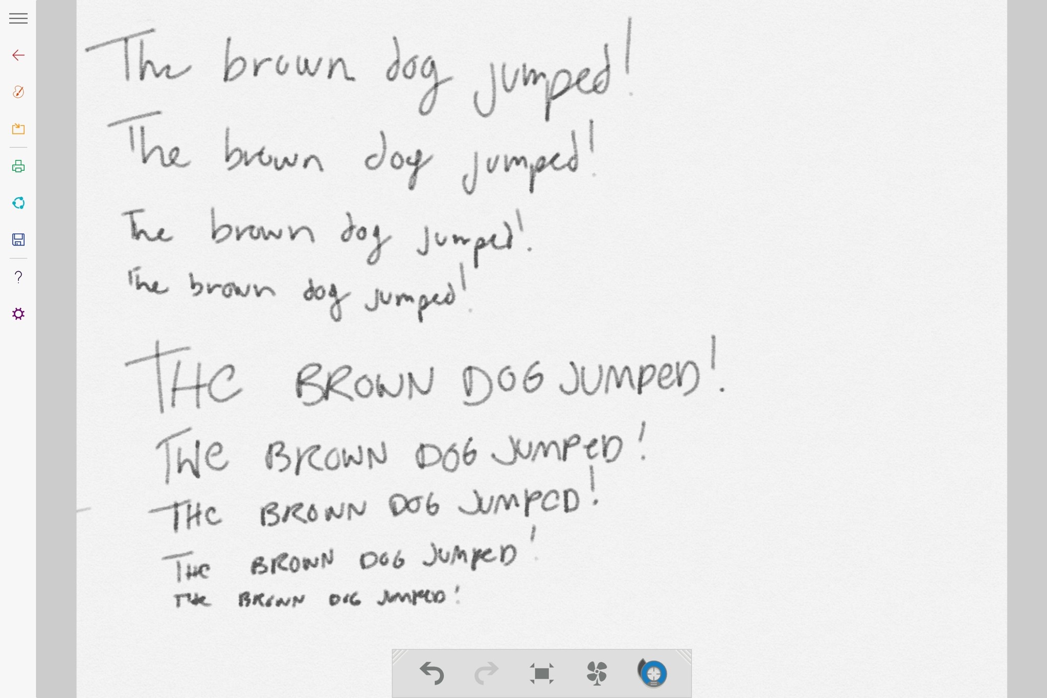
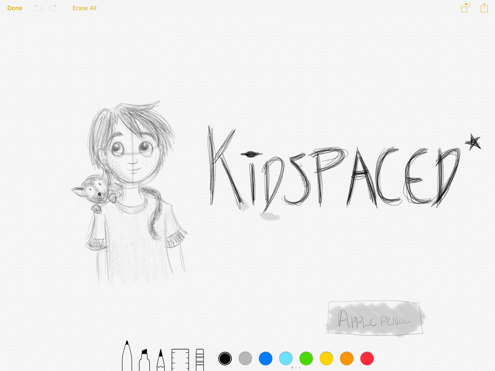
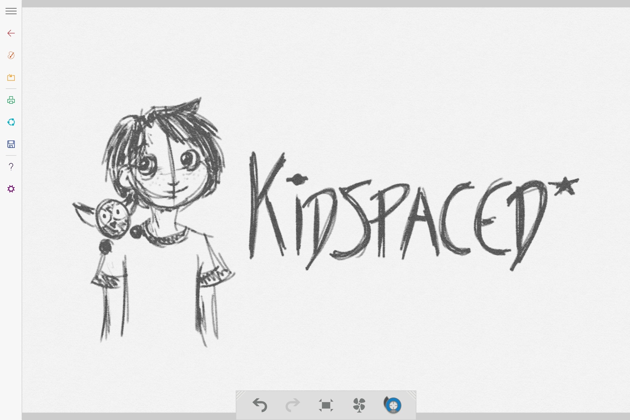
But if you care just as much about process as results, the Surface may let you down. The tablet's insistence on hovering cursors (a default holdover from the mouse-based Windows environment) in many of its apps is frustrating—it doesn't feel nearly as natural as working directly on the screen. I don't want to see where the pointer is, because I should trust that both pens are going to be precise and mark where I'm pressing. While you can disable this setting, it's still odd that Microsoft makes it the default when it has a pretty precise engine in place.
As I mentioned in the stylus section above, Microsoft's tablet reminds me a lot of digital drawing experiences past. It feels like a Cintiq—which is awesome for those looking for that Cintiq experience—but again, that's a continuation of the old guard. Not a reinvention for the better.
In contrast, the iPad Pro and Pencil is a step forward in drawing technology. There are no pressure ratings, because the stylus just works the way you want it to. It's more comfortable to draw with: There's no faux pointer showing where your pen's cursor is because you just don't need it. And when it comes to default apps, Notes just smokes Fresh Paint. Even with a more limited color palette and tools, the app looks so much more natural.
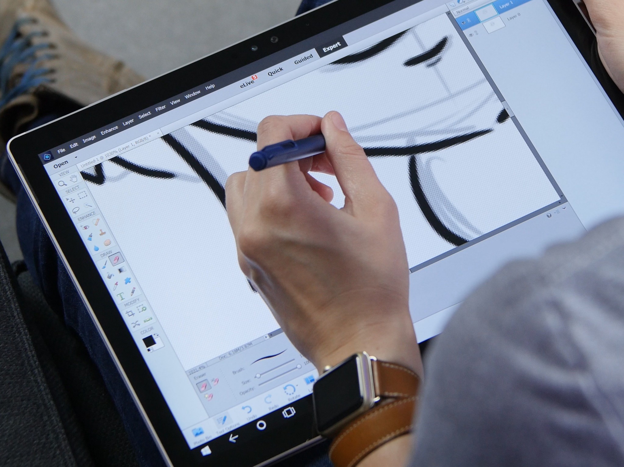
If you need to work in the full version of Photoshop or Illustrator on your tablet and you're used to the Cintiq-style experience, the Surface is going to win out. Adobe's apps are scattered to the winds on the iPad, and their tools, while great, are limited. But the iPad Pro is a great excuse to step forward and embrace digital drawing both on the go and at your desk, especially if you work in tandem with a more powerful desktop computer. (Unlike iOS's Astropad, the Surface Pen won't work with pressure sensitivity if you run a second monitor app on your Surface Pro or Surface Book.)
If you're comfortable with the old Cintiq-style experience: Surface Pro or Surface Book
If you want a more natural digital drawing experience: iPad Pro
What should you get?
This brings us to the big question: Which tablet is the right one for you? Ultimately, it's going to be the one you enjoy working with and that meets the requirements you need for your artwork or writing.
The Surface Pro and Surface Book are great machines, and I don't begrudge anyone in the art community for picking one up. If you want something that's going to act as your primary computer while on the road or at home, the Surface line has a lot going for it. The Pen feels like a Wacom-style tool, and you can get incredibly precise lines and strokes when you write with it. And you can use any desktop apps natively, which can be a huge boon for your workflow.
Where the Surface fails, however, is where the iPad Pro shines. The Pro may not be as powerful but has better battery life, a more natural-feeling stylus, superior entry-level apps, and is an outright joy to draw with. It's a digital sketchbook and idea machine, and you can hook it up to your desktop Mac using third-party software to get a very close approximation of a true Cintiq drawing experience.
To borrow an oft-quoted metaphor, the Surface Pro and Book are the trucks in the drawing tablet world—great, reliable machines that revere and model themselves after digital sketching tablets of old. The iPad Pro is the upstart electric car—it may not be as full-featured as the Surface, but it doesn't need to be to achieve its goal. It wants digital drawing to feel as fun and energetic as drawing in a real sketchbook, and it does.
Right now, there are going to be artists who still need or want trucks for their daily drivers, and that's fine. And if you have a Surface Pro already, I don't think you need to trash it and go running for an iPad. It's an excellent tablet for drawing and writing as-is. But for me, the iPad Pro's drawing experience is so obviously the way of the future that—at the very least—trying one is a no-brainer.
Serenity was formerly the Managing Editor at iMore, and now works for Apple. She's been talking, writing about, and tinkering with Apple products since she was old enough to double-click. In her spare time, she sketches, sings, and in her secret superhero life, plays roller derby. Follow her on Twitter @settern.
