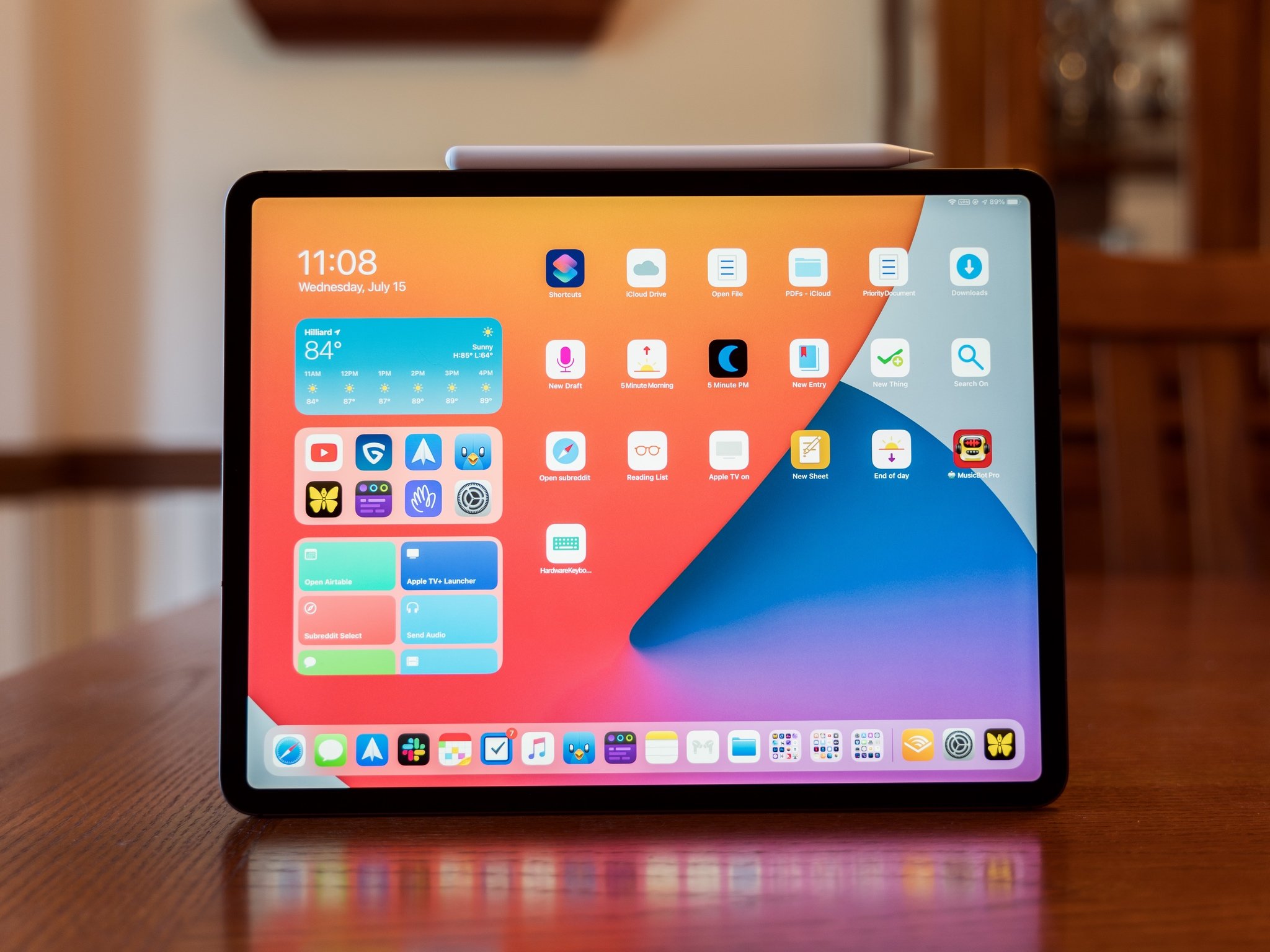
iPadOS 14 is here, ready for anyone to download and use. It's full of excellent refinements to the iPad experience, like more refined app design and a compact user interface, to a few entirely new features, like Scribble. I've found it to be an exciting update that truly enhances how I use my iPad.
Let's dive in.
○ Improved app navigation and design
○ Home screen widgets
○ Overhauled search UI
○ Scribble handwriting-to-text feature
○ Refined Messages experience
○ Improved Notes app
○ Redesigned Shortcuts app
iPadOS: Availability
The first big question you need to answer when thinking about downloading the latest version of iPadOS: can I?
Basically, if your iPad ran iPadOS 13, it'll run iPadOS 14. This means that every iPad released since 2014, except for the iPad mini 3, will run iPadOS 14, which puts it ahead of even iOS 14 for backward compatibility.
But so you have a full picture, these are the devices that are compatible with iPadOS 14:
- iPad Pro 12.9-inch (4th generation)
- iPad Pro 11-inch (2nd generation)
- iPad Pro 12.9-inch (3rd generation)
- iPad Pro 11-inch (1st generation)
- iPad Pro 12.9-inch (2nd generation)
- iPad Pro 12.9-inch (1st generation)
- iPad Pro 10.5-inch
- iPad Pro 9.7-inch
- iPad (8th generation)
- iPad (7th generation)
- iPad (6th generation)
- iPad (5th generation)
- iPad mini (5th generation)
- iPad mini 4
- iPad Air (4th generation)
- iPad Air (3rd generation)
- iPad Air 2
iPadOS 14: What's new
iPadOS 14 might be light when it comes to brand new features, but it does offer some substantial improvements to the overall iPad experience.
From the addition of Home screen widgets and Scribble handwriting-to-text feature to improvements in Messages, Notes, Shortcuts, and more, there's plenty to love in iPadOS 14. That's on top of some interface improvements across all apps in the form of Compact UI for elements like Siri and a snazzy new design for search.
For the most part, the changes in iPadOS 14 are about refining the iPad's dedicated software and upgrading existing experiences. And since your iPadOS 13-running iPad can handle the upgrade, there's no reason not to make the most of these improvements.
iPadOS 14: First things to do
So, you've gone ahead and downloaded iPadOS 14 and want to know what you should try out first. Since it's one of the marquee new features, getting set up with a few Home screen widgets is a great place to start. A bunch of Apple's own apps and those from third-parties have widgets available so you can use this space to ensure you have important information available at a glance.
If you're an Apple Pencil user, we recommend you try out the new Scribble and Notes features in iPadOS 14. The Pencil is a huge focus in this update with both the first- and second-generation Apple Pencil gaining new capabilities in the latest software.
You'll probably also want to get to grips with Messages mentions and in-line replies, dive into some Shotcuts, and just enjoy the improvements in UI across the board.
iPadOS 14: App design
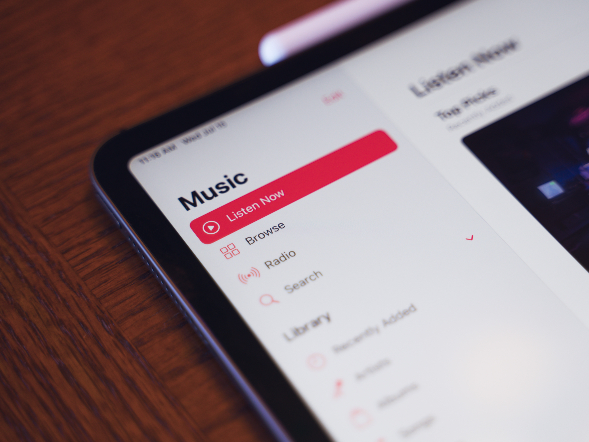
Apple has rethought how you should navigate many of its apps on the iPad. This is done using design elements that have been more traditionally Mac-like, such as sidebars and drop-down toolbars.
For a long time, Apple seemed content to make what essentially amounted to blown-up iPhone apps for many of its core experiences. Sure, Apple's apps have done a better job of taking advantage of the space of the iPad than most "blown-up iPhone apps" do, but that doesn't change the fact that a lot of the design elements, like the bottom navigation row, was designed primarily for the iPhone.
In iPadOS 14, that's changed, and you might be amazed at how much of a difference it makes. It might sound wild that I'm talking about sidebars and toolbars like this, but once you experience it, I think you might agree with me, at least a little.
Music is a perfect example of the benefits of the new design. In iPadOS 13, to find your playlists, you need to tap Library at the bottom of the screen, then Library in the top-left corner of the screen, then tap playlists. On iPadOS 14, your playlists just sit in the sidebar. All you have to do to find one is open Music, scroll down the sidebar, and pick it from the list.
Your library is also separated from the rest of the Music app. This makes sense because the rest of the primary sections, Listen Now, Browse, Radio, and Search, connect back to Apple Music, while your library might just be your collection of purchased or uploaded music. And again, it's all there on the sidebar, so you're not jumping around to different pages or digging through menus.
It might seem that this is Apple making the iPad more like a Mac, and to an extent, it is.
Files is another app that benefits from the new sidebar design. While Files has had a sidebar since its debut on the iPad, controls for creating new folders, organizing your files, or changing the app's layout were hidden. You'd have to scroll to the top of a view, then pull down to expose them. Now, all of that sits in the top-right corner of the app. Tap the three-column button to show the single drop-down menu that lets you change the view and how items are sorted. It dramatically enhances usability.
Now it might seem that this is Apple making the iPad more like a Mac, and to an extent, it is. When you add Mac-like design touches, you get a more Mac-like experience, after all. And these new sidebars and toolbars work great with the recently enhanced trackpad and mouse support. But that's not the end of the story.
See, these sidebars and toolbars just make these apps more comfortable to use. I no longer need to take my hand off of my iPad and move it across the screen to navigate to the Browse section of Music anymore. I just touch the Browse control with the thumb of my left hand (which is already holding the iPad). No more tapping Albums, then scrolling left and right for some and up and down for others in Photos. You just find all of your albums in the sidebar.
It all means less drilling down into menus, fewer hidden controls, and more time with the content you actually want to experience.
iPadOS 14: Search
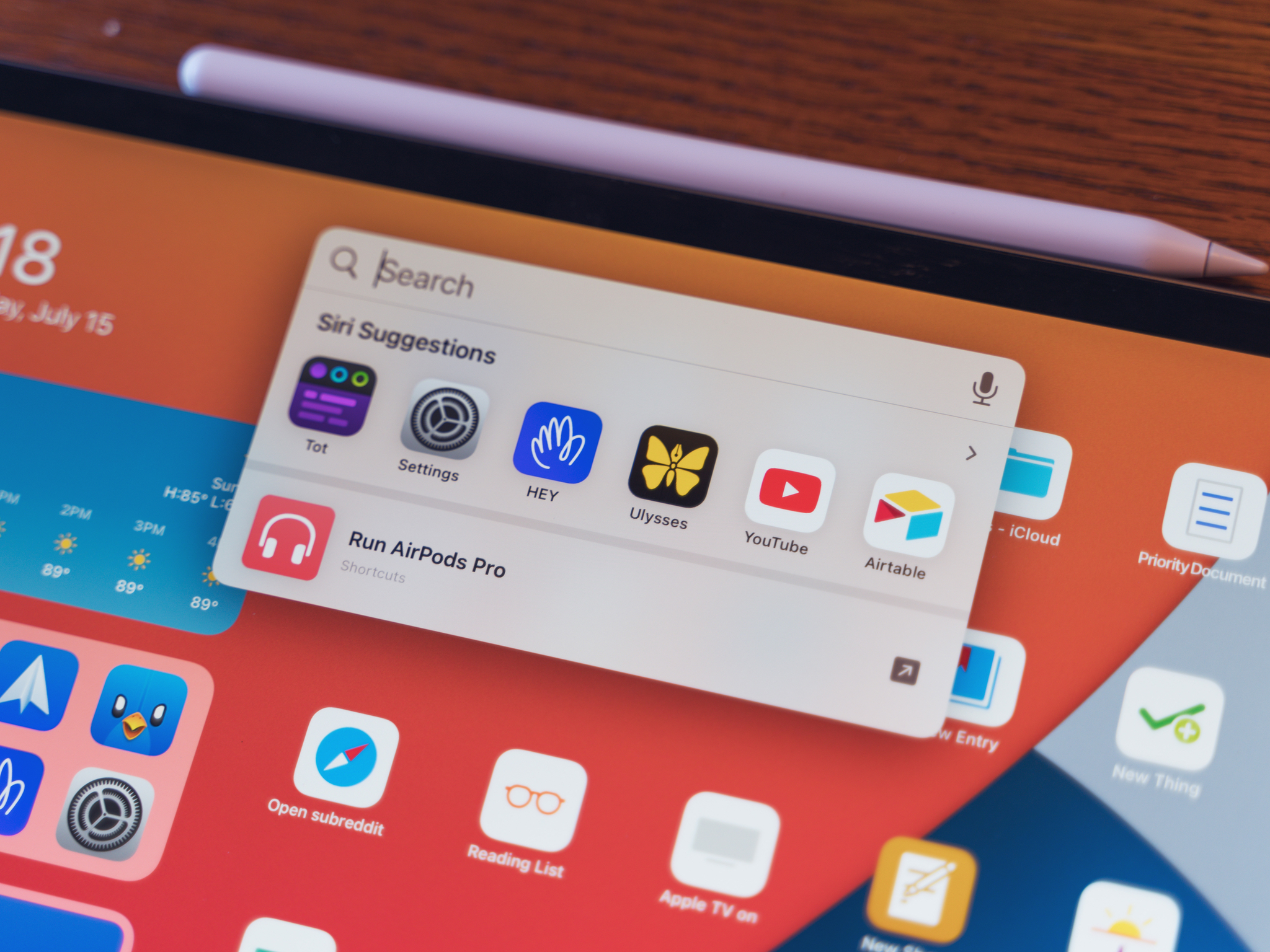
Search on iPad is getting a visual overhaul, and not a few under-the-hood upgrades. While search doesn't function any differently in iPadOS 14 than it does in iPadOS 13, it feels a lot better. This is one of those things that can come down to personal experience, but search in iPadOS 14 seems to be a lot better than in previous versions.
It starts with the interface. Instead of taking over your entire screen, search now pops up as a slim bar a bit up from the center on your iPad's screen. It looks almost exactly like Spotlight on the Mac, in fact. It doesn't fade out your content, just floats on top of it, and it looks good whether you bring it up on the Home screen or in an app. And because of this new, more streamlined interface, the list of results doesn't take up your whole display. Everything stays confined to a nice little rectangle, just like on the Mac.
Then there's what it can do. If you've extensively used search on your iPad before, you'll be familiar with its essential functions like searching the web, opening apps, and combing through your files. In iPadOS 14, it still does all of this, but it does them faster. Results start appearing earlier, and they're usually right on the money, or at least very close, when they do.
iPadOS 14: Compact UI
Apple has made several design changes to both iOS and iPadOS this year that fall under what Apple's calling Compact UI. Essentially, it means that interface elements take up only the space they need to when you're using them. Siri no longer takes up the entire screen, and instead just pops up in the bottom-right corner of your iPad. Incoming calls now pop down from the top of your device like a notification instead of taking over the whole device.
The compact interface design helps the iPad feel less like an iPhone afterthought and more like its own system. It's an extension, in many ways, of the changes started in iPadOS 13 with the ability to pin widgets to the side of the Home screen. The iPhone is getting a more compact Siri and phone call notifications, too, but they feel different on the bigger screen of the iPad, more at home. I'd go so far as to guess that more compact UI features were designed for the iPad first, then brought down to the iPhone, a nice change of pace.
In a way, things like search, app design, and Compact UI highlight what might be the primary theme of iPadOS 14: refinement. As we'll see, much of iPadOS 14 hinges on improvements to existing experiences, such as Messages, Notes, and the Apple Pencil, with fewer out-and-out 'new' features.
iPadOS 14: Scribble
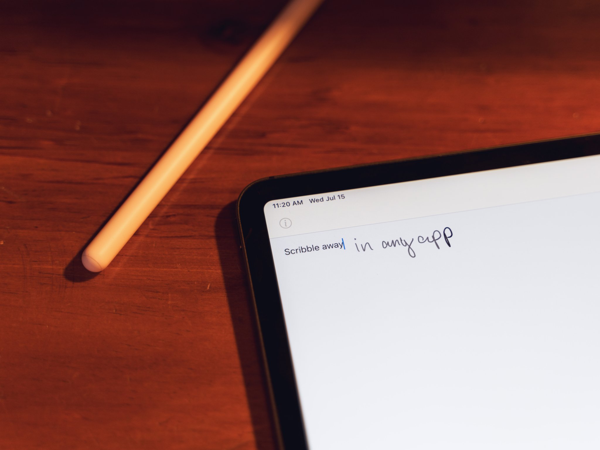
Of course, the second I talk about how 'iPadOS 14 is all about refinement,' I immediately jump into a brand new feature. But Scribble is both a brand new feature and a refinement of the Apple Pencil experience, so there's that.
Scribble is a truly impressive new feature that lets you use the Apple Pencil to write by hand in standard text fields, then watch as that handwriting turns into typed text. You can handwrite your text messages, emails, or even web links and have them transform into typed text as though you had used a keyboard.
The idea behind Scribble is relatively simple: if you're using the Apple Pencil to do something like draw, paint, or take handwritten notes, then you shouldn't have to stop using it to do things like responding to a text message. I would never suggest that you pick up and use an Apple Pencil specifically to write out your text messages, but if you're already using one, you don't have to put it down and start using a keyboard. It's a great sort of experiential continuity that makes using the Apple Pencil even better.
The technology behind Scribble is equally impressive. As you might expect, Scribble is powered by Apple's machine learning tech, but what's critical here is that you don't have to train Scribble before you start using it. You just start writing with your Apple Pencil, and Scribble will translate that into text. This also means that, unlike previous versions of handwriting-to-text software, you don't need to learn a specific way of writing.
You don't have to train Scribble before you use it. You just start writing.
There are, of course, certain Scribble gestures that are worth learning. You want to delete a word? Just scratch it out with your Apple Pencil. Circle one or multiple words to select them. Need to separate one word into two? Just draw a small vertical line where you want your separation.
All of these features serve to give Scribble a near-magical feeling when it gets everything right. And I should say that, at the time of this writing, Scribble gets a lot more right than it does wrong, even with my less-than-perfect handwriting. But there are always issues, depending on how you write. For instance, sometimes my lowercase "m" looks a little more like a "v" with an "n" attached to it. And that's sometimes how Scribble can interpret that. But those issues have been surprisingly rare given what the technology is being asked to do.
And that connects to one big thing to be aware of with Scribble if you're jumping into the iPadOS on day one: there is no autocorrect. Scribble doesn't apply autocorrection to anything you write; instead, just translating what it 'sees' into typed text. But you can get those blue 'this might be a mistake' lines under words that the system might have had trouble with, which you can tap to find a replacement if you need to quickly.
I think Scribble might just be the single coolest feature to come out of this round of Apple software releases. In my few weeks using iPadOS 14, I've found Scribble to almost be the AirPods of software feature: something that just works in ways that both surprise and delight.
iPadOS 14: Notes
iPadOS 14 is probably the most significant release for the Apple Pencil since it was announced, and along with Scribble, Notes is a big reason why. The new features of Notes all revolve around the Pencil in some way and make writing by hand a more powerful option than it's ever been before.
In previous versions of iOS and iPadOS, handwriting has been, if not an afterthought, a second-class input citizen compared to typing, including in Notes. Though Notes has offered support for handwriting and sketching for a while now, that was really all you could do with it.
But with iPadOS 14, that's changing. The first significant addition to Notes is Smart Selection for handwritten text. Just as you can for typed text, just tap, hold, and drag your finger over text written with the Apple Pencil to highlight it. Double-tap to select a single word, while triple-tapping selects a sentence, and you can make these selections with your finger or the Apple Pencil itself.
In previous versions of iOS and iPadOS, handwriting has been an afterthought but that's changing with iPadOS 14.
After highlighting your text and bringing up the contextual popup menu that would allow you to perform actions such as copying, you'll see a new option: Copy as Text. What this option does is take your handwritten text, copy it, and then when you paste it, pastes it as typed text. This lets you take your handwritten text from Notes and paste it in, say, Pages.
Another new Notes feature is shape recognition. Notes now recognizes when you're using an Apple Pencil to draw shapes like circles, squares, stars, and pentagons, and helps you create geometrically perfect ones. To do this, simply draw the shape with your Apple Pencil, then when you've reached the end of the shape, continue to hold the Pencil to the screen momentarily until the shape snaps into geometric perfection.
Finally, and this one's huge for me, we have data detectors. Notes has supported data detectors for a while now, identifying things like dates, addresses, and web links in the text you've typed. Now, those data detectors support handwriting, too. So if you handwrite a bunch of notes, or even scribble a date in the margins of an existing typed note, Notes will recognize it for what it is and link to the relevant task. For instance, if you write a date, tapping it after it's highlighted by Notes will cause the New Event creation view to pop up.
I'm not sure I'd ever pick an Apple Pencil instead of a Smart Keyboard for text entry on my iPad Pro, but iPadOS 14 has done a lot of impressive work to make that possible.
iPadOS 14: Messages
Messages is another excellent example of how Apple is refining the user experience with this year's software releases. Every change made in this app improves the communication experience, whether you're talking to a single person or a group.
Pinned conversations make sure that the threads you care about most are always easy to find. You can pin up to nine conversations to the top of the app, and they can be both individual conversations or group chats. When someone in a pinned conversation says something, their latest message will appear in a speech bubble over the conversation's pinned circle at the top of the app. Recent participants in a group conversation will have their avatars animate around the pin.
Group conversations are getting the bulk of the benefits of these new Messages features. In a nice little touch, you can now set an image for your group Message. Just be aware that the image you choose, say, a hotdog emoji, is what everyone in the conversation will see, so pick carefully.
There are more substantial changes, too. Mentions have come to Messages. With mentions, you can have a group conversation on Do Not Disturb, and only get alerts when your name is mentioned. And unlike apps like Slack and Discord, you don't need to put an "@" in front of someone's name to mention them. Just write their name, tap it, then tap their avatar that pops up. Messages will highlight the name in your text in blue to indicate that the person is being mentioned in your message.
The other big Messages feature for group messages is inline replies. Use this feature to reply to a specific message within a conversation. So if someone mentions you in a message, for instance, you can tap and hold (or two-finger click/right-click with your cursor if you're using your iPad with a trackpad or mouse) and select Reply from the menu. The reply you type will only be seen by the person you replied to, though anyone could tap on it to see it.
All in all, Messages is seeing a robust set of updates in iPadOS 14, and I'm really looking forward to my friends getting their hands on the update so that I can be continually spammed with mentions in our group chats.
iPadOS 14: Widgets
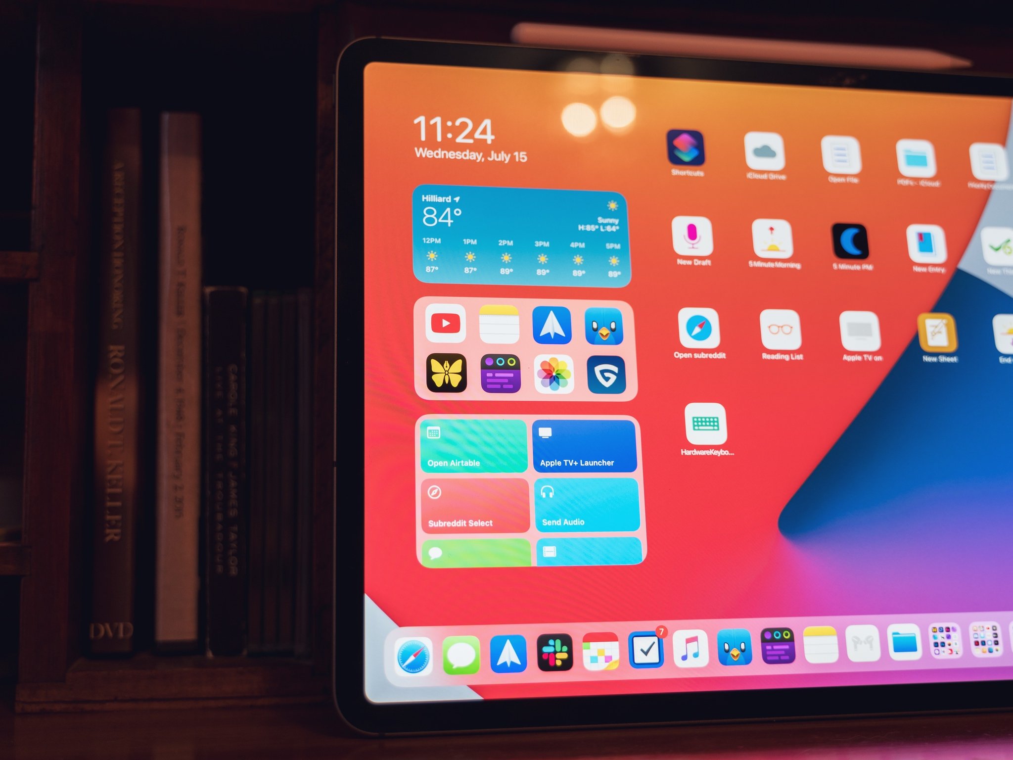
When it comes to widgets in iPadOS 14, there wouldn't seem to be too much to report, at least compared to iOS. On iOS, your widgets can now live on the Home screen, taking up space once reserved for apps. You can, in fact, have a whole screen full of widgets with nary an app icon in sight.
But this isn't the case for iPadOS 14. Apple's reasoning seems to be that because you can have the Today view on your Home screen already, you don't need to be able to place widgets elsewhere on the Home screen. You have them readily available on the left-hand side of your screen, so the changes Apple made on the iPhone aren't necessary on the iPad.
As someone who wants to set his first iPad Home screen up as some kind of widget-powered dashboard, I find this reasoning… insufficient. Of course, I could just use the widgets on the side of the Home screen, but I don't want to be constrained like that.
Importantly, if your Home screen goes onto a second page, it's not like those widgets follow along with you. You can only have widgets on one Home screen on iPad, and while that screen's going to be a lot bigger than an iPhone, that doesn't change the fact that your widgets are stuck on one screen.
On iPadOS, widgets mostly function as they did in iPadOS 13. You can place the Today view on your primary Home screen, and scroll through and interact with your widgets next to your Dock and primary set of apps. The most significant change involves Apple's new style of widgets, which offer better information density and more flexibility of form.
I'm disappointed that Apple hasn't extended widgets further into the iPad's Home screen.
The new widgets come in three sizes: small, medium, and large. Some widgets only come in one or two sizes, while others come in all three. Many of Apple's built-in apps or essential functions, such as battery readouts, have these widgets, and you can, of course, place them in your Today view as you see fit.
Perhaps my favorite new widget across the board is the Smart Stack, a group of up to 10 widgets stacked on top of one another. You can quickly flick through a Smart Stack and set it to rotate intelligently to present you with relevant information as your device thinks you need it.
You can also stack multiple widgets from the same app on top of each other to create a single-app smart stack. For instance, if you stack 10 versions of the large Shortcuts widget together, each of which has space for eight shortcuts, with each widget displaying a different folder, you could have as many as 80 shortcuts occupying the same widget space.
One of the things that we lose with these widgets, however, is interactivity. The older style of widgets could almost serve as mini-apps (looking at you, PCalc), which could function without entering the app itself. While it's sad to lose this functionality, for widgets that serve as information displays or quick action launchers like Shortcuts, the new style offers more benefits than drawbacks.
I'm disappointed that Apple hasn't extended widgets further into the iPad's Home screen this time around. However, I'm reasonably confident that it will, even if it's not in the iPadOS 14 life cycle. But the new widget changes are welcome, from multiple sizes to higher information density.
iPadOS 14: Shortcuts
Shortcuts are a powerful tool at the disposal of any iPhone or iPad user, and while the upgrades this year aren't on the level of the system integration seen in iOS 13 and iPadOS 13, they're still worth noting.
Shortcuts on the iPad has gotten a significant redesign. First of all, like Photos, Music, and other apps, there's now a sidebar available in the app. This sidebar sits to the left and gives you quick access not only to Gallery and Automation tabs, but also all of your folders.
That's another significant addition to Shortcuts in this year's software: folders. These folders help you organize your shortcuts and are the basis for the Shortcuts widget. Folders are easy to create, and on the iPad, even easier to populate than on the iPhone. Just select as many shortcuts as you want to add to a particular folder, then drag and drop them on the folder in the sidebar.
Automations have also gotten a boost with this release. One of the more annoying aspects of time-based automation triggers until now was that they weren't genuinely automatic. You'd have to activate them by tapping a notification. No longer. In iPadOS 14, if you create an automation that uses a specific time of day as its trigger, you can set it to run without being asked.
There are also new email and message-based automation triggers, as well as triggers for when your battery hits a certain percentage or when you're plugged into a charger. These last two aren't quite as useful to me on the iPad as they are on the iPhone, as Low Power Mode is still absent from Apple's tablets.
This is a great update to shortcuts, and I'm glad to see these features continue to get the attention that I think they deserve.
iPadOS 14: Privacy & security
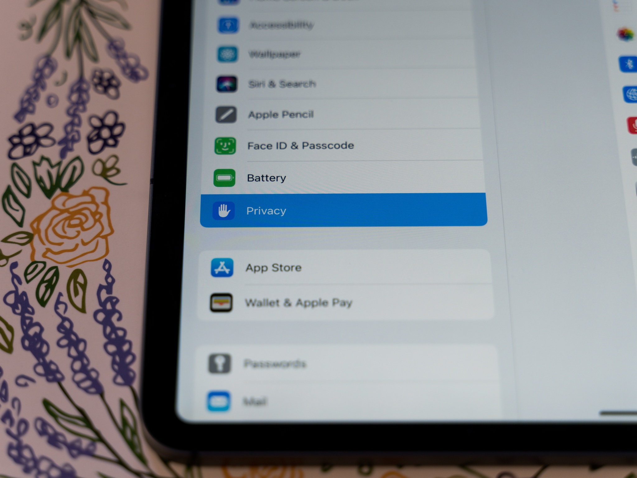
Apple puts a lot of emphasis on privacy across all of its products, and the iPad is no different. Like iOS 14, iPadOS 14 features many substantial upgrades to security and privacy throughout the system. From Safari to Maps to third-party apps, there are new privacy measures to make sure your experience using the iPad is as private as possible.
One of the most critical changes in this arena concerns location data. Not only can you choose whether an app can access your location, but you can also now decide, on a per-app basis, whether you want to share your general location or your precise location. It's the difference between an app knowing, for instance, whether you're at 1 Capitol Square, Columbus, Ohio 43215, or just in Columbus, Ohio.
Some apps, like ride-sharing apps, are going to need to know your precise location. Other apps like Facebook, for example, probably not so much. It's an excellent way to give you more control over how your location is shared, and just who gets let into that circle of trust.
With iPadOS 14, Apple giving its customers more control over their own privacy.
So many of us spend much of our time on the web, which is full of trackers and other software that keeps tabs on how we browse. Now, Safari has done a lot in recent years to try and curb this tracking, and its vigilance is growing in iPadOS 14. Safari is also adding a new feature called Privacy Report. With Privacy Report, you can see just who's tracking you, using what tools, and how many trackers Safari has blocked with its built-in capabilities.
Safari is also getting built-in password monitoring. You'll be notified if your password has been compromised as part of a security breach. Apple is implementing new cryptographic techniques to check your passwords against known breaches in a secure way that keeps third parties and Apple itself, from actually getting their hands on your passwords while Apple is checking them.
With a new initiative for the App Store, Apple is trying to keep people informed about what data third-party apps collect about them. The new App Privacy section on each app page in the store will show you essential information on data gathered about you. This includes what data is used to track you across apps and websites, what data is linked to you, and what data isn't used to track you.
There are several other privacy updates, too. For instance, there's a new indicator in the top-right of your screen that tells you when an app or system function has recently engaged your microphone (orange) or camera (green). In apps that support their own account system and Sign in with Apple, developers can now allow you to move your account to Sign in with Apple even if you sign in another way already.
With iPadOS 14, Apple is taking new steps to improve user privacy and give its customers more information so that they can take more control over their own privacy.
iPadOS 14: Should you wait?
There's no reason to wait on upgrading to iPadOS 14. It doesn't matter if you're using the very best iPad or a slightly older model. If your iPad got iPadOS 13, you'll be able to run the newer software and enjoy the year-over-year improvements on the user interface and experience while also taking advantage of new features like Home screen widgets and Scribble.
With iPadOS 15 set to build on iPadOS 14's changes, it's a good time to upgrade to get to grips with some of the UI changes before iPadOS 15's fall release.
iPadOS 14: The bottom line
iPadOS 14 is a substantial update, and evidence that Apple is taking seriously its commitment to the iPad that it made when it segmented iPadOS into its own operating system. It may be more focused on tweaks and updates to existing features than brand new capabilities, but for me, every change has made my iPad experience better (looking at you, sidebars).
There's a lot to iPadOS 14, and iMore has spent the last few months exploring all of the new features, big and small. Be sure to check out our coverage of iPadOS 14 and all of Apple's major new software updates.
Joseph Keller is the former Editor in Chief of iMore. An Apple user for almost 20 years, he spends his time learning the ins and outs of iOS and macOS, always finding ways of getting the most out of his iPhone, iPad, Apple Watch, and Mac.
