iPhone 12 and the retro future of Apple design

We knew this was coming. Everybody knew this was coming. Ever since the moment we saw the updated iPad Pro a couple of years ago — the iPhone 4 and iPhone 5-style squared off sides have returned.
iPhone 12: Forward to the past
After half a decade of curved glass and rounded antenna bands, Apple has taken the iPhone design language… not back to the future but… forward to the past.
It's the way iPhones looked for almost half a decade. From June of 2010 to September of 2014, when the iPod touch and iPad mini's design language came to the iPhone 6 and iPhone 6 Plus. More curved and rounder even, front and back. And promptly stayed that way. Until now.
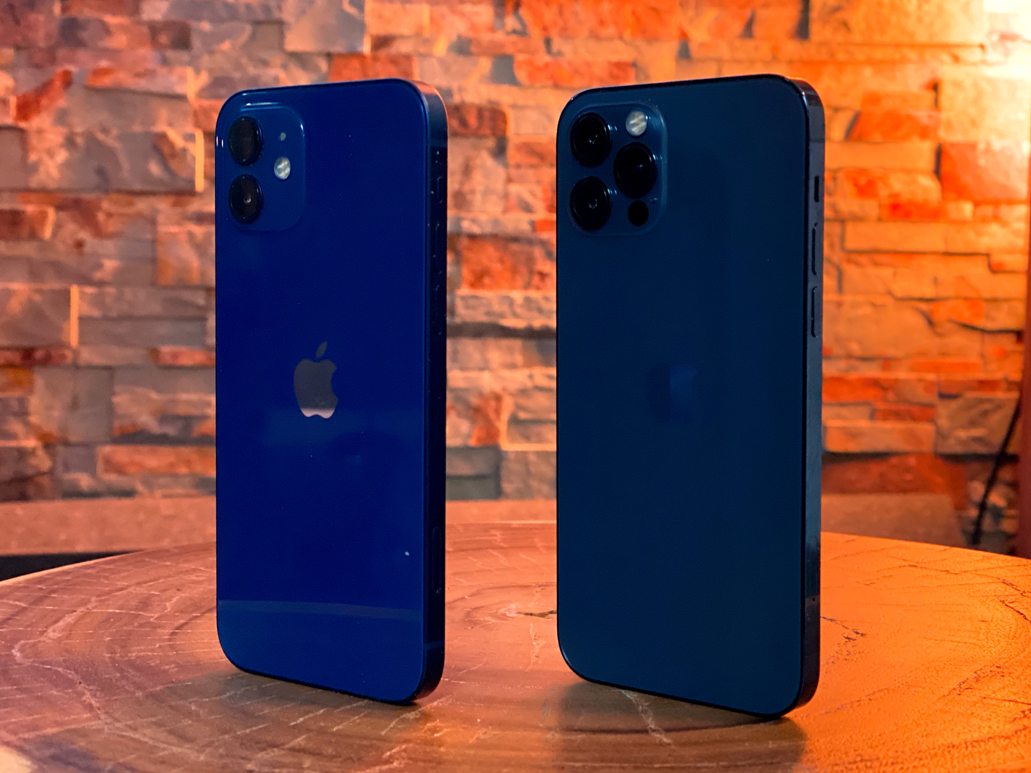
The iPhone 12 borrows most heavily from the iPhone 5, because aluminum. It manages the same trick of feeling just as impossibly light for its size. Like it's not a real phone but one of those dummy phones at carrier stores light. 15% less volume than the iPhone 11 light.
The squared off edges feel every bit as good — or bad, if you preferred the curves. For me, they dig in just a little for a more secure grip. But because the back is glossy glass and not textured aluminum, and because anodization seems a little thicker, the overall feeling is different. At least on my deep blue review unit. Yeah, this year it comes in deep blue, but also black, white, a minty green, and Product RED.
Same with the iPhone 12 Pro. Which comes in the lighter, slightly more teal looking Pacific Blue, but also comes in silver, and, like the new Apple Watch, graphite and 18-K-as-in-Kardashian gold.
Which is... kinda fitting since the last of the squared-off iPhones, the iPhone 5s, was also the first of the gold iPhones. A lighter, champagne gold, with the internal code name — wait for it! — Kardashian!
Master your iPhone in minutes
iMore offers spot-on advice and guidance from our team of experts, with decades of Apple device experience to lean on. Learn more with iMore!
Now, for the 12 Pro, the very iPhone 4-like antennae band is also in a very iPhone 4-like stainless steel. Which is what Apple's been using for he higher-end iPhones since the iPhone X.
It still feels light for the size, though not as light, but the lack of the curve also makes it feel slightly thicker. And, obviously, since this, the smaller of the iPhone 12 Pros, is now as big as the iPhone 12, same size as the previous iPhone 11 and iPhone XR, just bigger in general than the iPhone 11 Pro.
But I've always wanted the non-Max Pro in this size. Just the perfect middle-ground size.
iPhone 12: Similar, not the same
Because the bands on the colored models are PVD (even the silver) and not just clear coated like all the iPhone 4 models were, and the glass doesn't sit above the bands, but flush with them, it ends up feeling very different as well. Especially with the back glass having a matte finish, something Apple introduced last year for the Pro line.
Sadly, Apple didn't return to the round volume buttons of the elder iPhone era. Which, visually, I've always just loved and wish they had. Tactilely, though… I'll admit to liking the utility of the longer lines better.
Because the regular iPhone 12 has gone from LCD to OLED, which means it no longer requires an LED backlight, the display is no longer so thick it pushes the Lightning port backwards. No, now the Lightning port is all right and properly centered again. Hurrah.
That just leaves the not-color-matched screws on the iPhone 12 as the last remaining design blight in needing of a fix. Apple's been leaving them bare metal on the aluminum models since the Product RED iPhone 7, despite color-matching them just fine on the stainless steel models. Sure, PVD coating the steel screws may not perfectly match the anodized color of the aluminum, but I trust Apple's color wizards to solve that either way.
And... thoe are the only rea differences between the iPhone 12 and iPhone 12 Pro here. Colors and materials. Glossy black, white, green, blue, and red with aluminum bands versus matte graphite, white, pacific blue, and gold with stainless steel bands. That's it.
iPhone 12: Not glass

Even the front glass is the same… Well, it isn't even glass any more. Not scientifically. It's impregnated with nanoscale ceramic crystals — which is a fancy way of saying super tough but still transparent — to make what Apple calls Ceramic Shield.
Combined with the retro, flat, flush design, Apple says it provides 4 times more break resistance than the iPhone 11. Which… I'm both super curious and terrified to find out about at some accidental point in the future.
Because, so far, the glass backs also seem every bit as slippery as the last few versions. Which means, if you put them down on anything other than a level surface, which I do a lot, they'll probably slide and tumble, and in short order. It's never caused a break for me, but every time I see or hear it, it does cause my robot heart to skip a beat or several.
Now, If you're concerned about scratches, nothing has changed there. It's still ion-exchange, chemically hardened, but break resistance and scratch resistance are also still a trade off and Apple is still optimizing more for break resistance. So, if you used a screen protector before, you're going to want to keep right on using one.
Also, the Ceramic Shield is only on the front. The back is the same hardened glass as the iPhone 11 series. Which, Apple says, is still harder than any other glass on the market. A benefit of their super buddy-buddy relationship with Corning. That doesn't mean, if you drop an iPhone 12, you want it to land butter side down, though.
If you tend to do that a little too often, look into a case.
Everything bold is news again...
So, the iPhone 12 design language is retro, yes, a throwback, in a way, but also a design that ends up being distinct and futuristic in its own way. Squared but not quite chamfered. Banded but also flush. metal but colorful. As much a singular object as anything Jony Ive ever dreamt up, but perhaps even more singular now than ever before. The result of even more modern and advanced manufacturing processes, of course, but also of Ive's inheritors taking the next logical, minimal, essential step.
The question becomes — how long will it stay this way?

Rene Ritchie is one of the most respected Apple analysts in the business, reaching a combined audience of over 40 million readers a month. His YouTube channel, Vector, has over 90 thousand subscribers and 14 million views and his podcasts, including Debug, have been downloaded over 20 million times. He also regularly co-hosts MacBreak Weekly for the TWiT network and co-hosted CES Live! and Talk Mobile. Based in Montreal, Rene is a former director of product marketing, web developer, and graphic designer. He's authored several books and appeared on numerous television and radio segments to discuss Apple and the technology industry. When not working, he likes to cook, grapple, and spend time with his friends and family.
