iPhone 13 first impressions — A cinema rig in your pocket
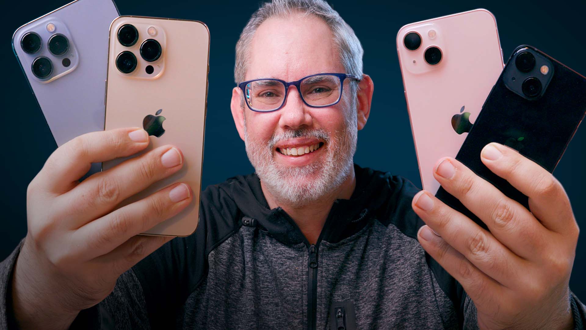
Superficially, the iPhones 13, iPhone 13 mini, iPhone 13 Pro, and iPhone 13 Pro Max are almost indistinguishable from their iPhone 12 counterparts. Same industrial design, same screen sizes, same prices. But once you start using them, the differences are considerable: Brighter displays, better camera, especially on the Pro variants; huge improvement in battery life, especially for the mini, a novel cinematic mode, double the storage for the baselines, and up to double the refresh rate for the Pros. They're exciting, inspiring even, but also frustrating. Let me explain…
iPhone 13: The Exciting
Battery life is almost always at the top of the list when it comes to what people actually really care most about in their phones.
Last year, one of the biggest knocks on the iPhone 12 was battery life. Especially on the mini. So, this year, that's one of the biggest areas Apple's focused on for the iPhone 13. Especially the mini. They've made them bigger, which is always challenging because you have to balance for things like weight, thermals, and radio transparency, so you don't just end up with more battery to waste.
And yes, being slightly thicker this year, combined with the bigger camera bumps, means it's all but certain your old cases won't fit the new hotness. RIP.
In addition to the usual improvements in software and artificial intelligence that tries to guess and optimize for what you're about to do before you do it, Apple's also made the new A15 Bionic chipset even more efficient, and they're using an improved 5G radio. It has more bands and better 4G LTE and 5G NR aggregation, but it's also being handled better both on the phone and through a lot of… yeah, pressure on the carriers. Also, for the Pro models, a new adaptive refresh display which I'll get to in a 120Hz minute.
Apple claims their teams averaged an extra 1.5 hours of battery life for the iPhone 13 mini and Pro and 2.5 hours for the iPhone 13 and Max, all with typical, mixed, real-world workloads. I'm getting about 2/3rds of that right now, but I'm also doing way more than a typical workload, because 24/7 testing for this review. And Pokemon Go.
For most people, I imagine it'll be substantial. So much so, I can see iPhone mini aficionados upgrading just to get their daily drivers safely into the night. Either way, I'll follow up with a deep dive on battery life soon.
Master your iPhone in minutes
iMore offers spot-on advice and guidance from our team of experts, with decades of Apple device experience to lean on. Learn more with iMore!
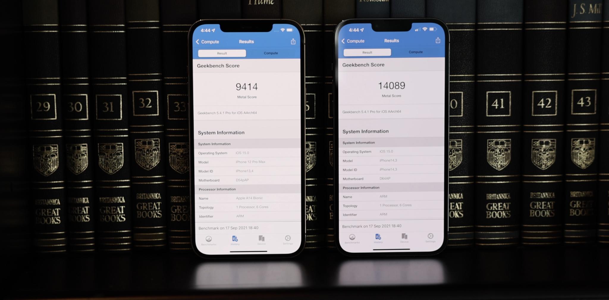
Same with that A15 chipset, just like I did with the A14 and M1 last year. It's roughly 10% faster, or similar to previous years in my tests, thanks to a frequency bump in all models and an extra graphics core in the Pro models. But it really looks like Apple is increasingly spending their transistor budget on efficiency and non-core features these days, especially on the display and the new camera and video pipelines, which are also coming right up.
Otherwise, it handles some of the most computationally intensive tasks we've ever seen on a phone and with aplomb. Panache even. That includes neural engine intensive tasks like Live Text, which is now available as part of iOS 15 for everyone with an iPhone 6s or later. Which is one of the most important parts of any new chipset — providing enough headroom for Apple to continue to offer iOS and app updates for it for another five or more years as well. That's where the investment in silicon really pays off for us, the customers.
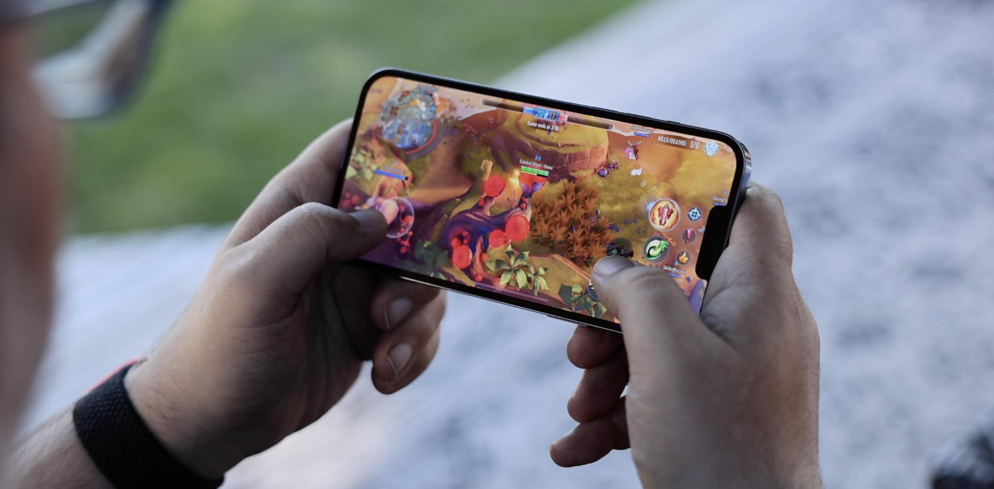
With the 13 Pro and Max, Apple is finally, the Rock-style finally, bringing their ProMotion adaptive refresh displays to the iPhone. Like the iPad Pros have been doing for almost half a decade now, they can ramp up to 120Hz for silky smooth scrolling and gaming… like high thread count silky smooth too, not the cheap no-tell motel stuff.
But also ramp down to 60Hz for TV and web videos, 48Hz for movies the way nature and Hollywood intended, even all the way down to 10Hz for static content like books and photos.
It took Apple a while longer to get to 120Hz than competing Android phones, but it took the technology they needed, a more advanced OLED process using LTPO, a while longer to become available in sufficient quantities for even just the iPhone Pro. It's easy to forget sometimes just how many Apple sells every year.
And the thing about 120Hz is if you don't do it right, it shreds battery life or forces lower screen resolutions, cuts off when lighting changes or messes up color management as refresh rate shifts, and… is otherwise just a spec absent an experience.
Because ProMotion on the iPhone 13 Pro can't go all the way down to 1Hz like it can on the Apple Watch, there's no always-on mode or Lock Screen this year. I love it on the Watch, but I'm conflicted on its value for the phone.
Combined with a slightly bigger, L-shaped battery, though, going down to 10Hz, which is even lower than the iPad Pro's 24Hz bottom, does let them claw back enough power to rocket the 12 Pro's battery life past the 12 non-Pro on highly optimized workloads. By up to 3 to 5 hours.
Now, how much any of this matters to you will depend entirely on how sensitive you are to refresh rates. The human eye probably taps out at around 480Hz, but some people won't even notice the difference between the previous 60Hz and the new up to 120Hz. Others will be like, oh my god, finally, my eyes have stopped bleeding.
What might be exciting or frustrating for you, depending on your personal tastes, are the new colors. For the 13 and 13 mini, that includes a pale pink. Yes, actual iJustine pink, not just rose gold. Blue, which is more teal than last year. Midnight, which is kind of an indigo black, Starlight, which adds a touch of gold to the usual silver, and Product RED, which is deeper again this year. So, yeah, mint green is gone, as is the lavender purple that was added just last spring. But maybe there'll be another color next spring. We'll have to wait and see.
For the 13 and 13 Pro, there's Silver and Graphite, which seem the same as last year, Gold, which is a bit less beige and a bit more full-on Karshasian… Cardashian? One of the two…. and Sierra Blue, which is less pacific and more sky. While some people don't like it, I think it looks great.
iPhone 13: The Frustrating
Apple made the notch 20% smaller this year by surface area, mostly by narrowing it down. I still hate the aesthetics on principle, but I also still don't notice it 99% of the time. And while the narrower notch — the natch? — does technically free up more pixels along the top, I haven't really seen that taken advantage of yet, so as Thanos snapping goes, it's symbolic at best.
The bigger issue for me personally is that after the last couple of hellscape years — and yes, I'm talking to you 2020 and 2020 Jr. — I was also hoping to see Touch ID back. Not even under-display, though that'd be great, but just in the power button like new iPad Air and mini. Multi-biometrics adds complexity but also convenience and consideration, and we could all use a little more of that right now. So, fingers crossed, literally, for next year.
There are some terrific camera improvements this year, which I'll get to in a cinematic minute, but I'm still irked by the 10-bit Dolby Vision HDR Apple added last year. Not the HDR itself, that's gorgeous, and I love it. But the way iOS handles it. Basically, in the camera app, you can see and change resolution, frame rate, flash, but not HDR. For that, you have to pray you notice in the viewfinder, then go spelunking down deep into Camera Settings to flip it on or off. Like an animal. And you still can't switch between the HDR and SDR tone map from the iOS Share Sheet either. You can only share it to a non-HDR device, like an old iPad, or round-trip it through iMovie, like, what's more animal than animal, some kind of monster? It's especially frustrating because given HDR adoption still isn't high, iOS should be going out of its way to support those exact toggles. Like I said, I love HDR, I just need some love back on it.
And not to beat a dead horse until it's fully undead. Like Lich King Nightmare undead, but the amount of data we can now capture on iPhones is ridiculous and only set to become even more ridiculous with the upcoming ProRes 422 feature. I'll talk more about that in the follow-up when it ships, but it lets you record and edit in Apple's high fidelity video codec. Super high fidelity, but also super high bitrate. And that really makes me wish Apple had reevaluated the whole Lightning Port situation this year.
I totally get that most customers, mainstream customers, have a ton of Lightning accessories, and if you try to make them change, they'll cut you. Hell, they're still angry the back end isn't USB-A anymore because their PCs and cars. But… just the idea of moving a ton of video, especially ProRes video, gigs, and gigs 10-bit HDR ProRes video, over Lightning or AirDrop, fills me with… deadline destroying dread. And I'm not even talking about USB-C anymore, either. The iPhone and iPhone mini could go either way at this point, there are arguments to be made for both, but the iPhone Pro and Max, like the iPad Pro and every single modern Mac, I just really want Thunderbolt at this point. I mean, If Pro is on the box, Thunderbolt should be in the port.
Maybe Apple will have more to say and show when ProRes ships, but I'm old school, I'm Matrix. I'm Galactica. For my most important, mission-critical data, I want my hardline. I use Thunderbolt for my Canon video. I want to use it for my Apple video. And I want it to be fast. Like speed force fast. So we'll see.
Also, Apple's going all the way up to 3x this year for the telephoto on the iPhone 13 Pro and Max. And I think it's great Apple really wants to improve the zoom this year, because as I've complained over and over again for the last few years and reviews, zoom is one of the few areas of traditional photography Apple still hasn't really addressed. Not with a massive megapixel camera, binned down for normal use, or a dedicated periscope zoom for full-on creep mode. And I'd still love to see them get there eventually. For bird peepers, city scapers, and proud sports ball parents alike.
iPhone 13: The Inspiring
For all that, Apple has made the iPhone 13 cameras better — and bigger — across the board. Starting with the iPhone 13 and mini, which had their layouts shifted diagonally just to fit in the new wide angle camera.
It's still f/1.6 and 26mm equivalent. But it's got a bigger, 1.7-micron pixel sensor now, which means it can gulp down 47% more photons for brighter, cleaner photos. And it's got the sensor shift system, which is what Apple calls IBIS or in-body image stabilization, for crisper photos and steadier video. Last year, that was exclusive to the 12 Pro Max wide angle, but it's on every iPhone 13 wide angle this year.
There's also a new ultra wide angle. Still f/2.4 and 13mm equivalent, and still no auto-focus, but it's faster now, which Apple says will make for better detail in dark areas and shadows.
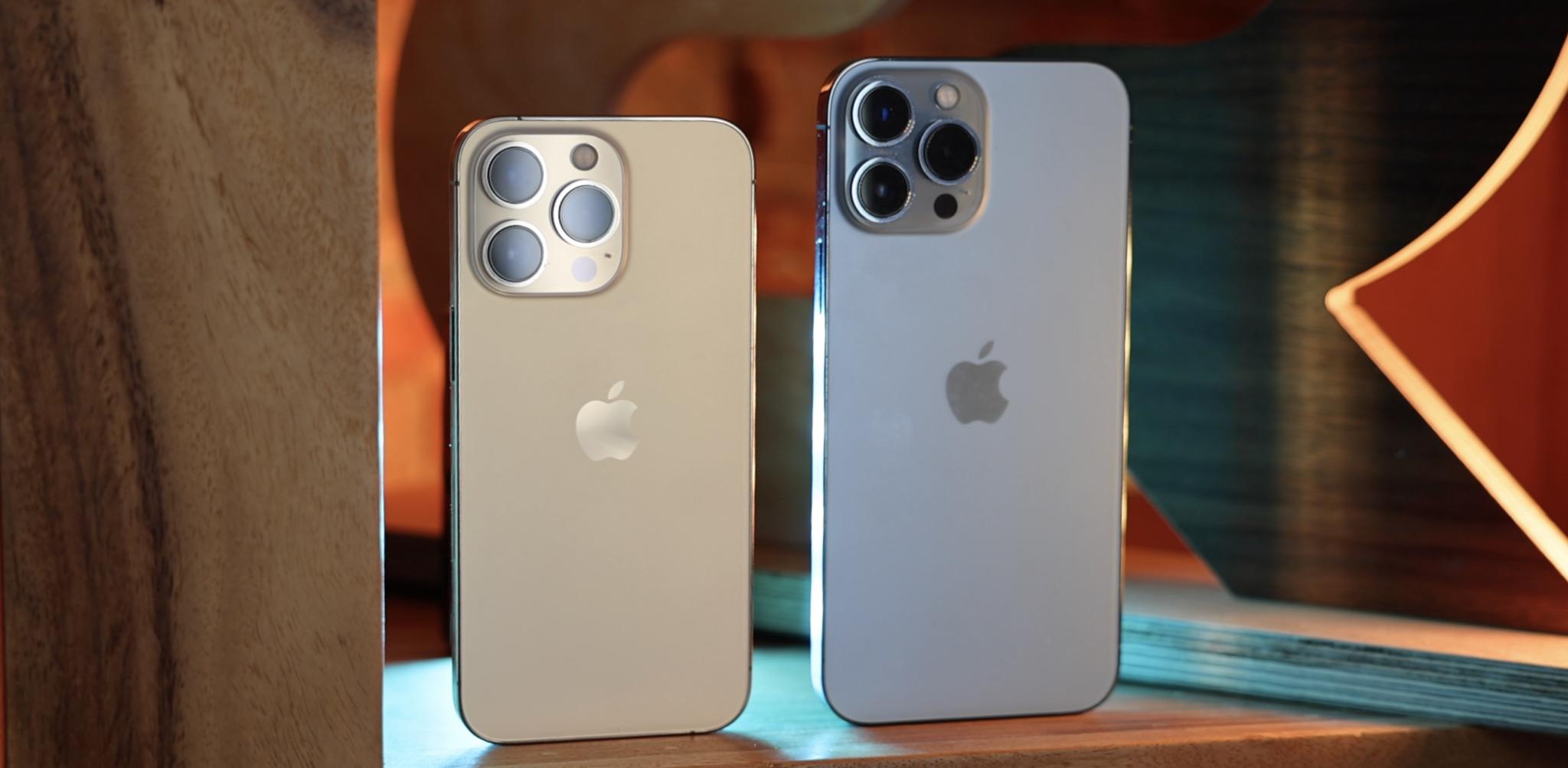
For the iPhone 13 Pro and Max, the new wide angle is slightly faster, going from f/1.6 to f/1.5, still 26mm equivalent, but has a way bigger sensor with whopping 1.9-micron pixels for a 49% increase in light intake over the previous Max, and a 120% increase over the previous Pro. If I got my math right. Ish. Sensor shift as well on both. Which means this year, unlike last year, the cameras, and pretty much everything aside from screen and battery size, are identical between the Pro and the Max. Which is terrific, straight-up terrific, for people who love big cameras but not big phones.
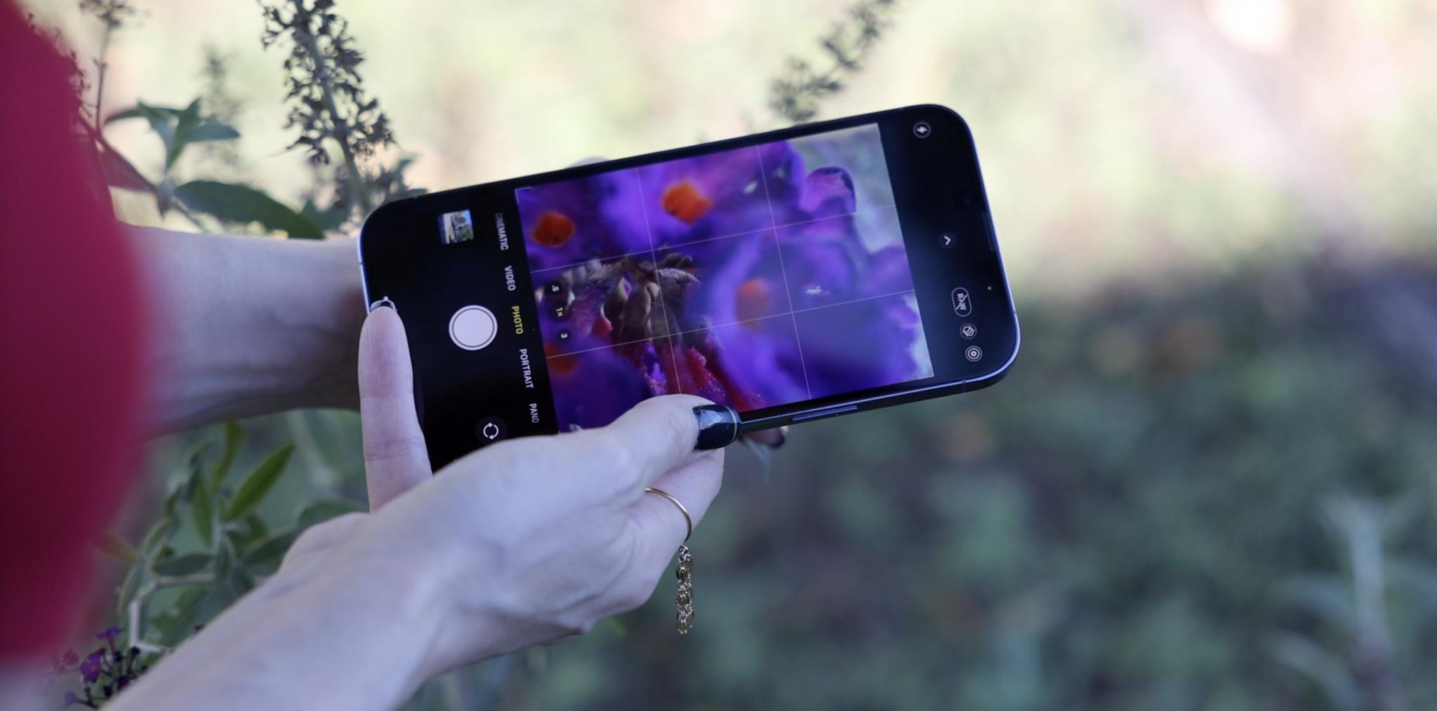
Here's where it gets more even more interesting: The ultra wide angle has rocketed from f/2.4 to f/1.8, it's still 13mm equivalent, so it's drinking in 92% more light. But it's also gotten Focus Pixels now, which is Apple's name for phase detection auto-focus. And that means it can double as a macro lens, with a 2cm minimum focus distance. Which is something I've been hoping the iPhone would get for a good long… or close while.
Macro isn't a separate manual mode like Portrait or Pano or zoom level like .5 or 2x. It's more like Night Mode, where it just engages automatically when you push in really, really close. And then, where previous iPhone cameras would struggle and fail to focus, hunt, fail, hunt, fail. You can see it switch and lock on.
(If you hate that implementation, don't worry — Apple will be adding a toggle to prevent automatic camera switching in a future update.)
It works exactly the same way for video, and delightfully, slo-mo video. I love it.
What's messing with my mind, though, is the telephoto. It's slowed from f/2.0 and f/2.2 on the previous Pro and Max to f/2.8 on the 13 Pro and Max. But it's also gone from a 52mm equivalent on the previous Pro and a 65mm equivalent on the previous Max to a 77mm equivalent on both the 13 Pro and Max. And that also changes it from a 2x or 2.5x punch into a 3x punch in. And for the first time, it can also use Night Mode now, which is Apple's system for extreme low light photography. That means all modes, HDR4 for bright, Deep Fusion for indoor, and Night Mode, on all the cameras. Peace in our time.
Objectively, Apple's done a great job compensating for the slower aperture with the Image Signal Processor, or ISP on the A15. Subjectively I'm torn. I dig that classic 85mm portrait look as much as the next camera nerd, but my heart really belongs to the 50. It's the lens for a reason. So, creatively, I'm going to get a lot of joy playing around with this new-for-iPhone focal length. And just the different look, different compression, and different natural bokeh it delivers. Apple does let you manually thumb-dial in 2x, which is close to the previous 52mm equivalent in terms of framing, but it's digital, not optical, so I'm going to just keep shooting with it for a while and see how I feel.
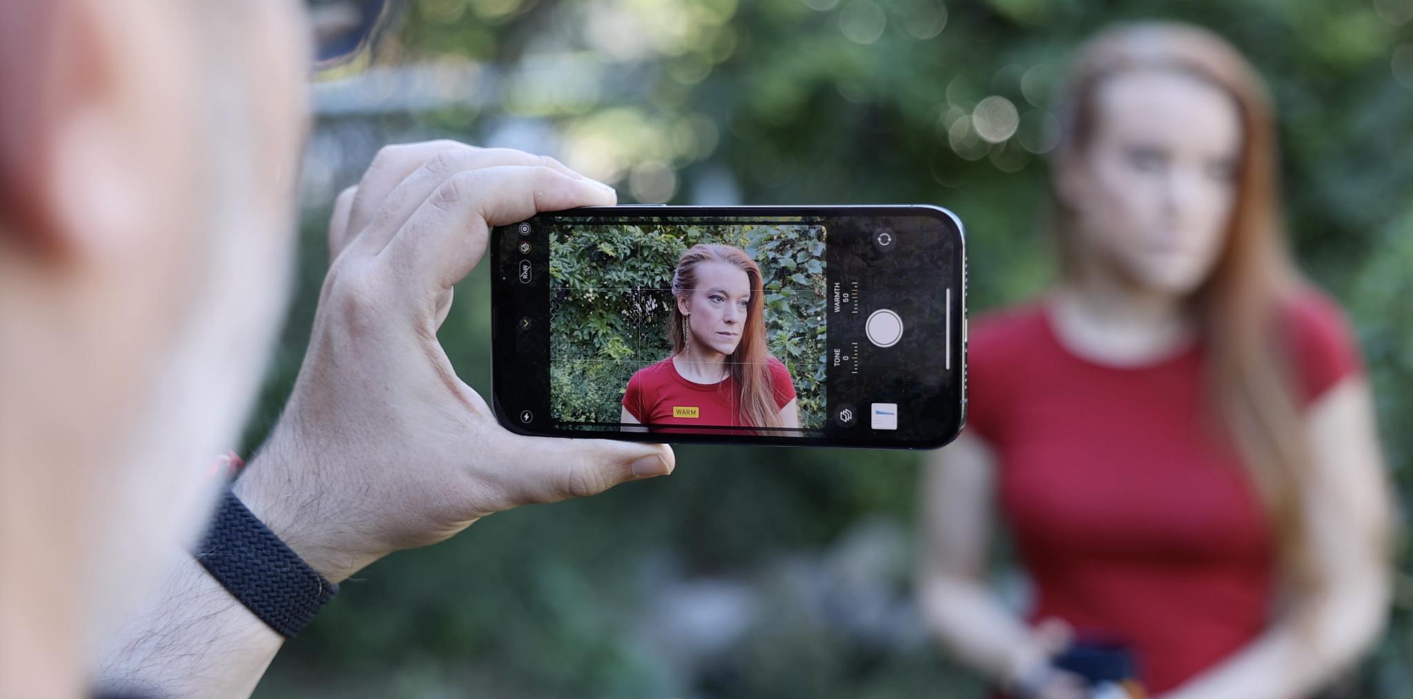
On the non-optical side, Apple's also adding Photographic Styles this year. Whether you just miss the different hipster Fuji film choices we had back in ye old days of your, or you just spend long minutes of your life perfectly tuning a look for Instagram over and over again to maintain the purity of your grid aesthetic, then Styles will give you some of that back. With one huge caveat, I'll get to in a burned-in second.
You can use any of those defaults, or you can tweak the tone or warmth up or down to create your own and apply it to any or all of your shots as you see them and take them. Best part is, Apple's using their computational prowess to preserve things like skies and skin tones, so warm doesn't make anyone too pink or too pumpkin, and rich doesn't blow out the clouds.
Now for that caveat: Styles aren't filters. They're not treated as after effects you can add, remove, edit, and tweak at any time. They're not non-destructive. They're being treated like film stock — burned in. Which I'm not crazy about, especially because it's unlike anything else in the camera pipeline, from Portrait Mode and Lighting to the regular filters.
But, I've made Styles version of my usual boosted, crushed, teal, and orange vibe, or as close to it as I can, and I'll be posting with it on my Instagram, so check it out and let me know what you think.
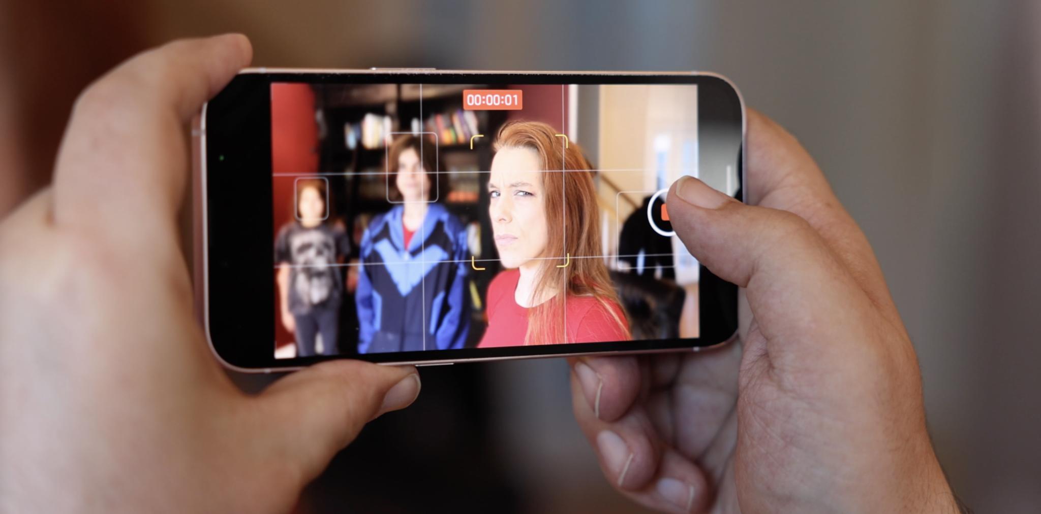
Now, the headline feature on both the iPhone 13 and Pro variants this year just has to be Cinematic Mode. It's tempting to think of it as just Portrait Mode video, aka, blurry bokeh background video, but Apple's trying something even more ambitious and audacious — automatic focus pulling. Like Rack Focus
Apple says they studied a ton of cinematography to train the system, and you can see a lot of the classic elements at play. Especially with eye lines. Cinematic Mode will latch on to the closest set of eyes it can, and if and when those turn away, it'll rack focus over to the next closest set. And if the closer set turns back, it'll rack focus back. Same for eyes coming in and out of frame, or losing eyes completely and rack focusing onto objects.
You can also do it manually because no machine learning system this side of Rise of the Machines can beat a human for truly creative, artistic, and in-the-moment shot selection. And best of all, the depth and focus data is all recorded along with the video, so you can go back in and change the focus or the depth in post. Whether the system got it wrong or you changed your mind, or if the bokeh wasn't perfect and you want to ease it back to compensate. Or, you know, just completely blur-bliterate out that person you never liked.
All of this leans a ton on the A15 Neural Engine, not just segmenting and blurring the live view or current frame, but analyzing adjacent frames, so the bokeh effect stays as consistent as possible throughout the scene. They've also got new video codec blocks and a new storage controller to make sure the system can keep up with all the data being streamed its way, and you don't lose a single frame. Which is a huge example of the way Apple thinks about their chipsets beyond those big cores and through entire feature sets and the pipelines to support them.
That said, even with A15, Cinematic Mode is still limited to 1080p/30. 1080p because it can't handle the data throughput for 4K yet. 30fps because, while everyone who hears the word cinematic will be jumping up and yelling 24fps, myself included, Apple has just always treated 1080p not as a movie but as a television and web video format, and only offered it at 30 or 60 in North America, even before Cinematic Mode. As the throughput ramps up with an A16, A17, and so on, I expect we'll see 1080p/60 and 4K/24 next — because 4K is where Apple gets super serious about cinematic. That is unless we can all file enough feature requests to get Apple to sneak in 1080p/24 for us as a hold-over.
It's amazing in concept, but it's still early days in execution. So I find myself going from "whoa!" to "D'oh!" and back again… like I'm rack focusing my emotions. In many cases, it's utterly usable, which sounds like damning with faint praise, but until now, it wasn't even possible. But it's also just so much damn fun.
And because Apple insists on doing everything they can, live and in real-time, in the viewfinder, you can see where the segmentation mask isn't perfect, usually around thinner, sharper angles, and just move a little bit to improve it. That's what's always made Apple's depth effect implementation functionally the best in the business, if not technically. You always felt, feel, like you're shooting with a real camera. Not waiting for an after effect to load. And that helps you learn. Which I think this will as well.
We've all had photo studios in our pockets for a while now, but with the iPhone 13, Apple has put a full-on cinema rig in every pocket. That's going to help inspire a whole new generation of cinematographers, of people who can more easily and accessibly experiment with the langue of cinema, and in places and with shots they never could before.
Especially because once Apple does something like this, it tends to trigger everyone else doing it, or the ones already doing something like it to promote and push it even further, and then in a couple or few years, it's just everywhere. And I can't freaking wait to see what that means for things like YouTube and TikTok. Just rack focused all the trends.
iPhone 13: First Impressions
There's a lot more to talk about, including what's happening with MagSafe and the Apple ecosystem in general, as well as A15, more on the camera system and battery life, and all the other deep dives I promised you. But here's the bottom line on upgrades:
Typical iPhone cycle these days is between three to five years. So, for anyone still on an iPhone 8 or 10, or earlier, even an XS, the sum total of new and improved features on the iPhone 13 will be compelling. Just a huge upgrade.
If you're on an iPhone 11 or iPhone 12, then it really comes down to two things. One in the camera. Arguably the biggest camera update ever, if that's critically important to you. The other is ProMotion. If you've been waiting basically forever for that.
That is, if you're not on an annual iPhone upgrade program or a 2-year carrier plan, then that pretty much makes your decision for you. Otherwise, my always advice is wait as long as you can to upgrade, upgrade when you need to, get the best you can afford, and then enjoy the hell out of it with zero regrets because they'll always be something new and something next.
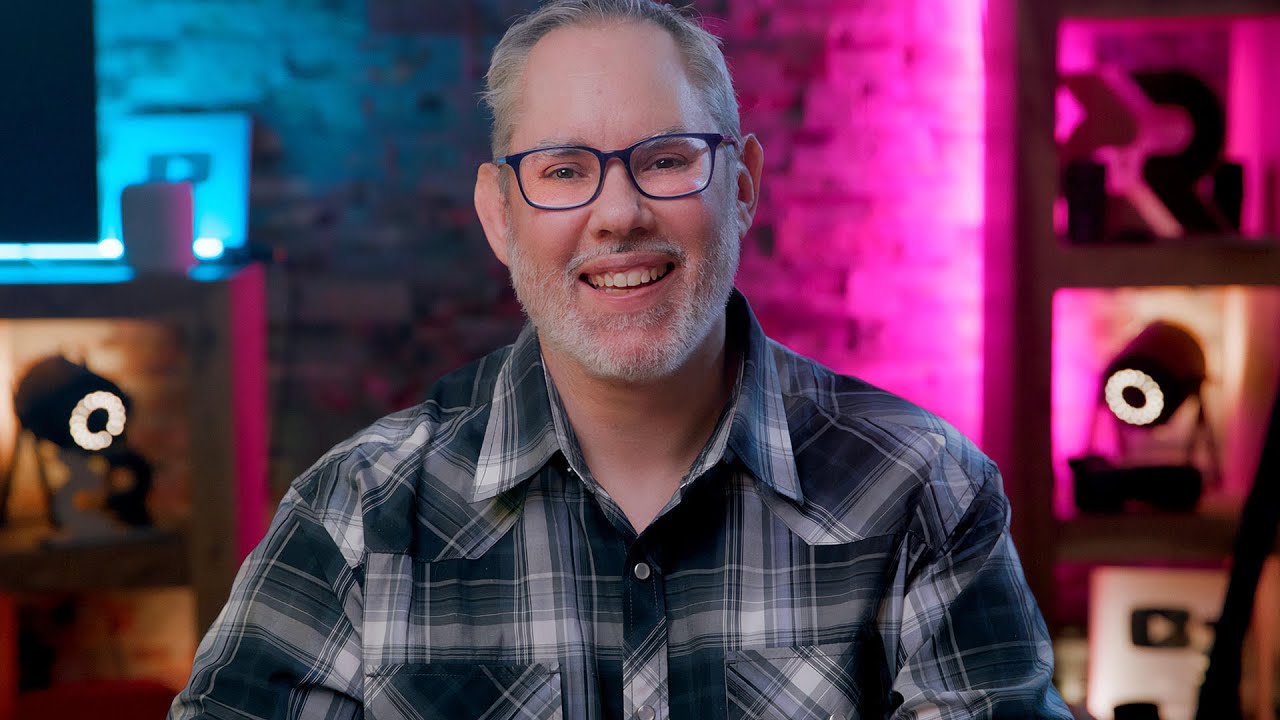
Rene Ritchie is one of the most respected Apple analysts in the business, reaching a combined audience of over 40 million readers a month. His YouTube channel, Vector, has over 90 thousand subscribers and 14 million views and his podcasts, including Debug, have been downloaded over 20 million times. He also regularly co-hosts MacBreak Weekly for the TWiT network and co-hosted CES Live! and Talk Mobile. Based in Montreal, Rene is a former director of product marketing, web developer, and graphic designer. He's authored several books and appeared on numerous television and radio segments to discuss Apple and the technology industry. When not working, he likes to cook, grapple, and spend time with his friends and family.
