Using Dynamic Island on iPhone 14 Pro a year on - a notch by any other name
When is a notch not actually a notch? When Apple says so.
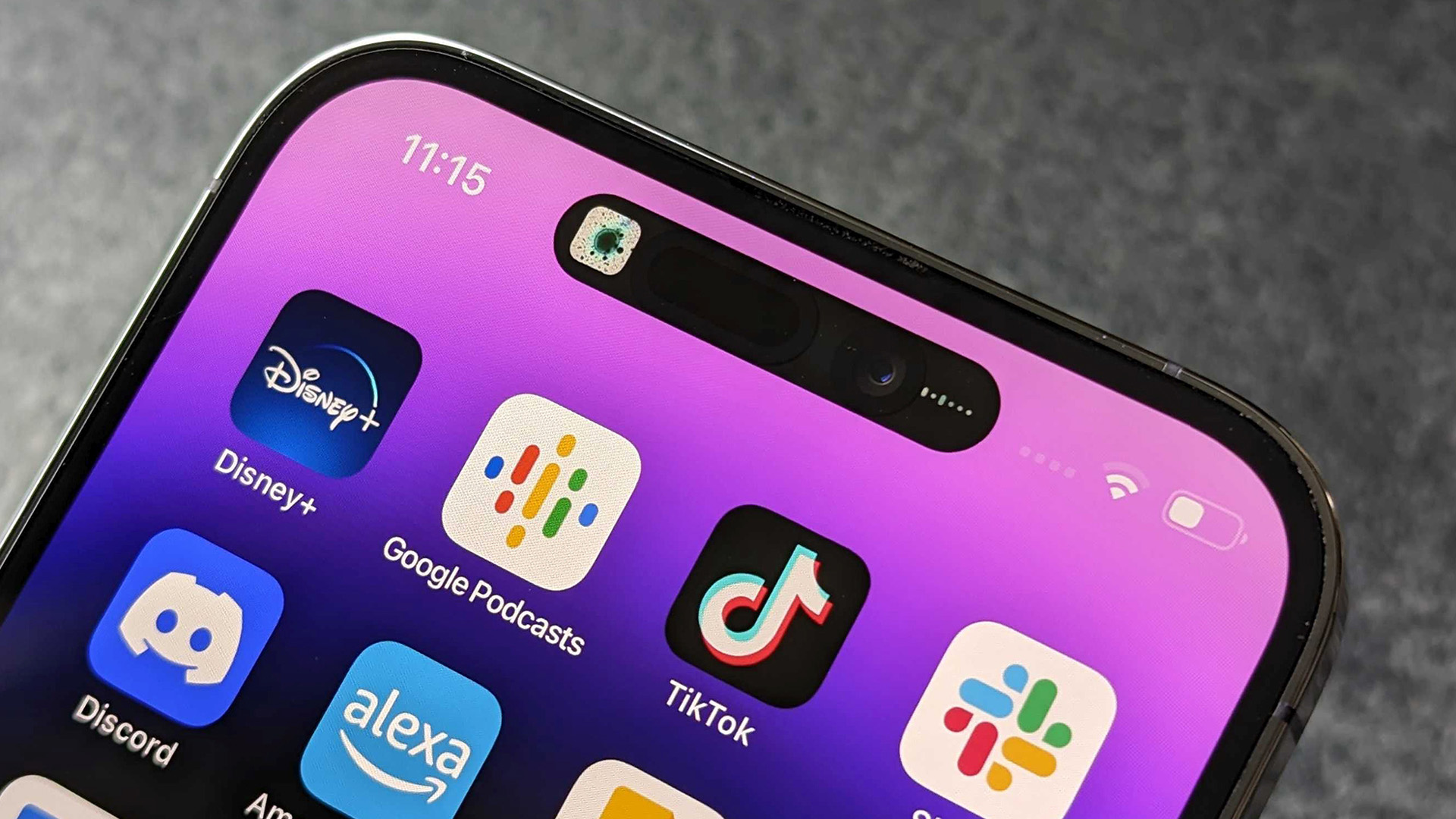
Dynamic Island is coming to an iPhone 15 near you. Well, that’s if the rumors are to be believed. These state that the feature — which is Apple’s animated notch replacement — will not just appear on Pro models of the upcoming iPhone 15, it’ll be incorporated across the whole range.
This is an interesting move by Apple. With the iPhone 14 Pro, Dynamic Island was not only a ‘killer feature’ that separated the Pro from regular models, but it was also the biggest visual change to the hardware since the iPhone 12 redesign.
We don't have long to see if this rumor turns out to be true, with Apple airing its 'Wonderlust' event in mere days on September 12.
But here’s the question: If you’re a buyer of the entry-level iPhone and are planning to get your hands on the 15, should you be excited? What has it been like using Dynamic Island for the past year? And is the future rosy for the feature?
Well, let’s find out.
All the potential in the world
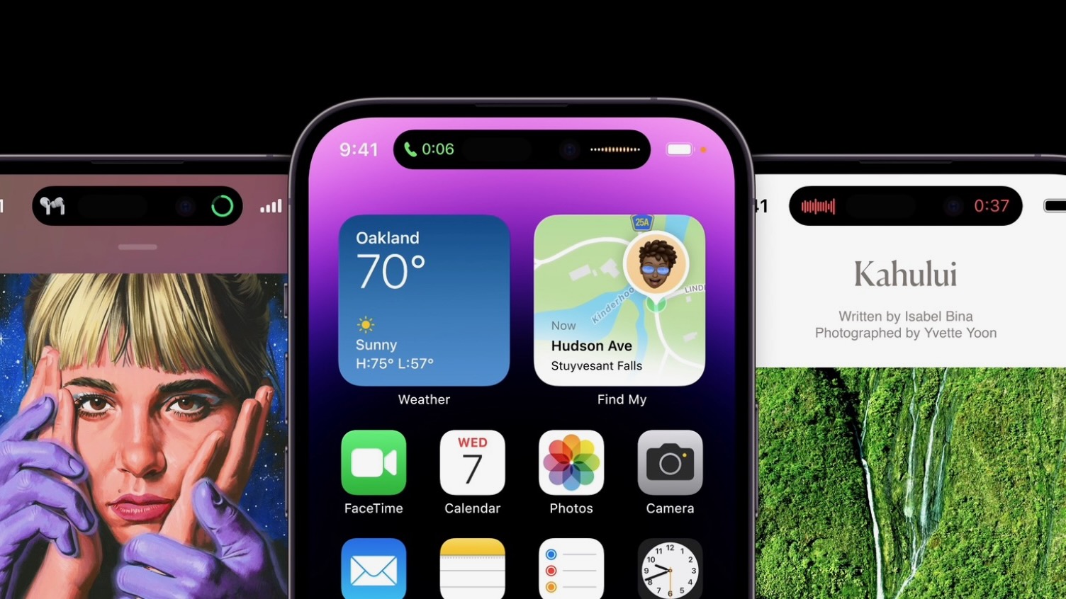
When Apple first announced Dynamic Island, I was enthralled.
I’ve disliked notches on phones since, well, as long as companies have been putting notches on phones. I understand why manufacturers do it — increasing display real estate while having somewhere to fit the front-facing camera and other modules — but in all honesty? I’d prefer thicker bezels over that ugly, screen-ruining bump.
Master your iPhone in minutes
iMore offers spot-on advice and guidance from our team of experts, with decades of Apple device experience to lean on. Learn more with iMore!
Despite this, I came to accept the notch as part of phone ownership. As much as I dislike it, there’s nothing I can do to fight it — and it also helps that my brain stops noticing it after a while.
This is why I was so excited when Apple announced Dynamic Island. The idea was simple and elegant, a way of elevating the notch and making it genuinely useful.
Gimmick or gamechanger
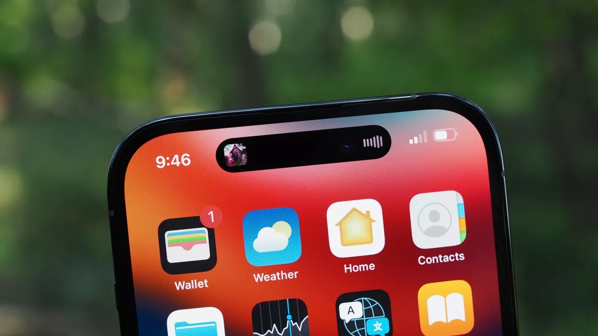
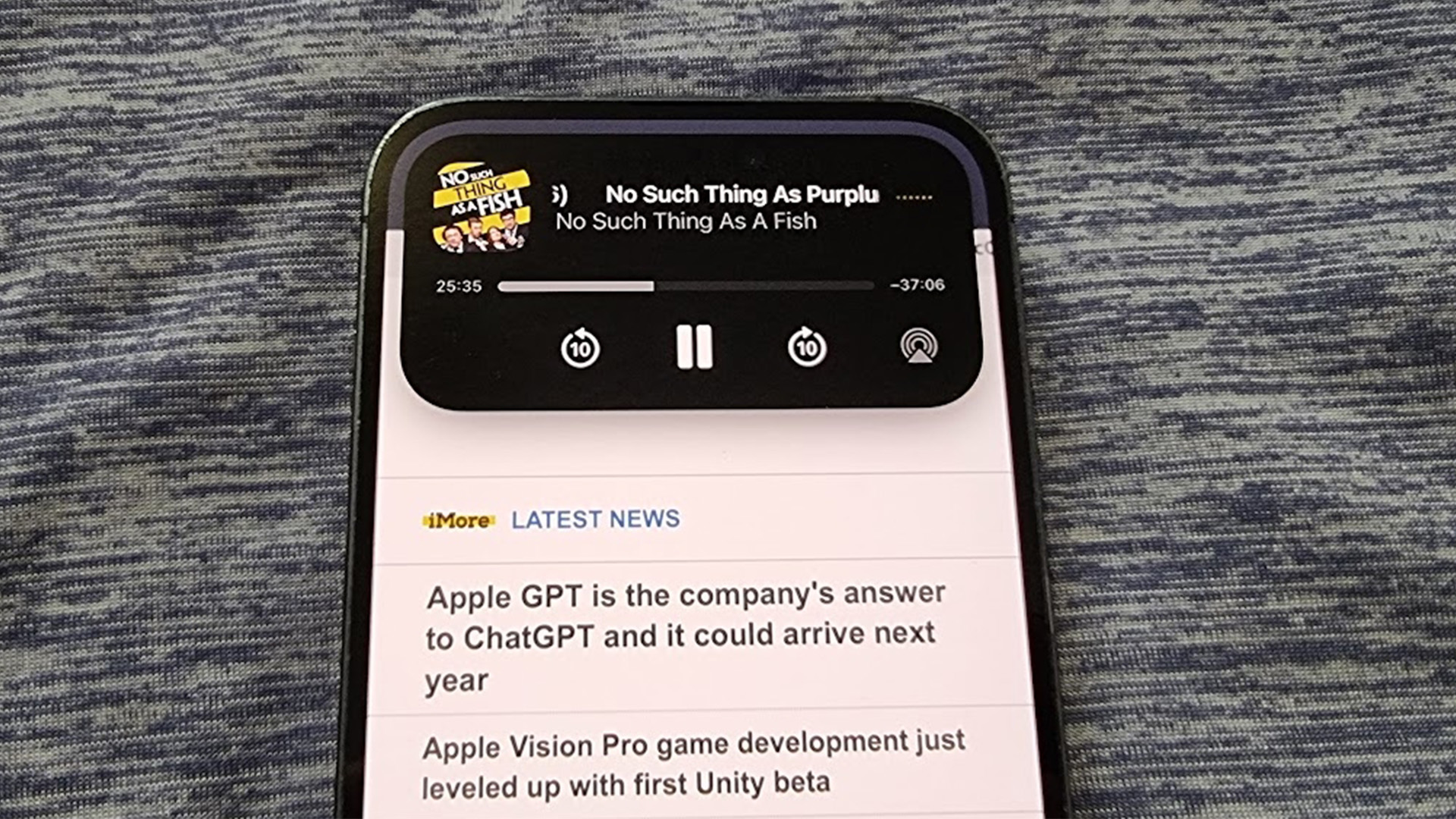
When I first got my hands on the iPhone 14 Pro, Dynamic Island was the thing I was most excited to show people. From explaining how it could be used to check on timers, or how music could be controlled from it.
While this experience didn’t exactly invoke the “oohs” and “aahs” of wonder that early iPhones did, there was enough magic — and, importantly, novelty — in the feature to make it feel that Apple had created something both exciting and useful.
This, I thought to myself at the time, is going to change phones for the better.
For the first couple of weeks, I went out of my way to use Dynamic Island, continuing to think of it as a delightful alternative to the notch.
Yet, as time marched on, things changed.
Hold on, it’s just a notch, right?

The first thing that began to bug me about Dynamic Island was how it’s always there. After a while, the notch disappeared — this hasn’t happened in the same way with Dynamic Island.
There are a few reasons for this. One is the fact it’s constantly shifting, changing size and shape depending on the task at hand, meaning my eye is continually drawn to it. Another is the fact Dynamic Island sits lower on the display than the notch and has a gap at the top, which causes it to stand out more.
To put that another way, while the notch melts into the background, Dynamic Island remains front of mind.
This would be acceptable if Dynamic Island was something I used constantly, but after those first few weeks, I stopped engaging with it. Probably the only thing I use it for regularly is navigating back to the phone screen when I look something up while chatting with someone.
For any other task — whether that’s setting a timer or controlling music — I’ll use other methods, whether that’s Control Center or flicking through apps.
In his piece for this site, John-Anthony Disotto wrote he hoped that Dynamic Island wouldn’t become another Touch Bar. Unfortunately, I think that wish is dashed. There are undoubted parallels between the two, with neither being awful, but still not offering a better way of doing things than features that came before.
To sum all this up? I wouldn’t get too excited if you’re buying an iPhone 15 for Dynamic Island alone.
What’s the future for Dynamic Island?
The chatter is in full force, with the current rumor being that Apple will ditch Dynamic Island with the iPhone 16.
And its replacement? Well, that’s expected to be under display cameras.
This has been touted for several years now, with noted Apple analyst Ming-Chi Kuo putting serious credence behind the rumor. The thought is that the iPhone’s front-facing camera lens and Face ID will actually sit beneath the screen, being basically invisible while using the device. This means the iPhone will have an uninterrupted display — something we’ve not seen in flagship models since the iPhone 8.
To me, this shows the perception of Dynamic Island, both inside and outside of Apple. This isn’t a beloved feature that people want to continue, it’s a necessary evil that people will tolerate until something better comes along.
Of course, nothing is confirmed yet. Because of the intense technical challenges of under-display cameras, we may not see this technology until closer to the iPhone 18. However long it takes, though, it seems the experts agree on one thing: the days of Dynamic Island are numbered.
Even though I’ve become less enamored with the feature, I do live in hope. Maybe, just maybe, someone inside Apple or a third-party developer will come up with an incredible reason to use the Dynamic Island.
But I’m not holding my breath.
It turns out that if something looks like a notch, is used like a notch, but is called Dynamic Island, it’s still a notch.

Callum Booth is a journalist with over a decade of experience. Previously, he was the Managing Editor of The Next Web, an Amsterdam-based global tech news site owned by the Financial Times. Callum's reporting has been cited widely, including in VICE, the FT, and the BBC. While working as a freelancer, his writing has appeared in The Verge, The Daily Telegraph, Time Out, and many more. Outside of work, Callum’s an avid bookworm, a Fisherman's Friends addict, and resolutely unshaven. Follow him on Twitter/X @CallumBooth or visit www.callumbooth.net.
