Dynamic Island on iPhone 14 Pro is an awesome feature (with an awful name)
A useful evolution of the notch, Dynamic Island deserves a memorable name given the functionality it opens up.

All good iPhone launches need one killer feature. iPhone X had Face ID. iPhone 4 had that monolithic design. iPhone 13 had Cinematic Mode for filmic video capture.
And now iPhone 14 Pro has the Dynamic Island. Yes, the name is awfully overwrought. But the feature itself looks brilliant — a clever fusion of hardware, software, engineering and design.
Apple took a lot of flack for introducing the notch for front-facing cameras into its devices — primarily for its latest and best MacBooks, but it didn’t get off lightly for putting them on the iPhone, from the iPhone X up.
The idea was to offer as much screen real-estate as possible, letting the wonderful OLED screen sing across as much of the front of the device as possible, and to reduce the bezels around the edge to the bare minimum. It works, and it works well — after a few hours with a ‘notched’ iPhone you forget it’s ever really there.
But it’s always been a compromise – whichever way you cut it, that’s dead screen space jutting into the colors that flow below.

With Dynamic Island, that all changes. Finally, function and form come together — life is breathed into that dead zone, and what was once merely a hardware necessitation is transformed into a useful tool.
What is Dynamic Island?
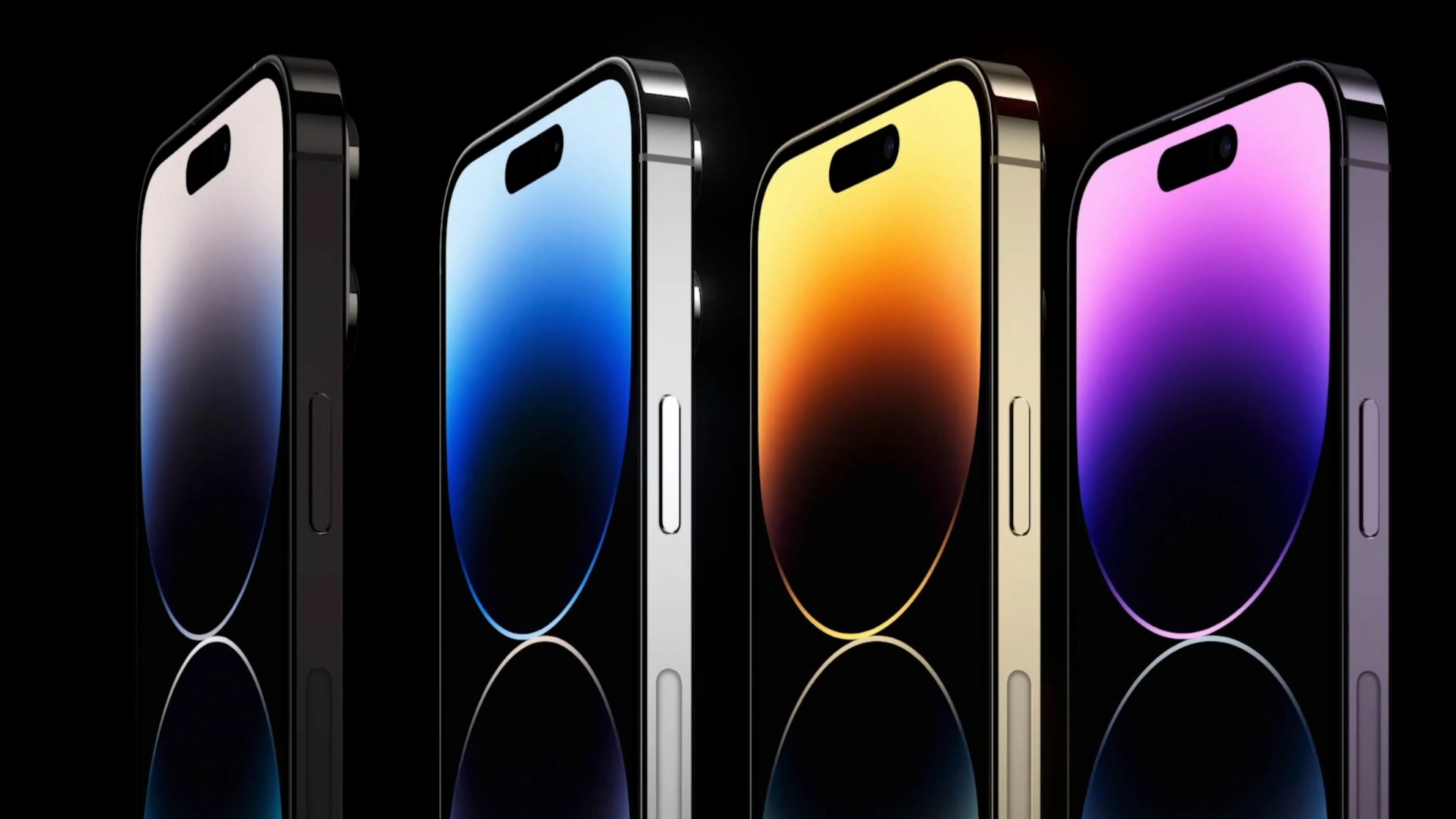
See the notch on your iPhone X-through-iPhone 13 Pro? That little black cutaway houses the front facing camera and Face ID sensors. On iPhone 14 Pro, they move to two separate cutouts that float just below the top edge of the display.
Master your iPhone in minutes
iMore offers spot-on advice and guidance from our team of experts, with decades of Apple device experience to lean on. Learn more with iMore!
Early leaks showed this in advance of the big Apple ‘Far Out’ event. But that’s just the start.
With the cutouts now integrated into the main display itself and detached from the border edging, the A16 Bionic chip (exclusive to the iPhone 14 Pro) works alongside iOS 16 software and the sensors to add extra functionality to the Dynamic Island.
It essentially becomes an additional menu screen — that ‘dynamic’ part of the naming referring to how it morphs and adapts depending on what you’re doing on the phone at a given moment. The Dynamic Island works across the entire system, so no matter what app you’re in, it’ll offer contextual functionality, changing in size and shape depending on what’s needed.
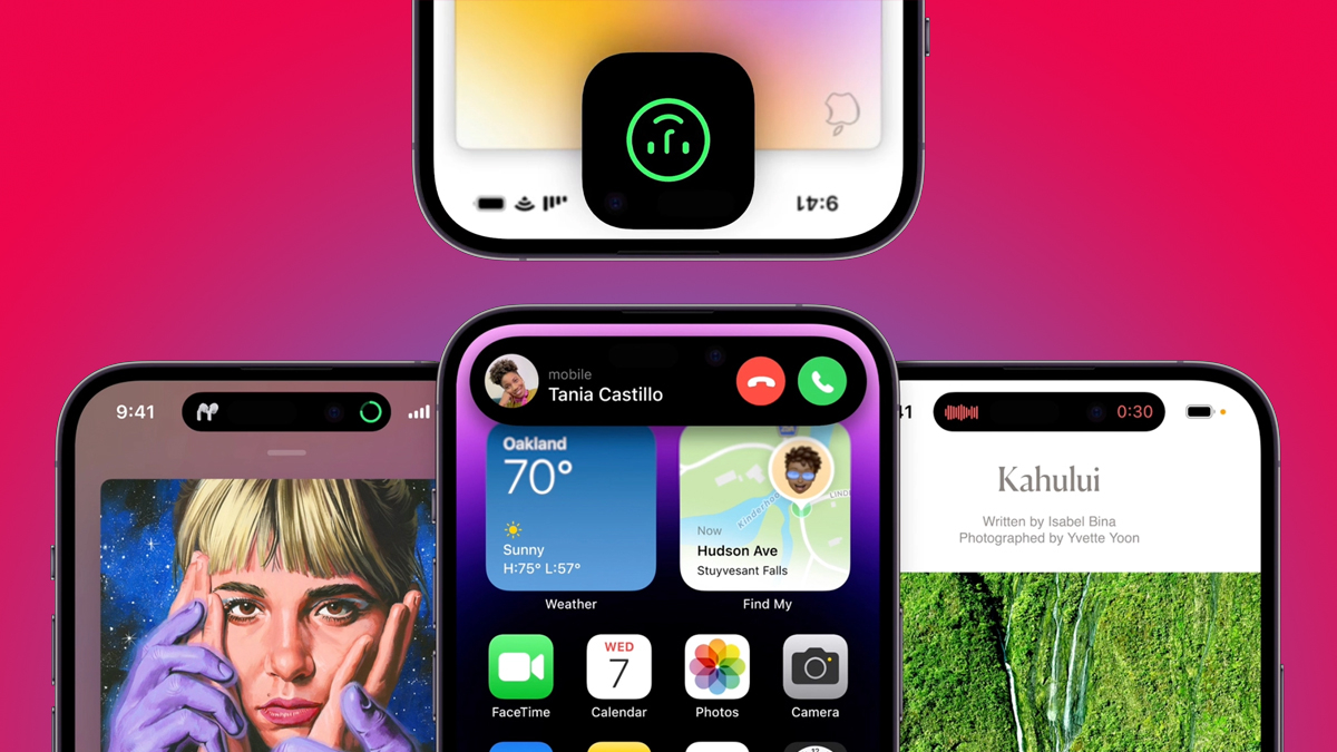
So what have we seen it do so far? We’ve seen the Dynamic Island show when AirPods are being connected, when the phone is being charged, when an Apple Pay payment is being made, and when Do-Not-Disturb modes are being switched on. Tapping the contextual icons then throws up options relating to them — we were shown, for instance, a stopwatch timer expanding when tapped, and incoming calls stretching out into a banner to display caller ID and a contact image.
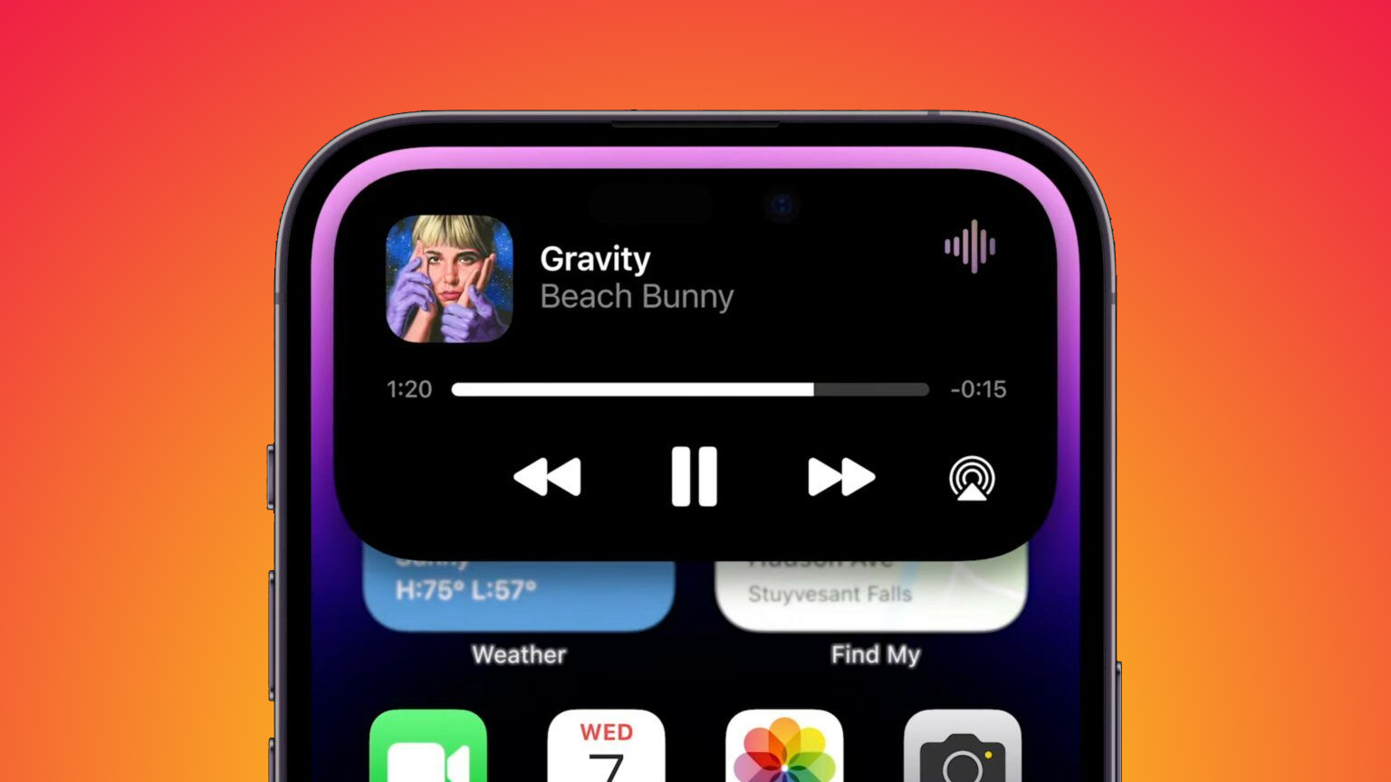
More expansive use of the Dynamic Island was also shown off. The Face ID logo expanded into a larger square around the Dynamic Island when it was processing a face during the event showcase, and the Apple Music album art and track details expanded into a banner when tapped. What’s particularly helpful is that, as it’s a cross system feature, you’ll be able to make tweaks to settings and features relating to apps not the primary focus app, without leaving what you’re currently active in.
That’s before seeing what third-party apps decide to do with the Dynamic Island. The feature is an exciting one.
The Apple way
It’s a classic Apple move — it’s not the first to use a “pill-shaped” spot within the display for housing sensors and hardware. But rather than be first to a feature, its aim is to be the best at employing it. And the Dynamic Island is the smartest use we’ve seen of a camera-and-sensor cut out yet.

It also acts as a great identifier for the phone itself. iPhone 13 and iPhone 13 Pro looked, from their exteriors at least, fairly similar. But there will be no mistaking the iPhone 14 and the iPhone 14 Pro thanks to this feature. It’ll ramp up the ‘FOMO’ for iPhone 14 owners, and helps Apple justify tempting users towards its higher-priced device.
And as for the name itself? Yeah, it’s a bit much. But it makes sense from a marketing perspective, too. This is a cool feature, one worth shouting about — and one worth naming in a memorable way to help further differentiate the iPhone from its competition. Would “Dynamic Menu” have had the same impact? “Cutout banner”? No, probably not. We may scoff at the branding, but the feature deserves to be highlighted in its own right. And from an early glance, its usefulness seems to speak for itself.

Gerald Lynch is the Editor-in-Chief of iMore, keeping careful watch over the site's editorial output and commercial campaigns, ensuring iMore delivers the in-depth, accurate and timely Apple content its readership deservedly expects. You'll never see him without his iPad Pro, and he loves gaming sessions with his buddies via Apple Arcade on his iPhone 15 Pro, but don't expect him to play with you at home unless your Apple TV is hooked up to a 4K HDR screen and a 7.1 surround system.
Living in London in the UK, Gerald was previously Editor of Gizmodo UK, and Executive Editor of TechRadar, and has covered international trade shows including Apple's WWDC, MWC, CES and IFA. If it has an acronym and an app, he's probably been there, on the front lines reporting on the latest tech innovations. Gerald is also a contributing tech pundit for BBC Radio and has written for various other publications, including T3 magazine, GamesRadar, Space.com, Real Homes, MacFormat, music bible DIY, Tech Digest, TopTenReviews, Mirror.co.uk, Brandish, Kotaku, Shiny Shiny and Lifehacker. Gerald is also the author of 'Get Technology: Upgrade Your Future', published by Aurum Press, and also holds a Guinness world record on Tetris. For real.
