Editor’s Desk: Apple’s ‘Far Out’ event was a smash hit
Turns out Apple can still surprise us after all.

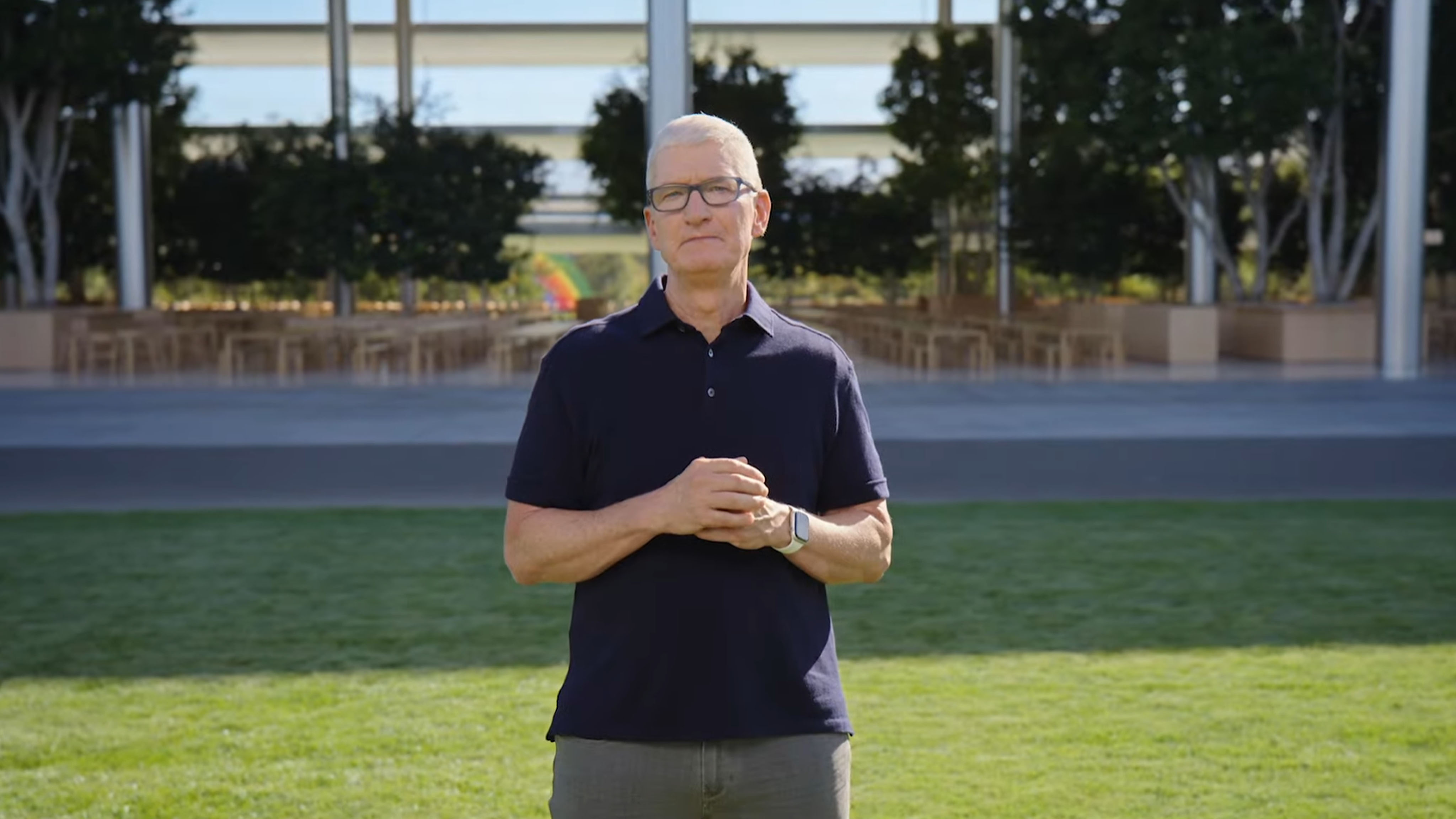
It’s been quite the busy week here at iMore, but for good reason. Apple’s ‘Far Out’ event took place on Wednesday, and it gave us a slew of great new products, including the brand spanking new Apple Watch Ultra, AirPods Pro 2, and my personal favorite, the iPhone 14 Pro (along with the regular iPhone 14 devices). There’s a lot of fun stuff to discuss, so let’s dive right in!
The iPhone 14 Pro surprised everyone with the Dynamic Island

As someone who looks forward to the best iPhone upgrade every year, the iPhone 14 Pro was the big winner for me during the keynote. First off, PURPLE! While I still yearn for a pink Pro-level iPhone, purple is one of my top color choices, and I’m loving that Deep Purple color this year. I made sure to put in my iPhone 14 Pro pre-order for a 1TB in Deep Purple, and I can’t wait to get my hands on it. It’s a nice purple color that isn’t too obnoxious and quite subtle enough even for “professional” settings, you know?
My biggest reason for upgrading each year though is always for the camera improvements, and this year has some big ones. The 12MP Main camera has finally been bumped up to 48MP and there are larger sensors for all lenses, allowing for better low-light photos across the board. I can’t wait to see how these higher-resolution photos turn out, especially when editing in the ProRAW format. Oh, and autofocus on the front-facing camera for the first time? Now maybe my selfies at Disneyland can turn out better, ha!
Autofocus on the front-facing camera for the first time? Now maybe my selfies at Disneyland can turn out better, ha!
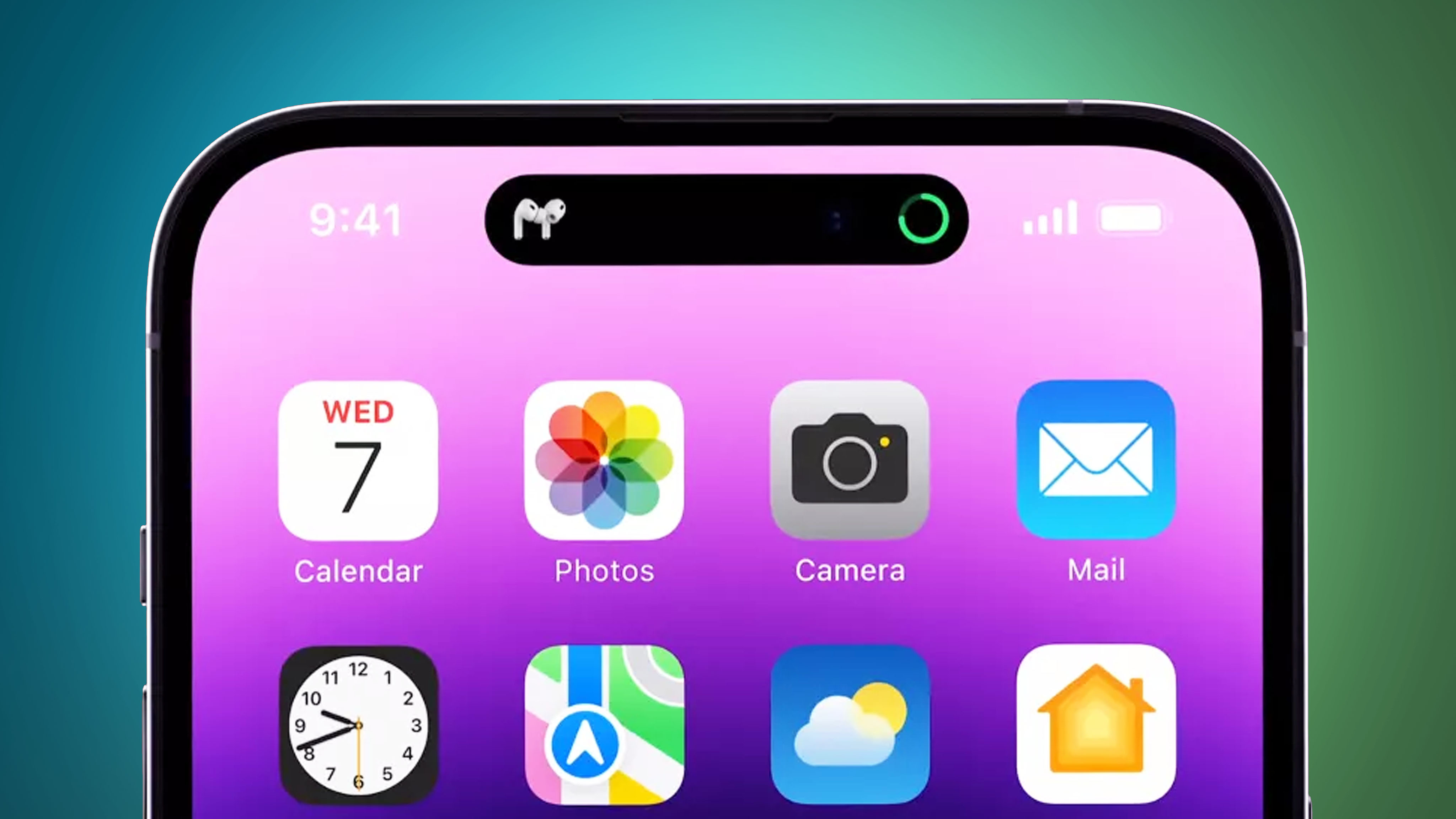
But the real surprise with the iPhone 14 Pro came in the form of the Dynamic Island. Despite the silly name, the Dynamic Island is one of the coolest things I’ve seen on an iPhone, let alone any smartphone in recent memory. While we all saw the pill-shaped and hole cutouts coming, no one saw how this hardware feature would be so seamlessly integrated with the software itself. When it’s not in use, the Dynamic Island appears as a single pill toward the top of the display, as it houses the TrueDepth camera and Face ID sensors there. But the Dynamic Island can be interacted with through gestures, and it will even morph and change its appearance based on current activity. During the keynote, the Dynamic Island was shown off to adapt when AirPods connect, the phone is charging, Apple Pay is used, and even when Focus modes activate. You can also interact with it to do things like control audio, answer calls, check when a Lyft or Uber is coming, and more.
Dynamic Island takes my least favorite thing, the notch, and turns it into something so incredibly useful and beautiful to see.
The Dynamic Island takes my least favorite thing, the notch, and turns it into something so incredibly useful and beautiful to see. It makes full use of every little bit of screen space, instead of wasting it like the notch did. It’s such a small feature, but one that is so unique and useful. I’m honestly very impressed with what Apple has managed to do here, and I can’t wait to see how it works in person.
I fully expect Samsung and other Android smartphone manufacturers to try and replicate this (and not do it quite as good) in the coming months and years.
Apple goes PLUS ULTRA! with the new Apple Watch Ultra

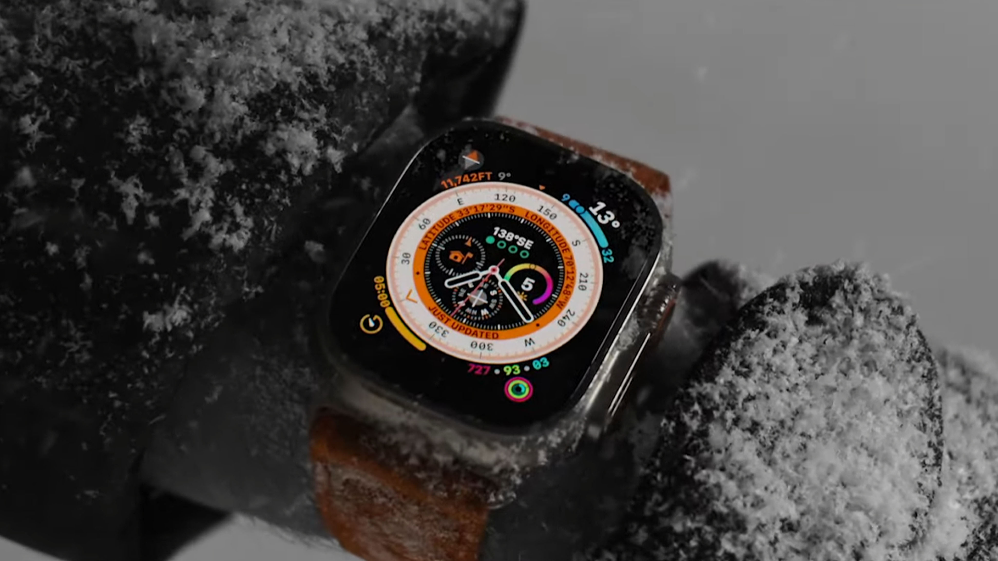
Though we all saw it coming, no one was expecting the "Ultra" moniker on the new rugged Apple Watch, designed for those who are into extreme sports and activities. Or those who just want a bigger Apple Watch. I’m not into either of those, so the Ultra isn’t for me. But it’s still exciting to see nonetheless.
Master your iPhone in minutes
iMore offers spot-on advice and guidance from our team of experts, with decades of Apple device experience to lean on. Learn more with iMore!
Apple also released the Series 8, but that update was honestly boring compared to the Apple Watch Ultra. It is crafted from aerospace-grade titanium, so it’s super lightweight while also being as durable as possible (I have a titanium Series 5 still, and it’s held up fantastic despite my clumsiness). But it also only comes in one size, 49mm, so yes, this is a chonky boi. Apple also went with a flat sapphire crystal front for protection, and it shines brighter no matter where you are or what you’re doing.
Apple also released the Series 8, but that update was honestly boring compared to the Apple Watch Ultra.
Some of the new features on the Apple Watch Ultra are interesting and welcome additions to the lineup. For example, the new Action button is customizable so you can get quick access to starting a workout or move on to the next interval of your custom workouts (a watchOS 9 specific feature). You can even take the Apple Watch Ultra scuba diving up to a depth of 40M, so this is basically like a diving watch. Oh, and the battery life is also better than the Series 8, as you can get up to 36 hours of battery with normal use, though Low Power mode stretches that out to 60 hours on a single charge. There are plenty of other features that the Ultra offers, but those are some of the most notable.
The most surprising thing about the Apple Watch Ultra is the price. We were expecting it to be north of $1,000, but it starts at $799, and it only comes in Cellular + GPS models, which makes sense. Again, it’s personally not for me (I don’t scuba dive or go on hikes in very remote areas, nor do I have a triathlon to train for), but it looks like a great product, if a bit bulky, for those who do. I’m looking forward to future Apple Watches with more advancements. Like seriously, I would pay top dollar for an Apple Watch that could integrate blood glucose monitoring!
AirPods Pro 2 have arrived

I loved my original AirPods Pro, so I’m glad that there’s finally a successor to some of the best true wireless earbuds on the market. The biggest reason I love AirPods Pro is because of the noise cancellation, and it looks like that is even better than before. Thanks to that new H2 chip, the AirPods Pro 2 can block 2x more noise, and the improved Transparency mode will keep ear-damaging noise out, which is always welcome. Though Spatial Audio also sees some improvements, the lack of Lossless audio is a little bit of a letdown.
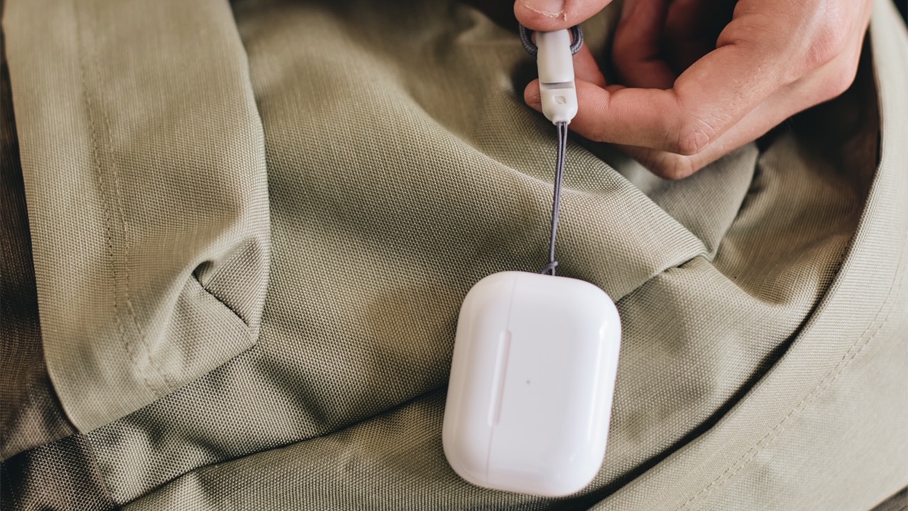
I’m also happy with the case changes that Apple has made. You can now use your Apple Watch charger to charge them (make sure you get the right case though), which is something that I had wished Apple did sooner. After all, the Watch charging puck is a perfect size! And it’s about dang time Apple added a lanyard loop on the case itself — after seeing how many AirPods cases include a hole to attach a keyring or lanyard of some kind, it’s something that should have been implemented directly into the product in the first place.
Lots of exciting new products
September may have just begun, but it’s looking to be jam-packed with a lot of exciting hardware from Apple coming in the next few weeks. And we probably have a more Mac and iPad-focused event next month, so there’s definitely even more to look forward to!
In the meantime, I can’t wait to get my iPhone 14 Pro and put it to the test in our review. So make sure to keep an eye out for that!
Until next time,
— Christine Romero-Chan
Christine Romero-Chan was formerly a Senior Editor for iMore. She has been writing about technology, specifically Apple, for over a decade at a variety of websites. She is currently part of the Digital Trends team, and has been using Apple’s smartphone since the original iPhone back in 2007. While her main speciality is the iPhone, she also covers Apple Watch, iPad, and Mac when needed. When she isn’t writing about Apple, Christine can often be found at Disneyland in Anaheim, California, as she is a passholder and obsessed with all things Disney, especially Star Wars. Christine also enjoys coffee, food, photography, mechanical keyboards, and spending as much time with her new daughter as possible.

