Ranked: iPhone designs from worst to best
We rank every iPhone design, from the humble 3G to the latest iPhone 13.
- Apple Event - LIVE updates
- iPhone 15
- iPhone 15 Pro /iPhone 15 Pro Max
- Apple Watch Series 9 / Ultra 2
- iOS 17
- watchOS 10
The iPhone has changed a lot over the years.
The very first iPhone was iconic in so many ways, from its edge-to-edge Touch Screen, its Home Button, sleek metal back, Apple logo, and more. In many ways, Apple revolutionized phone design forever, with everyone else following suit. Yet Apple’s iPhone design has never really stood still, with tweaks and sometimes massive changes coming with each passing model.
With iPhone 14 just around the corner, what better way to celebrate than to rank every design from worst, all the way to best? Which one will come out on top? Read on to find out…
iPhone 5C
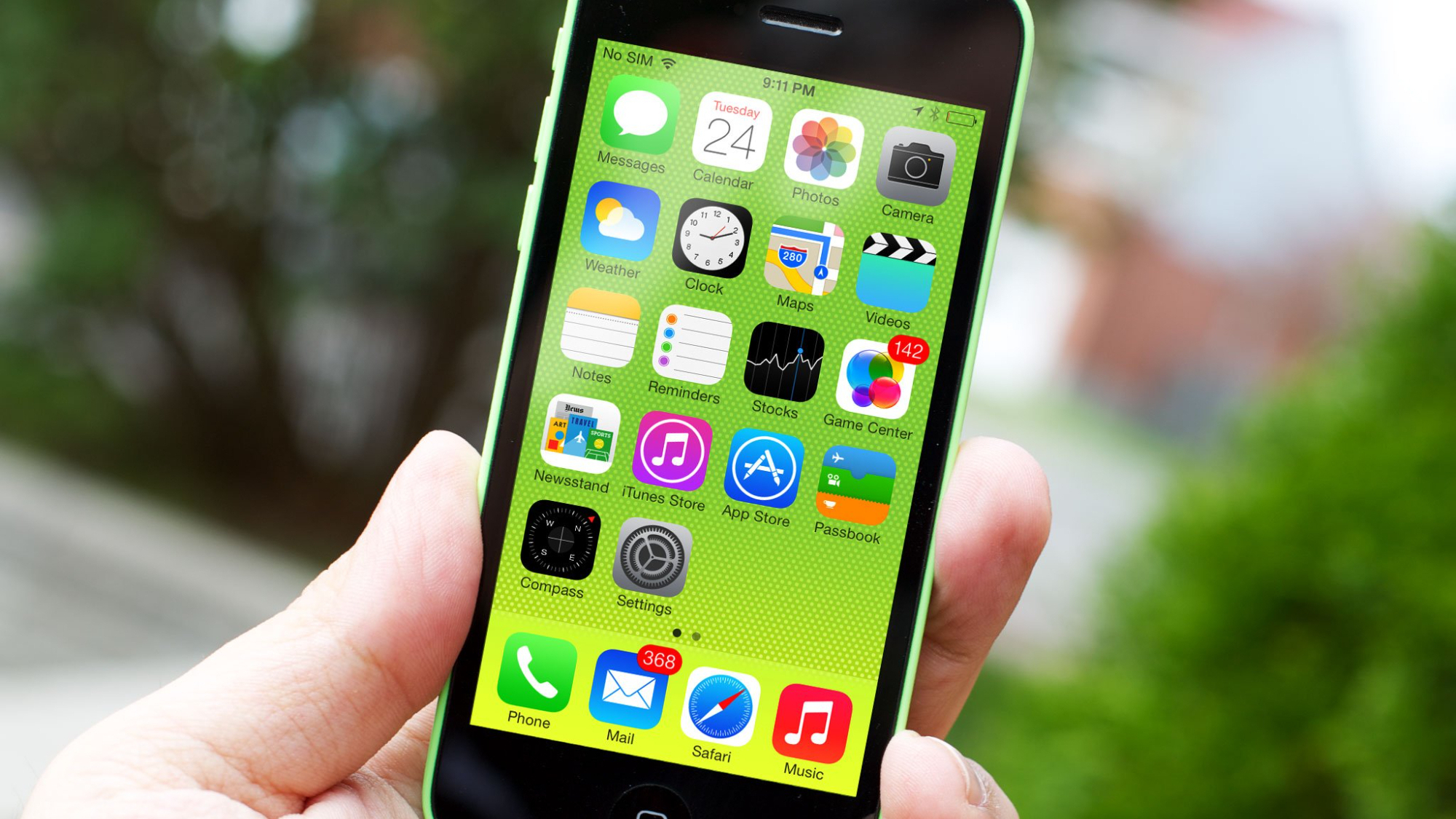
I’m sorry, but one of the designs had to be last. The iPhone 5C just wasn’t that great. The only thing it had going for it was the colors; yes they were cool, but the cheap, plasticky back just wasn’t all that, especially when you compare it to some of Apple’s finest phone designs. Even the color choices looked cheap, and Apple has done bright and bold far more successfully on other models since. Oh, and remember that hideous case with all the holes in it? Yeah, exactly. Even the box of the iPhone 5C looked terrible. No thank you.
iPhone 8 and SE (2nd-gen, 3rd-gen)
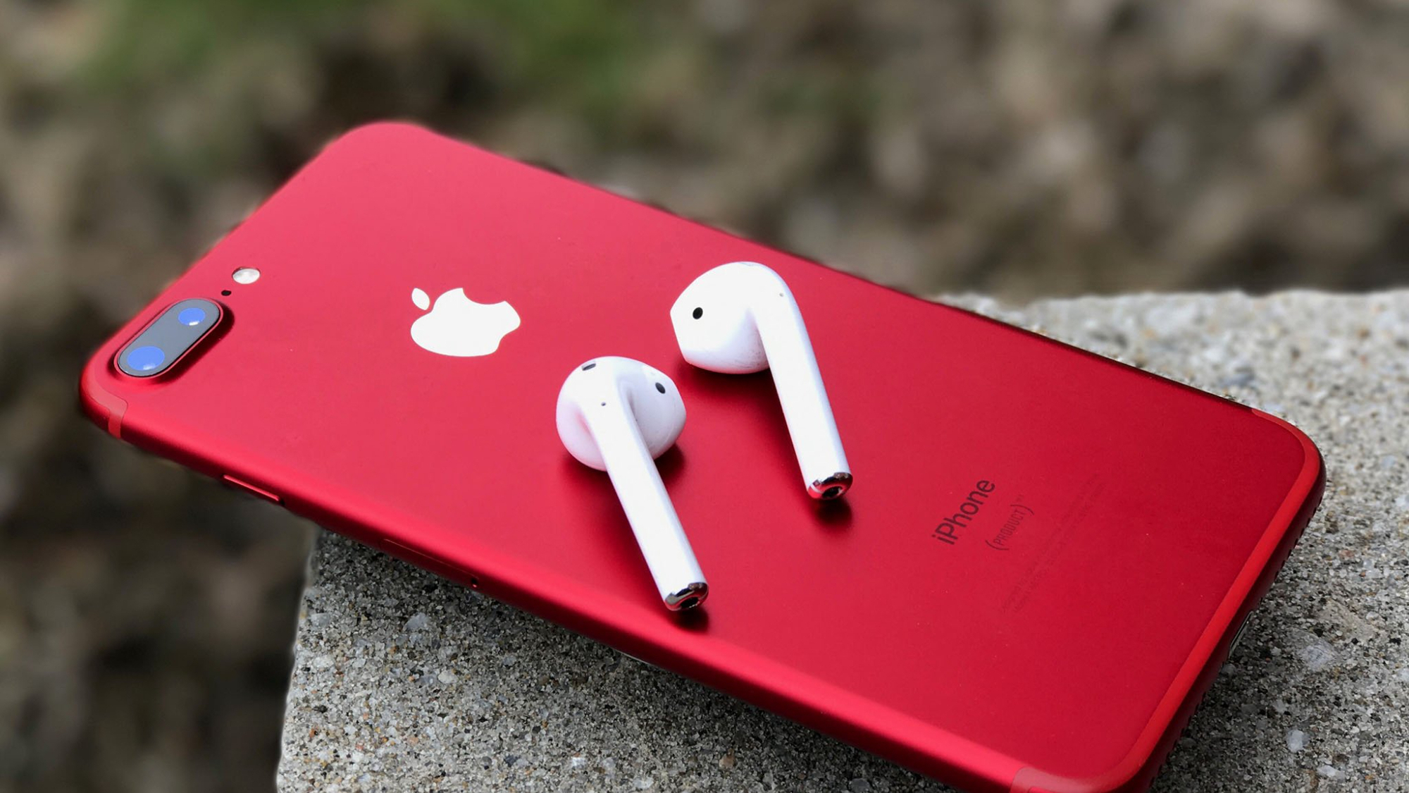
I think I can happily concede that the iPhone 5C was the only iPhone design that I find to be objectively bad. We’re now on to the “least good” iPhone designs, starting with iPhone 8.
The iPhone 8 wasn’t terrible, it built on the very successful and arguably stunning iPhone 7, conversely, this loses points in my book for lack of originality, the colors also weren’t fantastic. Of course, the iPhone 8 chassis would go on to become the second and third-generation iPhone SE, with each release less original than the last, the group winds up near the bottom of the pile. Bonus points for product Red options though.
iPhone 13 and 13 Pro
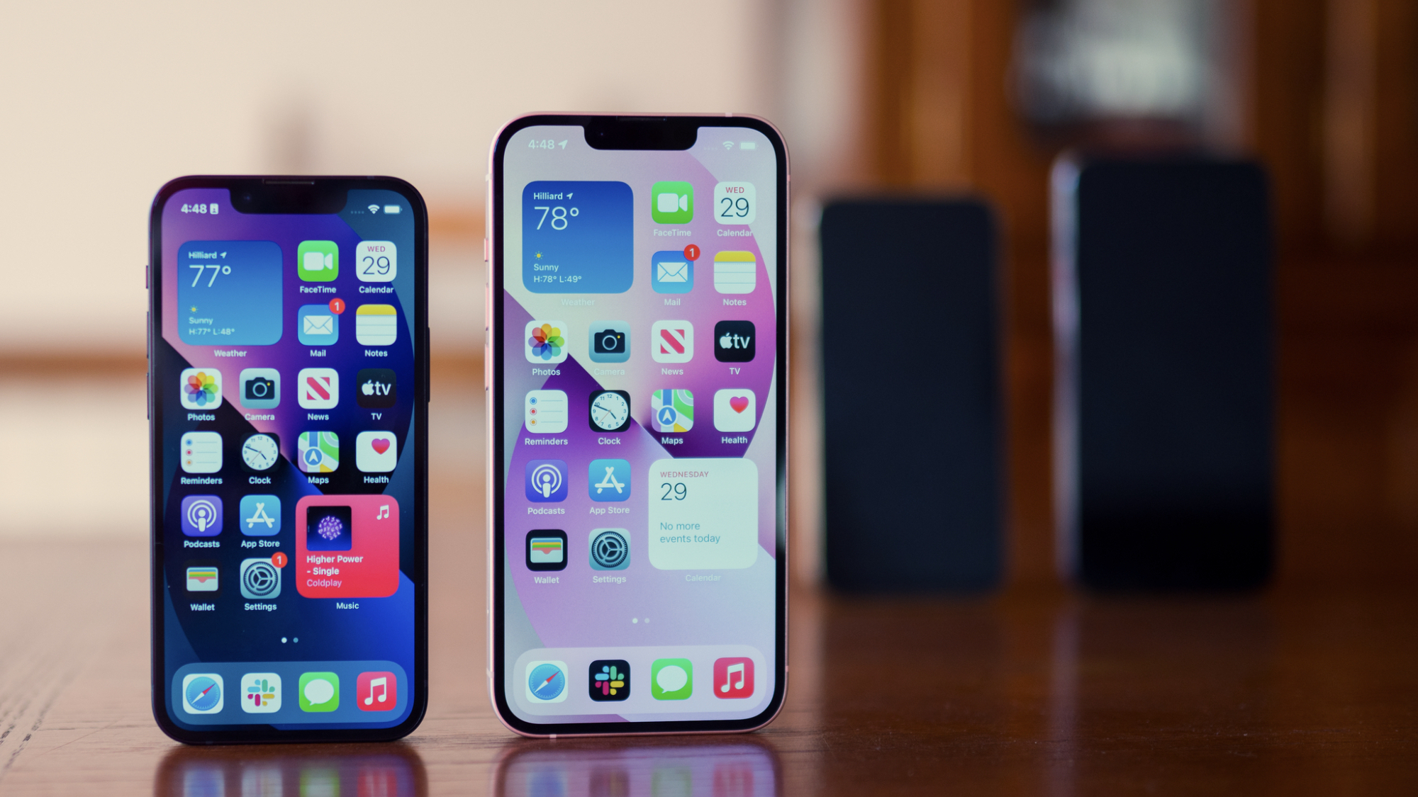
You’re going to spot a theme here. If we’re rewarding Apple for good, original iPhone design in our ranking, then we have to mark them down in years where much hasn’t changed. You might love the iPhone 13 design, but I’m afraid it simply doesn’t build enough on the iPhone 12 in order to warrant a higher ranking. The iPhone 13 and iPhone 13 Pro has some nice color options, but the iPhone 12 Pro’s Pacific Blue crushes this year’s Sierra Blue. The only bright spot in this ranking is the green options Apple gave us for both models in the spring.
iPhone 6 and 6S
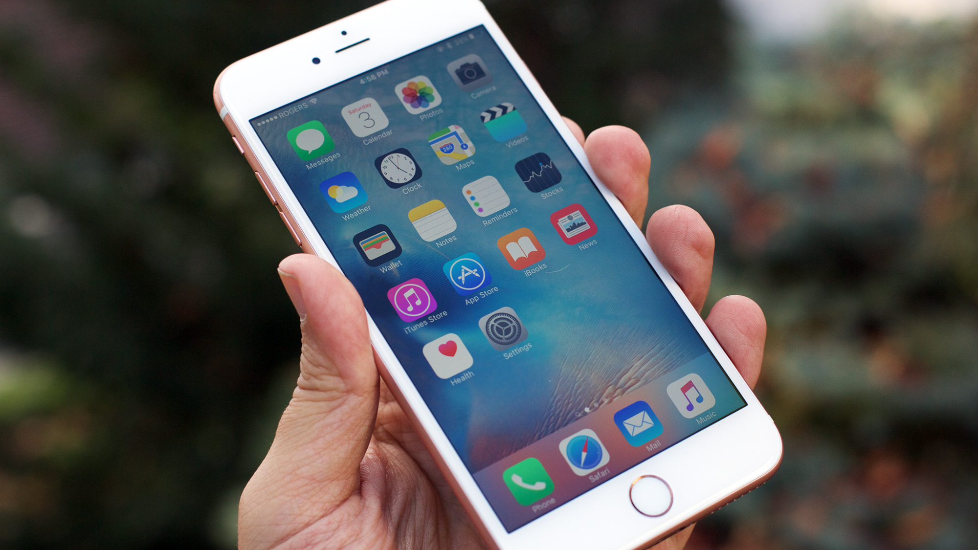
Lumping the iPhone 6 and 6S together, we’ve come to the first-ranked phone that hasn’t actually been marked down for lack of originality. The iPhone 6 and subsequent 6S design was a marked change over the iPhone 5S, but in my opinion, I don’t think it was an improvement. I much prefer the square edges of the previous models and found the back of the phone to be a bit dull.
iPhone 11 and 11 Pro
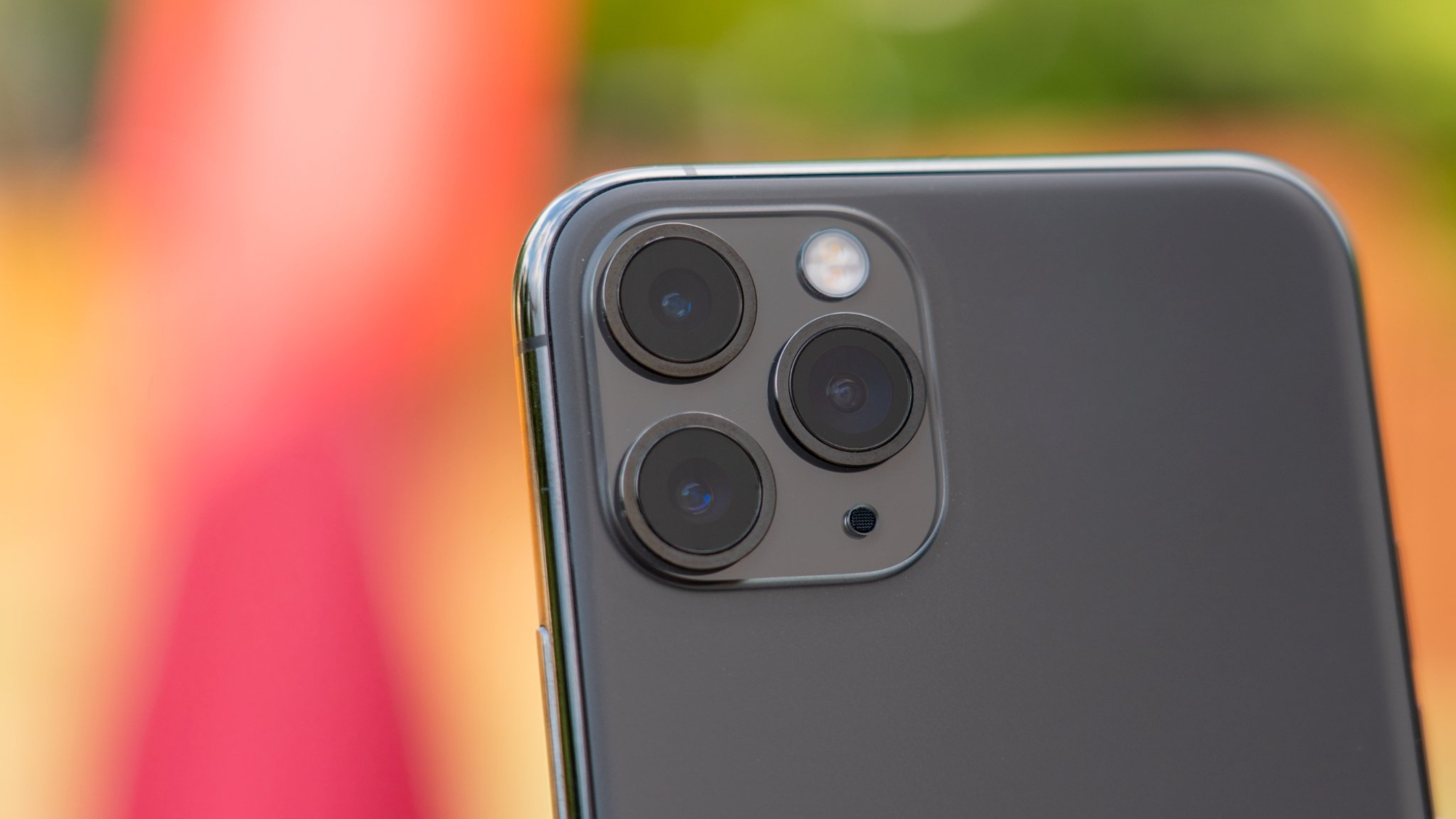
The iPhone 11 was a fairly impressive bit of kit and boasted a fabulous midnight green color as well as the first triple camera configuration on the rear of the device. It was also the last of the “round” iPhones before the iPhone 12 went all square on us. While the iPhone 11 Pro was really excellent, I thought the regular iPhone 11’s colors were a bit weak, and Apple didn’t really do much to improve on the design of iPhone X, which scores much higher as an innovative design change in my opinion.
The original iPhone, 3G, and 3GS
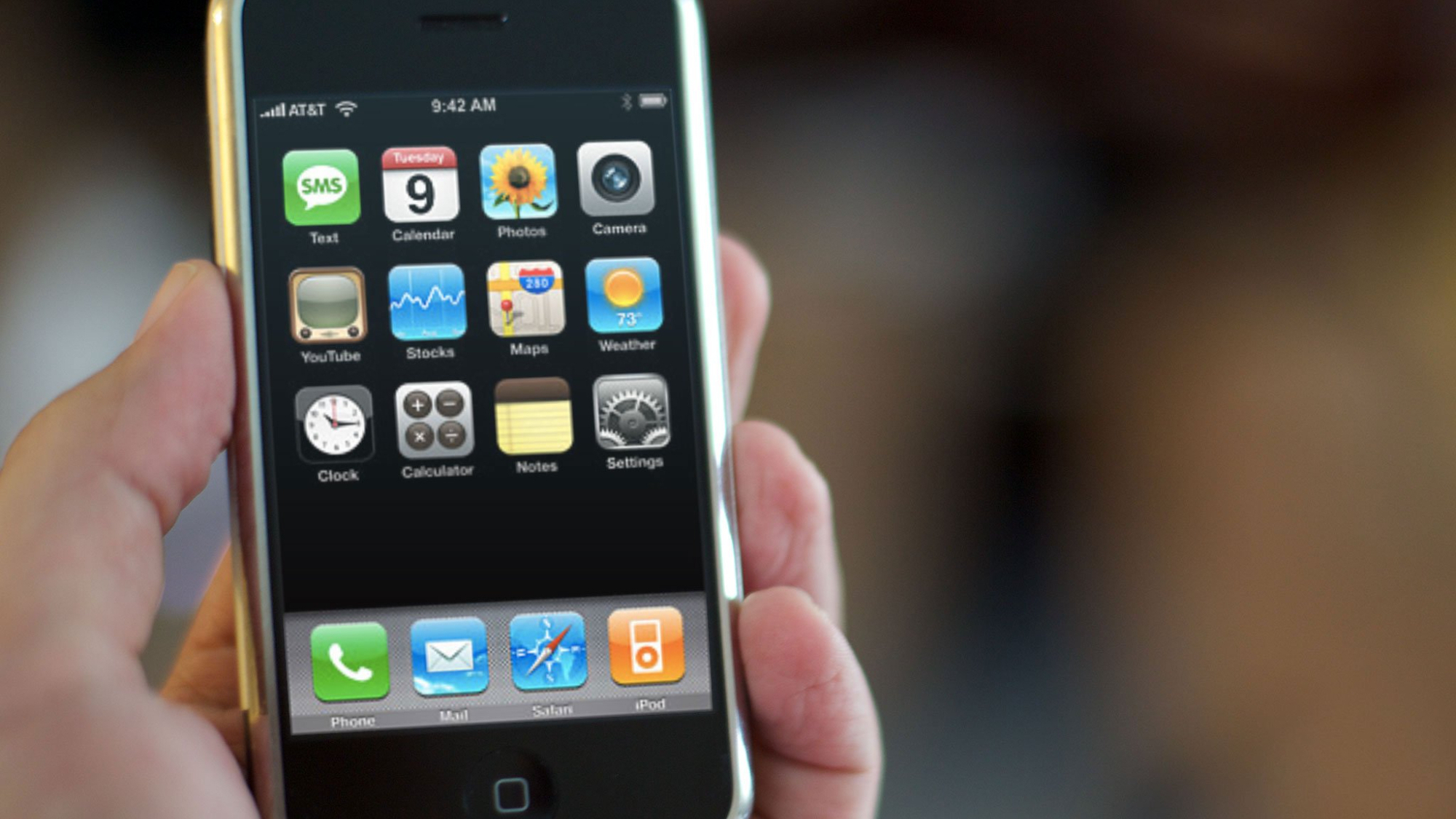
The original iPhone, as mentioned is an absolutely iconic design. Apple certainly improved on it with later versions of the iPhone, but its rounded edges, aluminum back (in the first model), gloss black and white in the 3G and 3GS totally changed the game when it came to smartphones. It can’t possibly be considered the best iPhone design ever, but to be able to rank it so highly amongst all that have come since speaks volumes to Apple’s original success in reinventing the phone.
Master your iPhone in minutes
iMore offers spot-on advice and guidance from our team of experts, with decades of Apple device experience to lean on. Learn more with iMore!
iPhone 4 and 4S
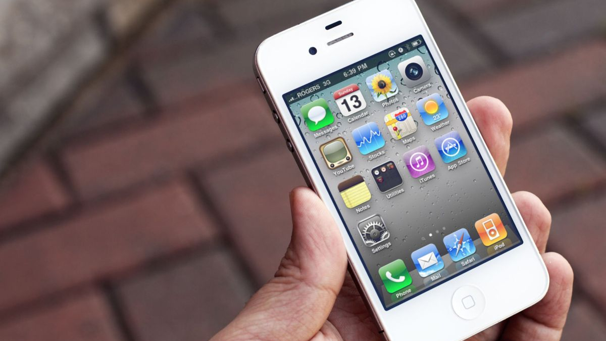
This might be controversial, but I think the iPhone 4 was a better overall design than the original iPhones. Not only that, but it was also a monumental change compared to the previous models after three relatively similar entries. It’s completely squared edges, aluminum surround, unique buttons, and crips color options were very alluring. The glass on the back was definitely an accident waiting to happen, and I know I smashed my fair share, but gosh was it nice to look at.
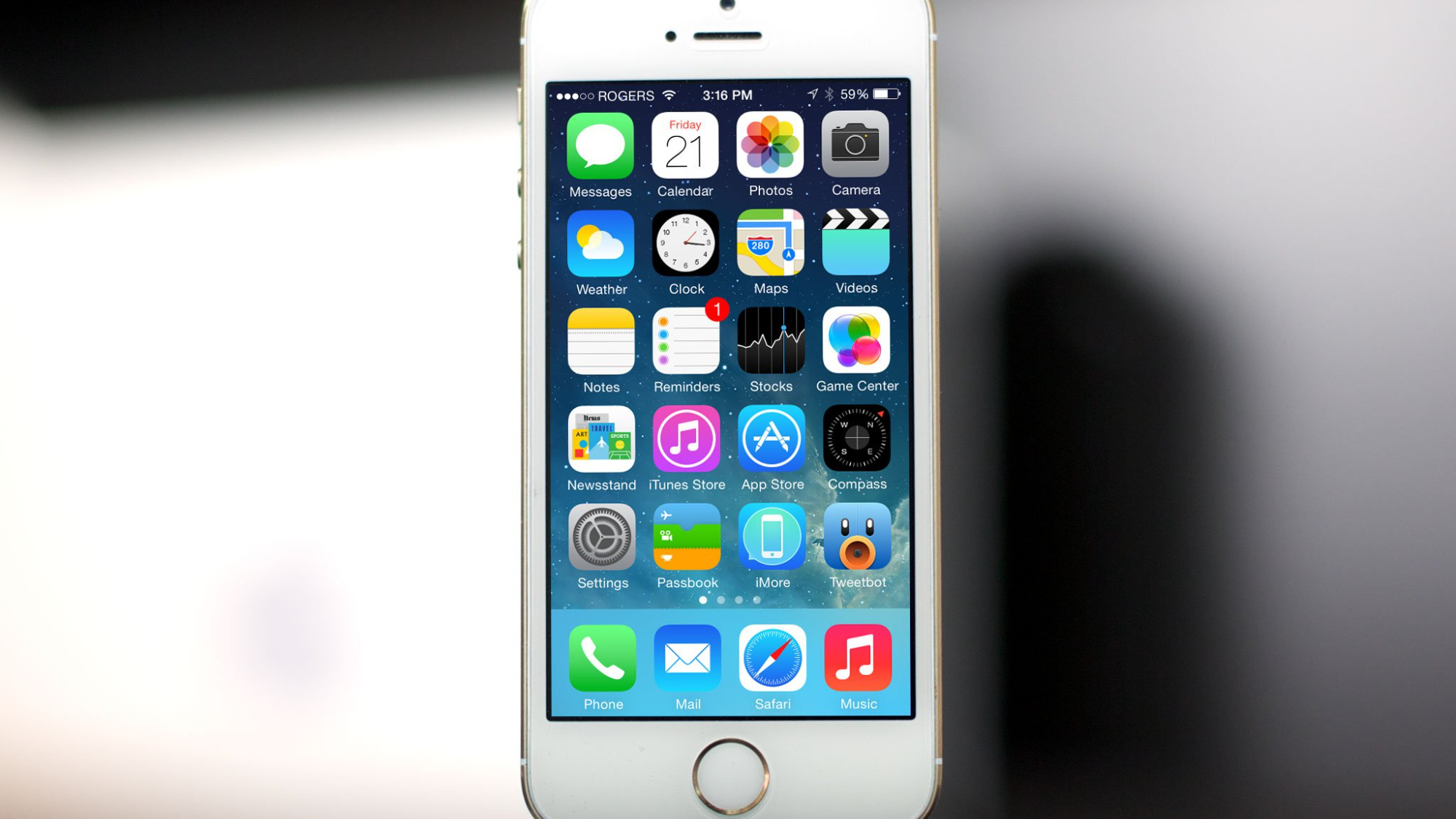
iPhone 5, 5S, SE (1st-gen)

You remember the advert, “something something your thumb goes from here to here, so why shouldn’t your phone?” Or something. The iPhone 5 was so much longer than the 4 and 4S that it was almost comical, yet its fabulous aluminum back and dark colors were an iconic design in the iPhone’s history. The 5S brought even more to the table with the first ever Touch ID Home button. Of course, the iPhone 5S became the original iPhone SE, another iconic phone in the lineup that offered customers the chance to get their hands on an iPhone for less.
iPhone X and XS
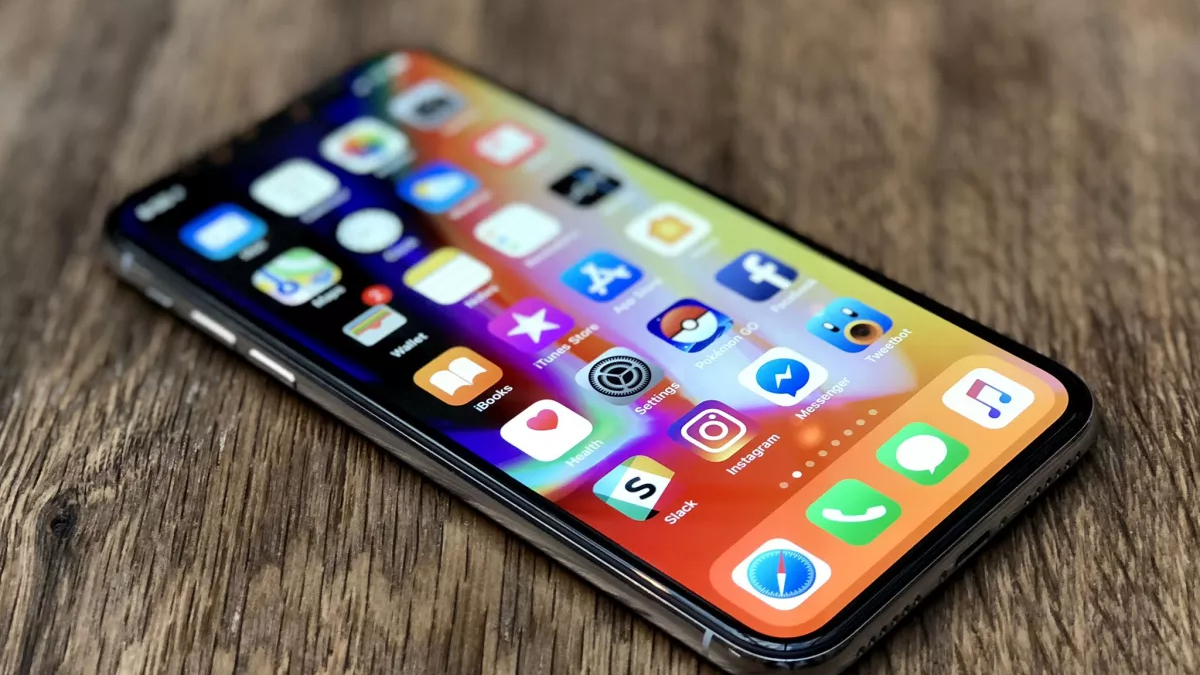
The iPhone 8 was completely overshadowed the year it was announced by Apple’s incredible ‘One more thing’ twist in 2017, the iPhone X. The stunning iPhone X and its predecessors, the XS and XR completely changed the iPhone design game, eschewing the Home Button, the iPhone’s chin and forehead, and bringing in the iconic notch. Some people hated the notch, some people still do, but the iPhone X was arguably the most important change to the iPhone’s design, maybe ever. The iPhone XS built on that success (but it didn’t change much), and the iPhone XR proved Apple could do accessible colors well (not like the 5C)
iPhone 7
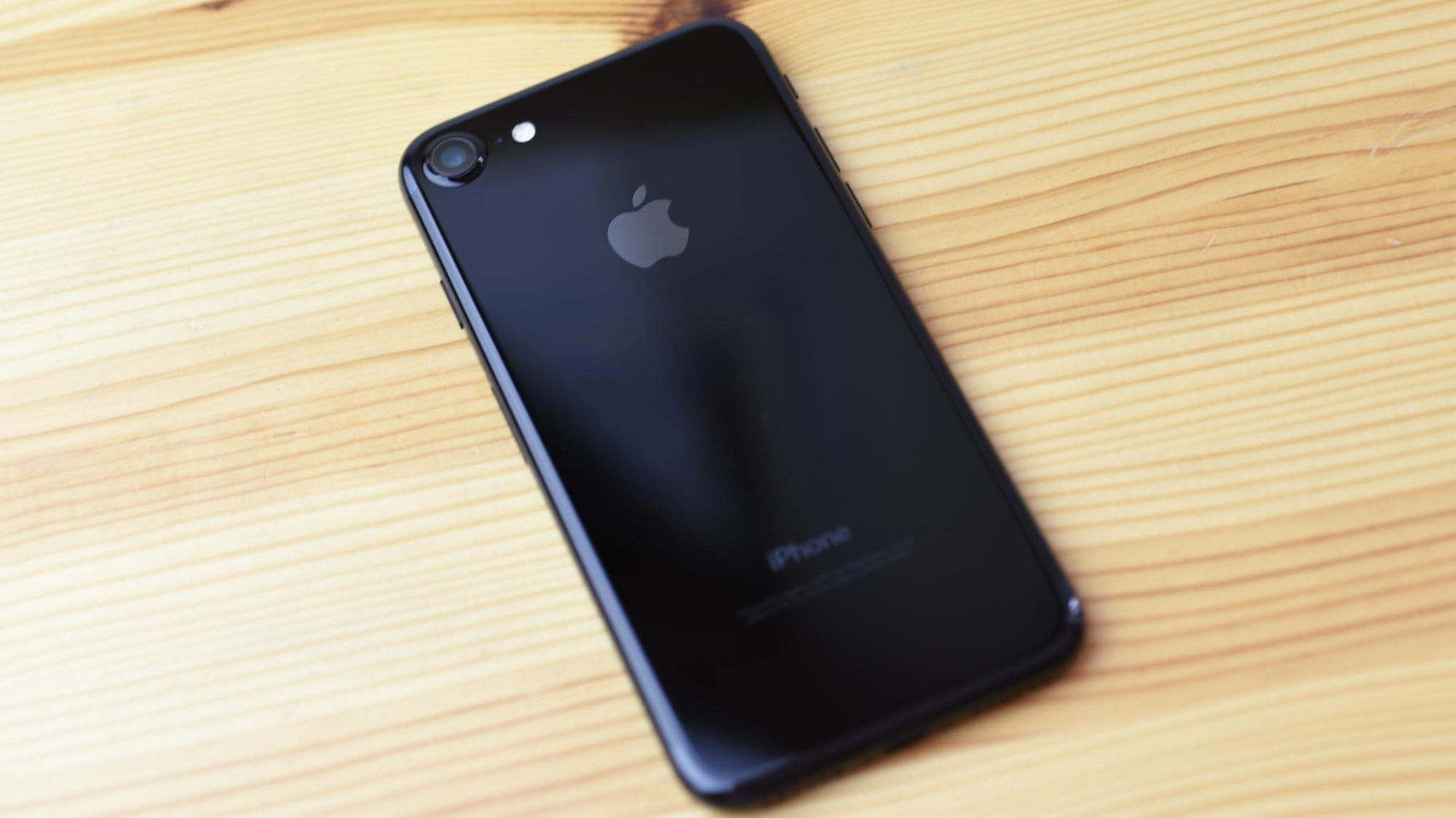
I went back on forth on this one. A lot. But to me, the greatest iPhone design ever made is the iPhone 7, specifically the Jet Black model. I’ve never wanted an iPhone like I wanted the Jet Black iPhone 7. The finish on this phone alone was achingly beautiful, and it refined the design of the iPhone 6 enough to make it a much better design leap from a device like the iPhone 5S where the 6 failed. I know there have been bigger design changes, such as the iPhone 4, 5, and 12, but for me, the Jet Black model remains my all-time favorite iPhone design.
iPhone 14?
So there you have it, our rundown of the best iPhones ever made. Looking back, there have truly been some iconic iPhone designs and some great colors and finishes too. I truly believe that Apple's design is one of the many reasons Apple's products stand apart from rivals in spheres including mobile phones.
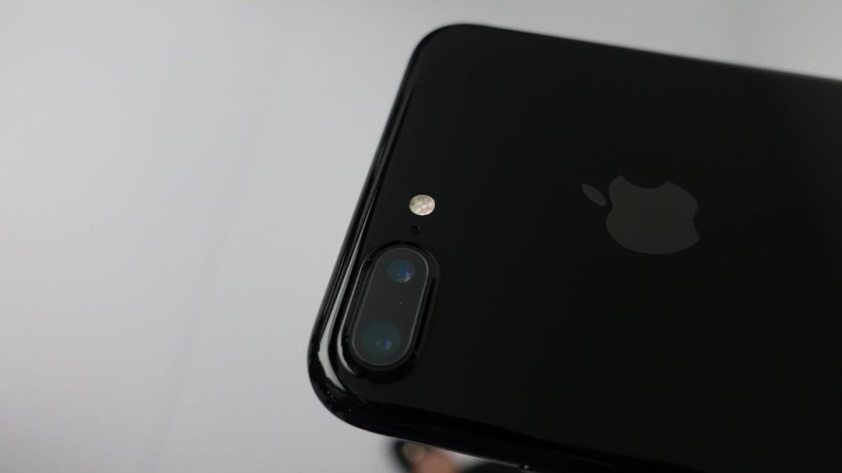
If you're all about design when it comes to iPhone, then we might have some bad news when it comes to iPhone 14. Reports indicate that this might not see a design change on the iPhone 13, which we've just slated for not improving over the iPhone 12. Three years of the same iPhone design? Say it ain't so, Apple.

Stephen Warwick has written about Apple for five years at iMore and previously elsewhere. He covers all of iMore's latest breaking news regarding all of Apple's products and services, both hardware and software. Stephen has interviewed industry experts in a range of fields including finance, litigation, security, and more. He also specializes in curating and reviewing audio hardware and has experience beyond journalism in sound engineering, production, and design. Before becoming a writer Stephen studied Ancient History at University and also worked at Apple for more than two years. Stephen is also a host on the iMore show, a weekly podcast recorded live that discusses the latest in breaking Apple news, as well as featuring fun trivia about all things Apple. Follow him on Twitter @stephenwarwick9
