Thanks, Apple, I hate the new battery percentage indicator
This is what we waited five years for?

Apple released the iPhone X in 2017 with a new space-hogging notch and without a battery percentage indicator on the top right of the screen. This was a double whammy because the notch wasn’t (and isn’t) popular, and some of us like to know our exact battery percentage at a glance. Sure, we can swipe down from the top right corner to access that number, and sure, the battery indicator was still there, letting us know in green, yellow, or red roughly how much battery power remained. But the single glance precise battery percentage was gone.
There was quite a bit of uproar over this, but eventually, we learned to deal with the change while holding out hope that Apple would bring it back.
The battery percentage indicator is baaaaack
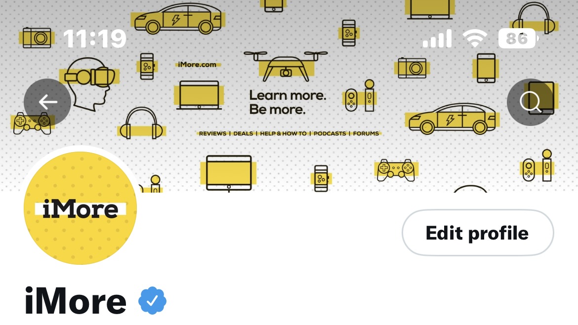
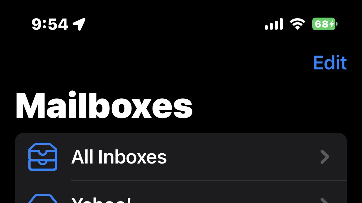
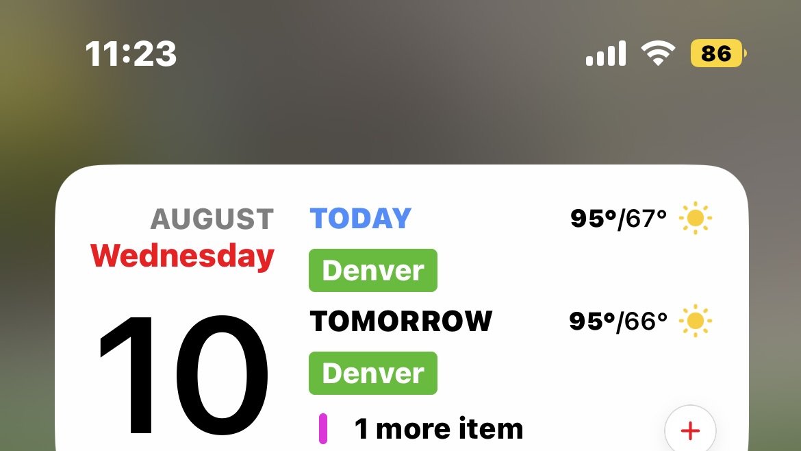
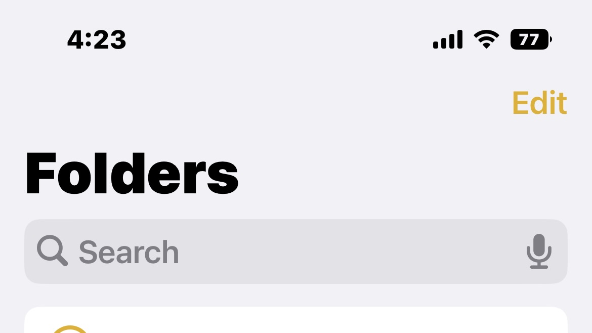
With the latest iOS 16 beta, Apple brings back the battery percentage indicator — it’s just not the way we wanted it. Instead of sitting legibly next to the battery icon, the number is inside the battery icon. Why, Apple, why?
This is about the worst implementation I can think of. Not to mention, it only works on certain models: iPhone 11 Pro Max, iPhone 12 Pro Max, iPhone 13, iPhone 13 Pro, and iPhone 13 Pro Max. The iPhone 13 mini and the non-Max models of older phones are apparently too small, or the notch is too large, for it to work. This doesn’t even make sense to me. How much of that precious top right corner space can a number inside the already existing icon take up?
Also, why on Earth did this take five years?

Why it isn't great
Besides how it won’t work on most models, there are some issues with the implementation itself. Since the number is placed inside the icon, the icon itself can no longer serve its original purpose. It no longer shows a visual indication of battery level, just the number. The battery icon isn’t green when you have plenty of battery or yellow when you’re running low. Instead, it’s black when you have a light background and white when you have a medium-to-dark background. When the iPhone is charging, the number is hardly even legible.

Is there anything good about it?
Although I’m a bit salty about it, I suppose it’s better than not having it all. The battery icon does at least show as yellow when your iPhone is in low power mode.
Master your iPhone in minutes
iMore offers spot-on advice and guidance from our team of experts, with decades of Apple device experience to lean on. Learn more with iMore!

Is there a better way?
People online have already been trying to improve the battery indicator. Twitter user Brian Michel came up with this solution:
Just recreating the battery indicator pic.twitter.com/cK8PZDe9Y5August 9, 2022
While the numbers changing color is cute, I think this is even harder to read than Apple’s implementation. This animation is blown up, so it’s not hard to read here, but if it were squeezed into the iPhone's top right corner, it would be tough.
Given that the notch isn’t going away anytime soon, why not give us a choice with the best iPhones? Let us pick the battery icon or the battery percentage if there’s not room for both. A simple option in the settings would satisfy everyone. Apple can also move the Wi-Fi indicator to the top left corner and abbreviate the name of my cellular company (I know what it is, anyway).
In general, Apple could offer several different arrangements of those important icons on either side of the notch and let us choose in Settings which one we’d like to use.

The battery indicator just needs a few tweaks
Thanks for bringing back the battery percentage, Apple, five years after you took it away and we had finally gotten over it. It’s just too little, too late.
It's worth noting that we're still in beta. My hope is that the final version of iOS 16 will offer a better iteration and some options for the consumer to choose their own battery indication icon.

Karen is a contributor to iMore.com as a writer and co-host of the iMore Show. She’s been writing about Apple since 2010 with a year-long break to work at an Apple Store as a product specialist. She's also a contributor at TechRadar and Tom's Guide. Before joining iMore in 2018, Karen wrote for Macworld, CNET, AppAdvice, and WatchAware. She’s an early adopter who used to wait in long lines on release days before pre-ordering made things much easier. Karen is also a part-time teacher and occasional movie extra. She loves to spend time with her family, travel the world, and is always looking for portable tech and accessories so she can work from anywhere.
