This iOS 16 notification setting will drive you crazy if left unchanged
Especially if you get a lot of notifications.

Apple is set to release iOS 16 to the public very soon and you're probably very excited about that, as you should be. But I'm here to tell you that you're going to go crazy if you don't make sure you have one specific setting configured just right.
The big iOS 16 update is a worthwhile one, not least because it finally lets us edit iMessages and unsend emails. But one standout change is the way your iPhone's Home Screen functions. Not only can you add widgets to your Home Screen for the first time, but you can also change how notifications appear — with three options to choose from. But choosing wisely is vital, especially if you get a ton of notifications.
To stack, or not to stack

Here's the gist. With iOS 15 and earlier you had your notifications appear as an on-screen list and that was the long and short of it. You could have them grouped by app and whatnot, but they all appeared as a list. That changes with iOS 16.
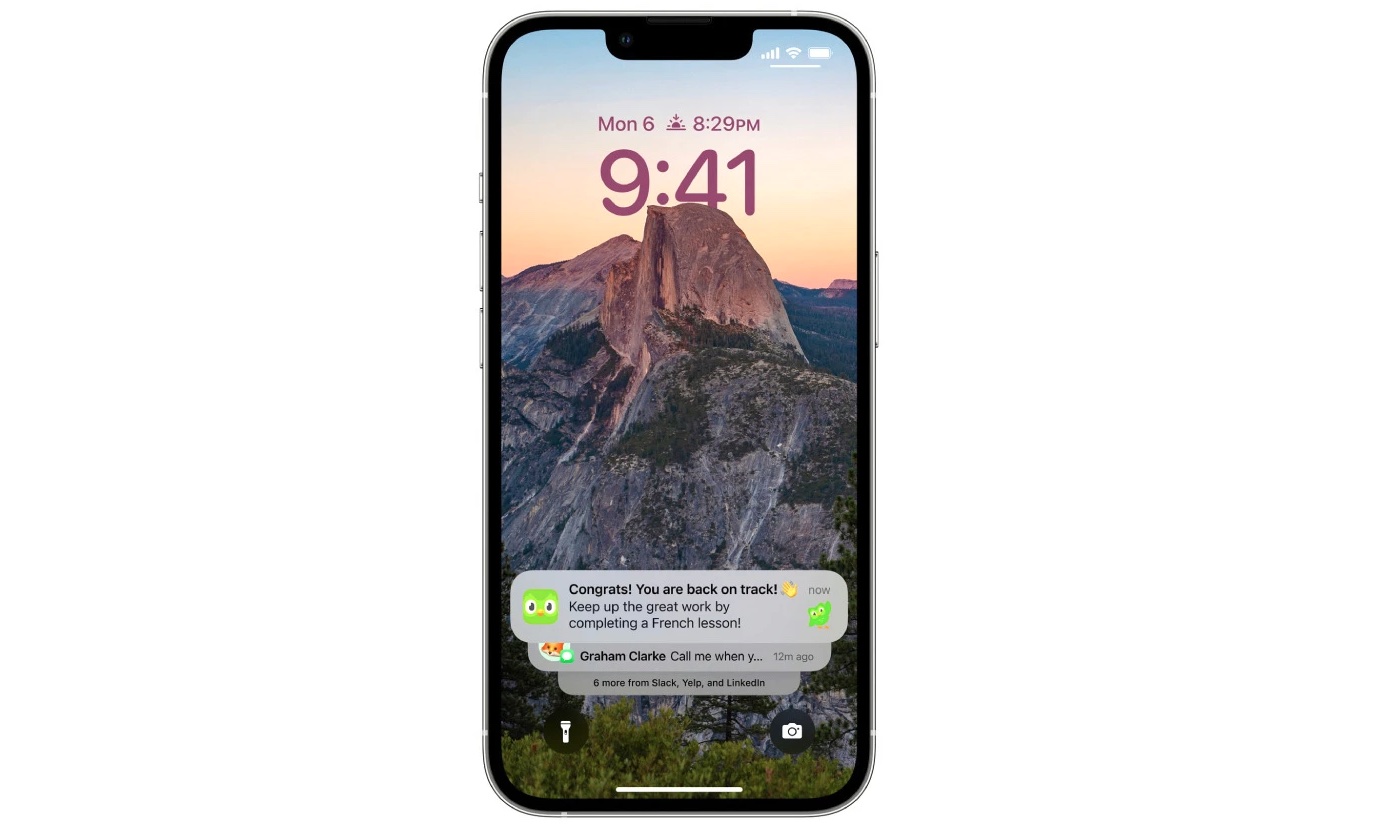
Now, you can choose to either have your notifications appear in a stack or as a numerical count, plus the previous list view.
The numerical option is cool, especially if you're someone who wants to know that you have notifications but are acutely aware of the fact that you get too many and want to avoid them eating into your time. Just tap the number and your notifications appear, ready to be read.
If you only receive a notification or two, you're golden. But any more than that and you'll find yourself constantly trying to move that first notification out of the way.
The list option works as I just explained.
But the stack option? That's maddening. It was set as the default the first time I updated to the iOS 16 beta and after giving it a few hours I had to change it back to the list option. Oh boy, did I hate it. And it's the default for all iPhones upgrading to iOS 16.
Master your iPhone in minutes
iMore offers spot-on advice and guidance from our team of experts, with decades of Apple device experience to lean on. Learn more with iMore!
The theory is sound, of course. Apple wanted to move the notifications down to the bottom of the screen to get out of the way of your gorgeous wallpaper. It also means they can be tapped more easily because they're lower down the screen on an iPhone that just keeps on growing. That's all fine. The problem comes when you actually need to read the things.
If you only receive a notification or two, you're golden. But any more than that and you'll find yourself constantly trying to move that first notification out of the way so that you can see the ones beneath it. But be careful, do it wrong and you'll be launched into the notification's app, marking it as read in the process. The number of times I did that were too many to count. And far too many for my stack experiment to last much longer.
The smart choice
So, do yourself a favor. If you want to hide your notifications, try the count option. But if you get any number of notifications and want to stand a chance of seeing them, stick with the list option. Your patience will thank you for it.
Still, all of that aside, iOS 16 remains the best iPhone software to date, so long as you change that one setting, of course. The new Lock Screen widgets and wallpaper customizations are excellent, as are those changes to Messages and Mail I mentioned earlier. There's more, too, with Shared iCloud Photo Library fixing a pain point many have dealt with for years. Give it a try come release day, it'll be worth the wait!

Oliver Haslam has written about Apple and the wider technology business for more than a decade with bylines on How-To Geek, PC Mag, iDownloadBlog, and many more. He has also been published in print for Macworld, including cover stories. At iMore, Oliver is involved in daily news coverage and, not being short of opinions, has been known to 'explain' those thoughts in more detail, too. Having grown up using PCs and spending far too much money on graphics card and flashy RAM, Oliver switched to the Mac with a G5 iMac and hasn't looked back. Since then he's seen the growth of the smartphone world, backed by iPhone, and new product categories come and go. Current expertise includes iOS, macOS, streaming services, and pretty much anything that has a battery or plugs into a wall. Oliver also covers mobile gaming for iMore, with Apple Arcade a particular focus. He's been gaming since the Atari 2600 days and still struggles to comprehend the fact he can play console quality titles on his pocket computer.
