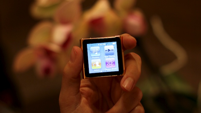
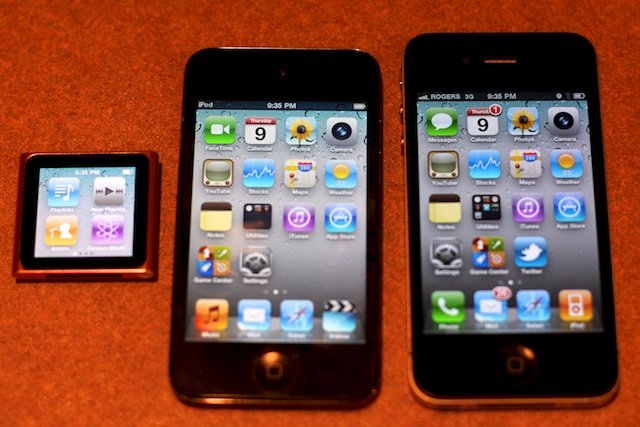
iPod nano (2010), the sixth generation iPod nano, is a complete redesign from form factor to interface. Gone is the click-wheel, gone is the camera, gone is the video. What's left is a beautiful, polished square running something that looks like iOS, complete with multitouch, gestures, and little nano apps. How does that compare to an iPod touch or iPhone? Read on after the break for our review.
Hardware
The 2010 iPod nano is cooler and sleeker, and definitely smaller than last year's model -- 46 percent smaller to be exact and 42 percent lighter. That works out to a tiny 1.48 inches (37.5 mm) high, 1.61 inches (40.9 mm) wide, 0.35 inch (8.78 mm) deep with the clip, and a weight of just 0.74 ounce (21.1 grams). That makes it extremely portable.
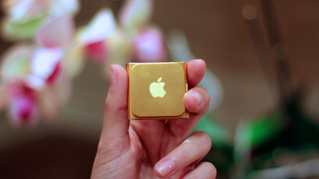
The nano also picks up the iPod shuffle's clip. Located on the it's easy to use and can be worn almost anywhere -- believe me, I've tried!
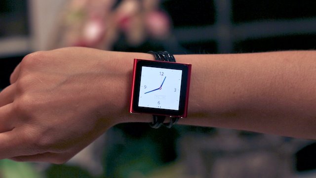
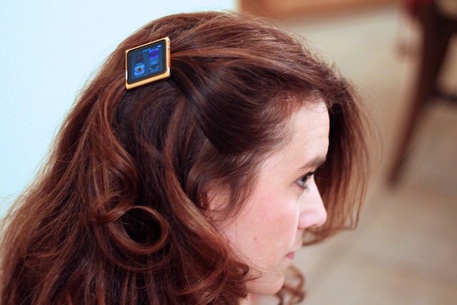
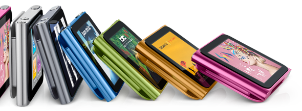
You may have heard that it's hip to be square and the nano proves it. The anodized aluminum outer shell comes in 7 different colors, silver, grey, yellow, green, blue, pink and red.
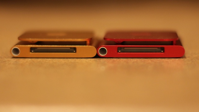
As for ports, the new nano has the same old 30 pin connector so you can use it with your computer, car, and any other iPod accessories that you may already have, and the standard 3.5mm headset jack.
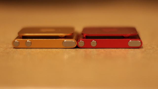
There are also buttons, which are round and metal and similar to iPhone 4, including volume up and down and sleep/wake. Unfortunately there's no home button like iPhone, something I'll gripe about later.
The bright 1.54-inch display packs 240-by-240 pixel, 220ppi resolution. The multi touch screen allows you to tap to launch apps or make selections, drag apps around to re-arrange them, put two fingers down and twist to rotate the display, double tap (Zombieland ftw), and press-hold an icon to star/stop jiggly mode, or in the middle of the screen to go back to the main home page.
Apple rates the battery life at 24-hours for music with a fast change time of an hour and half to get to 80% and 3 hours to get to full.
And yes, no more video camera. The iPod touch stole it.
Software
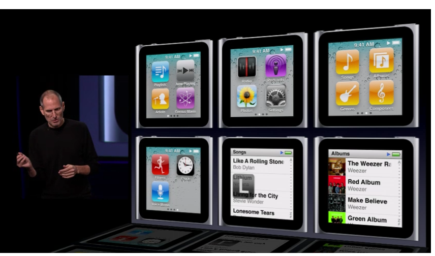
Music is where the iPod nano is at. You can select your music from a multitude of different icons (I can't really call them apps, they just launch different views of the iPod app). Songs, albums, artists, playlists, genres, and composers are all here.
The Genius app will take music you already like and choose other songs which you may find appealing. You use the genius application in iTunes and then just sync over any songs you want.
The FM radio works very well on the iPod nano, just plug in your earphones (they double as the antenna) and let the tuner do the rest. You also have the ability to live pause your music, this way you can listen to a song on the radio and then pause the song and come back to the song just where you left off.
If you like to run with your iPod Nano then the pedometer is perfect. It will track how many steps you have taken, how many calories you have burned, and any when you have reached your target goal. If you use Nike+, it's there and waiting for you as well.
One of my favorite applications is the clock, which looks like a snazzy watch. You can choose to have the black or white watch background, I think the black looks nicer.
Apple continues to lead the pack when it comes to accessibility and he new nano is no different. You can turn on the VoiceOver feature which will then give you a description of what is under your finger.
There's a photo app so you can swipe through any photographs you've synced over, but there's no video player any more. I synced over a few video podcasts just to see what would happen and all I got was the audio. Maybe Apple doesn't think people want to watch video on a 1.5-inch square, or maybe Apple just wants them to buy an iPod touch instead.
Conclusion
The 2010 iPod nano is small and lightweight and offers great battery life. The clip also makes it wearable for athletes, hipsters, and pretty much anyone on the go.
It's easy to use and immediately familiar to anyone coming from an iOS device like iPod touch or iPhone. That said, the "tap and hold center" as home button is not very intuitive and sometimes conflicts with other interface actions. Could they have fit in a real, physical home button, or somehow added the functionality to the sleep/wake button? As it is, it's a klutzy deviation from iOS and not for the better.
It's also an iPod in the more traditional sense, not in the iPod touch sense. You're limited to music, music, music, and a few nano apps (napps?). There's no more video playback, and there's not even a contact book or calculator. (Sure it would have been hard at that size, but if anyone could do it it's Apple).
Taken as a whole, which is how Apple products simply must be taken, the iPod nano (2010) won't appeal to those who can afford a iPhone or a iPod touch but might just be the best nano yet for those who want to bring something lightweight with them on the go.
Senior Editor at iMore and a practicing therapist specializing in stress and anxiety. She speaks everywhere from conferences to corporations, co-host of Vector and Isometric podcasts, follow her on Twitter @Georgia_Dow and check out her series at anxiety-videos.com.
