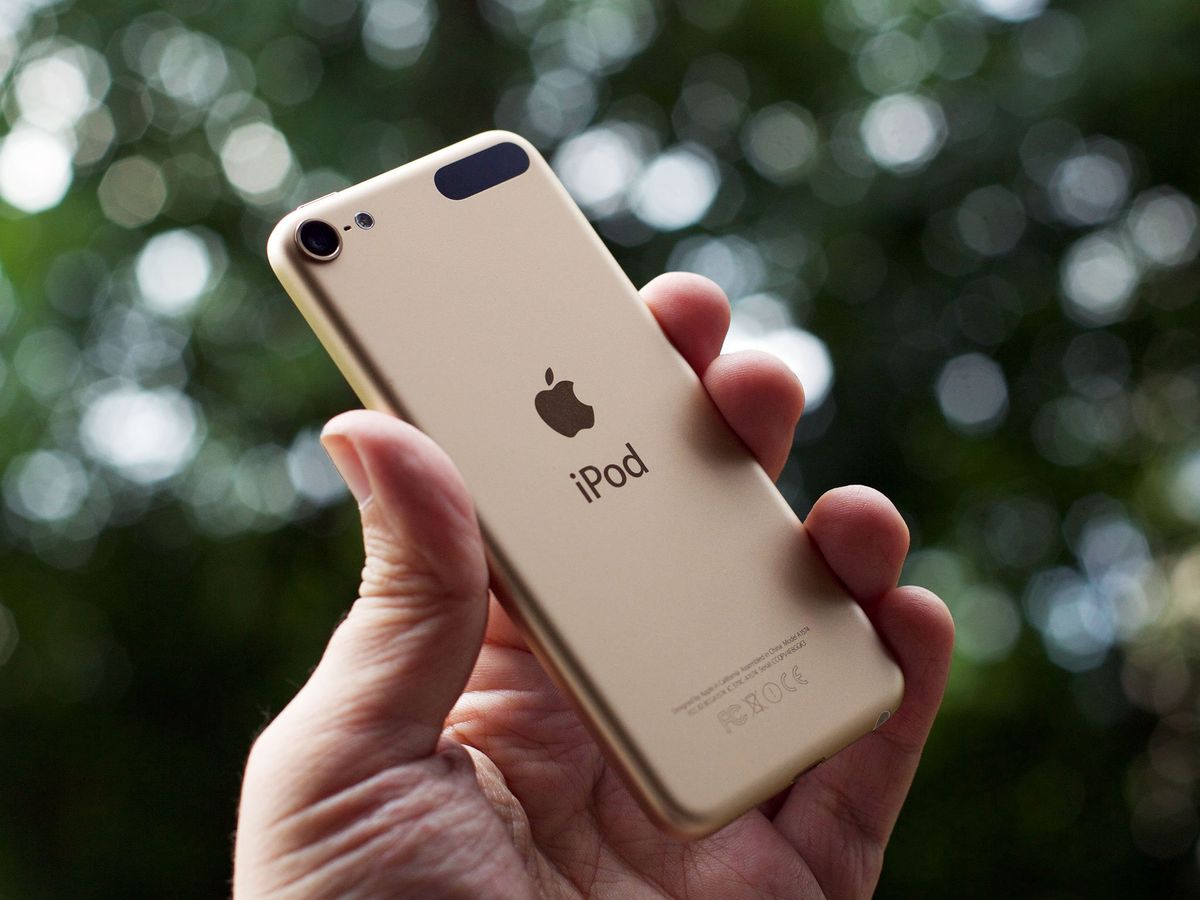
2015 doesn't bring the next generation of iPod touch: It's still the same general design Apple introduced back in 2012. Yet that design was so forward-thinking, it evolved and spread through the iPad and iPhone lines as well. As a result, even without a major design overhaul the iPod touch still looks sleek and sophisticated and utterly modern.
The insides, however, are truly modern. Gone is the old 32-bit Apple A5 chipset; in its place is the scorching fast Apple A8—the same silicon inside the iPhone 6 and iPhone 6 Plus. Gone also is the old 5-megapixel iSight camera, replaced with the much better 8-megapixel iSight—the same sensor and lens from the iPad Air 2.
There's more to the new iPod touch as well: a better front-facing FaceTime camera, faster 802.11ac Wi-Fi, and fresh exterior finishes that match—and extend—the rest of Apple's iOS product lines.
But is it enough? Let's find out!
For people who want:
- Affordable access to the App Store
- An incredibly small, thin, light "tablet"
- No cellular plan to worry about
- A connected camera
- A family remote control
- An extra development device
Not for people who want:
- A phone
- Cellular and/or GPS
- A larger-than-4-inch display
- Touch ID
- Apple Pay
iPod touch video review
Give us 4 minutes and we'll give you the iPod touch!
iPod touch Evolution
| Header Cell - Column 0 | iPod touch 1 | iPod touch 2 | iPod touch 3 | iPod touch 4 | iPod touch 5 | iPod touch 6 |
|---|---|---|---|---|---|---|
| Row 0 - Cell 0 | Row 0 - Cell 1 | Row 0 - Cell 2 | Row 0 - Cell 3 | Row 0 - Cell 4 | Row 0 - Cell 5 | Row 0 - Cell 6 |
| Code Name | n45 | n72 | n18 | n81 | n78 | n102 |
| Model Name | iPod1,1 | iPod2,1 | iPod3,1 | iPod4,1 | iPod5,1 | iPod7,1 |
| Screen Size | 3.5 inches | 3.5 inches | 3.5 inches | 3.5 inches | 4 inches | 4 inches |
| Screen Resolution | 480x320 163ppi | 480x320 163ppi | 480x320 163ppi | 960x640 326ppi | 1136x640 326ppi | 1136x640 326ppi |
| System-on-a-Chip | Samsung S5L8900 | Samsung S5L8720 | Samsung S5L8920 | Apple A4 | Apple A5 | Apple A8 |
| CPU | 412 MHz ARM 1176JZF-S | 533 MHz ARM 1176JZF-S | 600 MHz ARM Cortex A8 | 800 MHz ARM Cortex A8 | 800 MHz dual-core ARM Cortex A9 | 1.1 GHz dual-core ARM v8 Typhoon |
| GPU | PowerVR MBX | PowerVR MBX | PowerVR SGX535 | PowerVR SGX535 | PowerVR SGX543MP2 | PowerVR Series 6XT GX6450 |
| Co-processor | N/A | N/A | N/A | N/A | N/A | Apple M8 |
| RAM | 128 MB | 128 MB | 256 MB | 256 MB | 512 MB | 1 GB |
| Max storage | 32 GB | 32 GB | 64 GB | 64 GB | 64 GB | 128 GB |
| iSight | N/A | N/A | N/A | 0.7 mp, 720p | 5mp, 1080p | 8mp, 1080p |
| FaceTime | N/A | N/A | N/A | 0.3mp, VGA | 1.2mp, 720p | 1.2mp, 720p |
| Bluetooth | N/A | Bluetooth 2.1 + EDR | Bluetooth 2.1 + EDR | Bluetooth 2.1 + EDR | Bluetooth 4.0 | Bluetooth 4.1 |
| Wi-Fi | 802.11b/g | 802.11b/g | 802.11b/g | 802.11n | 802.11n | 802.11ac |
| Sensors | Accelerometer | Accelerometer | Accelerometer | AccelerometerGyroscope | AccelerometerGyroscope | AccelerometerGyroscope |
| Connector | 30-pin Dock | 30-pin Dock | 30-pin Dock | 30-pin Dock | Lightning | Lightning |
| Height | 4.3 inches | 4.3 inches | 4.3 inches | 4.4 inches | 4.86 inches | 4.86 inches |
| Width | 2.43 inches | 2.43 inches | 2.43 inches | 2.32 inches | 2.31 inches | 2.31 inches |
| Depth | 0.31 inches | 0.33 inches | 0.33 inches | 0.28 inches | 0.24 inches | 0.28 inches |
| Weight | 4.2 ounces | 4.1 ounces | 4.1 ounces | 3.6 ounces | 3.1 ounces | 3.1 ounces |
| Battery | 580 mAh | 739 mAh | 789 mAh | 930 mAh | 1030 mAh | 1043 mAh |
| Colors | Black | Black | Black | BlackWhite | Slate/Space GraySilverYellowPinkBlueRed | Space GraySilverGoldPinkBlueRed |
| Launch OS | iPhone OS 1.1 | iPhone OS 2.1 | iPhone OS 3.1 | iOS 4.1 | iOS 6 | iOS 8.4 |
| Starting Price | $299 | $229 | $299 | $229 | $299 | $199 |
| Release Date | September 2007 | September 2008 | September 2009 | September 2010 | September 2012 | July 2015 |
iPod touch design
The 2015 iPod touch looks almost identical to the 2012 iPod touch, lacking only the wrist strap and its pop-up anchor; likely few, if any, will miss it. The colors have evolved, too. Other than that, everything on the outside appears identical.
Packaging
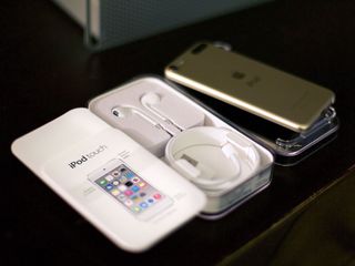
If you're not already familiar with it, the iPod touch comes proudly displayed just beneath a transparent plastic lid. Remove the device, and you'll find a quick start guide along with a pair of Apple EarPods for listening and a USB to Lightning cable for charging (and, if you're old school, syncing to iTunes).
Unlike the iPhone, iPad, Apple Watch, Apple TV, and Mac, the iPod touch doesn't come with an AC adapter: If you want one of those, you'll have to buy it separately.
Design language
The 2012 iPod touch was at the leading edge of Apple's current industrial design language, and as such, it still fits in brilliantly despite its age. The rounded corners, the metallic finishes, the extreme thinness—all of those design elements from 2012 have moved across the line to iPad mini, iPad Air, and most recently, iPhones 6.


Even the new MacBook fits in perfectly now. Only the Apple Watch, which harkens back to the original iPhone design, stands apart.
What's particularly impressive about the iPod's design is that it isn't "classic" or "timeless;" the 2012 casing was simply ahead of its time, and now everything else has caught up.
While it's not shocking to hold the way it was a few years ago, it still feels impossibly light and impossibly thin. Especially when compared to the big and bigger iPhones 6, the iPod touch still feels almost too light to be real. Yet its structure remains strong: The casing never feels like it'll bend or fold, at least not with anything even approaching normal use.
My question is this: Where does Apple's design language go from here? Given that the iPod touch was just refreshed and the Apple Watch seems to be taking cues from the past, which new device will lead it?
Display
The iPod touch followed the original iPhone's launch in 2007 with a similar 3.5-inch, 480x340 163ppi display. In 2010, when the iPhone 4 went Retina, the iPod touch 4 followed again with a similar 960x640 at 326ppi display. Likewise, in 2012 when the iPhone 5 went to 16:9 at 1136x640, the iPod touch 5 followed.
Now the iPhones 6 have gone to 4.7- and 5.5 inches, 1334x750 at 326ppi and 1920x1080 at 401ppi respectively, but the iPod touch 6 has stayed stuck with the same resolution and screen size as in 2012.
For some, that's a disappointment. The idea of an iPhone 6- or iPhone 6 Plus-sized mini tablet for surfing, reading, or gaming held a lot of appeal. For others, the new screen sizes themselves were literally big disappointments, and the iPod touch staying at its original size is the best thing that could have happened to the device.
Regardless of which side you fall on, Apple now has a modern lineup with devices that range from 4 to 9.7 inches. They're not numerous enough to cover every quarter-inch increment like some competitors, but Apple's iPhones, iPods, and iPads still fill a very wide array.


Personally, after having used an iPhone 6 Plus almost exclusively going on nine months now, going back to the 4-inch screen feels almost claustrophobic. The human brain is remarkably pliable, and 4-inches, to me, now seems like such a small window. Because it's so small and light, however, I liked it a lot more than my experiences returning to an iPhone 5s with the same-sized display. The difference goes both ways, though: Despite its slim frame, the new iPod touch still lacks the in-cell display technology and dual-domain pixel in-plane switching arrangement of the iPhone.
That means the contents still looks like it's beneath the glass, not inside the glass the way it does on an iPhone 6 or iPad Air 2, and that the extreme viewing angles are a little less extreme and a little less color consistent.
In terms of overall quality, this year's iPod touch looks about the same as 2012's. Mostly. To my eyes, the 2015 displays are slightly cooler (bluer) than the 2012 (yellower), and closer to the balance of the current iPhones and iPads. Opinions on cast vary, but I definitely prefer it this way.
Gold and gamuts
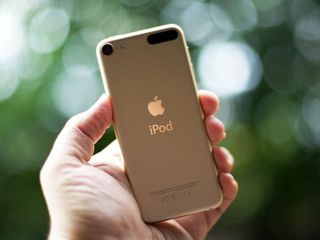
The new iPod touch comes with new metallic finishes. Space gray and silver are still here, of course; yellow, however, has been replaced with gold to better match the iPhone, iPad, Apple Watch, and even the new MacBook. The gold is, as usual, closer to champagne and much nicer on my eyes than the metallic yellow ever was.


The blue is darker and deeper now; the iPod's original metallic blue was closer to cyan or turquoise, while the new one is more cerulean. Likewise pink: The previous color was closer to salmon; the new one is richer and—yeah, I'll say it—hotter. Product RED, which supports the AIDS charity of the same name, remains both an extra color option and an Apple exclusive.


You can chalk the changes up to fashion but overall I like them much better. The old blue was fine but the old pink never really looked pink enough. The new one is pink. Overall, everything looks deeper and bolder, and that's a good look.
iPod touch chipsets
Apple's been putting together its own chipsets since the Apple A4 in the original iPad, but the company has only been making its own custom silicon since the Apple A6's Swift processor found in the iPhone 5. The Apple A7 brought 64-bit to mobile with the Cyclone in the iPhone 5s.
The iPod touch, languishing as it was on the Apple A5 platform, benefited not at all from either of those leaps forward. But that changes now: The new iPod touch has an Apple A8 chip, with the Typhoon processor at its core.

I wrote about the Apple A8 in the iPhone 6 review. Rather than recapitulate it all, I'll just note here that the iPod touch 6's dual-core processor is clocked 300 MHz slower. That's not surprising given the differences in case and components, and Apple's history of running close to thermal limits.
The iPhone's PowerVR Series 6XT GX6450 graphics processor appears to be the same here in the iPod touch. It's tempting to think that pushing the iPod's 727,040 pixels around is less work than the iPhone 6's 1,000,500 or the iPhone 6 Plus' 2,073,600 physical (2,742,336 internal), but regardless of the implementation details, in practice there's little discernible difference between devices. Apps all launch incredibly quickly and games fly.
Here are the perfunctory Geekbench and Sunspider benchmarks to show the difference between the iPod touch 6 (left) and iPod touch 5 (right); Geekbench first, and then Sunspider. (Higher is better for Geekbench, lower is better for Sunspider.)

For Geekbench, that's 1289/2420 for iPod touch 6 vs. 214/416 for iPod touch 5, or six times faster for single core and almost six times faster for double core. For Sunspider, that's 576.2 vs. 2879.7, which is almost five times faster. By way of comparison, the Geekbench scores I got for the iPhone 6 and iPhone 6 Plus were 1636/2933 and 1627/2907 respectively, and Sunspider were 395.9 and 369.7.
Numbers aside, technology is never as important as experience, and like I said before, the iPod touch 6 is screaming fast. It handled everything I threw at it not only with speed, but with style.
M8 motion coprocessor
Along with the Apple A8 chipset, the iPod touch gains the M8 motion coprocessor. It's what handles the accelerometer, gyroscope, and similar data in a persistent yet incredibly energy efficient way. Combined with Apple's Health app and HealthKit framework, it can not only track your steps and activity, but coordinate with a host of fitness apps and accessories to help keep you motivated and keep you going.
It's great to see it on the iPod touch. For those who don't want or need an iPhone, or for those who want something lighter than their iPhone to take jogging or to the gym who don't have an Apple Watch, the new iPod touch can now be that device.
802.11ac + Bluetooth 4.1
Apple has updated both the radios in the iPod touch. Wi-Fi has gone from 802.11n to 802.11ac, which offers up to 3 times the data transfer speeds. Theoretical speeds, however, are just what the name implies. If you don't have an 802.11ac router, like Apple's current AirPort Extreme or Time Capsule, it won't make much difference to you. If you do, environment variables aside, you should see an improvement over the previous generation iPod touch. (And over the current generation iPod mini 3, which is still on 802.11n.)
Bluetooth has also gone from 4.0 to 4.1. That makes the iPod touch the first Apple device to ship with the new spec. Some of what BT 4.1 offers is lost on the new iPod touch, like "coexistence" with LTE cellular radios. Better connection persistence and faster transfer speeds should make a difference with everything from fitness trackers to home automation.
Once the standard propagates, of course.
Battery life
Smaller devices mean smaller batteries—though they also have smaller displays to light up, which can offset power draw at least somewhat. Since the iPod touch in particular doesn't have a cellular radio to fire, that, too, offsets power draw as well. That said, there's still the Apple A8, Wi-Fi, Bluetooth, and the 4-inch display to manage.
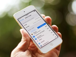
Yet Apple still claims the tiny, wafer-thin iPod touch gets up to 40 hours of music playback and 8 hours of video playback. That compares with up to 50 and 11 hours for the larger iPhone 6, or up to 10 and (from Apple's website, in what I assume is a misprint) 10 hours for the much larger iPad Air 2.
The company hasn't provided internet usage battery estimates for the iPod touch—this generation or previous—the way it has with iPad and iPhone. Given that no other iPod has internet connectivity, it makes for neater product comparison charts, but the information would still be appreciated. (Both the iPhone 6 and iPad Air 2 are listed as up to 10 hours.)
As usual, the first couple days can be rough as Wi-Fi stays on to restore data, apps, and media, along with services like iCloud Photo Library and iCloud Music Library kick in. (Personally, I always set up iPods and iPhones as a new device to keep things, including Spotlight indexing, to a minimum.)
Over the last week, battery life for me on the iPod touch 6 has been roughly on par with the previous generation. I didn't quite make it to 8 hours of Continuum Season 2, but I got pretty close. (No spoilers!)
As it proved last year with the iPhone 6 and iPad Air 2 and shows again with the iPod touch 6, the Apple A8 might be more powerful—but it's also more power-efficient. And so far, that balance is working out well for everyone.
iPod touch cameras
Apple has improved both the rear iSight camera and the front FaceTime camera on the new iPod touch. The rear-facing iSight camera received the biggest boost, going from 5 megapixels to 8 megapixels.

iSight camera
8 megapixels is the same count as found in the iPhone 6, iPhone 6 Plus, and iPad Air 2. (The iPad mini 3, sadly, still has a 5-megapixel camera.) Since the iPhones 6 have a larger ƒ/2.2 aperture and bigger 1.5µ pixels, and the Plus model has optical image stabilization (OIS), the iPod touch 6's camera internals most closely match the iPad Air 2.

All of them have the same 5-element lens, hybrid IR filter, and most importantly, the same Apple A8-powered Image Signal Processor (ISP). The ISP provides ever-improving auto-balance, auto-exposure, and auto-focus, along with new features like improved face detection, burst mode, and—in conjunction with iOS 8—full on manual controls in App Store apps that support them.
To see what kind of difference the new glass makes, and to see how the new iPod touch compares with Apple's other 8-megapixel, A8-powered cameras, I took some sample shots. In order: iPod touch 6 (top left), iPod touch 5 (top right), iPad Air 2 (bottom left), iPhone 6 (bottom right):


| Header Cell - Column 0 | iPod touch 6 | iPod touch 5 | iPad Air 2 | iPhone 6 |
|---|---|---|---|---|
| Aperture | ƒ/2.4 | ƒ/2.4 | ƒ/2.4 | ƒ/2.2 |
| ISO | 50 | 64 | 50 | 40 |
| Focal length | 3.3mm | 3.3mm | 3.3mm | 4.15mm |
| Exposure time | 1/30 | 1/24 | 1/30 | 1/30 |
Recent iOS devices still seems to struggle to lock onto macro focus when extremely close. That aside, the iPod touch 6 should—and does—perform every bit as well as the rest of the lineup. Here's a comparison, shot indoors in indirect light. In order: iPod touch 6 (top left), iPod touch 5 (top right), iPad Air 2 (bottom left), iPhone 6 (bottom right):


| Header Cell - Column 0 | iPod touch 6 | iPod touch 5 | iPad Air 2 | iPhone 6 |
|---|---|---|---|---|
| Aperture | ƒ/2.4 | ƒ/2.4 | ƒ/2.4 | ƒ/2.2 |
| ISO | 320 | 320 | 250 | 250 |
| Focal length | 3.3mm | 3.3mm | 3.3mm | 4.15mm |
| Exposure time | 1/15 | 1/15 | 1/15 | 1/17 |
While the iPod touch 6 has more pixels, it doesn't seem to have bigger pixels, as with the iPhone 6. That means not as much light is being captured, so low-light photography on the iPod touch 6 is more on par with the iPad Air 2 than iPhone 6. Here's a comparison shot indoors in low light. In order: iPod touch 6 (top left), iPod touch 5 (top right), iPad Air 2 (bottom left), iPhone 6 (bottom right):


| Header Cell - Column 0 | iPod touch 6 | iPod touch 5 | iPad Air 2 | iPhone 6 |
|---|---|---|---|---|
| Aperture | ƒ/2.4 | ƒ/2.4 | ƒ/2.4 | ƒ/2.2 |
| ISO | 800 | 640 | 800 | 1600 |
| Focal length | 3.3mm | 3.3mm | 3.3mm | 4.15mm |
| Exposure time | 1/15 | 1/15 | 1/15 | 1/15 |
Like the iPad Air 2 and the iPhone 6, the iPod touch 6 is now capable of producing up to 43-megapixel panoramas. Here's a comparison shot on a cloudy day at the river. In order: iPod touch 6 (top left), iPod touch 5 (top right), iPad Air 2 (bottom left), iPhone 6 (bottom right):


| Header Cell - Column 0 | iPod touch 6 | iPod touch 5 | iPad Air 2 | iPhone 6 |
|---|---|---|---|---|
| Aperture | ƒ/2.4 | ƒ/2.4 | ƒ/2.4 | ƒ/2.2 |
| ISO | 25 | 40 | 32 | 32 |
| Focal length | 3.3mm | 3.3mm | 3.3mm | 4.15mm |
The results are pretty much as expected: The iSight camera on the iPod touch 6 is clearly better than the iPod touch 5, about the same as the iPad Air 2, and just behind the iPhone 6. Much like Leanna Lofte said in 2012 when she shot our iPod touch 5 vs. iPhone 5 camera tests, with good light and the tools available in modern photo editing software, the differences aren't extreme. Unless you intend to shoot a lot of low-light photography, any of the 8-megapixel, Apple A8-powered connected cameras will serve you well.
FaceTime HD camera
The iPod touch's front-facing FaceTime HD camera has also received a few improvements to bring it into line with the rest of Apple's current iOS device lineup. That's largely thanks to the Apple A8 ISP, and the front-facing camera now includes burst mode, better high-dynamic range, better face detection, and exposure bias.
In other words, your low-light selfies and FaceTime calls have never looked better.


| Header Cell - Column 0 | iPod touch 6 | iPod touch 5 | iPad Air 2 | iPhone 6 |
|---|---|---|---|---|
| Aperture | ƒ/2.2 | ƒ/2.4 | ƒ/2.2 | ƒ/2.2 |
| ISO | 2000 | 1000 | 2000 | 2000 |
| Focal length | 2.65mm | 2.18mm | 2.65mm | 2.65mm |
| Exposure time | 1/15 | 1/15 | 1/15 | 1/15 |
Video
The Apple A8 ISP also increases the iPod touch's video capabilities: The existing 1080p 30fps video camera now has cinematic stabilization, better face detection, and 3x digital zoom. New video modes include 720p 120fps slow motion, along with time-lapse.
The slow motion isn't up to the level of the iPhone 6 or iPhone 6 Plus — both models can both go to 240fps—but it's just as good as the slow motion on the iPad Air 2 and iPhone 5s. Time-lapse photography appears to be the same across the board.
iPod touch and Apple Music
The new iPod touch ships with iOS 8.4, the latest update to Apple's current-generation mobile operating system. It includes a host of great features, including Extensibility, which lets apps interact like never before, and Continuity, which syncs your activities with other iOS devices and the Mac. In addition to the new Photos and Health apps, and performance enhancements like Metal, there's an updated Messages app, a predictive QuickType keyboard, Family Sharing for App Store apps, games, and iTunes media, iCloud Drive for online storage, and much, much more. All of that's been around of a while, though. What's new is Apple Music.
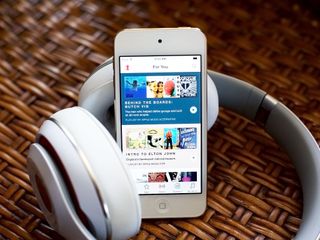
In years past, new iPods and new music services would have been the main event of Apple's fall event. Even today, though, in the era of iPhones and streaming, Apple kept the launches as close together as possible. And for good reason—Apple Music makes the iPod touch a much better music player.
Fusing the music
iTunes was founded on the principal of $0.99 songs. Pricing got a little more flexible over the years, but the core notion of owning your music stayed the same. Culture did not.
As part of a much larger trend, the idea of owning a few things gave way to the idea of renting access to almost everything. For music, that meant purchases dropped, and subscriptions soared.
Apple considers music part of the core of the company. From the executive team on down, they deeply love music and want it to be great. But unlike the hardware Apple sells, music has never been a high-margin business. Music was, and is, something Apple does because the people who run the company believe they must do it.
Over the last few years, Apple experimented with the iTunes Match music locker and iTunes Radio streaming service. But last year, the company bought Beats—including the subscription service Beats Music—and everything changed. iTunes Radio plans were put on hold, the iTunes and Beats teams fused together, and Apple Music was born.
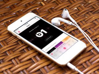
Composed of three distinct yet interwoven services, Apple Music offers streaming (and cached) access to almost all the songs in the massive iTunes catalog; Connect provides a new social network for recording artists where they can share backstage material, rough cuts, lyrics, and more; and Beats 1 is an always-on, worldwide radio station that plays—and-breaks—new music, all spun by real DJs.
This is all topped off by magnificent Siri integration; all for $9.99 a month.

Apple Music guide
Apple Music isn't just new, it's complicated. There's the music app, the streaming service, the radio service, the social network, and the traditional iTunes tie-ins. Here's how to get the most out of it:
Apple Music
With Apple Music, you never have to worry about whether or not you own a particular song. If it's in your iTunes library, or in the Apple Music catalog, you can just play it. There are a few holdouts, like the Beatles; and a few that had their music on the service, then revoked it, like Neil Young; but it's impossible to describe the feeling you get when a song comes to mind and a few moments later, it just plays.
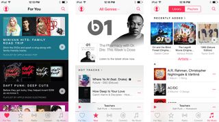
There's a lot more to it than that. Too much, actually. Jammed into the new Music app is a recommendation service called For You, a section on New music, another for My Music, and Beats 1.
For You has been terrific for me. I can almost always find something cool there, be it a playlist, album, or song, I'd never have thought of, or perhaps even known about, otherwise.
New is more than just a list of releases and a set of top charts: It's also a repository for playlists by Apple's editors; songs for working out; and curator mixes. The last of those, assembled by major magazines, have quickly become ghost towns, but the first two remain consistently solid.
My Music is a hodge-podge of material from your iTunes library that's been synced over, including anything you've ever bought from iTunes, as well as any Apple Music you've added to your library and anything you've download for offline access. You can also toggle over and view your playlists, or any playlists you've added from Apple Music's editors.
Connect
Make all the Ping jokes you want, but the goal of connecting musicians with audiences is an important one. One look at who has the most followers on Twitter will show you that it's not athletes or actors that dominate the leaderboard—it's singers. As part of Apple Music's goal to encompass the entire music experience, the company has brought social back with Connect.

Connect is a tab, just like For You and My Music. And technically, it's great. You automatically follow anyone whose music you've bought from iTunes. Sure, an argument could be made that it should have some quantitative component for the auto-follow, but it creates content and encourages interaction. You can also follow almost anyone on the service, from the singers and bands to the Beats 1 DJs and Apple Music editors, and you can do it easily from most places in the app.
Practically, it's a mixed bag. Because Apple Music is new, because it's additive, and because everyone is already beyond busy, a lot of artists—or their "people"—simply don't update often, if at all. Granted, it's not a complete loss: Beats 1 DJs like Zane Lowe and St. Vincent are terrific, and Apple's editors are routinely on fire.
There's legitimate concern from indie artists that getting on Connect and posting onto Connect isn't as easy as it should be. Apple has added Connect to GarageBand for iOS and will be adding it to GarageBand for OS X soon, as well. Still, Apple Music's Trent Reznor has said the company can and will be doing more.
Beats 1 + Radio
Beats 1. Always on. Worldwide. Breaking. I can (fondly) imitate that all day long. It takes me back to high school when great DJs spun great music, and it was what I—and everyone I knew—listened to on FM radio (It's a thing. Wikipedia it!). That eventually faded, however, thanks in no small part to iTunes and the iPod. With thousands of your own songs and playlists in your pocket, you could be your own DJ. At the same time, many radio stations consolidated, and human programming gave way to inhuman metrics.
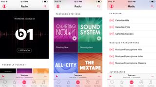
The Music app's Radio tab houses Beats 1 and many other genre-specific "radio" stations, but Beats 1 really is different in kind. Conceived by Trent Reznor and realized by Apple Music, it aims to use the latest technology to return us to the glory days of the past. In the style of BBC 1, and with Zane Lowe and many other talented DJs and hosts on staff, it also aspires to do more—to create a real-time, shared, cultural experience around the world.
How many DJs, shows, and songs you like will depend entirely on your individual tastes. I've been listening on and off since it launched and I've been surprised by how much has not only appealed to me but delighted me. I think I discovered more new music in the first 24 hours than I had the previous 24 months. And when people tweeted about the first St. Vincent's Mix Tape show, and I was missing it, I felt a sense of disconnect and wanted immediately to join in.
Apple Music could do more to ensure you can replay what you miss, both in terms of discoverability and consistency for the resulting playlists, but it's a good start. So are the genre-specific stations that supplement—or for many people, fill a much more important role—than Beats 1.
I'm listening less these days than I did at first, but I'm also listening to more of the Apple Music catalog that I've since discovered. Now I return to Beats 1 when I can't or simply don't want to decide what to listen to for myself, and for some shows and special events. And I think that's exactly where Beats 1 should fit.
Music app
All this functionality is crammed into the all-new Music app that launched as part of iOS 8.4. I don't envy it—the job it has to do is impossible. To be one consistent thought around music, everything has to be in one place. Yet putting everything in one place makes it incredibly dense and complicated, especially on a screen as small as the iPod touch.
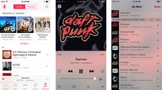
The result is some beautiful design around recommendation and discovery, a lot of lists, and an overwhelming number of More buttons (•••) that lead to yet more lists. It feels almost impenetrable at times. You have For You and My Music, you have Beats 1 and Radio, you have Playlists and Up Next, you have the mini-player and Now Playing, and you have Connect, all jockeying for physical and conceptual space. You have the music you bought, the music you matched, the music you added, and the music you downloaded, all mixed and sometimes muddled.
Worst of all, I have no idea what I'd prefer. There's simply too much content with too many options to fit, but if you take any of it out, you lose the integration that makes it all so great. If Apple presents fewer options and manages more preferences automatically, you run the risk of not having your music available offline, for example, just when you want to hear it.
Like I said, the job Music's been given is impossible. Yet those are exactly the kinds of problems we expect Apple to solve.
Apple Music is still in the first month of its free three month trial. What Apple learns and what we learn, how the service changes and how our usage of it changes, and ultimately whether it succeeds or fails are questions for the future. Right now, from recommendations to playlists to radio stations, Apple is injecting the humanity back into music programming. That in and of itself is an incredible win for everyone.
I don't listen to much music—Netflix is my radio station—but thanks to Apple Music I'm listening to more and enjoying it more than I have in years.
For me, simply being able to say things like "Siri, play Smooth Criminal; play Smooth Criminal by Alien Ant Farm; play more like this; add this to my library; shuffle; play Beats 1; like this..." make it easily worth $9.99 a month. The rest is icing.

Update: iOS 9
While the new iPod touch shipped with iOS 8.4, it's now been updated to iOS 9, which includes new Siri intelligence, a new Notes app, transit for Maps, new privacy and security features, and much more.
iPod touch Pricing and availability
The iPod touch is available now. It starts at 16GB for $199 and has options for 32GB at $249, 64GB at $299, and 128GB for $399. That means you can get a 128GB iPod touch—perfect for iPod classic holdovers—for the same price as a 16GB iPad mini 3.
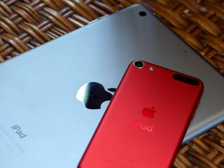
iPod touch or iPad mini?
The new iPod touch is here! But if you're considering a small iOS device, should you get it... or should you get an iPad mini?
iPod touch The bottom line
With the new iPod touch, Apple's gone from fives to eights: Apple A5 to Apple A8, 5 megapixels to 8 megapixels. Yet the company has kept the same light, clean, ridiculously thin design as the previous generation. There's no Touch ID fingerprint identity sensor or Apple Pay, and no 4.7- or 5.5-inch display options, but there's also an incredibly low—for Apple—starting price of $199.
That price point is important. The role of the iPod touch within Apple's device lineup isn't expanding: With bigger iPhones and smaller iPads to choose from, and the Apple Watch and Apple TV offering significant ways to extend the experience, the iPod touch may not even be on many people's wish lists.
Yet the iPod touch remains the least expensive way to gain access to iOS and the million and a half apps and games in the App Store. It also means that the accessories made to work with the 2012 iPod touch—wrist straps not withstanding—will keep working just fine with the 2015 model. Add to that the support that comes with the Apple Stores, AppleCare, iCloud, and the ecosystem, and the iPod touch enjoys value far greater than just its atoms and bits.
In that role, the iPod touch can still hold considerable appeal:
- For a child who doesn't need an iPhone and doesn't want a bigger, heavier iPad.
- For a developer who needs to text new OS and new apps but doesn't want them on a primary device.
- For an athlete who wants iOS in a gym or on a jog but wants the lightest device possible.
- As a home controller that can be shared without worrying about personal data.
- As a FaceTime device for grandparents or relatives.
- As a Continuity calling handset to have extra extensions available around the house.
- As a dedicated media or gaming device to save iPhone battery and avoid interruptions from calls and messages.
- As a connected alternative to a pocket camera or video camera
In all of those ways the new iPod touch is just like the old iPod touch, only better.

Rene Ritchie is one of the most respected Apple analysts in the business, reaching a combined audience of over 40 million readers a month. His YouTube channel, Vector, has over 90 thousand subscribers and 14 million views and his podcasts, including Debug, have been downloaded over 20 million times. He also regularly co-hosts MacBreak Weekly for the TWiT network and co-hosted CES Live! and Talk Mobile. Based in Montreal, Rene is a former director of product marketing, web developer, and graphic designer. He's authored several books and appeared on numerous television and radio segments to discuss Apple and the technology industry. When not working, he likes to cook, grapple, and spend time with his friends and family.
