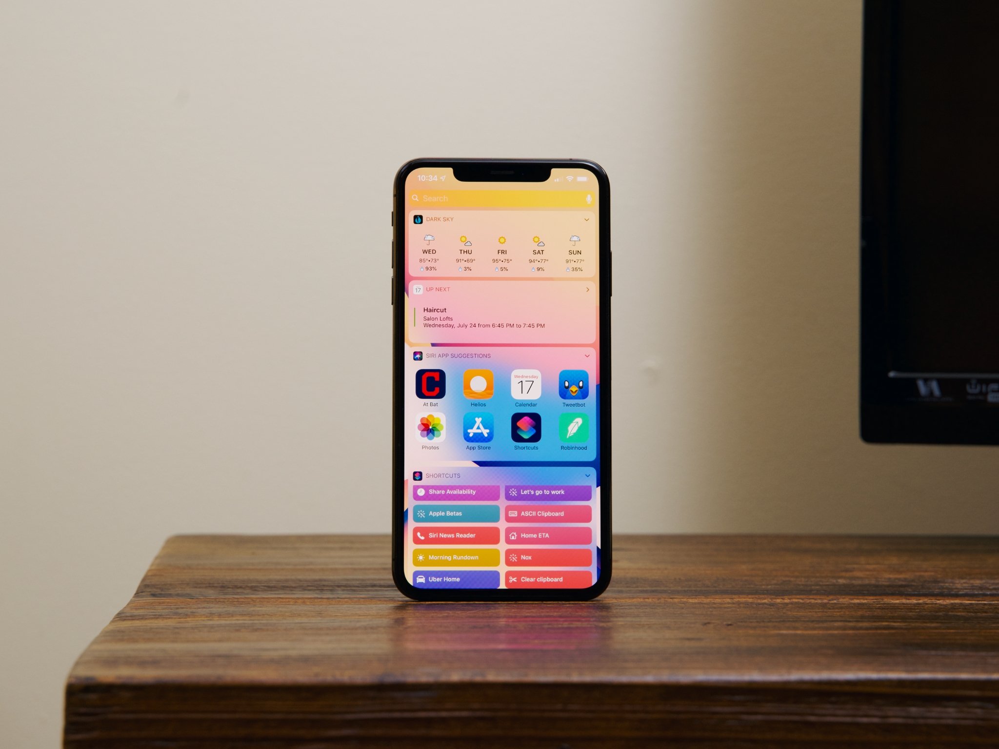
It's time for widgets to come to the iPhone Home screen

Recently, a number of concepts have made the rounds depicting a potential iOS 14 that allows for widgets on the Home screen. Not just widgets, but widgets that expand from the icons that already occupy the Home screen. These concepts are less like Android's widgets and more like the late lamented Windows Phone's Live Tiles, which can serve to display information from an app and launch that app.
Both of these more recent concepts are intriguing in their plausibility, painting a picture of widgets on iOS that's less like a copy of the Android experience that some fear, and more of a natural outgrowth of Apple existing design language.
The concepts are also exciting to me because they show me something that I've wanted for a long time: an iOS experience that can be customized to suit my needs.
The time for widgets is now
The thing that I continue to find most attractive about Android compared to iOS is the customization. Whether it's the ability to add widgets to my Home screen or change the entire look and feel of the system with a launcher theme, Android has had iOS beat on personalization pretty much since launch.
While I wouldn't expect widgets on the Home screen to be as freeform as Android (indeed, I think the newer concepts are closer to what we can expect: widgets that still fit into the classic iOS grid), I would expect them to present more flexibility that we're used to seeing.
A weather icon that can expand to tell you the current temperature, a music playback widget that puts controls right on your Home screen, or a Shortcuts icon that grows into a widget full of shortcuts to run would be more useful to me than a static grid of icons. Would I be sacrificing space currently used by some of the apps I've deemed important enough to be on my Home screens? Yes. But what I'd gain is increased functionality for those that have become essential, both for work and my life in general.
Widgets would give users a higher degree of control over their iOS experience than they currently enjoy. I've said it before, but the most personal device you own should be, well, more personal. I've seen people say that this sort of thing would be messy, but I would counter that at least it would be my mess. The mess would be my choice. Besides, would it be any worse than the disorganized icons that I already have on my second and third Home screens? I submit that it would not.
I'm ready for widgets
Widgets might not appeal to everyone, and they'd be an extra layer of complexity. But they'd be an optional one. And that's the point here. People should have options, including the opportunity to make their Home screen more useful than a static set of icons.
It's long past time that iPhone users were able to put widgets on their home screens. I hope that we finally see it when iOS 14 debuts next month.
Master your iPhone in minutes
iMore offers spot-on advice and guidance from our team of experts, with decades of Apple device experience to lean on. Learn more with iMore!
Joseph Keller is the former Editor in Chief of iMore. An Apple user for almost 20 years, he spends his time learning the ins and outs of iOS and macOS, always finding ways of getting the most out of his iPhone, iPad, Apple Watch, and Mac.

