Review FOR THE LADIES: iPeriod vs Period Tracker by llofte. For more Forum Reviews, see the TiPb iPhone App Store Forum Review Index!
Ladies, we all know the infamous question asked by our doctor at the beginning of every visit - "When was the first day of your last period?" Now if you're like me, you pick some date you know is accurate by plus or minus a week and your doctor shakes his head and stresses the need for keeping track of these things and you shake your head wondering why it's even necessary when you're there for a broken arm. Well, with the help of an app, you can easily provide your doctor with any information needed about your cycle. With so many options in the app store, it may be difficult to decide which app is best for you, so I have chosen two apps that I believe are very good and comparable in price, iPeriod and Period Tracker.
Please note that for the sake of keeping my personal information private, the data provided for these screenshots is fake.
iPeriod
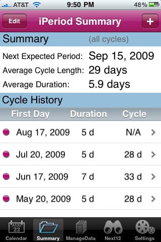
The home page of iPeriod is on the Summary tab which shows your next expected period date, average cycle length, average duration, and a brief history of your last 4 periods. You can add/edit a period from here as well. When adding a period, you are asked for the first day and last day. It will automatically have your average duration length set as default.
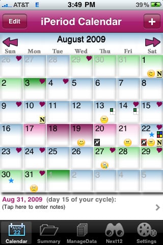
The Calendar tab is a calendar view of information. It is here that you can add more detailed information. At the bottom, you will see which date you have selected and what day of your cycle is associated with that date. Tapping here will bring up notes for that day. There are 3 options for flow levels (light, medium, heavy), severity of cramps (none, mild, severe) and boxes to check for spotting, love connection, and 4 user defined options. There is also 33 different moods you can choose for the day, each with it's own smiley to appear on the calendar. All information given in notes will appear on the calendar as an icon or coloring. Period days will be in various shades of pink and fertile days will be in light green with dark green signifying ovulation. iPeriod assumes a luteal phase length of 14 days, but this can be changed in settings. Remember ladies, you should not use these apps to prevent pregnancy!
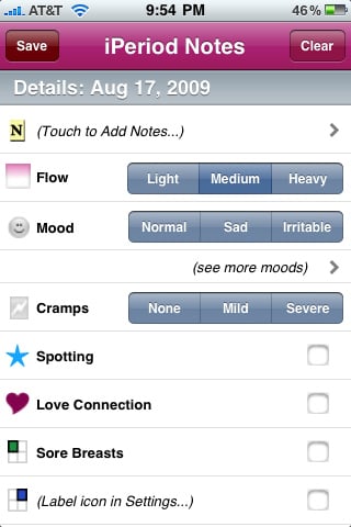
You can edit/add a period from the calendar view as well. One thing I don't like about period entry, is that you must either accurately predict the length of your period when adding it, or go back and edit it once it's over. There should be an option in notes to select the date as a last day. Another thing I don't like about the calendar is that there isn't a color change for the selected date; you must read the date on the bottom to know which date you have selected. This is only a minor annoyance, but an annoyance none the less.
The ManageData tab is where you go to email your data as text or CSV.
The Next12 tab has predictions for your next 12 periods and fertile days.
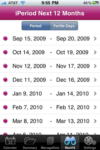
In Settings, you can password protect the app and set a question in case you forgot your password. In the event that you do forget your password, iPeriod will just give it to you if you get the question right, so make sure you choose a question that only you know the answer to! You can also set up in-app and/or email alerts reminding you of an expected period or informing you that you're late. There are other basic changes you can make in settings like setting the length of luteal phase, editing the user defined calendar icons, and specifying how many cycles to use when calculating averages.
The best and worst feature of iPeriod is it's calendar view. Some may love it's colorfulness and the way it provides lots of information at a glance. Others, however, may find it too busy and cluttered. For the the latter, Period Tracker may be your period tracker of choice.
Period Tracker
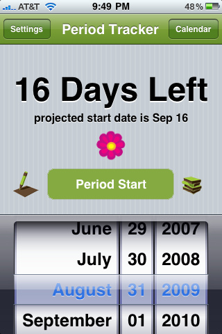
The home screen for Period Tracker is very simple. In big bold letters it says how many days until your next predicted period or how many days late you are. To enter a period start date, just scroll to the correct date and tap "Period Start". At the top corners, there are two options, Settings, and Calendar.
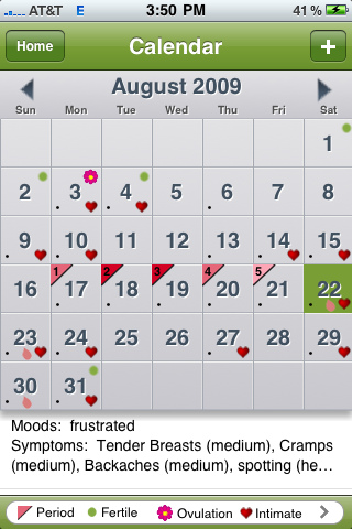
The calendar view is much more plain in comparison to iPeriod. It's all gray with some icons. The same data was entered into both applications, so the screenshots really show how differently they display the same information. Fertile days are represented by green dots and ovulation day has a pink flower. Period days have various shades of pink triangles, "intimate" days have a heart, and a pink droplet means spotting. A little black dot means there are notes associated with that day, even if that note is also an icon on the calendar. The selected day is green instead of gray. At the bottom, there is more information about the selected day and tapping here brings up the notes page. Notes have an on/off toggle for "Period Ended" and "Intimate Today" and selections for backaches, bloating, bodyaches, cramps, spotting, headaches, and tender breasts, all of which have 3 levels of severity. Period Tracker has the advantage over iPeriod here, but iPeriod has more moods to select from. Period Tracker has 9 moods, but you can of course type your mood into notes if you feel like none of the choices accurately depict your mood. Since the smileys don't show up on the calendar anyway, I feel like this is an acceptable compromise.
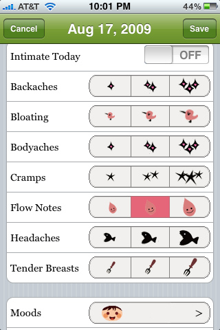
In settings you can set your default cycle and period length, edit entries, export notes through email, and set a 4 digit passcode. Period Tracker uses the same default of 14 days for the luteal phase, but does not have an option to change it. You also cannot export in CVS format. There is no list view of future period and fertile days; you must navigate to the month of interest to see predictions.
Period Tracker also offers a companion app for $0.99 to sync period dates and fertile days with a significant other... if that's something you're interested in.
The best feature of Period Tracker is it's simplicity. It's quick to start and end a period and calendar view shows only the most important data. Period tracker also offers more note options (minus mood choices). However, iPeriod offers more summary information, a nice list view of predictions, and export in CVS format.
Conclusion
I don't think one app is better than the other and will not proclaim one as the winner. I personally prefer Period Tracker over iPeriod, but the girl next door may prefer iPeriod. They satisfy a different set of needs and offer different types of style.
Instead of a Pros and Cons list for each app, I will provide a list of features iPeriod has that Period Tracker does not, and vice versa.
Features of iPeriod that Period Tracker lacks
- List view of predicted period dates and fertile days
- Export in CVS format
- Colorful, detailed calendar view
- Edit length of luteal phase
- Question for password retrieval
- User defined symptoms
- Lots of summary information
- Email alerts
- 33 moods
Features of Period Tracker that iPeriod lacks
- Quick entry of period start and end dates
- Simple, less cluttered calendar
- 7 symptoms, all with 3 levels of severity
- Color change for date selection
- Companion app available
iPeriod TiPb Review Rating

Period Tracker Review Rating

Former app and photography editor at iMore, Leanna has since moved on to other endeavors. Mother, wife, mathamagician, even though she no longer writes for iMore you can still follow her on Twitter @llofte.
