The future of Apple Retail begins now
April 25, 2017: Apple Union Square is about to go... everywhere.
Apple has announced its taking the concepts and community-first approach first showcased at Union Square and aggressively pushing them across many other major Apple Stores.
From Apple:
Apple today announced plans to launch dozens of new educational sessions next month in all 495 Apple stores ranging in topics from photo and video to music, coding, art and design and more. The hands-on sessions, collectively called "Today at Apple," will be led by highly-trained team members, and in select cities world-class artists, photographers and musicians, teaching sessions from basics and how-to lessons to professional-level programs."At the heart of every Apple Store is the desire to educate and inspire the communities we serve," said Angela Ahrendts, Apple's senior vice president, Retail. "'Today at Apple' is one of the ways we're evolving our experience to better serve local customers and entrepreneurs. We're creating a modern-day town square, where everyone is welcome in a space where the best of Apple comes together to connect with one another, discover a new passion, or take their skill to the next level. We think it will be a fun and enlightening experience for everyone who joins."
It's not just the programming but the design of the stores that's evolving as well.
[CBS This Morning[(http://www.cbsnews.com/news/angela-ahrendts-apple-svp-of-retail-redesign-today-at-apple/?linkId=36872029):
In 100 of its biggest stores, like the San Francisco flagship, Apple's "hardware" update means new screens and spaces for meetings and classes. The Genius Bar, now lined with trees, becomes the Genius Grove. And there's a more dimensional take on the Genius: new staffers specialized in music and photography called "Creative Pros."
If you've visited Union Square, it's easy to get excited about this news. It's the same concept that's always driven Apple's retail stores, but re-imagined for a more modern, community-driven world.
See below for what Union Square looks like — it might be a store near you next!
A couple of days ago Apple gave us a preview of the company's new Union Square store. Apple Store Union Square represents more than just a new flagship, though. It's a re-imagining, from core-concept to physical expression, of where Apple sees the future of retail.
Master your iPhone in minutes
iMore offers spot-on advice and guidance from our team of experts, with decades of Apple device experience to lean on. Learn more with iMore!
Re-imaging Apple Retail could be terrifying. We're talking about some of the most beloved and successful stores in history, serving tens of millions of customers and handling billions of dollars of transactions. Few companies would risk messing with a formula working that well. But, as we saw during the preview, it's clear that exactly what Angel Ahrendts, Jony Ive, and Apple have done.
Inside out

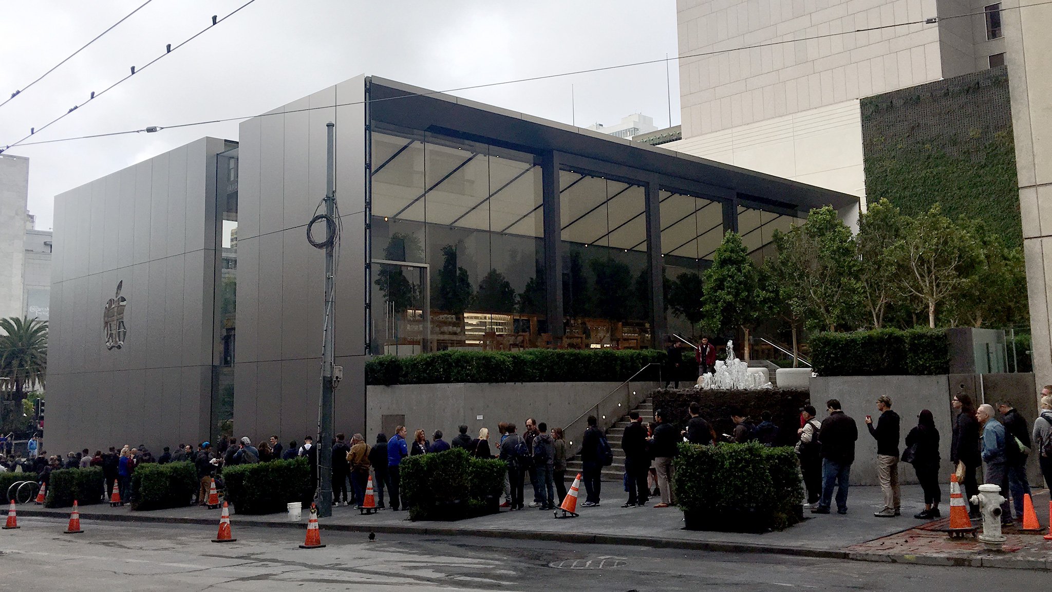
On the outside, there's no mistaking this Apple Store as anything other than next-generation. Just like with the MacBook, gone is the old glowing Apple logo and in its place is polished stainless steel set right into the side. It matches recent iPhones and iPads too, right down the the space gray finish.
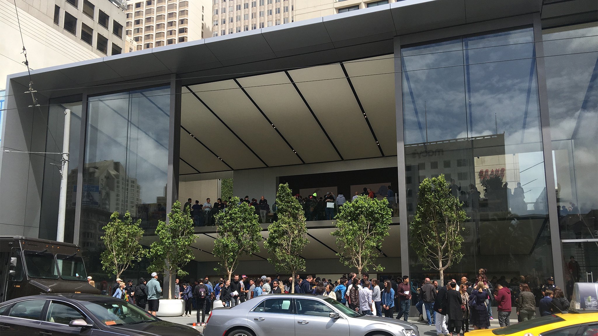
On the other side is a massive door, more than 40-feet massive, that can open up the store almost entirely to the street. There are smaller doors on either side for when weather or other conditions dictate. But, when Apple wants it to, the Union Square Store can become an actual, open, physical part of union square. The sheer scale and affect is beyond impressive.
Outside in
On the inside, a lot more has changed. Apple Online, updated last year, can now handle most purchases for most people faster and more conveniently than going out to a brick-and-mortar store. Apple online support, which includes a brand-new Twitter presence, can now likewise handle most simple customer problems at the speed of the internet. That both liberates and challenges Apple Retail to think different and re-justify its existence.
And the strategy Apple's taken is all centered around a single concept: community.
It would have been easy to tweak and iterate. To make the screens bigger and the bars ever-so-slightly curved. Apple didn't go for easy, though. They burned what was down and used the concept of community to build it back up. That meant the screen went 6K but the bar... well, the bar went away.
After months and months of planning and testing, Apple has ultimately fielded five new features in Union Square.
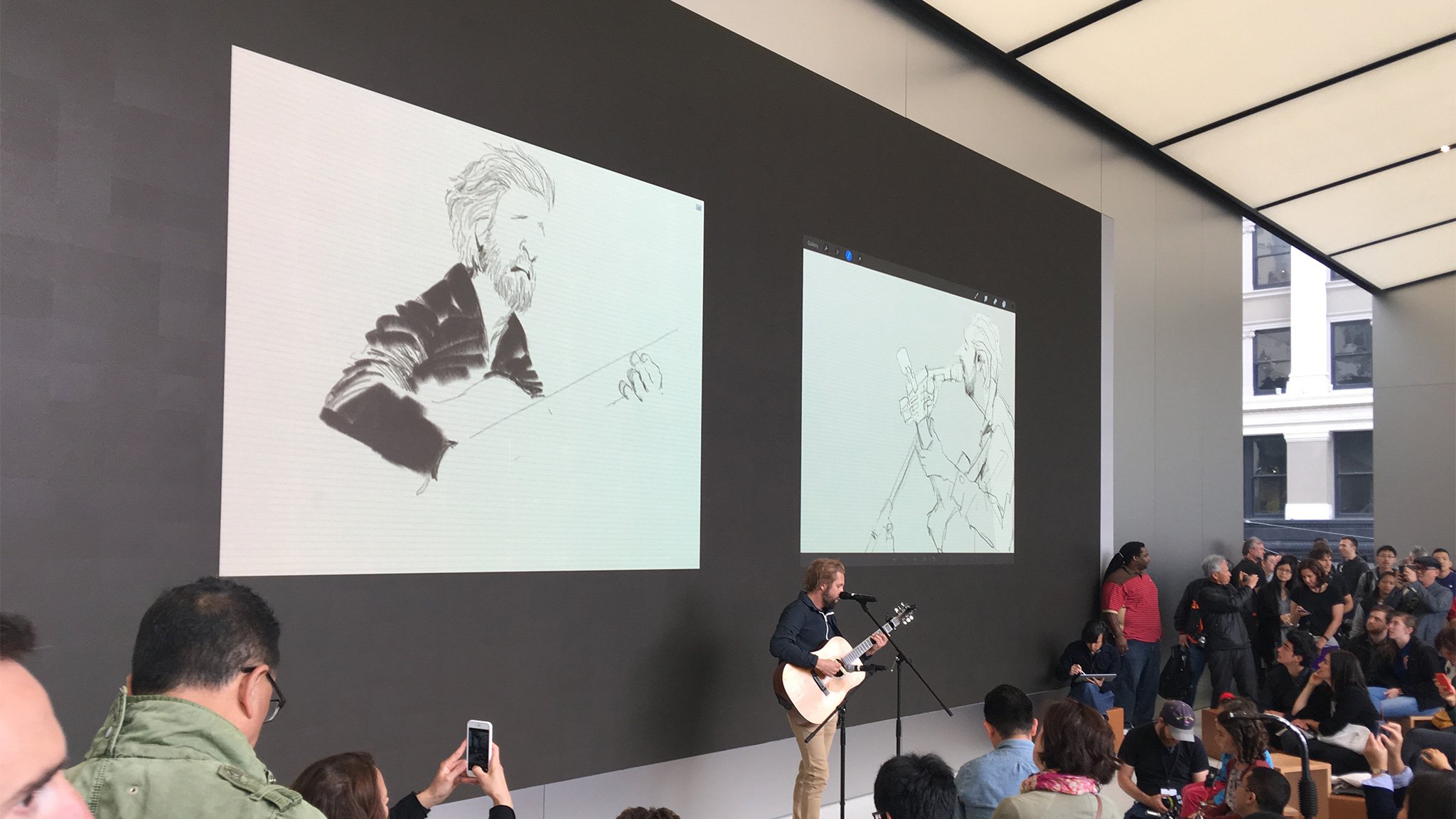
The Forum

That 6K display I just mentioned is the centerpiece of Apple's new Forum. Rather than an updated version of the theaters that some older flagship locations offered, the Forum offers flexible box and ball seating rather than rigid rows. That way experts can come in one at a time or many at a time and address audiences singly and in small groups. Even more importantly, rather than lecture or present, they can really interact, standing not in front of but among everyone else.
"Today at Apple", the program for the Forum, will feature artists and technologists, and sessions of kids and adults, students and teachers, gamers and developers.
All told, Apple has devoted 20% of its space to educational rather than retail pursuits. That's astounding.
Genius Grove
Bars are noisy, elbow-y affairs. No longer content with what that invokes, Apple has re-imagined the genius area as a grove. Instead of at the back, it's now up front and center, open and with expansive tables, surrounded by trees. Since the simple stuff is being taken care of online now, geniuses can focus on fixing hardware issues with customers instead of across from them.
The Plaza
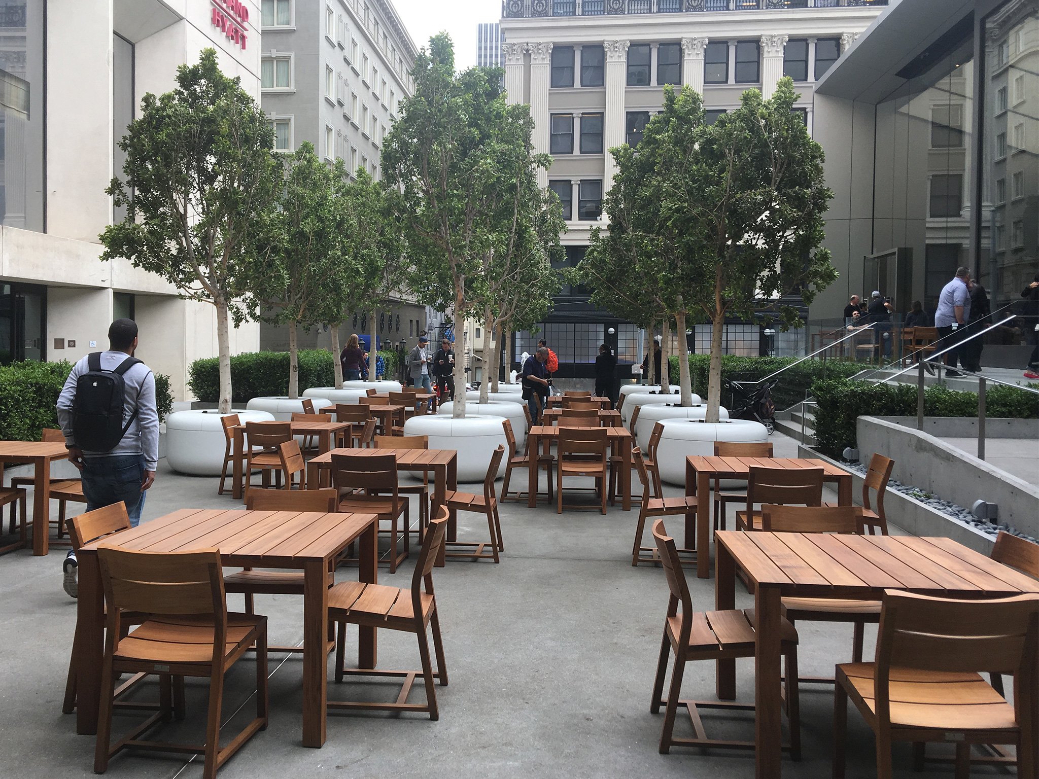
While much of the Apple Store involves bringing the outside in, with rich woods and trees, and a deeply organic feel, the Plaza brings the Apple Store out. Open 24/7, it features seating for a couple of hundred people and, yes, free Wi-Fi for all.
Centerpieces include a garden wall and a statue, and events will include live music. When you consider those two massive 40-foot+ doors can open the area up almost entirely, it makes the Apple Store very literally part of the block and of the neighborhood.
The Boardroom
Partnerships with IBM and SAP have helped Apple better address the needs of Enterprise and big business. With the Boardroom, the Apple Store hopes to bring together small business and entrepreneurs. Business Team members can offer advice and training, but the Board Room can also provide a place for people to come together, network, and learn from each other.
The Avenue

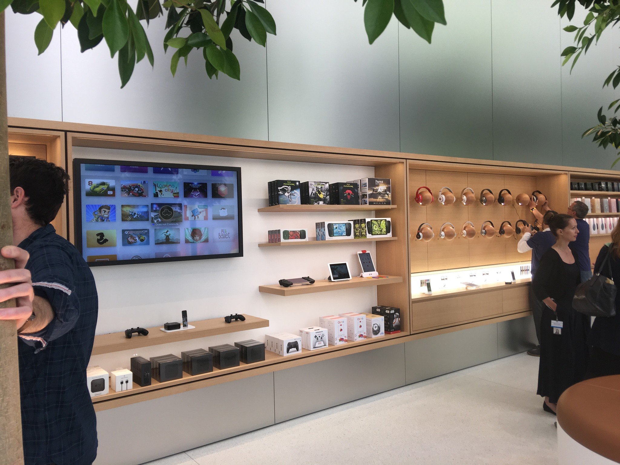
Here's where the Apple Store remembers that it's a store. Mostly. Instead of cramped shelves with a bewildering array of products, Apple has built a wide "Avenue" with boutique-like "windows" focused on specific activities like music, creativity, apps, and photography.
Creative Pros are stationed among the trees to help customers touch, try on, and learn about everything from lens attachments to headphones to droids and drones—30% of which can only be found at the Apple Store.
The reaction
Apple doesn't design museum pieces. They design objects that are meant to be used. The store is the same way. The new features, in whole and in part, will eventually roll out to other stores. Right now, though, they're still unproven. Some of them have been tested in new stores in New York, in Belgium, and on Apple's own campus at Infinite Loop.
But now they're all coming together and the true test begins. The first time I saw Union Square it was empty save for media, members of the retail and design teams, and veteran staff. The second time it was flooded with hundreds of customers eager to be among the first to experience it.
Over the course of the next year, though, millions more will experience Union Square and Apple will get a chance to see how the company's vision holds up to reality. Both Apple and its customers will learn a lot from each other.
Rethinking Apple Retail from the ground up was risky. Messing with success always is. It's also the only way to continue that success into the future.
With the new Union Square store, Angela Ahrendts, Jony Ive, and Apple are playing the long game. They're investing in the brand and in education. They hoping, once again, if the company takes care of the top line, the bottom line will take care of itself. That if the experience is great, visitors won't just turn into customers, but into lifelong customers.

Rene Ritchie is one of the most respected Apple analysts in the business, reaching a combined audience of over 40 million readers a month. His YouTube channel, Vector, has over 90 thousand subscribers and 14 million views and his podcasts, including Debug, have been downloaded over 20 million times. He also regularly co-hosts MacBreak Weekly for the TWiT network and co-hosted CES Live! and Talk Mobile. Based in Montreal, Rene is a former director of product marketing, web developer, and graphic designer. He's authored several books and appeared on numerous television and radio segments to discuss Apple and the technology industry. When not working, he likes to cook, grapple, and spend time with his friends and family.
