M1 Max MacBook Pro — First impressions
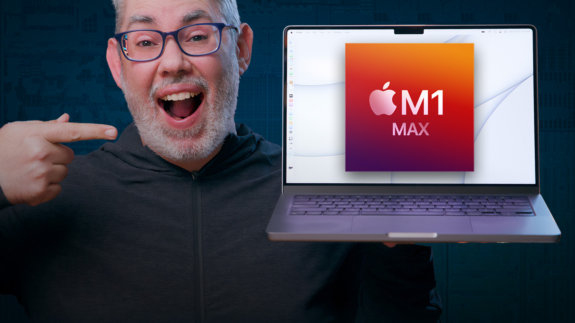
Apple's brand new M1 Max 14-inch MacBook Pro. That's eight performance cores, two efficiency cores. 32 graphics cores. 64 gigs of unified memory. 2 terabytes of ultra-fast SSD. Oh, yeah.
M1 Max MacBook Pro — Performance
I loaded up my review unit with the 200+ gig, close-to-18-minute iPhone 13 Review video locally onto the M1 Max MacBook Pro, last year's M1 MacBook Pro, and 10th gen 13-inch MacBook Pro, and my current main, the 2019 16-inch MacBook Pro. It has a ton of 4K CLog2 Canon 10 bit XF-AVC Canon footage and a bunch of iPhone Dolby vision. All color-graded and with a wide variety of effects and some motion graphics layered on top. And all on battery. Charged to 100 and then unplugged for render.
And here's what we got:
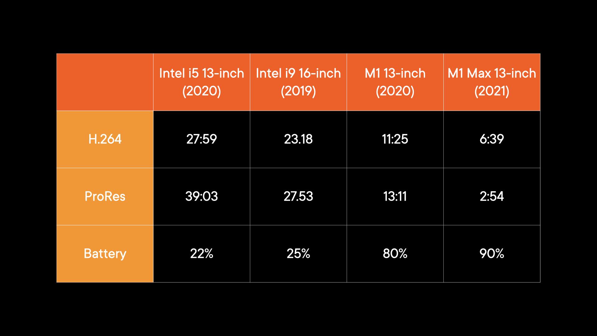
Yeah, this is where I watched Intel die, Parappa. Oof oof.
The difference between M1 and Intel is just night and day… or then and now. And it's not even a fair fight because H.264 is being given a boost on Intel by Apple's T2 chip, which is basically an A10 chip with media accelerators, just four generations behind M1. ProRes, where it's entirely CPU bound on Intel, and handled by two new, dedicated media blocks on M1 Max, shows a much bigger difference, even compared to M1, which doesn't have ProRes accelerators. Also, the extra GPU cores, which are pitching in to speed up things like the effects applied to the clips.
Now, If there are any other workloads you want me to run like WebKit compiles, 3D tests, whatever, just leave a comment, and I'll get to them, or find them, as fast as is inhumanly possible. But also, make sure you check out people who actually do coding, VFX, music, all day, every day because benchmarks are only ever a tiny, tiny part of the story. Modern silicon is complex, and not everyone knows what tasks hit performance vs. efficiency cores, graphics cores vs. accelerator blocks, and a lot can vary based on everything from background activities to radio signal strength to ambient temperature.
For me, personally, though, I can already tell this is going to be transformative. Not just because the render time is faster, though… yeah, that. But rendering is only a small part of my day. Even multiple renders. The even more important part to me is finally living a life without beachballs, without freezes, not a few minutes out of every day, but a few seconds out of every minute. Every time I adjust a clip or change an effect or move a layer. It costs me time and causes me frustration, and that's all just gone. Not just for Final Cut either, but opening Safari or tabs, switching to VIP or searching in Mail, opening and closing apps, doing everything I do all day, every day. Just everything, with instant responsiveness.
Master your iPhone in minutes
iMore offers spot-on advice and guidance from our team of experts, with decades of Apple device experience to lean on. Learn more with iMore!
Along with heat, because the M1 MacBook Pro was dead silent the whole time, and while the M1 Max fans kicked up audibly and quickly, they weren't hellicarriers that the Intel models were, and while the M1 Max got warm, it didn't get too hot to comfortably touch for more than a few seconds, as the Intel models did. And the fans shut off, and the temperature dropped almost immediately after the rendering was done, where the Intel models kept spinning and radiating for long, long minutes after.
I couldn't test the new High Power mode in macOS Monterey because that's exclusive to the 16-inch model. It basically turns the fans on and lets the temperature get higher, which is super useful if you're sustaining combined CPU and GPU workloads for a really, really long time. Which is just beyond the thermal envelope of the 14-inch.
All on battery power, with the difference in drain being… ridiculous. Stupefying. Life-changing, to be honest with you. And that's not hyperbole, that's the result of making every little thing I do on the Mac every day not just faster and more efficient, but way less stressful and way more enjoyable.
M1 Max MacBook Pro — Design
I'll get to unified memory, but I want to talk about the design for a retro-chic minute. Because it feels like that's what I've been calling Apple's current kit since the 2018 iPad Pro. And I feel exactly the same way here. This new MacBook Pro has real, old-school PowerBook energy. Bigger, thicker, more industrial. Total Pro vibe. And I love it. I legit all caps love it.
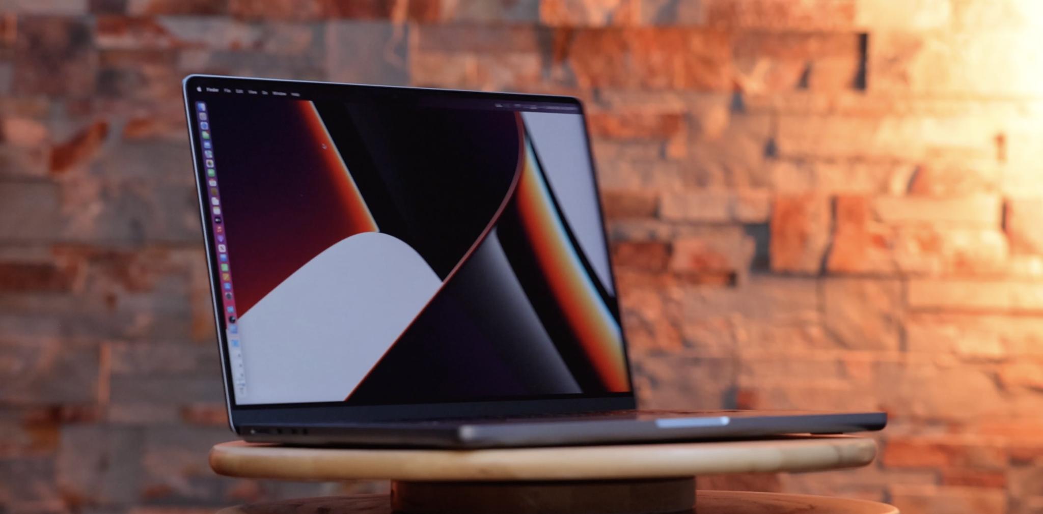
I'm happy Apple's letting the Pro machines breathe a bit more again. It comes at the cost of heft, especially on the 16-inch. When the world fully stops ending, and we're back to more regular travel again, these are going to be real baby Yoda's in our backpacks.
The keyboard is still Magic. Which I love. Scissor switches like the OG MacBooks, but way more stable, which turned out to be the only good thing about the butterflies. I've been typing on it all weekend, and it's a dream. Tactile but not a chose, clickety but not clackety. Satisfying but not obnoxiously sharp.
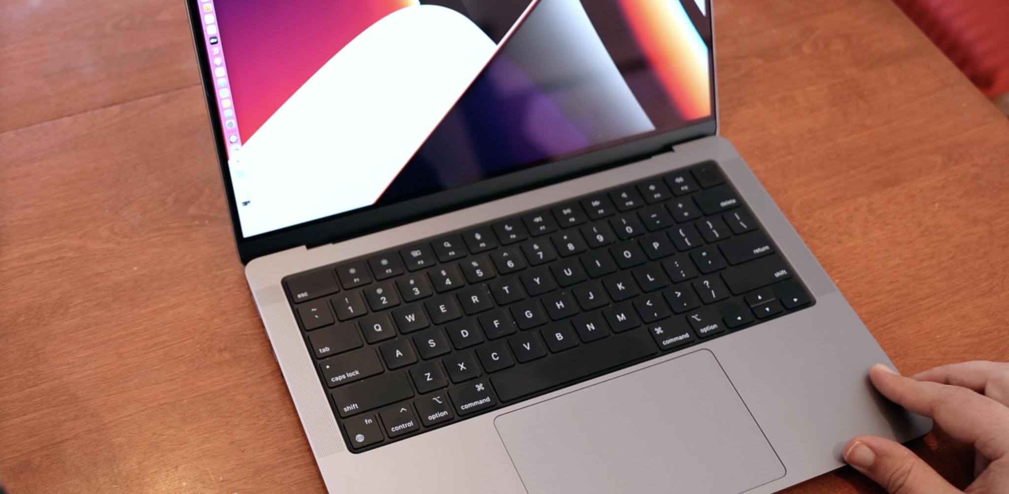
The black keys are inset on double black anodized background, which looks… awesome, but I worry will be lower contrast for people with lower vision. Even with the backlights. But especially for the Touch ID power button, which has no backlight, maybe because it would interfere with the sensor. But I'd love to see something there, especially around the ring.
The function/media keys, depending on how comp-sci you skew, are full height now, and they're fine. But, like the ports, which I'll get to in a minute, they're as much regression as they are correction.
M1 Max MacBook Pro — Display
Then there's the notch. Dead center right at the top of the otherwise magnificent new mini-LED display. Which, yeah, if Retina high density was opening the screen door, and cinema wide gamut was opening the glass patio door, fully high-dynamic range HDR mini-LED is like stepping out into world. Deep blacks, bright whites, with tons of contrast and detail in both. Basically almost all the advantages of OLED, similar sustained brightness levels, better peak brightness levels, without the lack of consistency OLED still suffers from at laptop size and Apple scale. But with haloing around really bright areas on really dark backgrounds. Feel like the right trade-off for now, and it looks absolutely gorgeous.
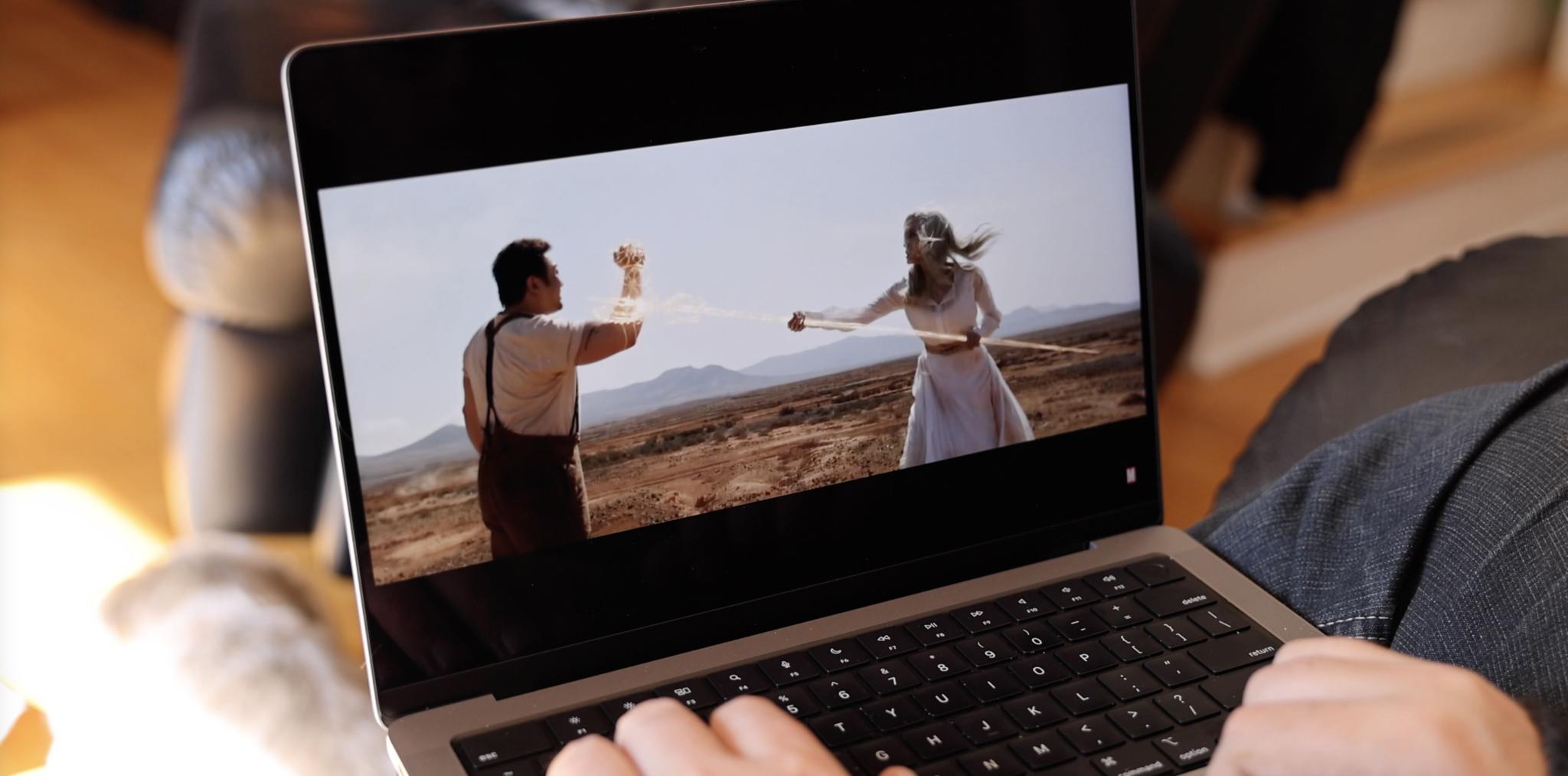
Especially with up to 120Hz adaptive refresh rate, not just for the high-thread-count silky smooth scrolling, but for the ability to dynamically ramp down to 24Hz to save battery life, but also go to 48Hz to show and edit 24fps movies the way nature and Hollywood intended. Especially when combined with the new spatial audio speaker system. You've basically got a high end Dolby Vision and Dolby Atmos theater in your laptop now.
If you're worried about editing at 50Hz for PAL or SEACAM, unlike the iPad Pro and iPhone, Apple has kept the manual settings fully operational as well.
But yeah, the Notch. You can blame me. I've been asking for it for years. It gives us way thinner top bezels, which increases the corner-to-rounded corner size of the display to 14.2-inches, and pushes the menu bar up off of the main display. And the MacBook Pro logo… right off the machine.
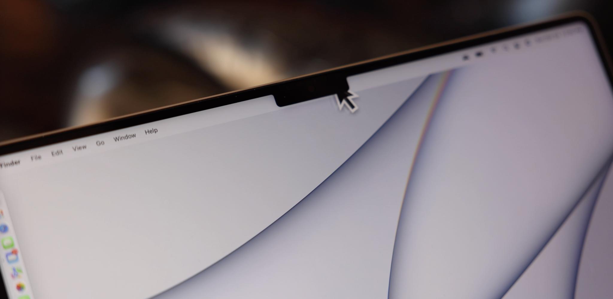
It costs us nothing but an eyesore our brain learns to magic eraser away — I mean, content-aware fills away — within a few hours anyway. My only gripe is that the menu isn't level with the notch. The menu does change height depending on the screen scaling you set if you go off true Retina. And yeah, finally true Retina. But you just can't make it level, or pure black even in light mode. Which means Apple's HI team thinks it looks better with a tiny land-bridge than as two completely separate islands. But I'd love a setting to prove otherwise.
For those of us waiting on Face ID, I think it's going to be a while longer. Which is disappointing because Apple released it for the iPhone 5 years ago already. I figure they need to keep reducing the z-index of the other components, like the infrared dot projector, flood illuminator, and figure out how to let us authorize purchases without double-clicking the power button — which makes it no more convenient than Touch ID.
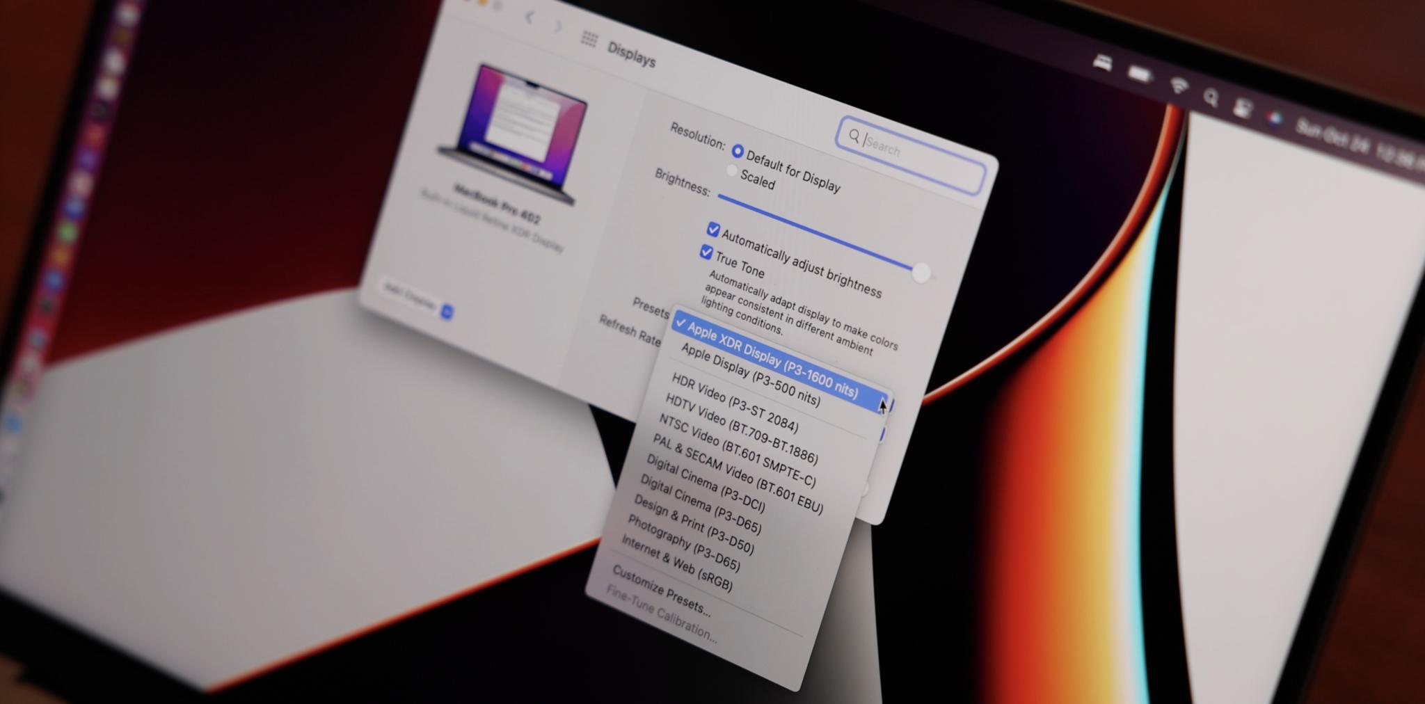
I'm here for all of it. Including, for these reference modes. Yeah, Apple has totally added reference modes, just like the Pro Display XDR, for anyone color grading or in those production workflows.
M1 Max MacBook Pro — A/V
Apple has turned the old 720p MacBook Potato Cam into… full-on 1080p poutine. Come on, as a Montrealer, there's no higher compliment I can give. Like the M1 iMac, it has way, way better optics upfront, and Apple's iPhone 12-generation image signal processor behind it, so it captures a ton more light and can make the absolute most of it. And I mean, it doesn't beat a dedicated 4K camera or iPhone, of course, but if you don't have that ready and available, this will finally, — the Rock approved finally — more than make do.
Similar to the mics, which were already mid-range USB mic good, but now even better at stripping away noise and hiss. Not meant to replace your high-end USB, much less XLR mic, but they can more than ever make do now in a pinch.
See the samples in the video above!
M1 Max MacBook Pro — Ports
If you do use an XLR mic, like me, you're still going to need a dongle. Likewise if, like me, you use CFExpress cards over Thunderbolt rather than SD cards for your camera. Or if your particular layer of enterprise hell still requires DVI or, oh Luce, VGA. Because Pros never really get to live a dongle-free life. That's why I'm super beyond happy Apple kept at last 3 now Thunderbolt 4 ports on the MacBook Pro. I'll take as many as I can get.
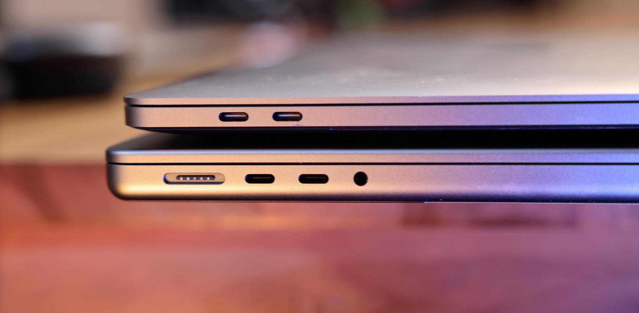
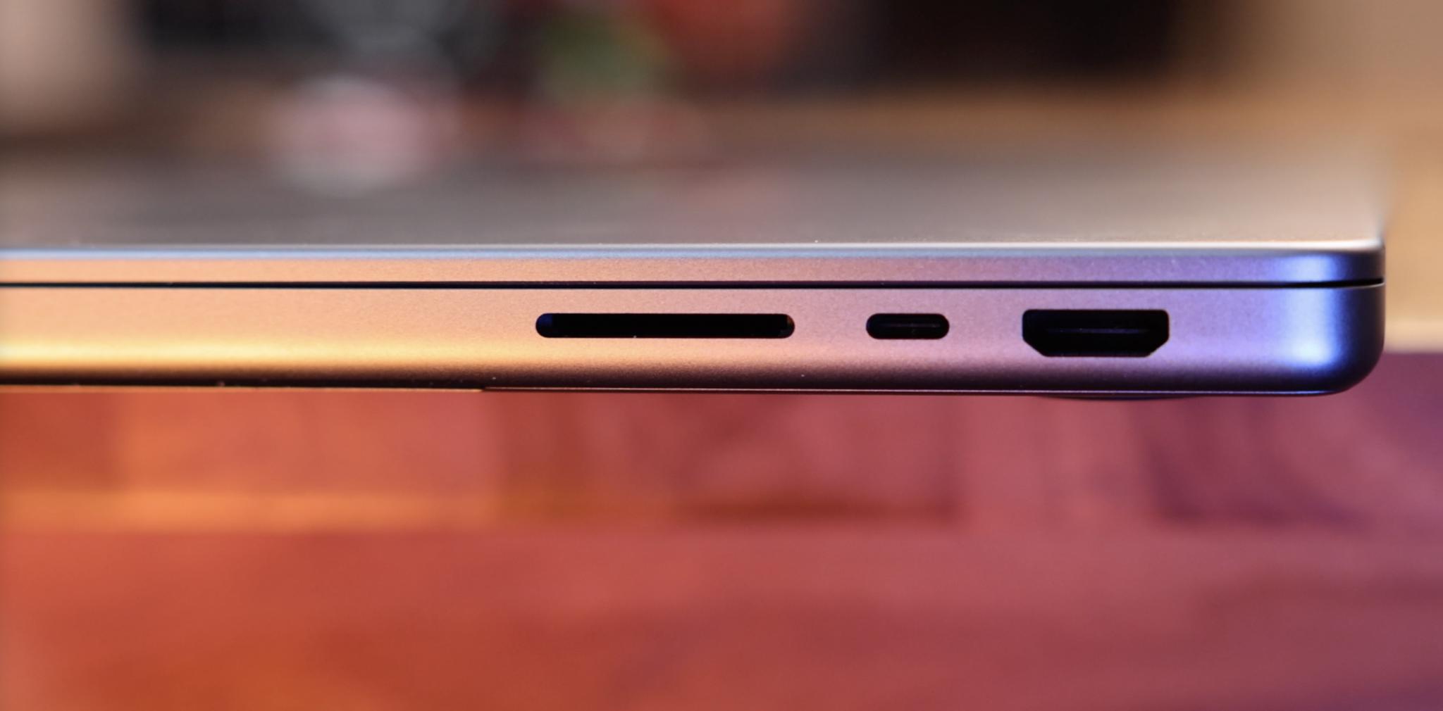
Even though I don't personally use HDMI or SD Card, or high-impendence headphones, and as much as I love MagSafe, I love being able to charge from either side just equally as much, I'm also super beyond happy Apple brought all of those ports back for everyone who does use them, especially on the daily. I just wish they'd thrown ethernet on the power brick along with it, like the M1 iMac. But none of us every time get what we wish.
Including those HDMI and SD Card ports being less than bleeding edge. They're HDMI 2.0 and UHS-II, respectively, not HDMI 2.1 and UHS-III.
There are three thunderbolt busses, up from 2 on M1, and 3 USB busses, so it's probably just a limitation on how much bandwidth Apple can spend with M1 Pro and M1 Max and how they chose to spend it between the various ports right now. Given how much more, for example, HDMI 2.1 requires vs. nothing on the MacBook Pro pushing 8K or 120Hz out yet anyway. By next rev, they'll probably be more popular, more widely supported, and have even better component options, so who knows.
Thanks to MagSafe, which seems to be debuting USB Power Delivery 2.1, you can fast charge the 14-inch MacBook Pro up to 50% in 30 minutes… if you get the 96-watt adapter — or the 140-watt for the 16-inch. With the lower power adapters or with Thunderbolt 4, you get the regular charging speeds.
All this to say, Apple can't ever make everyone happy, but with this new arrangement, I think they're going to make a ton more people happier than they've been in half a decade.
M1 Max MacBook Pro — Bottom Line
In some ways, the M1 Pro and M1 Max MacBook Pros are a repudiation of the 2016 models, walking back almost all the then-future-thinking technologies the winning group at Apple hoped would make it truly next generation. But now the Butterfly keyboard is gone. The Touch Bar is gone. The all-in on USB-C and Thunderbolt is gone. And only the Force Touch trackpad remains. And that does make it as much regression as it does correction. But in this case, for everyone who loved those original MacBook Pros, it's a massive win. A huge win. And one entirely eclipsed by what Apple's done beyond all that.
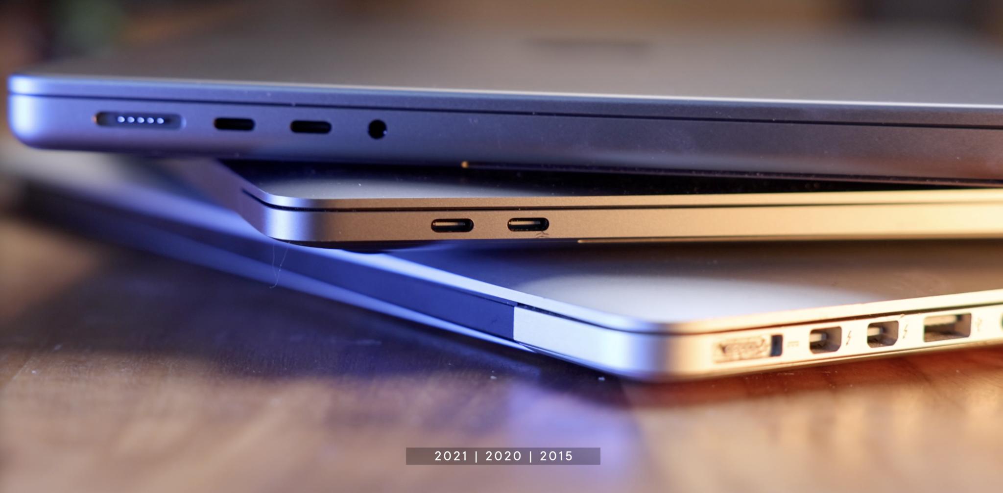
Namely, the XDR display and most especially M1 Pro and M1 Max.
It's hard to wrap your head around because it's one of the few legitimate, this changes everything moments we've had in laptops in a generation. Honestly since the second-generation MacBook Air, but for very different reasons.
Apple's just put a 2019 Mac Pro into a 2021 MacBook Pro, complete with everything from reference modes to Afterburner acceleration. Pretty much everything but the PCIe expansion slots and… the wheels.
With up to 64 GB of unified memory feeding not just the CPU but the GPU and all the other cores and blocks on the M1 Pro and Max, which is the level of VRAM you'd max out on a Mac Pro, not a MacBook Pro, not any laptop. But not only feeding all those up to 32 GPU cores but just wiping away all the overhead that traditional boards accrue by copying back and forth. With SSD that swaps so fast, it's almost indistinguishable from RAM.
As someone who sits in front of a Mac and edits video all day, almost every day, it's going to make my life legitimately better, all day, almost every day. Not just in time, which is already more valuable than money because you can never make more of it, but in quality, which is every bit as immeasurable.
This is literally the MacBook Pro I've been dreaming of ever since Apple dropped the A7 back in 2013 and kinda loudly announced their silicon intentions to the world.
And what really, truly warps my brain here, cliched as it sounds — M1 Pro and M1 Max are only the beginning.

Rene Ritchie is one of the most respected Apple analysts in the business, reaching a combined audience of over 40 million readers a month. His YouTube channel, Vector, has over 90 thousand subscribers and 14 million views and his podcasts, including Debug, have been downloaded over 20 million times. He also regularly co-hosts MacBreak Weekly for the TWiT network and co-hosted CES Live! and Talk Mobile. Based in Montreal, Rene is a former director of product marketing, web developer, and graphic designer. He's authored several books and appeared on numerous television and radio segments to discuss Apple and the technology industry. When not working, he likes to cook, grapple, and spend time with his friends and family.
