A history of widgets on the Mac - from Dashboard to Desktop on macOS Sonoma
Using your Mac like it’s 2005..
iMore offers spot-on advice and guidance from our team of experts, with decades of Apple device experience to lean on. Learn more with iMore!
You are now subscribed
Your newsletter sign-up was successful
What goes around, comes around. It was back in 2005 that Apple gave us Dashboard Widgets for the Mac, but in 2019, it took them away again. Four years later, in the Autumn of 2023, they’ve returned – sort of.
macOS Sonoma finally lets you put widgets on your desktop, a feature that has much in common with the Dashboard Widgets of old. Similar to widgets in iOS and iPadOS, you can place as many as you can fit on your desktop, and you can interact with them.
From podcasts to weather, there's plenty you can add now. But back in 2005, widgets were a tentpole feature of Mac OS X 10.4 Tiger, and I loved them.
Article continues belowSo with this in mind, here's a history of using widgets on a Mac, and what you could do almost 20 years ago.
Do it yourself
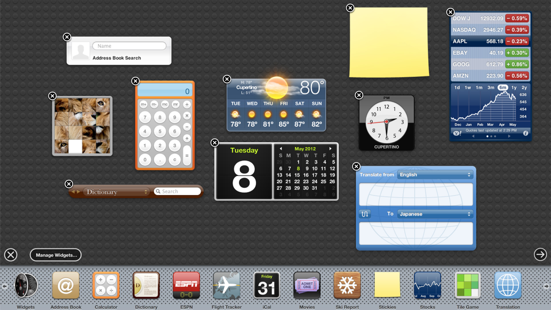
Widgets would sit on a dashboard, which took up the whole screen and was opened using the Dock, Launchpad, Spotlight, or a hotkey. They gave speedy access to instant functionality without having to open an app.
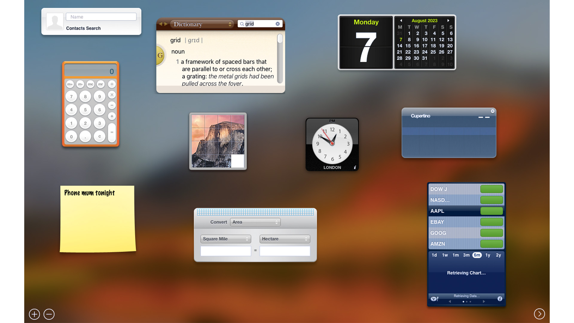
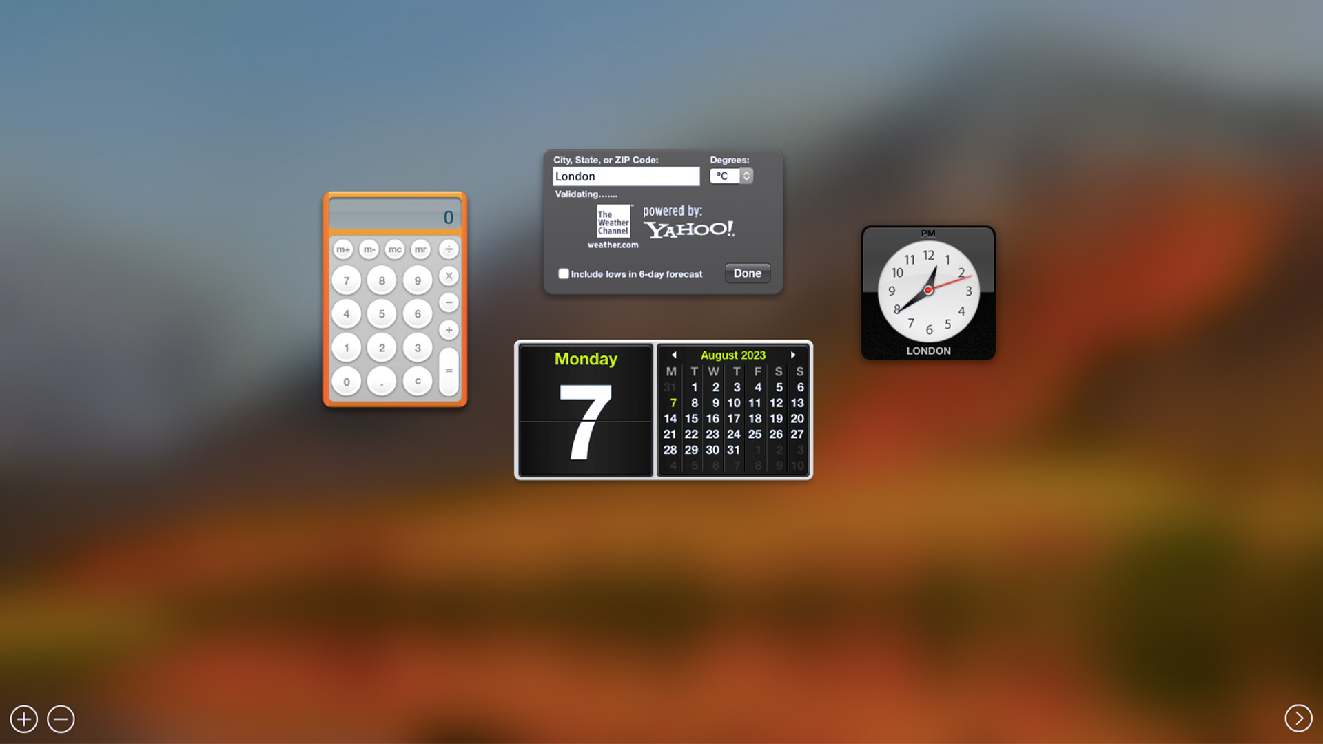
There were four by default; Calculator, Clock, Weather, and Calendar. You could customize the dashboard by opening a Dock-like bottom bar, from where you could add new widgets and close existing ones you didn’t use. Additional Widgets included a Dictionary, iTunes controller, Address Book, Stickies, and a Stocks ticker. By dragging open widgets around on the screen you could arrange them exactly how you wanted them.
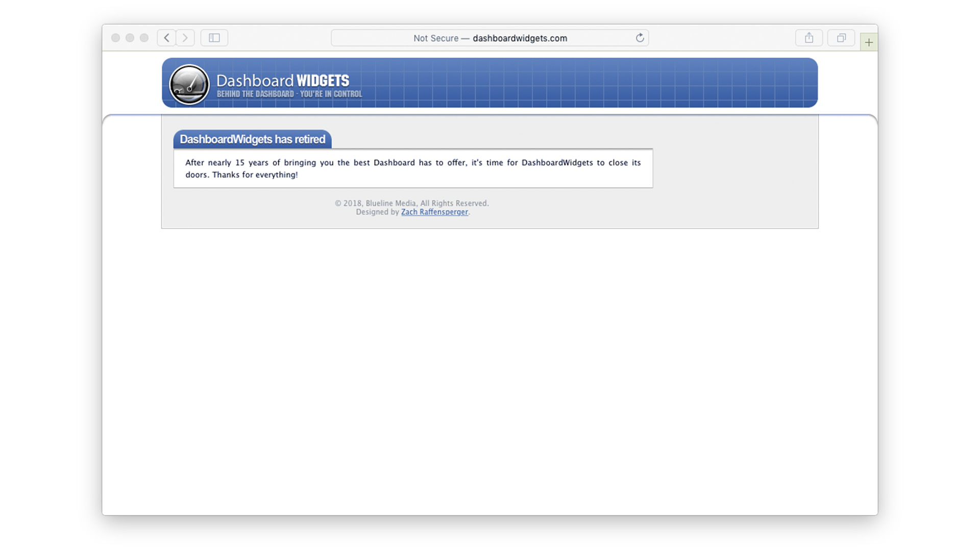
Anyone with sufficient skills could create a widget and share it with the Mac community. There was a page on the Apple website where you could download new widgets, and third-party sites like the now-closed DashboardWidgets sprang up too.
iMore offers spot-on advice and guidance from our team of experts, with decades of Apple device experience to lean on. Learn more with iMore!
All sorts of widgets for all sorts of tasks could be downloaded and installed. There was an eBay widget that let you keep tabs on your auctions. PCalc released a full scientific calculator widget to accompany the app, online comic strips were offered in a widget, there were mini-apps for translations and currency exchange, and more. Most were free, but there were also a few paid-for Widgets.
The introduction of Dashboard wasn’t without controversy. As some users pointed out, it bore more than a passing resemblance to Konfabulator, a third-party application that had similar functionality. This also called its mini-apps ‘widgets’ and allowed users to create their own. It could be further argued that Konfabulator was itself a ‘tribute’ to Apple’s own Desk Accessories released with the first Macintosh in 1984, but such objections are wide of the mark.
Desk Accessories was basically a means of running trivial applications like a calculator or alarm clock without shutting down the app you were using at the time (there was no multitasking in those days), and while Konfabulator was released long after Desk Accessories ceased to be a thing, Dashboard came out while Konfabulator was at its peak.
A case of neglect
Dashboard got little love from Apple over the years. There were a few upgrades. In Mac OS X Lion, released in 2011, you could configure your Dashboard as a desktop space so you could swipe to it, instead of opening it like an application.
But this was the only major update the feature enjoyed. With the release of macOS Yosemite in 2014 it was disabled by default, and had to be enabled in the Mission Control System Preferences, and macOS Catalina in 2019 killed it completely. The only widgets you could use after then would be in the Notification Center, which was handy, but not as versatile.
Fast forward to 2023, and widgets have returned in macOS 14 Sonoma once more. Not in a designated space like the post-Lion Dashboard, but actually on the regular Finder desktop. Setting up your desktop widgets couldn’t be simpler.
You can click on the clock in your menu bar to open the Notification Center and drag a widget into place from there. Alternatively, right-click on your Mac’s desktop and select ‘Edit Widgets’ to open the widget picker. From there you can drag widgets anywhere on the desktop, but if you want to keep things neat and tidy, guides appear to help you snap your widgets to a grid.
This new widgets feature accompanies rather than replaces the old one. You can still find widgets in the Notification Center.
Widgets, widgets everywhere...
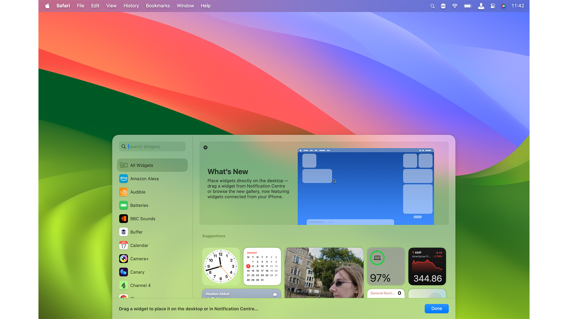
As well as the existing widgets from your Mac, you can also use those from your iPhone as desktop widgets. As long as you’re signed into the same Apple ID on both devices, just bring your iPhone close to your Mac and open the widget picker. Your iPhone’s widgets are there, available for selection.
When in place, your desktop widgets are always visible. When not in use they blend into the background by adopting the colors used by that area of your desktop, sitting discreetly and not getting in the way.
Click on the desktop or spread with four fingers and your open windows are pushed off the screen, your widgets to the fore. Click on one to open its parent app. Widgets are shown on every currently open desktop space, so if you swipe between spaces, you still have your widgets.
As always, the prime purpose of widgets is to display a small amount of information from their parent applications; a Clock widget shows the time, a Weather widget gives you a short-term forecast, and so on. But now, widgets are also interactive. Control your smart home devices through the Home widget, tick off to-dos in the Reminders widget, and so on.
You can add more widgets whenever you like, rearrange them on the desktop, and delete them by right-clicking on the widget to edit or remove it or opening the widget picker and clicking on the minus sign in a widget’s top-left corner.
Second time lucky?
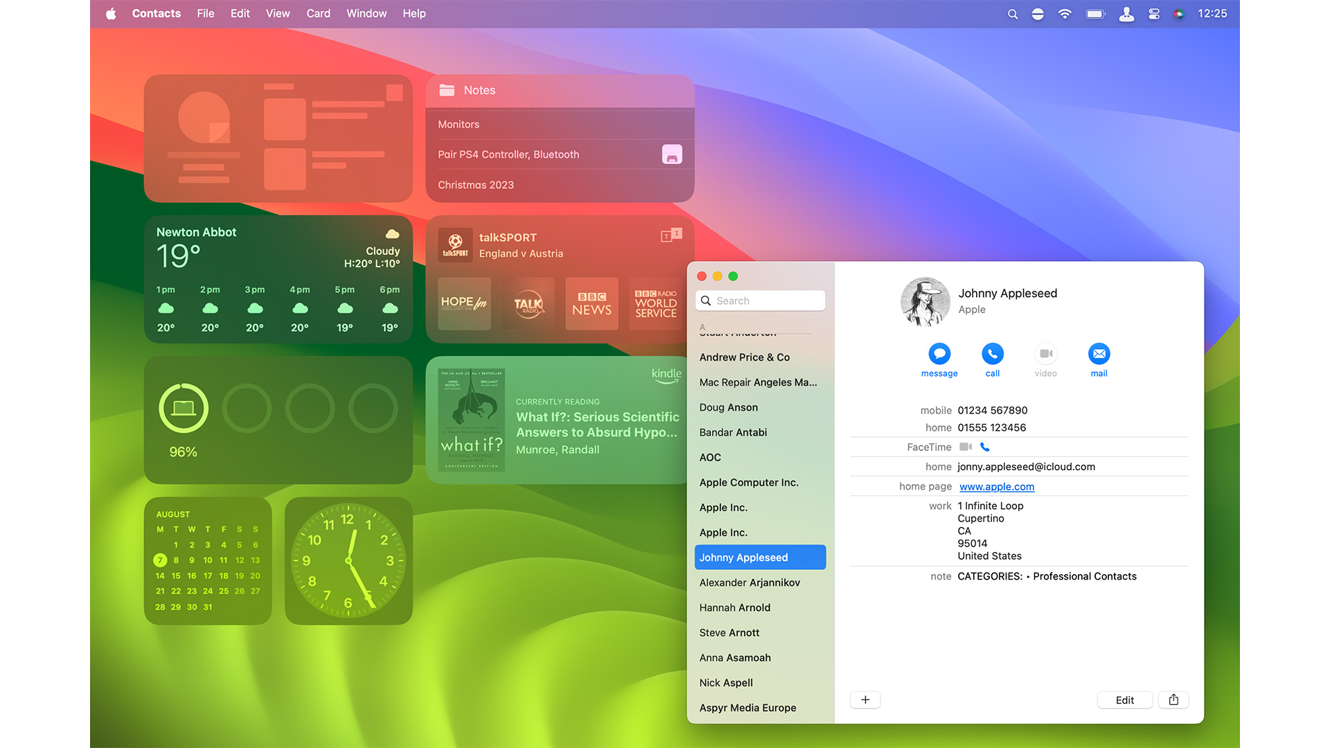
Can desktop widgets succeed where Dashboard failed? Are widgets more useful on the desktop than they were in a separate space all those years ago? Initial signs are good so far since Sonoma's release.
Widgets in general are a far more integrated part of home computing and smartphone use than they were back in Dashboard’s day, and desktop widgets are easier to get to while you’re working (not that they were very hard before).
The feature will take time to reach its full potential as developers work on interactive widgets for their own apps, but with the existing library comprising both Mac widgets and the iPhone, they’re already off to a great start. Let’s just hope that desktop widgets get more love from Apple than what Dashboard was given in it short life.

Ian started his career as a games journalist, working on legendary magazines such as Crash and Zzap! 64, before moving into tech. As well as iMore, he currently works for titles such as MacFormat and Mac!Life. He also has a keen interest in history, and has written several bookazines about famous battles in World War II. His favourite computer is his M1 iMac, but his M2 MacBook Air gets a lot of love too. He’s also a keen user of other Apple devices, such as his iPad Pro, iPhone 15 Pro and Apple Watch.
