"Just slap a Retina display in the MacBook Air and ship it!" is what a lot of people have been clamoring for Apple to do for a long, long time.
Apple might have explored that idea on the old model and, eventually and for a variety of reasons, decided against it and for what became the then-new 12-inch MacBook instead.
But that meant the old model was left to languish for years, inexpensive by Apple standards but non-Retina in an otherwise completely Retina world. Its chunky, large pixels evident, scraping cornea and making high-density coddled eyes bleed.
OK, nothing quite so dramatic, but unlike the equally non-updated Mac mini, whose ancient parts were hidden away, MacBook Air's shame was exposed for all the world to see.
Until now.
Price: From $1,199 at AppleBottom line: If you need ultimate portability, get a MacBook. If you need cutting-edge power, get a MacBook Pro. If you want something you can take everywhere, do everything on, and not have to pay... quite so much of a premium for it, then get the MacBook Air. It's the new normal.
For people who want:
- A balance of portability and performance
- Retina display
- Ultra-fast Thunderbolt 3 and USB 3.1 Gen 2 ports
- Smaller bezels
- The most affordable MacBook
Not for people who want:
- Extreme portability or performance
- DCI-P3 Retina display
- USB-A, Thunderbolt 2, HDMI, SDHC, or other ports
- No bezels
- A cheap notebook
MacBook Air (2018) Display
Yes, the new MacBook Air has a new Retina display. If you're not familiar with the term, it means a density that's high enough for the individual pixels to fade away at normal viewing distance for people with average eyesight. It's like opening a screen door and seeing the world without a grid superimposed on it.
Typically, Apple does Retina by moving to @2x or rendering every point with not just 1 pixel but a square of 4. That makes angles cleaner and curves smoother.
Apple's not quite doing that here. The previous Air was 13.3-inches, 1440 x 900 at 128ppi, which would double to 2880 x 1800. The new Retina Air is 13.3-inches, 2560 x 1600 at 227ppi. You do lose about 300 points horizontal and 100 points vertical in the translation.
But, you're effectively getting the same Retina size and density as the13.3-inch MacBook Pro so, in my experience, it's still perfectly usable.
The biggest difference between the new MacBook Air and the current MacBook Pro displays is color gamut. The new Air is still sRGB but 48% wider than the previous generation or the current 12-inch MacBook Air. That means richer reds and more vibrant greens. Just not as rich and vibrant as the full-on DCI-P3 wide gamut displays on the current MacBook Pro.
So, if you're a photographer or anyone whose workflow is all DCI-P3, all the time, you'll have to either remember you're not getting all of that on the Air or stick to a 13-inch MacBook Pro when you're portable.
Compared to anything but the current generations Pros, it does look terrific though, and I bet most people couldn't even tell it apart from the Pro if they didn't know exactly what to look for.
That's the biggest advantage the Apple display team brings to every product right now: Complete color management across all devices, Mac and iOS, and nearly perfect calibration from the factory.
Apple didn't call it Liquid Retina like the iPhone XR and new iPad Pro, and it didn't drive it almost edge-to-edge and painstakingly anti-alias and mask it around the corners like it did those displays. So, there may still be that to look forward to on some new Mac, someday.
But Apple did snap its fingers here too and kill off 50% of what was very broad, very bright bezels on the old model, and replaced them with black under the glass as every modern Mac deserves.
I can't say it was worth the wait because, in this specific case, the wait was so damn long, but I can say it looks great. And the end result is way better than just slapping a Retina display in the old Air.
MacBook Air (2018) Design
MacBook Air is a trend-setter. An originator. Ever since Steve Jobs pulled the very first one out of a Manila envelope, it's forced customers to pay attention and competition to play catch-up.
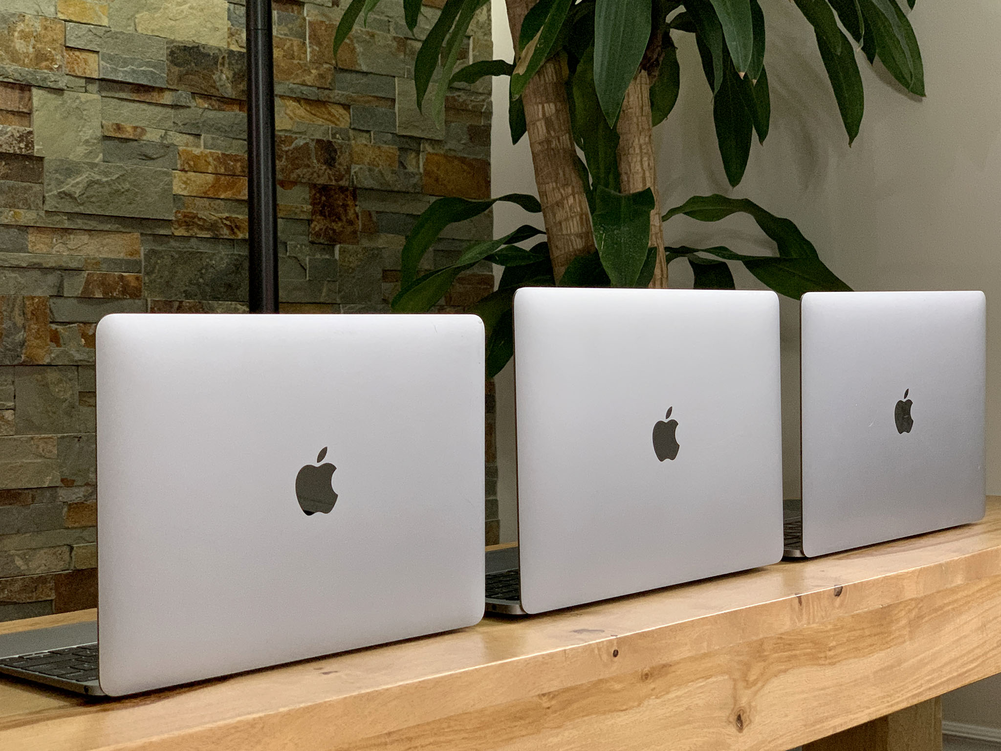
Nothing highlights that more than the second design generation Air, which introduced a wedge shape and portable profile that became the template from which Intel and other vendors cloned again and again for almost a decade. Yes, it was ultrabook zero.
In 2015, Apple superseded the design with the new 12-inch MacBook, which pulled every trick in the book, including terracing the battery, to get even smaller and lighter than Air. That design quickly spread to the MacBook Pro, if in beefier, more power-focused form.
Now it's come full circle back to the Air. Kinda.
Like I said in my initial hands-on, it's not like the MacBook design language is overwriting that of the Air, it's more like it's fusing together creating something with all the best bits of both.
The now-iconic wedge is still here, but in place of MagSafe power, USB-A, and a 3.5mm jack on the left side, there are now two USB-C / Thunderbolt 3 ports. In place of a second USB-A and an SD card slot on the left, there's just a 3.5mm jack.
Since I still make videos for a living, I personally miss the SD card slot like gangbusters. AirDrop and sync work terrifically well for photos and small videos. They do not work well for an hour or more of 4K footage. Like any pro, I've had to live with dongles for cables for years but those disappear into the cables. Dongles for cards just sit there. Dongling. Dangling. Whatever. Until you remove them and inevitably misplace them.
I get that Apple's minimalist philosophy is to only include the hardware most people use most of the time. And, in that light, I think it's fine for the Air in a way I still don't for the Pro.
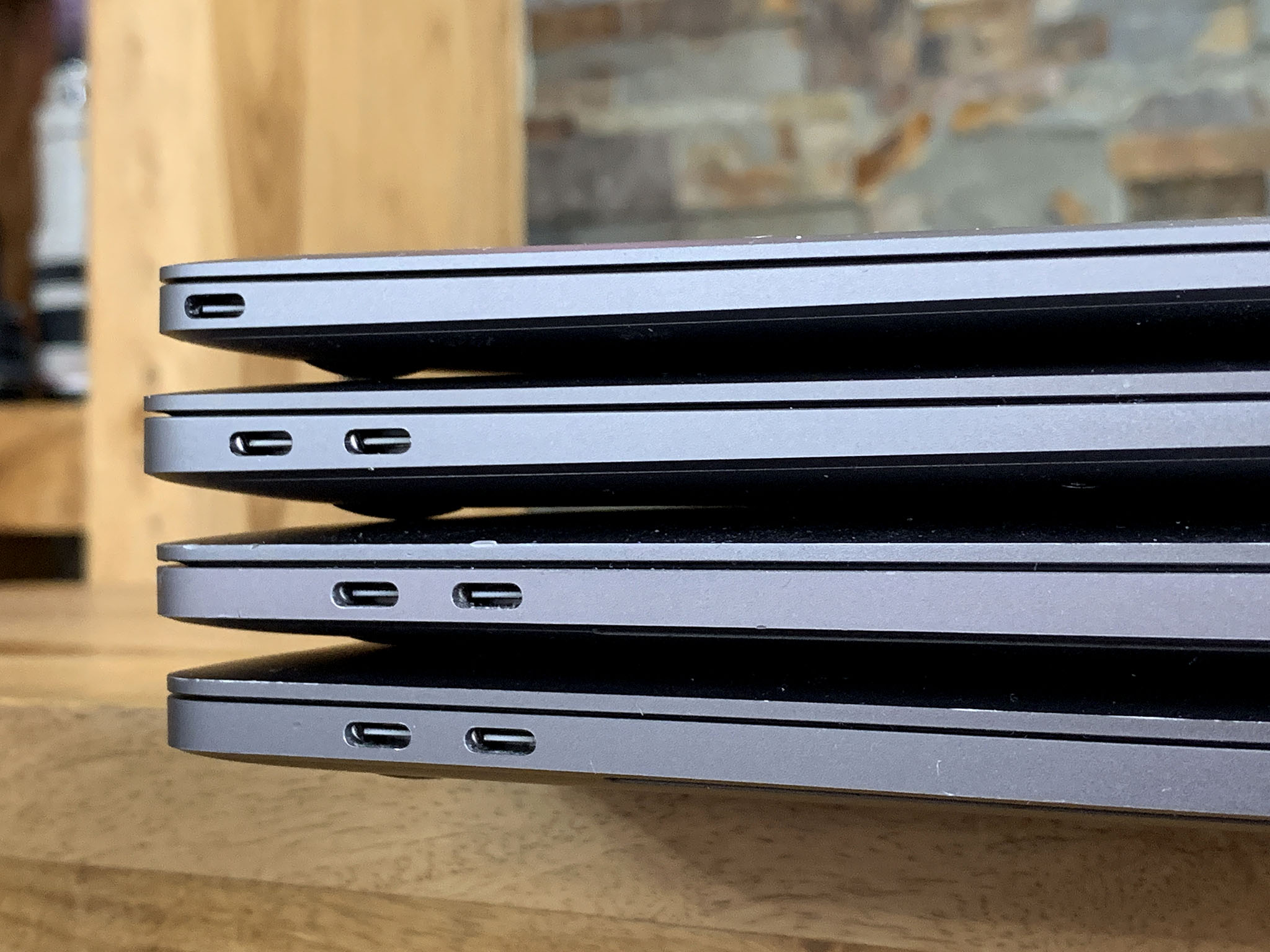
I'm also fine with losing MagSafe. Unitasker ports just aren't as efficient and Macs have become enough like iPads that they really don't have to stay plugged in most of the time.
When they are plugged in, it's a net neutral anyway. As much as I miss MagSafe detaching elegantly if anyone ever tripped over it, I absolutely do not miss the much more frequent detachments when I was using my MacBook on my lap and my thigh moved just enough to push it up and kill the connection.
What I like best about multitasker ports that also carry power is that, on most of the new MacBook Pros, you can plug into any one of the ports on either of the sides. I use that "feature" all the time at home, in coffee shops, at hotels... everywhere.
And that's what bums me out most about the port change on the new MacBook Air. We went from one USB-A on either side of the old design to two on the same side of the new design.
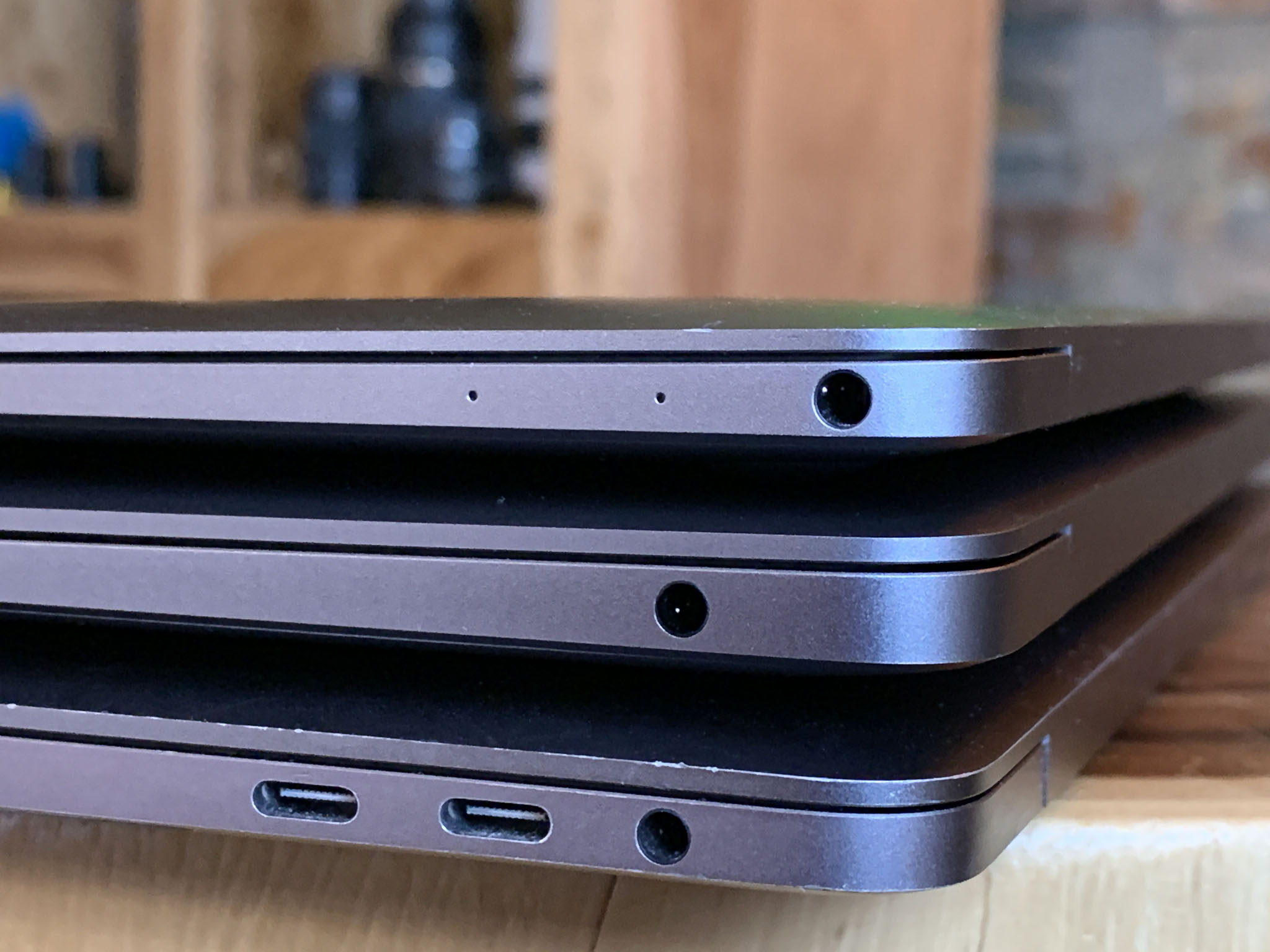
And that means, instead of just swapping charging sides to whichever is the most convenient at the moment, I have to go back to the MagSafe days and swapping the way I'm sitting or standing, if at all possible.
I get that architecting two ports on two sides is way more difficult than putting them both together on one side, but it's a feature that, once you get used to it, it's really inconvenient to lose.
I'm also not sold on the return of the branding under the display. That went away for a while and I didn't miss it. There's no iPhone or iPad on the front of iOS devices, and while they put it on the back and that wouldn't sit anywhere nearly as well on the Mac, even with all the shameless imitations out there, I feel like the design still speaks for itself and the letters on the bezel could easily take a rest for an eon to two.
The other big design change is the keyboard. In some people's eyes, the best thing about Apple not updating the old Air in years was that it got to keep the old, beloved, scissor switch keyboard.
The new Air has the new, much more divisive butterfly and dome switch keyboard that the 12-inch MacBook and new MacBook Pro have.
In my incredibly informal polling, I've found roughly a quarter of the people I know hate it, half don't care one way or another, and a quarter like it better.
I'm in the quarter that likes it better. I think I liked the second generation best, but the current, third generation, has so far exhibited lower failure rates — and complaint rates — and really is quieter, both big wins.
Like I've said repeatedly, though, I'm not everyone and having a keyboard that is so divisive on a product made by a single vendor where there are no other reasonable options (external keyboards aren't reasonable for a notebook) is hugely problematic.
Apple really does believe that the new keyboards provide a better, more stable, more precision typing experience, and Apple is one of Apple biggest customers, so it says something that they're so committed to it, despite the complaints.
Still, I very much hope Apple is working on another generation or another new design that, even if I personally happen to like less, a broader range of users end up liking more.
MacBook Air (2018) Touch ID
The only major change to this 3rd gen butterfly and dome keyboard is, well, a major change — the addition of Touch ID... minus a Touch Bar.
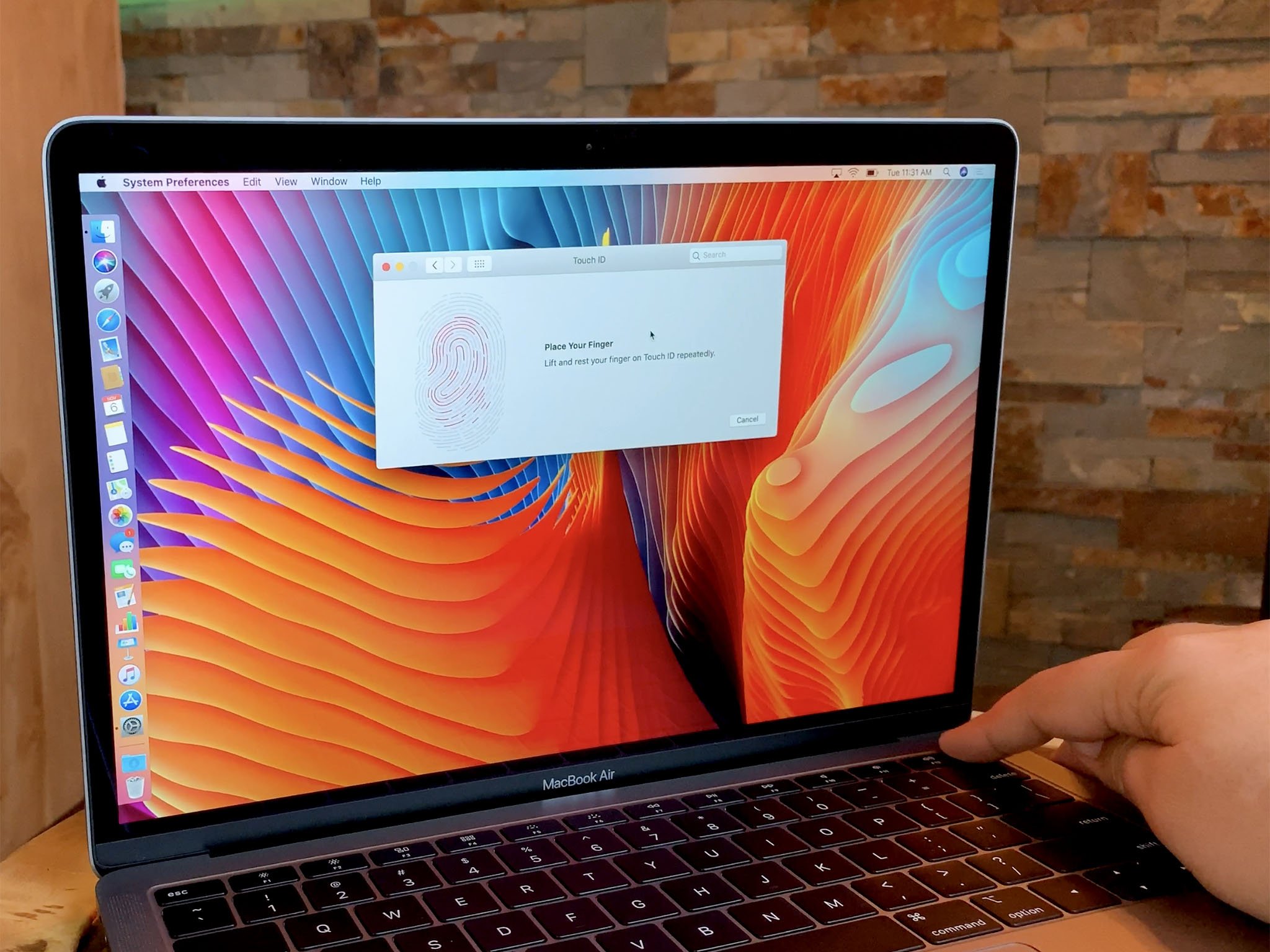
Confession: I happen to like the Touch Bar way more than function or media keys, and on the Pro, I use it far more than I ever used the keys. But, again, I realize I'm not the only kid on the playground and many people, including developers, still seem to prefer having all their Fs on all those keys.
So, for many, I imagine this will be the best of both worlds. At least until, and inevitably, it gets replaced with Face ID like the latest iPhones and iPad Pro.
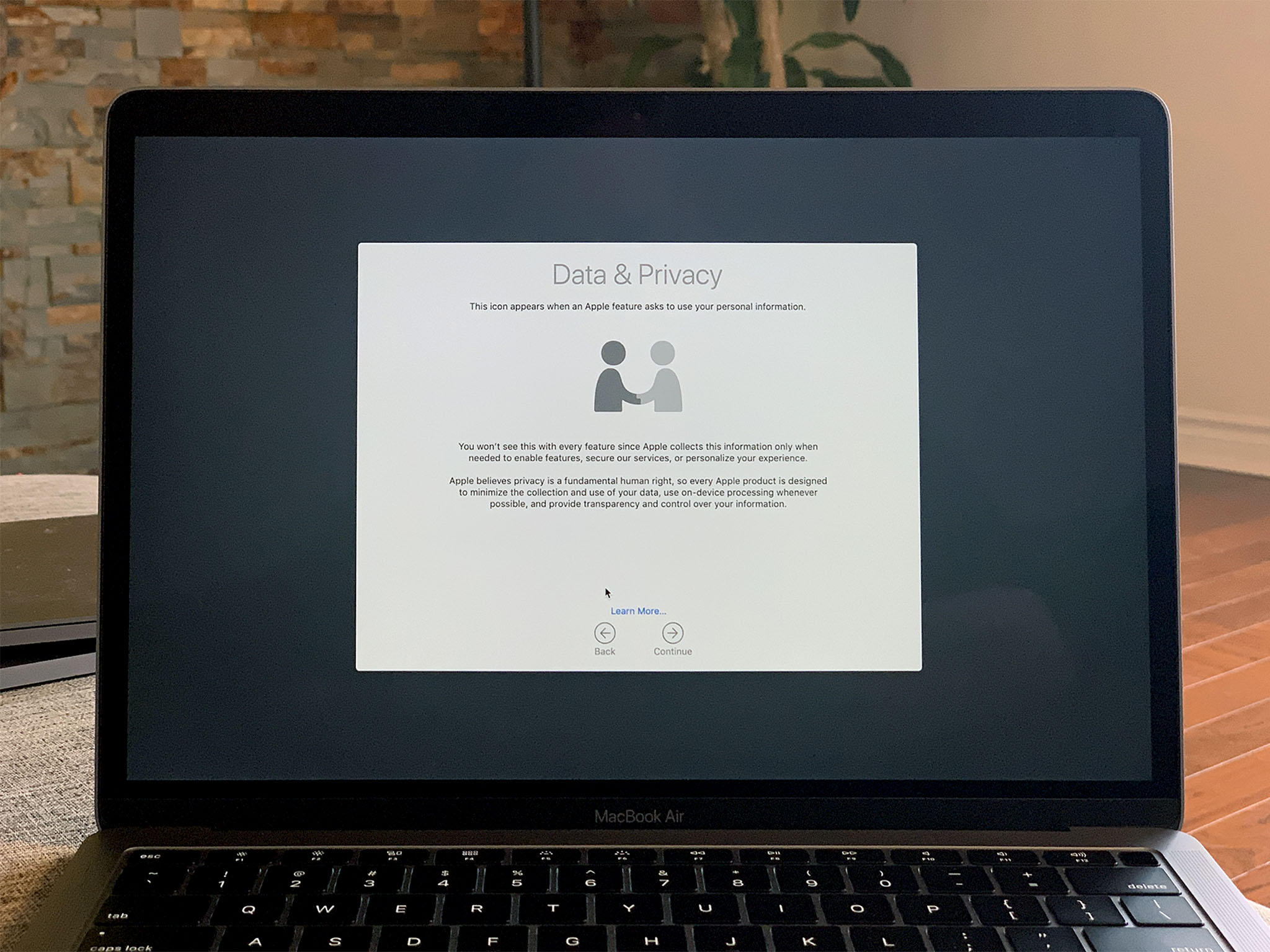
Touch ID is still incorporated into the power button. It replaces the usual key with a laser-cut sapphire crystal lens, activated by a stainless steel, capacitive single-touch sensor. Touch the key, a picture is taken of your fingerprint, it's converted to math, sent through a secure hardware channel to the T2 Security Chip, and algorithmically compared with the fingerprints registered with Touch ID. If it's a match, you're in. If not, you're out.
You can use Touch ID instead of your account password to quickly unlock the machine or secure apps like a password manager, or authenticate for Apple Pay.
Like with Touch ID on iOS and MacBook Pro, you can't use it if you're wearing gloves or your fingertip is moist or wet, and if you haven't used it for a while, if a non-registered finger tries to use it and fails repeatedly, or certain other circumstances occur, you'll have to enter your password again to re-register it.
Now, with the Touch Bar on the MacBook Pro, Touch ID had a dedicated, secured display to ensure price information was never misrepresented. Since the MacBook Air doesn't have a Touch Bar, Apple has instead hardened the display pipeline for macOS so, even on the big screen, what you see is what you pay.
And, if the T2 Security Chip detects anything amiss, it'll shut local authentication for Apple Pay but still give you the option to authenticate with your iPhone, iPad, or Apple Watch instead.
Gotta love that security team. It may not be as transparent as Face ID, but Touch ID is so fast, and moving your finger to the sensor on the keyboard is so in-context on the Mac, that it ends up being very close.
It's one of the best new features of the Air and once you get used to it you never want to be without it.
MacBook Air (2018) Internals
I've said this before and I'll say it again: Every time I go to sleep I wake up and Intel has introduced a new optimize cycle into its roadmap. What was supposed to be Skylake and Cannon Lake has become Skylake and Kaybe Lake and Coffee Lake, and variants like Ice Lake and Whisky Lake and... whoops, I dozed off again, did we get to Lake Lake yet?
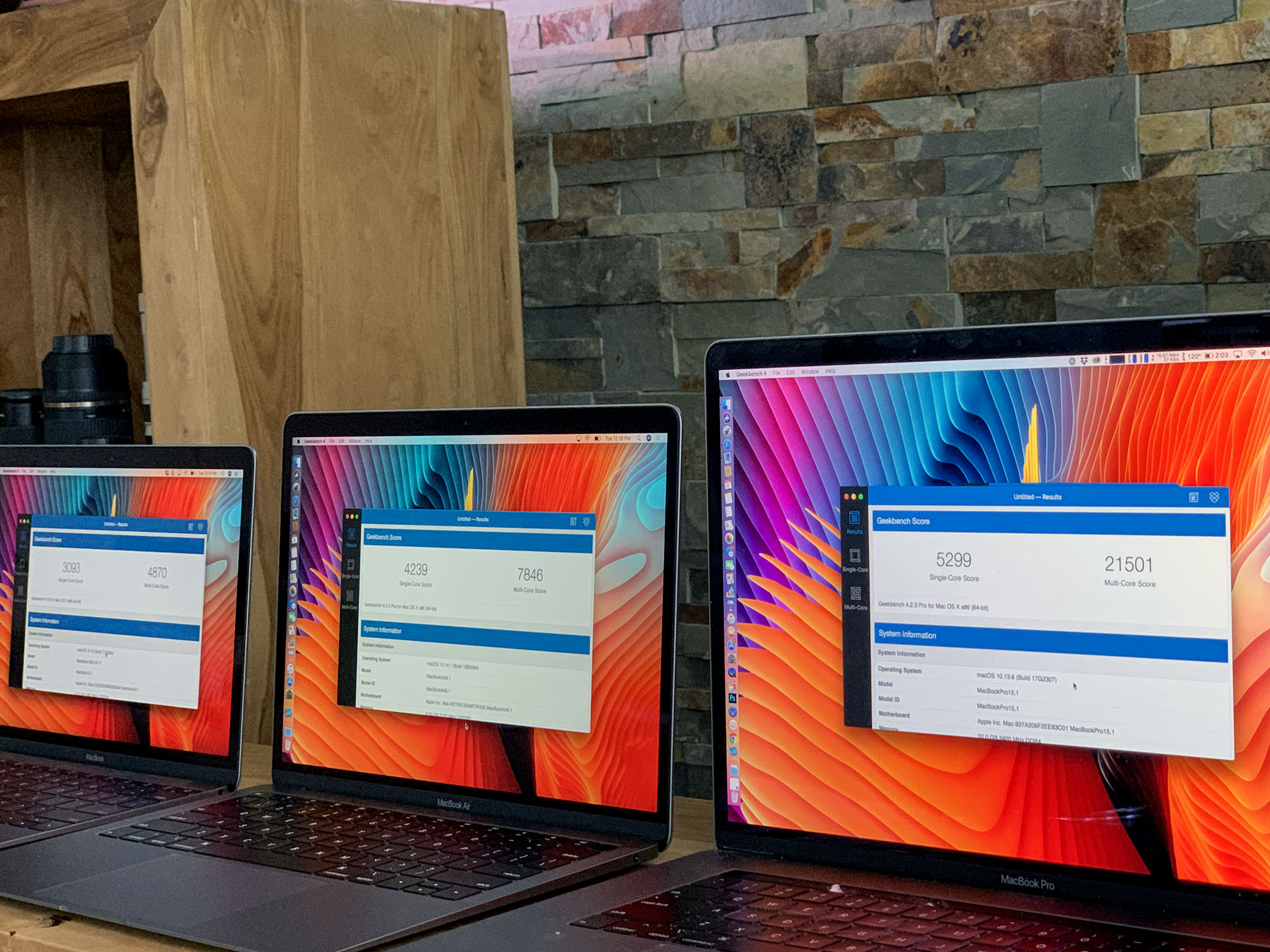
It's been a bad few years for Intel, especially when it comes to processing shrinks. While Apple has become the first to field 7nm chips in both the iPhone and iPad, Intel hasn't been able to shrink down to 10nm yet.
And yeah, those sizes are more marketing names than anything else, but they're also generational shifts, and Intel is now once again throwing cores at a process problem.
So, here's where we are: The new MacBook Air uses (a still 14nm) 8th generation Amber Lake chip — so... many... Lakes... — with 1.6GHz base and 3.6GHz turbo frequencies, and UHD Graphics 617.
It's basically a tweaked Y-series chip, the kind of chip the 12-inch MacBook has been using for years, and not a U-series chip, like the previous MacBook Air and like MacBook Pros use.
So, it's 7 watts instead of 15 watts. Which is, of course, fewer watts, and something that's been a concern to some people since it was announced. Including me — I was kinda down on it when I first realized what it was.
The way I've come around to looking at it is this, though: Beyond nanometers and watts, base and turbo frequencies, thermal limits and throttling, what kind of performance can it provide given the chassis it's contained in.
And, given everything I've seen, heard, and experience now, I think this Amber Lake chip is the best choice Apple could have made for this Air, and going with full-on Coffee Lake would have essentially necessitated other compromises, turning the Air effectively into the lowest end Pro. (Which, ironically, is still waiting on either its own Coffee Lake update or EOL.)
The only really odd thing here is that, unlike the 12-inch MacBook which currently comes with m3, i5, and i7 Kaybe Lake Y-series (cough, coreM, cough) options, and the Pro, which currently comes with i5, i7, and i9 Coffee Lake U-series options, the new MacBook Air only comes in i5 Amber Lake Y-Series.
So, there's no way to pay less for an m3 or more for an i7.
Apple may feel m3 just doesn't perform well enough and i7 doesn't run cool enough for to be worth it, and it's not like Apple has ever offered processor variant options on iOS devices, but on a Mac, it still feels... weird.
Like with my Mac mini review, I'm not going to compare back with the last version because it's just too old to make it reasonable, but I used an Air for years when I was blogging and only switched to a Pro because I started to need the faster Final Cut Pro X rendering times for YouTube.
Otherwise, I'd still be more than fine with this new Air. And especially fine given Apple's still rating it for 12-hours of battery life. (For casual use, not video rendering, obviously.)
Apple's also using its own, custom silicon here — the T2 Security Chip — to engineer around some of Intel's... lack of engineering.
If you're not familiar with the T-Series, T2 is rumored to be something akin to the A10 chipset that powers the iPhone 7. It's used here to provide secure boot, real-time AES-256 bit storage encryption, the Secure Enclave for Touch ID, HEVC encode and decode blocks so rendering isn't quite as slow as it might otherwise be, and even always-on "Hey Siri" processing so you can voice activate the voice assistant on your Mac. (And, with macOS Mojave, that blessedly includes HomeKit commands.)
The cost of the added security is that you can't just flip the Air over, open it up, and swap out the storage, since it would break the hardware encryption, but with USB-C at 3.1 Gen 2 speeds of up to 10 Gbps and Thunderbolt 3 at up to 40 Gbps, if the blisteringly fast built-in 128GB, 256GB, 512BG, or 1.5TB options aren't enough, or become not enough, you can hang as much additional external storage as you want or need. It may not be as convenient but it's effectively limitless.
(I'd still suggest buying as much internal storage up front as you can afford, and more than you initially think you need, because it is so convenient you'll want the room to grow.)
Memory, which Apple keeps upgradable on desktops but not on notebooks for space and reliability reasons — listen to my interview with Tom Boger, Sr. Director of Mac Product Marketing, linked in the description below, for the company's rationale on that) — is 2133MHz LPDDR3, and you can get either 8GB or 16GB.
I still typically default to 16GB, even though memory compression is so good and swap is so fast now it's getting harder and harder to tell the difference.
You can plug into either two 4K displays or one 5K display up to 60Hz if you want to dock at home or at the office
It all comes together to really reinvigorate the Air: True to everything it was, maybe not when it first came out of the envelope but certainly when it was revised into the most popular Mac and influential notebook of this generation. Now, simply, made modern again.
MacBook Air (2018) Recycled Aluminum
If you were to just look at the new MacBook Air, available in space gray, silver, and new kinda-rosy, kinda brassy gold, you'd think it was the same 6000 series, bead-blasted, unibody aluminum alloy Apple's been carving computers out of for going on a decade now.
It's only when Apple tells you that their metallurgical team has found a way to reuse the excess aluminum alloy carved off of devices like the new iPad Pro to make devices like the new Mac mini and MacBook Air that you do a double take. Maybe even a spit take.
Combined with Apple's previous news about finding a better, carbon-free way to smelt the aluminum, to begin with, and now not having to smelt any additional aluminum at all for the new Macs, it's an astonishing win.
Not for the environment. The environment can and has existed in many ways over the astronomical life of the planet. But for an environment that's not depleted of resources and remains hospitable to human life.
That last part is especially important to us. So, let's hope Apple's efforts here are as widely copied as its designs.
MacBook Air (2018) Conclusion
"But the MacBook Air price isn't entry level anymore!" The internet is raging, and not without cause. "Apple is using new products to raise the price on everything!"
Fair enough. Though I'd quibble and say with iPhone X, iPad Pro, and even Mac mini, Apple is absolutely skewing towards more expensive components making for more expensive devices.
With the Air, there's a pattern to new versions starting off at higher price points, and only really the second version coming down after a couple years on the market.
The original Air, remember, started at $1799. The second revision started at $1299 for the 13.3 inch and only dove lower, to $999, for 11.6-inch version. (Yeah, there was an 11.6-inch version.)
It was only in 2014, once the 11.6-inch was discontinued and right before Apple essentially stopped updating it, that the 13.3-inch dropped to $999.
Now, the new, third revision is out and it starts at $1199, lower than any new MacBook Air ever. But, yeah, not low enough to meet expectations.
A pessimist would say Apple knows it can sell new Macs at launch at almost any price, so why discount them until it has to? An optimist, that Apple uses at-launch demand to pay-down the investment in the new designs and technologies that go into new products.
A pragmatist would probably just note that Apple discloses its margins every quarter and there's never a huge variance, so products cost what they cost, plus that margin, and as scale and yield increases, and costs go down over time, Apple typically price-drops to keep up or even increase demand.
So, yeah, at $999 for this new Air, I think Apple could have done a lot of damage to the rest of the market. At $1199, I think it'll still appeal to the typical Air market but won't expand much beyond that until, a couple or few years from now, it potentially drops to $999 as the previous Air did before it.
The difference between then and now, though, is that given Intel's challenges, Microsoft and Google's interest in the space, the willingness to experiment that we've seen from other vendors, and everything Apple is doing beyond the MacBook, the world will likely look even more different in an even shorter span of time.
For a long time, Apple had two notebooks: A MacBook and a MacBook Pro. Then came the MacBook Air and, while initially positioned as an expensive option for people who valued extreme portability above all, with its redesign it quickly killed off the MacBook and became the entry-level, everyday notebook for everyone.
Rather than dropping the Air brand and letting it be the new MacBook, though, Apple kept it as the Air, and it became the most popular Mac ever.
Then, when Apple introduced an even smaller and more portable notebook, rather than calling it the Stealth or the Helium or something else lighter than Air, Apple kept it at MacBook.
Many, myself included, assumed the new 12-inch MacBook would likewise drop in price over time and do to the Air what the Air had done to it: Kill it off and return the line to two simple options.
But it never did. Maybe it stayed expensive to make or maybe the Air became too beloved to let fade away, or both, but for the last few years Apple's simple product grid has been just a little more complicated.
The new MacBook Air does nothing to change that.
On one extreme, you have the 12-inch MacBook for those who want ultimate portability and are willing to pay a premium for it. On the other extreme, the MacBook Pro for those who want ultimate power and are likely willing to pay for it. In the middle, the broad middle, you have the new Air for those who want a balance of portability and power and don't want to pay as much of a premium.
That it's confusing is the result of legacy branding and SKUs. In a perfect world, the 12-inch would be the Air and this would be the new MacBook, and everyone would understand naked is the baseline and modifiers are the two extremes.
But given how popular the Air brand is, and how it's come to be associated with entry-level, Apple is stuck with things the way they are. At least for now.
And, in that context, the new MacBook Air is exactly what Apple says it is: The ideal notebook for most everyone to take with them every day to do all things they do every day.
Personally, if I didn't care so desperately about Final Cut Pro X rendering speeds on the road, it would absolutely be my next MacBook.
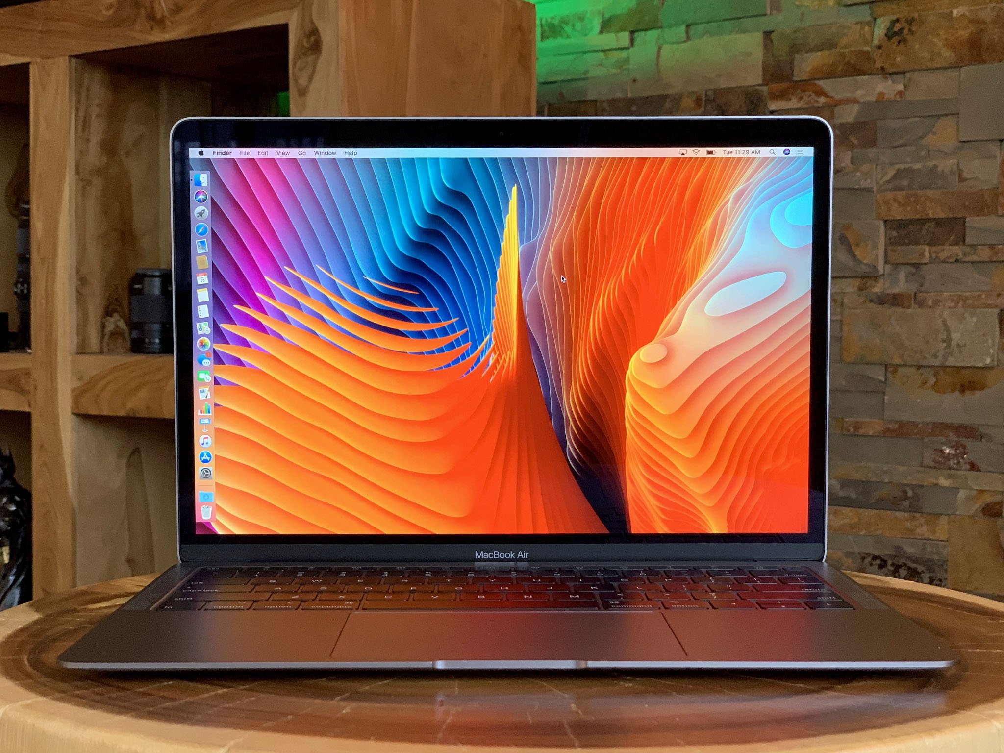
Price: $1199Bottom line: If you need ultimate portability, get a MacBook. If you need cutting-edge power, get a MacBook Pro. If you want something you can take everywhere, do everything on, and not have to pay... quite so much of a premium for it, then get the MacBook Air. It's the new normal.
For people who want:
- A balance of portability and performance
- Retina display
- Ultra-fast Thunderbolt 3 and USB 3.1 Gen 2 ports
- Smaller bezels
- The most affordable MacBook
Not for people who want:
- Extreme portability or performance
- DCI-P3 Retina display
- USB-A, Thunderbolt 2, HDMI, SDHC, or other ports
- No bezels
- A cheap notebook

Rene Ritchie is one of the most respected Apple analysts in the business, reaching a combined audience of over 40 million readers a month. His YouTube channel, Vector, has over 90 thousand subscribers and 14 million views and his podcasts, including Debug, have been downloaded over 20 million times. He also regularly co-hosts MacBreak Weekly for the TWiT network and co-hosted CES Live! and Talk Mobile. Based in Montreal, Rene is a former director of product marketing, web developer, and graphic designer. He's authored several books and appeared on numerous television and radio segments to discuss Apple and the technology industry. When not working, he likes to cook, grapple, and spend time with his friends and family.
