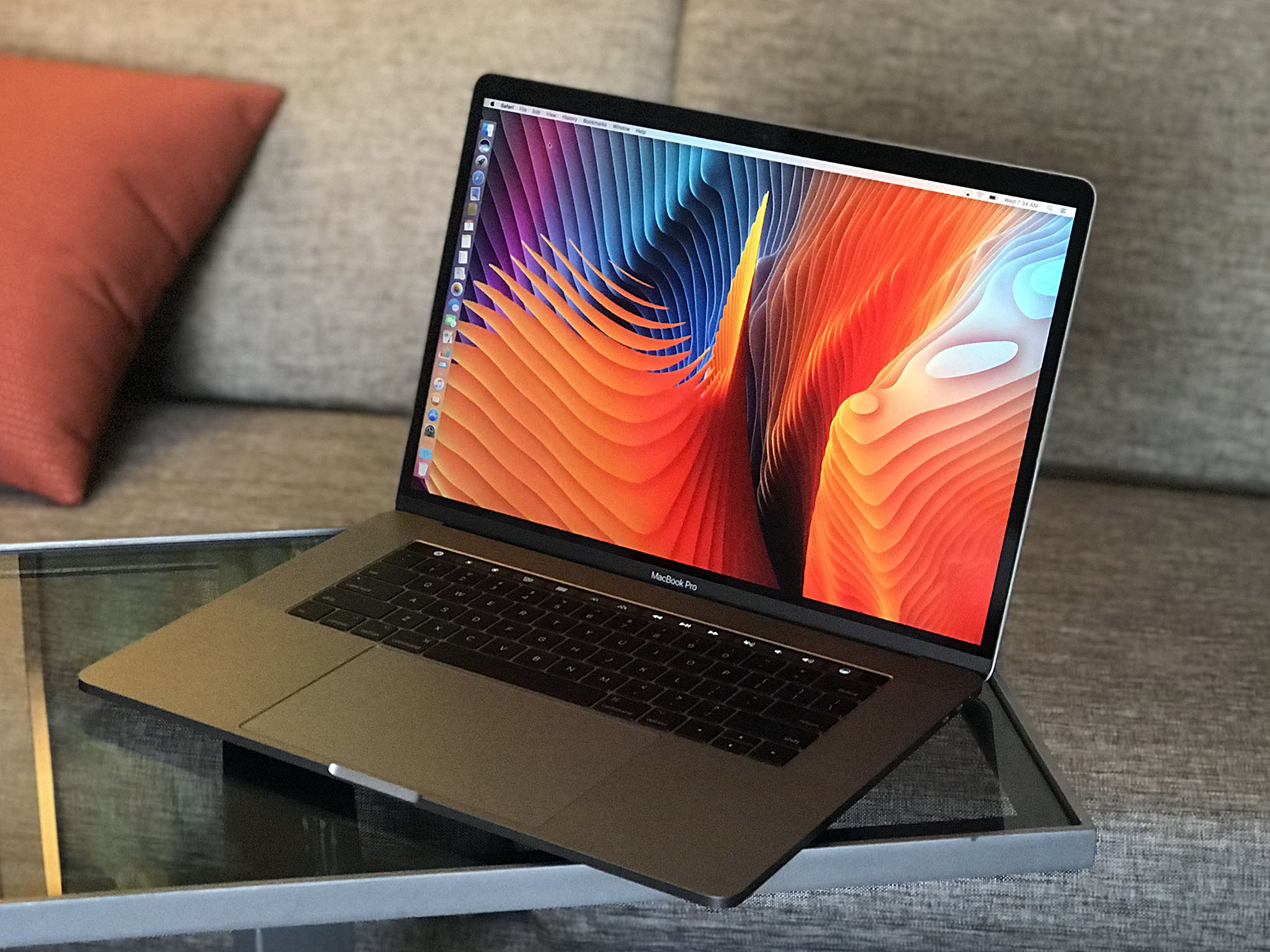
Since the last major MacBook Pro update, MacBook has been reimagined, macOS has been renamed, and the iPad has gone Pro. So, how does the MacBook Pro respond? By going even faster, thinner, lighter, and brighter. No surprise there: It's almost Apple's battle cry at this point.
Cinematic color gamut, unified ports, ludicrously fast storage, the Touch Bar — a capacitive multitouch strip that provides for dynamic controls — and Touch ID define the company's vision for the future of the MacBook Pro. But memory and graphics constraints, the lack of legacy ports, and an ultra-flat keyboard make things complicated for some of Apple's traditional pro customers right now.
But that was last fall. This summer Apple's already updating the MacBook Pro. It's got Kaybe Lake processors, better graphics, and a new $1299 entry-level option.
So, how much difference does eight months and a processor generation make?
For people who want:
- An incredibly portable pro laptop
- Blisteringly fast storage
- The latest ports
- Touch Bar and Touch ID
- Strong, sleek unibody design.
Not for people who want:
- Nvidia graphics.
- Large amounts of RAM.
- Legacy ports.
- Touch screen.
- Low, low pricing.
In brief
Every few years Apple flips the table on MacBooks, going thinner and lighter in design and more cutting edge in display, input technologies, storage, and ports. Often at the expense of traditional processing and graphics power, memory, and price. The new MacBook Pro is no exception. If anything, it's an acceleration.
The high-density Retina display now supports wide color, higher brightness, and better contrast. It's got SSD so fast you might just mistake it for RAM. The ports, 2 or 4 depending on the model you choose, are the new, unified Thunderbolt 3 / USB-C and are faster and more flexible than ever. It's got a more expansive Force Touch trackpad and the option for an all-new Touch Bar input strip and new-to-Mac Touch ID fingerprint identity sensor. The potential unlocked by all of it is enormous.
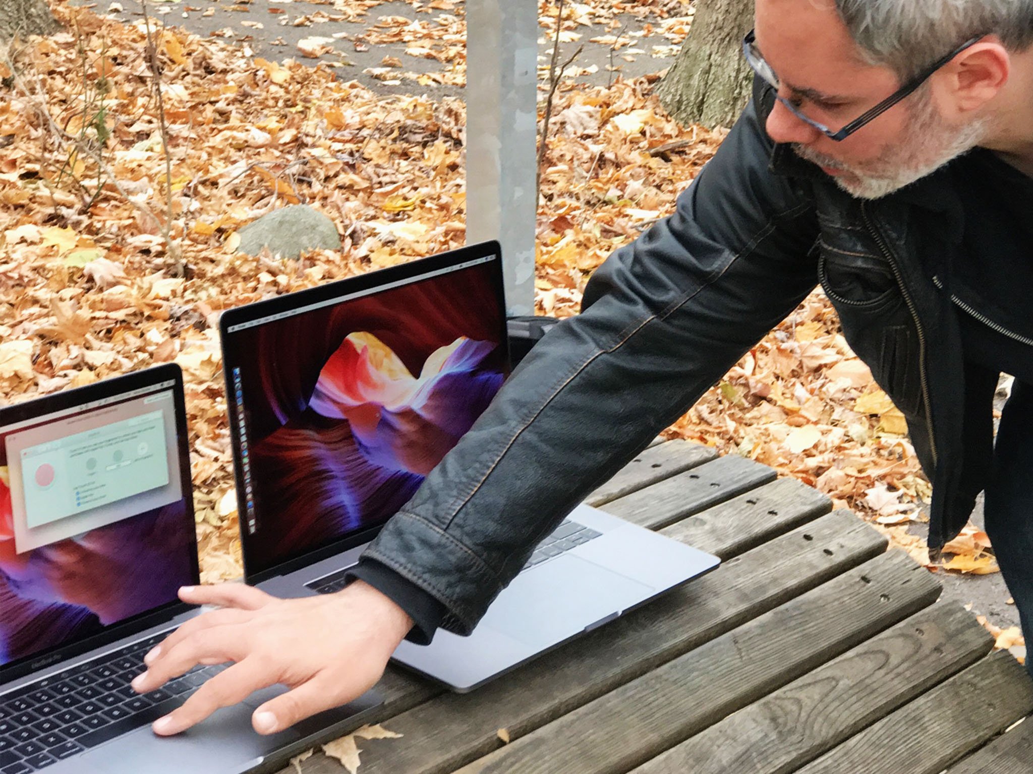
But they've got graphics that, while they can run dual 5K displays at the high end, can't run VR or the highest end games. (eGPU, coming soon, might fix that — but at an additional cost.) They've got a 16 GB memory limit that, while mitigated by compression and SSD speed, may not prove enough for the most demanding professionals. They've got Touch Bar and Touch ID but not a touch screen, and there's no option for anything but Apple's incredibly flat, incredibly divisive new keyboard.
What this means to you will depend entirely on your personal preferences and professional requirements. For some, they'll be deal breakers. For others, like me, they'll be terrific and once again deliver on the future, right now, today.
Either way, unless you loved the new MacBook Pro at first sight, I strongly encourage you to try before you buy, and when you buy, push them as hard as you need to, as fast as you can, so you can see if they meet your real-world needs.
I suspect, for the vast majority of people, they will. And even more so than you might initially expect.
MacBook Pro Lineup
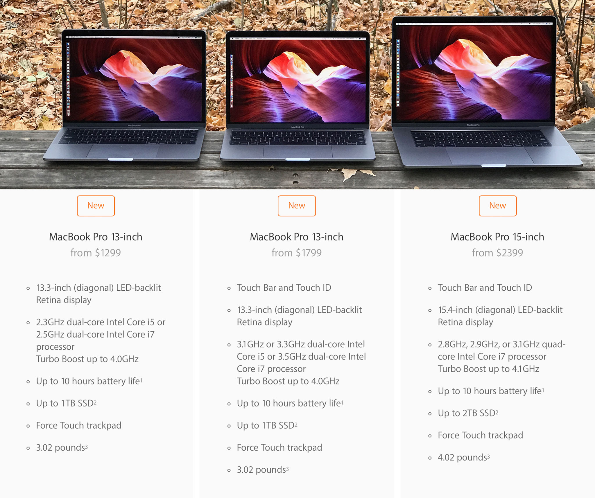
The 2017 MacBook Pro comes in three models: 13-inch, 13-inch with Touch Bar and Touch ID, and 15-inch with Touch Bar and Touch ID. This year, the 13-inch sans Touch Bar has been made even more affordable.
For $1299 you now get a 13-inch DCI-P3 Retina display, 2.3GHz dual-core Intel Kaby Lake Core i5 processor that Turbo Boosts up to 3.6GHz, Intel Iris Plus Graphics 640, 8GB 2133MHz LPDDR3 memory, a 128GB SSD, and 2x USB-C / Thunderbolt 3 ports. If price is your most important feature, that gets you into the MacBook Pro for less than last year.
If you want a faster i7 processor, 16 GB of RAM, more SSD storage, 4x USB-C / Thunderbolt 3, and Touch Bar with Touch ID, the price goes up. A maxed out 13-inch MacBook Pro will run you $2,899.00. Jump up to 15-inches and quad core Kaby Lake, and you're starting at 2,399.00, with BTO options, including discreet graphics, that can take you all the way to 4,199.00.
It makes for a wide range of options that should suit everyone from those looking for a "Retina MacBook Air" to those who want maximum Mac performance in as portable a laptop as possible. The only thing still missing a "MacBook Pro Pro" at the very top — analogous to the just-previewed iMac Pro — that would sacrifice some of that portability and efficiency for gobsmacking amounts of power and memory, for the 1% who still want that the most.
MacBook Pro Performance
The new MacBook Pro originally came with Intel's previous-generation Skylake architecture. That was thanks to Intel, who hadn't yet shipped quad-core versions of Kaby Lake, or Iris Pro versions, which is what Apple uses in the MacBook Pro. Flash forward to today, though, and Kaby Lake is not only a reality for MacBook Pro, it's better than I expected.
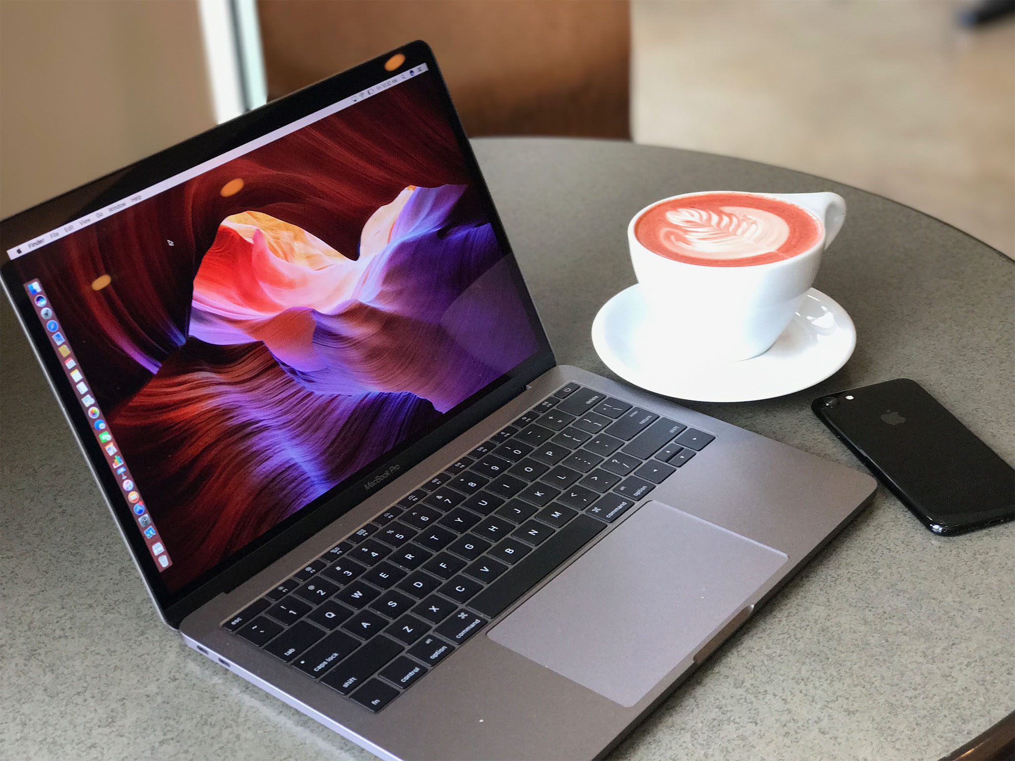
I say that because, increasingly over the years, generational advances in chipsets have been less about power and more about power efficiency. With Kaby Lake, though, the MacBook Pro is getting a decent increase in both base and turbo frequencies.
On the efficiency side, Kaby Lake includes hardware acceleration for H.265, more commonly referred to these days as HEVC (high-efficiency video coding). The successor to the ubiquitous H.264, HEVC compression makes even 4K, 10-bit HDR video faster to stream and download. Handling that compression in hardware also means software doesn't have to do it, which significantly decreases the load on the processor.
That means 4K, HDR video won't just play better and for longer, it'll have less minimal impact on any other apps and processes you want to run on your MacBook Pro at the same time.
Kaby Lake is partnered with Intel Iris Plus Graphics 640 and 650 graphics on the 13-inch models and Intel HD Graphics 630 with Radeon Pro 555 with 2 GB of memory or 560 with 4 GB of memory on the 15-inch models.
Where last year I didn't see any lag or stutter and interface animation, screen draws, and transitions were all snappy, this year they downright pop.
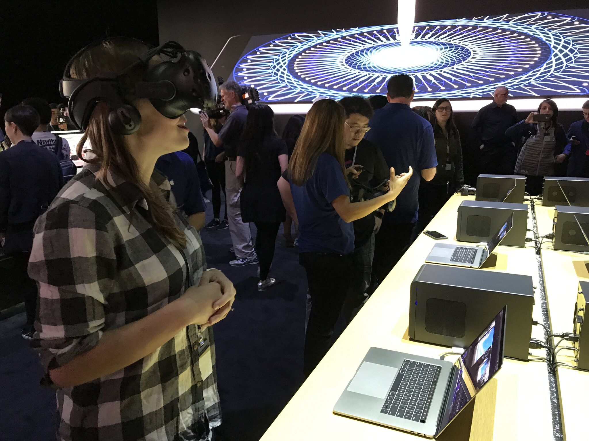
If that's not enough, Apple has announced support for external GPU (eGPU). They're available for developers to work with right now but, later this year, we should see several options on the market for everyone.
With an eGPU, you connect a box over Thunderbolt 3, and the upcoming macOS High Sierra operating system will make it available for everything from standard video and 3D rendering to virtual reality (VR) content creation.
It remains to be seen how fast and how smooth the eGPU story on MacBook Pro really is but, based on the demos I saw at WWDC, I'm optimistic.
Memory on the 2017 MacBook Pro has stayed the same. It starts at 8 GB and can be expanded to 16 GB. That's the current limit, though. Apple's using ultra low-power LPDDR3 RAM and it still hasn't scaled to 32 GB.
To sort-of make up for it, Apple's using macOS' built-in memory compression, but they've also raised the game on their already incredibly impressive SSD speeds — which come in up to 1 TB for the 13-inch and a whopping (and pricey) 2 TB for the 15-inch. It's so fast it pegged my tests and, if I have forced my Mac to swap in Photoshop or Final Cut Pro X, it's fast enough I've barely noticed.
That may not matter for everyone, but I think most people, even higher-end pros, will be surprised at just how far they can really go with 16 GB on a Mac.
Battery life, which received a tremendous amount of attention at launch last year, has remained stable for me on the original 2016 models. Apple did and still does claim the same 10 hours of battery life for all the MacBooks Pro. A lot of that will depend on the peaks and valleys of your workload, though.
I can get through marathon sessions writing and editing at a show like Apple's WWDC conference, or at a coffee shop back home, without worrying about it. That's what matters to me.
I'm not expecting Kaby Lake to make much of a difference — at least until 4K HDR video becomes the norm. Even then, I'll be less grateful for the dozens of additional minutes it gives me and more for the overhead it removes.
I've only spent the last few hours testing it, though. So I'll update over the next few weeks and months.
MacBook Pro Charging
MacBook Pro boxes haven't changed much over the years. It's what's inside, though, that's different. Instead of the trusty MagSafe adapter and classic power brick, there's now a USB-C cable and a USB-C power brick.

The USB-C cable is identical to the one that comes with the 12-inch MacBook. The brick is nearly identical as well, but pushes even more power. It's also similar to what's available separately for the 12.9-inch iPad Pro, though that one requires a Lightning to USB-C cable instead. So, when it comes to high power, Apple seems to be standardizing on USB-C.
The new charging setup has some advantages. Notably, if your cable frays or otherwise fails, all you have to do is get another cable, which is much, much cheaper than a new MagSafe all-in-one cable and brick. It's also easier and more flexible to pack.
On the downside, there's no bundled extension cord, which is disappointing in a premium product like MacBook Pro, and no more fold-out wrappers on the brick, which made for clean cable storage. There's also no easily detachable magnet on the end. In other words, no MagSafe.
I can handle wrapping the cord — I've been doing it with iOS devices for years — but I miss the extension cord. Sometimes I miss MagSafe, but not always anymore. I've gotten used to plugging Macs in the way I've been plugging iPads in for years.
Mostly, I like that we're moving toward universality in charging. And so does my gear bag.
MacBook Pro Design
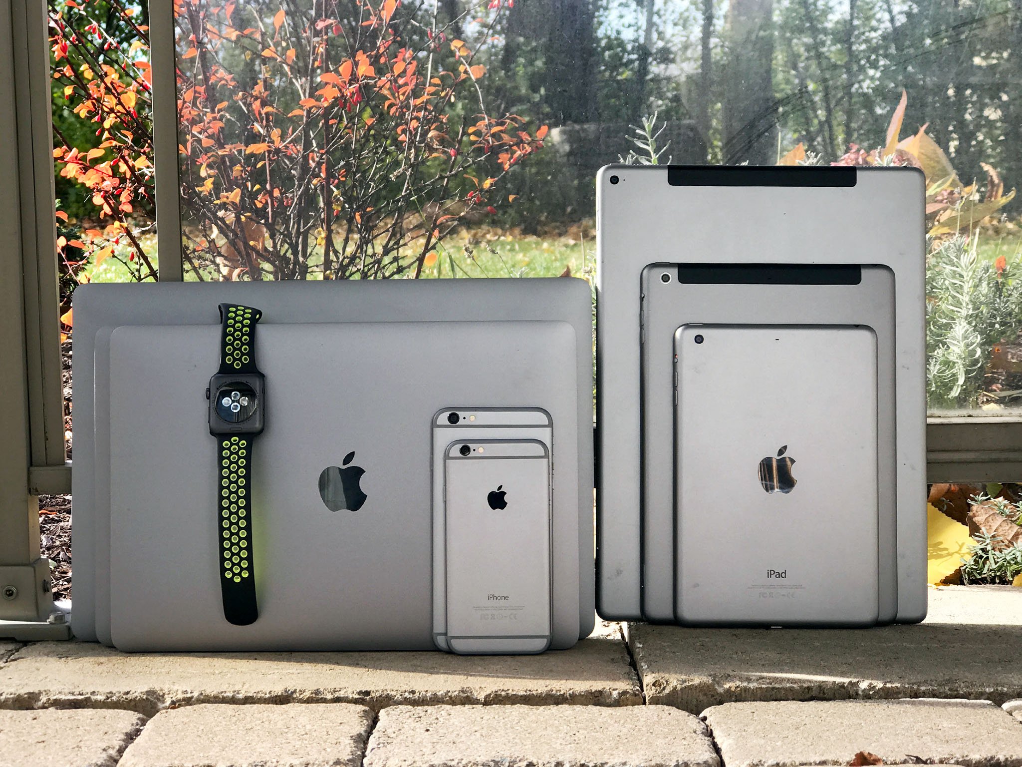
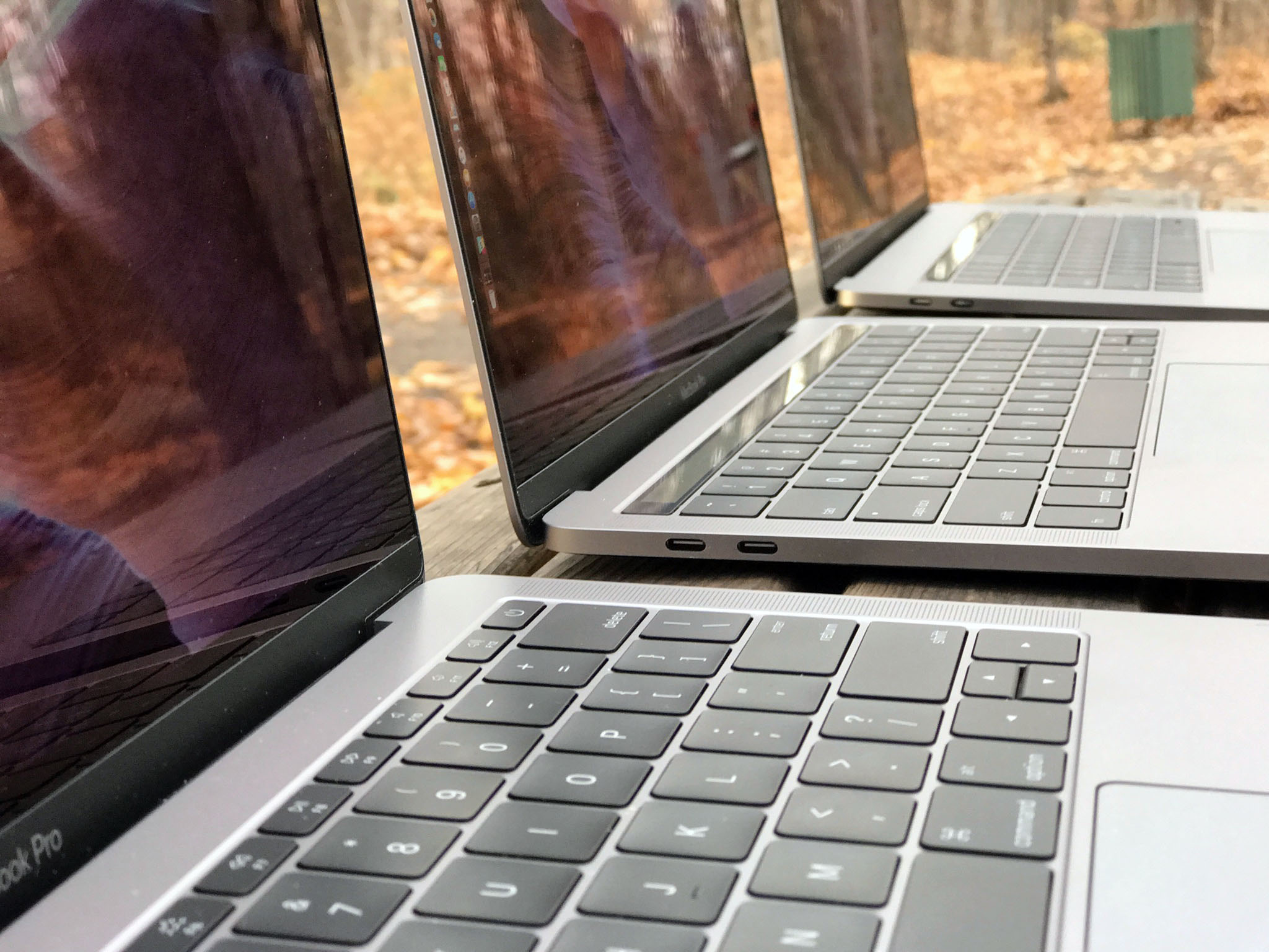
The first thing you notice about the current MacBook Pro is how dense it feels. Sure, it's lighter and smaller — MacBook Air-level lighter and smaller. That means you can carry it around longer without wrenching your shoulder or breaking your back, and it'll fit more easily into your bag or onto your tray table. But that aluminum it's carved out of feels stronger as well. There's a rigidity to it that I really appreciate when picking it up and moving it around. Unibody MacBooks have proven their durability over time and, if anything, the new MacBook Pro feels like the most durable to date.
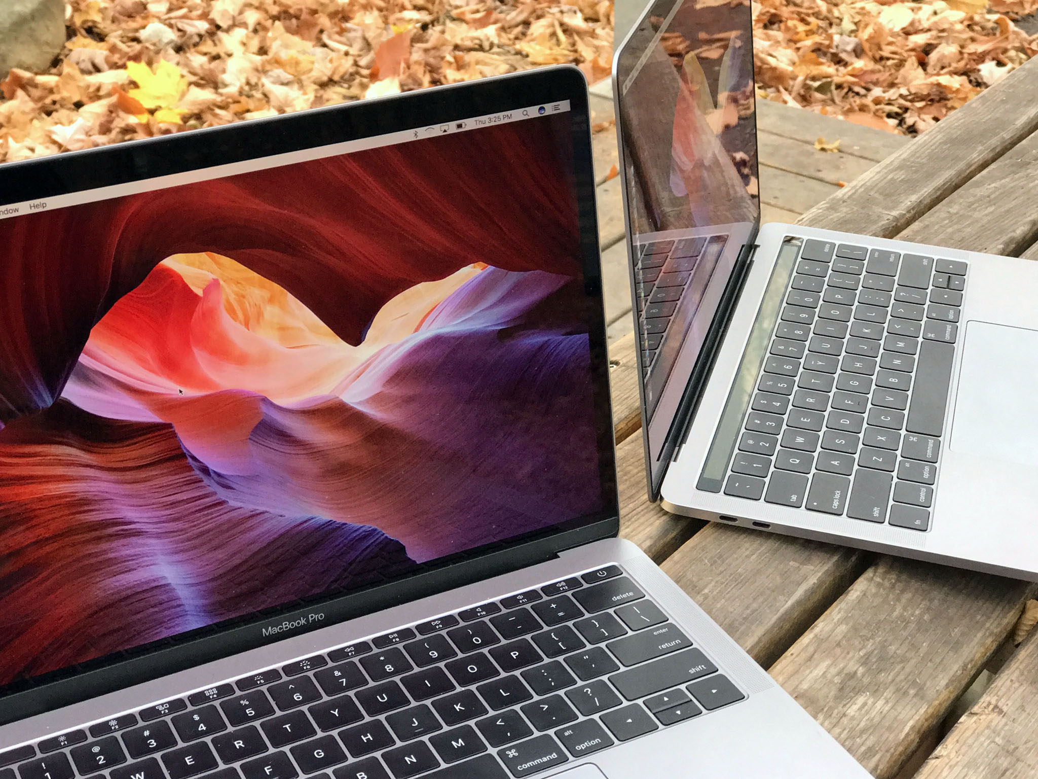
MacBook Pro is also available in silver and space gray now. Not gold or rose gold like MacBook, nor jet black like the new iPhones. The space gray of MacBook Pro matches the space gray of MacBook and the iPhone 6 series, so it's lighter than Apple Watch and much lighter than the (matte) black iPhone 7.
Still, you can go darker now if you want to.
The result is something that looks and feels even more like a slab than previous generations. At least until you open it. Then it looks pure MacBook Pro. Even if it doesn't sound it.
That's right, the classic chime no longer greets you on startup. It's gone now, a concession to the new auto-boot feature that makes powering up functionally indistinguishable from waking up. In other words, it no longer matters if your Mac was off or just asleep, you open it and you log in, and it's terrific.
No more staring at a blank screen for a few seconds, fumbling with a power button trying to figure out what state it's in, or worrying the chime will go off in a meeting — lift and you're good to go.
Despite the thinness of the new display, Apple did manage to cram in a 720p FaceTime camera. It's a stark improvement over the anemic 420p camera in the MacBook. I'd still prefer 1080p on a MacBook Pro — even if it takes a camera bump to do it.
What Apple didn't manage to cram in is their signature glowing logo. Like MacBook — and iPhone and iPad before it — you now get a polished stainless steel logo embedded in the center of the casing instead. It looks good but I'll miss the light.
As much as it's all business on the back, there's a brand new party going on up front…
MacBook Pro Display
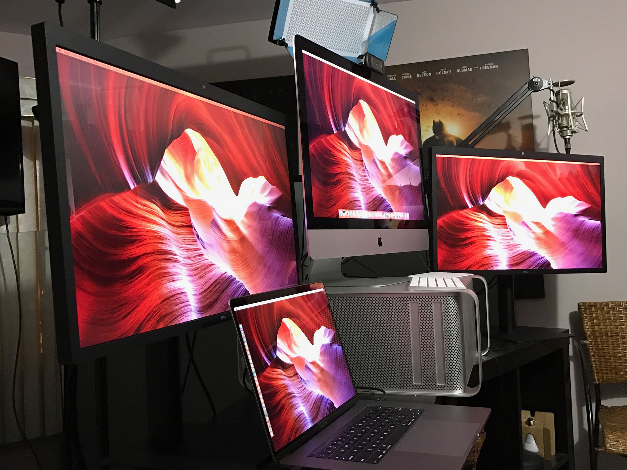
Apple has gone all-in on wide color. You can shoot it with iPhone 7, you can display it on the 9.7-inch iPad Pro and the latest iMacs, you can manage it across macOS and iOS, and now you can see it on the new MacBook Pro as well.
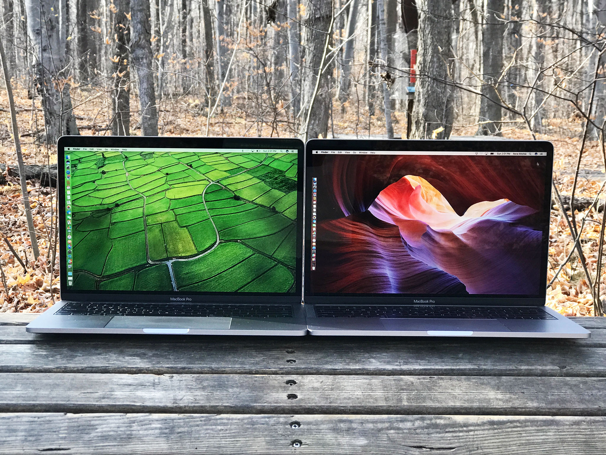
I've been using DCI-P3 — the cinematic wide color standard Apple's adopted — on the iMac for almost a year now so I didn't think I'd be impressed by it anymore. But it's different on a laptop. Where the iMac envelopes you in an almost super-reality, the MacBook Pro draws you in. The transition from old, sRGB display to P3 feels the same, though: It's like a layer of dullness was wiped away to reveal eye-popping greens and reds. And once you see it, you never want to go back.
Think of it like HDR for your screen. Last summer, Dolby showed me scenes from The Force Awakens and The Revenant in 4K sRGB and in 1080p HDR. 1080p HDR kicked 4K's ass. Put both together, which is essentially what you get sitting at normal distance from a MacBook Pro display, and zo-ma-gawd.
The 13-inch model is 2560 x 1600 at 227 pixels per inch (ppi). The 15-inch is 2880 x 1800 at 220 ppi. Here's what the difference in pixel count looks like:

They use display technologies similar to, but even more advanced than, the ones found in the 12-inch MacBook. It makes them both significantly brighter and offers much better contrast. That translates into more vivid whites and deeper blacks, but also makes it easier to work in brightly lit rooms, and more enjoyable to watch movies or game in the dark.
I've only had to go back to my old MacBook Pro a couple of times over the last couple weeks — I've been too lazy to move my work VPN over — and when I do, the difference is noticeable. I can still work on it without problem, but it's just not as enjoyable anymore.
About the only thing the MacBook Pro screen still can't do is register touch input. macOS isn't a touch-based operating system and Apple's prototyped and disliked multitouch on Macs. So, they're expanding touch in a different way and on a different plane.
MacBook Pro Touch Bar
Apple's new experiment — and that's exactly what it is until time and adoption proves it otherwise — is called Touch Bar. It's available on both the higher-end 13-inch MacBook Pro and all 15-inch models. Paired with Touch ID, it's like a long, thin iOS device embedded right above your keyboard lending you all the security and multitouch responsiveness you've grown to love on iPhone, iPad, and Apple Watch, but fully integrated into the Mac.
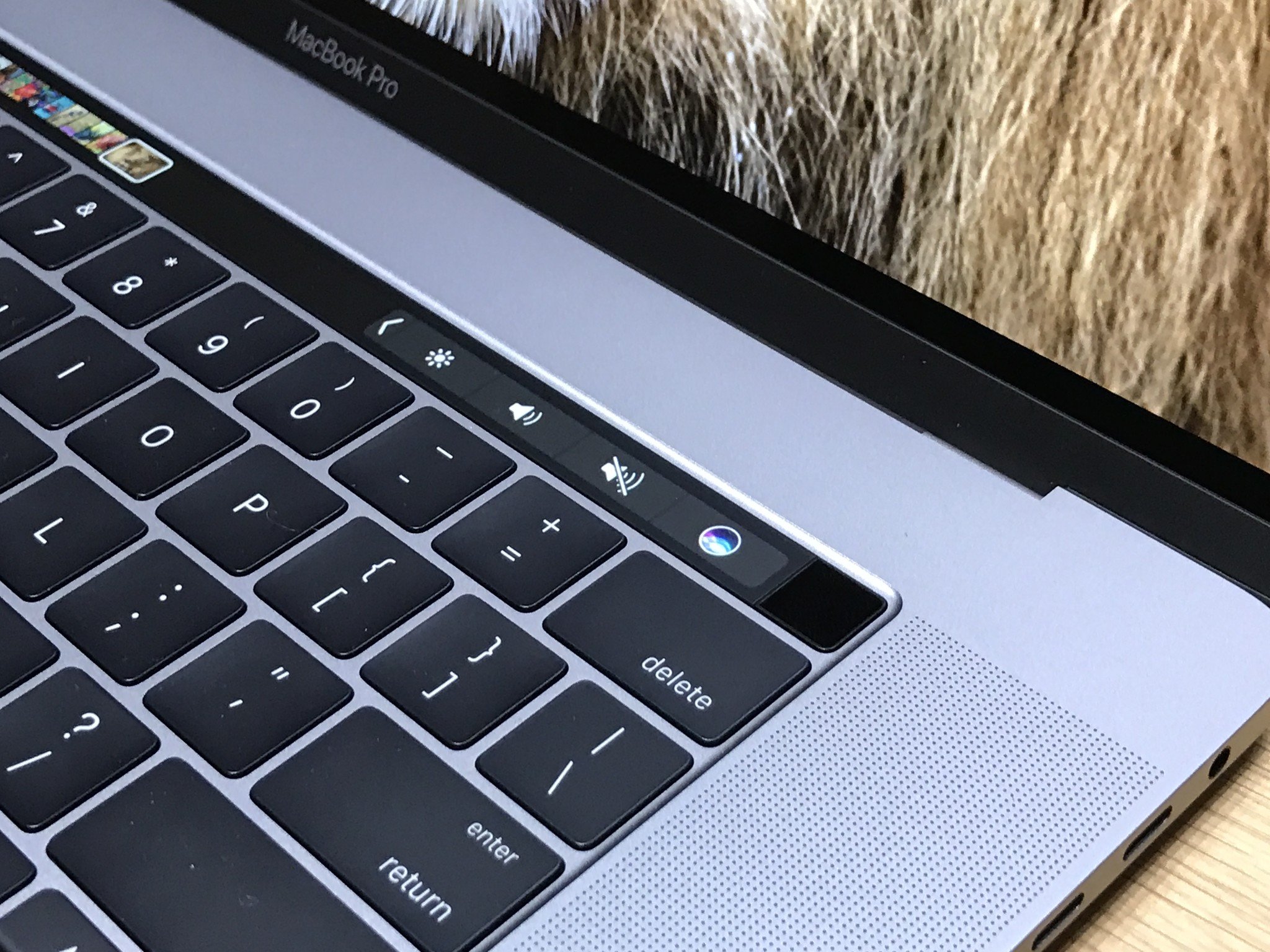
The Touch Bar starts off mimicking the escape key and system and media controls of the standard keyboard, but then it changes and adapts to what you're doing. Touch and hold a control and you might get a slider or you might reveal additional options — or classic ones.


It's like a dynamically curated set of shortcuts and tools, matching the functionality offered by each app. Safari shows you tab options, so you can switch between them or add a new one without leaving the keyboard. Mail suggests sorting options, iTunes gives you music controls.


And the list goes on and on. Apple has integrated Touch Bar into every app that ships with macOS, and developers have begun integrating into Mac App Store apps as well.
Final Cut Pro X is a great example of surfacing controls and shortcuts that otherwise require memorization or multiple interactions to achieve, including clip cutting and timeline scrubbing.


And... I have mixed feelings about it. The human brain isn't great at context shifting. It's why it can still feel awkward to reach up and start tapping an iPad Pro when you've been typing on the Smart Keyboard. And the Touch Bar suffers from some of the same here — it's not always natural to look down at the keyboard.
That's why I started off thinking things like predictive word suggestions would be useless for me, especially when I type faster than I even notice the suggestions. Then I remembered English is a terrible language with words and spellings no person should be expected to remember. And when I struggled to remember a word or spelling, I noticed they were right there, suggested for me on the Touch Bar.
It's not perfect. If my spelling is off by too much, it can't predict what I want, and sometimes I have to guess enough right before the suggestion comes up that I could figure out the rest on my own, but it learns from the words I choose and seems to get better over time. And each spell check or Google detour it saves me is appreciated.

The same for shortcuts. Shortcuts suck. Even Adobe and Apple can't keep them consistent across their ranges of apps. Previously, when I'd blank on a shortcut, I'd go back to the mouse and menu, like an animal. Now I just look at the Touch Bar and the control I want is right there.
Even better are tools like color palettes and timeline scrubbers. The precision and granularity they enable are iPad great, but it all happens without ever blocking the main display with your fingers. It's direct manipulation but in an indirect way, and it's trippy.


It also creates a really interesting new input dynamic where sometimes I have one hand on the Touch Bar and the other on the keyboard, other times one on the Touch Bar and the other on the Force Touch Trackpad, which Apple has now made luxuriously big.
There's no Force Touch in the Touch Bar, which feels like an obvious next step, but there is VoiceOver for accessibility — activate it by triple clicking the power button — and once you get used to where controls spawn, it's easy enough to throw your fingers in the right direction.
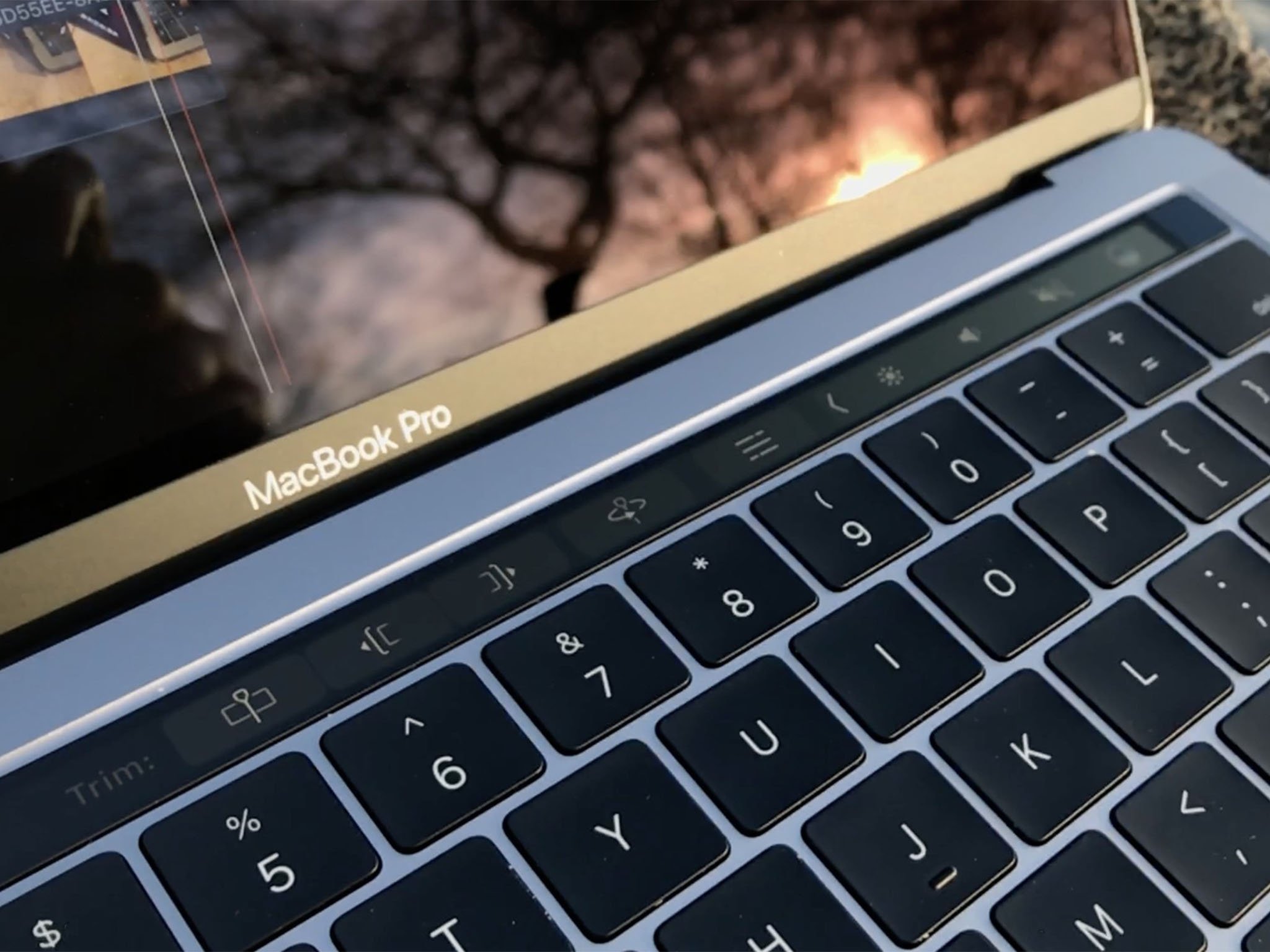
As an experiment, I spent a few months on the Touch Bar MacBook Pro, then tried to go back to the model without the Touch Bar. It was fine for the most part but I did find myself missing some of the shortcuts I'd gotten most habituated to hitting, especially in apps that really optimized for them.
Touch ID, though, I missed immediately. Once you get used to biometric authentication, it's tough to go back to entering passwords to unlock apps and make purchases. And once you get used to Apple Pay, everything else suddenly feels unnecessarily arduous.
MacBook Pro Touch ID
Touch ID, Apple's fingerprint identity sensor, has been a mainstay on iPhone and iPad for years. It takes a high-resolution picture of your fingerprint, converts it to a secure hash, and stores in it on the secure element. On iOS, that's part of an Apple A-series processor. On the Mac, it's part of a special T1 chip. From there, when it matches your fingerprint, it releases a token that the operating system can use to verify your identity.
Your fingerprints are never revealed to the operating system, never stored in the cloud, and never made available to anyone else, including Apple. Your finger can, however, be forced onto the sensor, which is something to consider when you balance security and convenience.
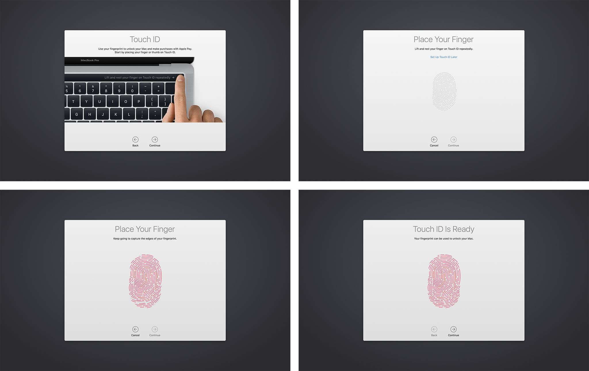
Registration is the same as on iPhone and iPad, and you can register up to 3 finger prints per user, for a total of 5 fingerprints across alls users. You can — so cool! — use it to quickly switch between users too. Like iPhone and iPad, though, if you reboot, stop using Touch ID, or fail to authenticate with your fingerprint, you'll need to enter your password again to re-activate it.
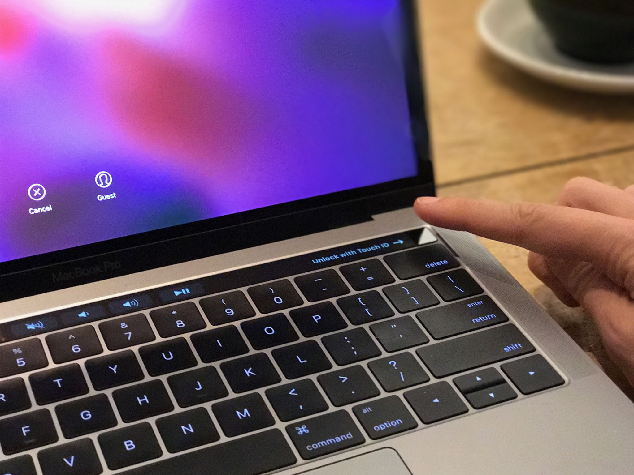
The sensor on the MacBook Pro Touch ID system is the same, super-fast second generation version found on iPhone 6s and iPhone 7. And it is super fast. The sensor is on the extreme right of the Touch Bar strip, built into the power button. You can press it and linger your finger to unlock in one move, or press another key, swipe the trackpad, or otherwise wake it up first, then touch the sensor to unlock.
That said, at first I found it to be slower than Auto Unlock, which uses Apple Watch to verify identity. The slowness was because Auto Unlock is automatic while Touch ID requires a finger be placed on the sensor — something it took me a few seconds to remember to do.
Apple does provide an indicator for Touch ID, but it's on the Touch Bar, where I wasn't used to looking, as opposed to under my account picture on the main screen, where I am used to looking and where Apple places all the other indicators. I'd prefect an indicator on both — "Touch ID to unlock" beneath my account picture as well.
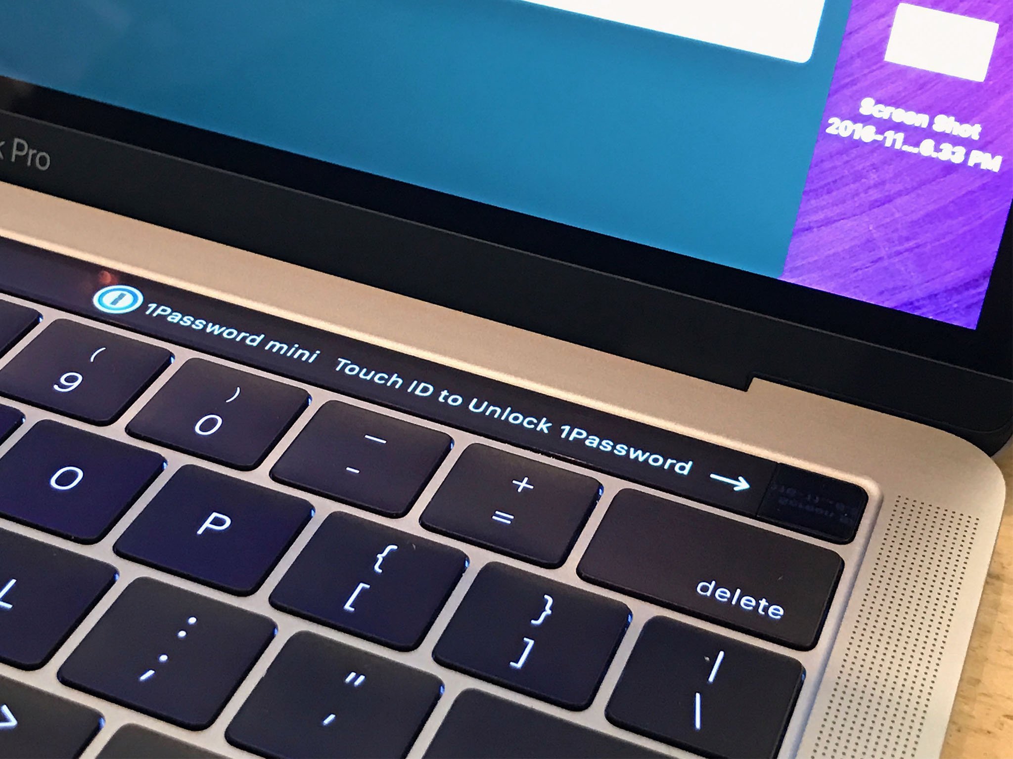
It'd also be great for people who require higher-level security if Apple provided the ability to use Touch ID and password and Apple Watch to authenticate. That would be something you are, something you know, and something you have — the multifactor trifecta.
Apple Pay works great, as well as it does with iPhone-based authentication in macOS Sierra, but without having to fuss with a second device. It also works extremely well with Mac App Store apps, though those are only just beginning to trickle out.
I'd love a way for my Safari passwords to be protected with Touch ID. I don't want just anyone who has access to my Mac to be able to log in and buy things from my online accounts or Apple Pay. But I absolutely want to be able to do that.
MacBook Pro I/O
My previous generation 13-inch MacBook Pro has MagSafe for power, 2x Thunderbolt 2 and 2x USB-A, a 3.5 mm headphone jack, HDMI, and an SD card slot. My previous 13-inch MacBook Air had MagSafe, 1x Thunderbolt 2, 2x USB-A, a 3.5 mm headphone jack, and an SD card slot. The new MacBook Pro 2016 only has Thunderbolt 3 / USB-C — oh, and a 3.5 mm headphone jack, remember those?
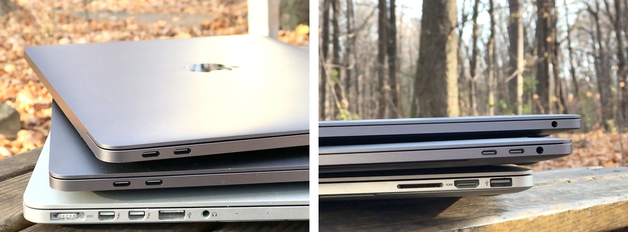
The entry level 13-inch MacBook Pro has 2x ports. The high-end 13-inch has 4x ports, though the ones on the right aren't as fast as the ones on the left. All 15-inch MacBook Pro models have 4x ports, and they're all full-speed.
You can charge over any USB-C port. I didn't think that would be a huge difference for me but it is. Previously, I'd run into situations where having MagSafe on only one side meant the cord was slightly too short to reach the table, or got in the way of something. It wasn't often but it was super annoying when it happened. Now, I can simply plug into whichever port is available and I'm go for charge.
Thunderbolt 3 / USB-C all being the same cable and none requiring a specific connector direction is likely liberating. As long as you have compatible accessories, you don't even have to think about which port goes where or which way is up. You plug, it works.
For older cables and devices, though, you'll need adapter dongles. So. Many. Dongles. You can get them for USB-A, HDMI, VGA, Thunderbolt 2 — pretty much anything you need these days, but they're one more thing to carry with you, fuss with, and potential forget or lose when you need it.
For some, especially those who've already gone wireless, it won't matter. For others, it'll be months of one-more-thing-to-pay-for-and-potentially-lose inconvenience.
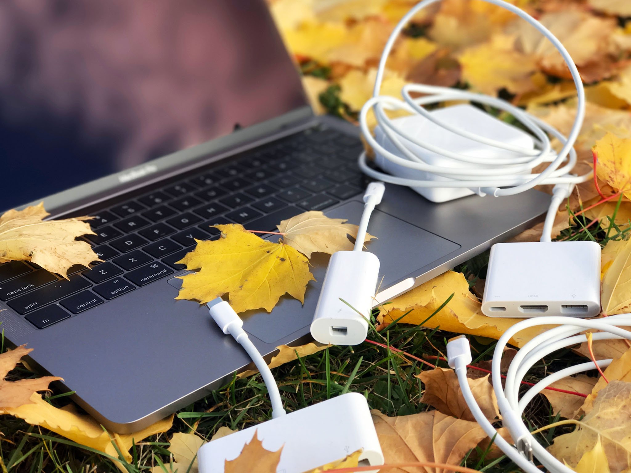
I've had to briefly use dongles with every MacBook Pro upgrade since… forever… or firewire… or whatever. I"m fine with it. I can always get rid of them when I no longer need them, but I can't retrofit the new screaming fast port into the old super slow port once I'm done with it.
Even now, 8 months or so post-release, I barely if ever reach for an adapter. Only once in the last three months, in fact, and that was for a single USB thumb drive given me by a single vendor at a trade show. Your mileage, and dongle disdain, will of course vary.
While the SD card slot is gone, much to the chagrin of photo and video professionals everywhere, the 3.5 mm headphone jack remains. It's not really meant for headphones — those are also going wireless, or so my iPhone tells me — but for audio pros and live music production. (Enjoy it until that all goes wireless too, friends!)
But my use case isn't everybody's. Even if most people in the mainstream never connect over a cable to anything, MacBook Pro by definition isn't mainstream. It's for people who do connect over cables and to everything.
I understand Apple's desire to simplify, and their almost Alton Brown-esque distaste for unitaskers, but we're still in a period of transition and that means we need to transition.
Just like iPhone 7 contained a 3.5 mm to Lightning adapter, it'd have been nice if Apple included a USB-C to USB-A adapter for everyone with an iPhone or iPad and no out-of-the-box way to connect them, or any other legacy peripheral, to a brand new MacBook Pro.
That aside, the new ports are heavy duty. They can drive one 5K external display or two 4K external displays (though at least one of them will have to supply power, since that requires all your ports!) They can also drive external storage at the state-of-the-art-of-speeds.
MacBook Pro Trackpad and Keyboard
The new MacBook Pro comes a new, bigger Force Touch trackpad. If you haven't used one before, a Taptic Engine tricks your fingers into believing vibrations are depressions, and so you "click" a solid surface and are misled into feeling like it really clicked. Basically, science is a lie, your fingers are proprioceptive liars, and nothing makes sense anymore. But it works and well.
The increased size, made possible by not having to worry about physical constraints like hinges and mechanical buttons, is... luxurious. For normal text and office work I don't notice much difference but for creative work like image and video editing, it feels like you can go further, faster than on previous versions. It's not quite as big as the standalone Magic Trackpad, but it's getting closer.
To the right is what it looks like compared to the 2015 model.
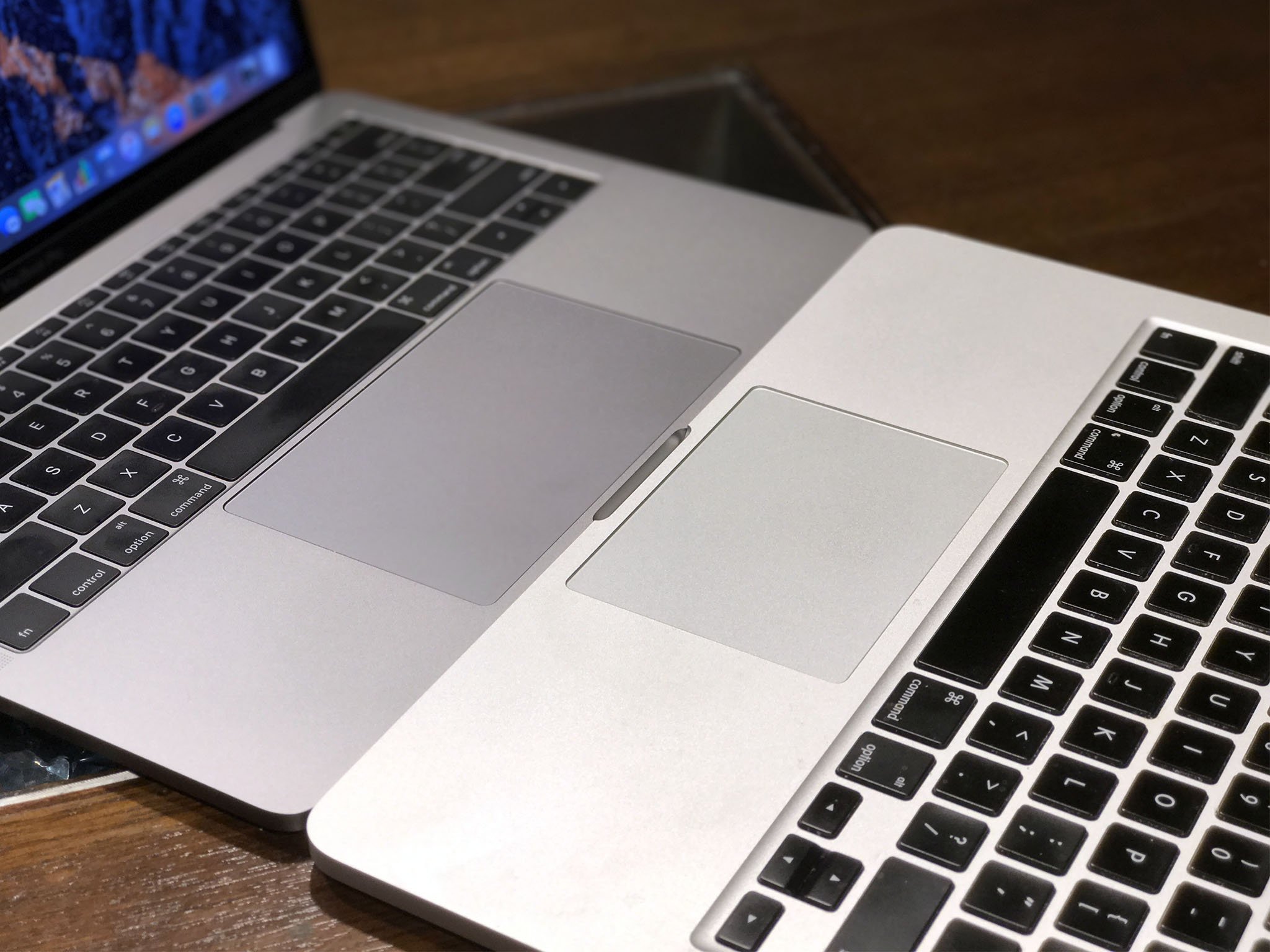
There's no issue with palm rejection. I typically don't rest my palm on my trackpad while using it, but incidental contact while typing has been ignored to the point that, when I deliberately put the edge of my palm down and try to swipe with it, it barely moves. If I had to guess, multitouch is smart enough to distinguish finger sizes from palm sizes and Apple has learned from iPad to distinguish everything in-between.
The keyboard is a second-generation version of the dome and butterfly design introduced with the 12-inch MacBook. I've used the original for almost 18-months and am fine with it. I can pretty much adjust to any keyboard, including the Smart Keyboard for iPad Pro, within a very short period of time. Your mileage will absolutely vary.
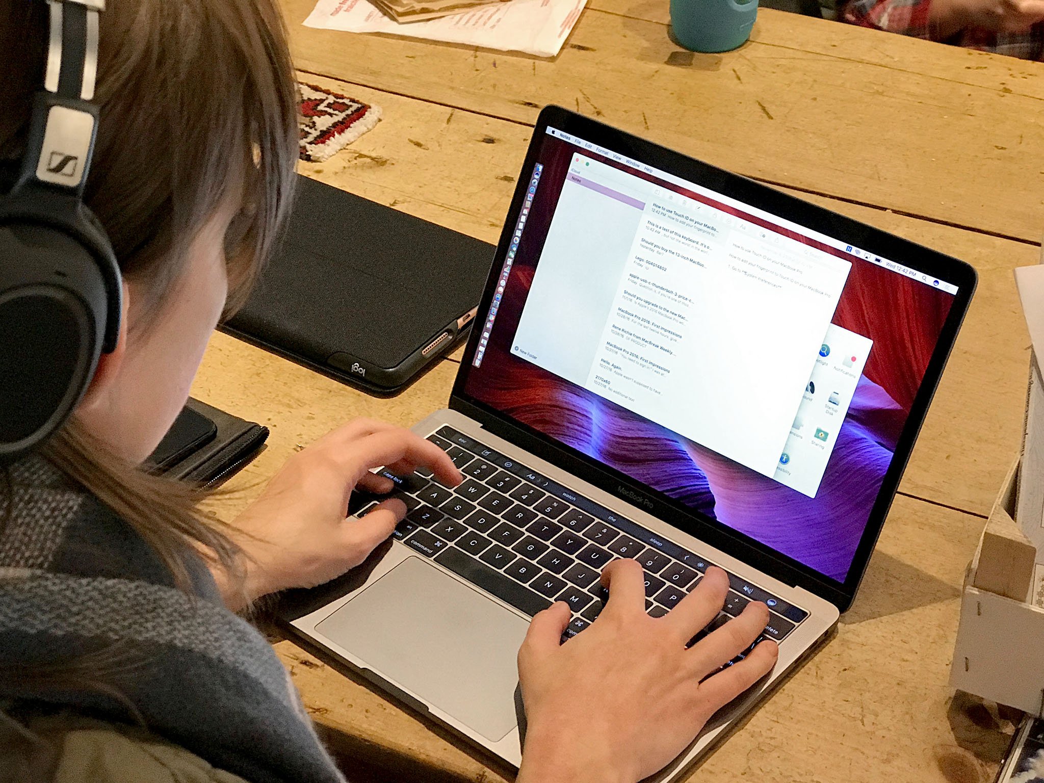
After a few days of using it, though, I found that I enjoyed typing on it. It was punchy in a way that made me smile. I was fine on the MacBook, but I really like the MacBook Pro. I'm not sure if Apple's tweaks are responsible for that, if it's the slight difference in how all the parts are laid out, or if I've just gotten more and more used to it over time.
Almost three-quarters of a year in, and I have a hard time imagining myself going back to the older, looser, keyboard style. About the only thing I miss is how much quieter it was to type on.
Noise level aside, people who love clickety-clackety keyboards with tons of travel are going to hate the new MacBook Pro. People who love scissor-switches and the old MacBook Pro keyboards, likewise. Keyboards are a deeply personal thing, though, and if it isn't the keyboard for you, Apple's giving you no other option.
MacBook Pro Speakers
My previous generation 13-inch MacBook Pro didn't have speakers on either side of the keyboard. This new one does. Big, bold, glorious speakers. I'm not an audiophile but when I heard Adele pouring out of them during the demo, it sounded great. Likewise right now while I'm playing some iTunes and YouTube.
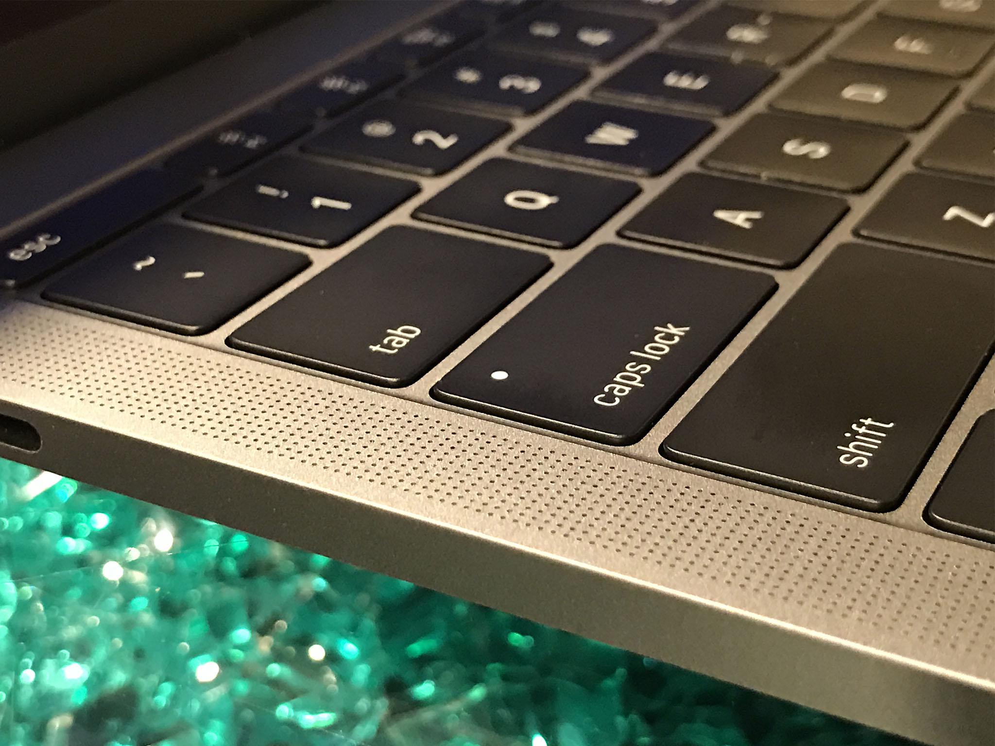
Apple says they have far more dynamic range and separation than before and I have no reason to doubt them. I just know they're LOUD and they're clear.
First iPad Pro, then iPhone 7, now MacBook Pro — Apple has seriously upped their speaker game in recent years and I really appreciate it.
MacBook buyers guide
Trying to decide which MacBook, MacBook Air, 2015 MacBook Pro, or new MacBook Pro is for you? Check out our ultimate guide to sizes, colors, makes, models, and more!
- MacBook Buyers Guide
- Best Mac apps
- Best Mac accessories
MacBook Pro Conclusion
Apple has been making computers into appliances for years now. It started with the iMac and, more recently, the MacBook Air and iPad. Step by step, Apple has sealed up everything from the minis to the pros and, in so doing, made them better for the mainstream — at the expense of the the traditional tinkerers, do-it-yourselfers, and bleeding edge pros.
Steadfastly, resolutely, step-by-step, Apple is moving from the power user to empowering all users, even if that leaves some of the Mac's most loyal, most passionate customers behind.
Look no further than the 13-inch MacBook Pro without Touch Bar or Touch ID. Apple slipped it in as a low-end offering for those who've wanted an ultra-portable with more power than the 12-inch MacBook.
Apple made no such concession to the high-end. There's no heavy, hot, and hungry 15-inch with extra RAM, legacy ports, and lower battery life. If they had, some pros wouldn't feel as abandoned as they do now. But that, apparently isn't a MacBook Pro Apple wants to make, at least not right now.
So, they've given some people the Retina Air they've always wanted and others exactly the MacBook Pro they've been waiting for, with an interesting new input method that may — emphasis on the may — make them even more valuable.
Add to that new Kaby Lake processors and Iris Plus and Radeon graphics options for 2017, eGPU on the way, and a new entry-level model starting at $1299, and some of the constraints (and counter-arguments) are starting to fall away.
If you're still on the fence — or if you're still blockaded away on the other side of the fence — I get it. Apple's vision for the future of laptops won't be for everyone — even if they, and I, think it will be for more people than ever before.
Including an entirely new generation of pros.
Rene Ritchie is one of the most respected Apple analysts in the business, reaching a combined audience of over 40 million readers a month. His YouTube channel, Vector, has over 90 thousand subscribers and 14 million views and his podcasts, including Debug, have been downloaded over 20 million times. He also regularly co-hosts MacBreak Weekly for the TWiT network and co-hosted CES Live! and Talk Mobile. Based in Montreal, Rene is a former director of product marketing, web developer, and graphic designer. He's authored several books and appeared on numerous television and radio segments to discuss Apple and the technology industry. When not working, he likes to cook, grapple, and spend time with his friends and family.
