Rene Ritchie: macOS Big Sur redesign — Explained!

iMore offers spot-on advice and guidance from our team of experts, with decades of Apple device experience to lean on. Learn more with iMore!
You are now subscribed
Your newsletter sign-up was successful
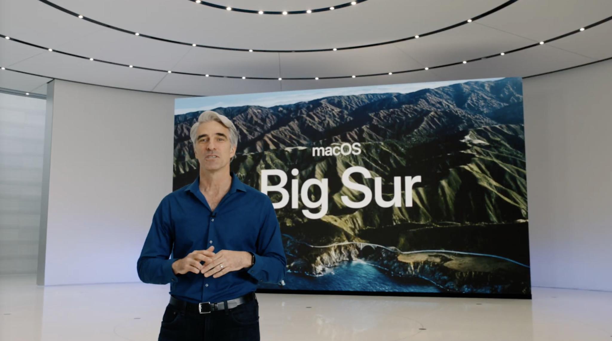
Apple's continuing to name new macOS releases after California landmarks. This time, the powerful mountains and beautiful coastline of Big Sur. The power part is obvious. Macs will soon be getting Apple's own custom silicon. A family of custom systems-on-a-chip. That second part, the beauty, represents the redesign, which Apple is calling the biggest since the launch of the original Aqua interface with the very first version of OS X.
Taking macOS beyond Aqua
I think that's fair. Aqua was all about showing off what the then-new, NeXT-based Macs could do. Lickable buttons with delightfully rendered gloss, and textures from the pin stripes to brushed metal. There have been some major design moments since then, though, including the taking of iOS names and looks back to the Mac with OS X Lion, and the post-iOS 7 flattening, translucency, and vibrancy of OS X Sierra. But this feels like less of a half-step and more of a full-on leap.
At first blush, Big Sur is more iOS-like than ever. In many ways, that's great. More and more macOS users have been halo'd over from the iPhone and iPad and, for them, consistency is an absolute user benefit.
Article continues belowAlso, with Mac on Apple Silicon's upcoming ability to run iPhone and iPad apps, those are just going to fit in with the overall look way better than they would have otherwise.
In some ways, it does feel like a regression.
Those new icons though...

Can we talk about the new, Big Sur icons? Gone are the circles and angled rectangles and arbitrary shapes of macOS icons past and in their place, the super-ellipses of iPhone and iPad apps. Albeit with varying degrees of emboss, drop-shadow, and detail from the subtle to the absurd.Yes, I'm looking at you, Messages.
And… I kinda wish Apple had let macOS keep its own, arbitrary shaped identity here.
iMore offers spot-on advice and guidance from our team of experts, with decades of Apple device experience to lean on. Learn more with iMore!
watchOS gets the circle. tvOS gets the wide-screen round-rects, beyond even a single shape I can't think of anything that better exemplifies the difference between macOS and every other Apple platform — it's raison de still etre — than the spiritual consistency yet rich, silhouette diversity of its icons.
Also, there is such a thing as just too much of a good super-ellipse.
The most desktop desktop
Likewise, the higher levels of translucency on the menu bar can make it look bitsy and messy, but you can also hide it now, something you can't do with the status bar on iOS.
In other ways, the Big Sur redesign is huge expansion. Not just the full-height sidebars, but how toolbars stay out of your way, visually and physically, until you ned them. How the unified symbol library Apple's been developing allows icons and glyphs to stay compact but still be recognizable… everywhere. The spacing and rounding of interface elements feels more natural and more breathable. Notification Center is more functional, like iOS, and Control Center is finally, finally here from iOS, but with the very Mac-like ability to tear off individual controls and persist them in the menu bar.
The design changes even made some of the more frustrating apps, like the early Catalyst apps and the iTunes-sundered media apps less visually disjointed. But, I'd argue, many of their base, structural problems are yet to be addressed. Like, you can take the border off a lonely back arrow, but it's still out of eye line and still wastes an entire interface row. Same with adding sidebars to the Home app.
But what does it all mean?
What's been most fascinating to me over the last week has been seeing all the reactions to the redesign. It's been the most amazing Rorschach test:
- Those who want touch screen Macs see it as more touch-friendly.
- Those who want Apple Glasses see it as more AR-friendly.
- Those who like the iPad see it as more iPad-like.
- Those who like the OG Mac… just want it all to stopMore simply, though, context-appropriate consistency is just a huge win for everyone.
Does 'NO!' mean... 'Um, well, yes?
All of this does create confusion, even conspiracy theories, for people who hear Apple say, year after year, that they're not merging the iPad and the Mac, iOS and macOS, yet see everything from the silicon to the operating system components to the interface elements coming exactly that kind of together.
I think the difference is Apple doesn't see the Mac or the iPad for that matter as a collection of parts. They seem them as products. Both incredibly successful products. Businesses most other companies would trade their c-level executives for. And beyond crunchy, chewy emotional stuff, until one of those businesses starts to slide significantly, there's just no way Apple as a company is going to want to give either of them up.
But they are going to want to make them more efficient and, yes, more consistent. For them, to streamline development, and for customers, to streamline adoption.
To abuse the old Steve Jobs analogy, a truck can have most of the same components and comforts of a car, should have, in point of fact, but also still a flat bed and towing capacity... Some will end up being more like SUVs, some more like… Optimus Prime. But they're still trucks.
Like the Schiller doctrine says — the iPad teams job is to make the iPad so good you don't need a Mac. The Mac team's job is then to make the Mac so much better it's clear why you'll still want a Mac.

Rene Ritchie is one of the most respected Apple analysts in the business, reaching a combined audience of over 40 million readers a month. His YouTube channel, Vector, has over 90 thousand subscribers and 14 million views and his podcasts, including Debug, have been downloaded over 20 million times. He also regularly co-hosts MacBreak Weekly for the TWiT network and co-hosted CES Live! and Talk Mobile. Based in Montreal, Rene is a former director of product marketing, web developer, and graphic designer. He's authored several books and appeared on numerous television and radio segments to discuss Apple and the technology industry. When not working, he likes to cook, grapple, and spend time with his friends and family.
