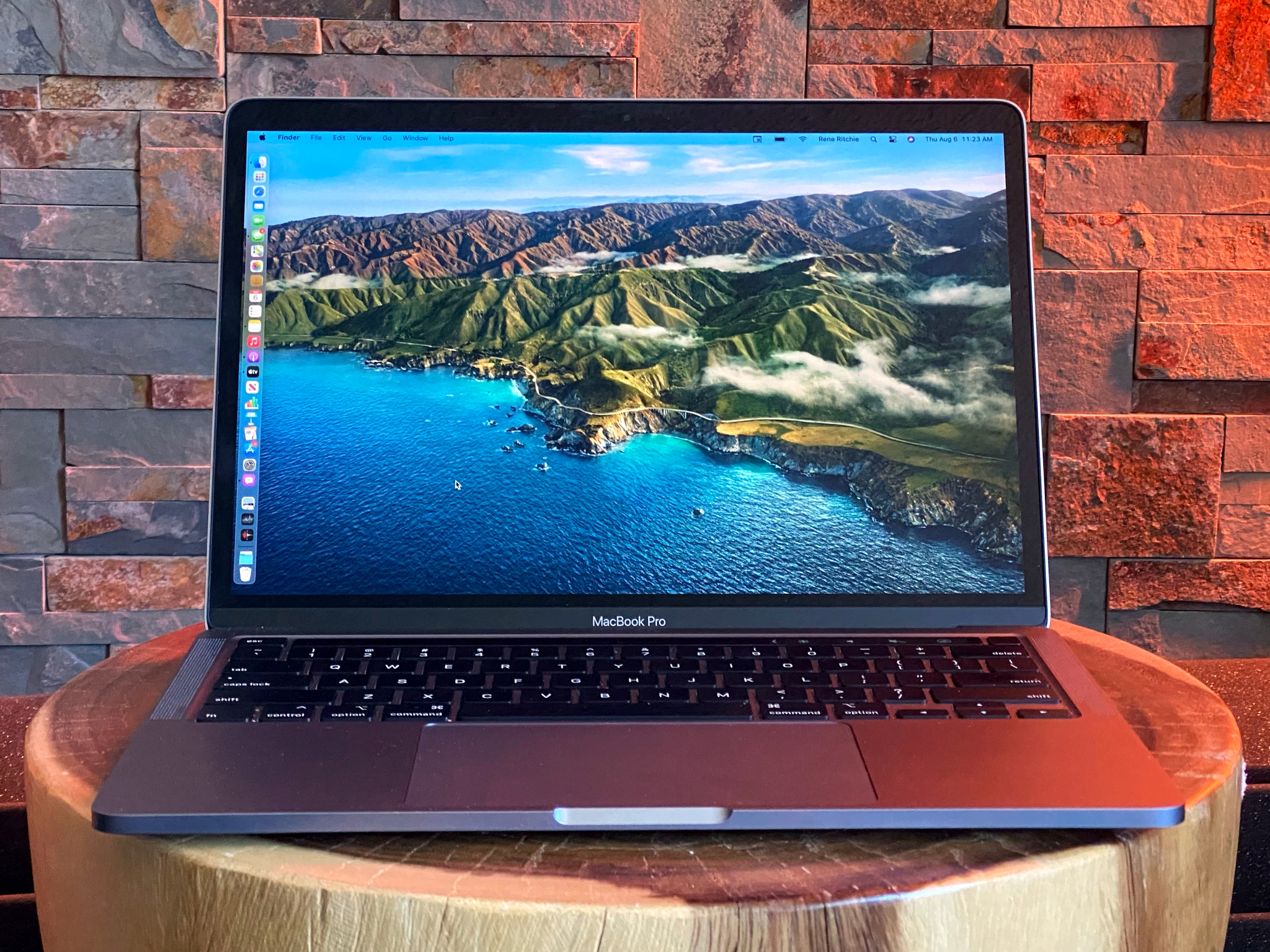
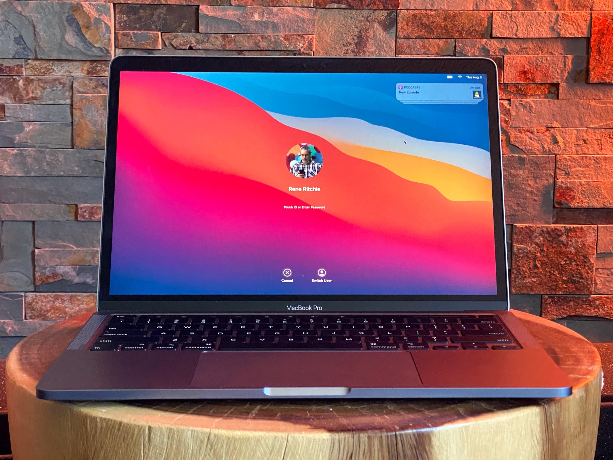
The moment you boot back up into macOS Big Sur, you know pretty much everything you need to about it. Your profile picture is bigger. The password field is rounder. The Mac has never looked more like the iPad and yet… and yet… the startup chime is back. Fully back, no terminal command needed. (Wall-E would be so proud.)
I think that's why Big Sur was chosen as the name for macOS 11 — yes, Apple has finally taken the Mac to 11 rim shot dot wav — Big Sur was chosen because it melds the beauty of the coast with the power of the mountains.
That power represents the Mac's upcoming transition away from Intel and AMD silicon to Apple's own, custom systems-on-a-chip. Similar to what they use in the iPhone and iPad. It's going to complete a common, shared architecture across Apple's major product lines.
That's what the beauty represents: The redesign meant to bring that shared architecture some… commonality.
And now, macOS Big Sur has just gone into Public Beta. So, if you're considering a test-drive before the general release later this fall, then wow but is this the preview for you!
macOS Big Sur Preview: Beta means beta
You can sign up for macOS Big Sur — and any or all of other's software testing programs — at beta.apple.com.
Just remember — beta means beta. They can be stable, they can be a mess, and they can switch back and forth between the two in the blink of a new build.
So, use a secondary machine and make sure you back up just in case you decide you don't like it and want to back right out again.
macOS Big Sur Preview: Compatibility
macOS Big Sur runs on any 12-inch MacBook, the MacBook Air and MacBook Pro from 2013 and later, the Mac mini and iMac from 2014 and later, the iMac Pro, and the Mac Pro from 2013 and later.
macOS Big Sur Preview: Design
Big Sur's design bridges both of Apple's worlds. Nowhere is that more apparent than the wallpaper options this time. See, depending on your own predilections, you can choose #TeamCommonArchitecture with the new, colorful, iOS-like wallpaper. Or, you can choose #TeamItsAMacDammit with the more traditional, scenic wallpaper of Big Sur.
But that's all background. The foreground is moving decidedly forward either way.
Where the Mac has always had a short but substantial menu bar, and iOS a tall but transparent status bar, Big Sur blurs the boundaries with a taller, translucent menu bar.
And… And, maybe it'll still grow on me, but even a month or so in, I still find it all shades of bitsy-er, and I'd love an option to opaque-it-up again.
The Dock floats now, like on iOS, and is also more translucent, like on iOS.
Even the icons are more like iOS. Hell, they're just like iOS. Gone are the circles and angled rectangles and irregular shapes that, frankly made the Mac the Mac. In their place are the super-ellipses straight from the iPhone and iPad.
And I get it. I do. Really. With iPhone and iPad apps coming to Apple Silicon Macs, this will let Mac apps sit beside them, near-identically, on that new Dock.
But at the cost of what gave the Mac much of its app identity. I mean, the watch has circles, the TV has rounded rectangles, and the Mac now has… exactly the same as the iPhone and iPad.
I get it. I just mourn it.
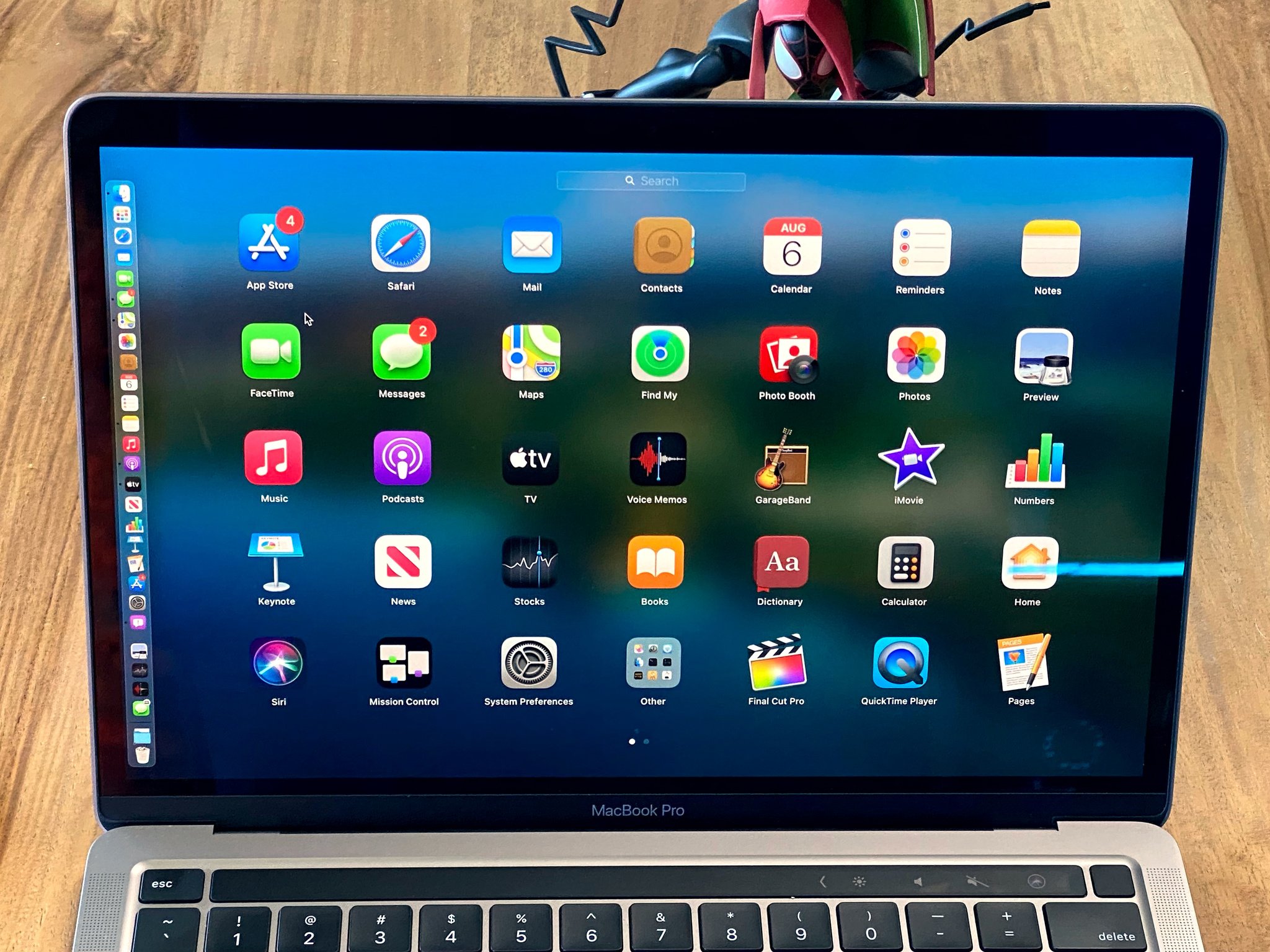
Especially because it's still kinda inconsistent. Some of the icons are almost as flat as iOS. Some have a richness like previous versions of macOS. And some… are just puffy. Trying really hard not to look at Messages and FaceTime.
Hopefully that all gets cleaned up by launch and we get icon elevations as shared as the upcoming architecture.
Now, I love the full-height sidebars, the new share sheets, and the extra padding in all the controls. How it makes everything more spacious.
I love the roundness as well. You can argue it's too round, too iOS-like. But if that's clearly the goal with Big Sur, and the execution is aces. I mean, we have iOS-style toggle switches now, something we never expected to have… and they look and work great.
Also, just the lightness of the interface in general. A combination of all the tweaks that just make macOS feel like it took a nice, deep breath of fresh pixels.
That includes the new symbol library, which brings a little color and lot of recognizability and consistency to glyphs and in-app icons. Hopefully for upcoming 3rd party apps as well.
Also, the sound design, which takes the essence of the existing, familiar Mac tones but re-imagines them in a way that just makes everything old… new and delightfully attention-getting again.
Now, yes, some people have said this redesign is to make the interface more finger-friendly in anticipation of touch screen Macs, or to take the sharp corners away before the upcoming augmented reality interface, or just that Apple really is finally merging the Mac with iPad…
And I say, porque no los dos? … no, wait, los tres?
Kidding. Right now it can be whatever you want it to be. Eventually, though, it will be whatever Apple wants and needs it to be.
But I am going to re-iterate this part:
Apple doesn't see the Mac or the iPad for that matter as a collection of parts. As custom silicon and rounded corners. They seem them as products. Both incredibly successful products. Businesses most other companies would trade their c-level executives for. And beyond crunchy, chewy emotional stuff, until one of those businesses starts to slide significantly, there's just no way Apple as a company is going to want to give either of them up.
But they are going to want to make them more efficient and, yes, more consistent. For them, to streamline development, and for customers, to streamline adoption. For developers, too allow iOS, Catalyst, and AppKit apps to all sit beside each other and look like part of the same family.
To abuse the old Steve Jobs analogy, a truck can have most of the same components and comforts of a car, should have, in point of fact, but also still a flatbed and towing capacity... Some will end up being more like SUVs, some more like… Optimus Prime. But they're still trucks.
Like the Schiller doctrine says — the iPad team's job is to make the iPad so good you don't need a Mac. The Mac team's job is then to make the Mac so much better it's clear why you'll still need a Mac.
This is the fresh coat of paint on them doing that.
macOS Big Sur Preview: Control Center
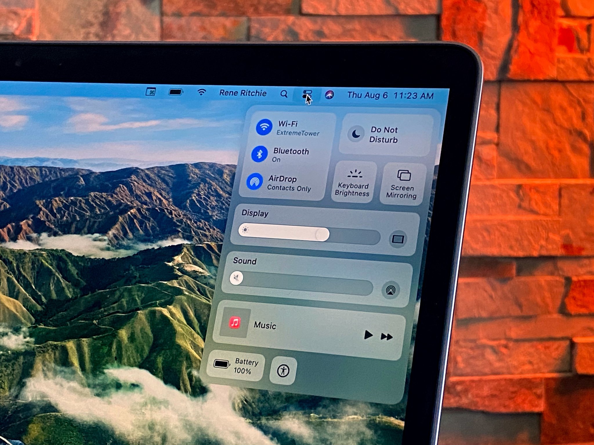
Control Center came to the iPhone and iPad with their big iOS 7 redesign and now it's coming to the Mac with Big Sur's. Almost like Control Center demands a redesign in its contract rider…
Anyway, it looks a lot like Control Center on the iPad but behaves more like you'd expect on the Mac.
It drops down from the menu bar to give you access to all your major toggles and settings. Things like wireless connections, display and keyboard brightness, accessibility and battery, do not disturb, and more. And you can click to bring up even more options.
Like the iOS Control Center, you can also customize it to have just exactly the controls you want in it… and none of the ones you don't. Kinda.
You have to go to System Preference > Dock and Menu Bar to configure it. Alas, the options in there aren't anywhere nearly as rich as the ones in iOS. Again, at least not yet. Like there's nothing for Apple TV remote or screen recording or any of a half-dozen or more other things I'd hope and expect.
There is some really cool Mac-ity Mac stuff here as well: I love how you can pin the controls you use most often, the ones for whom being even a click and drop away is just too far away, right into the menu bar, so they're as instantly accessible as ever. Just far, far more customizable and expandable.
macOS Big Sur Preview: Notification Center
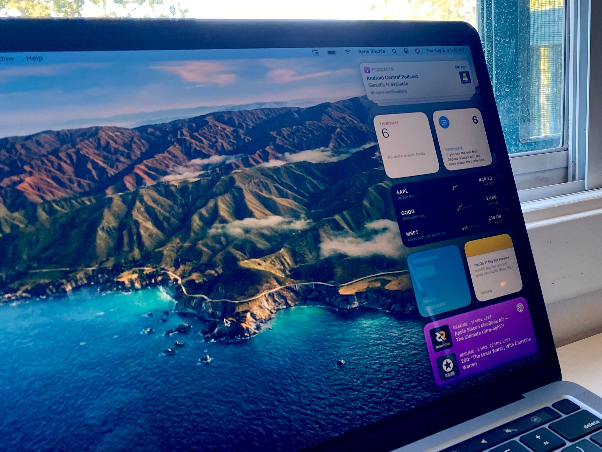
Big Sur has the same new, cross-platform SwiftUI-based Widgets as iOS 14. Based on the Watch complications, they look terrific, the information density is terrific, the glanceability is terrific… but they're just a huge step down when it comes to interactivity.
And that's especially noticeable and lamentable on the Mac. For example, over the last few versions of macOS, it's become muscle memory for me to swipe out the calculator, use it, and swipe it away again. Now… that's just gone. All a widget can do if you tap it is deep link you into a specific part of an app. So, if I want to calculate, I have to launch the calculator app. Like an animal.
Likewise, there's a gorgeous new Podcast widget but you can't control podcast playback from it. You can just deep link into the podcast or podcasts it's showing you. To play or pause, you have to go to Control Center. Which my upper brain understands but my lower brain just keeps going — why… can't… click.
I'm hoping that this is similar to iWork or Final Cut Pro, where there was a step diagonally backward to get to a new, better foundation, but then an eventual leap forward again. Otherwise, Apple's making a huge statement with this new implementation: That widgets, philosophically, are for glancing at data and launching apps, and interactions should live elsewhere.
And if that's is the new normal, then I'll be sad, but I'll also admit the execution is pretty terrific. Scroll down and click on Edit at the bottom and you go into a full-screen Widget Gallery where you can add, remove, and otherwise customize your widgets. Again, it looks like iOS but works like the Mac — instead of swiping between small, medium, and large widgets, you click on the size chart. When you're finished, just hit the Esc key or click the Done button at the bottom right.
The best part, at least for me, is that Notifications have been merged with Widgets now, and they've gotten the recent iOS-style grouping and organization. They sit on top of the widget stack, so one swipe takes you to everything you need to see.
macOS Big Sur Preview: Safari
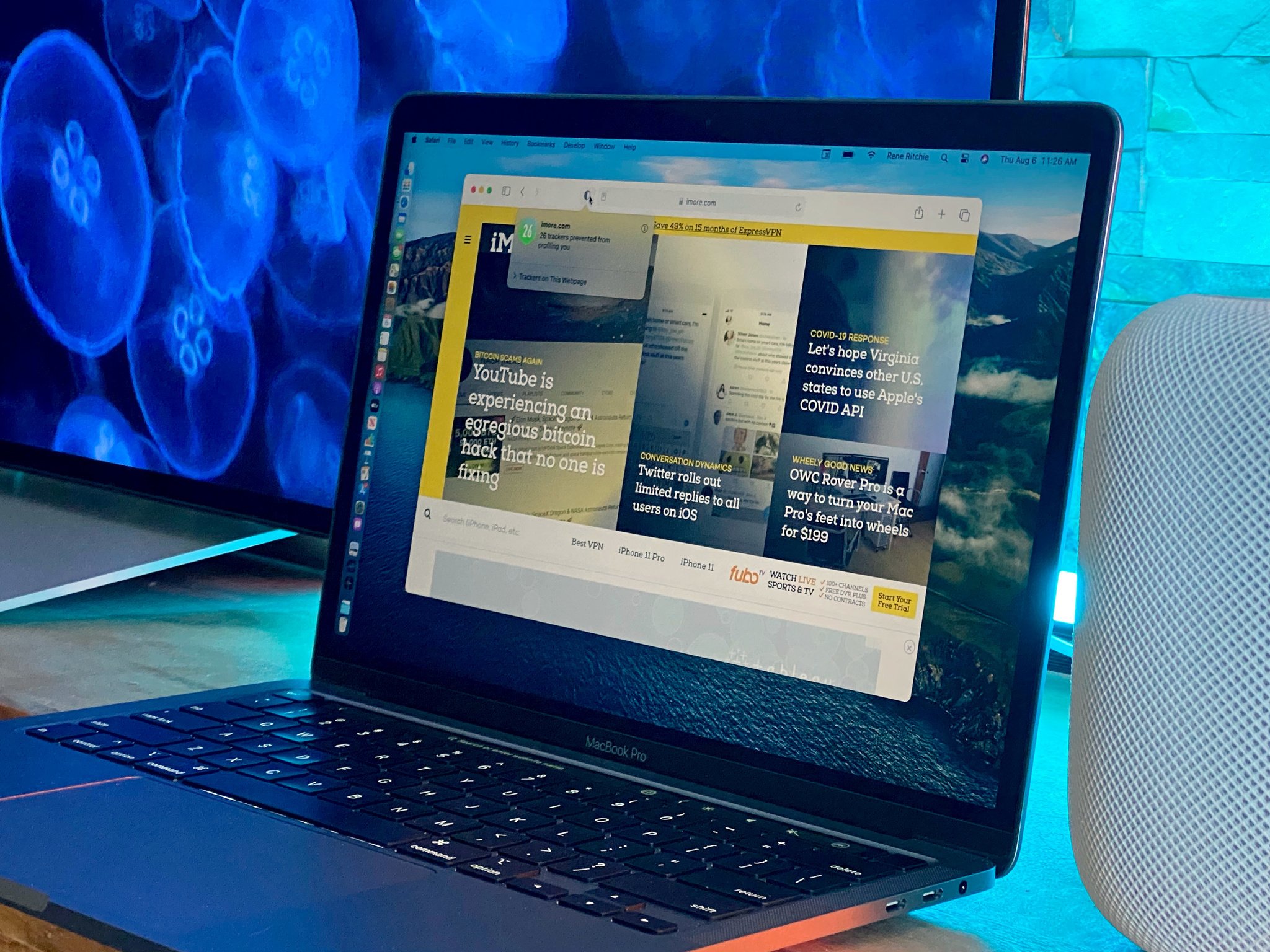
I covered many of the new Safari features in my iOS 14 Preview last month, simply because those public betas launched last month. I don't want to be overly duplicative here, but I do want to cover everything that still makes Safari so important and, in many ways, so forward-thinking on the Mac.
It's faster and more power-efficient than ever, which is no surprise given speed and power efficiency have been the priority in Safari since Steve Jobs told Don Melton and team to focus on that some 20 years ago this summer.
And that's on Intel with T2, can't wait to see how fast and efficient it gets on Apple's own silicon.
Speaking of which, Optimized Battery Charging, which holds the charge level at 80% when you're plugged in for extended periods of time, is now enabled by default on all Thunderbolt 3 MacBooks Air and Pro. You can also get battery usage graphs going back 24-hours and 10 days now.
You've got more ways to personalize the start page now. So, if you live on the web even more than you do the desktop, you can have your favorite background picture here now, not just there.
You can control what you have immediate access to on the start page as well, like Favorites, Reading List, iCloud Tabs, Siri Suggestions, Privacy Report. Whatever you want.
Just click on the Settings icon at the bottom right of the start page to check, uncheck, and wallpaper it your way.
Now, I've said this part before but I'm going to say it again because I think it's critical for the future of the web:
Browsers work off standards but the various browser companies interpret those standards in their own way. Typically in the way that best suits the company. For example, Apple has a huge native app platform, so they tend to let the web be the web. Other companies, not so much, so they push for the web to act more native.
Because of Google's influence on the web, a lot of web developers now code for Chrome instead of the open web, just like they used to code for Internet Explorer. It's understandable but it's also detrimental. I hope open web advocates inside Google and the developer community can understand and help avoid the long term consequences of that trend.
Apple, for their part, is continuing to make Safari a first-class web experience. But, they've also become pragmatic enough to realize they also need to bend if they're going to prevent too many things from breaking.
So, they've added support for the WebExtension API, which means developers can bring extensions they've written for other browsers to Safari, and Safari users now gain access to all of the extensions they do.
But, Apple being Apple, they've also added an extra layer of privacy into their WebExtension support: You can choose to run an extension just once, just for a specific website, or always.
You can now see more tabs on screen at once, and favicon are finally on by default. Hover over a tab and you'll get a preview of the page. It all makes switching between tabs faster and more accurate.
But if you have a Touch Bar, that's still the fastest way to scrub through them. Yeah, I said it.
There's support for WebP images, though not yet WebM. But, there is VP9 support for 4K Youtube in Safari. Thank you, WebKit team, from a grateful YouTube nation!
There's also no Translate app for the Mac the way there is for the iPhone. But, Translation is now built into Safari. And, it does a really, really good job of parsing the text fields so as much as possible gets translated.
It's in beta… in the beta, and there are only 7 languages so far: English, Spanish, Simplified Chinese, French, German, Russian, and Brazilian Portuguese. But hopefully more to come.
There's a new web authentication API and security code autofill. And then there's privacy reports, which shows you all the trackers being blocked for the last 30-days. You also get reports for every website you visit. It's terrific, and I love that some websites and developers are already showing off their 0-tracker reports as points-of-pride.
Now, some are casting this feature as Apple vs. the ad industry and worrying about what it means for the future of monetization on the web. Including people who usually complain about web ads more than champion them… But, internet.
For me, though, it all just comes down to disclosure and consent. I have no problem with advertising on the web. Prior to going indie a few months ago, I worked for an ad-supported web network for a decade. And I don't think Apple has a problem with it either, because, guess what, they advertise on the web too.
I think all of us just think websites and advertisers should tell us what they're tracking, and let us choose to opt-in or opt-out.
Disclosure and consent.
If it's a good business, with good business practices, I don't imagine anyone doing it will be angry or upset about what they're doing getting an Apple-sized spotlight.
If anything, it'll make web advertising a better, more upfront, more honest business for everyone. And that would be a huge win for everyone.
macOS Big Sur Preview: Messages & Maps
The year one Catalyst proof-of-concept apps were… not great. Maybe the technology wasn't really ready. Maybe they picked the wrong apps to try and prove the concept. But they just felt like iPad apps dumped on the Mac, not iPad apps reborn on the Mac.
The year two Catalyst beta app were better. Apple Podcasts in UIKit was almost indistinguishable from Apple TV in AppKit. Neither was amazing, even great, but it was a big step for Catalyst.
Swift Playgrounds.. well, Swift Playgrounds was legit good.
Now, year three Catalyst transition apps are.. pretty damn great. So pretty damn great Apple's willing to trust the technology with one of their most important apps — Messages.
An app that had been languishing, embarrassingly, behind the iOS version for over half a decade.
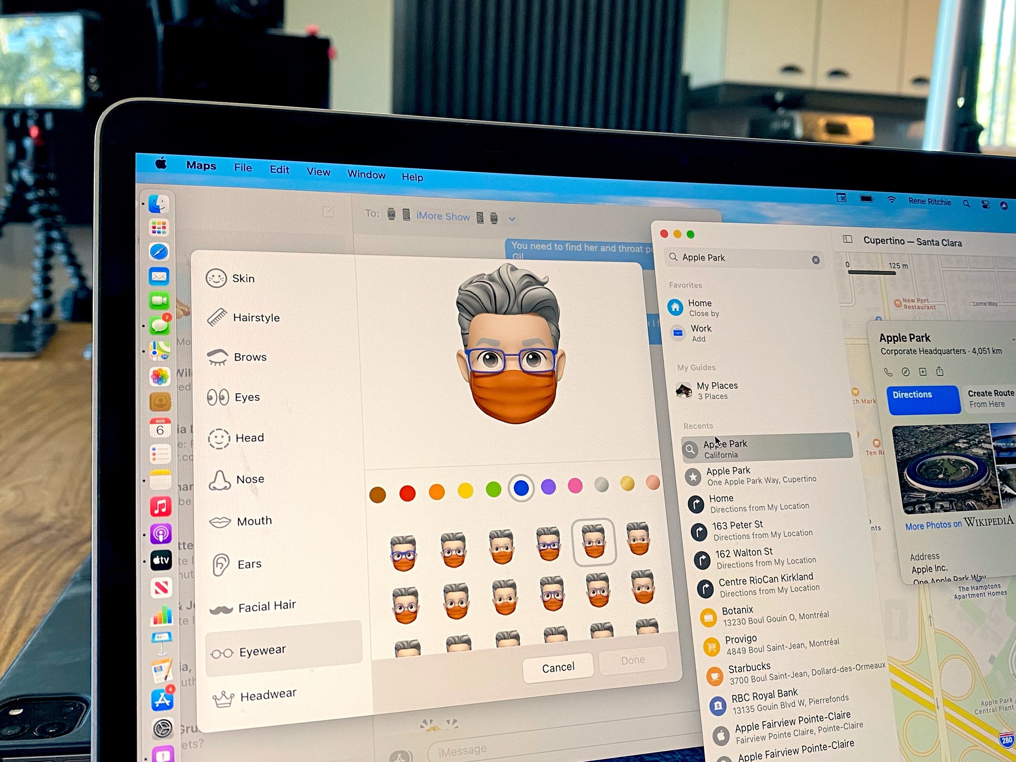
Now though, on Catalyst, it gets pretty much everything from the iOS version. Effects. Memoji. Even the brand new group messaging features like mentions and in-line replies. Yeah. All of it.
It even gets to keep Mac-exclusives like screen sharing. Though… maybe send that one back to iOS as well? Please and thank you.
Maps is now Catalyst as well, and getting caught up with features like favorites, indoor maps, ETA, and look around, and getting all the new stuff, same as the iOS versions, including guides, cycling directions, and EV and congestion routing.
You can see my iOS Preview for a rundown of everything new in Messages and Maps, because it's a lot.
It's great for Mac users because we get all these features now day and date with the iPhone and iPad. It's even better for Apple and developers, though. Because it means they have to live on these frameworks for these apps, and that's one hell of an incentive to fix them fast and make them truly fantastic.
macOS Big Sur Preview: And more!
Many of the new iOS 14 security and privacy features are coming to Big Sur as well. That includes Privacy Information on the App Store so, like Nutrition labels on food, you can see exactly what you're getting when you get an app. And that includes the data they're collecting about you, like usage, contacts, location, and who if anyone they may be sharing that data with, like Facebook or Google.
Big Sur's system volume is now cryptographically signed to further reduce attack vectors and so that it can be verified against a known, good state. That also means Big Sur can handle portions of future upgrades in the background, so it takes less time when it comes to install and reboot. Hurrah.
Also in the App Store, Family Sharing now lets you share in-app purchases and subscriptions from any app that allows it, and Game Center has a new in-game dashboard, new achievement section, and new leaderboards. It's a terrific re-launch of a feature that just hasn't gotten enough attention recently.
For Accessibility, if FaceTime detects someone is using sign-language, it'll make them more prominent so you can more easily see the signs.
Notes is getting the new, collapsible Pinned section, top hits in Search, and enhanced scanning thanks to Continuity Camera, which uses your iPhone to snap documents into your Mac.
Voice Memos now has customizable folders and smart folders, you can mark recordings as favorites, and there's a magic wand tool that'll try to reduced noise and reverb to improve your recordings.
Photos will now let you adjust, filter, rotate, and crop video, just like you've been able to do with photos. You can now apply Vibrance to photos and adjust things like Portrait Lighting from depth-enabled iPhone pics. And there's a new, Machine Learning-empowered retouch tool to help you better get your digital concealer on.
Captions, new to iOS Photos, now replace Descriptions in Mac Photos, and sync between your devices.
There are new dictionaries for French–German, Indonesian–English, Japanese–Simplified Chinese, and Polish–English.
20 new and 18 updated fonts for India, and localized message animations for India. So you get confetti when you send Happy Holi in Hindi now too.
In Reminders, you can now assign reminders to people on shared lists. There are smart suggestions for dates and locations, and suggestions from Mail. And, of course, improved emoji support to make lists more glanceable.
macOS Big Sur Preview: To be continued...
macOS Big Sur has just gone into public beta and should go into general release sometime this fall, typically September or October. Until then, things can and will change. So, if you're on the beta, make sure you send Apple your feedback early and often!

Rene Ritchie is one of the most respected Apple analysts in the business, reaching a combined audience of over 40 million readers a month. His YouTube channel, Vector, has over 90 thousand subscribers and 14 million views and his podcasts, including Debug, have been downloaded over 20 million times. He also regularly co-hosts MacBreak Weekly for the TWiT network and co-hosted CES Live! and Talk Mobile. Based in Montreal, Rene is a former director of product marketing, web developer, and graphic designer. He's authored several books and appeared on numerous television and radio segments to discuss Apple and the technology industry. When not working, he likes to cook, grapple, and spend time with his friends and family.
