macOS Mojave: The secrets behind Dark Mode

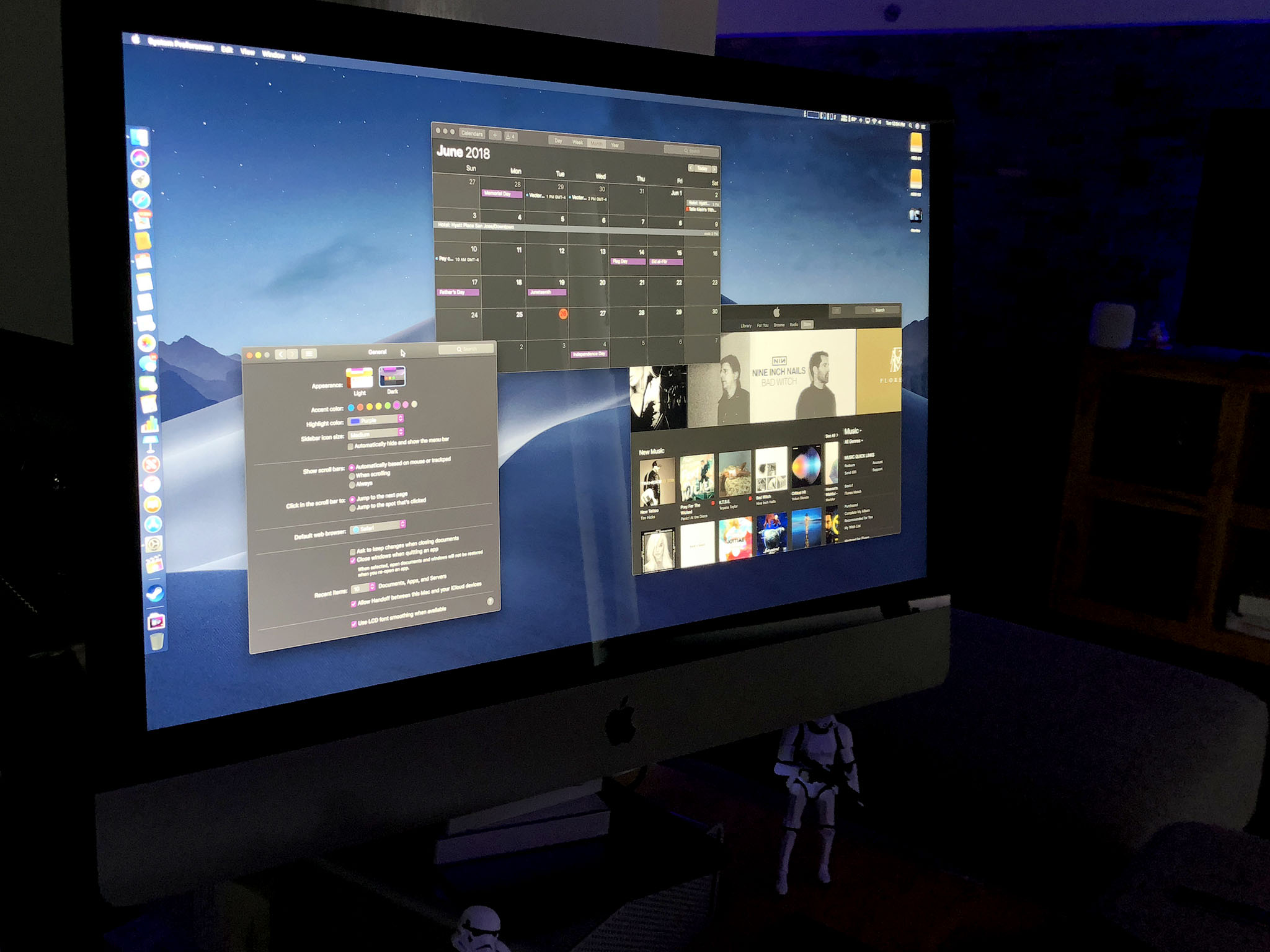
Dark Mode is here! No, not for iOS, but for macOS Mojave, Apple's next-generation operating system for the Mac. It's not just a coat of night-colored paint, though: Apple's implementation goes deep. That includes sampling the background colors to make sure the temperature is never so warm or so cold it clashes with the rest of your desktop, and some bright new accent colors that stand out like neon.
Mostly, though, it just looks cool. Sure, we act like it's all the nerdy, niche features that we love the most. But announce Dark Mode and we cheer like it's the second coming of emoji. Because we're human and we want to have fun and look good doing it. And that's what Dark Mode is really all about.
Going Dark
The goal of the new Dark Mode interface appearance is to let the cruft fade away and the content pop. Like, POP. Previously, this was the realm of pro apps and exclusive to creative pros. But, just as the definition of pro has widened over the years, so has the understanding of the value a proper Dark Mode brings.

It can reduce the type of glare that sometimes contributes towards eyestrain and the light pollution that can contribute to your being hit in the head by a pillow when working on the sofa or in bed. It can also help you focus, whether it's on content you're creating, editing, or consuming, or the tasks you're trying to get done.
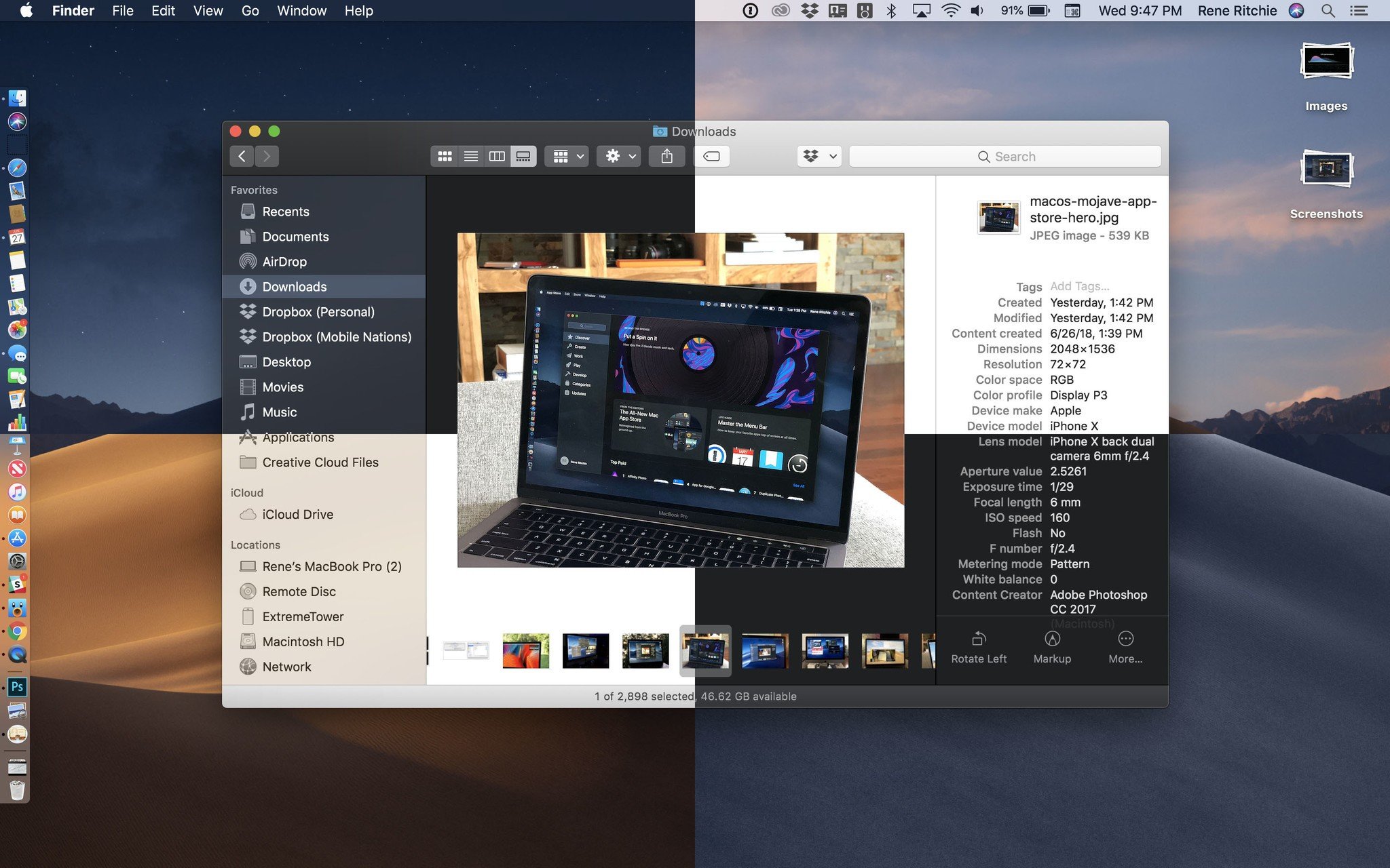
It works because Dark Mode on Mojave is enveloping. Dark Menubar. Dark Dock. Dark apps and sidebars. Dark buttons and backgrounds. But it's also deliberately consistent with "Light Mode", so you can switch back and forth without it feeling disruptive.
Developers can even specify different colors and appearances for Dark vs. Light interfaces in asset catalogs. So, for example, a lighter sky blue banner for Light Mode but a navy blue banner for Dark Mode. That way, apps look cohesive no matter which mode you're in.
That the modes are so easy to switch between is especially great. While I love Dark Mode for some pro apps and late night use, I find it a tad overbearing and even gloomy if I sit in it all day. My eyes and my moon need light! This way, whenever I have the slightest urge to switch, I just switch and go on about my business.
Master your iPhone in minutes
iMore offers spot-on advice and guidance from our team of experts, with decades of Apple device experience to lean on. Learn more with iMore!
Accents, Casts, and Glyphs — Oh, my!
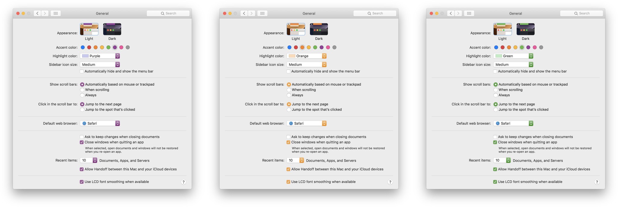
To coincide with Dark Mark, Apple has added new accent colors as well, and they work for both Dark and Light. Joining the venerable blue and graphite are red, orange, yellow, green, purple, and pink. It might seem like a small thing, but being able to highlight your interfaces with your favorite colors doesn't just make controls pop, it makes you pop.

Some of what Apple has done with Dark Mode is obvious: When you click a button, instead of it getting darker, it gets brighter. Some is not so obvious: The effect that indicates buttons are grouped together, instead of looking recessed, looks backlit.
Windows, on the other hand, to maintain a consistent depth effect, have drop shadows in Dark Mode just like they do in Light. (Though Dark Mode gets a rim stroke to go along with a stronger rim shader to keep it looking nice and crisp.)
Also, Dark Mode isn't just dark-as-in-desaturated. In order to prevent clashes, the system samples what's behind a window, including the system wallpaper. Then, it subtly tints the window — and controls because of their slight translucency — based on the average colors, and mixes that with a base gray, so that the color temperature of the window matches the rest of the environment and your wallpaper. It's a dynamic process that updates as you move windows around, so all the elements on your screen always feel part of a cohesive whole.
(If you hate the idea of tinting, you can pick the graphite accent "color", which forces no tinting at all.)
Vibrancy, which is what Apple calls the bright, saturation boosted, translucent effect applied to things like app sidebars, is also optimized in Dark Mode to maintain legibility. Basically, gray background elements take the place of white so that the contrast stays high, even in lower opacity levels.
Glyphs, or the monochrome icons used throughout interfaces, have also been adjusted so that they maintain weight legibility on dark backgrounds. Often, they've been redrawn to replace outlines with solid forms and details with knockouts.
Cool like Dark
It all results in a Dark Mode that's rich and polished — something that Smart Invert Colors on iOS, for example, doesn't really achieve.

For end users, the interface is the app. It's what we spend all our time staring at and/or interacting with. Change some plumbing deep in the foundations of an app, and maybe some of us will notice. Change the appearance, and most of us can't miss it.
That's why how interface looks is so incredibly important, especially when it's at the system level. Get it right and we'll love you. Get it wrong and we'll come for you.
macOS Mojave got Dark Mode right. It's simple but sophisticated, fresh and even a little futuristic.
macOS Mojave is currently available as a public beta and will be coming as a free update this fall for everyone running compatible Macs.
Read the full macOS Mojave Preview

Rene Ritchie is one of the most respected Apple analysts in the business, reaching a combined audience of over 40 million readers a month. His YouTube channel, Vector, has over 90 thousand subscribers and 14 million views and his podcasts, including Debug, have been downloaded over 20 million times. He also regularly co-hosts MacBreak Weekly for the TWiT network and co-hosted CES Live! and Talk Mobile. Based in Montreal, Rene is a former director of product marketing, web developer, and graphic designer. He's authored several books and appeared on numerous television and radio segments to discuss Apple and the technology industry. When not working, he likes to cook, grapple, and spend time with his friends and family.
