Minimal delightful product

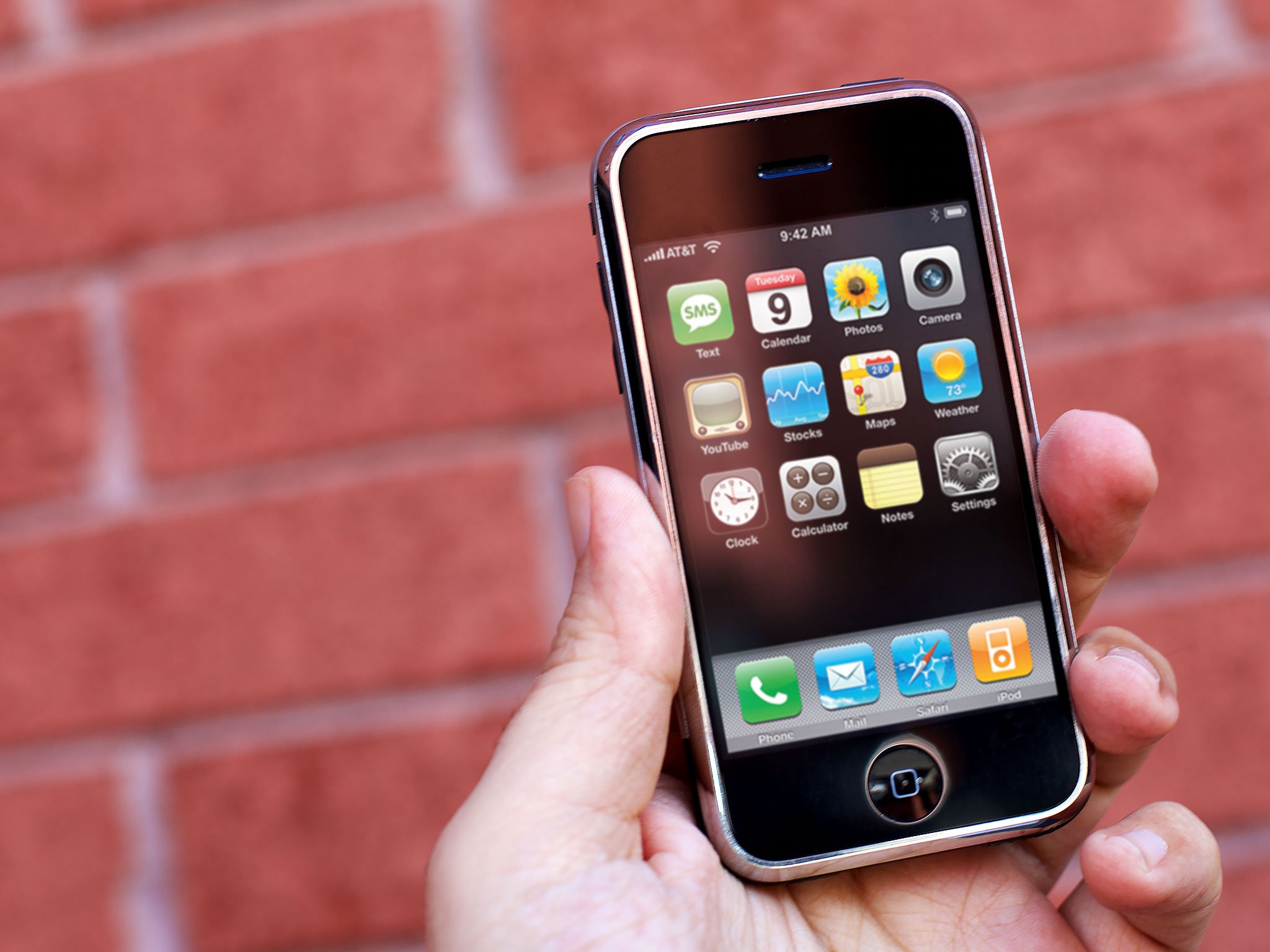
The original iPhone didn't do everything existing BlackBerry, Windows Mobile, Palm, or Symbian devices did. It didn't have MMS. It didn't have third party apps. It didn't have much in the way of customizations. And it didn't matter. Its multitouch interface was so great, most people who bought it were willing to live without those features simply because the experience was so great. Apple had, once again, hit on a minimal delightful product.
Those words might sound silly. Minimal viable product is the usual term. It's been succinctly defined as follows:
The minimum viable product is that version of a new product which allows a team to collect the maximum amount of validated learning about customers with the least effort.
Minimal delightful product, then, could be thought of this way:
The minimum delightful product is that version of a new product which allows customers to experience the maximum amount of affinity with the smallest feature set.
Many people cared that the original iPhone was missing features. Most of us cared more that we could pinch and zoom and swipe and bounce around the Photos app. More importantly, we delighted in demonstrating it to our friends. The reactions, both from ourselves and those around us, more than validated the purchase. We grumbled about missing features but we exalted about the few key ones that were there.
It hit the key balance of being both impressive and accessible. Features can (and did) come later, but it never needed a second chance to make a good first impression. It made a great one right away. As prices dropped and availability increased, iPhone surged in part because of the vacuum created by the affinity created ahead of it.
The original iPod was the same. So was the Mac, going all the way back to the smiling face that made us smile back.
Apple Watch was delightful too but, perhaps, not minimal enough. From point-and-click to a thousand songs in your pocket to phone, internet device, and iPod all-in-one, we went to a harder-to-sum-up starting set. The Watch is still a smash hit, beyond any other wrist computer in history, and a business any other company on earth would give almost anything to own, but it's delight is not as easy to sum up, and hence, to show off. Starting with something more minimal may have also made it more infectious.
Master your iPhone in minutes
iMore offers spot-on advice and guidance from our team of experts, with decades of Apple device experience to lean on. Learn more with iMore!
The next-generation Union Square Apple Store certainly feels minimal and delightful. There are five new features but all of them come from a single, unified theme: community. There's not a lot crammed in there either. Remarkably consistent tables, seating, and trees combine to make elements like the 6K screen and product windows not just stand out, but pop. You enjoy being there so much you want to tell other people about it. You want them to go so you can talk about it. You want to bring them. And because it's kept simple, you can easily tell them—and show them—why.
Whenever I hear rumors about what Apple is working on next, that's the filter I try to contemplate it through. The first question I ask is: What could Apple do in that space, at launch, to engage me and make me want to use it to engage others around me?
Whether it's a car or home appliance or virtual/augmented reality or anything else, that's what I want to know. What's the minimal delightful product?

Rene Ritchie is one of the most respected Apple analysts in the business, reaching a combined audience of over 40 million readers a month. His YouTube channel, Vector, has over 90 thousand subscribers and 14 million views and his podcasts, including Debug, have been downloaded over 20 million times. He also regularly co-hosts MacBreak Weekly for the TWiT network and co-hosted CES Live! and Talk Mobile. Based in Montreal, Rene is a former director of product marketing, web developer, and graphic designer. He's authored several books and appeared on numerous television and radio segments to discuss Apple and the technology industry. When not working, he likes to cook, grapple, and spend time with his friends and family.
