More on a 5-inch iPhone and scaling the interface
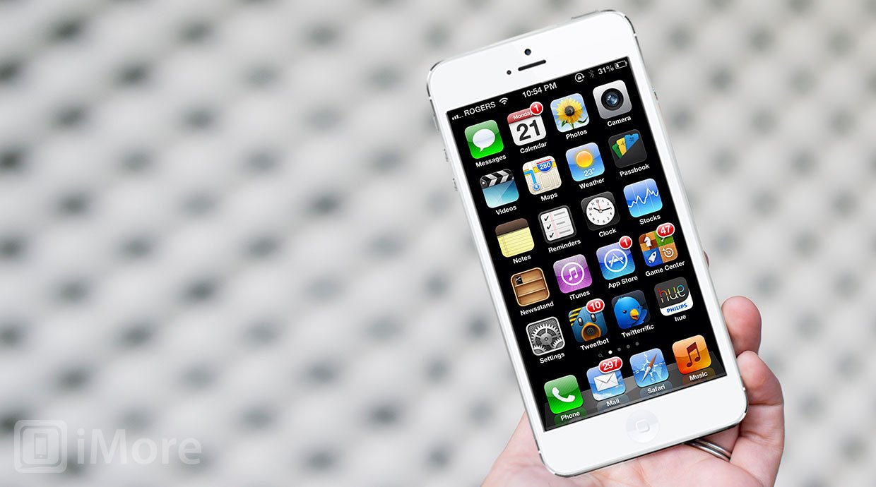
Just over a week ago I ran the numbers on a bigger screen iPhone, and presented several ways Apple could go, including just taking the current screen and stretching it out to almost 5-inches, which would give it the same 264ppi pixel density as the Retina iPad 4 screen. Since Apple used the iPhone density to make the iPad mini, using the iPad density to make the iPhone maxi has a certain symmetry to it.
But would stretching out the icons, buttons, text and other interface elements just make them look bigger, or would it make them look silly? Let's find out...
John Gruber of Daring Fireball said:
From an operations standpoint, they'd be re-using a component they're already familiar with. From a software standpoint, existing apps would just run, and everything would just look bigger on screen.
Marco Arment of Marco.org said:
By keeping the pixel dimensions the same as the iPhone 5, no app changes would be necessary. While the larger screen would hinder one-handed use, two-handed use would actually be easier because the touch targets would all be larger, and UIKit's standard metrics and controls still work well at that physical size.
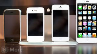
Here, again, is what it could look like relative to the original iPhone, iPhone 4, and iPhone 5.
And relative to other, larger screened phones on the market, including the Samsung Galaxy S3, the iPhone 5, the Nokia Lumia 920, the BlackBerry Dev Alpha, and the Samsung Galaxy Note 2.

Still, the most consistent question I'm getting -- other than why or if Apple would do it, which I've speculated about twice already -- is how would the interface work. Going from 4-inches to close to 5-inches increases everything, every icon, button, ever bit of text, every pixel, by 20%. For people with accessibility issues, for whom buttons and text are too small on every iPhone released to date, that could be really welcome news. For others, it sounds overly, perhaps comically large.
Master your iPhone in minutes
iMore offers spot-on advice and guidance from our team of experts, with decades of Apple device experience to lean on. Learn more with iMore!
This is exactly inverse the debate that preceded the launch of the iPad mini, where some feared the interface element size would be too small for comfortable use.
So what's the reality?
Let's fake a change in screen density and take a look. Note, the images below are scaled up to simulate 264ppi, then cropped to fit on the iPhone 5/iPod touch 5 screens and cleaned up a little. That means some icons, texts, and other stuff gets "lost" to make it all fit. None of that would happen on a 5-inch screen. The images below are only meant to show the size of buttons, text, etc., not completeness.
Just tap on these and view them full size on your iPhone (and tap and hold to save to Camera Roll if you want to experience them without the Safari chrome around them).
Here's the same thing for an iPad mini, without cropping, but with padding to fill the different pixel size and aspect ratio. Again, view them full screen.
For a full sized iPad, Marco made an Instapaper mockup you can try.
If you think of the iPad mini as a tablet that's using phone density, then the big iPhone is just a phone using tablet density. You have phone interface at high density, phone interface at less-high density, tablet interface at high density, tablet interface at less-high density.
Then, just like there's an 11- and 13-inch MacBook Air, and a 13- and 15-inch MacBook Pro, there's a 4- and 5-inch iPhone, and a 7.9 and 9.7-inch iPad.
Almost 9 out of 10 AT&T customers bought 4-inch or smaller iPhones last quarter rather than all big screen Android and Windows Phones combined, and roughly 6 out of 10 Verizon customers did the same. So aside from geeks who keep posting about how they really want it, and shoppers for whom bigger as a feature is always better, Apple might not feel any pressing, mainstream need to add another screen size to the iPhone product line. Yet.
But if and when they do, stretching the screen offers less complexity, and less impact on both iOS and developers. That's how you expand a product without expanding panel production or developer support headaches. It's an Apple-like solution.

Rene Ritchie is one of the most respected Apple analysts in the business, reaching a combined audience of over 40 million readers a month. His YouTube channel, Vector, has over 90 thousand subscribers and 14 million views and his podcasts, including Debug, have been downloaded over 20 million times. He also regularly co-hosts MacBreak Weekly for the TWiT network and co-hosted CES Live! and Talk Mobile. Based in Montreal, Rene is a former director of product marketing, web developer, and graphic designer. He's authored several books and appeared on numerous television and radio segments to discuss Apple and the technology industry. When not working, he likes to cook, grapple, and spend time with his friends and family.
