The most divisive MacBook Pro ever
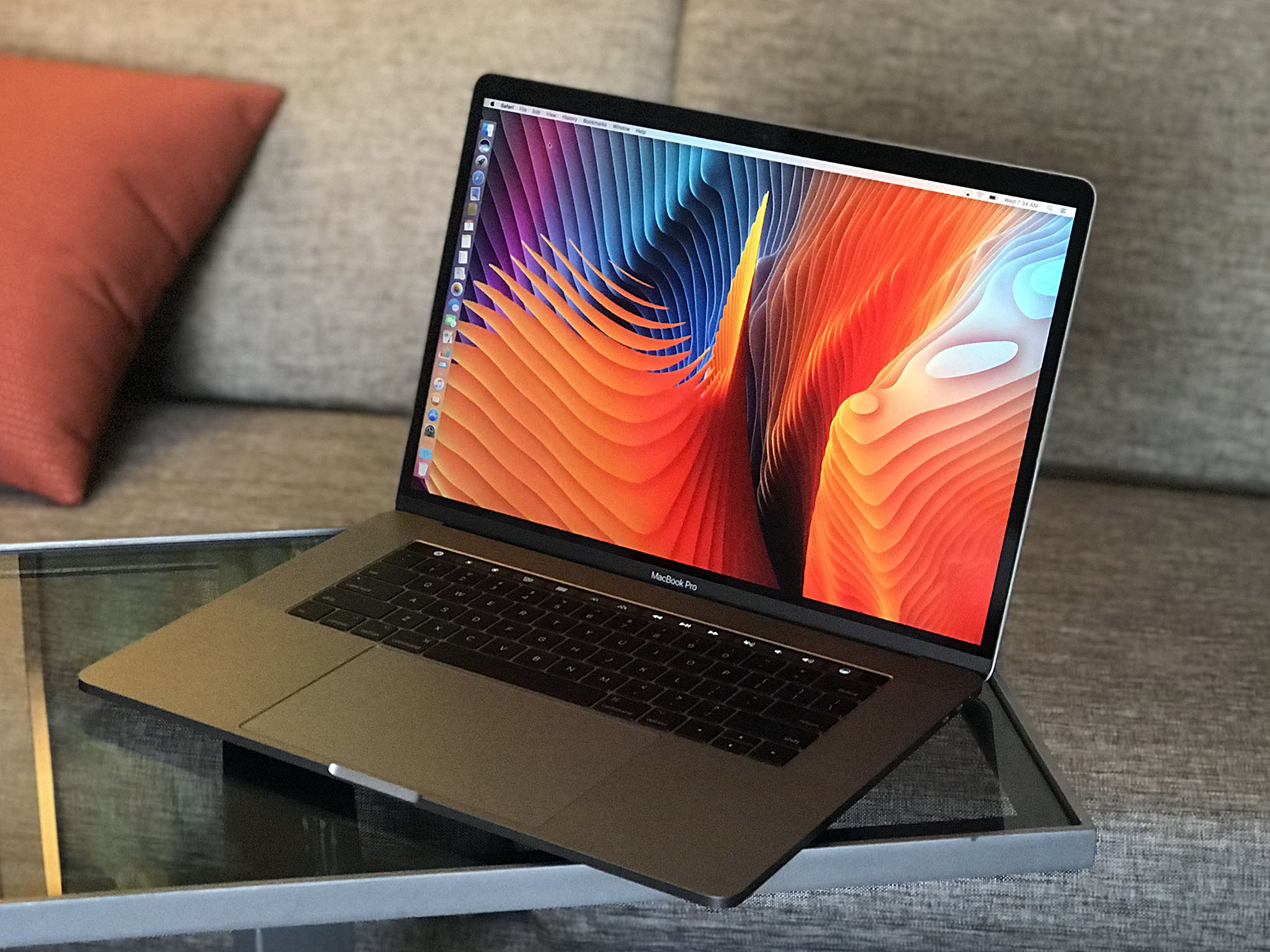
Rumor has it Steve Jobs dropped an iPad on the table and asked the team why they couldn't make a Mac more like that. What we've seen for the past few years has been in response to that. Whether or not Jobs would have liked every decision, from butterfly switches to Touch Bar, is immaterial. His one defining purpose was to make computing more accessible and approachable to the mainstream. And the latest MacBooks Pro, regardless of any personal opinions, follow that path.
Preface the first: People can disagree about products. I know perspective-taking is hard, but different people have different use cases, workflows, and personal opinions, and can legitimately dislike things without being haters or click-baiters, or like things without being apologists or fanpeople.
Preface the second: I really like the current MacBook Pro. It's by far the best laptop I've ever owned. I loved my 2015 MacBook Pro, but going back to it now, the keys feel sloppy, the function row just sits there collecting dust, and I swap one set of dongles for another.
Not the MacBooks everyone was looking for
The current MacBooks Pro have proven remarkably popular. Apple is selling a ton of them. Whether Apple would have sold a ton of any MacBooks Pro that finally got Skylake and Kaby Lake processors is impossible to say. Traditionally, when mainstream needs and pro user needs clash in the marketplace, pro users don't come out of it uncut.
So, for all their sales, we now have current generation MacBooks Pro that many long-time MacBook Pro customers don't just dislike but have a strong, emotional revulsion for.
And that's a problem.
Keyboarded
Marco Arment, writing for Marco.org:
Master your iPhone in minutes
iMore offers spot-on advice and guidance from our team of experts, with decades of Apple device experience to lean on. Learn more with iMore!
Despite my love for the previous Retina MacBook Pro, I won't be able to use it forever. The best laptop to ever exist should be in the future, not the past.There's a lot to like about the new MacBook Pros, but they need some changes to be truly great and up to Apple's standards.
I'm going to use Marco's piece as a framework for this one, which means I'll be quoting him heavily. (Apologies, Marco.)
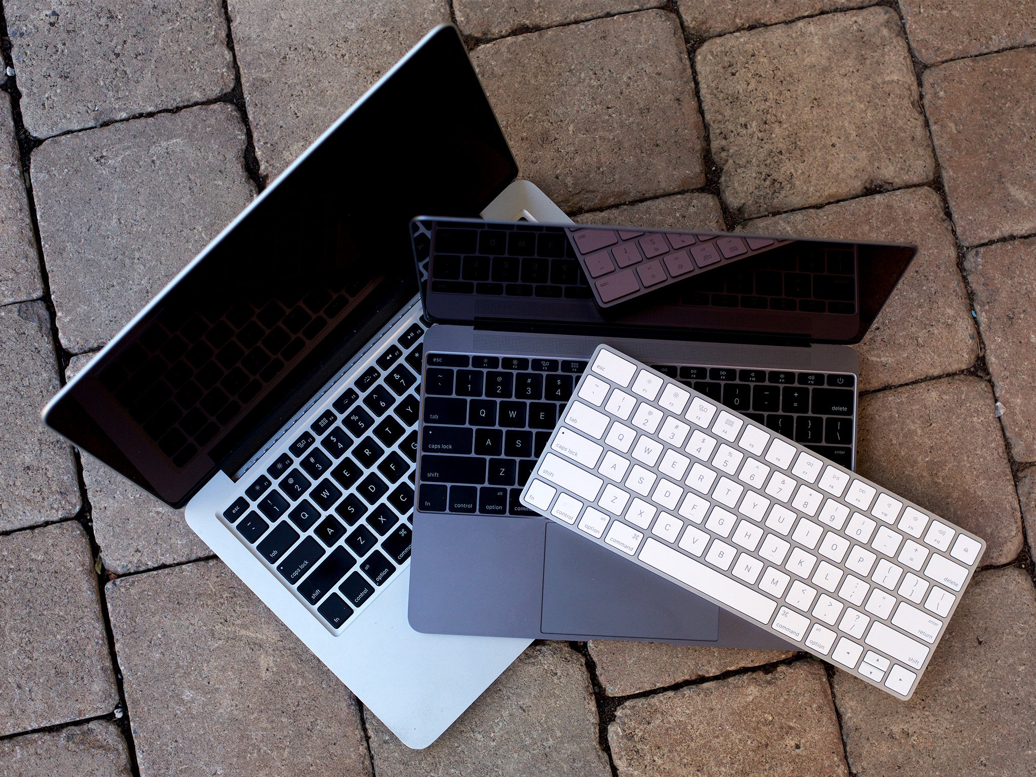
After three significant revisions, Apple's butterfly keyswitches remain as controversial and unreliable as ever. At best, they're a compromise acceptable only on the ultra-thin 12" MacBook, and only if nothing else fits. They have no place in Apple's mainstream or pro computers.
Again, I far prefer the new butterfly switches to the old scissor switches, which now feel wiggly-wobbly to me, but here's the thing: I can use the old ones just fine. I'm largely keyboard agnostic and I can go from an old-style clickity-clack keyboard to the iPad Pro Smart Keyboard and back and it only takes a few minutes for me to acclimatize each time.
That longtime Apple customers I respect, like Marco and Andy Ihnatko dislike the new keyboards so intensely is problematic. While I'm sure others prefer the butterfly keyboards like I do, I'm not aware of anyone actively hating the old scissor keyboards like many seem to the new butterflies.
When only Apple makes MacBooks and there only the option for the, divisive keyboard, that's a problem.
Also a problem: reliability. I've had a half-dozen or so review units with the new keyboards and I've been using a MacBook and MacBook Pro with the new keyboards since launch with zero issues. (And my keyboards look like they've gone through re-entry.) But, anecdotally, the number of people for whom the new keyboards have failed sounds significantly higher than in the past.
It seems like, in attempting to design a keyboard the prevented dust and particle ingress, Apple made one that sometimes keeps what ingress does happen from being easily removed or fixed. And that makes for a costly repair outside AppleCare. That alone could well result in a rethink.
Marco offers an interesting compromise and one I, embarrassingly, failed to consider:
The Magic Keyboard's scissor switches feel similar, but with a bit more travel, and all of the reliability and resilience of previous keyboard generations. They're a much better, more reliable, and more repairable balance of thinness and typing feel likely to appeal to far more people — even those who like the butterfly keyboards.
I have a Magic Keyboard on my iMac and like it a lot. I'm not sure everyone who loved the scissor-switch MacBook Pro keyboard loves the Magic Keyboard as much, but if it's something that manages to please more people — and, importantly in my book, provide even more consistency between Apple's keyboards — than I'm all for it.
The Magic Keyboard only needs one change to be perfect for the MacBook Pro: returning to the "inverted-T" arrow-key arrangement by making the left- and right-arrow keys half-height again. This arrangement is much more natural and less error-prone because we can align our fingers by feeling the "T" shape, a crucial affordance for such frequently used keys that are so far from the home row.
I barely noticed this change and it hasn't affected me at all. But I'm not a touch typist and I know a lot of people, including my former podcast co-host, Marc Edwards, who have cited the lack of the inverse "T" design as substantially hurting usability.
There may be counter-arguments in support of the new, full-height side left-and-right, half-height up-and-down arrow, but I haven't heard them. If it doesn't harm anyone but does help many, Apple should consider it.
USB-Wait-And-C
The MacBook Pro bet heavily on the USB-C ecosystem, but it hasn't developed enough on its own.
Apple in general, at least for the Mac, bet heavily on USB-C, and the industry, in general, hasn't realized its potential.
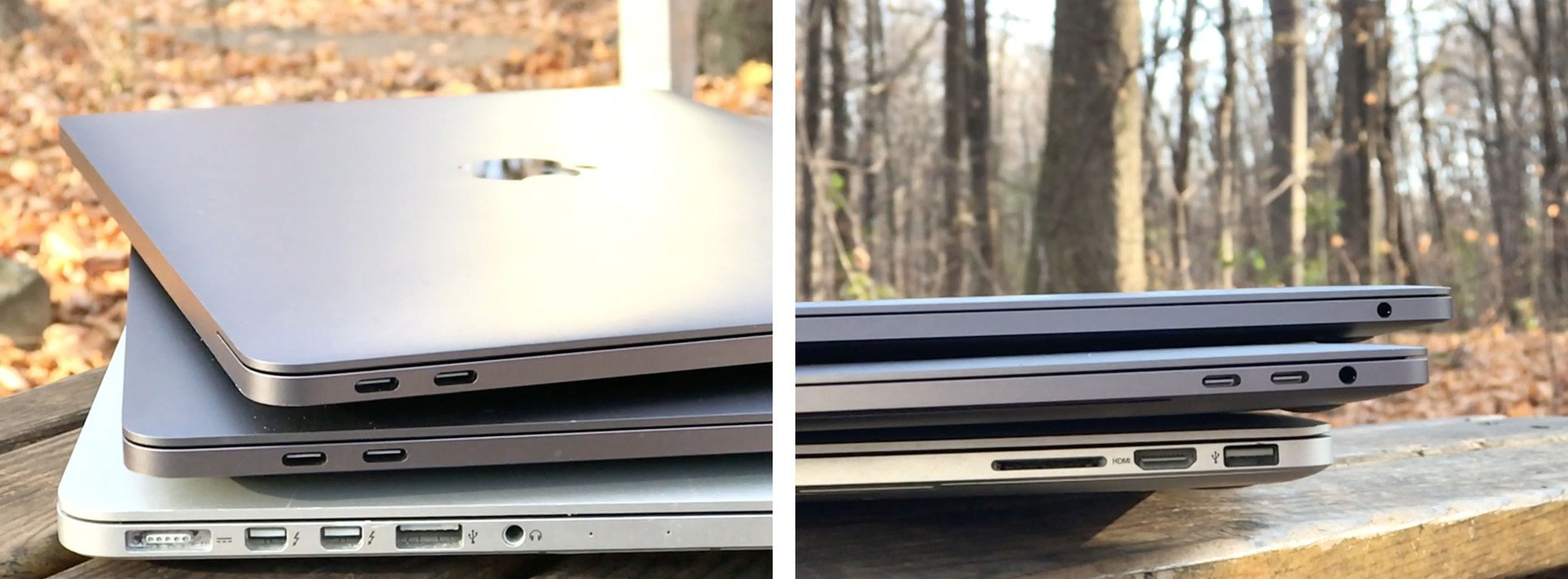
USB-C is also confusing. It looks like Thunderbolt 3, since they share the same plug design, but not all USB-C ports are Thunderbolt 3 ports and not all USB-C cables support Thunderbolt 3, making things terribly convoluted for customers.
Dongles are legitimately annoying but because standards change over time and ports cannot, they've become a fact of life. I had FireWire and VGA and DVI and mini DisplayPort dongles, now I have ethernet, USB-A, and HDMI.
Alex Lindsay, among others, wished Apple had left the right side of the MacBook Pro alone: HDMI, USB-A, and SD Card for everyone, and loaded up the left side with USB-C. That would have been a great transitional machine for some people for some years.
You can ditch dongles when they bcome outdated, though. I have a drawer full. You can't upgrade outdated ports to get better throughput or capabilities, though.
I do find two USB-C ports to be too few on the entry-level MacBook Pro. And I find the difference in throughput on the four ports on the mid-level MacBook Pro to be something no human should ever have to think about. Mostly, I think Apple should have include adapters in the box, much as the company did when it removed the 3.5mm headphone jack from the iPhone. Just one USB-C to USB-A adapter in the MacBook Pro box — and in the iPhone box — would have taken the sting out of the transition for any customers.
Touch disbarred
The Touch Bar should either be discontinued or made optional for all MacBook Pro sizes and configurations.
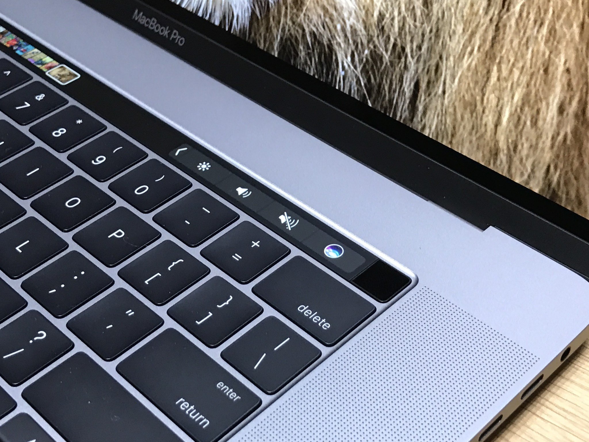
I don't use Touch Bar a ton but I use it far more than I ever used the function keys. For people who "grew up" using them, I'm sure the esc and function key row are wonderful. For people new to computers, though, I think they're impenetrable.
Steve Aquino, writing for Steve's Blog:
I've read many articles and heard many podcasts where prominent members of the community deride the feature and question its future. These criticisms, while legitimate, sting me personally because I like the Touch Bar.It stings because, in my usage, I find the Touch Bar to be an invaluable tool when I'm using macOS. Where it shines considerably is as an alternative to keyboard shortcuts and the system emoji picker. Tapping a button on the Touch Bar is far more accessible than trying to contort my hands to execute a keyboard shortcut or straining my eyes searching for an emoji. In addition, the Zoom feature—one of the Touch Bar's many accessibility features—makes seeing controls much easier.
When Steve Jobs announced the iPhone, he showed many of its competitors and explained the problem they all had was in the lower 40: the keyboards. They couldn't change. Different apps wanted different keyboards and couldn't have them and, if you come up with a new feature, you couldn't ship a new key.
The multitouch display with multitouch keyboard solved that problem for phones and tablets but not for laptops. Perhaps, one day, the fullness of the force touch technology will bring real simulated textures and virtual, changeable, keyboards, but we're not there yet.
Face ID will render Touch ID on MacBooks irrelevant and Apple, if it wants to, will be able to call a Mulligan on the Touch Bar as a whole. My hope is that it neither continues nor disappears. My hope is that it significantly improves.
The idea of a keyboard that has some degree of contextual flexibility is hugely appealing on the Mac. With proper Taptic support and some other improvements, perhaps Touch Bar could become a better tool for more people. Maybe even most people.
(Touch screens are a separate issue. I'd still like to see Apple add basic touch navigation to the Mac display.)
That charger
USB-C PD charging and replaceable charging cables are great advances that should be kept. USB-C PD is the reason I didn't include battery life in this list — occasional needs for extended battery life can be achieved with inexpensive USB-C PD batteries.But Apple could make their chargers and cables so much nicer — and they only need to look to their own recent past.
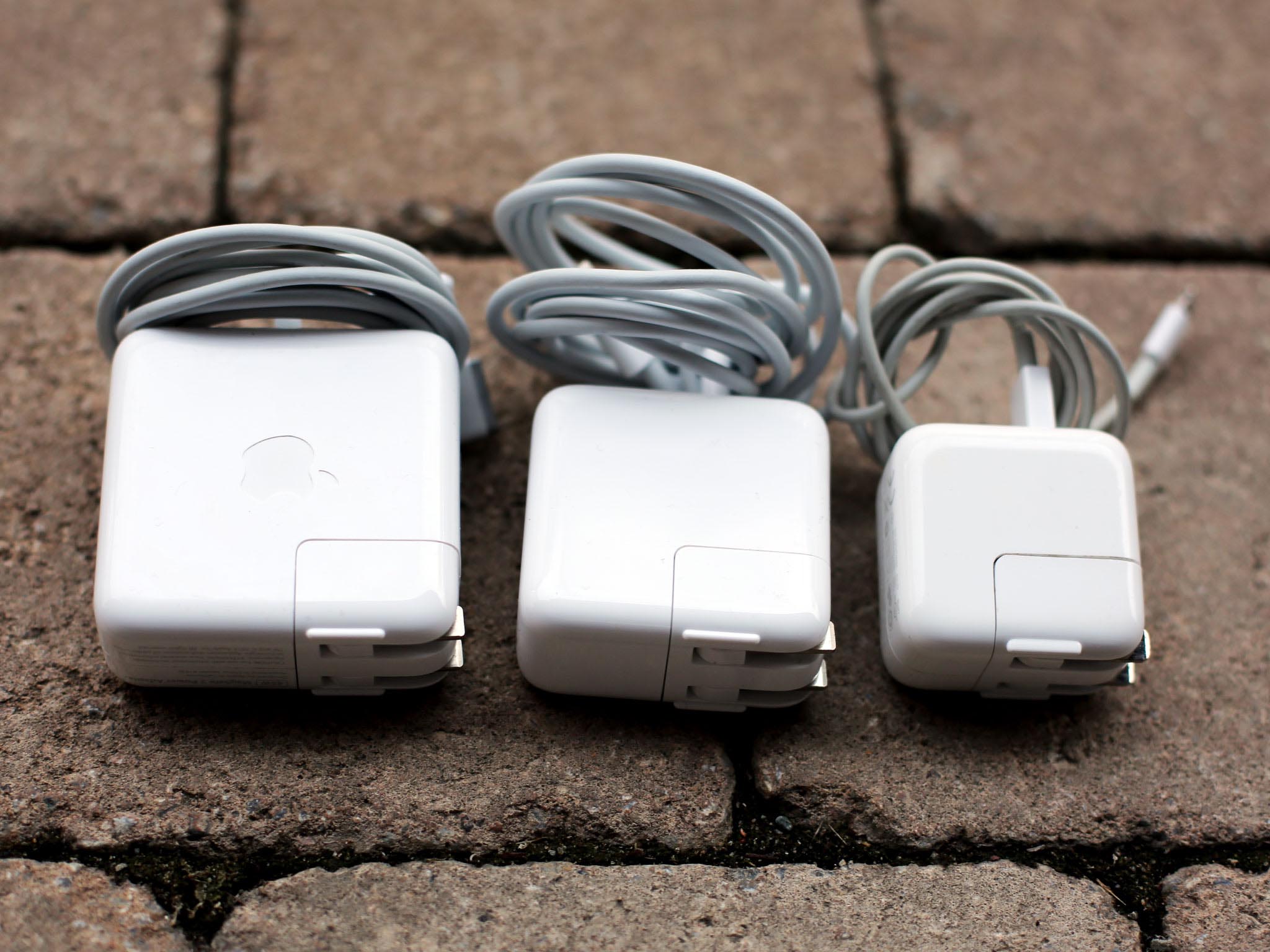
The move to USB-C charging has been a huge win for me. I can charge from any port at any time, meaning the days of having to contort myself or my cable just to plug in AC power are over.
But in giving us USB-C, Apple took away a lot of what made the old chargers great. Including the extension cord in the box. And the horns on the brick for easy wrapping. And the light on the cable so you knew you were charging. And the breakaway safety of MagSafe.
Taking away the extension cable in a product that already requires a lot of change adaption from customers just seems unwise. Adding the sound to signal charging is great for low-or-no-vision customers but removing the light is terrible for low-or-no-hearing customers.
iPad has existed without MagSafe since inception, and it's clear iPad-style charge-at-home-use-for-hours-on-the-go behavior is what Apple is pushing with MacBooks now, but old habits die hard.
This seems like the kind of problem Apple is typically good at solving.
The most divisive MacBook Pro ever
People are forever telling Apple that it's wrong. More often than not, it's proven right. But that creates a problem: Apple becomes immune to being told it's wrong.
If the company learns that it just has to wait a while for its customers to overcome old habits or move past misconceptions, legitimate issues get through. It's happened in the past with the "fatty" iPod nano and buttonless iPod shuffle. Apple rolled both back the very next year.
People inside Apple seemed convinced the new keyboards and Touch Bar were the future and thought customers would love them as much as they did. Many do. Many don't. And maybe too many don't.
I'm not of the opinion Apple should revert back to the 2015 MacBook Pro. But I agree Apple needs to iterate forward on the current design.
If you love the MacBook you can't get one from anywhere else and that makes it incumbent on Apple to meet the needs of as many customers as possible.
Tweak the keyboard. Tweak the Touch Bar. Add an even more powerful version on top of the product line, opposite to the lower-end version, for people who really do want or need as much Mac as Apple can squeeze into a laptop.
2018 is right around the corner. With it will come new MacBooks Pro (Intel's horrible roadmap willing). And Apple has an opportunity to deliver a machine almost every MacBook lover can truly love.

Rene Ritchie is one of the most respected Apple analysts in the business, reaching a combined audience of over 40 million readers a month. His YouTube channel, Vector, has over 90 thousand subscribers and 14 million views and his podcasts, including Debug, have been downloaded over 20 million times. He also regularly co-hosts MacBreak Weekly for the TWiT network and co-hosted CES Live! and Talk Mobile. Based in Montreal, Rene is a former director of product marketing, web developer, and graphic designer. He's authored several books and appeared on numerous television and radio segments to discuss Apple and the technology industry. When not working, he likes to cook, grapple, and spend time with his friends and family.

