5 best things about Apple Music Classical
What's great about Apple's new app.
Apple Music Classical only launched a couple of weeks ago, but I now use it so much that it feels like something that came preinstalled on my iPhone 14 Pro when I first bought it. To the untrained eye, the app may seem like a simple library trim of the main Apple Music app, keeping the same visual style and layout as the more conventional music app. Having been using it for a little while now, however, I’ve found that Apple Music Classical has some of its own improvements and quality-of-life updates that make it lovely to use – and in some ways, better than its cousin.
Having been using it for a little while now, however, I’ve found that Apple Music Classical has some of its own improvements and quality-of-life updates that make it lovely to use.
There are small things, like the text and the extra library sections, but there are also bigger things like layout improvements and the epic browse tab. It’s been tricky to get it down to five of the best things, but I’ve done it: Here are the best 5 things about Apple Music Classical.
The font
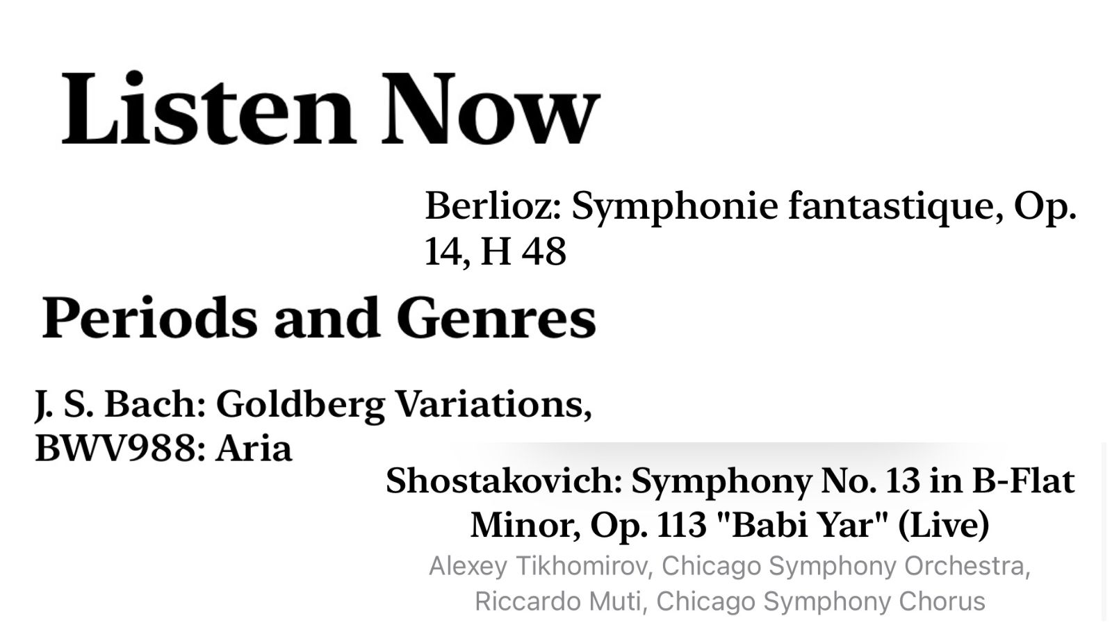
If you’d have told me that I’d be typing the words ‘the font is one of the best things about this new app’ and then said that it wasn’t even a sarcastic comment on how there’s nothing else good about the app, I’d likely have guffawed, pushed my glasses up my face, and then walked off muttering obscenities. Yet here I find myself. The font in Apple Music Classical is one of the highlights of the app, and I’m deadly serious.
The font is a more classy version of something like Times New Roman, but it adds an air of sophistication to the whole affair. It makes sense – when I boot up Apple Music Classical I want it to feel like a refined night at the Proms rather than an early morning walk home from a nightclub. It’s all over the app too, highlighting various sections and lists with a kind of posh accent and a glass of champagne.
If nothing else, it’s just a really, really nice font. If I knew more about fonts, I could tell you what it is, but I remain clueless, so instead I shall simply say ‘I like the font.’
The artwork
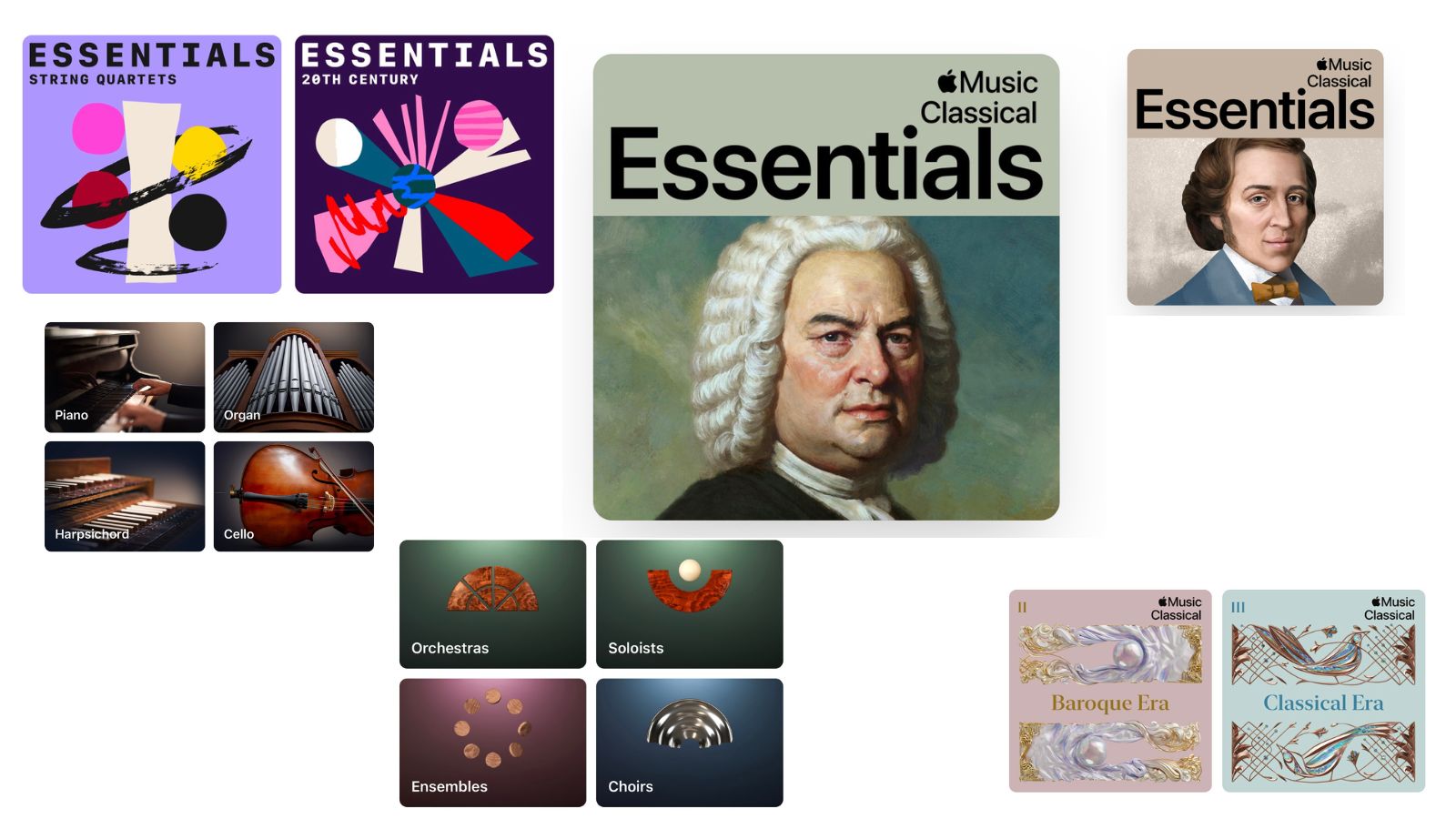
Classical music has inspired some of the best physical artwork in human history, so if you’re going to make an app based entirely around the genre then you going to have to make sure that it's filled with gorgeous art. Apple has done just that with Apple Music Classical, stuffing it to the brim with attractive pieces. From the simple images for each genre, the sections in the browse tab, and the great (if a little angry) composer profile images, Apple Music Classical has some stunning art on board.
These additions feel like more than spit and polish, they’re an integral part of the experience. The art that represents different playlists tells you the genre, the mood, and the style of the music you’re about to listen to, while the composer profiles feel like you’re reading a book about each one as you experience their work. It makes Apple Music Classical feel more personal than other streaming apps.
Master your iPhone in minutes
iMore offers spot-on advice and guidance from our team of experts, with decades of Apple device experience to lean on. Learn more with iMore!
Although someone needs to check on Bach, the poor guy looks like he just stepped on a bee.
The library
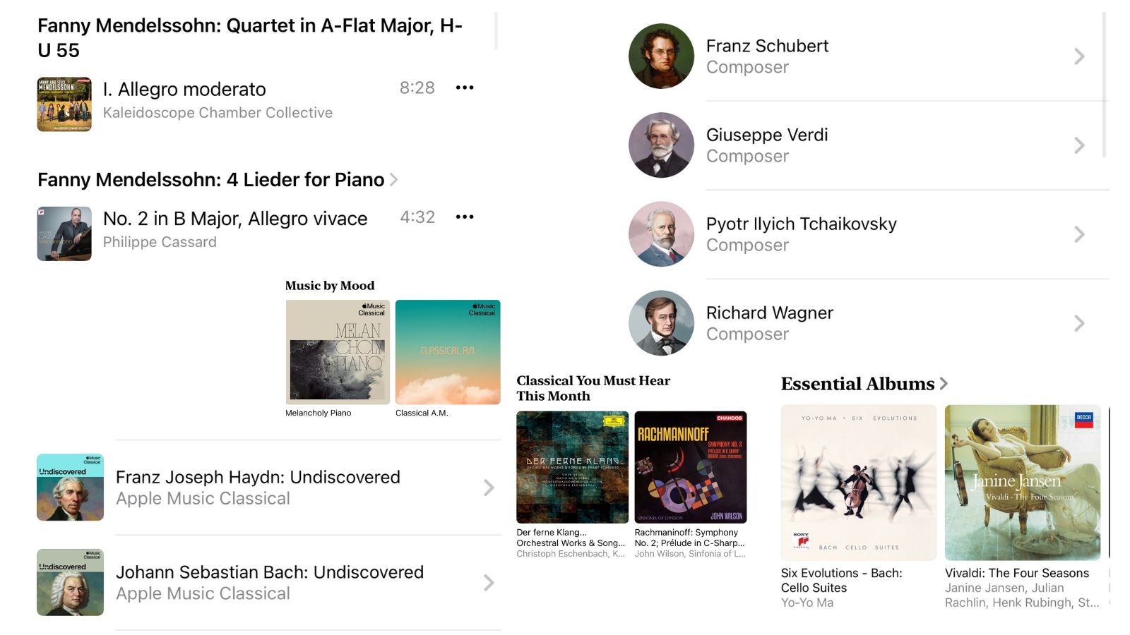
When Apple was making Apple Music Classical they could have tossed a few well-known classical tracks in there and called it a day. Thankfully, the app is chock full of an incredible range of classical music, from movie and video game soundtracks to some very niche music that you might never have heard of.
One of the highlights for me wasn’t the most niche piece, but it’s one of my favorites. I like the 2001 recording of Aaron Coplands Billie the Kid Suite by the New Zealand Symphony Orchestra, and I’ve had problems finding it beyond my CD copy in the past. One quick search on Apple Music Classical, and it was there top and center. Excellent.
Apple Music Classical and its big library have already become one of the biggest parts of my classical music discovery journey, and I can see it becoming more prolific even still.
That big library also means that you can discover more music that you wouldn’t have otherwise listened to. I love browsing around some of the suggested sections or in the curated playlists to find more music, or falling into the ever-deepening cave that is the ‘play next’ function. Apple Music Classical and its big library have already become one of the biggest parts of my classical music discovery journey, and I can see it becoming more prolific even still.
All the information
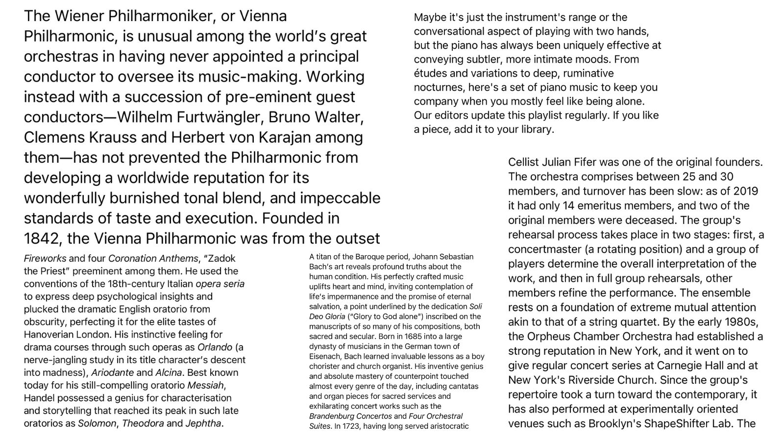
If you’ve ever wanted to learn more about the music that you listen to, then Apple’s streaming services have always been good. There’s loads of info about artists and albums, all available at the flick of a finger. Apple Classical has taken this one step further, with podcasts about composers and pieces to go with meticulously maintained and curated playlists with information about each track.
You could learn more about how a piece was composed, the inspiration behind it, who played it, and so much more. You can even learn anecdotes about tracks and compositions. Did you know for, example, that Bach’s Ich Habe Geung, one of his most popular works, was first played on February 2nd, 1727, during the Feast of the Purification? What follows from the description is a stunningly descriptive and analytical piece about the work that you’re listening to, giving you more insight into what the work means. It's something that not many other audio streaming services are good at, and Apple Music excels at it.
The search function
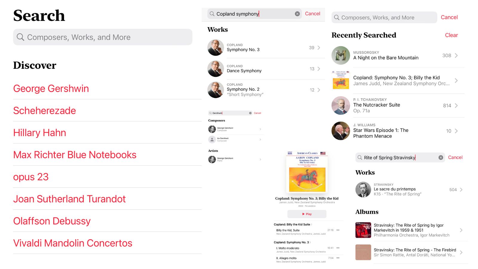
When people ask me what the best thing about Apple Music Classical is I’ll always come back to the deeply detailed search function. On the surface, it looks much the same as the search on Apple Music – there’s a big search bar, and you input some details so that you can find the track you want.
The brilliance comes with how the search actually works. Because of the nuances of classical music naming conventions, you need to be able to search more than just track name and artist – you should have recording, date, composer, conductor, orchestra, and more to be able to find the exact track you’re looking for. Apple Music excels with its new search function, and you’ll have no problem with getting right into the weeds when you’re looking for your favorite classical music recordings.
Apple Music Classical is pretty great
The service isn’t perfect. You can’t download anything from the app directly, and you have to use a weird Apple Music workaround to listen to anything offline. The fact that it's only on the best iPhone continues to be a bugbear as well, but it doesn’t stop what we do have from being excellent.
I love the app, and I love all the little facets of the classical music cube that it’s managed to replicate precisely and delicately. It works super well, and has allowed me to discover more music than I thought it would. It hasn’t replaced classical music radio stations for me quite yet, and I’ll still have my reams upon reams of MP3s on my iPod for a long time to come, but it’s added to my classical music listening experience like nothing else.

As iMore's Senior Staff writer, Tammy uses her background in audio and Masters in screenwriting to pen engaging product reviews and informative buying guides. The resident audiophile (or audio weirdo), she's got an eye for detail and a love of top-quality sound. Apple is her bread and butter, with attention on HomeKit and Apple iPhone and Mac hardware. You won't find her far away from a keyboard even outside of working at iMore – in her spare time, she spends her free time writing feature-length and TV screenplays. Also known to enjoy driving digital cars around virtual circuits, to varying degrees of success. Just don't ask her about AirPods Max - you probably won't like her answer.
