tvOS 17.2 brings huge changes to Apple TV — here's what's new
Apple has given tvOS a slight refresh to make it clearer and easier to use.
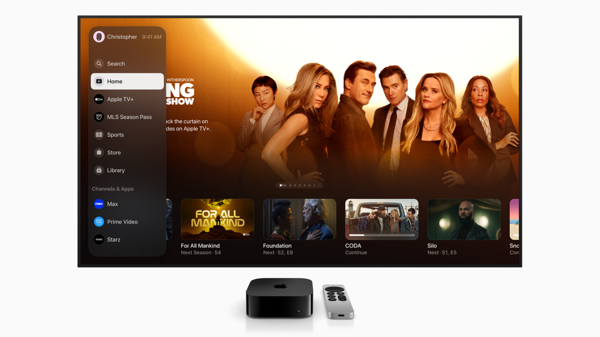
Getting your Apple TV 4K to update to a major new version of tvOS can be a lot of fun. It means you can use new features that could change how you use the device, and a brand new Apple TV interface in tvOS 17.2 is a great example of this.
In a press release announcing the new update, Apple details how its new TV app showcases TV shows, movies, and sports in one place with a better interface. There's also a new sidebar, where you can switch between profiles, and look at recommendations for other shows.
You can update to tvOS 17.2 by going to Settings > System > Software Updates on your Apple TV. To note, the redesigned TV app is also available in iOS 17.2 and iPadOS 17.2.
Here's what's new, what's better, and what could do with some improvements in tvOS 17.2 and the new Apple TV app.
What's changed in the Apple TV interface?
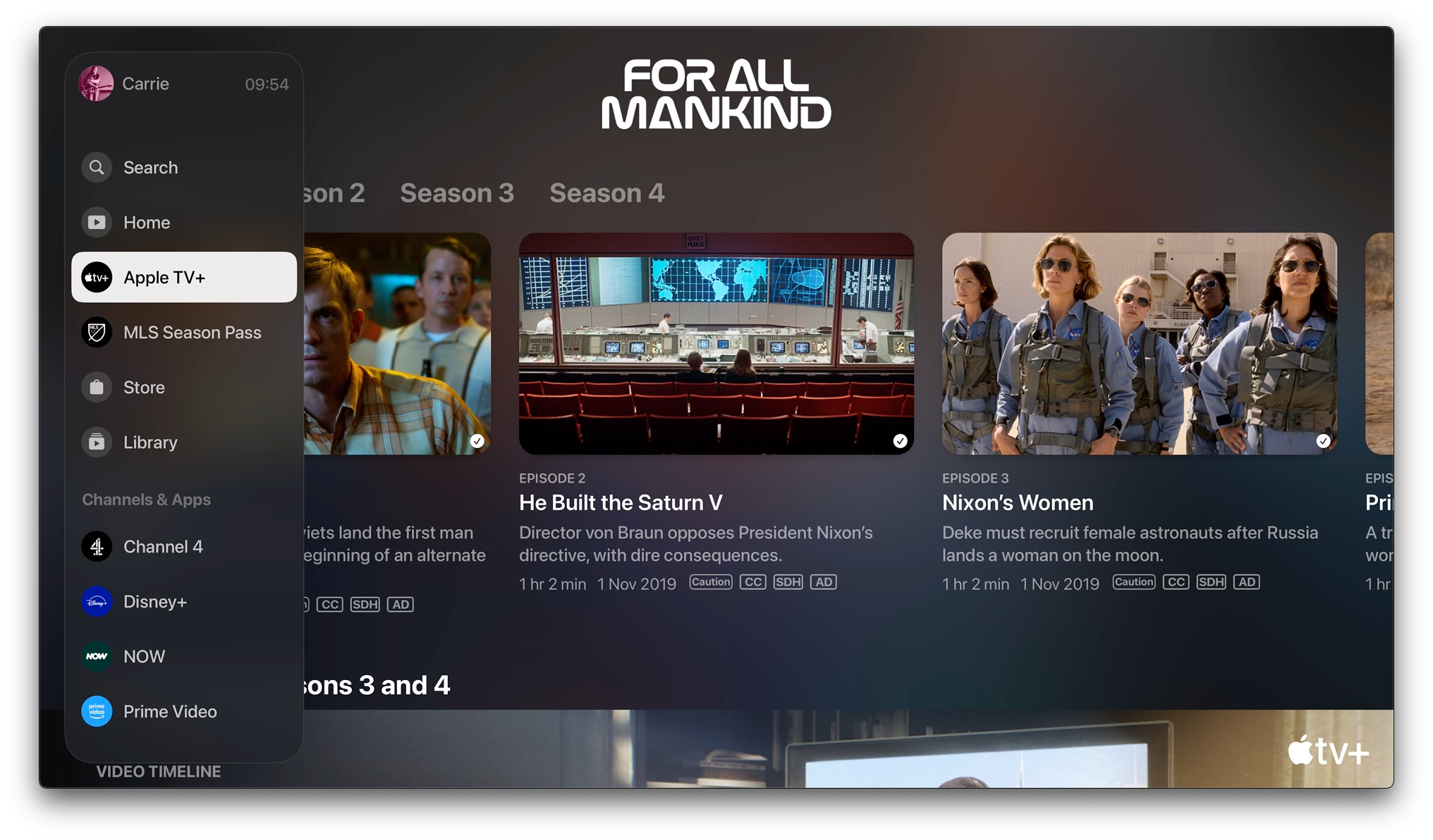
There are two key changes. The first is that Apple has removed the dedicated iTunes apps for music and for movies: everything to do with TV and movies from Apple is in the main TV app now. And the second is that Apple has revamped the main TV app interface.
The most obvious change is that instead of a couple of tabs at the top of the screen, there's now a sidebar down the left-hand side of the screen, just like you're probably used to in Netflix, Disney Plus / Hulu, and other prominent streaming apps.
The new Apple TV sidebar
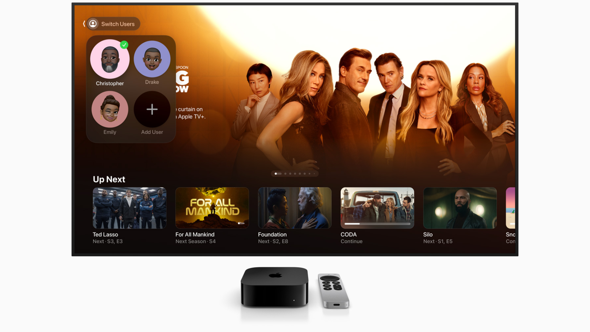
The whole point of the redesign is to make navigation simpler and easier, and that means the sidebar is very straightforward. At the very top of the sidebar, there's your name and account icon, with the current time next to it. Beneath that, there are dedicated sections: Watch Now, Apple TV Plus, MLS Season Pass, Sports, Store, and Library.
Master your iPhone in minutes
iMore offers spot-on advice and guidance from our team of experts, with decades of Apple device experience to lean on. Learn more with iMore!
In tvOS 17.2, you can't remove MLS Season Pass or Sports from their sections: unlike third-party channels, which you can hide or remove. Apple is doing Stocks and for now, at least, making the presence of its own apps and channels non-negotiable.
If you subscribe to additional channels that integrate with the Apple TV app – which is most of them but not Netflix – you'll then get individual icons for those, so for example, if you subscribe to Comedy Central or Discovery you'll see options for those. Available services currently include ABC, CBS, Comedy Central, Discovery, ESPN, Hulu, Peacock, and Prime Video.
If you select a channel, you'll be taken to the page for that particular channel. There are no great surprises here: the bulk of the screen is initially dedicated to whatever show is currently being promoted by that channel, and then you have a scrollable horizontal Up Next for that specific channel. Up Next now works with installed apps as well as with channels. Scrolling vertically will bring up shows and movies in the service's various categories.
Changes to the 'Watch Now' section
As before, the main Apple TV interface has a Watch Now section at the top of the shows. Below that is a new 'My TV' carousel, which replaces the old Channels section and shows suggestions from the various channels you're subscribed to. If you don't have any channels, you can subscribe from the Store section of the sidebar.
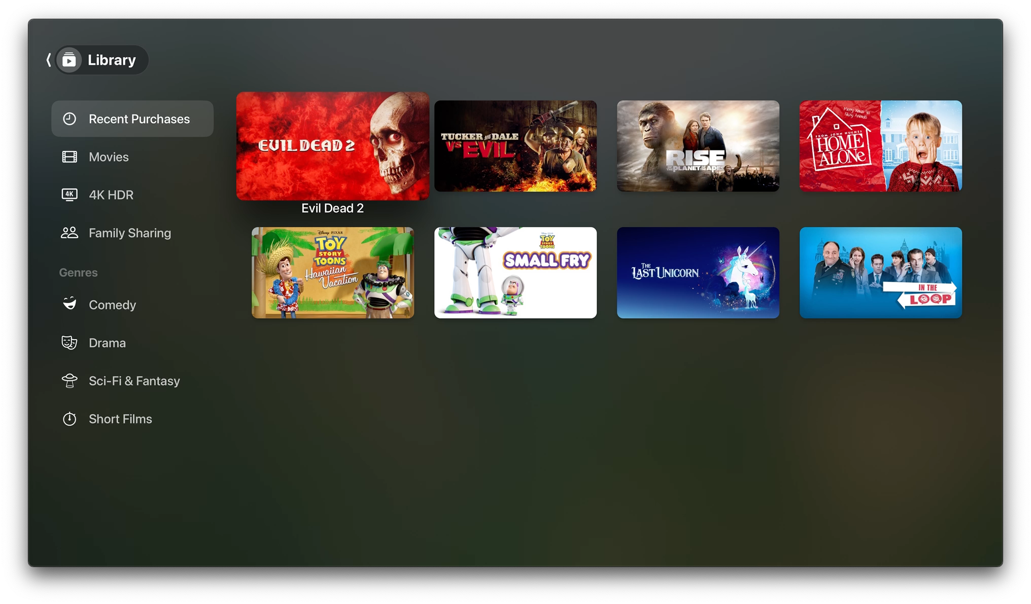
Other parts of the interface are currently unchanged. Your Library looks like it did before, with the same categories: Movies, 4K HDR, and Family Sharing, followed by the various genres of movies and TV shows. And the Store hasn't changed either.
More improvements could still be made
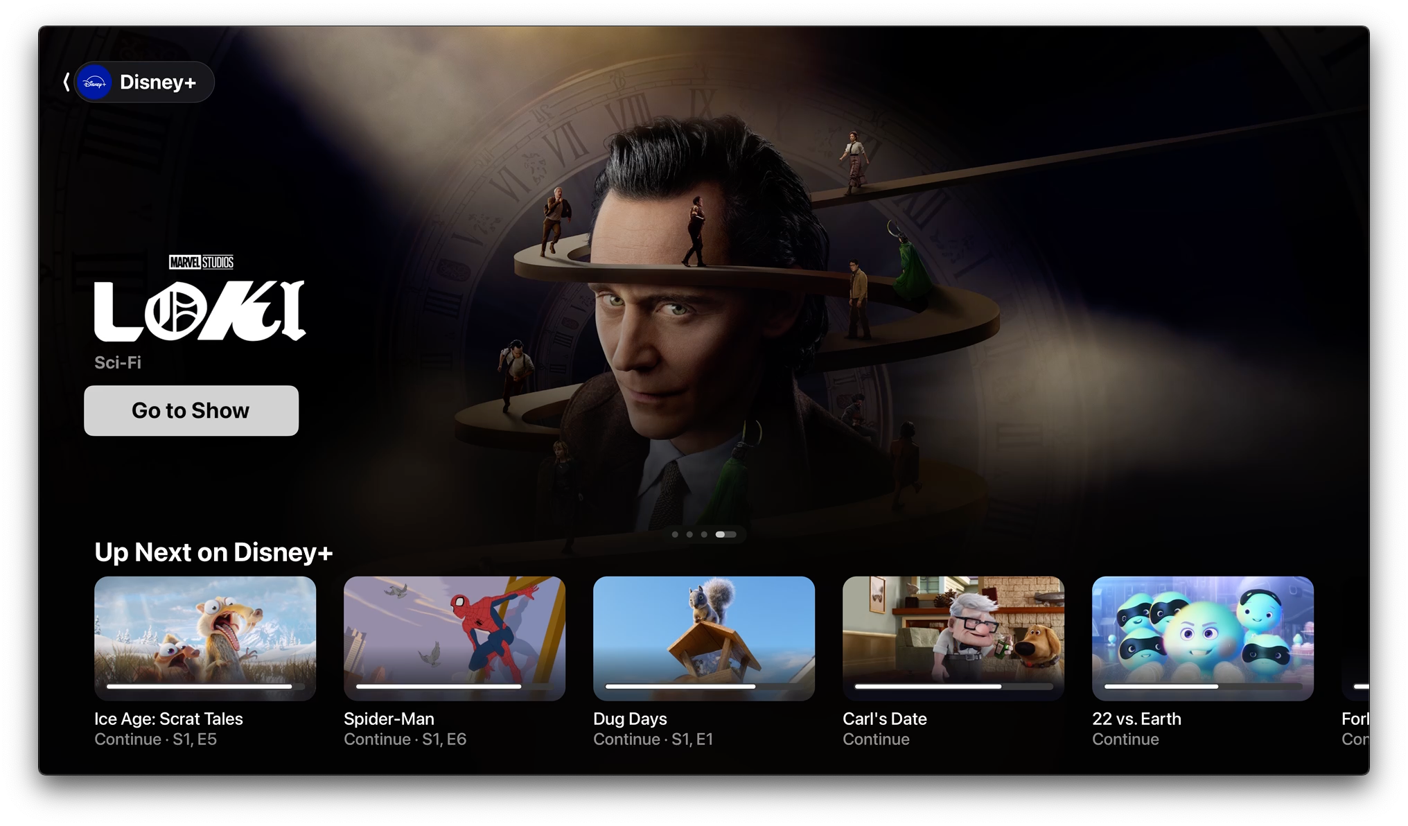
The new interface is a vast improvement, and it makes third-party channels such as Disney Plus feel much more integrated with the rest of your Apple TV experience. Tapping once on the Siri button on the Apple TV remote now brings up a search bar, which is also very welcome for. However, there's still room for improvement.
Netflix's ongoing unwillingness to be integrated alongside other channels is a pain, and if you launch a show that runs in an app you'll be taken out of the Apple TV app and into the show's dedicated app instead. That one's probably inevitable.
Another irritation isn't Apple's fault: some services, such as Prime Video, could do a much better job of separating their paid content from your already-paid-for subscription content. That means that you'll often think "Ooh, I'll watch that now!" only to have Amazon demand some money. It's not what we'd call best practice.
All in all, though, tvOS 17.2 is a solid update that refines Apple's own TV app into something much more usable, while making it easier to navigate around the operating system. Have you already updated your Apple TV 4K to tvOS 17.2? Do let us know what you think of the new features in the iMore Forums.
Writer, broadcaster, musician and kitchen gadget obsessive Carrie Marshall (Twitter) has been writing about tech since 1998, contributing sage advice and odd opinions to all kinds of magazines and websites as well as writing more than a dozen books. Her memoir, Carrie Kills A Man, is on sale now. She is the singer of the Glaswegian rock band HAVR.
