Netflix is about to look totally different on your Apple TV and other streaming devices
New Netflix, who dis?

Netflix is one of the most popular streaming services. So of it course it has a dedicated streaming app on most platforms. But where do users watch most? On their TV, naturally. And Netflix on your TV is about to look totally different, thanks to this incoming redesign.
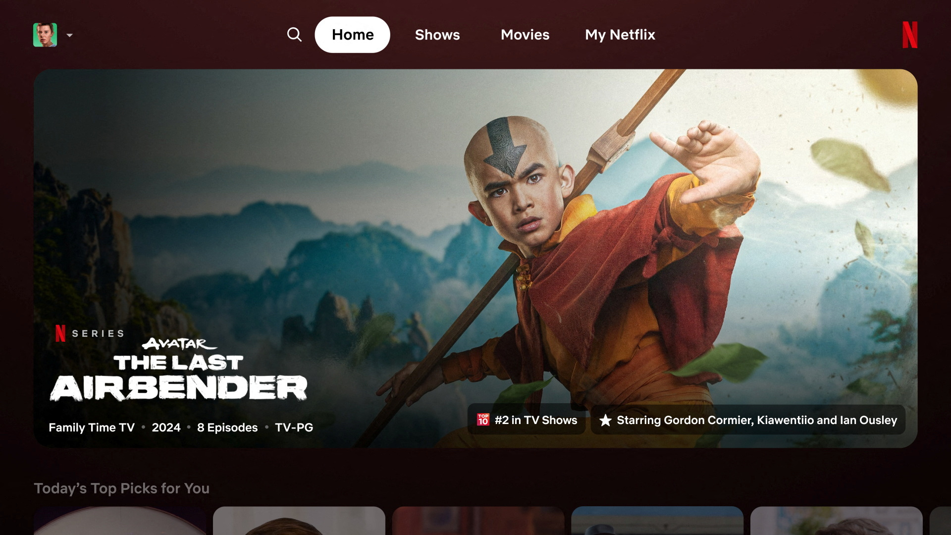
The Netflix app on the excellent Apple TV 4K, other streaming devices, and smart TVs is testing a spiffy new look. It offers a homepage where static tiles are gone. Now, as soon as your remote's cursor flirts with a title, the box will expand, making all that glorious content burst onto your screen.
What else is changing in the redesigned Netflix?
With this revamp, you only need to hover over a title and a mini-preview starts playing right within the tile. And, if you linger a bit longer, you’ll get all the juicy details below the box: synopsis, release year, episode count, genre. All the info is there, so there's no need to go hunting. Netflix’s current layout showcases trailers and other info at the top of the screen. The new design consolidates everything, making the whole interface feel more cohesive and less like a scavenger hunt.
According to Pat Flemming, Netflix’s senior director of product, the brand is doing this to save us from "doing gymnastics with our eyes." Bless. Netflix also ditched the clunky left-side menu. Instead, you’ll find a sleek new menu bar at the top with options like search, home, shows, movies, and My Netflix.
Some of the old menu's clutter, like Categories and New & Popular, has been shown the door. But fret not, Categories is still accessible through the search tab, and the new My Netflix tab, which debuted on mobile last year, is now part of the TV experience. This nifty tab offers personalised recommendations and quick access to your recently watched or saved titles.
This overhaul is Netflix's "first effort" at what they think will be a smashing new TV experience. With the platform dabbling in live events, the new design couldn’t come at a better time. For now, this redesign is being tested with a select group of subscribers on smart TVs and streaming devices. If all goes well, Netflix hopes to roll it out to the masses in the coming months.
More from iMore
- FaceTime in tvOS 17 is a game changer — here's how I'm using it
- Apple TV 4K (2022): Specs, price, model differences, release date, and more
- Best speakers for your Apple TV 4K
Master your iPhone in minutes
iMore offers spot-on advice and guidance from our team of experts, with decades of Apple device experience to lean on. Learn more with iMore!

Connor is a technology writer and editor, with a byline on multiple platforms. He has been writing for over eight years now across the web and in print too. Connor has experience on most major platforms, though does hold a place in his heart for macOS, iOS/iPadOS, electric vehicles, and smartphone tech.
