My 6 favorite features in iOS 15 so far

During the Worldwide Developers Conference (WWDC), Apple revealed iOS 15 and iPadOS 15 to the masses. Both of these software updates feel more like a refinement stage since there aren't any super mind-blowing features like iOS 14 brought to the table (i.e., Home screen customization). However, I've been on the iOS 15 developer beta (and for iPadOS 15 as well), and so far, I'm quite impressed with the next iteration of iOS.
Here are my favorite features in iOS 15 so far.
Focus

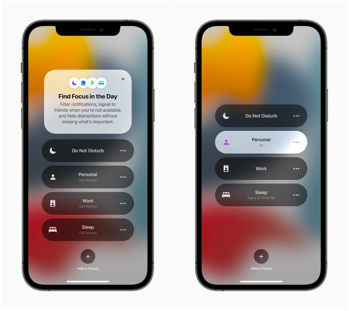
One of the new features in iOS 15 is basically Do Not Disturb mode on steroids, and it's called Focus. With Focus, I can create different Focuses for things like work, entertainment, personal, and whatever else. While Focus is on, it only lets notifications through for people and apps that I mark as exceptions, and I'll still get time-sensitive notifications. You can also choose specific Home screen pages to appear while a Focus is on, giving you only the essential apps you need for the Focus and eliminating all other distractions. Other people will also be made aware of your DND or Focus status through iMessage or even Spotlight search, which I find to be a nice touch.
Focus has helped me cut out unnecessary distractions and notifications while I have it on. This makes me feel more productive than ever when I'm using my Work Focus or allows me to enjoy my binge-watching sessions in my Entertainment Focus. And letting me choose certain Home screens to show up only while in a Focus means more flexibility with customization, even if it may not be what I originally wanted.
For example, my Work Focus only has a large Fantastical widget showing the date and month, along with my agenda underneath. I only have work essential apps on a single page, so I don't waste time on Twitter or Facebook on my phone while working.
I've been using iOS 15 on a secondary iPhone 11 Pro, so it's not on my main iPhone 12 Pro (I don't put betas on my primary device in case something goes catastrophically wrong). But once I get iOS 15 on my main phone, I will be making use of Focus much more, and I look forward to using the on-device AI to have my different Focus modes kick in automatically based on my usage. As of right now, I've just been turning it on manually when I need them.
Notifications
While this can be considered part of Focus itself, notifications got a nice revamp in iOS 15, and you don't need to use them exclusively with a Focus either.
Master your iPhone in minutes
iMore offers spot-on advice and guidance from our team of experts, with decades of Apple device experience to lean on. Learn more with iMore!
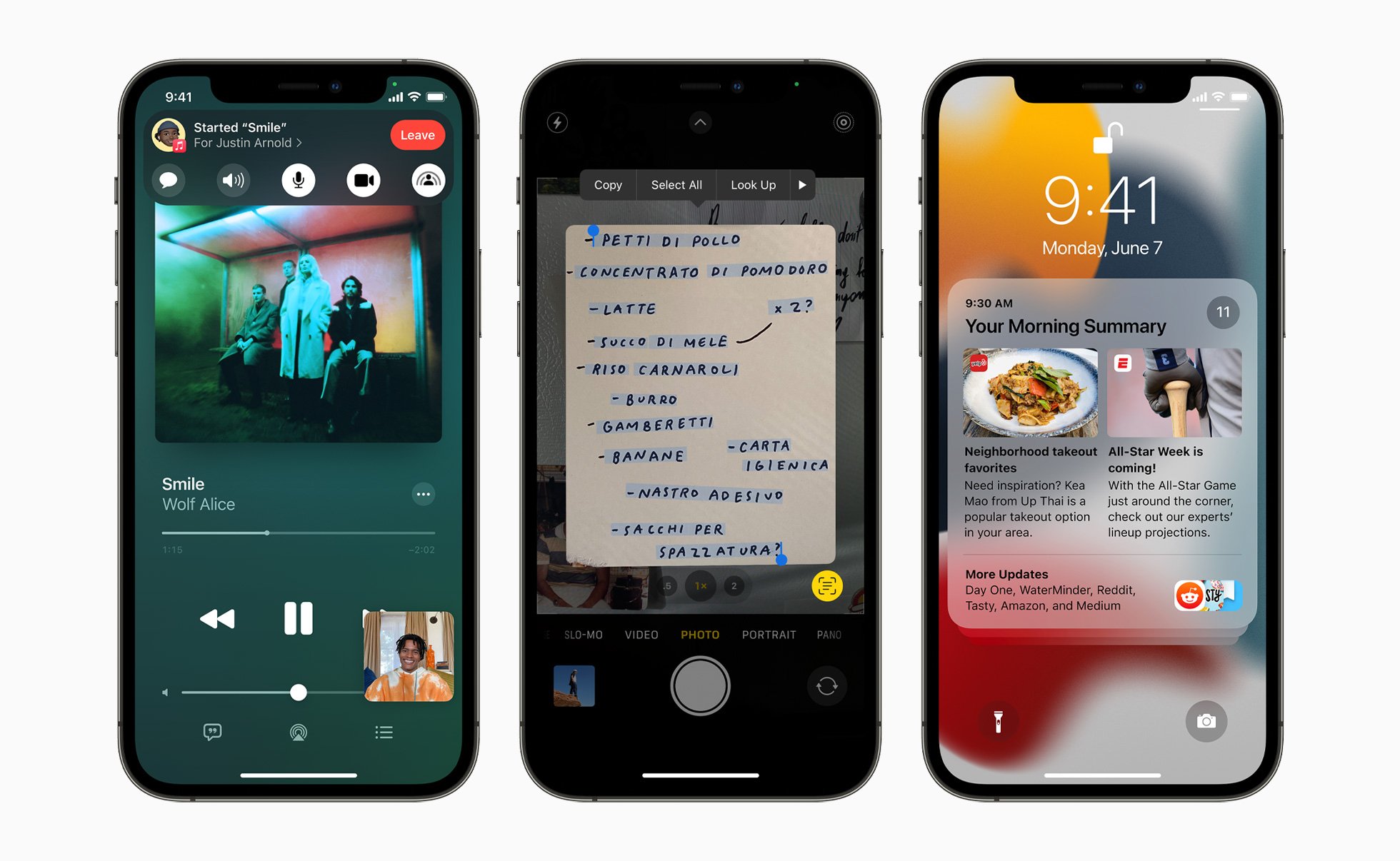
You can now have Notification Summaries sent throughout the day at times you choose. A Notification Summary basically groups together low priority notifications into an expandable bundle, so you don't see a million different notifications in a huge list on your Lock Screen. If you want to see all the things you missed, tap the summary to expand them. It also groups notifications from a single app (or, in the case of Discord, a single server), which is similar to what Android has been doing for years.
All-in-all, it is a much more streamlined and easier way to get your notifications at times that you specify, rather than get bombarded throughout the day. You can also set up as many Scheduled Notification Summaries as you want, in case that makes it easier for you. It's a fantastic change that I have been particularly enjoying during the beta testing phase.
Improvements to Messages

One thing that I tend to do a lot is send a barrage of photos to my husband or family in Messages. This usually ends up with a lot of scrolling through to see all of the images, and if more messages come through while you're scrolling, well, have fun with that rubber band effect.
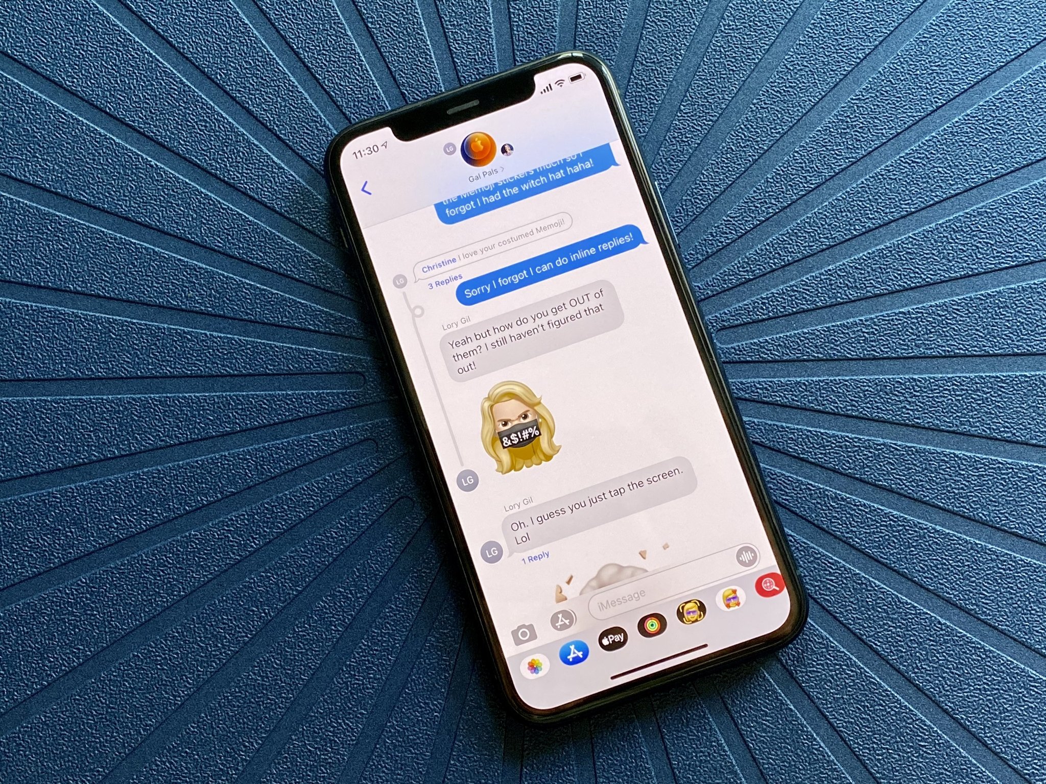
Apple introduced photo stacks and collages in Messages with iOS 15, which will be a huge lifesaver for me, personally. If several images are sent in a single message, these photos will be shown as a "stack," which you would tap to expand and view all images. It's going to be a lot less clutter and a much more streamlined way to view many images at once, like vacation photos.
I also get sent a lot of links for news stories (though not necessarily from Apple News) and other things, so the Shared With You feature is another nice addition. I look forward to just going through all of the links and other multimedia that I receive at the end of the workday in one place, like Safari or Apple News, though Share With You also works with Podcasts, Apple TV, Apple Music, and Photos.
Better Health

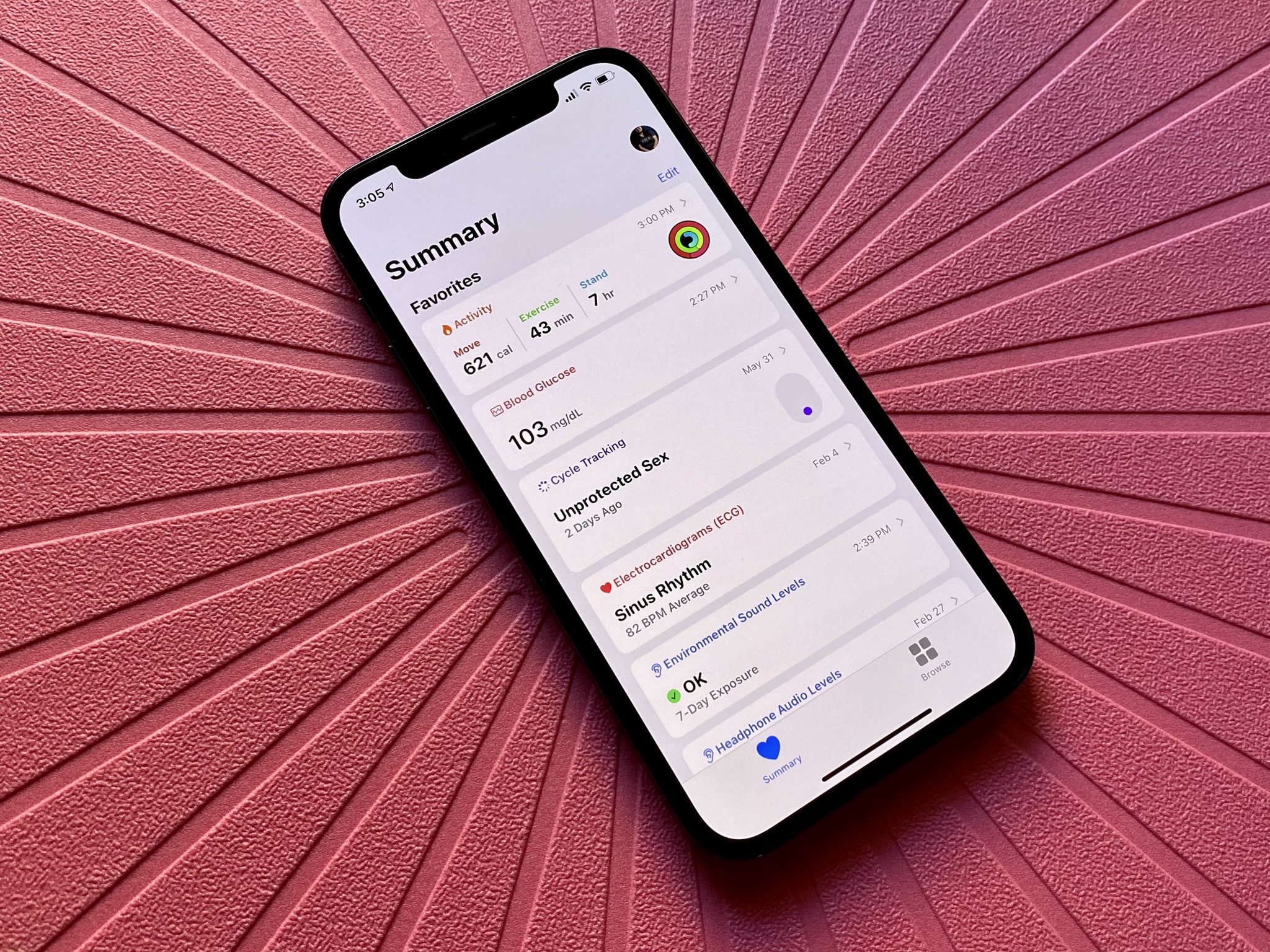
Health has been a biggie for me the past few years since I've been diagnosed with Type 2 diabetes, and I am now also pregnant. While I am disappointed that the Health app is not bringing native food tracking like previous rumors were pointing to, I am still excited for the upcoming changes in the Health app in iOS 15, which include Walking Steadiness, new Trends, and improved Health Reports.
The updated Health Report is a big feature for me, especially since I constantly have to do lab work because of my pregnancy. Previously, while you could get the results of your lab reports from places like Quest Diagnostics in the Health app, it didn't do much to explain what all those results mean. Now in iOS 15, you get detailed explanations of most results, which helps you understand what that means for your overall health and well-being. I mean, yeah, your doctor will probably go over the results with you on your next visit, but I also like to know what the heck I'm looking at for each metric too.
Trends is another thing that I'm excited about. Now I'll be able to see at-a-glance how I've been doing on certain health measurements over the past few weeks and whether I'm doing better or worse overall. And while I'm not too worried about my Walking Steadiness, it's a nice new feature that lets you see how good your balance, stability, and coordination are while moving. You even get notifications if your risk of falling increases, and it will give you advice on exercises to help increase your overall stability.
I've said it before, but Apple has made access to health data more accessible for everyone, especially with the best Apple Watch, so I am eager to see how these new Health app changes affect users in iOS 15.
Safari refinements
Safari is getting some big changes in iOS 15 as well, including the ability to customize your start page, new tab groups, and the new placement of the address and search bar. In regards to the latter, all I can say is rejoice! It's about time, honestly.
While I don't feel the need to change much about the start page myself, I do like the fact that I can now add a background image to it. This lets me add a personal touch to my Safari browser, which is nice. For others, changing the sections that appear on the start page gives more flexibility and control over what you see whenever you open a new tab.
Speaking of tabs, I love the new tab management in Safari, including tab groups. It is so much easier to see all of your tabs at a glance versus the cumbersome method in previous iterations of iOS. It's much more akin to what you get in Safari on Mac, where you view all tabs in a single view. Tab groups will also be insanely useful for me because I usually end up with over 200 tabs open at once on my iPhone because of all the various links I tap on. With tab groups, I'll be able to organize my tabs into easily recognizable groups for work, shopping, video game guides, personal, and more. It is definitely going to make my life a lot easier.
Finally, the address and search bar is now at the bottom of the screen rather than the top. As someone who prefers to use an iPhone with one hand whenever possible, seriously, it's about dang time. It was always a pain in the butt to reach up to the top of the screen (especially with larger iPhones) when my thumbs are usually at the bottom to type. Now, I hope we can move the bookmarks and cancel button towards the bottom, too (they're still in the top left and right corners, which is a reachability nightmare).
Home screen Widgets and App Library on iPadOS 15
With iPadOS 15, Apple finally brought Home screen widgets and the App Library from iOS 14 over to the iPad. It only took another software iteration, but it was worth the wait.
Using widgets, I have turned my iPad Home screen into an informational dashboard with no apps on the first page. I have my most used apps in the Dock, and Spotlight search is just a few keystrokes or a swipe away. I have some iPad Home screen pages with apps for certain Focus modes, but otherwise, I prefer the clean widget-only look.
Another reason why I don't want apps on my main iPad Home screen is that we now have the App Library. Since the App Library is just a screen away, I can quickly get to it from my single iPad Home screen page and search for whatever app I want to check out. And since the App Library is also accessible when you invoke the Split View or Slide Over modes for iPad multitasking, I see little reason to have app icons littering my Home screen.
What are you looking forward to in iOS 15?
These are just my favorite features so far as I try out the iOS 15 and iPadOS 15 developer betas. What are you looking forward to in iOS and iPadOS 15? Let me know in the comments.
Christine Romero-Chan was formerly a Senior Editor for iMore. She has been writing about technology, specifically Apple, for over a decade at a variety of websites. She is currently part of the Digital Trends team, and has been using Apple’s smartphone since the original iPhone back in 2007. While her main speciality is the iPhone, she also covers Apple Watch, iPad, and Mac when needed. When she isn’t writing about Apple, Christine can often be found at Disneyland in Anaheim, California, as she is a passholder and obsessed with all things Disney, especially Star Wars. Christine also enjoys coffee, food, photography, mechanical keyboards, and spending as much time with her new daughter as possible.

