New concept imagines what an iPhone-like Settings app could look like on a Mac

iMore offers spot-on advice and guidance from our team of experts, with decades of Apple device experience to lean on. Learn more with iMore!
You are now subscribed
Your newsletter sign-up was successful
What you need to know
- A new concept imagines what a Mac version of the Settings app could look like.
- The System Preferences app is long overdue being replaced.
- A Settings app would make for a more consistent experience across Apple's devices.
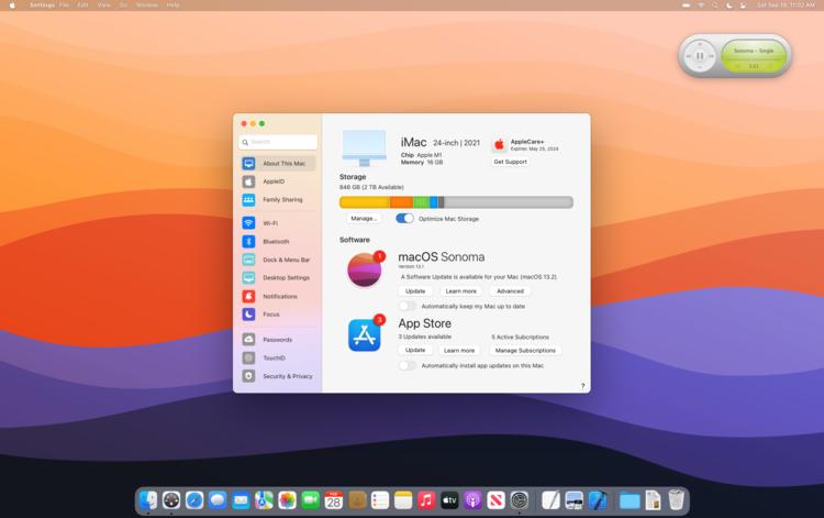
Apple's macOS System Preferences app has been around a long time, but what if it was replaced with something more modern? That's something one concept imagines with the Settings app on iPhone and iPad used as the inspiration.
This new concept was created by The Basic Apple Guy and shows us a world where the System Preferences app has been replaced by something called Settings, complete with the same icon that we're familiar with on iOS 15 and iPadOS 15 as well as earlier releases. And yes, we get the same sidebar configuration, too. Making the Settings app a consistent experience across macOS, iOS, and iPadOS would surely help people who are new to the Mac after buying a gateway iPhone, something that shouldn't be overlooked.
I'll be the first to call out that my few mockups of System Preferences are just an initial take to address some of my frustrations with the application. It by no means solves all annoyances and may conceivably create more problems than it solves, but let us take a look at some initial reimaginings of a redesigned Settings app. I wanted the new Settings app to have coherence across all menu options. In its current incarnation, preferences like 'General' look and function very differently than a more recent preference like 'Trackpad' or an even newer window like 'TouchID' or 'Apple ID'. A redesigned Settings app could modernize and simplify many legacy preferences with a fit and finish more at home to modern macOS.
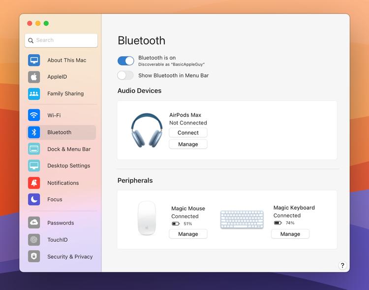
The improvements extend into each individual setting, too. Bluetooth, for instance, can display images based on the devices that are connected — blue AirPods Max? You'll see them on-screen, just as you should.

I'm a big fan of what's going on here and I absolutely agree that it's time that Apple gave the macOS preferences a refresh. You can see more screenshots and read about the reasoning behind them in the original blog post, too.
iMore offers spot-on advice and guidance from our team of experts, with decades of Apple device experience to lean on. Learn more with iMore!

Oliver Haslam has written about Apple and the wider technology business for more than a decade with bylines on How-To Geek, PC Mag, iDownloadBlog, and many more. He has also been published in print for Macworld, including cover stories. At iMore, Oliver is involved in daily news coverage and, not being short of opinions, has been known to 'explain' those thoughts in more detail, too.
Having grown up using PCs and spending far too much money on graphics card and flashy RAM, Oliver switched to the Mac with a G5 iMac and hasn't looked back. Since then he's seen the growth of the smartphone world, backed by iPhone, and new product categories come and go. Current expertise includes iOS, macOS, streaming services, and pretty much anything that has a battery or plugs into a wall. Oliver also covers mobile gaming for iMore, with Apple Arcade a particular focus. He's been gaming since the Atari 2600 days and still struggles to comprehend the fact he can play console quality titles on his pocket computer.
