The next evolution of iMore


Since the start of 2016, our entire team has been brainstorming about the next iteration of iMore. We've always had big goals for the site since its earliest iterations, and this next step puts some of our biggest ones in motion.
In short: We want to put the "more" in iMore — to help everyone live a connected, fruitful life with their technology; provide better analysis on the news that matters; and give our readers a great place to enjoy all of this content.
For the last year, we've been chatting with you about your vision for the future of iMore, and we've been rolling out various editorial and under-the-hood changes to get us on that track. Today, we're launching our first big visual and navigational change: a new iMore look and feel, along with a new website header.
The evolution of iMore
In the beginning, there was phone different — a site dedicated to giving our readers the latest and best news and tips coverage for iOS. As we found ourselves conquering iPhone and iPad, we wanted to expand our coverage, and became iMore — your place for all things iPhone, iPad, Mac, and Apple.
Now, it's come time for us to take that next step. Our iPhone and Mac world has widened beyond what Apple has to offer:
- Covering the latest Apple news and rumors now means following (and understanding) topics like politics, education, commercial zoning, the entertainment industry, privacy issues, and federal law
- More people than ever have entered the iOS and Mac ecosystem — and that means more people looking for help on base issues as well as more advanced ones
- Apple's Beats line of headphones and speakers means we're covering more audio technology than ever before
- Gaming titles like Pokémon Go and consoles like Nintendo Switch further blur the line for what mobile gaming has to offer
- With rumors that Apple will soon enter the AR/VR space, we may soon have to explore virtual reality
The old iMore structure and site isn't built to handle this, and we've struggled at times to help support our newer readers and provide great content for our core community. We believe there is a place for both, but these content types don't necessarily play well together; for a news junkie, the fifth article about Pokemon Go will be four articles too many — and we get it.
Just because we are expanding our Apple world doesn't mean you want to take part in everything that world has to offer, and we don't want to force readers who want expert analysis from Rene or Serenity to sift through six how-to articles to find it.
Master your iPhone in minutes
iMore offers spot-on advice and guidance from our team of experts, with decades of Apple device experience to lean on. Learn more with iMore!

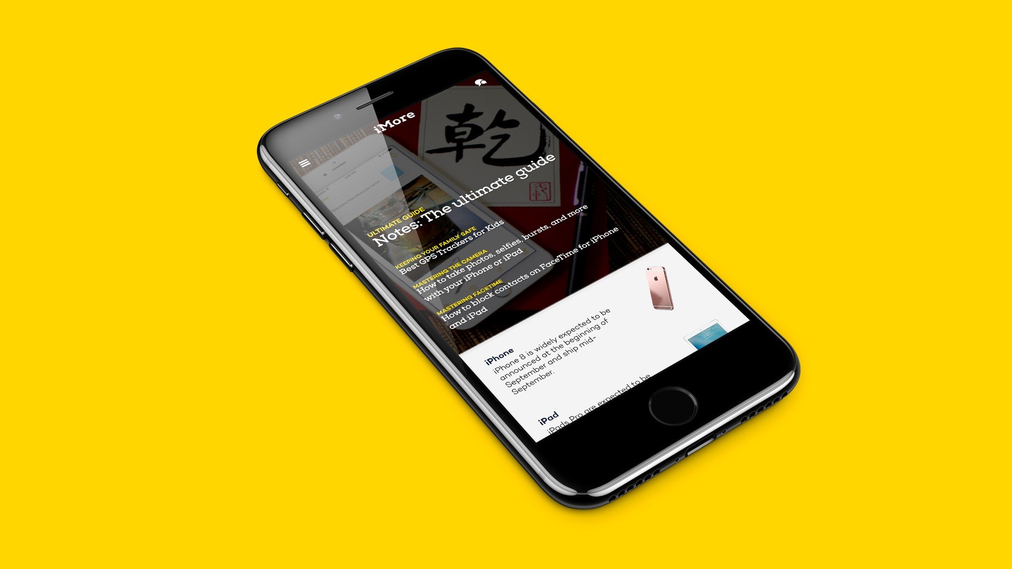
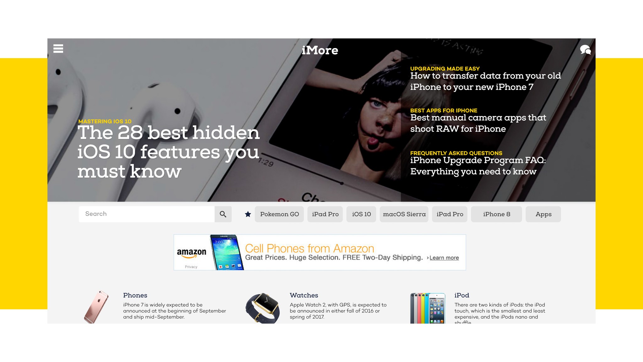
Starting today, we're beginning the process of refreshing our site to make it easier for you to find what you want to read amidst the growing technology ecosystem on iMore. We're doing that by refreshing the infrastructure of both our site, app, and forums, and a brand new iMore look and feel:


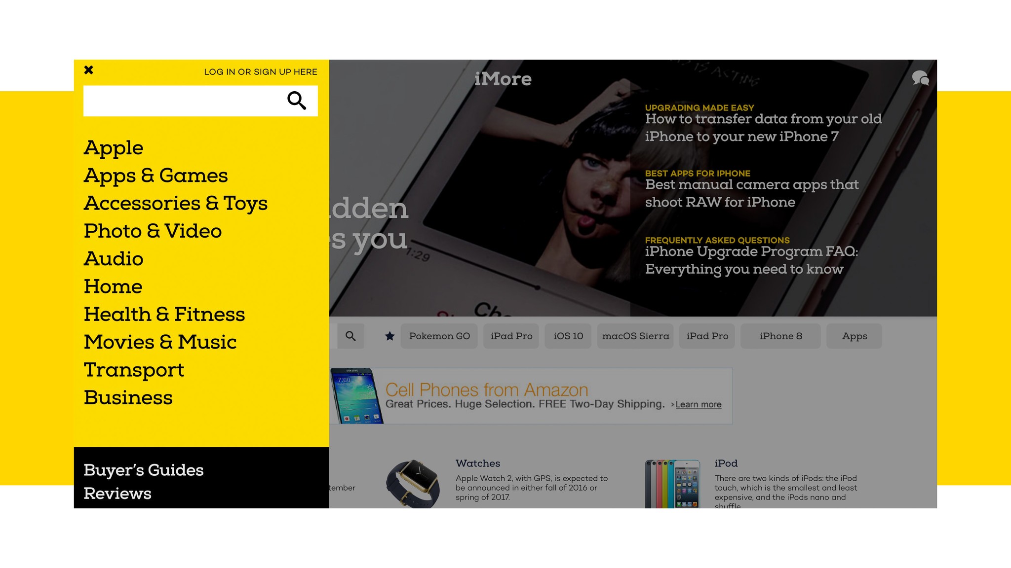
As of today, you'll see this new style appear on iMore.com as well as on our Twitter, Facebook, and YouTube channels. And in addition, we're rolling out the first piece of the new iMore.com website: a new header page, along with new navigational changes.
Previewing our new site

We're rolling out our new iMore site in pieces (more on that below), but here's a preview of what you'll get when we're all finished: Instead of one, unified roll of stories, we'll be providing readers with central hubs that cover the stories that matter to them. You'll be able to bookmark the sections you want to read; those will then become your customized home page and RSS feeds. Never want to see a how-to article again? You soon won't have to.
- Apple: This is where you'll find our core reporting and analysis from sources you trust like Rene, Serenity, Lory, Mikah, and more. If you want to keep up to date on the most important events and occurrences in the Apple world, here's the place you want to go. When our new site is completed, our Apple hub will focus entirely on news, analysis, reviews, and comparisons of Apple's products, business decisions, and cultural impact.
- Hubs: For those interested in how-tos, tips, and tricks on specific topics, we've broken down our non-analysis coverage into specific hubs like Apps and Games, Fitness, Home Automation, and more. You'll be able to visit these hubs to find device reviews and roundups, how-to content, and app coverage, and customize your home page to only show the bits you want to see.
- Destinations: Rather than create a new Buyers Guide or roundup every few months, we've built a single location for our most-often updated pages. When our rollout is complete, you'll be able to use these to check on the latest and best iPhone models, headphones, speakers, and more.

Every part of iMore's code base has undergone significant improvements; the site should load faster and perform better everywhere. Rogue ad units can still grind a page to a halt, but we now have considerably better oversight on finding those units and stopping them before they pose a nuisance to our site and our readers.
Our launch timeline
Many of the editorial decisions and underlying structural work for the new iMore have happened over the past six months, but starting today you'll see the first fruits from our visual and tech team. Rather than bombard you with an entirely new site, we're going to be launching our redesign in stages; it's a little bit messier, but it's also safer from both a tech and readership angle — we can get live feedback as we progress, and keep from accidentally breaking too many things in the process. Ideally, we're hoping to roll out all these changes over the next few months, so don't panic too much if you see a few bits of construction here and there.
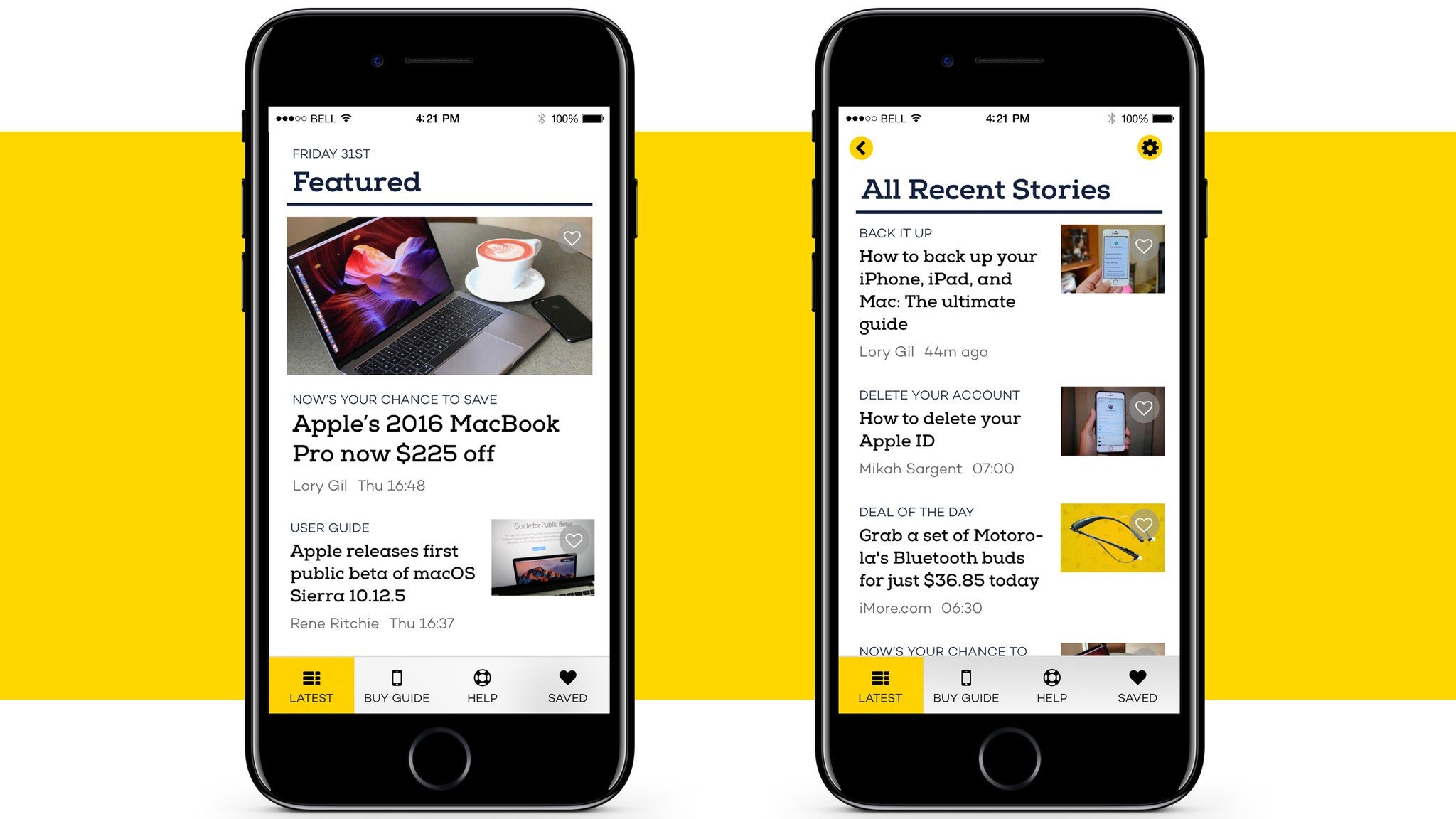
This week, we're also rolling out a new iMore app that's faster, smarter, and offers a great support team behind it. We plan to constantly test and improve this app over time; if you have feedback, please send it our way!

Today, you'll see iMore's new styles and header; next on our timeline is our Destinations section, which will contain our new-and-improved Buyers Guides and Roundups; once we've rolled those out, we hope to launch the rest of the homepage and fully transition into the next generation of iMore.
Our readers and supporters are some of the best out there, and we genuinely hope that these changes and improvements will help everyone get what they love from iMore — whether that's expert analysis, how-to coverage, buyers guides and recommendations, or app reviews. And as always, we want to hear from you as we undergo this process: If you have thoughts or feelings about these changes, let us know. More on the way soon!

