Next review: Quick, stylish, expense tracking for iPhone

Next Expense Tracking for iPhone is not only a quick and easy way to track expenses, but the interface is exactly what you'd expect from an expense tracking app if Apple themselves made it. Everything from the sounds to the way the interface works is done exceptionally well. If you have no need for a hardcore budgeting app but just want a quick look at your overall expenses at a moment's notice, Next Expense tracking may be right up your alley.
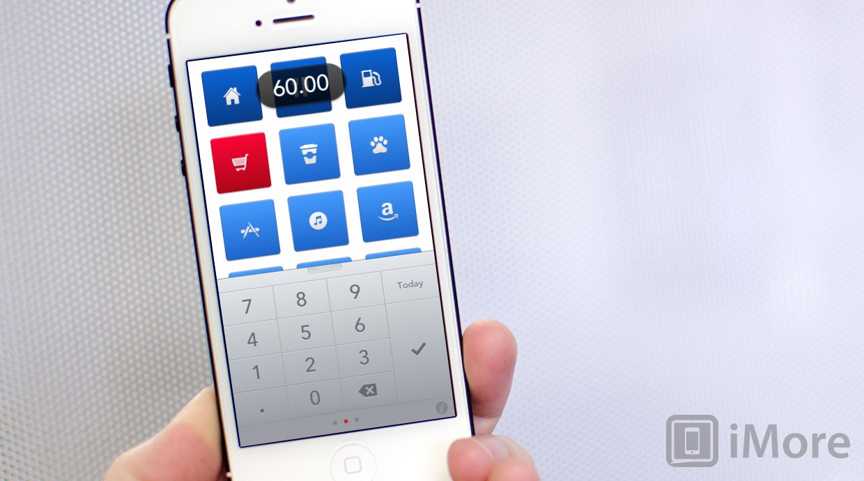
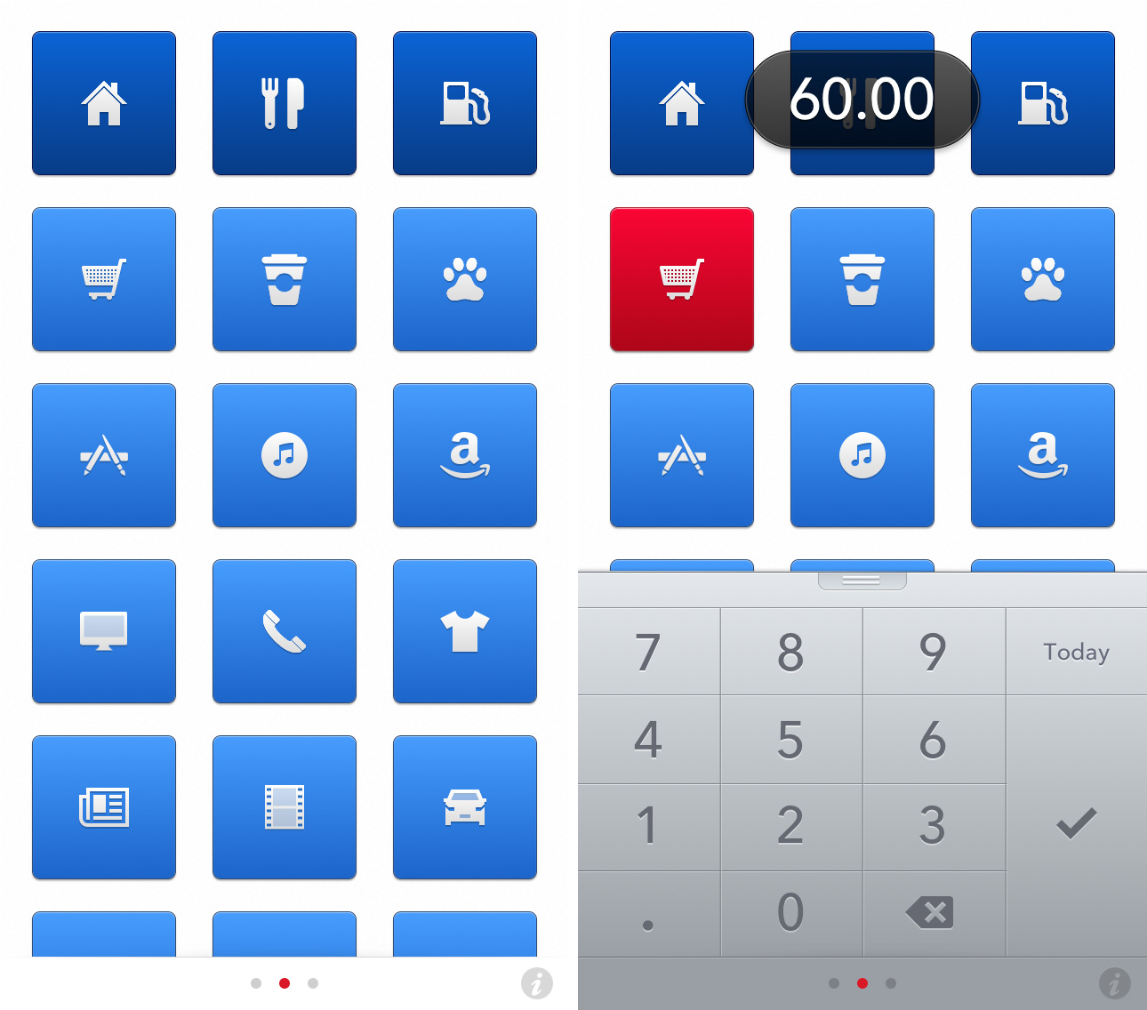
Next functions by using a series of grids with icons that represent a particular kind of expense. You can easily rearrange them by dragging them around or tap the settings button after holding down on an icon to change what type of expense it will track. There are lots of well made icons to choose from so finding ones that suit what you need to track should be an easy enough task.

Once you start entering data into Next, you'll notice that used tiles turn blue while ones you have no expenses for stay grey. As you add more and more expenses, the shade of blue will change. Darker blue, almost navy colored squares indicate higher expenses. For example, whatever icon you're tracking higher dollar items under such as a mortgage or rent tend to be darker blue since it indicates a larger payment or cash flow. Outside of typical expense options such as gas, food, and home items, you'll also find icons for liesure items such as App Store, iTunes, and Amazon expenses as well as cable or internet. This means you can keep everything separate instead of lumping them into one single category.

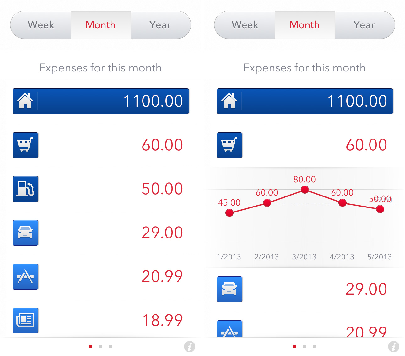
From the main grid view of Next, swiping to the left or right will break down data even further. For example, a swipe to the right will reveal a breakdown of expenses. Along the top you can toggle between week, month, and year. Tapping on any one of these expenses will review a chart showing you how expenses have fluctuated over the past several weeks or months. Obviously, this data will be a lot more meaningful the longer you use Next to track your expenses.
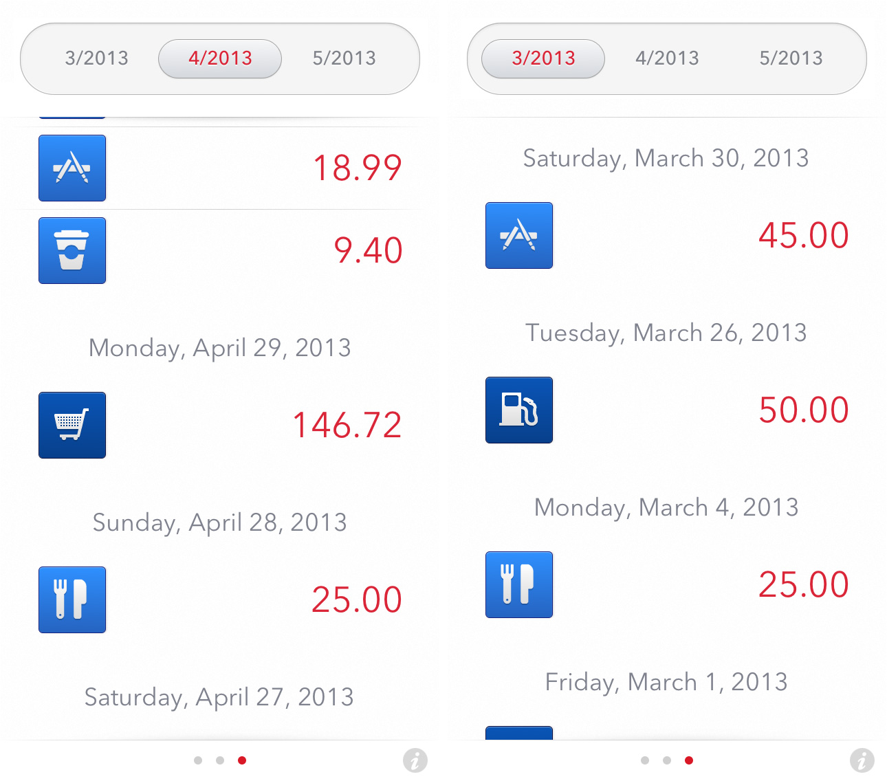
Swiping to the left from the main expense view will give you breakdown by month of what you're spending money on each day. Just tap on a month along the top and you'll see all the data for each day in that month. Again, as you accumulate more data and get better about actually tracking expenses, Next will filter in even more useful data for you to compare against past months.

The good
- Hands down one of the best interfaces of any expense tracking app available
- Tons of icons and expense types to choose from
- Provides expense data in a logical way that isn't overwhelming or hard to decipher
The bad
- No way to add more tiles or delete unused ones but 27 expense types will most likely be more than enough for most
The bottom line
If you're looking for an app to help you stick to a budget, Next Expense Tracking is not for you. You'd be better off going with an app like BUDGT. If you're only interested in tracking your expenses and viewing trends, Next is a perfect option and probably one of the better ones out there. Everything from the interface to how expenses are entered was carefully thought out and just makes sense.
If a simpler and more user friendly app is what you're after, Next Expense Tracking is definitely worth considering.
Master your iPhone in minutes
iMore offers spot-on advice and guidance from our team of experts, with decades of Apple device experience to lean on. Learn more with iMore!
- $1.99 - Download Now
iMore senior editor from 2011 to 2015.

