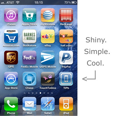
Interested in making one of those custom website icons that show up on your iPhone, iPod touch, or iPad when you hit "Add to Homescreen"? A cool icon will make visitors want to add a WebClip of your site to their home screens. They'll show it to their friends, their friends will also add WebClips of your site, and your site will zoom up the Google Page ranks. (Hey, every little bit helps!). Thanks to SockRolid from the forums, we'll show you how after the break!
It's actually quite easy, though thanks to Apple adding iPad and now Retina Display resolutions to the lineup this year, you do have to take the larger size into account:
- First, create a relatively small, square PNG file. 120x120 is the way to go if you want it to look good on iPad and crisp on iPhone 4.
- Don't worry about rounding the corners, Apple will do that automatically and even add the "shiny" treatment as well.
This is what the TiPb WebClip icon looks like:

- After you've created the ultimate icon, name it "apple-touch-icon.png"
- Now upload it in your website's root directory (typically via FTP). For example, http://www.yoursite.com/apple-touch-icon.png
That's it, you're done. What could be easier?
Now when visitors are browsing your site on an iPhone, iPod touch, or iPad, they can just hit the "action" button (on iOS 4.2, the "+" button or earlier versions of iOS) and tap "Add to Home Screen". That's will create a WebClip right alongside their apps. They get instant one-touch access to your site, and your site get more traffic. Never underestimate the power of simplicity. Especially when it's also cool and shiny.

Bonus tip: If you don't create a custom icon for your site, Apple will create one for you based on a tiny screenshot of whatever random page, at whatever random zoom-level, your visitor happened to be on when they tapped "Add to Home Screen." Image may not be everything, but as we all know it's crucially important. Don't leave it to chance. Manage your site's image.
UPDATE: Marc Edwards was nice enough to point us towards Jesse Dodd's article from Campaign Monitor on how to take your web icons to the next level.
Master your iPhone in minutes
iMore offers spot-on advice and guidance from our team of experts, with decades of Apple device experience to lean on. Learn more with iMore!
I put together three simple snippets of code which target each individual iOS device according to their pixel densities. 163dpi for the iPhone 3G/3GS and iPod Touch, 132dpi for the iPad and a whopping 326dpi for the iPhone4.
If you notice in the above code I have used apple-touch-icon-precomposed. The addition of -precomposed stops iOS from automatically rendering gloss atop my icon and rounding it’s corners. If you do want iOS to auto-apply the gloss and rounded corners automatically (so you can supply a flat, square image), simply use rel=“apple-touch-icon”.
So did you get it to work? If you have questions, let us know in the comments. If your site has a great new icon, drop us a link to it as well so we can check it out!
Tips of the day will range from beginner-level 101 to advanced-level ninjary. If you already know this tip, keep the link handy as a quick way to help a friend. If you have a tip of your own you’d like to suggest, add them to the comments or send them in to dailytips@tipb.com. (If it’s especially awesome and previously unknown to us, we’ll even give ya a reward…)
Senior Editor at iMore and a practicing therapist specializing in stress and anxiety. She speaks everywhere from conferences to corporations, co-host of Vector and Isometric podcasts, follow her on Twitter @Georgia_Dow and check out her series at anxiety-videos.com.

