Oggl by Hipstamatic: More than just an Instagram clone?
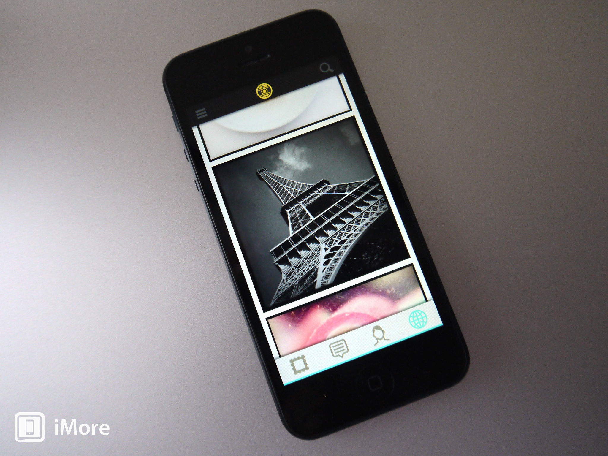
Beyond having an odd sounding name, Oggl is the latest creation by the long serving team at Hipstamatic. The app just went live in the App Store, but at the moment it requires an invitation code to use -- though you can apply for one in the app. But, what exactly is it? The official tagline reads as: "A community of creative people capturing & curating their Lives through photography." So that'll be a social photo sharing service then, will it?
Anyone who knows Hipstamatic knows that the fundamental principle stands around applying filters to your photos. Pretty common these days, but Hipstamatic has been doing it for a number of years now. When it comes to the social aspect, there's only one clear market leader; Instagram. So, is Oggl just an Instagram clone, or does it offer something more?
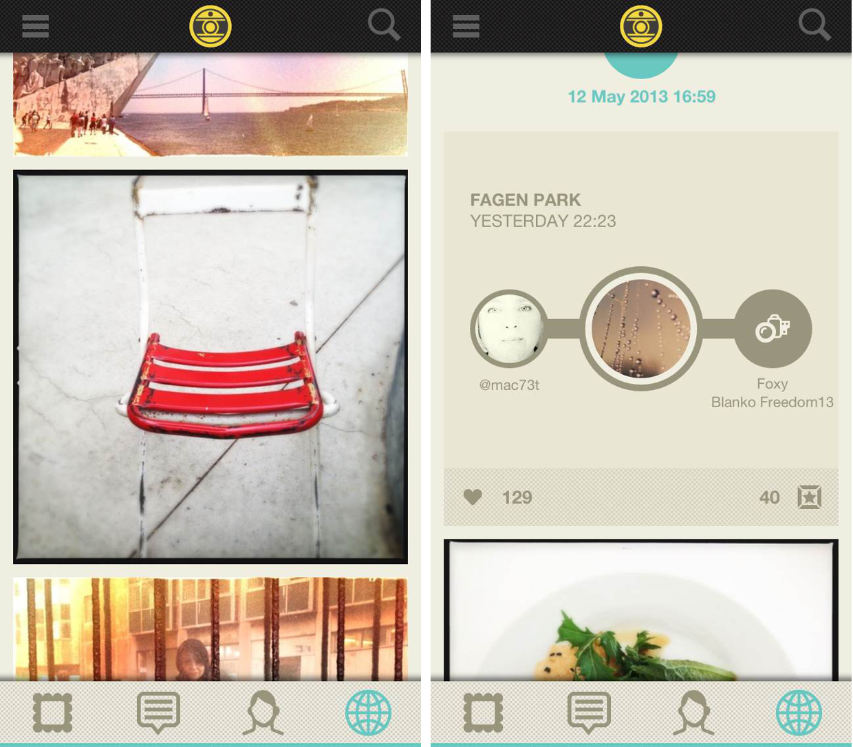
The main 'timeline' view is a definite improvement on the way Instagram attacks it. It's much cleaner, much simpler, with no usernames or comments on display it's all about the photos. You can customize what it is you want to see, be that from people you follow, editors choices, global or at the moment there's a special featured selection to see photos from San Francisco. When you see something you like, tapping on the image brings up the user information, and the lens and film combination they used to shoot it.
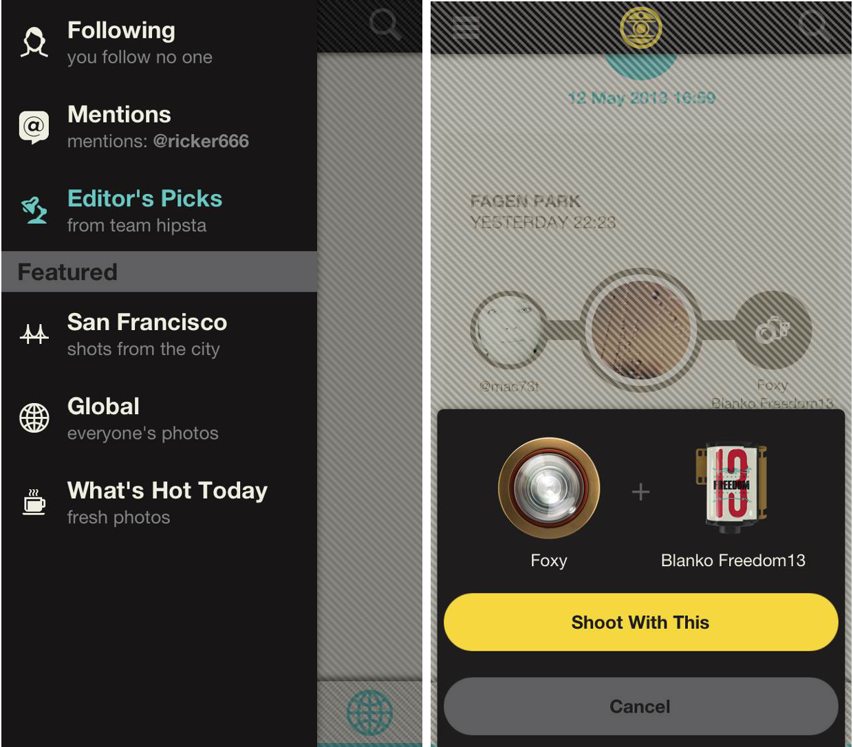
That then gives you the option to take that combination, and automatically select it to shoot your own images with. I quite like this touch. Quite often I'll see an effect in a photo that I really like the look of, and having the chance to use it myself in a couple of taps is really handy. Of course, it won't make me a better photographer, though.
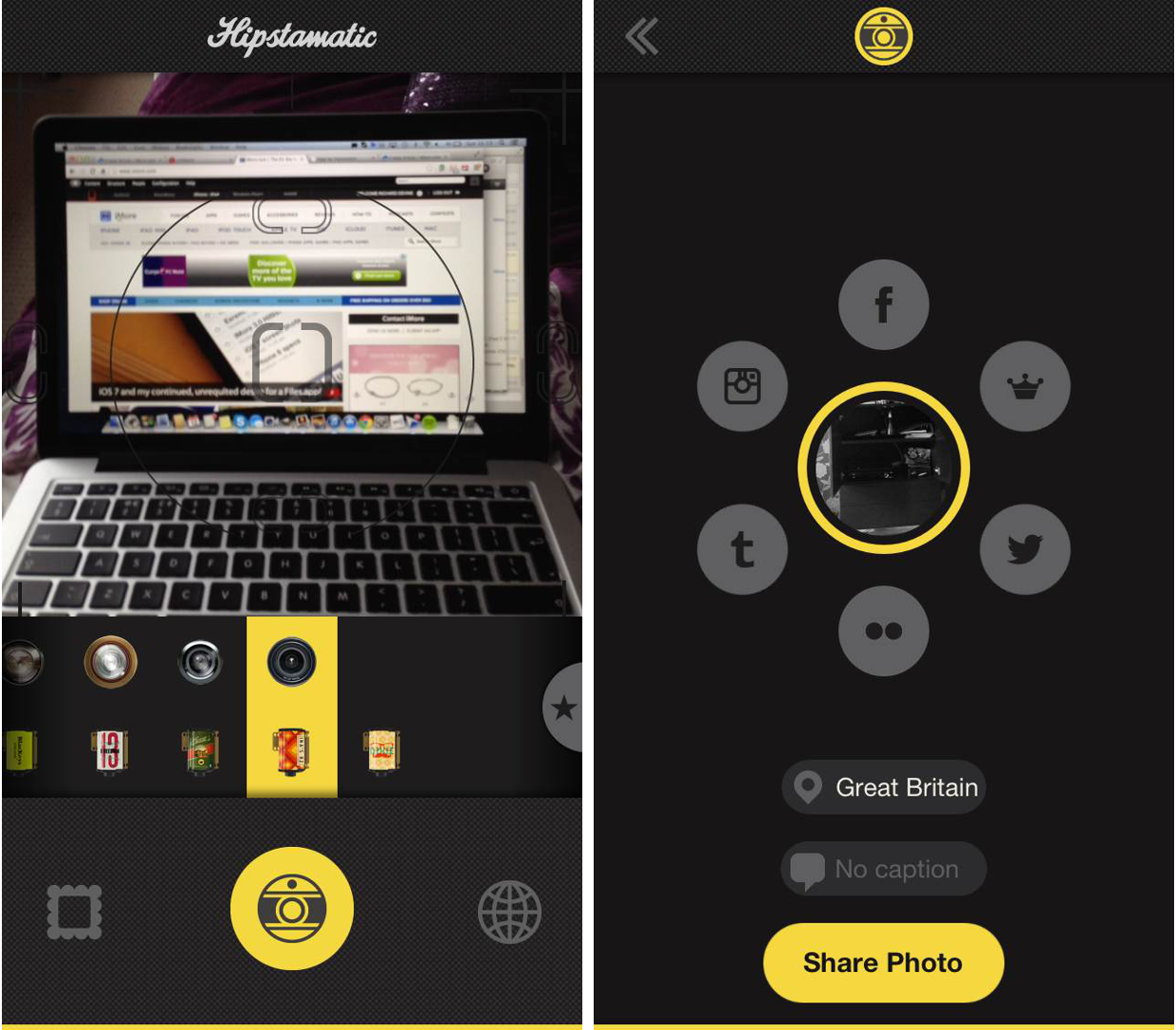
So, onwards to the shooting side of Oggl, Hipstamatic's bread and butter. The camera app itself is pretty nice, with the different effects being applied during shooting. Below the viewfinder are the selections for film type and lens type, along with some preset effects made up of a specific combination of film and lens. You aren't bound to applying the effects before taking the shot either. If you don't like it, you can change it up using the same effects afterwards.
The camera button remains at the top or bottom of each view throughout the app, so wherever you are it's only a single tap to access shooting mode. To the left of the shutter button is one-tap access to your Oggl gallery, and to the right of it is your exit point back to the global feed. So far then, so good.
It's when we get to the sharing that things become a little, peculiar. With Instagram, you hit the camera button, take your shot, edit it, tag it and upload it to whichever of the available services you desire. With Oggl, you take the photos, and then you have to go get them and decide what to do with them. It isn't difficult, but I have to admit that it took me a few minutes to figure it all out. With a sharing service, you would expect to take a photo, then share it pretty much straight away, not leave it sitting in a gallery.
Master your iPhone in minutes
iMore offers spot-on advice and guidance from our team of experts, with decades of Apple device experience to lean on. Learn more with iMore!
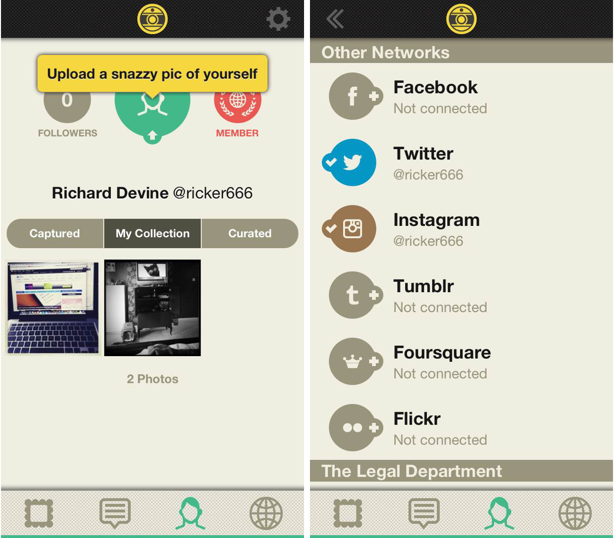
Perhaps oddly too, Instagram is one of the available sharing services for Oggl. The other usual candidates are there: Twitter, Facebook, Flickr, Foursquare and Tumblr, but being able to share to Instagram also seems like a strange move. The main Hipstamatic app can also share to Instagram, I just can't quite get my head around why you would use something like Oggl, only to then send the photos to Instagram.
This becomes an even stranger thought when you take into account the yearly subscription that Hipstamatic is charging for full access to Oggl. Priced at $2.99 quarterly or $9.99 yearly, paying up serves two purposes. The first is keeping Oggl free of all forms of advertising and keeping the app as a free download. The App Store listing puts it better than I could:
Oggl is an experience designed for capturing and curating beautiful photos, not for showcasing advertising. To support this vision for the community, Oggl will offer two subscription options: Quarterly for $2.99 & Yearly for $9.99. While Oggl itself will always remain free, each subscription comes with access to Hipstamatic’s entire catalog of current lens and film gear, and guarantees new gear each month.
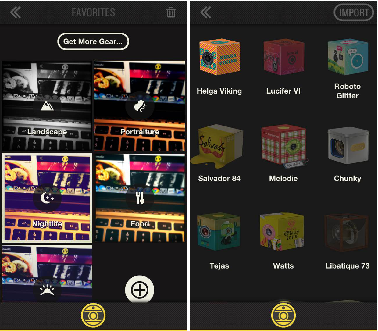
Oh yeah, and that's the other benefit to paying up. While Oggl is free to use for everyone, none-paid members are classed as 'contributors' and only get access to a limited number of the photo effects. Paid members get access to Hipstamatic's full catalog of filter packs.
The Good
- Well designed and good looking UI
- Sharing options a plenty
- Huge selection of effects for paid members
- Easy navigation, lots of one-tap access to various areas of the app
The Bad
- Slightly confusing method to sharing
- Limited effects available to free users
- Invite only at the moment
The Bottom Line
I want to love Oggl, really and truly I do. Instagram has always just felt like an extension of the other social networks to me, and like people tweet about anything and everything, there's a tendency to Instagram anything and everything. And every meal. Oggl feels different though. They're penning it as a way to curate and enjoy beautiful photography, and you do get that impression. The photos are always front and center, with the person who did it, where and how they did it and all that other business tucked out of the way.
Whether it will take off or not is another question. Whichever way you look at it, Instagram is free, and the best experience in Oggl is not. The average eye may see little difference between the two, only the mention of subscription fees, and then decide to stick with Instagram. And I still don't know why you can share your Oggl photos to Instagram. If you want to do that, the main Hipstamatic app will do that for you. I'm going to give it a chance though. I've signed up for a three month subscription. I like what I see so far, lets see what I think three months down the line.
So, is Oggl more than an Instagram clone? In some ways, yes. It takes the same idea and makes it a better experience. But it's going to need people using it to make it worthwhile.
- Free - Download Now
