Omnifocus 2 for iPhone review: Completely redesigned for iOS 7, easier to use than ever

Omnifocus 2 for iPhone by the Omni Group is a completely re-designed and re-imagined version of their popular task management suite. Not only has it been thought out and redone with iOS 7 in mind, but with how we handle tasks and interact with them also being at the center of their efforts. I've always loved Omnifocus products and the feature sets they bring to users when it comes to getting things done. The down side was that it could be overwhelming for new users, especially when it came to interface. Omnifocus 2 for iPhone is changing that and starting to break that barrier.
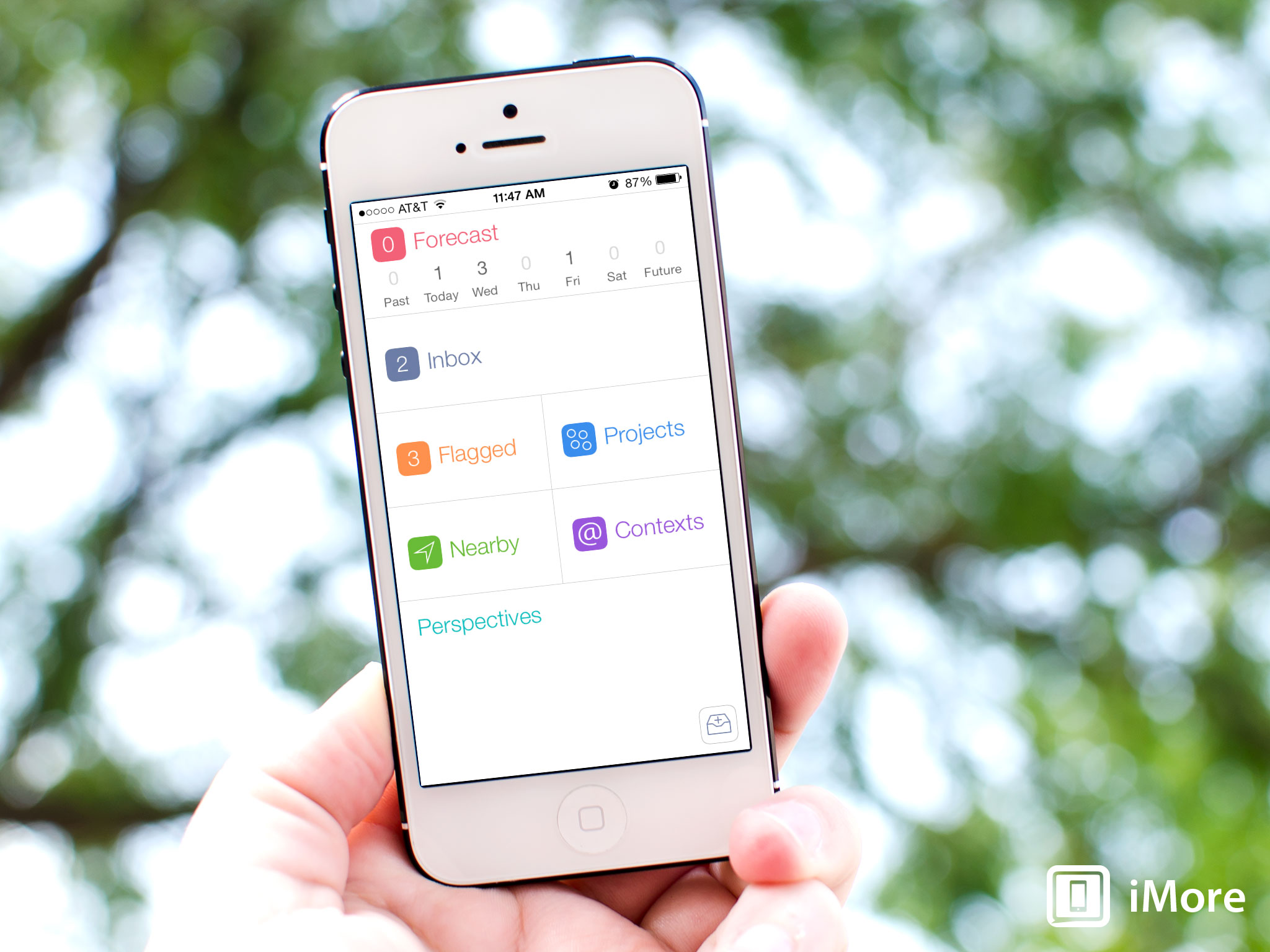
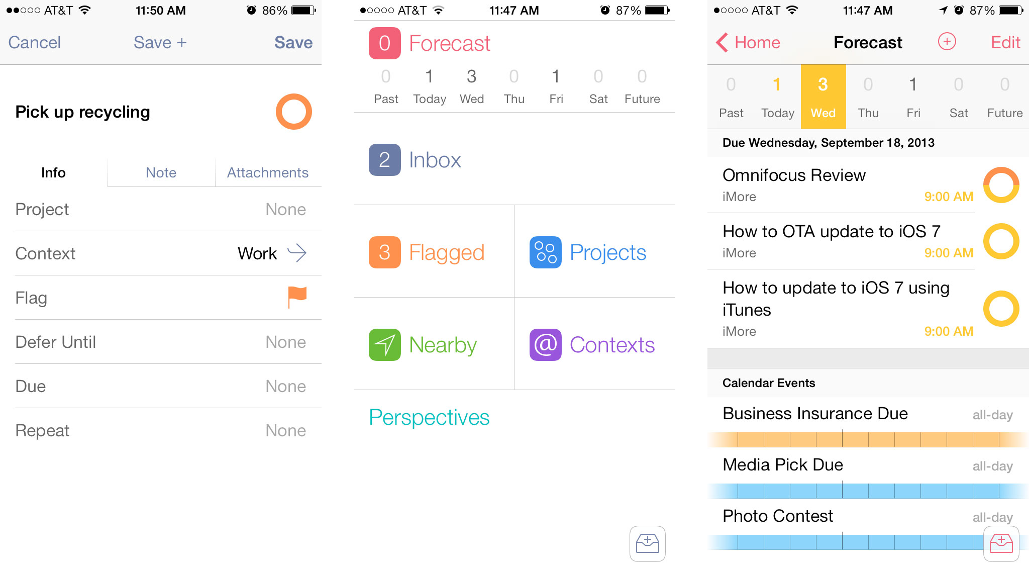
Upon launching Omnifocus 2 on the iPhone, you're greeted with a simplistic view of all the items you interact with. All these sections should be rather familiar to existing Omnifocus users. The Forecast Summary section along the top gives you a quick view of what tasks you have due each day. You can choose to tie in your native Calendar app as well in order to view events and appointments all in one place. Tapping on any day in the Forecast Summary section shows a complete list of what you have scheduled and due that day.

Other sections on the Home screen of Omnifocus 2 include exactly what you'd expect. The first section is the Inbox which is where you most likely spend most of your time. You can also quick add a task by tapping the add task button in the bottom right of the Home screen. When adding a task, it filters into the Inbox unless you specify what project or folder you want to put it in. When adding tasks quickly, tap the Save+ button instead of just the Save button in order to keep adding tasks without having to tap new task each time. A neat shortcut to keep in mind is that holding down on the Back button in any menu will immediately return you to the Home section of Omnifocus 2.
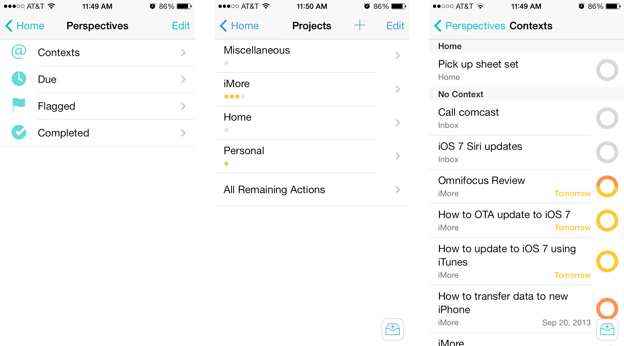
The next sections of Omnifocus 2 collect tasks based on how you've assigned them. The Flagged section only shows the tasks that you've marked as flagged. I typically use this to highlight tasks that need my immediate attention or things that I keep forgetting to do so I finally remember. Tapping on the Project section will show you a quick run down of what projects you have. A great new feature are the summary dots that show a quick view of what's inside each project without even opening it. A red dot indicates an overdue tasks while an orange dot indicates a task that is due soon. Each task within that project gets its own dot. An outlined gray dot means there is nothing inside that project while solid gray dots indicate tasks with either no due date or ones that don't have a due date approaching anytime soon.

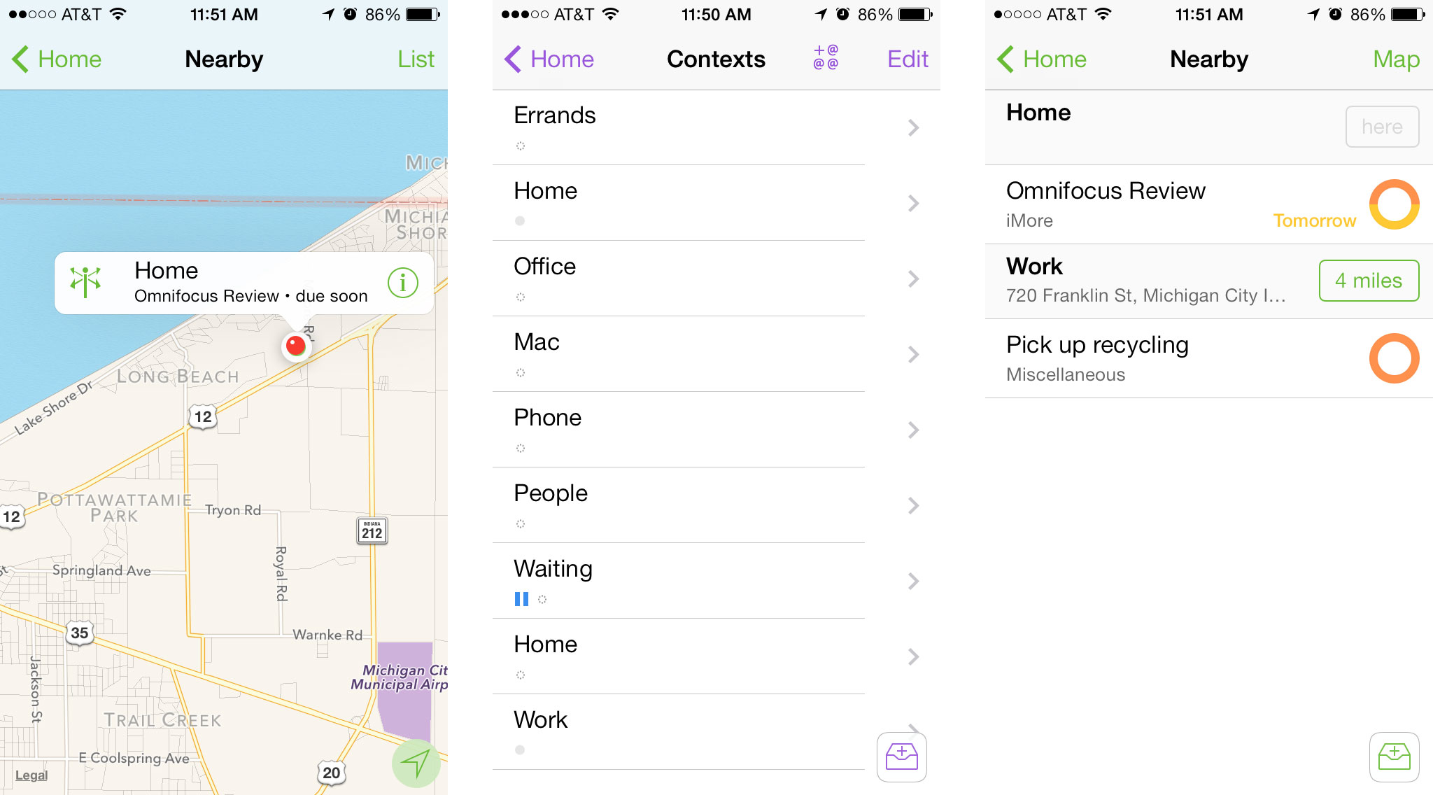
The Nearby and Contexts sections work hand in hand. If you've set up contexts for certain locations that you need to be at in order to perform certain tasks, a quick tap on the Nearby section can show you what places are around you that you have tasks to complete at. This feature is especially useful for when you're around town and want to make sure you aren't forgetting to pick anything up while you're out. In order to use the Nearby section, you'll first need to make sure you build contexts around places you visit most and then attach those to tasks that have to do with that location. Contexts can also be certain items or people as well.
The last section is the Perspectives section which lets you quickly drill down into certain kinds of items based on contexts, when things are due, what you have flagged, and a list of completed tasks. If you have a lot due or just want to see a list like structure of what needs to be done or what's already been done, this is where you want to be.

The good
- Completely new interface that's not only iOS 7 ready, but lets you get where you need to be in fewer taps
- Summary dots save a lot of time by letting you see what projects need your immediate attention with only a quick glance
- You can access the Search bar from virtually any screen by just pulling down
- Touch and hold the back button on any menu in order to instantly return to the Home menu
- Save+ lets you quickly enter tasks
The bad
- Project setup can be overwhelming to new users still, improved but still not the pinnacle of user friendliness
The bottom line
Omnifocus 2 for iPhone is a huge improvement over previous versions when it comes to creating tasks faster and analyzing your data more efficiently. One of my biggest peeves in the past has been the learning curve associated with using Omnifocus products. That pain has been greatly eased with Omnifocus 2 for iPhone. The only gripe that remains somewhat unchanged is that the project creation view is still somewhat cluttered and unexplained. If that could be addressed in an update, I think the barrier of entry for new users will be almost completely broken.
Master your iPhone in minutes
iMore offers spot-on advice and guidance from our team of experts, with decades of Apple device experience to lean on. Learn more with iMore!
The Omni Group has plans to update the Mac version of Omnifocus next followed by the iPad version. You can get Omnifocus 2 for the iPhone right now via the link below.
- $19.99 - Download Now
iMore senior editor from 2011 to 2015.

