Omnifocus, one of the more complex and serious get things done services available for both iOS and Mac, has just been updated to version 2.0 on the Mac. With it comes a fresh new design, Forecast view, a handy quick open feature, and lots more. Back when I reviewed Omnifocus 2 for iPhone, I found it to be a huge step in the right direction as far as usability was concerned. So is the new Mac version of Omnifocus a step in the right direction as well?
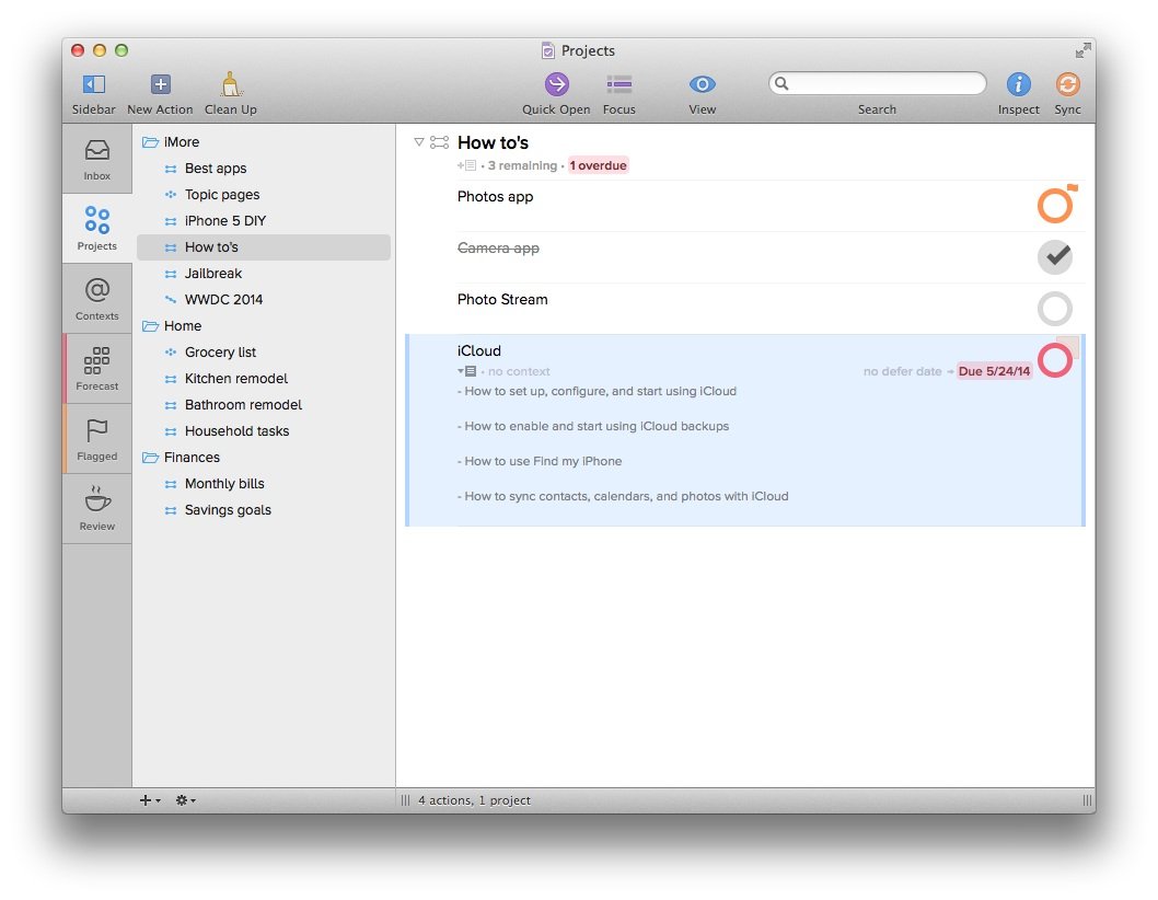
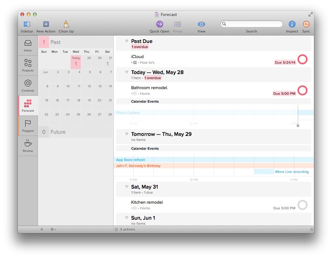
For anyone already familiar with Omnifocus, you don't need to worry about picking up the new Mac version and feeling like you have to relearn everything, especially if you're already using Omnifocus 2 for the iPhone. The new design is bright, bold, and easier to use than ever. On the left hand side you've got a standard navigation section that quickly lets you access any of your inbox, projects, forecasts, review section, and more. The Forecasts section will look familiar to anyone who uses Omnifocus on the iPad. While Omnifocus 2 for iPhone has a forecasts section, it's somewhat of a limited version of the full blown Forecasts view. It's nice to see it made its way to the Mac.
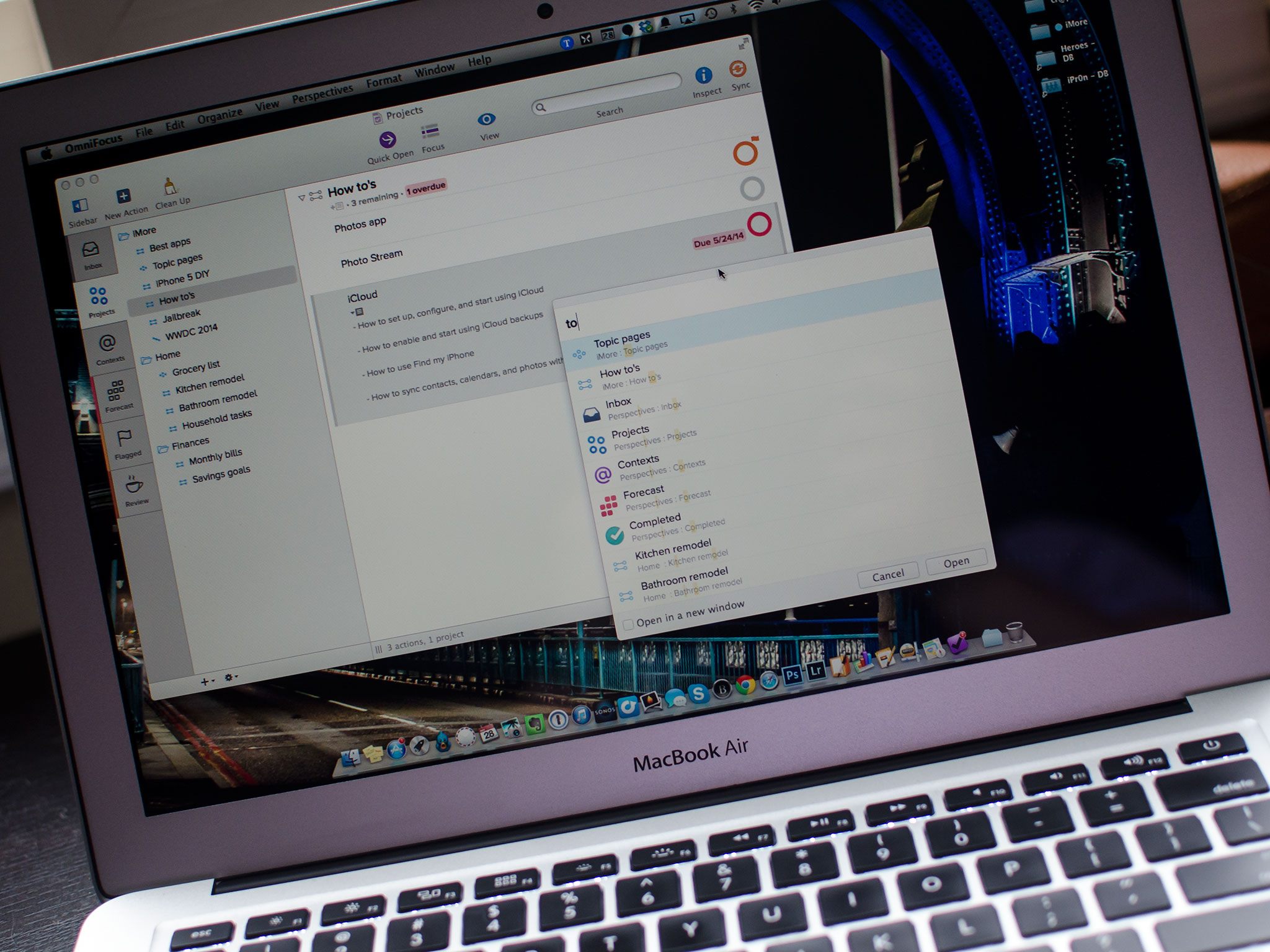
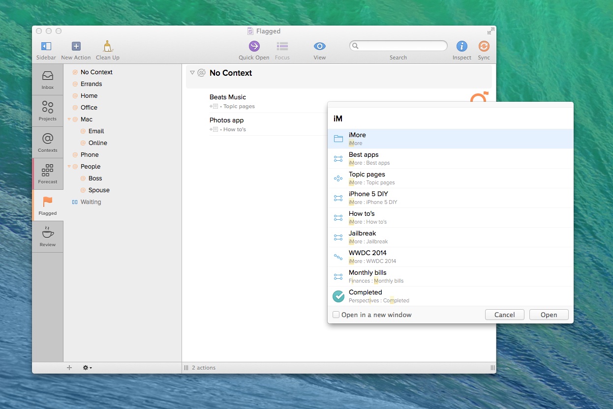
One of my favorite new features of Omnifocus 2 for Mac is the quick open feature. Simply press Command + O on your keyboard to invoke quick open. Start typing a keyword for what you're looking for and Omnifocus 2 quickly displays anything matching it. It's a great way to search for almost anything without taking your hands away from the keyboard. Review Mode has also received some attention and is a lot more pleasant to use in the new version of Omnifocus. The easiest way to move items into the review section is to just drag and drop them. You can do this with single items, lists, and projects.
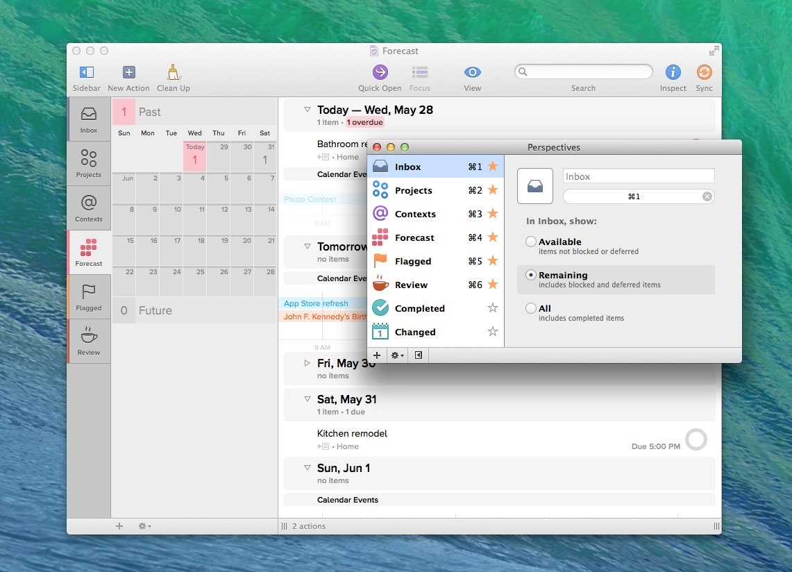
Article continues belowPerspectives are also easier to use and more clearly defined in Omnifocus 2 on the Mac. When I first started using Omnifocus over a year ago, I had no idea exactly what Perspectives were. After asking a few other people, it turns out I wasn't alone. For those that don't know, Perspectives are just different ways of looking at and understanding your information. For example, inbox, projects, contexts, forecast, review, and flagged are all perspectives. You can also add your own. You can use the perspectives menu in the top navigation to easy edit them, add more, and assign keyboard shortcuts.
The good
- The new design makes Omnifocus much less intimidating to new users, like its iPhone counterpart
- Keyboard shortcuts are better than ever, including the quick open feature which makes it dead simple to find what you're looking for
- Forecasts view is a great way to integrate your calendar with all your tasks at once glance
- Anyone already using Omnifocus will appreciate the simplicity of Omnifocus 2, not feel like they have to relearn everything
- Moving tasks or creating child tasks are ever only a keyboard stroke away
The bad
- No complaints so far
The bottom line
I never used Omnifocus on a day to day basis due to the overwhelming complexity of it. Omnifocus 2 for Mac may change that for me. Omnifocus may not be for everyone, but if you have a lot of concurrent projects to manage and you need a get things done workflow that can be tweaked and changed just as often as your demanding work load is, you need Omnifocus. Now I can't wait to see what the refreshed iPad version brings to the table next.
- $39.99 - Download Now
See also:
- $19.99 - Omnifocus 2 for iPhone - Download Now
- $39.99 - Omnifocus for iPad - Download Now
iMore offers spot-on advice and guidance from our team of experts, with decades of Apple device experience to lean on. Learn more with iMore!
iMore senior editor from 2011 to 2015.
