OS X Mavericks preview: Calendar

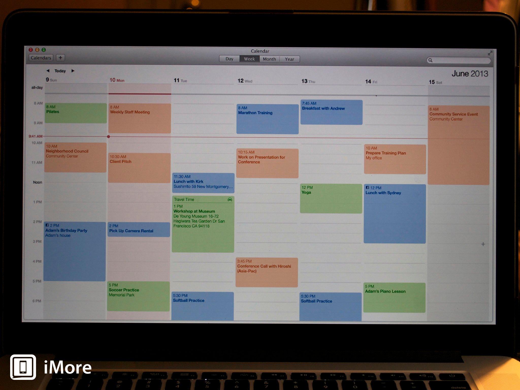
OS X Mavericks' Calendar gets a clean, streamlined look that makes it easier than ever to figure out what you're doing. Calendar knows where you're going and how long it'll take to get there, too, so you'll never be late for another appointment.
While OS X Mavericks' look and feel won't change quite as radically as iOS 7's when it debuts this fall, there are some welcome changes for users who aren't fond of skeuomorphic design elements. Calendar is getting a nice facelift in Mavericks and some new functionality too. We got a bit of a preview during the WWDC 2013 keynote, and now we've got a bit more info to share with you.
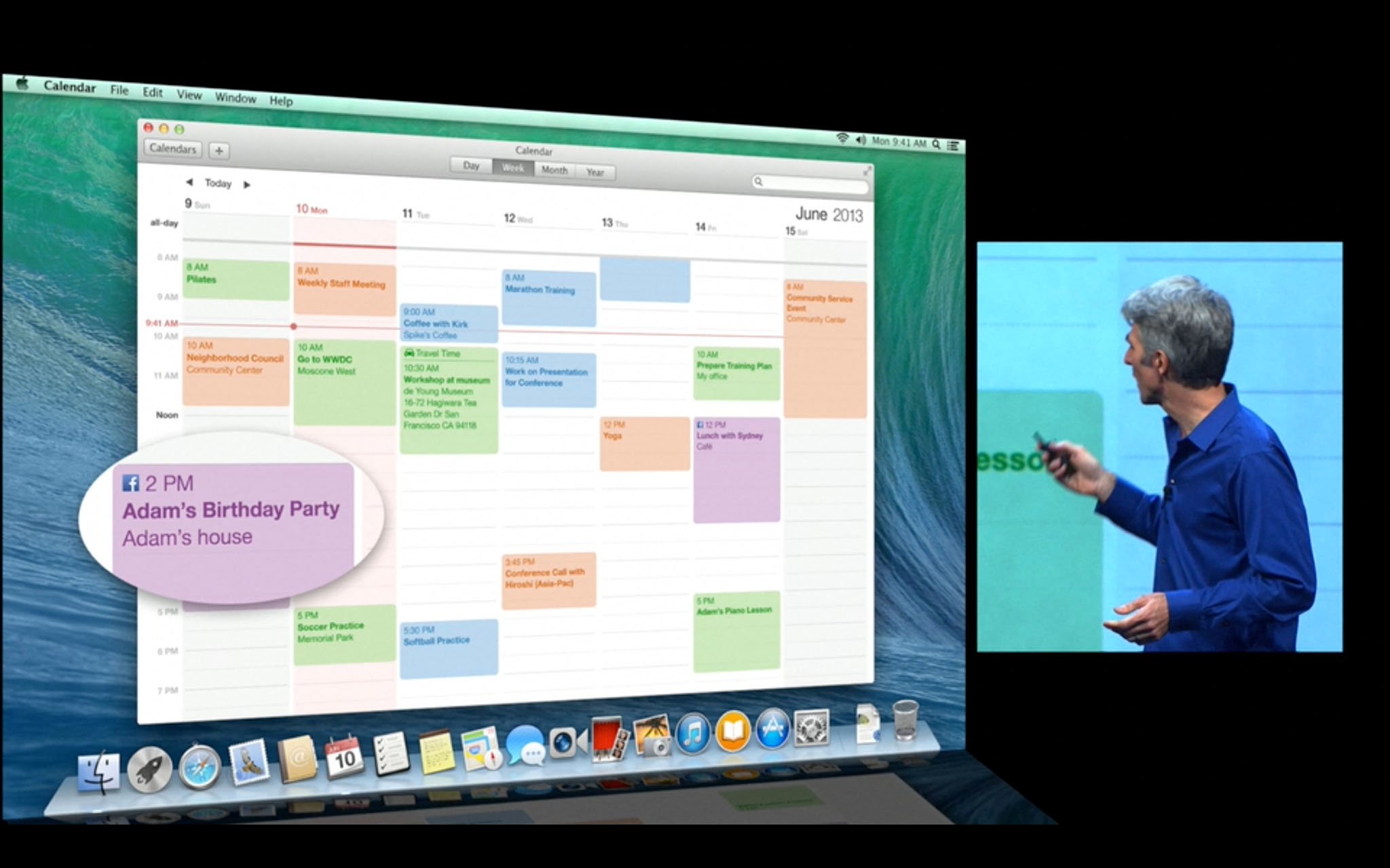
First of all, those stubborn artifacts of a physical desktop calendar are gone - there are no more torn page fragments at the top of the calendar and the title bar has a flatter appearance. "Streamlined" is the word Apple uses to describe it, and that's accurate: It looks cleaner.
"Absolutely no virtual cows were harmed in the making of this user interface," joked Apple senior vice president of Software Engineering Craig Federighi, when he unveiled the new Calendar at the WWDC keynote.
From the top down, the next obvious change is the placement of the navigation buttons and the date - they've been reversed in weekly, monthly, and yearly views, to give you a clearer visual cue to show what time period you're looking at.
Also gone is the one pixel-wide table grid that's used in Mountain Lion's Calendar for Week, Month and Year layouts. Days in Mavericks are instead separated with white space, with a one-pixel border to separate them vertically. The net result is a cleaner, less cluttered look.
Continuous scrolling is a new feature in Mavericks Calendar. In the monthly view, this means that you can scroll vertically from week to week (the current week gets a colored horizontal line across the top to help you return to it quickly; you can also just click the Today button). In Mountain Lion Calendar, you can horizontally scroll, in weekly or daily views. The scrolling in daily mode is abrupt, replacing each day's events as you scroll; weekly will snap to the next week's events. Now it's smoother and more continuous.
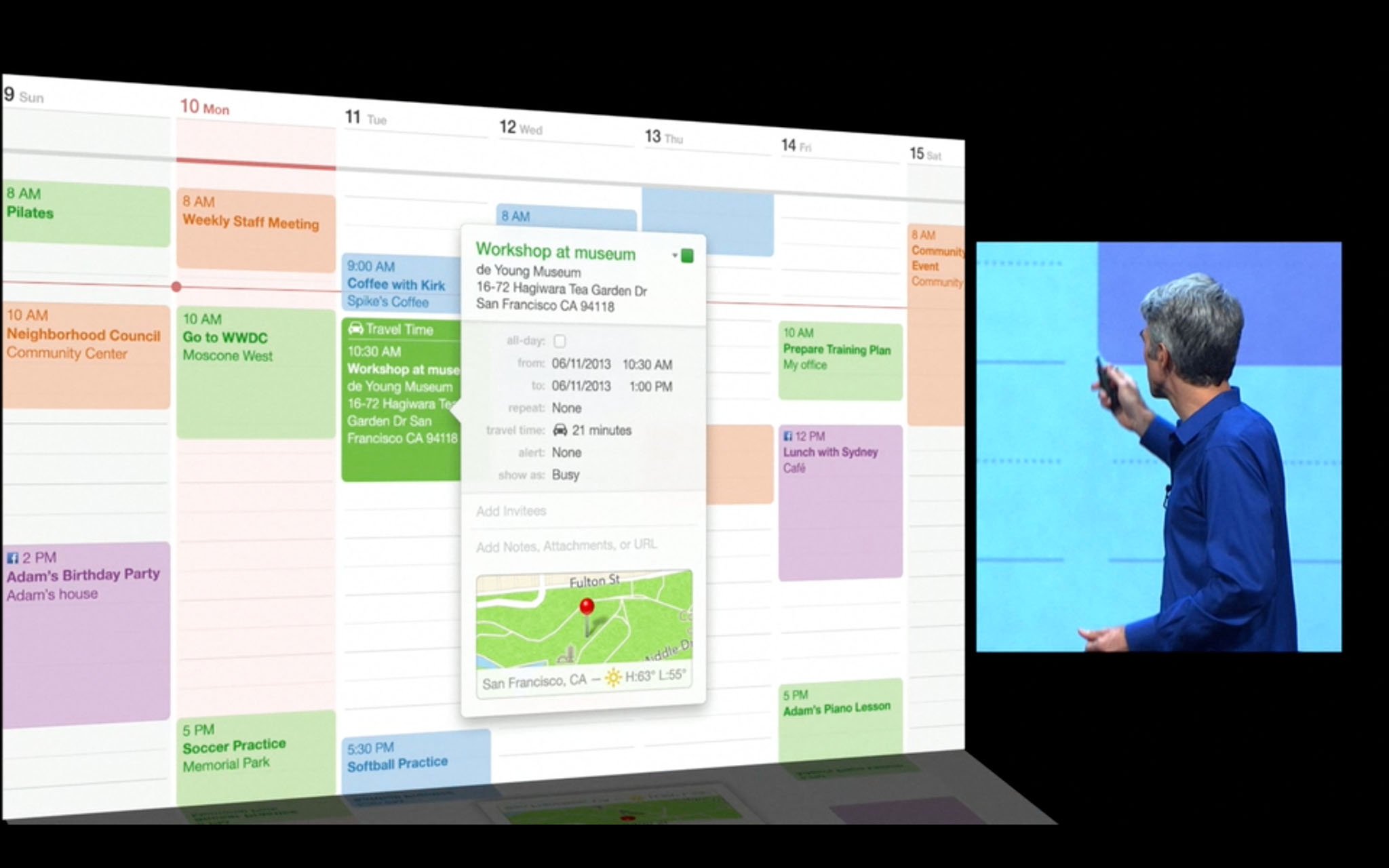
The new look and feel of Calendar will be a welcome change for users who are increasingly accustomed to gesture-based controls for all aspects of the OS X interface, but Calendar gets some really functional enhancements, too. The Inspector is where you'll see the greatest changes.
Master your iPhone in minutes
iMore offers spot-on advice and guidance from our team of experts, with decades of Apple device experience to lean on. Learn more with iMore!

Many of us now receiving information about social events through friends and family linked through Facebook. OS X Mavericks lets you connect to your Facebook account, and if you've said yes to events you've learned about through Facebook, they'll be displayed on a separate Facebook Events calendar.
The Maps app is coming to OS X, and Calendar's Inspector now ties into that data to provide you with a small map showing your meeting location. That's only a thumbnail, though, so if you need walking or driving directions, you can click on the image and the Maps app will automatically open and plot the way.

What's more, Calendar automatically pads your events with travel time, so you can be sure to have enough time to get to where you're going. It also ties in to weather information so you can see how you'll need to dress. The Inspector also supports autocompletion of fields to save you typing.
OS X Mavericks is still a moving target which won't ship until the fall, so we'll see if Apple introduces any new features to Calendar between now and then. But even if nothing else happens, these changes will be welcome improvements for users who rely on Apple's calendaring application to manage their schedules.

