Spotlight in OS X Yosemite: Explained

Spotlight is getting a major overhaul in OS X Yosemite. Not only does it look different but it acts differently too. It's no longer a passive search tool that just looks at file names and the content of files, then shunts you off to other apps if you need more help. Spotlight in Yosemite has been utterly reworked to be a very powerful information-finding tool that helps you get the data you need and act on it. So, how does it work?
Center screen

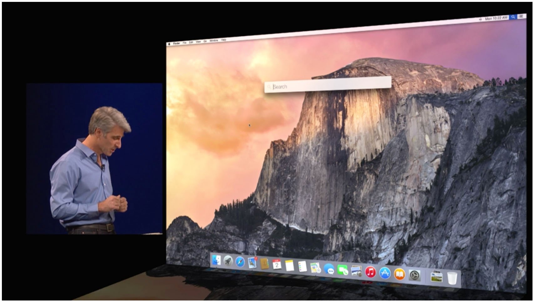
Spotlight's greater prominence as a search tool earns it greater prominence on the Yosemite screen. Clicking on the Spotlight icon in the menu bar, or hitting CMD + Space, yields a search bar in the middle of the screen, instead of a pop-down field that hangs from the menu bar in Mavericks.
A larger type face makes it easier to enter search terms, and a new search window shows you scrollable previews of your search results.
Expanded (and intermediated) search

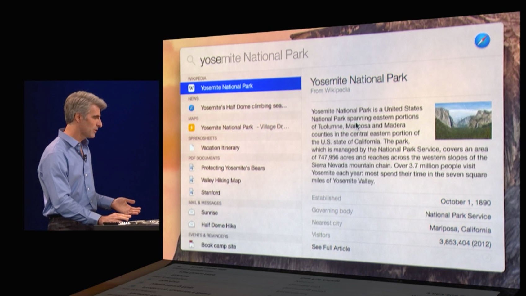
In Mavericks, Spotlight pushes you to your web browser to search the web and Wikipedia. In Yosemite, Spotlight integrates those results directly into its summary window, saving you a step. Wikipedia entries are shown as a summary with a thumbnail image; if you want more details, an embedded link will open the page in your browser when you click on it.
Spotlight also links to Apple's Maps data. Entering an address will yield an embedded map with options for directions and other information. Apple also noted integration with Microsoft's Bing search engine, but that functionality appears missing in the first developer preview release that Apple offered at WWDC.
Interested in a movie that's now playing in theaters? Type in the name of the movie and you'll see a summary with a movie poster, links to trailers and even links to showtimes near you.

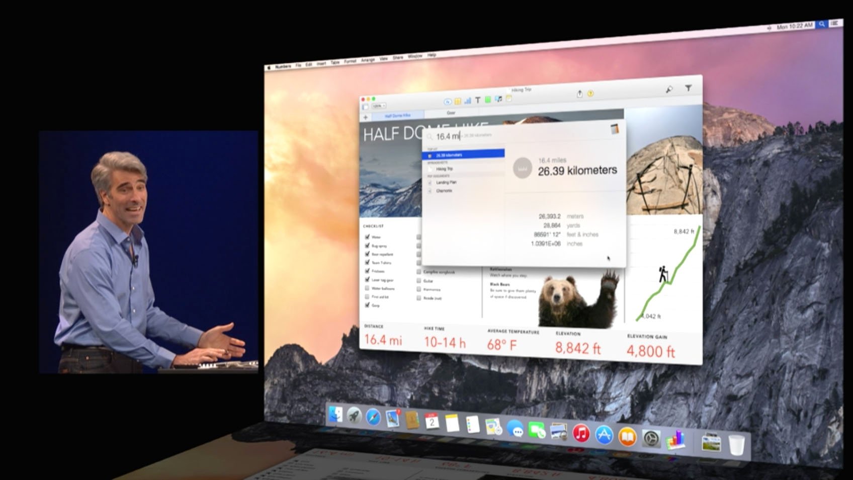
You can also ask Spotlight to do calculations and conversions. It's not quite as complete in the WWDC build as the actual Calculator application, but you can enter simple arithmetic or measurement units and Spotlight will yield results on the fly.
Master your iPhone in minutes
iMore offers spot-on advice and guidance from our team of experts, with decades of Apple device experience to lean on. Learn more with iMore!
Yosemite Spotlight vs. LaunchBar, QuickSilver, and Alfred
Third-party developers have certainly filled in Spotlight's gaps over the years, and when Apple showed off the new features of Spotlight, some users of Running With Crayons' Alfred noticed some similarities right away, such as quick Web searches, map searches and more. In the same token, Objective Development's LaunchBar and Stranded Design's Quicksilver both help Mac users find content quickly and easily with just a few keystrokes.
When Apple introduced its third iteration of the Sherlock search tool — Spotlight's distant predecessor — it focused on web search instead of local search, as previous versions had done. Apple was accused of copying the concept wholesale from Karelia Software's Watson, which offered similar functionality. Ever since then, the term "Sherlocking" has existed to describe what happens when Apple incorporates a feature into OS X that had previously been supported by an independent developer.
In truth, Apple hasn't "Sherlocked" any of these apps with the new Spotlight. Each of them has features and functionality unique to themselves, and it'll be up to the individual developers to continue to differentiate their products to appeal to customers.
Bottom line
Apple has evolved Spotlight from a simple file search tool to something much more robust — a general search tool. It's doing the work of several applications you already depend on, like your web browser, the Maps application and others. But Spotlight isn't replacing them. Instead, it's layering on top of them, providing you with a front-line interface to get at the information you need to get things done.
Looking forward to getting your hands on Yosemite? Does Spotlight look like something you'll use regularly? What do you think of the changes? Sound off in the comments..

