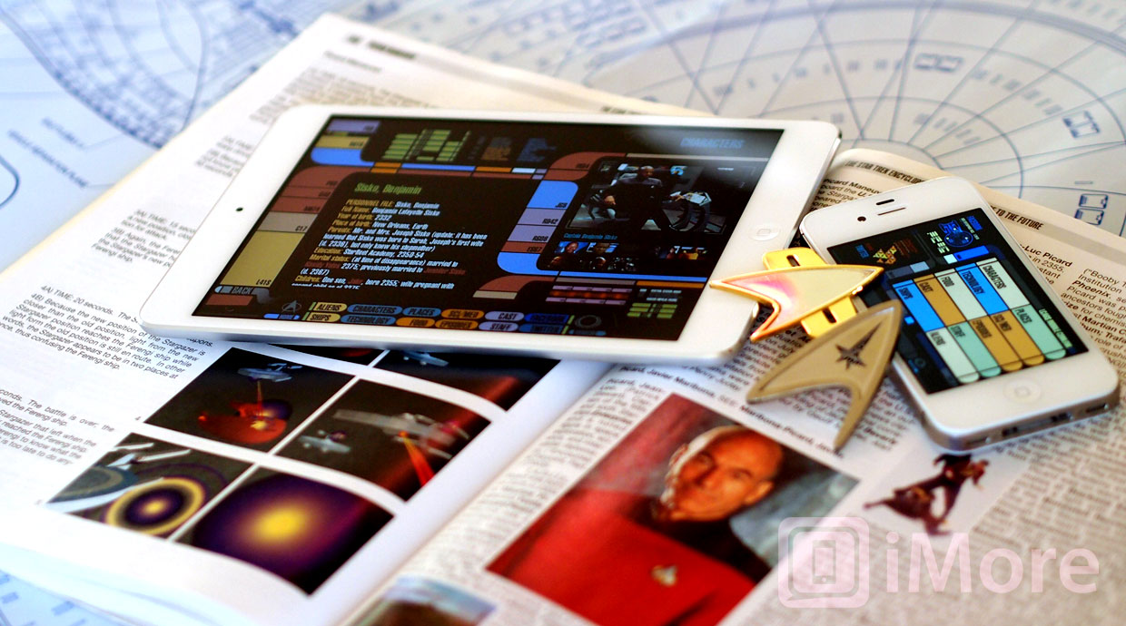
I'm a Trekkie. Or a Trekker. Some claim there is a difference between the two, but really it's hard to define the qualitative differences between the two - Trekkie seems to imply to me that while I'm a pretty big Star Trek fan, I don't take it far enough that I have a closet dedicated to replica uniforms. I'm also a techie, which I suppose goes hand-in-hand with the Trekkie bit. Star Trek's technological predictions have been hit-or-miss over the years. According to Star Trek: The Original Series' "Space Seed", we were to have concluded a world-wide Eugenics War that ended with the defeat of our augmented super-human overlords and their escape into deep space aboard a cryogenic sleeper ship. In 1996. Clearly, that didn't happen, or I really wasn't paying attention in the 90's.
But Captain Jean-Luc Picard's 24th century U.S.S. Enterprise-D was littered with PADDs - Personal Access Display Devices - thin tablets of varying size with touchscreen displays and access to the ship's databases. Today's iPads and Android tablets are significantly more capable than what Star Trek's PADD was ever demonstrated to be capable of. And to add insult to injury, the PADD could in theory hold a massive amount of information (extrapolating Moore's Law out to 2360, we're looking at around 10^73GB of storage space - 8.882 octodecillion yottabytes - which is far more memory than held in the brains of the entirety of the human species, estimated to be around 20 yottabytes in total), but it was more often than not used as a single document per tablet deal to allow for the relatable experience of a desk overflowing with 'paperwork'. And don't get me started on the hilarious three-inch-thick communication terminals found on the desks of Picard, Sisko, and Janeway.
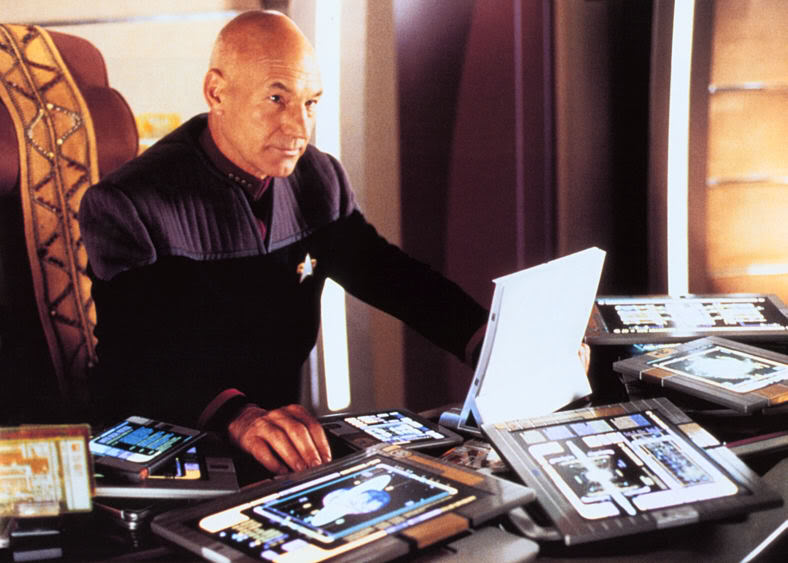
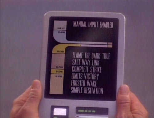
The interface of the 24th century is known as LCARS (Library Computer Access Retrieval System), characterized by bright colors on a black background, rounded rectangular buttons, a tall bold font, and a flat appearance divided by straight-edged rounded-cornered bars and angles. In a way, if you were to combine the aesthetics of iOS and Windows Phone, you'd get something that looks like LCARS. The beauty of LCARS was that it looked futuristic on both the small screen and the silver screen and was easy to fill with generic graphics that matched the style and made it look like the Enterprise was busily going about its mission (even if the majority of the background screens were unchanging back-lit plastic sheets).
Attempts have been made since the beginning of the web to bring LCARS to the internet, though by-and-large it hasn't gone well. LCARS has always been portrayed in Star Trek as a touch interface, whether on the huge consoles and screens of the Enterprise or on the smaller hand-held PADD tablets and tricorder scanners. As such, it's never worked well in intensive mouse-driven applications.
With the sudden availability of touchscreens in the form of smartphones and tablets, the LCARS interface is ripe for a second go 'round as a user interface. While we're unlikely to get a full-fledged Star Trek PADD complete with LCARS everything anytime soon, you can at least get a serious doseage of Trek and LCARS on your iPad and iPhone thanks to the updated Star Trek™ PADD for iPad ($4.99) and new Star Trek™ PADD for iPhone ($1.99) apps. The original version of PADD was released for the iPad back in June of 2011, but just a few weeks ago received a major update to version 2.0. The update coincided with a released of PADD for iPhone, bringing the LCARS interface from the big screen to the small screen. In no small dose of coincidence, the screen sizes of the iPhones and iPads roughly correspond to the devices sizes of Star Trek's most common PADDs, with the iPad Mini best fitting the bill as far as screen size, thickness, and even the radius of the corners.
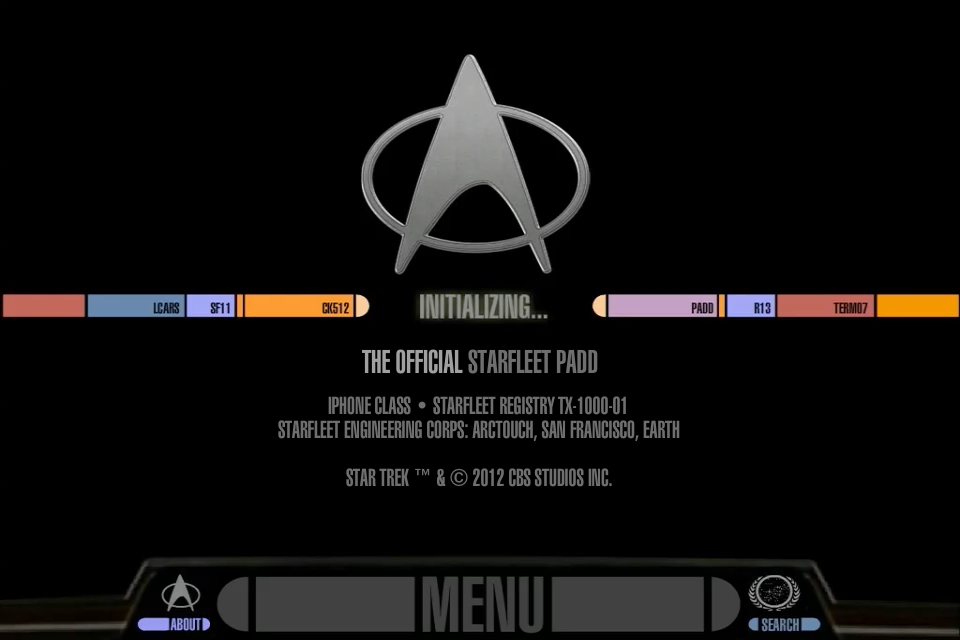
The updated PADD app retains the LCARS interface of old, offering a lot of Star Trek eye candy in the process. Both the iPad and iPhone apps maintain the same basic interface, so we'll discuss them in tandem. PADD is intended as a Star Trek reference, replacing the old Star Trek Encyclopedia that was last updated in 1999 (and thus lacks the final two seasons of Star Trek: Voyager, all of Star Trek: Enterprise, and the two most recent Star Trek feature films).
The database is broken down into categories, such as Aliens, Ships, Characters, Episodes, and Cast. The ten categories don't all match - the database is set up to access in-universe canon; the biography of Klingon Chancellor Gowron and the biography of real life person Deep Space Nine executive producer Ira Steve Behr are treated equally - but they're at least grouped by color to help differentiate. The PADD app only works in landscape (despite the fact that most PADD use in Star Trek was in portrait orientation), and these menu options are located in a bar across the bottom of the screen, framed by an incongruous faux-3D bit, which confuses whether I'm supposed to be looking at a PADD or the viewscreen on the front of the Enterprise's bridge.
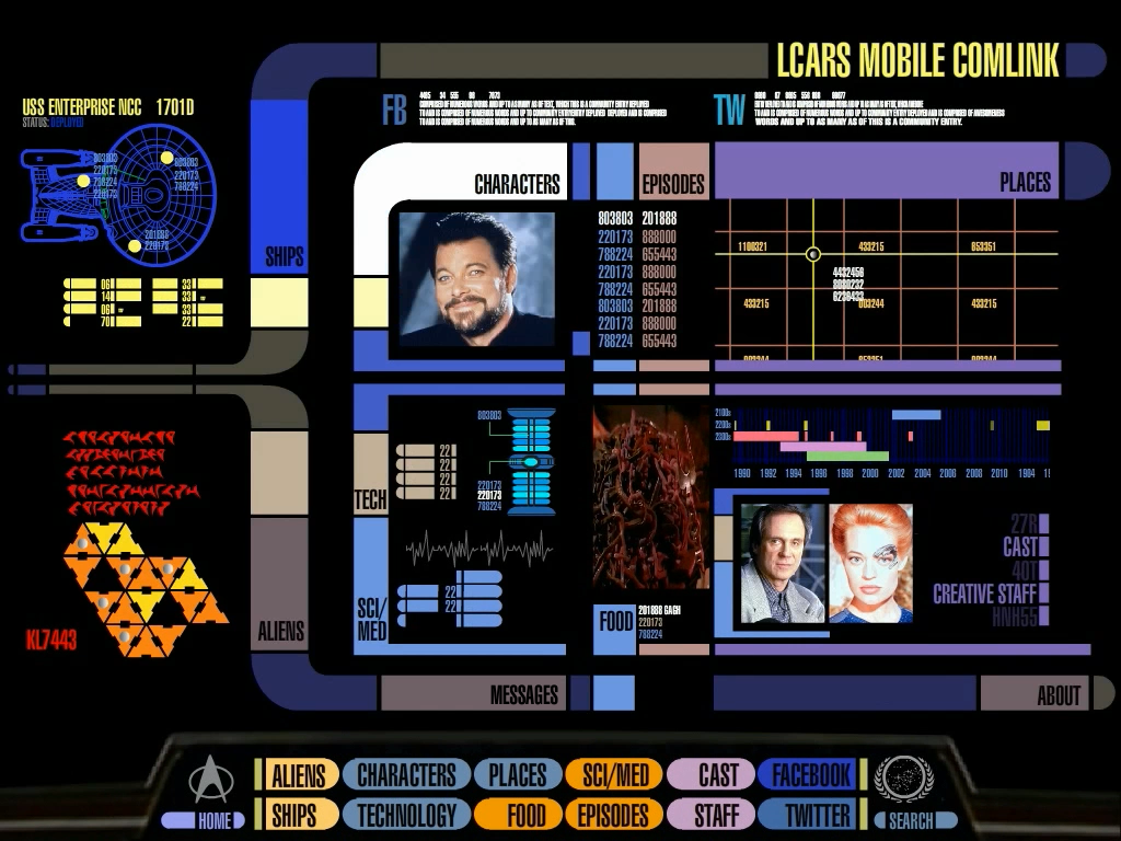
The app does launch differently on the iPad and iPhone. The iPhone version of PADD opens into a basic colorful grid of the categories, sized for easy finger-pickings, whereas the iPad version opens into a full-on nested LCARS interface with links to the various categories and rotating images from the database scattered about the screen (thankfully the grid of categories is still found along the bottom of the screen).
Once you've selected a category, a scrolling alphabetical list of the available content in that category appears, with an alphabetic selector along the right side of the screen. The list is simple enough, with thumbnail entry images on the left, and a title and a preview of the entry's text content on the right. Tap on any part of an entry listing and the full entry is opened for your perusal, with the complete text and any additional images made available. Navigation is accomplished either by selecting a category at the bottom, or tapping the back button at the bottom left. This back button occasionally kicked me back to the launch screen instead of taking me back to the previous screen, which was especially annoying when I'd gone several levels deep from hyperlinked entries to other characters and actors in the database.
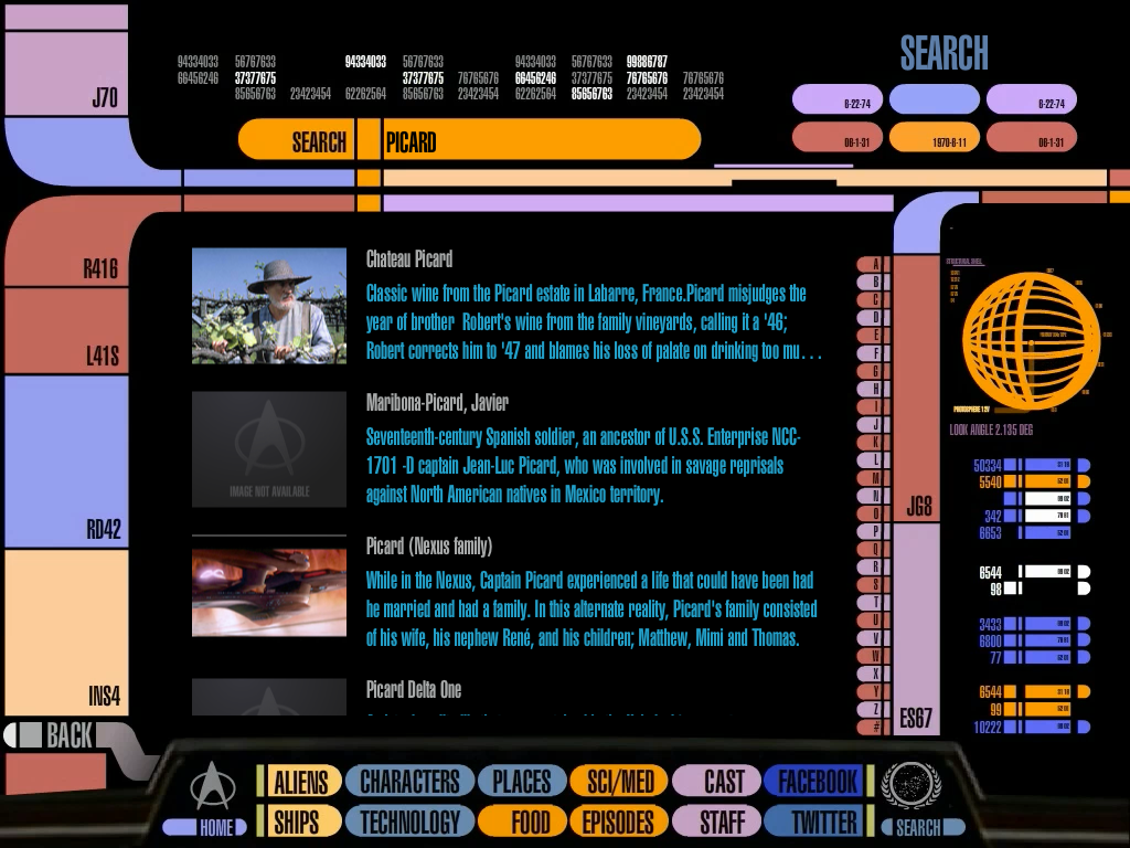
Search is available in the app, accessible from a tiny button to the bottom right of the categories menu (it's especially tiny on the iPhone). Search works well, querying both the titles and contents of the entries, but smartly displaying matching titles before moving on to matching content. The app supports voice input, but let's be honest - Siri isn't going to recognize and return Qo'noS when you search for the Klingon homeworld by saying "Kronos".
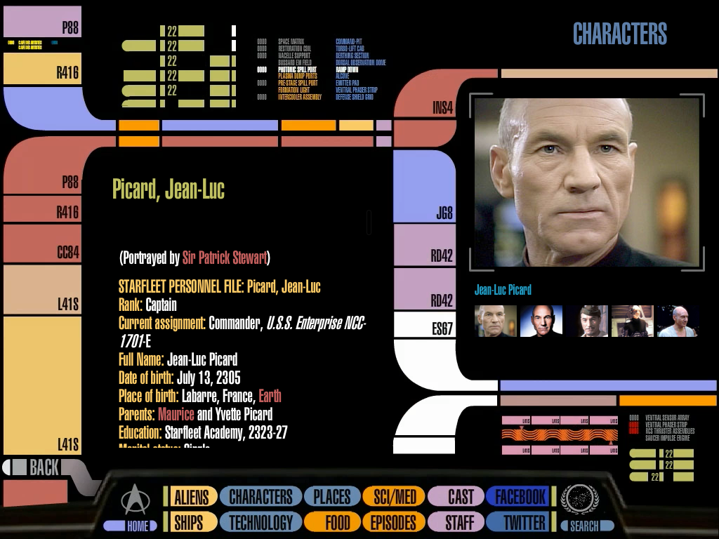
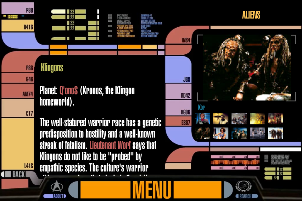
On PADD for iPad there's an annoying design decision that I've had trouble trying to understand: the layout of the interface changes between entries. Sometimes images are displayed on the right side with the character info on the left, and other times its text on the top and images below. There doesn't seem to be any rhyme or reason to why the layout changes between entries. Images are displayed with a medium-sized preview next to (or over) a grid of small thumbnails. If you want to view an image full-size, you have to tap it so it's viewed in the preview box, then tap the preview to see it full size. With the exception of content uploaded in conjunction with the upcoming film Star Trek Into Darkness (teaser trailer here), the images are of small size, and thus they look depressingly poor when viewed full size on even the iPhone's little screen.

For an app that uses very few interface elements from iOS, PADD is surprisingly fast on its feet. The problem is that PADD is also deliberately slow, going through staggered Trek-inspired interface-building transitions that looked cool for television but in real life are a pain to wait for after the sixth or seventh time. Especially when the lightweight web content doesn't seem to be fetched while you're waiting.
PADD is also incredibly heavy on the chrome. While Star Trek's LCARS interface was designed to be somewhat functional, it was also designed as chrome for the television and movie sets. PADD goes overboard with the chrome, with normally a little under half of the screen dedicated to non-functioning frames, grid globes, waveforms, graphs, and random text and buttons. This might be cool if it was all at least marginally interactive - lighting up when you press them like you might expect them to - but all the chrome does nothing but look neat and take up precious space. Tapping the chrome can elicit various audio responses, with the app selecting from a random sampling of beeps, alarms, and vocal chiding from the computer.
I also have to call into question the font choice for PADD. The LCARS interface uses Swiss 911 Ultra Compressed, which looks cool and kind of futuristic, but also is very dense. For the television screen and even the movie screen, this was great font choice because the designer didn't have to worry too much about the legibility of the text on most occasions - it was filler. But in PADD for iOS it's not filler, it's the content, and it's not easy to read, especially on the iPhone.
Further confusing things, PADD puts out a lot of sound. As in, non-stop sound. There's the low hum of the Enterprise's warp system, which while setting the Star Trek tone, is something that a PADD would never have reason to reproduce. The hum is easy enough to ignore - it's the constant background beeping and booping that's nerve-grating. Additionally, PADD responds vocally with samples of a Majel Barrett-Roddenberry (the omnipresent computer voice) randomly responding "Working", "Accessing", or "Acknowldeged" whenever you press a button (PADDs rarely had to respond audibly like that - beeps and the content changing was always enough before). Thankfully, PADD obeys the settings of your ringer switch, so if you find all of this nonsensical chatter as annoying as I do, it's easily silenced.
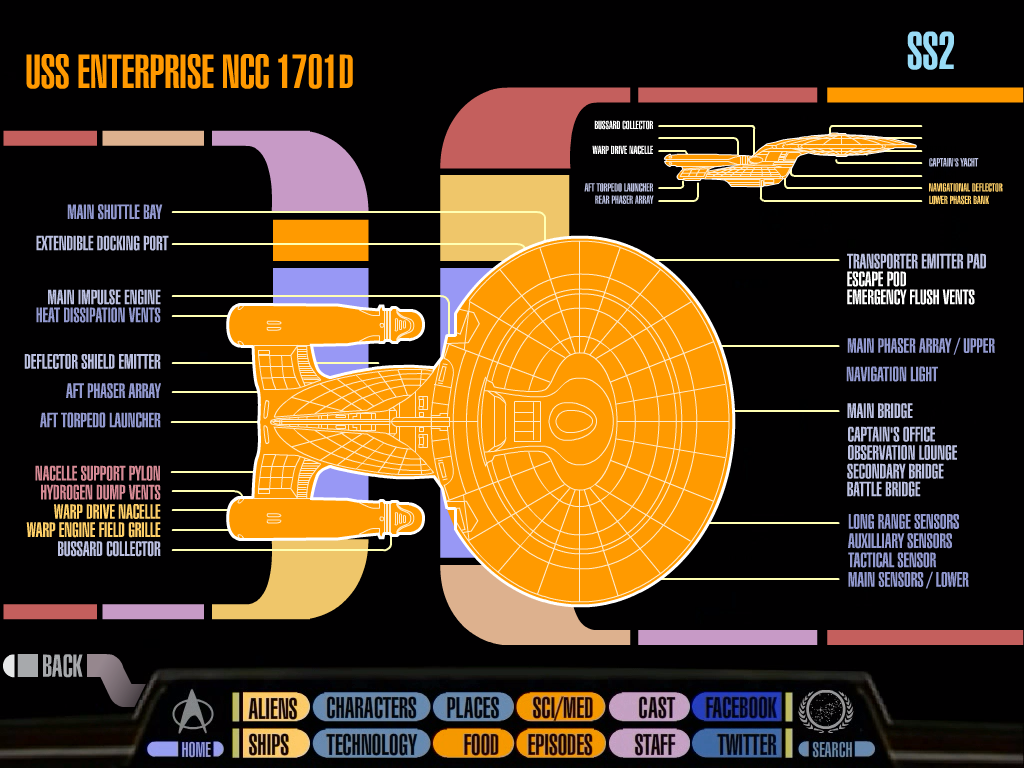
If you leave PADD sitting untouched for too long, sixty seconds to precise, it'll switch into a screensaver mode. There are two blinking and beeping screens displayed - a graphic of a warp core with a futuristic directional pad and a labeled schematic of the dorsal view of the Enterprise-D. PADD cycles between the two screensavers every fifteen seconds, and it never times out and lets the screen turn off. So don't set down your iPad or iPhone running PADD and walk away, or you'll come back to a drained battery. Tapping the screensaver drops you back into your previously-viewed content, alas no interactivity here.
In its earlier incarnations, PADD for iPad was not modular in its back-end design, requiring an update to the app in order to add new content to the database. With the update to 2.0, PADD gained an additional 170 on-device entries and the ability for the database to be updated independent of the app. This should, in theory, allow for more rapid and frequent updates, free of waiting for approval by Apple's App Store gatekeepers. PADD can give you push notifications when it's updated, should you want be notified of such things. The push update mechanism has already been put into play, with items like the poster for Star Trek Into Darkness getting pushed to the app after its November 29th update.
Okay, it's time to get to the meat of PADD - the content. Once you put aside all of the literal bells and whistles of PADD, it's a Star Trek reference app. It's not immediately clear how many entries are available in PADD, though it appears that they number in the high hundreds, if not thousands. Some entries contain links to other relevant entries, though this treatment can usually only be found in major entries like main characters, vessels, and episodes (at the very least I think each entry should have a link to the appropriate episode(s) so you can get more context, but what do I know?).
The structuring of the content itself is a source of additional confusion. The entries are generally formally written, though occasionally they delve into asides and less formal prose (much like this review, in fact). Main characters are given a broader treatment, including a bulleted list of data, timeline, and a detailed biography. For some characters the biographical data is presented as a psychological profile, other times it's just straight encyclopedic data. The entries aren't always complete - for example, for T'Pol (the Vulcan science officer on the Enterprise NX-01), the entry stops as the ship is about to enter the Delphic Expanse on a mission to save Earth - this is the beginning of the second season, with a full two years of biographical data missing.
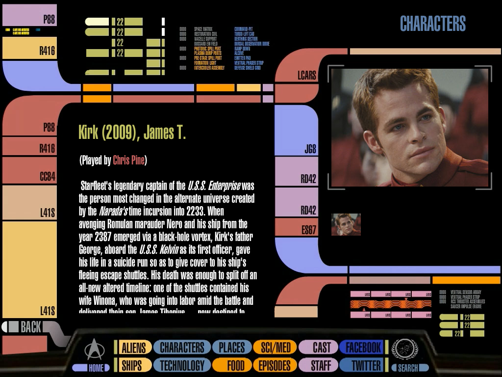
Generally the entries take an "in-universe" approach, as if you are holding a PADD in 2380 and reading about Captain Benjamin Sisko's career. But it's not always that way, the entry for Chris Pine's alternate version of Captain James T. Kirk (the app's description says that the database will not cover events from the alternate JJ Abrams timeline, but it most certainly does) is written in a much more relaxed style that acknowledges the effects of temporal hijinks from the 'reimagining' film. Granted, there's only so much data that could be gleaned about this alternate Kirk from just one film (PADD's database does not factor in the expanded universe of comics, books, and video games, which are not considered to be part of the official Star Trek canon), but entries like the new Kirk's are replete with out-of-character references and language such as this gem "Once reunited, the young men took the improbably fight to Nero and prevailed, ending the Narada's reign of terror." Doesn't sound much like a reference book to me.
The database offered by PADD for iOS is described as being comprehensive and drawing from the database of "information as officially published by CBS on StarTrek.com." While impressive, the database is far from comprehensive, as the missing two years of the Star Trek: Enterprise character bios can attest (and if you're thinking they just need time to get around to filling in the exploits of Captain Jonathan Archer and the gang, just remember that Enterprise went off the air over seven years ago).
The old Star Trek Encyclopedia offered a comprehensive look at Star Trek, though it was a bulky affair and by virtue of being bound paper wasn't as user friendly as a hyper-linked website. Even so, the books were sure to let you know that there were other entries with a little bit of bolding. The unofficial but delightfully comprehensive Memory Alpha database, on the other hand, is bountifully hyperlinked and full of imagery. Memory Alpha is a wiki (and hosted on Wikia), with more than thirty five thousand entries compiled since its creation nine years ago. Hundreds of Trekkies have offered their input and fact-checking into Memory Alpha, shaping its structure and entries, building thoroughly comprehensive articles on every Star Trek subject imaginable.

Memory Alpha's main entry covering the happenings of the Enterprise-D from Star Trek: The Next Generation and Star Trek Generations is more than five thousand words long, once you factor in background info on the construction of the various studio models, the design of the bridge, and appearances in video games the article approaches seven thousand words. PADD's entry on the Enterprise-D doesn't even cross the five hundred word threshold. Historically CBS has had a relatively cool relationship with the Star Trek fan community, so it's not surprising that they didn't partner with Memory Alpha to bring their excellent and massive fan-built database into the app, saving CBS a massive amount of work and instead only requiring that they build a wrapper for the wiki. Alas, that's not the approach they took, and there's not an app for Memory Alpha. Adding a layer of possible confusion, the app's description repeatedly mentions Memory Alpha, but in reference to the fictional Federation information archive from the original series episode "The Lights of Zetar", not the aforementioned fan-built database.
Additionally, we'd like to think that the app could offer more in the way of multimedia content. The app makes plenty of noise on its own, but with more than seven hundred hours of Star Trek at CBS' disposal, there's not a single clip or video to be found in PADD for iOS. With all of the text, small images, and extraneous sounds present, PADD weighs in at 39.5MB for the iPad and 36MB on the iPhone, though what exactly constitutes the 3.5MB difference isn't clear. PADD is generally going to be installed on a device that will be constantly connected to the internet, we'd like to think that live retrieval of content could have allowed for a lighter-sized app while permitting continuously updated content with higher quality media to be loaded on demand.
As A Trekkie, I was excited by the possibilities of the updated PADD app. I've always thought the PADD was one of the coolest bits of Star Trek technology, and certainly one that was easy to comprehend coming into existence (warp drive and transporters are still very much theoretical and will likely end up looking nothing like the science fiction incarnations). But PADD for iPad and iPhone feels more like a poorly conceived toy, not unlike the finicky LCARS-based websites of the early web. The app is touted as a comprehensive database of Star Trek information, but it's woefully lacking in both data and presentation. I want to like it, I really do, but I really can't see it being used as a useful Star Trek reference without a serious overhaul that places less emphasis on the eye candy and more on quality of content and accessibility. Then again, maybe that's not what this app is really meant to do - perhaps it's a toy wrapped in the guise of a reference database, meant to delight our inner nerd by hitting the nonfunctioning chrome to see what random Star Trek computer sound effect is going to chime in next. In the meantime, I'm just going to point Safari to Memory Alpha.
- iPad $4.99 - Download now
- iPhone $1.99 - Download now
Derek Kessler is Special Projects Manager for Mobile Nations. He's been writing about tech since 2009, has far more phones than is considered humane, still carries a torch for Palm, and got a Tesla because it was the biggest gadget he could find. You can follow him on Twitter at @derekakessler.
